
Seafoam green is a shade that is very close to mint, just as similar to pistachio, and in fact sits somewhere between the two. It's fresh and airy, bright and bold, energizing rather than restful. And designers are loving it as an accent shade, an extra green to play with when creating supremely liveable and ultra-relaxing schemes.
But while there are many colors that go with green, seafoam green is a little harder to play with. It's really a digital color — a new shade that is borne out of Pantone books and Canva backgrounds, rather than akin to anything found in nature. So while it's fun to use, it doesn't have a natural color family to be folded into.
That hasn't stopped these designers finding a way to make it work, though, and these six complementary shades will allow you to use seafoam green for gently uplifting rooms.
How to find colors that go with seafoam green
Seafoam green can go one of two ways, depending on what colors you pair with it. Put it with bold shades and they pull out its vivacity. Or, pair with softer neutrals and it will feel more relaxed.
We found 6 schemes that marry seafoam green into the palette perfectly to offer up some inspiration.
1. Off-white
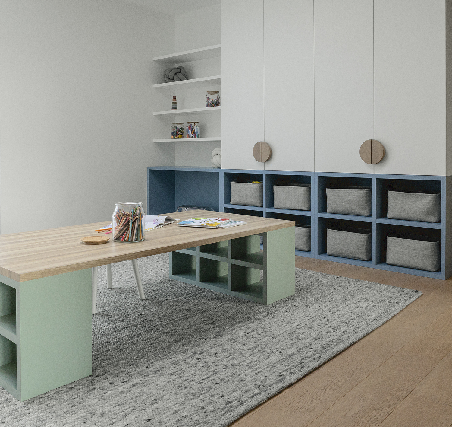
As seen in this scheme by design studio LemayMichaud, seafoam pairs just as well with softened neutrals like the off-white used on the walls. Next to these tones, it reads more calmly, too.
'Seafoam green [can] bring a serene and relaxing atmosphere to bright spaces,' says Annie-Claude Gilbert, Partner Designer at LemayMichaud. 'Its softness and neutrality make it a beloved color, perfectly suited to complement bolder shades in a palette. Its desaturated appearance and adaptability to various tones make it a mature and timeless option, while its growing popularity makes it an essential interior design trend.'
2. Lilac
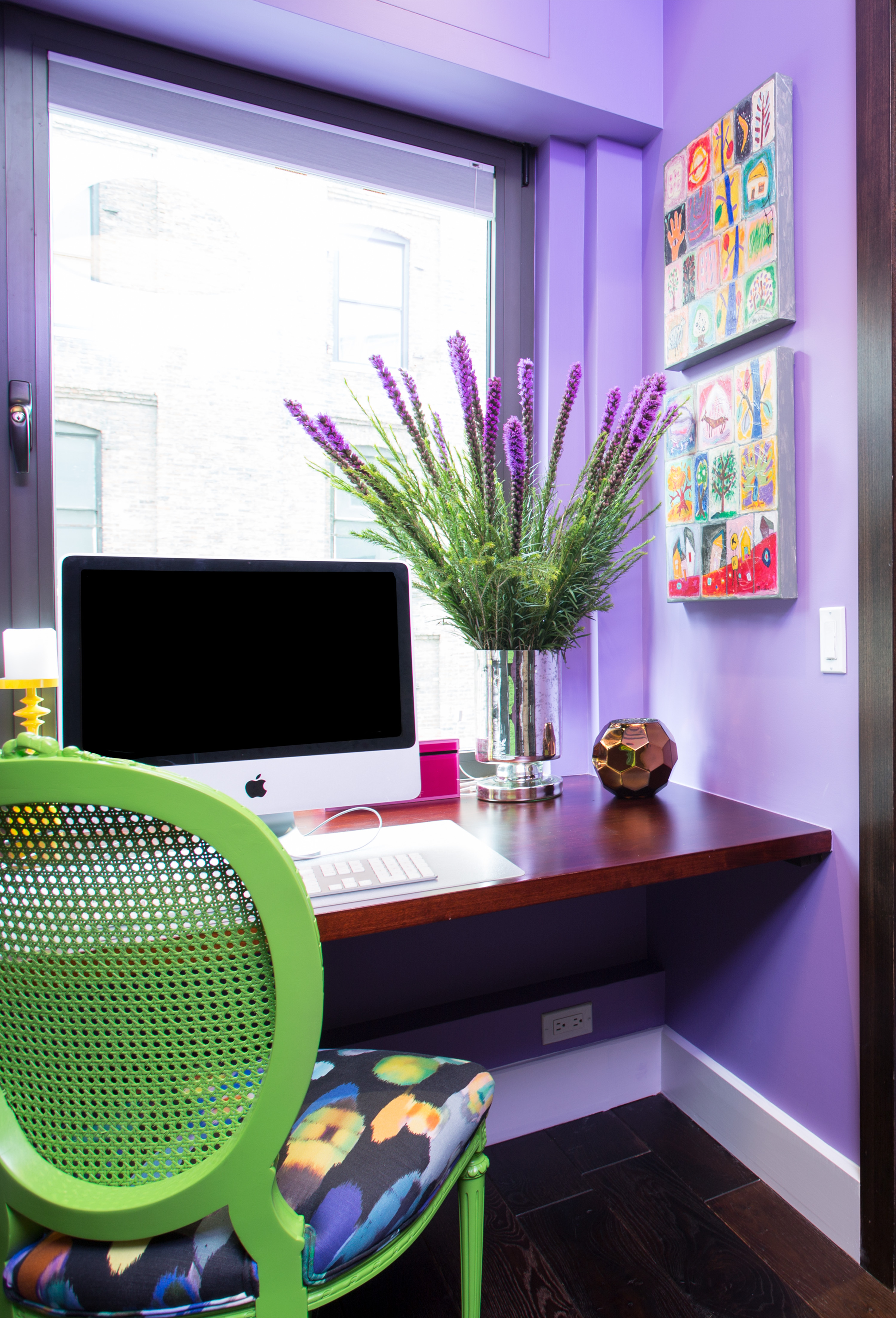
But of the colors that go with seafoam green, you can take it in a totally different direction. New York-based interior designer Rayman Boozer of Apartment 48 is adept at using strong hues — his own apartment is swathed in rich blue — and this office space is a prime example. As a color that goes with lavender and lilac, the seafoam green takes on a citric joy.
'Green and purple aren't the most common color combination in design, however we see it all the time in nature and floral arrangements,' Rayman says. 'In this downtown home office, the seafoam green chair provides a pop of whimsy in the foreground of an otherwise monochromatic scheme.'
3. Oak
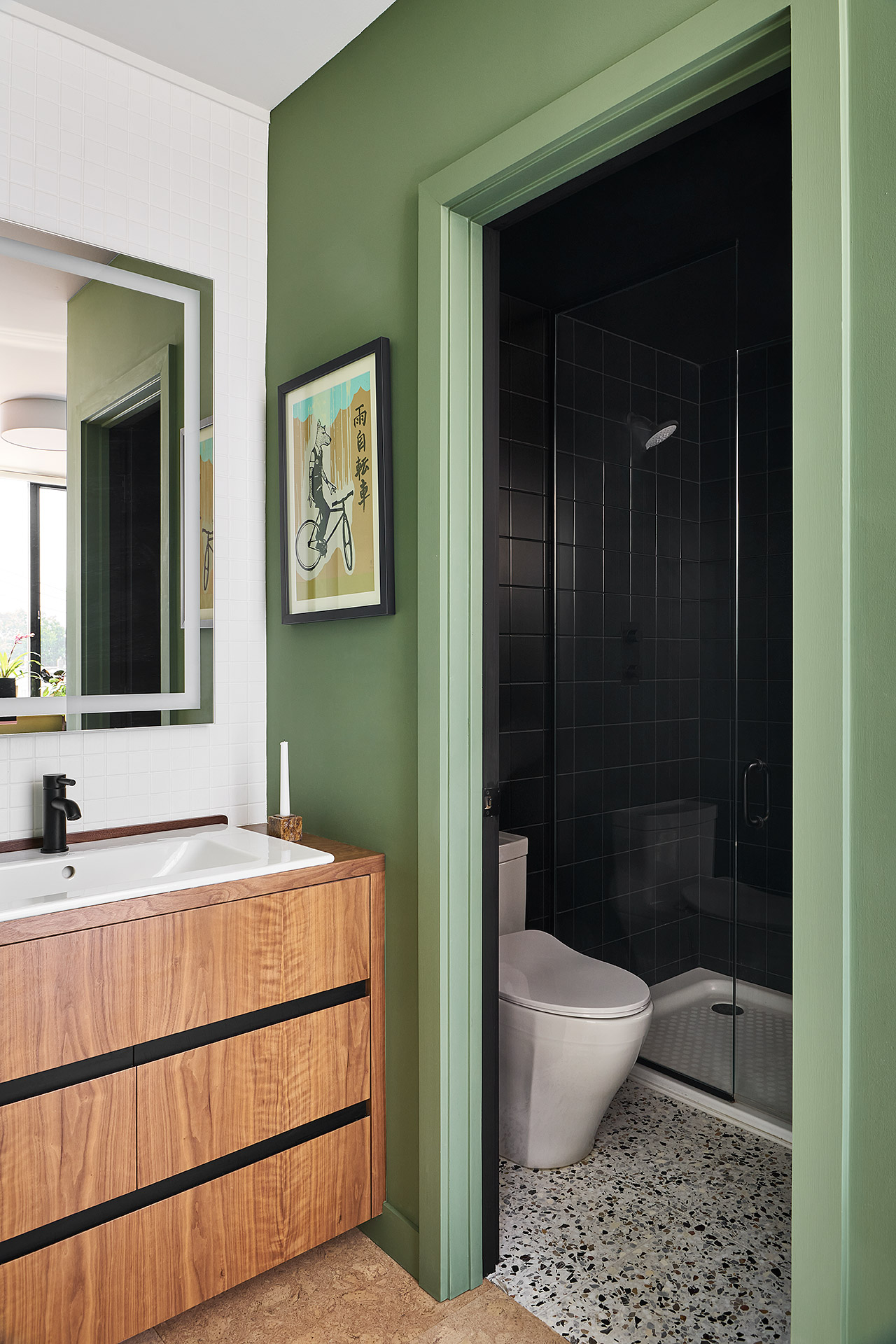
But let's take seafoam green back into a more calming direction. En Masse Architecture and Design have harnessed its soothing side in this serene bathroom color scheme, pairing it with an oak vanity for a look that evokes a forest in summer time.
'Green is one of the colors that works so well with other natural materials,' says the studio's founding partner Mike Shively. 'We find ourselves reaching for oak and walnut cabinetry in a space that features green. It also pairs well with other brighter colors like reds, oranges, and electric blues. Warm woods and green are naturally occurring in nature which almost make them appear as a neutral!'
4. Teal

As an accent color, seafoam green can provide a jewel-like pop, lifting an otherwise sophisticated scheme and adding a sense of fun to an otherwise grown-up decor approach. This coffee table glows as if it were a gem, popping out next to the teal sofa in a living room design by the Austin, TX-based studio Ashley Ferguson Interiors.
You may question whether blue or green work together, but 'just like we learned back in art class, it's all about the color wheel,' Ashley Ferguson says. 'Blue and green are analogous colors, which means they naturally play well together. They share the same base, creating an interesting dynamic that's both vibrant and calming. In this room, I also brought in natural elements like wood and leather to nicely balance the blue and green.'
5. Deep Red
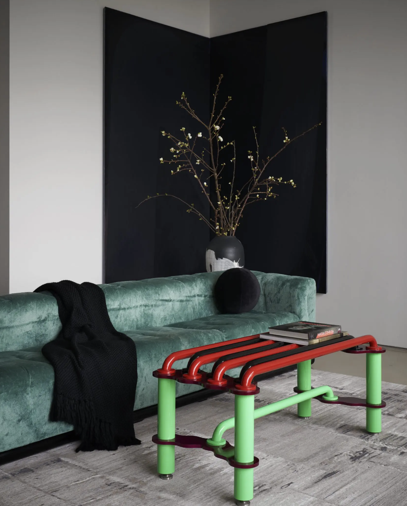
A very modern and uplifting take on seafoam green comes in the form of this living room by designer Nina Magon. The coffee table's seafoam legs are totally and utterly contrasted by the deep red surface, a pairing that makes sense when you remember they're opposites on the color wheel, meaning red and green go together.
But what stops this feeling too Christmassy and festive is that that the green is the bright seafoam version, and the red is a deep, dark, almost-burgundy hue. It's a combination of opposing colors and tones that works to perfection.
6. Hot Pink
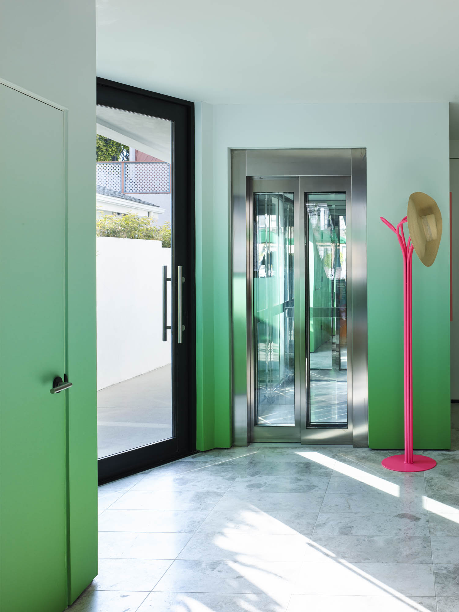
There was a time when pale pink and pale green were the color pairing of the moment, beloved by millennials across the world. The modern take on that is seafoam green as a color that goes with pink in vivid, "hot" shades, as seen in this project by Jessica Ayromloo.
'I love pink and green together,' Jessica says. 'The colors have good energy and the pink balances the cooler tone of the green.'


