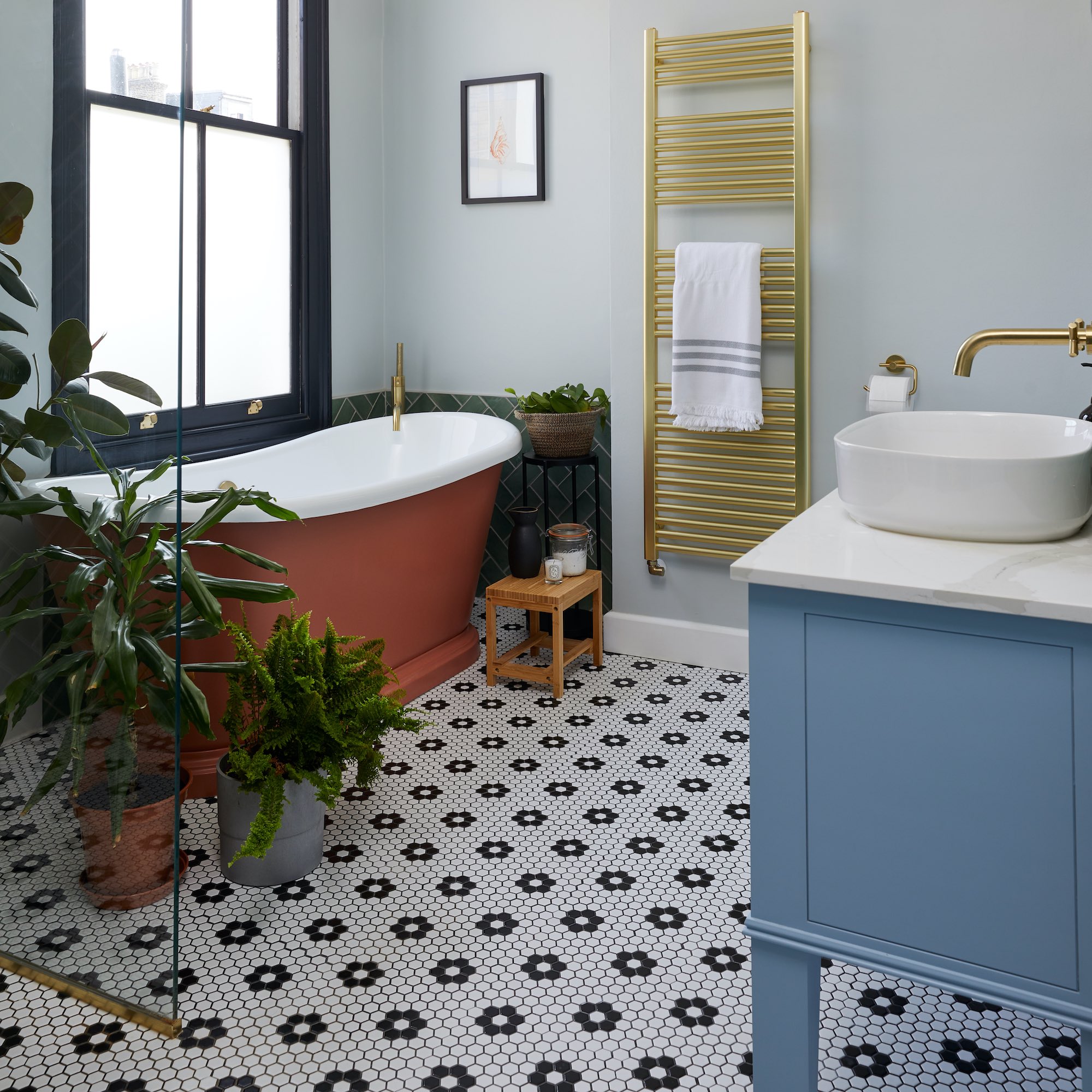
Picture your perfect bathroom. Do you want a Zen retreat to relax in at the end of a busy day? A space that will energise you in the morning? Somewhere you can go in, lock the door and just take two? Whatever your goal is, these bathroom design mistakes could be stopping you from getting there.
A bathroom is a super functional space, yes, but it's also that one room in the house where you can escape to – even if it is just for a few minutes. So it should be a room that makes you feel good and welcomes you with open arms. But not properly considering the layout, lighting, storage and overall aesthetic might be making your space look drab.
With that in mind, there are certain bathroom design mistakes to avoid to make sure your space doesn’t become sterile and unwelcoming. We've asked the experts what to steer clear of, and how to plan a bathroom successfully.
Bathroom design mistakes to avoid
'Historically, bathrooms were driven by functionality rather than style and luxury, however, today's bathrooms are all about merging all these elements to create a fun, stimulating and personalised environment in which to spend time,' says Annie Simpson, designer at Ripples Southport.
'Be bold and brave. Don’t be scared of mixing different styles and don’t let anybody tell you you can’t. What works for one person doesn’t have to work for you and that’s okay.'
Using a range of materials, bathroom colour schemes and textures that you love will result in a space that suits your personality. What you don’t want to do is forgo these in favour of a ‘safe’ design and end up with a space that you don’t enjoy using, isn’t very welcoming, or looks sterile.
So for a welcoming bathroom design, avoid these design mistakes…
1. Not enough storage
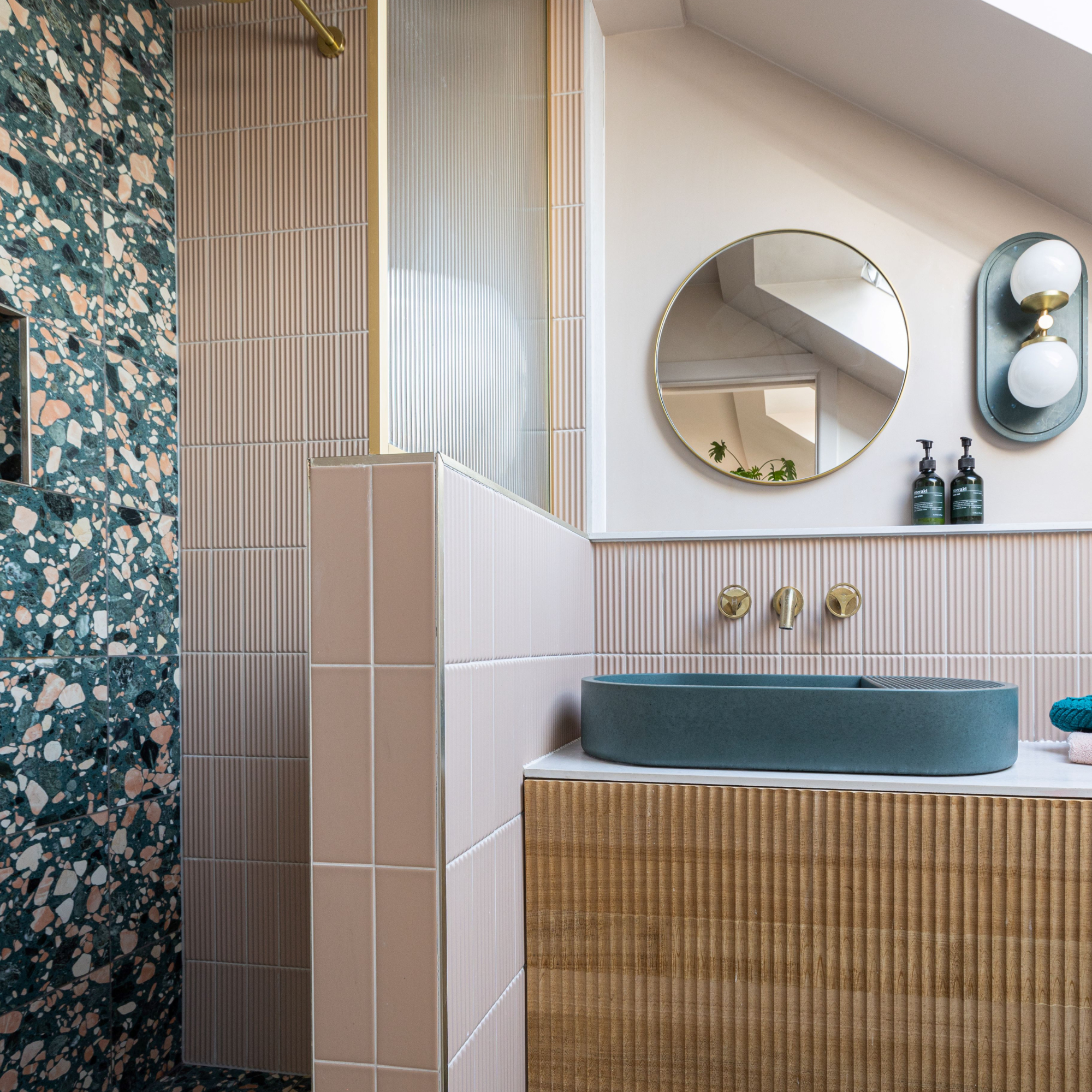
'A cluttered and disorganised bathroom can feel chaotic and unappealing,' says Graeme Borchard, managing director at UK Bathrooms. Customised bathroom storage such as built-in shelves, vanity units, wall-hung cabinets, or baskets to keep toiletries, towels, and accessories organised and accessible will keep calm and order.
Why not personalise storage containers with labels, decorative knobs, or fabric liners? If your bathroom design includes wall-hung fittings which need a stud wall, use the void within the wall to create cupboards that sit flush, or add nooks for decorative items.
Be careful not to go OTT with storage though. 'When a design is filled with too many items or furniture, it can quickly take the room from a clean luxurious space to a cramped and cluttered area. Don’t be afraid of ‘empty space’, if used correctly this will only draw attention to and enhance the main features in the bathroom,' says Annie.
2. Bad lighting
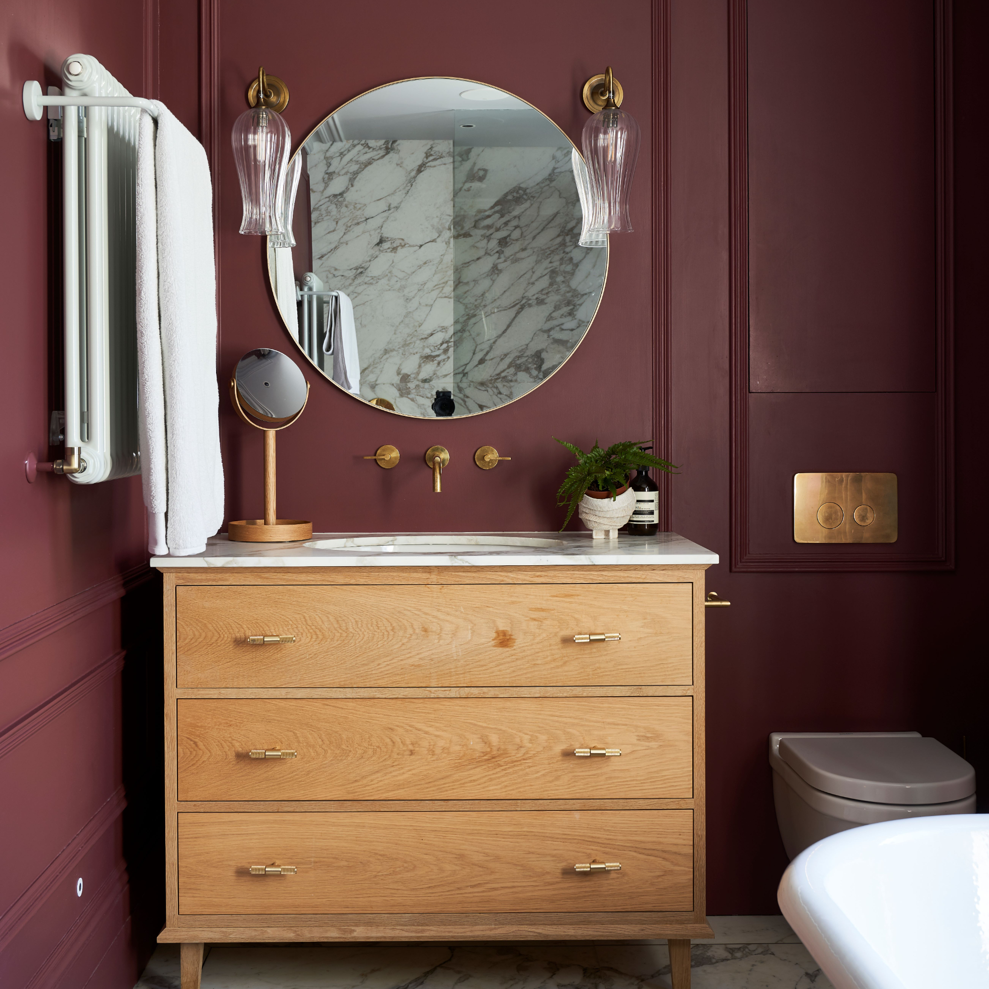
When it comes to bathroom lighting ideas, remember layers. Instead of relying solely on harsh overhead lighting, incorporate multiple light sources at different levels to create a warm and inviting bathroom. This is especially key if your room isn’t blessed with any natural daylight.
Go for an overhead light for a full-on glow, but also consider wall lighting either side of a mirror, or a mirror with integrated lighting, recessed spot or strip lights within features such as shelving, units or nooks, and lighting within the bath or shower area. Always ensure the light fittings are suitable for bathroom use by looking for IP ratings which signify how waterproof they are. A retailer or bathroom designer will be able to advise on this.
'Recently, there has been a noticeable change in preference for bathroom lighting, with a shift away from clinical utility lighting,' says Peter Woodward, marketing manager at Harrison Bathrooms. 'This has resulted in various lighting options that satisfy practical and aesthetic needs. It is important to remember that bathroom lighting is not just about function.'
Got a windowless bathroom? Follow the layering technique but also employ some more design magic. 'Opting for light colours with tiles and furniture finishes would also be a great choice to help brighten the space. Tiles with a gloss finish are great for bouncing light around a room,' says Annie.
3. Lacklustre tiling

'I find one of the best ways to avoid a bathroom design being sterile is to add a feature tile where possible, giving a design that pop of colour,' says Annie. 'By configuring tiles in an interesting way, you can create a unique look, even if you’re using the must-have tile of the moment.'
How about a simple metro tile laid in a herringbone formation, stacked vertically or with alternating colours for added interest? Or creating a half-wall panelled effect using tiles with a detailed border edge? You could use bathroom tile ideas to create zones – for example, the shower area could feature a bold tile design while the rest of the space is more pared back.
While all-over marble or pattern can work wonders, tiling the whole bathroom in one plain style of tile can look somewhat boring. Yes, it creates a cohesive and uniform look, but the balance could easily tip to looking cold and sterile.
'Even if you choose one style of tile for the entire bathroom, consider using different sizes, shapes, or textures. For example, you could use larger tiles on the floor and smaller tiles in a contrasting colour or pattern on the walls to create dimension,' suggests Graeme. 'Introduce accent tiles or decorative elements to break up the monotony of a single tile style. This could involve incorporating mosaic tiles as a border, creating a feature wall with a different tile pattern, or adding a decorative tile mural as a focal point.' You could add interest with a contrasting grout colour – simple, but effective.
4. Ignoring colour
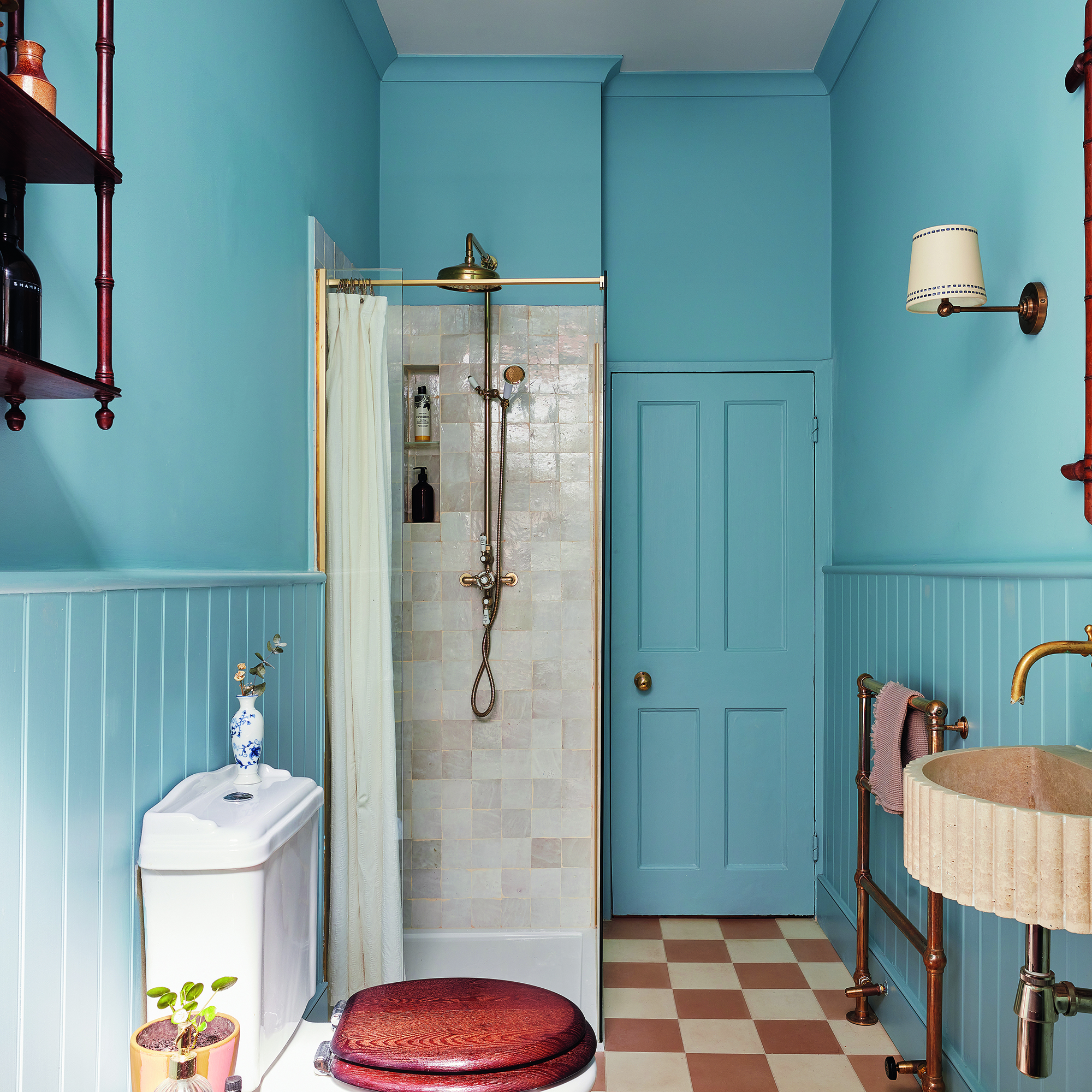
Unless you’re a total minimalist with a penchant for serious cleaning, an all-white bathroom might not be the most practical or welcoming. Neutrals such as beige, taupe, soft pinks and shades of brown create a simple backdrop with added warmth. You can then add your choice of fixtures and fittings, adding as much, or as little colour contrast as you fancy.
'You can add pops of colour by installing a coloured vanity unit,' says Peter. 'Copper and brass fixtures enhance white basins and baths, while fluted glass shower enclosures can add a stylish touch.'
Annie agrees. 'Tiles, vanity units, basins, even WCs can all be customised with colour choices,' she says.
5. Too many mirrors
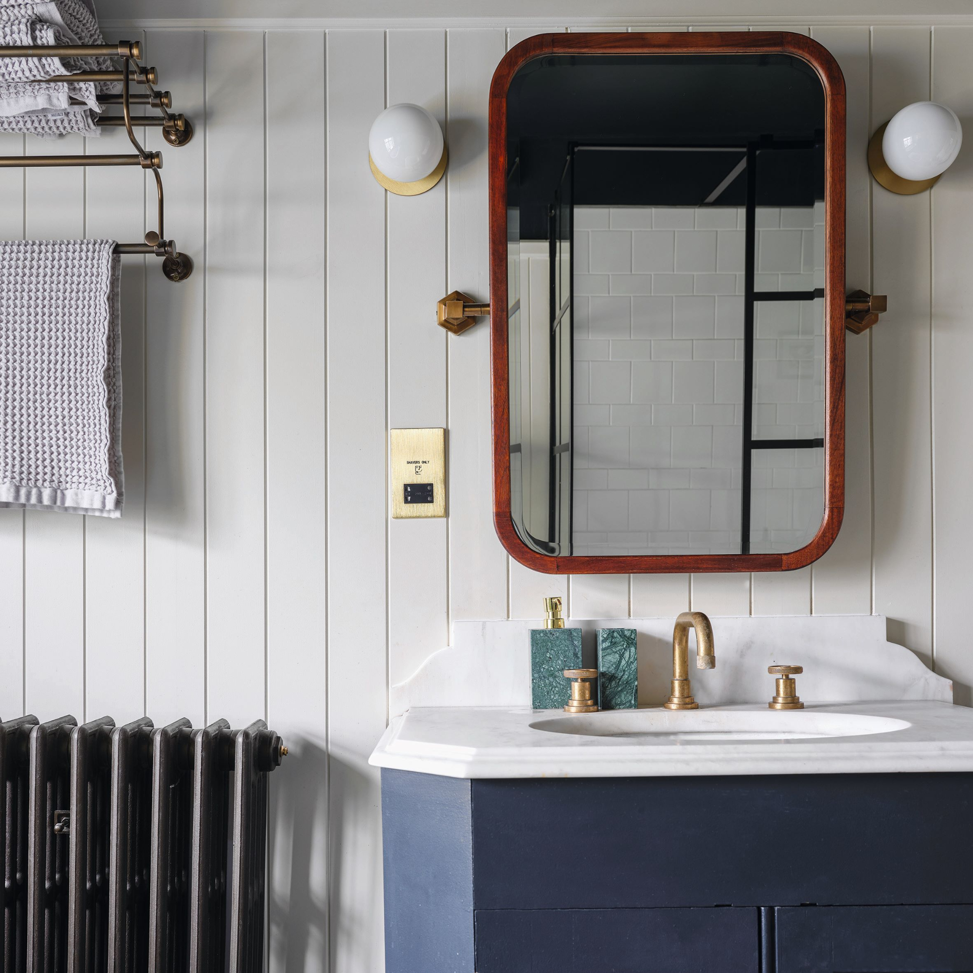
Mirrors can indeed be good for making a small bathroom feel bigger, but using too many mirrors or going super-sized with one giant mirror can make a bathroom sterile.
Use bathroom mirrors strategically. 'Rather than covering entire walls with mirrors, use them to highlight specific areas or create focal points. For example, installing a mirror above the vanity or sink area can enhance functionality while still providing the benefits of reflection,' says Graeme.
'Opt for decorative mirrors with interesting frames or unique shapes to add visual interest and personality to the bathroom. Avoid using plain, frameless mirrors that can contribute to a sterile look.'
6. No personal touches
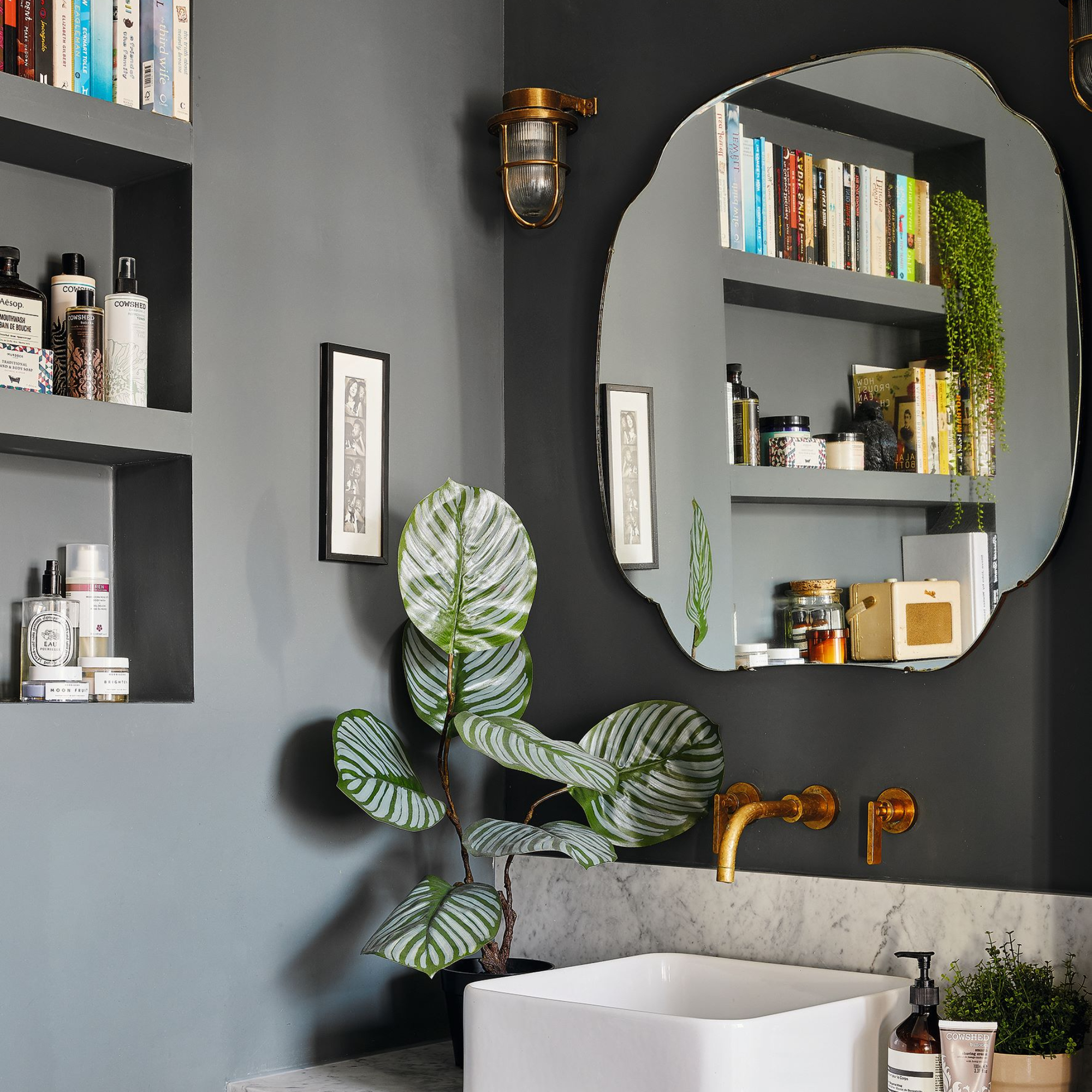
Who said a bathroom can’t have decor like you’d find elsewhere in the house?
Add a dose of colour and pattern with soft furnishings such as blinds, towels, bath mats or even a shower curtain. They’re easy to switch out with each season or laundry change so you can experiment with different looks – win-win.
Then, add bathroom wall decor through artwork and accessorise with candles and greenery. Don't forget to put your favourite posh toiletries on display too.
FAQs
What should you choose first when designing a bathroom?
One of the first things to decide on is the bathroom layout. Think about whether the existing format works for you, or if a reconfiguration of the space will make it more efficient and better to use.
Many designers agree that having the WC in view from the door is a no-no, with more attractive fittings like a vanity or bathing area being nicer to look at. Bear in mind that moving plumbing and waste outlets will cost a lot so weigh up the pros and cons of changing the layout with your plumber.
Once you’ve determined the layout, it’s a good idea to choose the biggest items first. Do you want a generous walk-in shower? Or a beautiful freestanding bath? Or maybe the vanity unit will be the star of the show? Allocate space and budget for these must-have features first and then plan the rest of your project accordingly.
Then, it makes sense to choose the flooring and wall coverings, ensuring they’re suitable for where they’ll be used, and plan the lighting to ensure you have enough illumination where you’ll need it. Follow this with storage, hardware and accessories.
'Consider factors such as style, finish, durability, and practicality when making your selections,' says Graeme Borchard, managing director at UK Bathrooms. 'By following this sequence of decision-making, you can design a bathroom that is both functional and visually appealing, with each element working together harmoniously to create a cohesive and inviting space.'
How to make a bathroom feel bigger
'Opting for wall-hung pieces is an excellent way to free up floor space and create more storage space, resulting in a room that looks and feels uncluttered,' says Peter Woodward. This includes the WC and basin or vanity.
'Space-saving designs such as back-to-wall baths and combination WC and basin units will help you maximise the available space in your bathroom,' Peter says.
For the decor, light colours will boost the feeling of spaciousness, but darker shades can also create a welcoming vibe with a cosy feel. If you fancy a dark and moody bathroom scheme, the key is to invest in good lighting and make sure you include multiple sources for tasks and ambience.
Which mistake have you fallen victim to?


