H ow lo ng di dit t ake yo u to r ea d t his sent en ce? (How long did it take you to read this sentence?) That, right there, was an example of how NOT to use letters if you want someone to understand your message. Now imagine that printed on a coffee cup or a poster.
Text design can be hit or miss. When done well, you glide over the words, absorb them and move on with your life. When done wrong, it can not only be jarring or annoying, but can also cause the sentence/word/phrase to take on a whole new and unintended meaning. Sometimes with hilarious results.
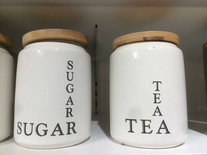
If you've ever had your brain doing backflips while trying to decipher a badly designed sign, you'll understand exactly what we're talking about. But just to drive the message home, Bored Panda has put together a bunch of perfect examples of typography trying to say, "I said what I said... but I absolutely did not mean to say that." You may have to read some of them a few times to figure out what exactly is going on. Others might never make sense. Ev er.
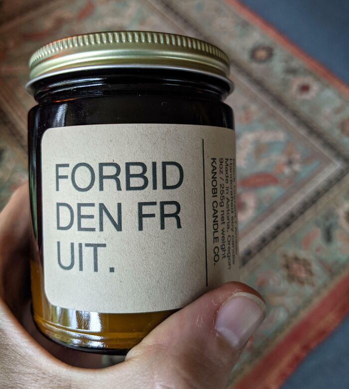
#1 Choosing The Best Way To Split A Word
© Photo: chiyukichan
Reading something shouldn't leave you feel like you've been flung around in a washing machine and then hung out to dry. But too often, designers get carried away when trying to get a message across. There are loads of ways typography can ruin an otherwise great design...
Perhaps it's a poor choice of font, or someone's attempt at playing Cupid with fonts that are simply incompatible. Then there are those who don't believe in the "less is more rule," and try to cram as many words as possible into a small space.
#2 Definitely Not A Safe Space
© Photo: JulineBernier
#3 If Only There Was A Letter In That Word That Resembled A Football
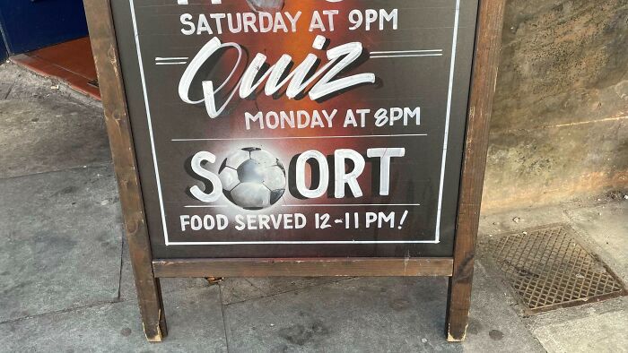
© Photo: iMaelstrom
"Typography that is difficult to read renders the message ineffective. Overly decorative fonts, poor colour contrast, or excessively small type sizes can all hinder readability," explains Melanie Downing, Creative Director/Owner of The Design Hive. "Prioritise clarity by choosing legible fonts and ensuring sufficient contrast between text and background. Avoid placing light-coloured text on busy or vibrant backgrounds, and stick to a minimum font size that is readable on all devices."
The experts over at U.K-based design studio, Infinity Creative agree. To them, "readability is Queen." As the site notes, cou could have the world’s most powerful message… but if your audience can’t read it, it may as well be invisible ink.
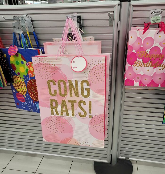
#4 When You Skip The Typography Section Of Your Groupon Graphic Design Course
© Photo: xkelsx1
#5 I Left The Union Under The Tadpole
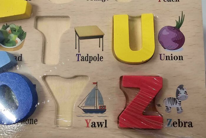
© Photo: N1NJACQUES
#6 Herpes
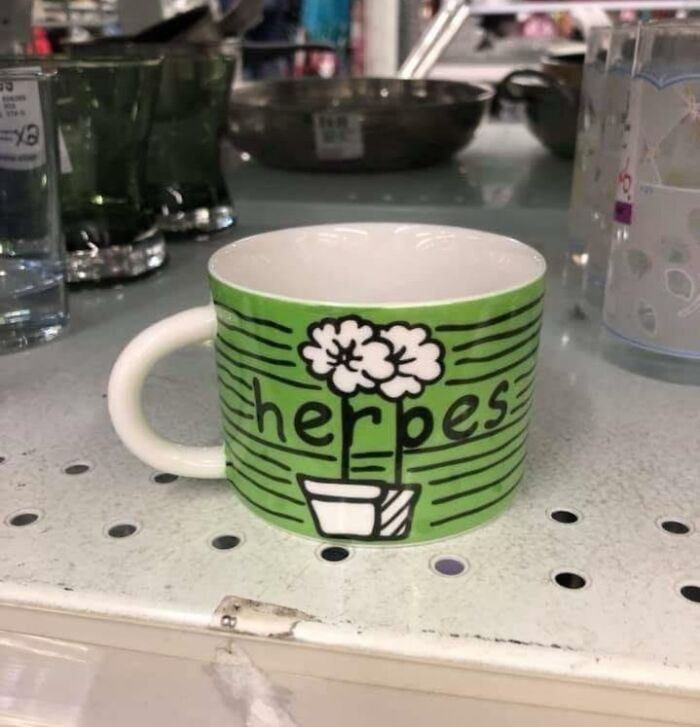
© Photo: staylovelys
The Infinity Creative team also cautions against what they call "Font Gluttony" or using too many fonts at the same time. Doing so can create visual overwhelm, inconsistency, confusion and pure chaos. "It makes your brand feel amateur rather than aligned," they explain.
It's best to stick to a core set of 3–4 fonts, say the experts. Using this rule would look something like this: A headline font that lets your brand personality shine, a clean, simple and legible font for the body of the text, and an optional accent font that you can use for special touches.
"Once you’ve picked your magic trio, use them consistently across your branding," advises the Infinity Creative site. "Think of them as your signature spell ingredients — repeat them in every potion (aka design) and your audience will start to [recognize] your vibe instantly."
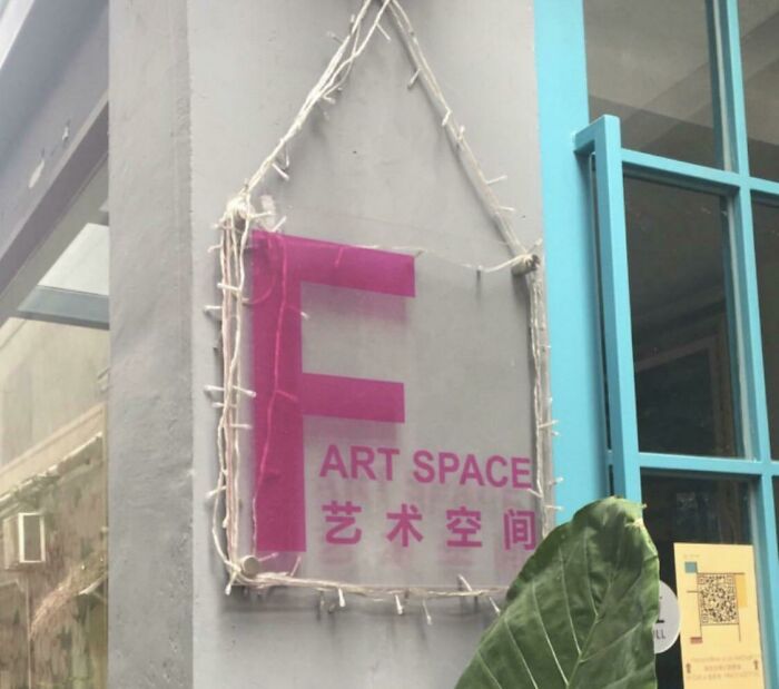
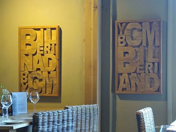
#7 This New Wall Art In My Office
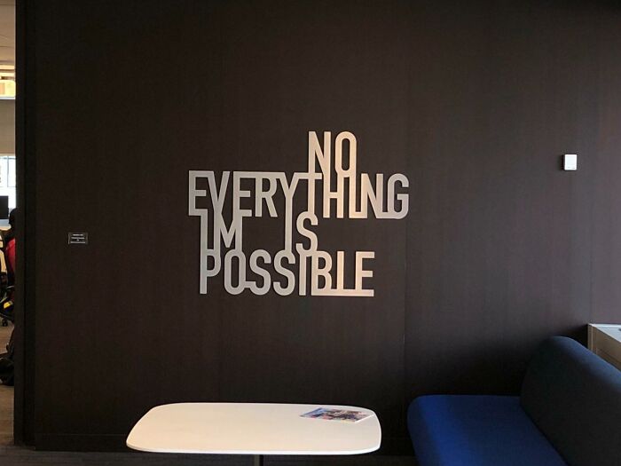
© Photo: Bitemarkz
#8 Beautiful "Car Spa Pan" Board At The Italian Restaurant, I've Visited Yesterday
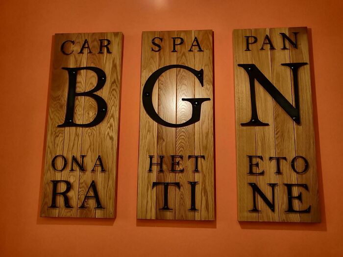
© Photo: VaultVulp
#9 Like, Eat Milk
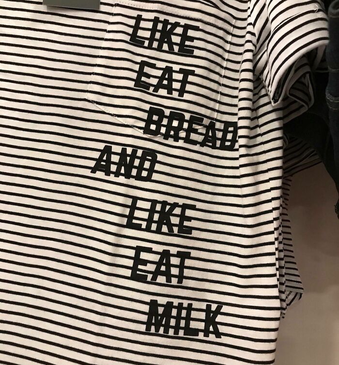
© Photo: malgreezy
You should always make sure the fonts you choose work well together. "Selecting fonts that clash in style or tone can confuse the audience and weaken the design’s cohesiveness," explains Downing. "For instance, combining a highly decorative script font with a bold geometric font may create unnecessary tension."
The trick is to select fonts with similar characteristics or complementary styles, they say.
#10 A Poster At My Moms Audiology Office

© Photo: coolrooman
#11 P Is For?
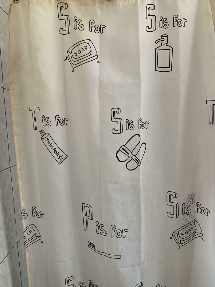
© Photo: WillieNolson
#12 One Of My Shoes Is Missing A Letter
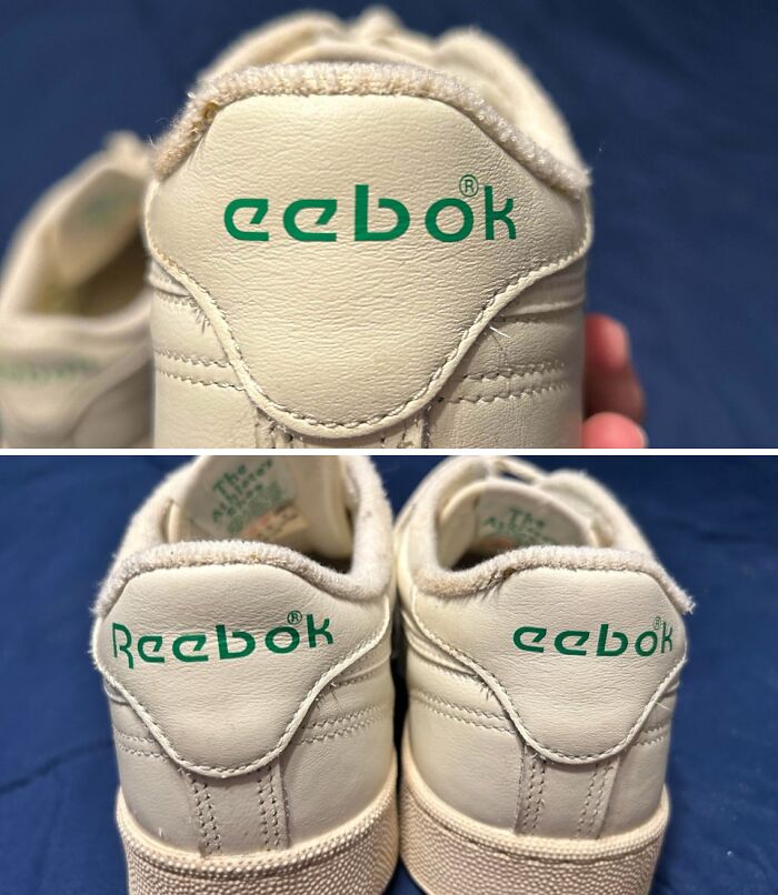
© Photo: Oc7ave
If you've ever misread or struggled to read a sign or sentence because the letter-spacing was all whack, you might understand how important kerning is. That spacing between letters, characters or words often goes unnoticed when done right. But when done wrong it totally shows.
"Letters that are either crammed together like a panicked hug or spaced so far apart they feel like strangers at a networking event" is a cardinal sin when it comes to text design, warns the Infinity Creative crew.
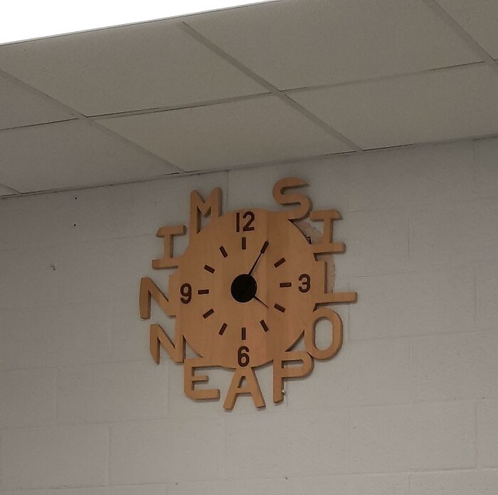
#13 This Clock At My Aunt's House
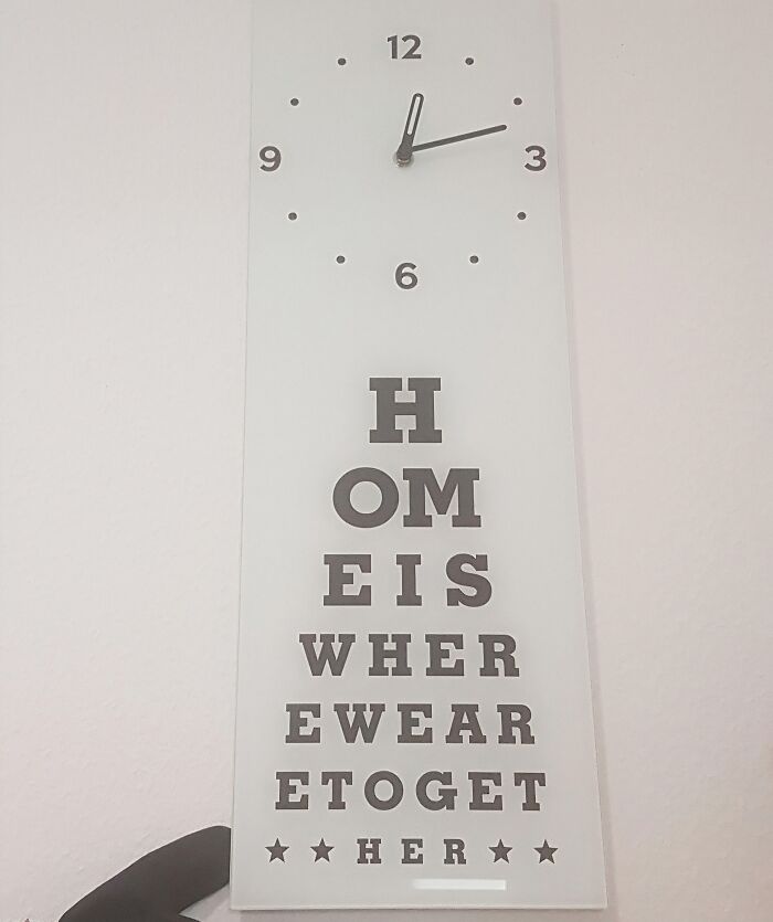
© Photo: kevindatfkommem
#14 Or... Y'know... The Her In Hero
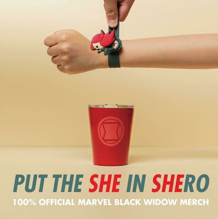
© Photo: Dyltendo64
#15 "Adida" Adidas Jacket Is Missing An "S" (Bought From The Official Website)
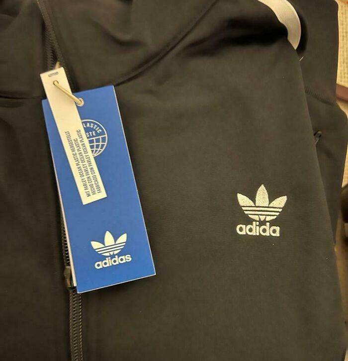
© Photo: MessagesFromLife
The same applies to the spaces between lines. There's a fine line between too much and too little space.
"Tightly spaced lines of text, known as leading, can make reading strenuous, particularly in longer passages," says Downing. "When text lines are too close together, the reader’s eye has difficulty distinguishing where one line ends and the next begins."
The expert suggests adjusting the line spacing to create a more comfortable reading experience. She says that a general rule is to set leading at about 120–150% of the font size. However, Downing notes that this may vary depending on the font and context.
#16 We Is Se Words
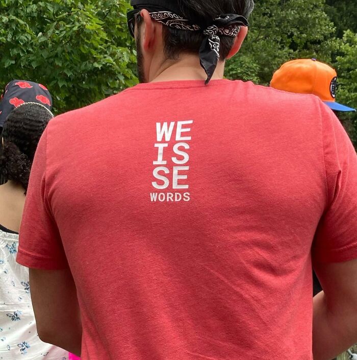
© Photo: SkepticWolf
#17 Since A Wine Glass Naturally Looks Like The Letter "H" And An Aircraft Like A "Y"
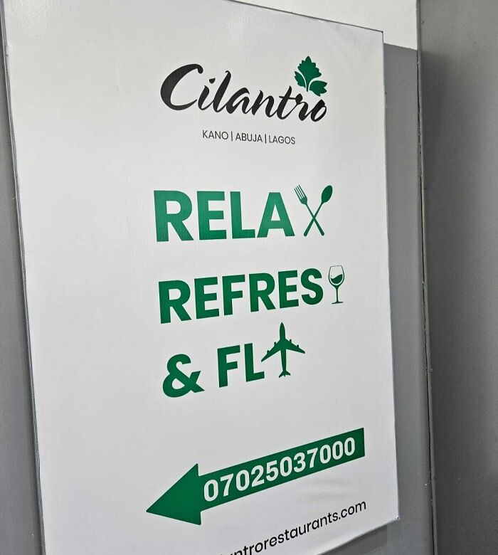
© Photo: CaptainPonahawai
#18 Who Thought That Silver Text On Yellow Packaging Was A Good Idea? I Guess Its A Mystery Serum
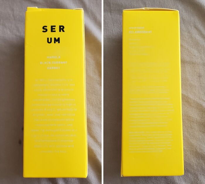
© Photo: WickedAmbiguous
#19 Cheat Yonur GF Not Yonur Workouts
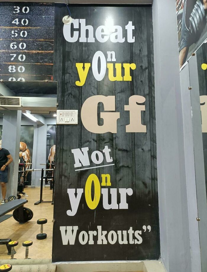
© Photo: Crowdie_
#20 This Porch Board My Mom Got For The Front Door
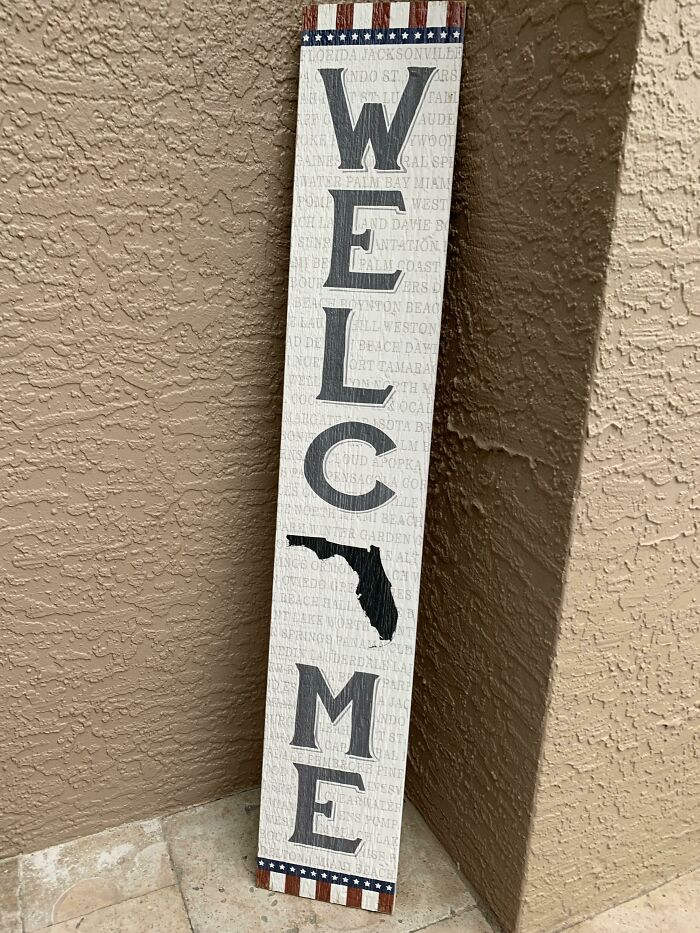
© Photo: RatMan05
#21 Surprise ?
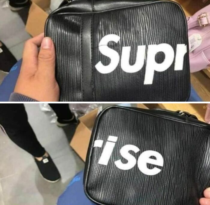
© Photo: manaluuu
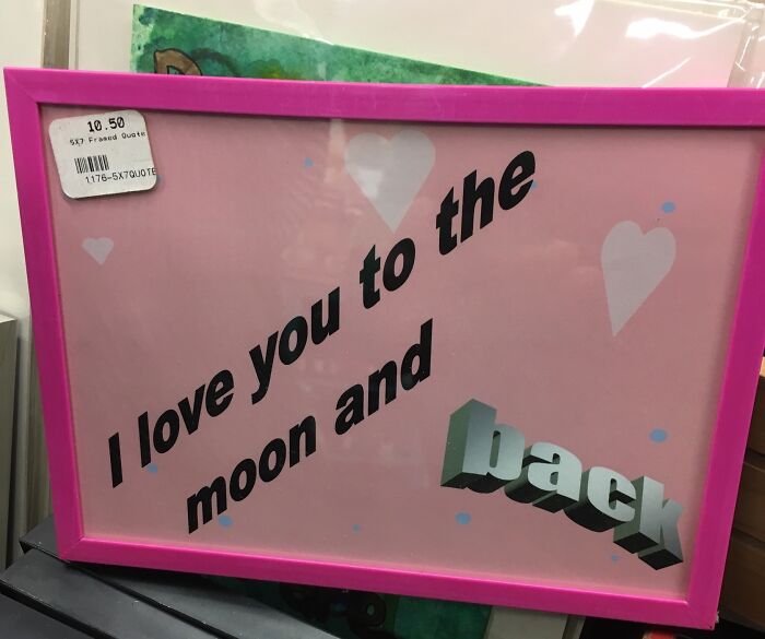
#22 The Decorative Letting Around The Edge Of This Poster Completely Changes The Meaning Of Intelligent
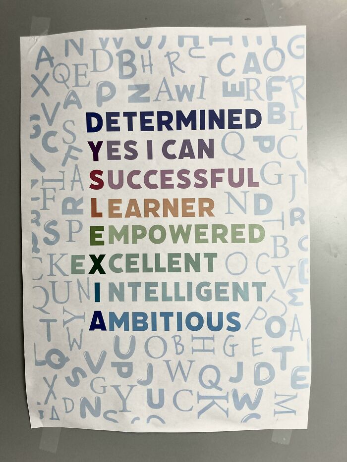
© Photo: sprogger
#23 The Fact That It's Trendy To Do This Right Now Doesn't Make It Any Less Crappy
© Photo: TechnicalDimension56
#24 Came Across This In My Literature Book At School
© Photo: SpectreOfMalta
#25 If Only There Was A Way To Make A Pizza Slice Look Like A Letter A
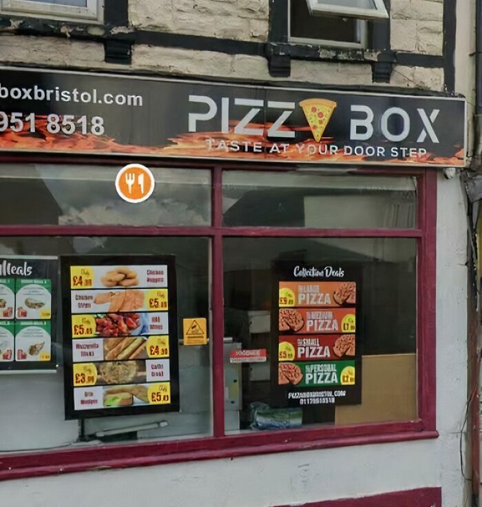
© Photo: flopsychops
#26 These Four "Letters" Are Supposed To Spell Out "Nova"
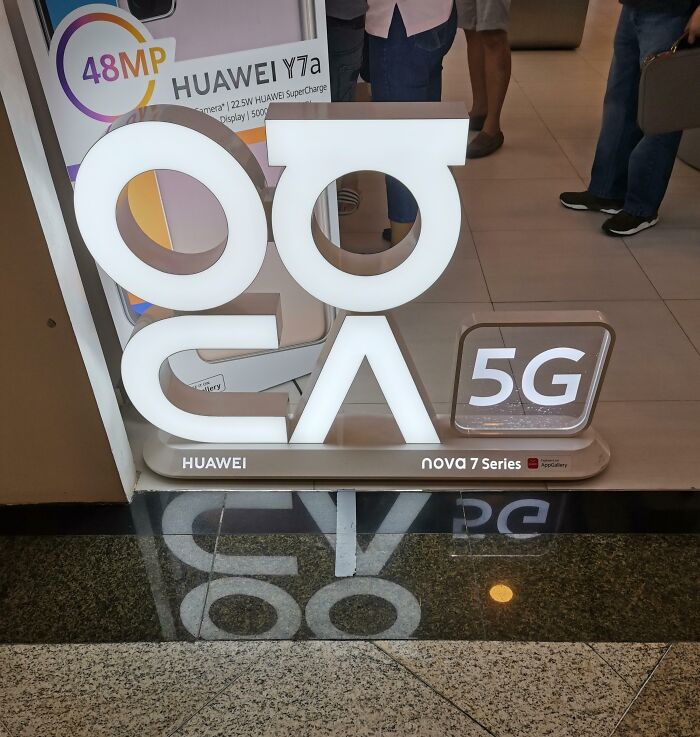
© Photo: TrashKetchoi
#27 That’s Not How Letters Work
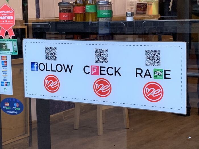
© Photo: miss-spell
#28 It Took A Couple Minutes To Get The Message LOL
© Photo: GlitchedBugs
#29 It’s Not Like There’s A Shared Letter
© Photo: lpf2g
#30 This Isn't How Wordle Works
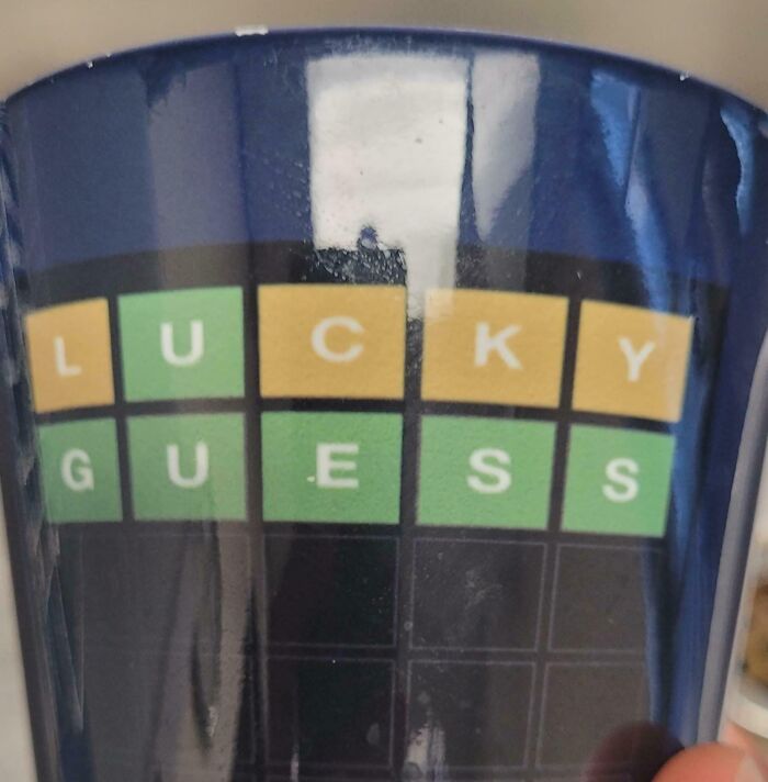
© Photo: VRZcuber14
#31 When You Perfect Your Wordart Skills And Go Retail
© Photo: OnceKittenTwiceHigh
#32 I Spent Half My Meal Trying To Decipher This
© Photo: InspectorGoole
#33 Don’t Want To Go Near The Playground In Case I Catch Faki STDs
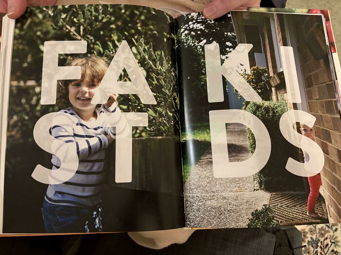
© Photo: jamelza11
#34 Yuokyol Orcmwrd, Such An Inspirational Quote From A Magazine
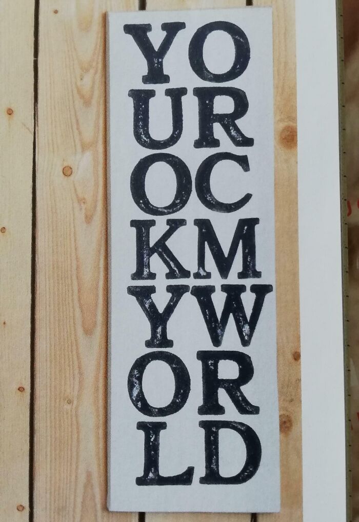
© Photo: purerainfall
#35 The Rewards Of Hypnotherapy
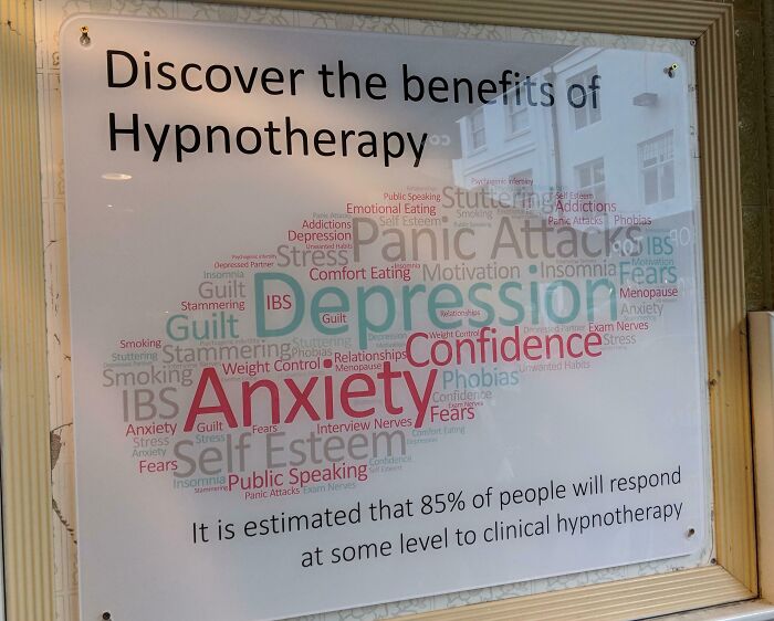
© Photo: goobzilla91
#36 Show Your N Maryland Ative Pride
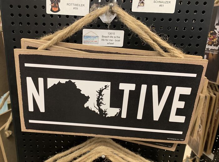
© Photo: Medical_Solid
#37 Forcea Forsmt
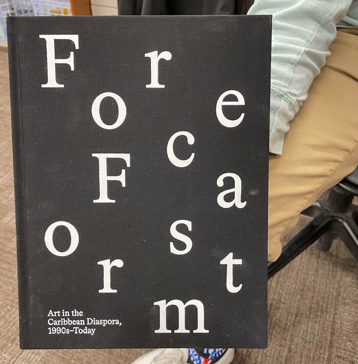
© Photo: coupledwalk
#38 The Simfsons
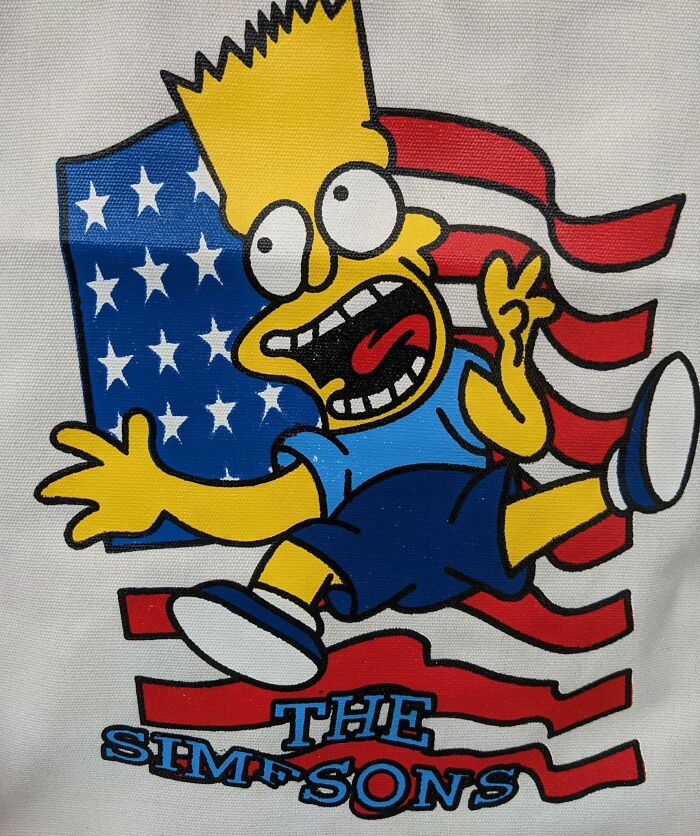
© Photo: Xatolos
#39 Wild Er Into The Ness
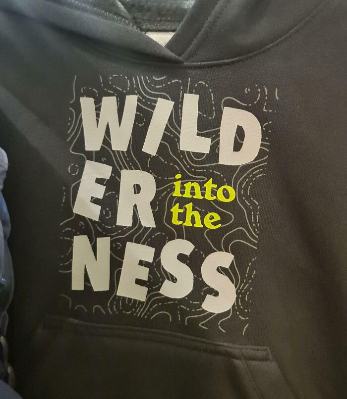
© Photo: SpongeGob
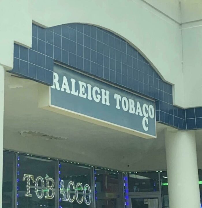
#40 This Company’s URL Can Be Any Combination Of These Letters. Guess Which One It Is
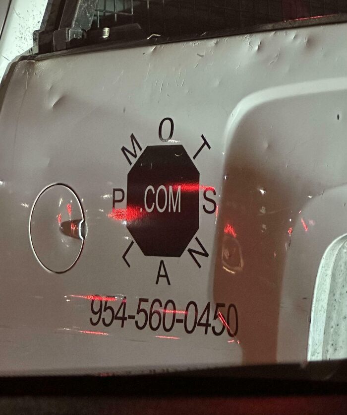
© Photo: darlzC
#41 I Guess We Dont Need Spacing Between Go On
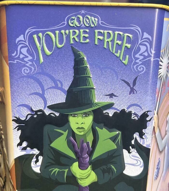
© Photo: Blue_Storybook
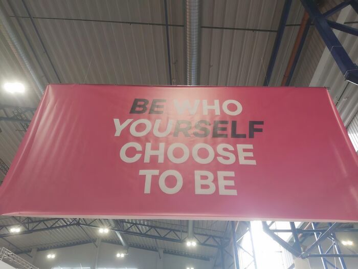
#42 This Won The Design Competition
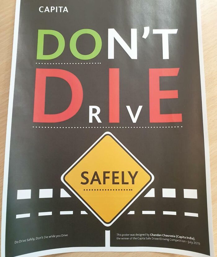
© Photo: chica420
#43 How Are You Even Supposed To Read This?
© Photo: username5391
#44 My Mum Bought This At A Home Decor Shop Years Ago. I Never Read What It’s Intended To Say
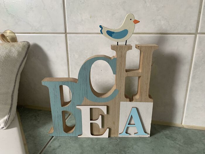
© Photo: noviboy123
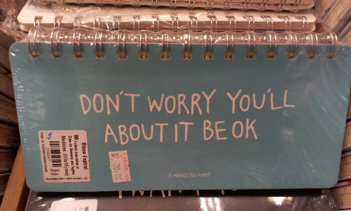
#45 And Make Believe Always It Happen
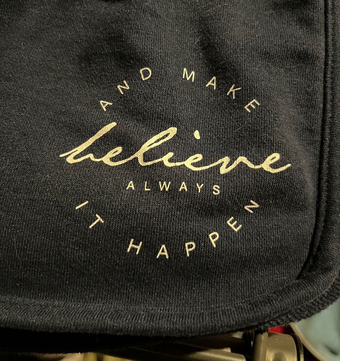
© Photo: misterpants8
#46 This Is A Poster By A Design School
© Photo: Dofke132
#47 No Need To Measure, There’s Plenty Of Space For All The Letters
© Photo: darwinpatrick
#48 I Almost Missed The Traffic Light Just Trying To Read This
© Photo: meowions
#49 The An Needs M
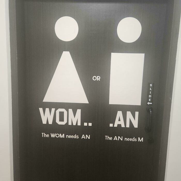
© Photo: 32oz____
#50 That's Not How Mirrors Work
© Photo: SpaceIsTooFarAway
#51 Worksheet My Kindergartner Brought Home Today
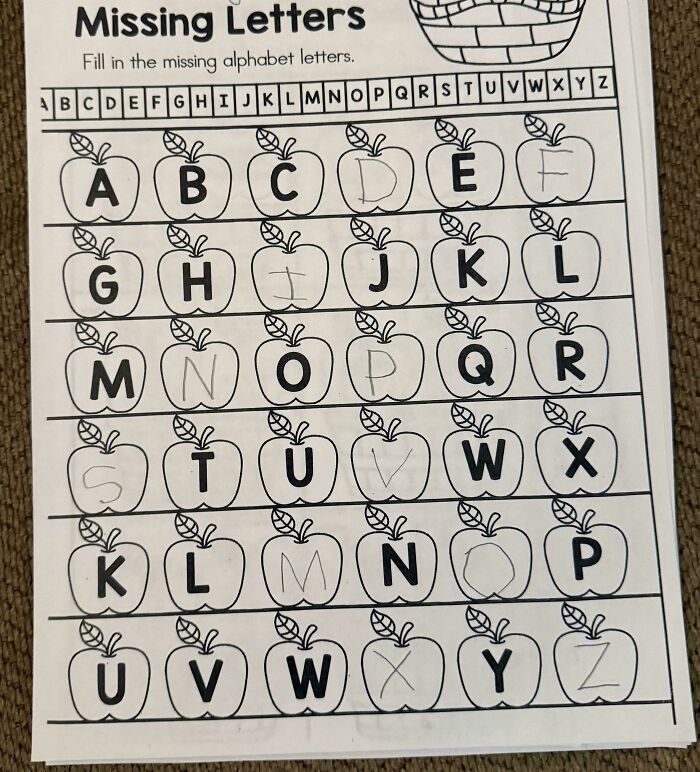
© Photo: Suitable_Visit_9990
#52 If Only Louisiana Were Shaped Like A Letter In The Word Love, This Would Have Worked Much Better
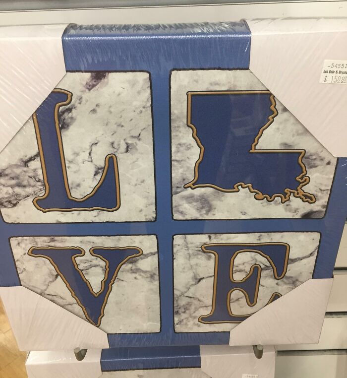
© Photo: BeerandGuns
#53 Missed The Obvious “Bright”
© Photo: bgolbov
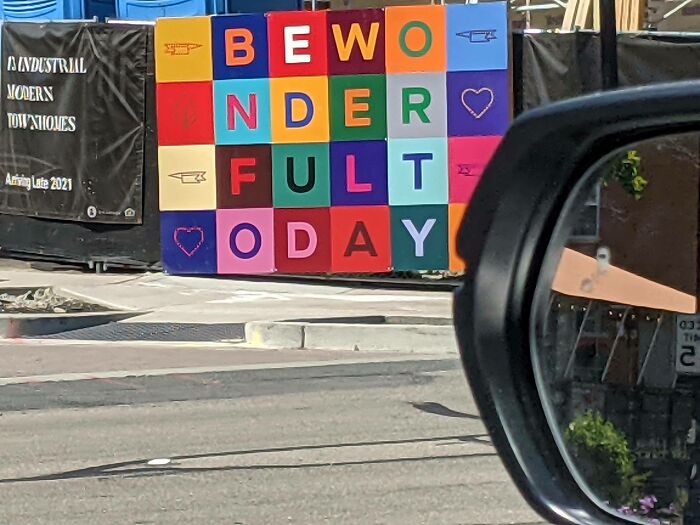
#54 When You Need To Grab Someone's Attention And Make Them Read A Lot Of Words While They're In Their Car... Definitely Don't Choose This Kind Of Font
© Photo: dubautia
#55 Bought Some Jammies For My Grandson
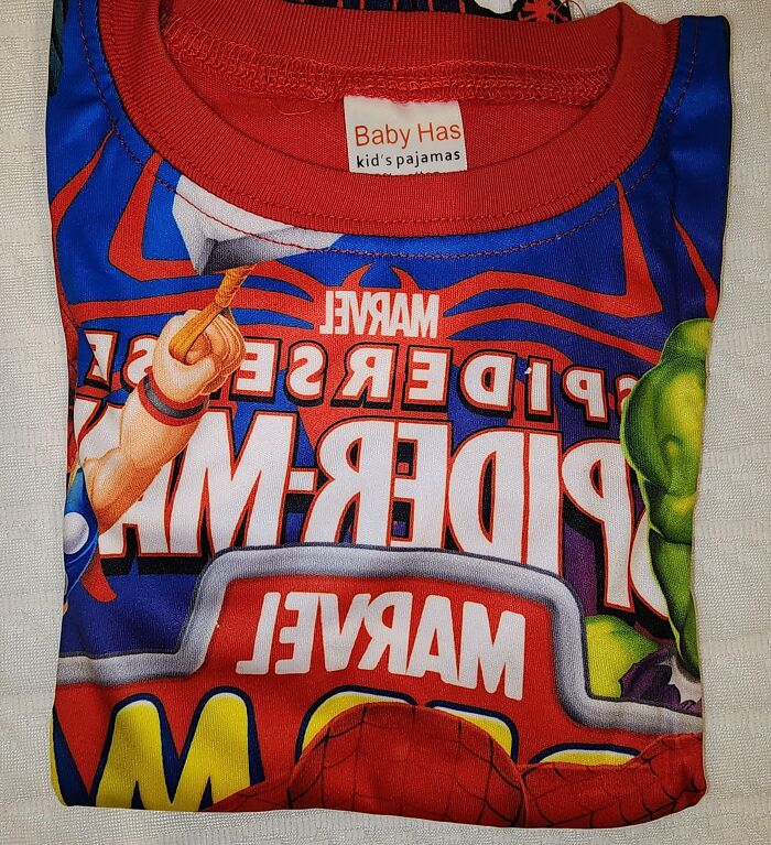
© Photo: gronk087
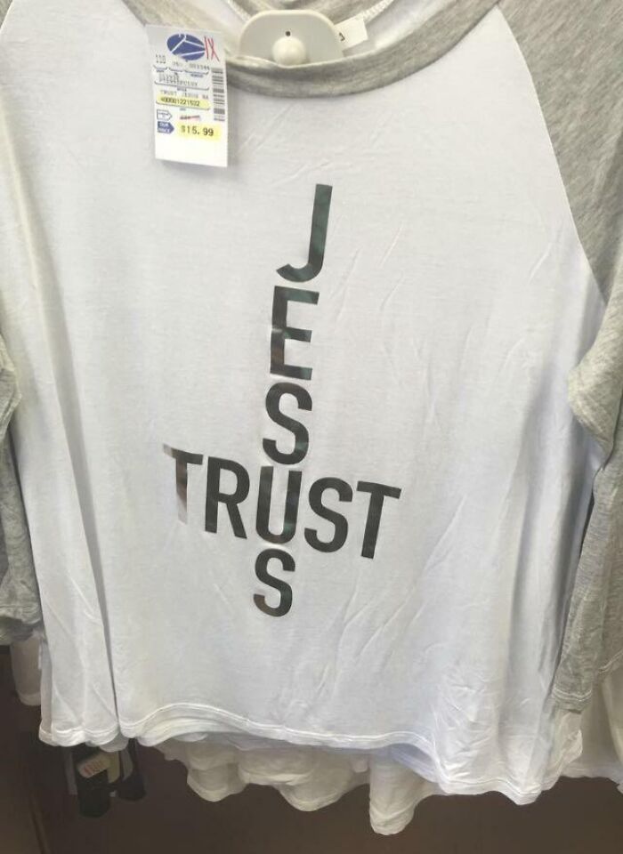
#56 Christian Shirt Where The Words Form An Upside-Down Cross
© Photo: manchild1116