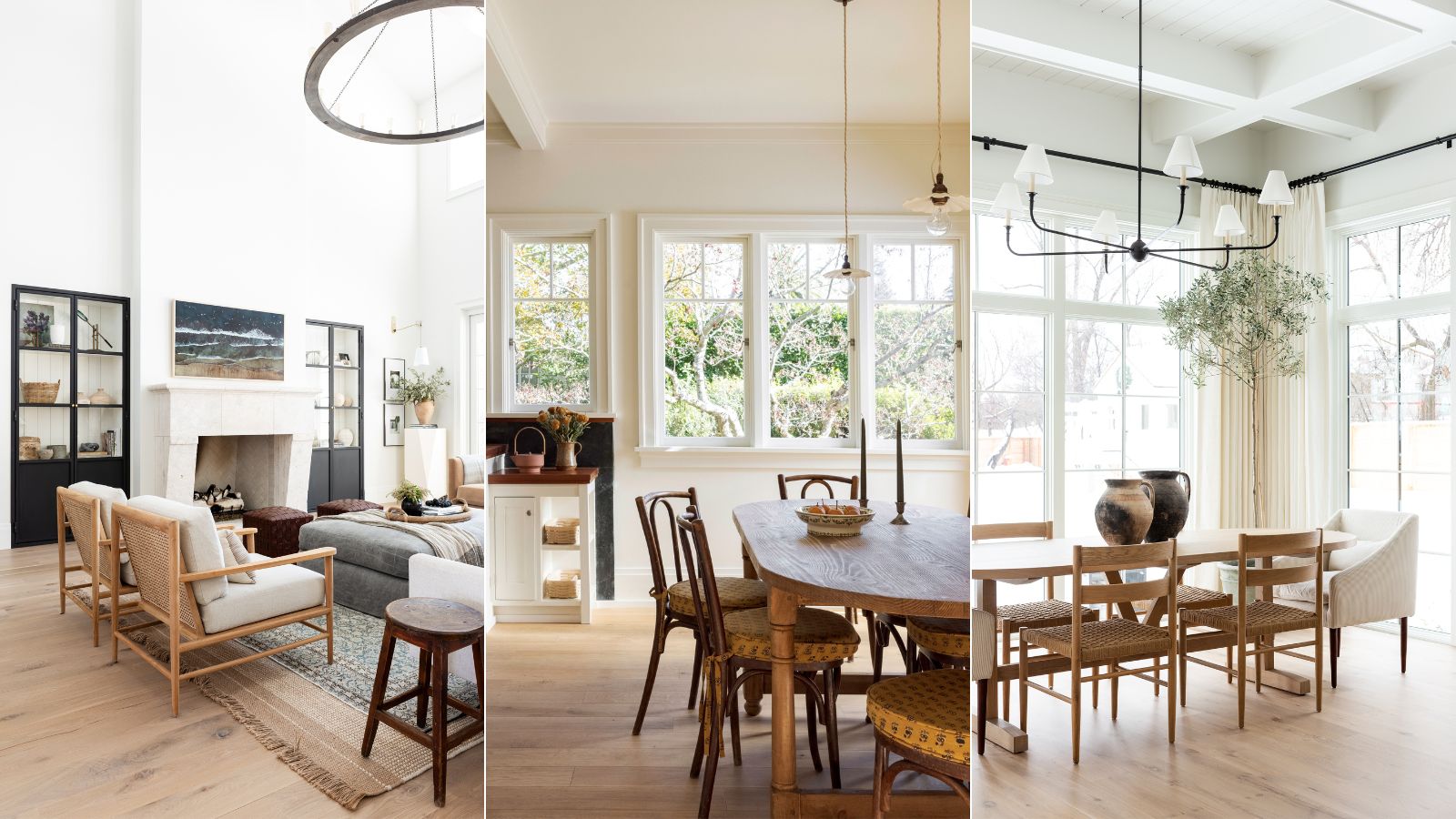
I recently asked designers for their favorite warm white paints, admittedly for slightly selfish personal research as well as for the benefit of H&G readers. I was expected to get back an array of shades and brands, however, one paint kept coming up over and over again - Benjamin Moore's Swiss Coffee.
I'd heard the shade was a favorite amongst designers, and it is one of the brand's best-selling white paints, but what is it about Swiss Coffee that makes it so popular? Well in short it's because of its versatility, it's the perfect white shade in terms of its adaptability. It's not quite a true white, but it's not overly yellow either. It's warm enough will add a softness to a room but not so warm it risks being cream.
While choosing the best white paint may sound simple, anyone who has tried to pick the perfect white will tell you, it's a minefield, there are thousands of choices and there's surprisingly a lot of difference between them so if Swiss Coffee makes that choice all the simpler by being that perfect warm(ish) white then wonderful. So along with finding out why it's so popular, I also found out how designers like to use the shade, what colors it goes with, what rooms it works best in etc.
What color is Swiss Coffee?
'Swiss coffee is darker than white and lighter than cream and has a bright, crisp, yet comforting and wholesome feel to it. In the home it will instill a sense of softness and elegance, whilst also being casually inviting.' explains Helen Shaw, Director of Marketing at Benjamin Moore.
It's essentially the perfect warm white paint, it gets that perfect balance between not being so warm you can't still pair it will cooler colors but not too close to white it's clinical. It's described as 'An essential white, with just a hint of warmth.'
Not quite a beige, but still soft and warm, Swiss Coffee is the perfect off-white shade. It's one of Benjamin Moore's best sellers, down to its versatility, it's the perfect neutral for any style.
Why is Swiss Coffee so popular?
'Swiss coffee is one of those wonderful colors that has just the right amount of warmth. These warm undertones add depth to any space and play well with other creamy shades and golden hues. It’s a great backdrop for any room as the design potential is endless. It is this versatility that makes it such a popular color.' explains Helen.
It works with any style too, from rustic to minimalist, and it's perfect for adding depth without too much warmth. It's known for being super versatile and designers love it because it makes for the perfect backdrop for so many different tastes and colors.
How do you use Swiss Coffee?
Decorating with neutrals is potentially the easiest scheme to work with, however, there are certain ways designers recommend using Swiss Coffee in order to get the best out of this not-quite-white shade. What colors does it go with? What rooms should you use it in? We asked designers who love the color for their advice.
1. Use it as a backdrop for pattern
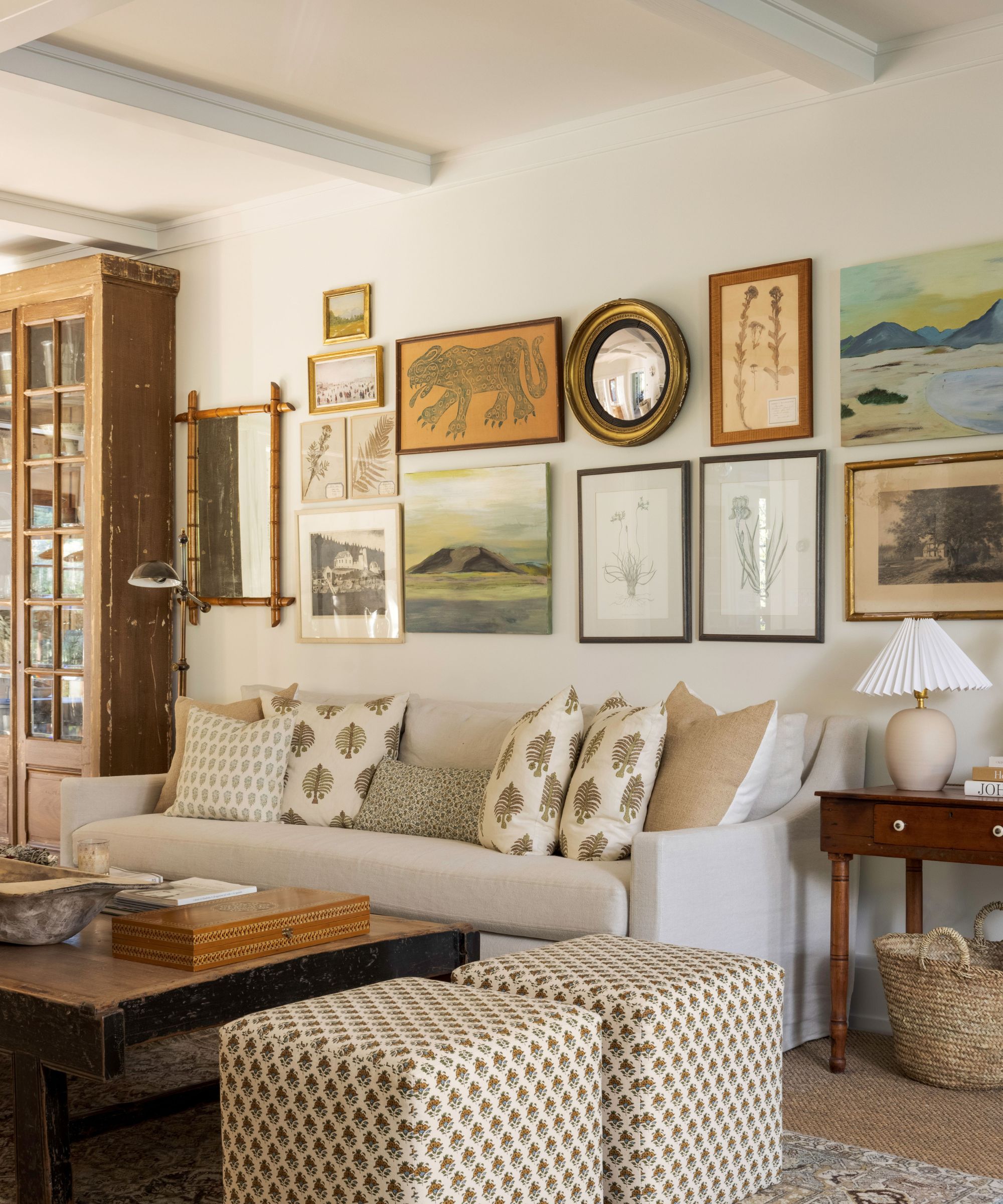
Designer Caitlin Flemming used Swiss Coffee throughout this modern rustic California home. It's the perfect backdrop for all the lovely textures and soft patterns going on in every room. The warm neutral works perfectly as it doesn't feel too clinical but you still get that freshness that lifts the traditional style of a lot of the decor, making it feel chic and modern.
'The warm hue of Swiss Coffee creates an atmosphere of calmness and serenity while also being elevated,' explains Caitlin. 'The beauty of this particular color is the brown undertones that don’t read too yellow. It looks perfect with the William Morris wallpapers in the home.'
2. Pair it with plenty of natural textures

'Swiss Coffee from Benjamin Moore is one of my favorite paint colors. It's versatile, sophisticated, and calming. This warm beige hue features the slightest touch of green in the undertones, so it pairs beautifully with organic design motifs that have their roots in nature, plus natural materials like light-colored wood, terracotta, rattan, and natural stone,' explains designer Kathy Kuo.
'If you love the wabi-sabi interior design trend, or organic modernism, Swiss Coffee is a great way to set the tone; complement this color with furniture and decor featuring sage green and slate blue and earthy elements like reclaimed wood and natural stone.'
Again, being such a versatile shade it can handle being layered with lots of different more earthy neutrals, and lots of different textures. The fresh off-white backdrop prevents this kind of look from getting too warm and so layered you step noticing the different elements.
3. Give Swiss Coffee some depth and pair with darker hues
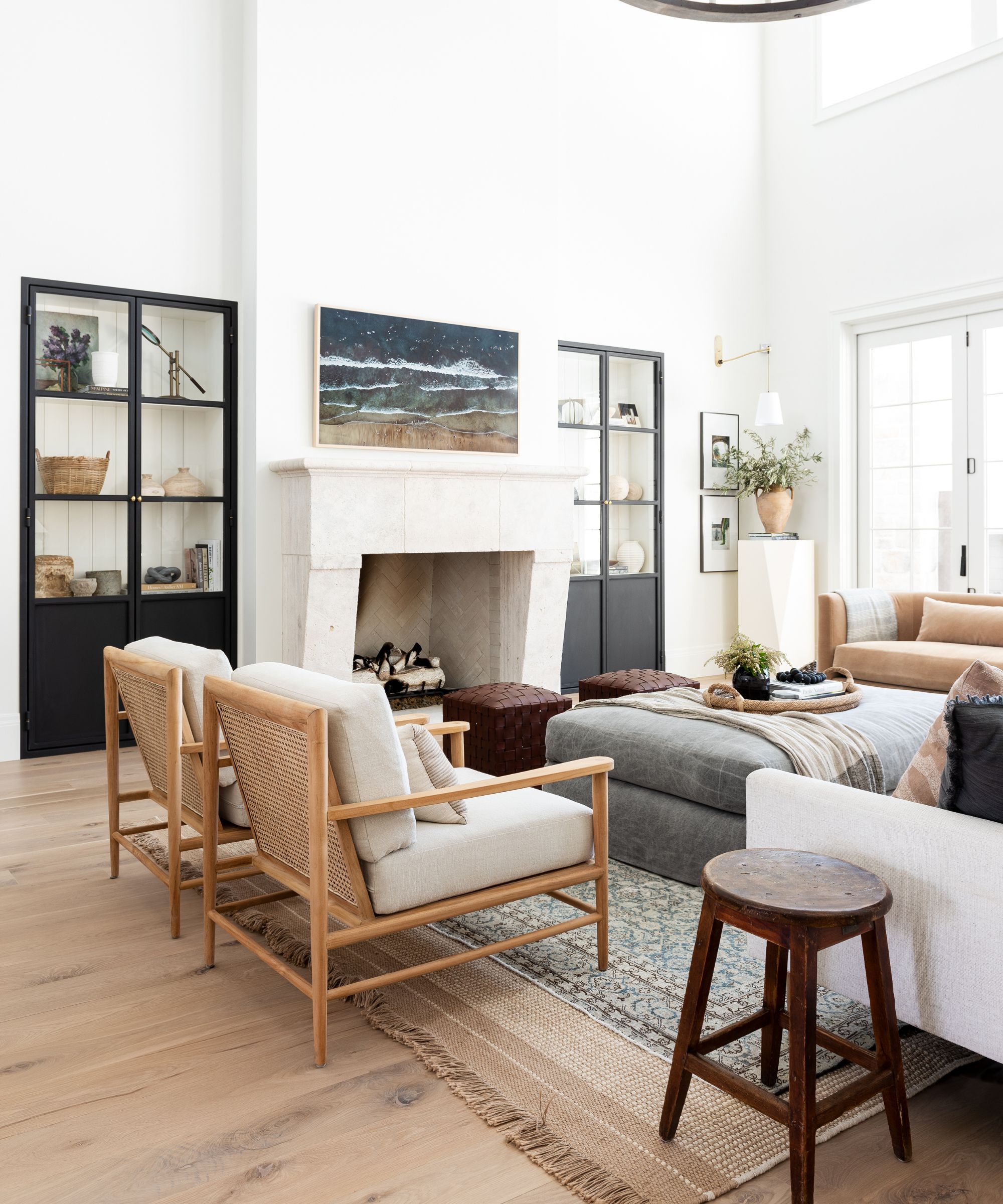
Designer Shea McGee is a huge fan of Swiss Coffee, she often uses it in projects, like the white living room above, but she also uses it in her own home, the ultimate stamp of approval from a designer. Designer Nate Berkus, also took to his Instagram to claim Swiss coffee as one of his favorite neutral paints.
One way to work with Swiss Coffee is to ground it with darker shades. Black works in small doses, as Helen suggests, 'A modern approach would be to pair the color with a contrasting black trim. The warm neutral provides the perfect base for experimenting with daring dark accents.'
Designer Bethany Adams agrees it works with darker shades, but for a softer look choose deep greens, blues, and even purples. 'Swiss Coffee is a wonderfully warm white, so it's a perfect backdrop for furnishings in other trending colors like burgundy or amber. Paint your living room in Swiss Coffee for an elegant, bright room and pair it with gorgeous velvets and boucles in deep, rich colors for a cozy yet bright space.'
4. Or use it to bring out the warmth in cooler shades
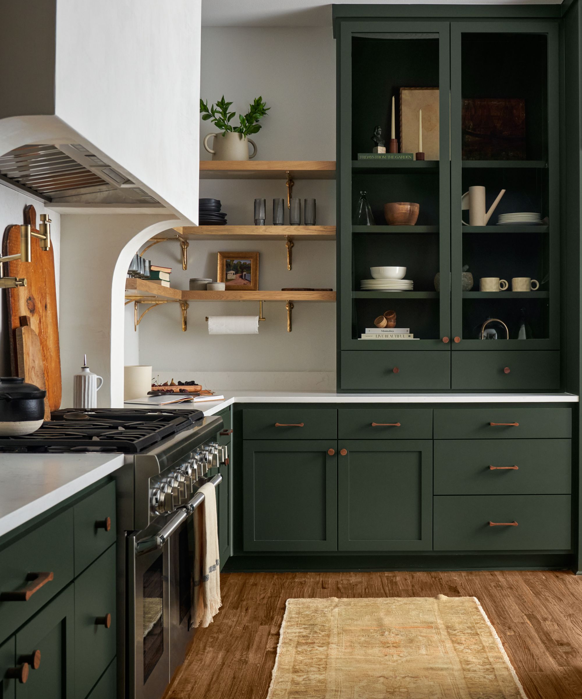
Despite being on the warmer side you can pair Swiss Coffee with cooler shades, it can even bring out the warmth in some shades if you pair it with a deep green or blue with brown undertones.
'Benjamin Moore's Swiss Coffee is a warm and creamy off-white color that works well in a wide range of interior design styles, and many homes or rentals come pre-painted in this color,' says Ginger Curtis. 'Swiss Coffee pairs beautifully with various colors. You can create a classic and timeless look by combining it with soft grays, blues, or muted pastels. For a more dramatic contrast, consider using deep navy or charcoal gray.'
Helen agrees, 'The rich off-white pairs well with a variety of other colors and can complement both classic and modern design styles. It works particularly well when combined with blue-greens as these will bring out the warm undertones.'
5.Test it out in different lights
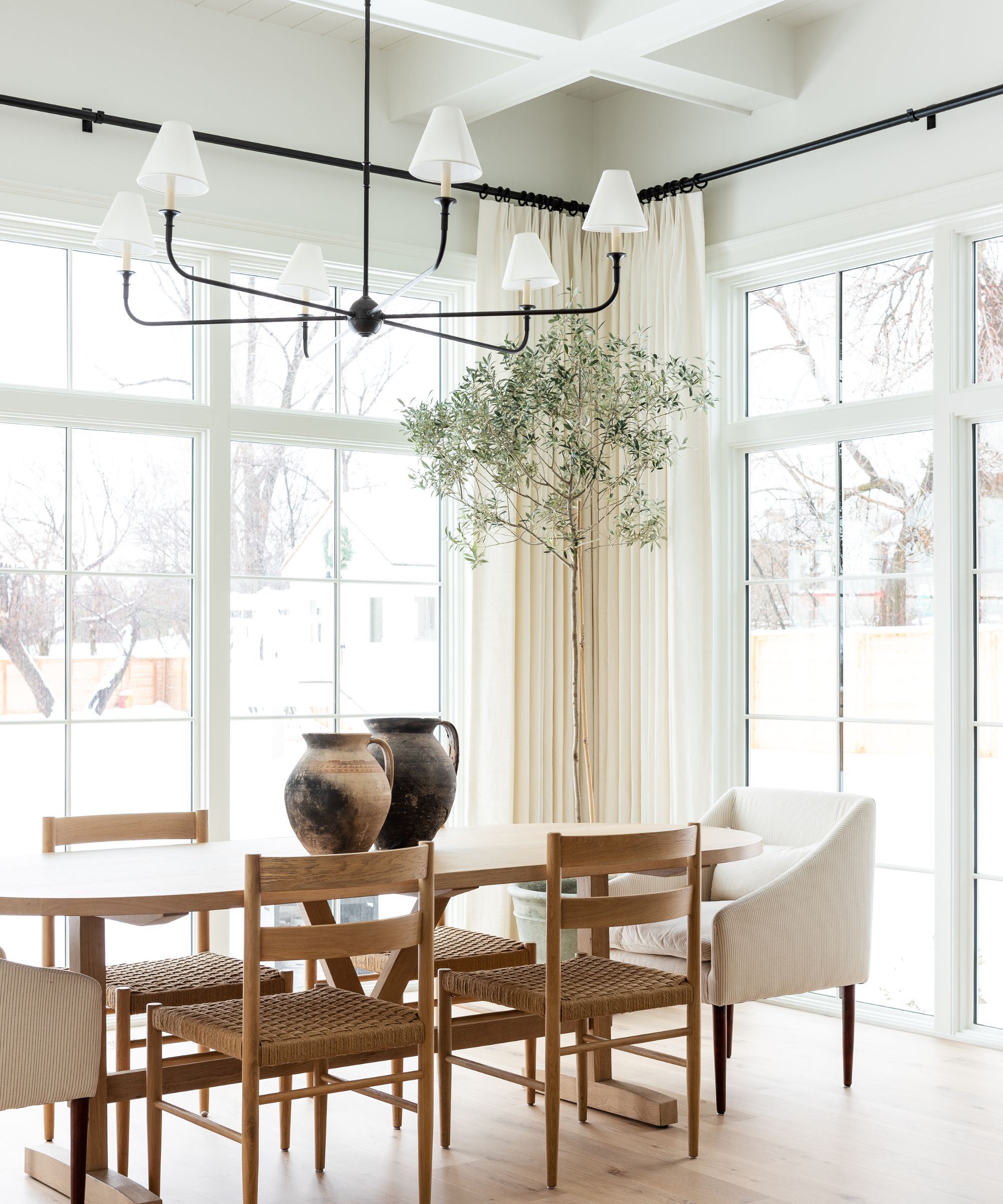
Swiss Coffee really does work in rooms of any aspect. If your room lacks natural light it can turn into this really warm shade that feels both brightening but also cozy. And if your room gets a ton of natural light it only enhances that. It can work in both cooler and warmer lights too, as aspected it will just look cooler or warmer (but never too cool or too warm).
The fact that it's so versatile makes Swiss Coffee a bit of a chameleon shade - it really does change depending on the light in the room. So do or samples and swatch it in your space so you can see how it changes, not just in the room but throughout the day too. You might find it's warmer, or cooler, than expected.
So is Swiss Coffee the perfect white? I think I will be for sure ordering a sample to test out in my home. It gets the seal of approval from designers, and all these spaces show how it can be the perfect backdrop shade for that very on-trend look of layering up other neutrals and textures.


