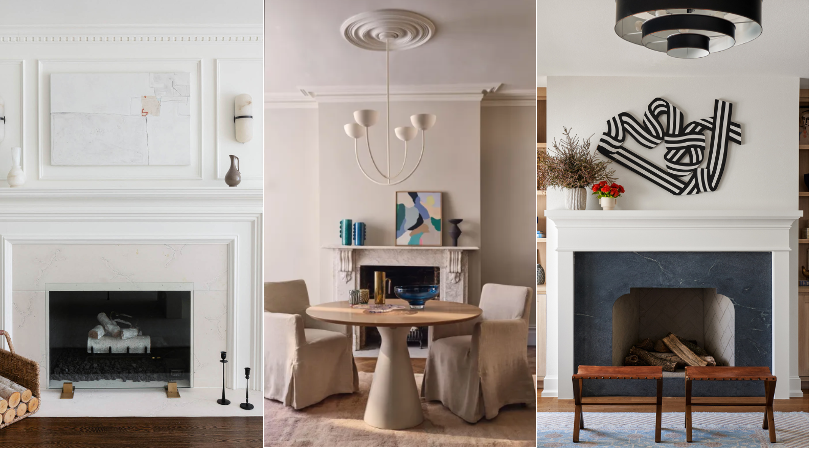
A mantelpiece offers a great display opportunity within a living room, and the objects chosen for it can add decorative detail and personalize the room’s design. But designers caution that without careful curation it can become cluttered and detract from the style of your space.
With so many mantel decor ideas to choose from, overfilling the space is an easy trap to fall into, and the result compromises your fireplace ideas. Edit what’s on the mantel, though, and the display can elevate the room and provide a fabulous focal point.
So what’s a no-no for the area? We asked interior designers which are the things you should never put on a mantelpiece, along with what can go on there to stylish effect.
5 things you should never put on a mantel
A mantel is too good a display space within a living room to neglect. ‘A home’s mantelpiece can serve as a beautiful focal point to showcase your interests and decorative flair,’ says Olma Fuentes, principal and founder of Deni + Dove Interiors. ‘But because mantel depths are generally narrow, you want to be careful not to overcrowd the area with too many objects and accent pieces.’
These are the items design pros suggest you edit out of the mantel display to ensure it’s chic.
1. Family photos
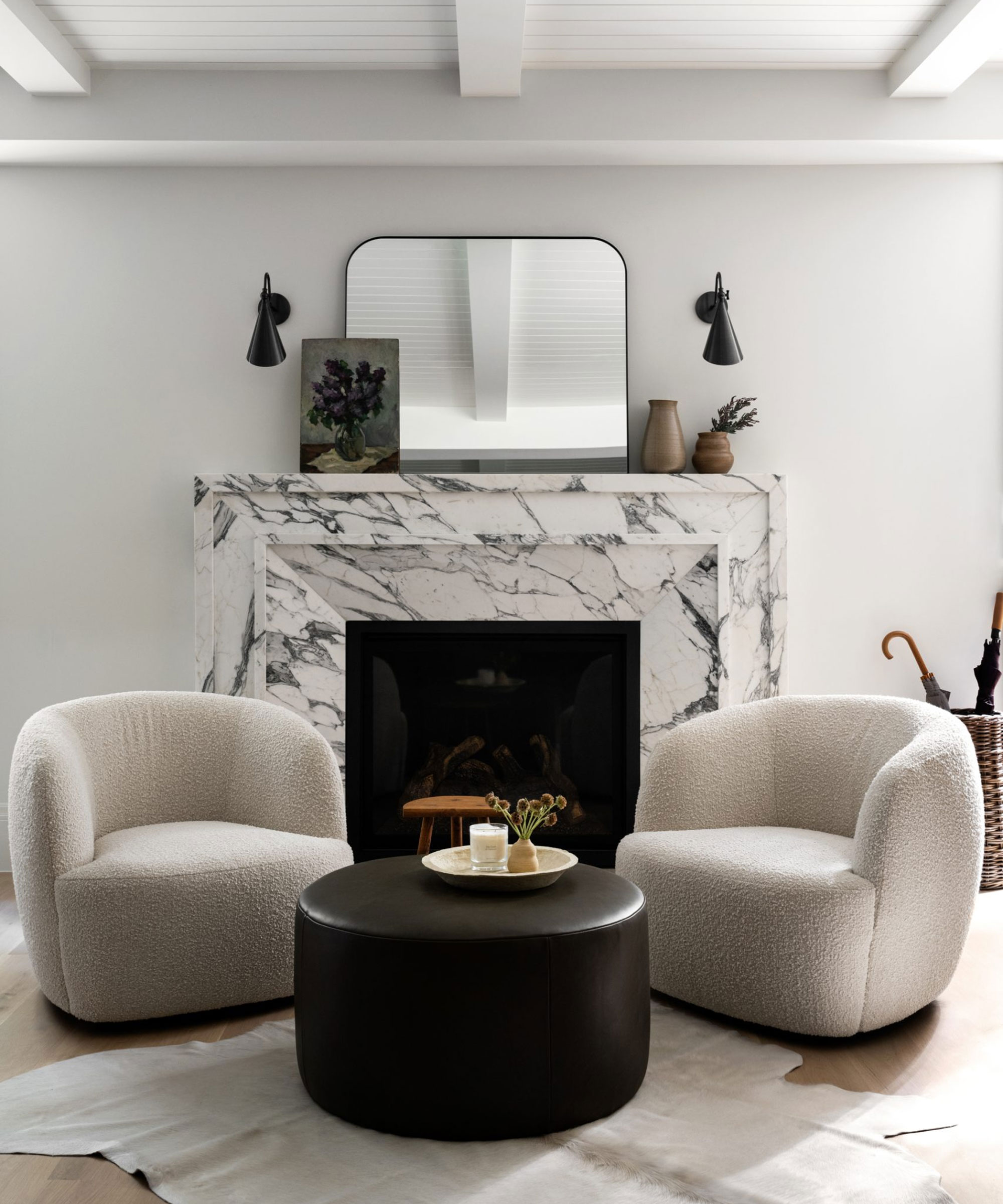
The mantelpiece is a popular place to display family photos, but the consensus from designers is that they can detract from its appearance.
‘We all love displaying family photos, but when your mantel becomes a gallery of mismatched frames, it can quickly go from personal to chaotic,’ advises interior designer Nancy Swanton, CEO of Abundant Home Design and creator of ‘The Guide to Living in Abundance’.
‘A cluttered mantelpiece filled with frames of different sizes, shapes, and styles disrupts the visual flow, making it hard to create a cohesive, balanced look. Instead of giving the eye a focal point, your mantel becomes a jumble of distractions.’
Don’t want to take them all off the mantel? ‘Choose one or two standout photos and place them in frames that coordinate with each other to maintain harmony,’ Nancy suggests. ‘These mindfully chosen pieces will still add a personal touch without overwhelming the space.
‘If you can’t bear to part with more photos, consider creating a gallery wall somewhere in your home,’ she suggests. ‘This keeps your mantel feeling clean and curated while still showcasing your cherished memories in a way that complements your decor.’
2. Knick knacks
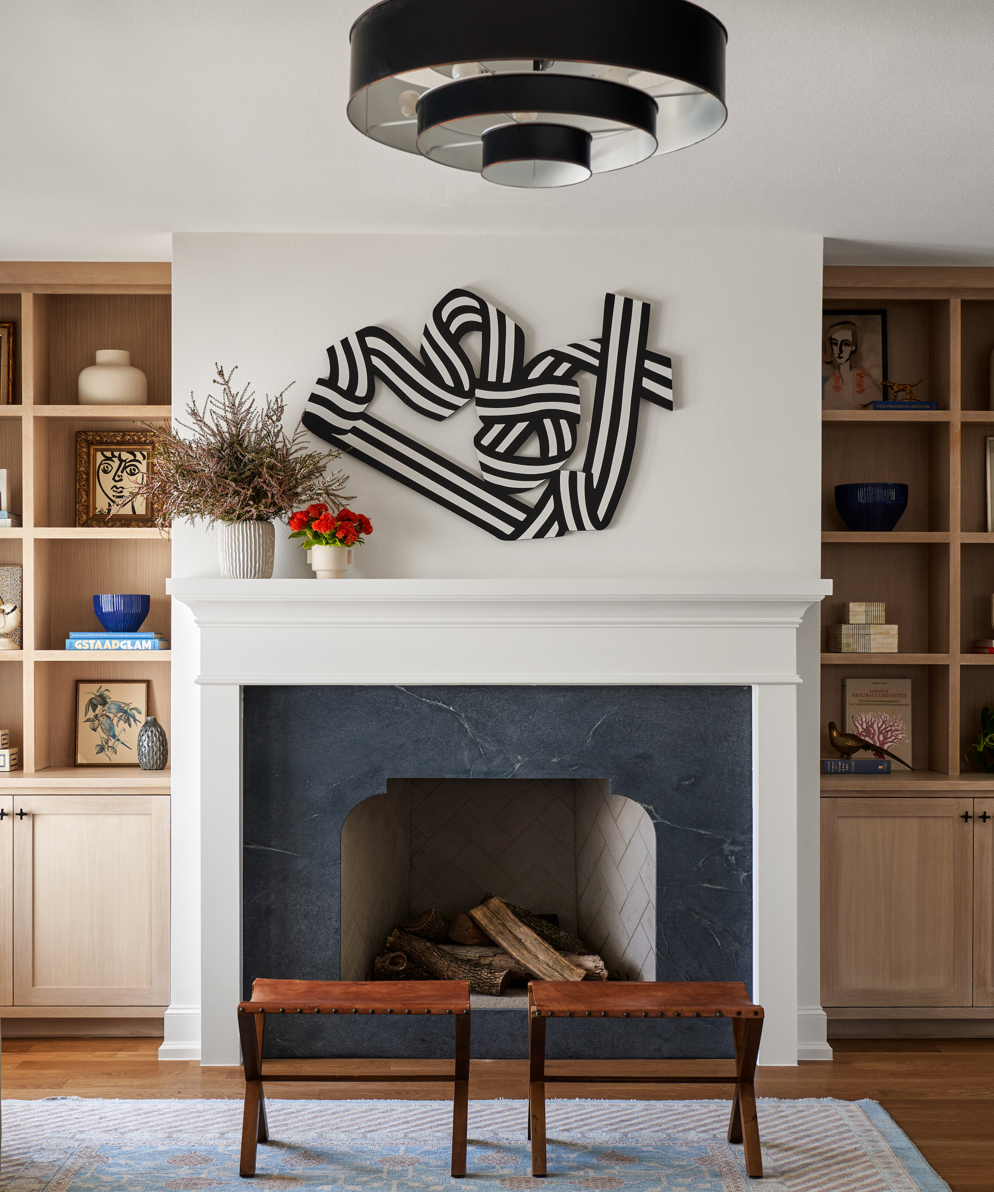
Ditching knick knacks from the mantel is a must for Janelle Patton, lead designer at Lark Interiors.
‘Leave knickknacks off the mantel – they can make it look cluttered fast,’ she advises. ‘Keep these for a console table or side table instead.’
So what should you replace them with? ‘We recommend one large-scale piece of art,’ she says. ‘In the past, TVs have been a no-no above the mantel, but with the introduction of great looking TVs like the Samsung Frame TV, they can absolutely go above the mantel and replicate the look of a large scale piece of art.’
3. Books
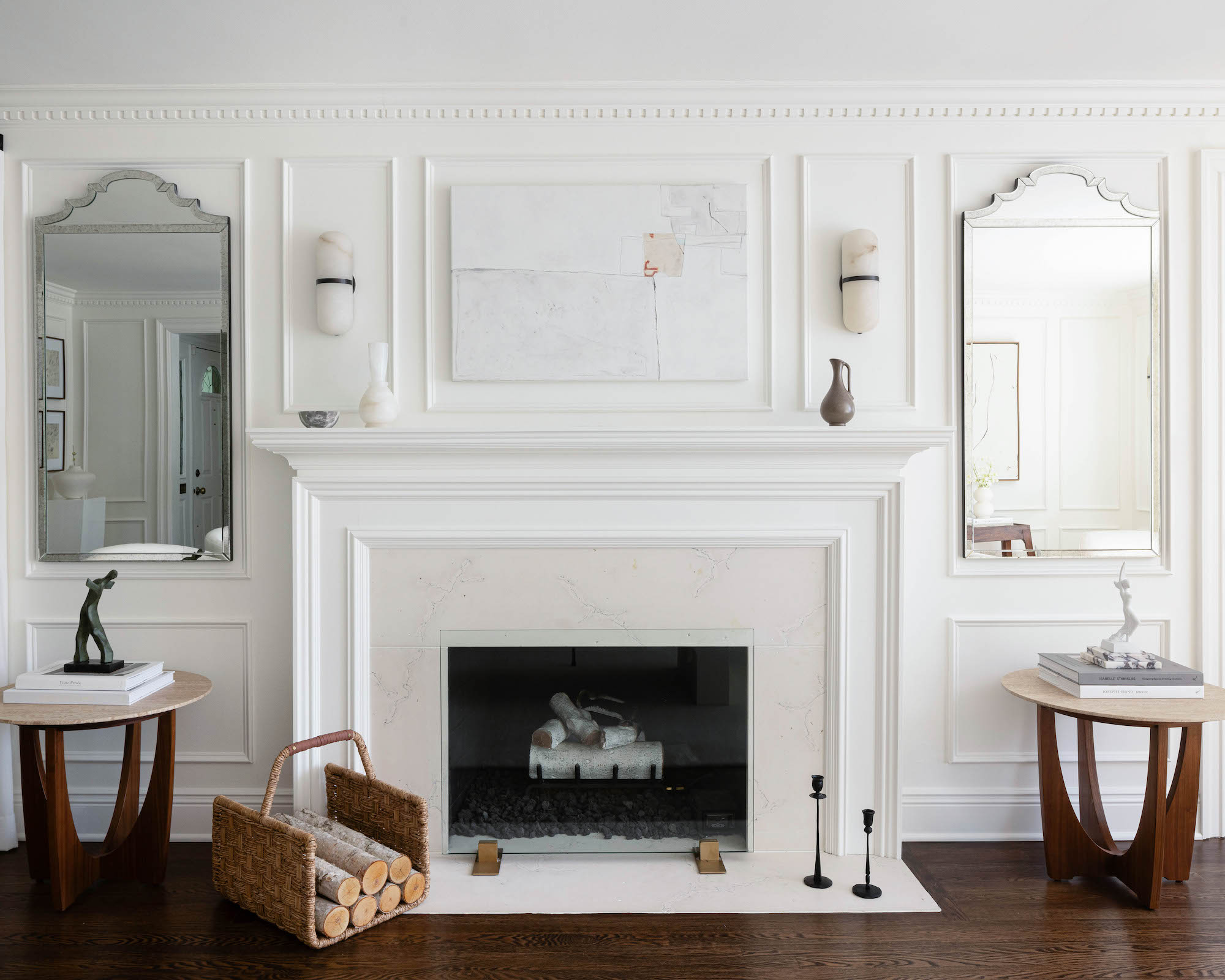
A stack of books is a favorite for coffee table styling or on a side table, but because mantel depths are often narrow they can be overwhelming put on display there.
‘It’s better to use your mantelpiece for smaller decorative pieces, so save large piles of books for your bookshelf or cabinet,’ says Olma Fuentes.
Still can’t resist using books there? Make sure they’re scaled to suit the mantel so they don’t make it look like you’re simply short of book storage, and limit the height of the stack. ‘I wouldn’t recommend using more than three,’ says Olma.
4. Candles
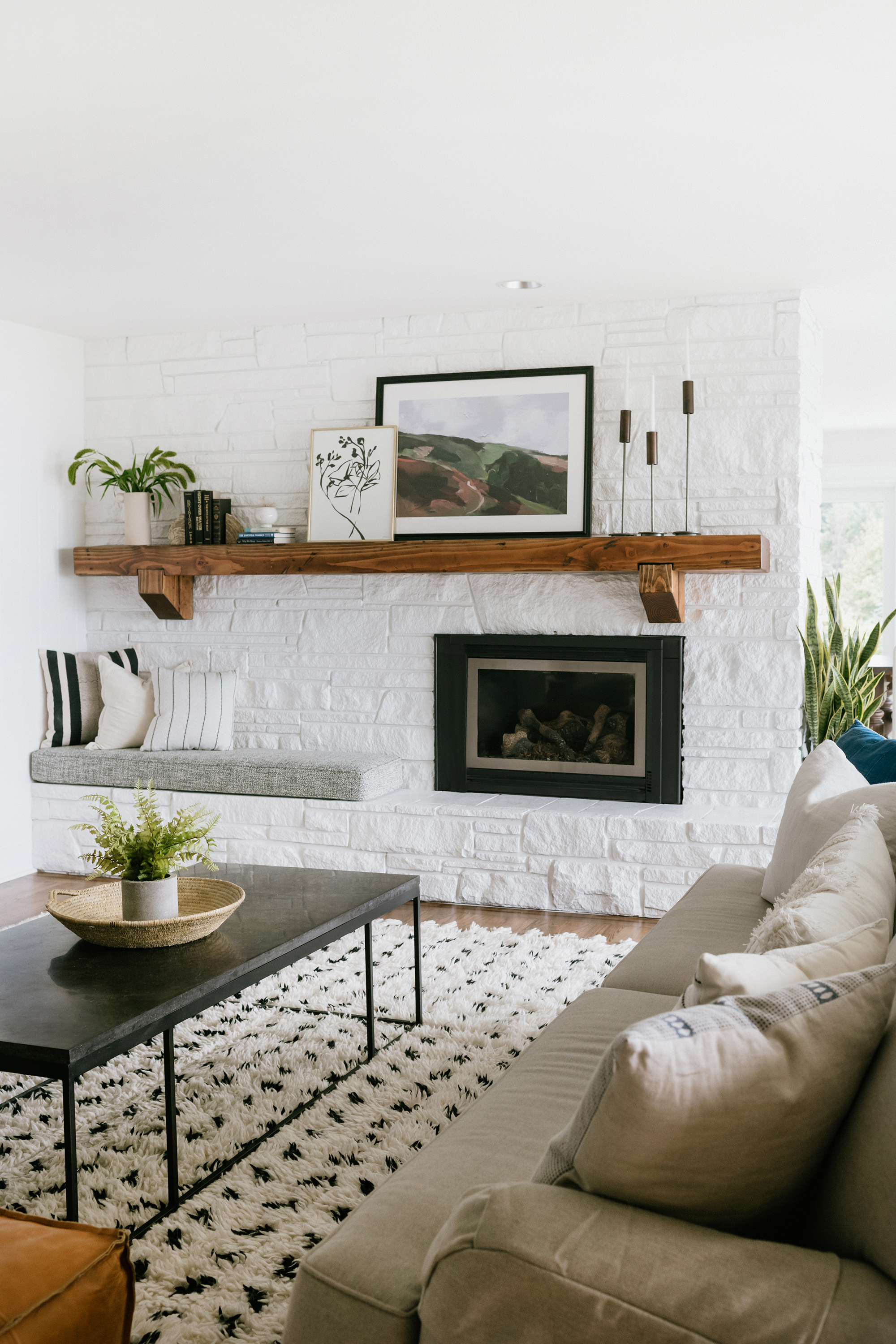
Candles as a no-no for a mantelpiece might surprise you, but designers have strong feelings about their display.
It’s actually a whole host of candles in different colors that’s the problem. ‘Too many can look chaotic, especially when they’re all different sizes and colors,’ says Alice Moszyznski, a New York-based interior designer at Planner 5D.
Of course, it’s true that their light can create a great ambiance for the room, so try following Alice’s recommendation of opting for one striking candleholder or just a few matching or complementary candles.
5. Random objects
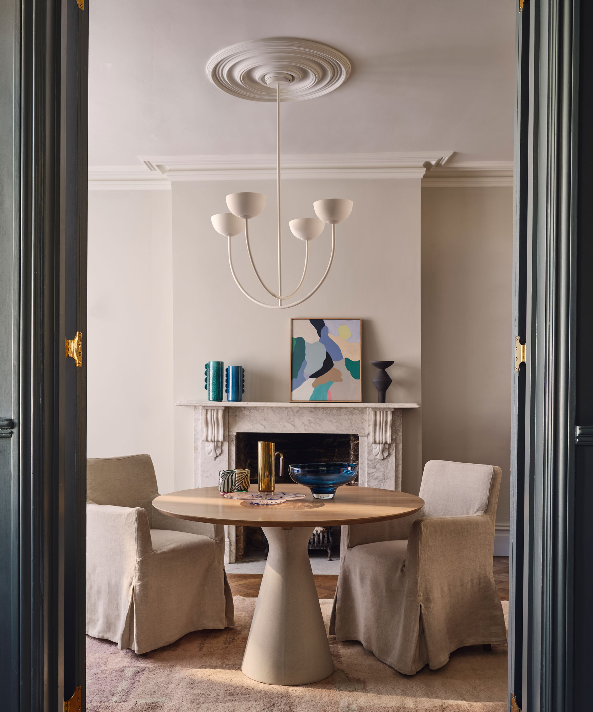
The desire to put a selection of items you find pleasing individually all together on a mantelpiece is a strong one. But it may be one you should quash.
Overcrowding a mantel with random pieces is an error, explains Colleen Bennett of CBB Designs. ‘While these items may have sentimental value, too many can make the mantel look cluttered and visually chaotic,’ she says.
Because items whose only connection is that you like them don’t add up to a sophisticated aesthetic, focus on both the number and scale of what you display. ‘Aim for balance by using fewer, larger statement pieces,’ advises Colleen.
Thoughtful curation is essential when you’re styling a mantelpiece. ‘Even if you’re a maximalist and believe that more is more, you’ll still want to be intentional with your display,’ says Nancy Swanton. Keep collections for elsewhere, too. ‘Large assortments of any one item are better displayed in étagères or curio cabinets,’ adds Olma Fuentes.


