Kitchen countertops don't get loads of love. Though they're used nearly every day and cleaned just as much, when it comes to decorating, they often go overlooked. And though designing thoughtful vignettes for your kitchen counters might feel less than pressing, it's a small step that differentiates functional kitchens from beautiful ones. Creating stylish, characterful kitchen counters takes just a little time and effort, and makes an inviting culinary space you'll love for the long haul.
Nate Berkus and Jeremiah Brent's New York City home is truly timeless, and the kitchen alone boasts a beautiful mix of sophisticated and homey design elements. And while there are too many stunning features to count, the design duo's space provides plenty of inspiration if you're at a loss for how to decorate your kitchen counters. Here are the five styling lessons we learned from admiring Nate and Jeremiah's kitchen vignettes.
The 5 styling lessons we learned from Nate and Jeremiah's kitchen
Nate, one of interior design's biggest names, and Jeremiah, the newest star of Netflix's Queer Eye, have put their collective design efforts into designing their New York City apartment – a space that blends the pair's signature styles seamlessly. And their kitchen counter styling is just one of many subtle details that makes the home stand out – and stand the test of time.
1. Feature art and family photos
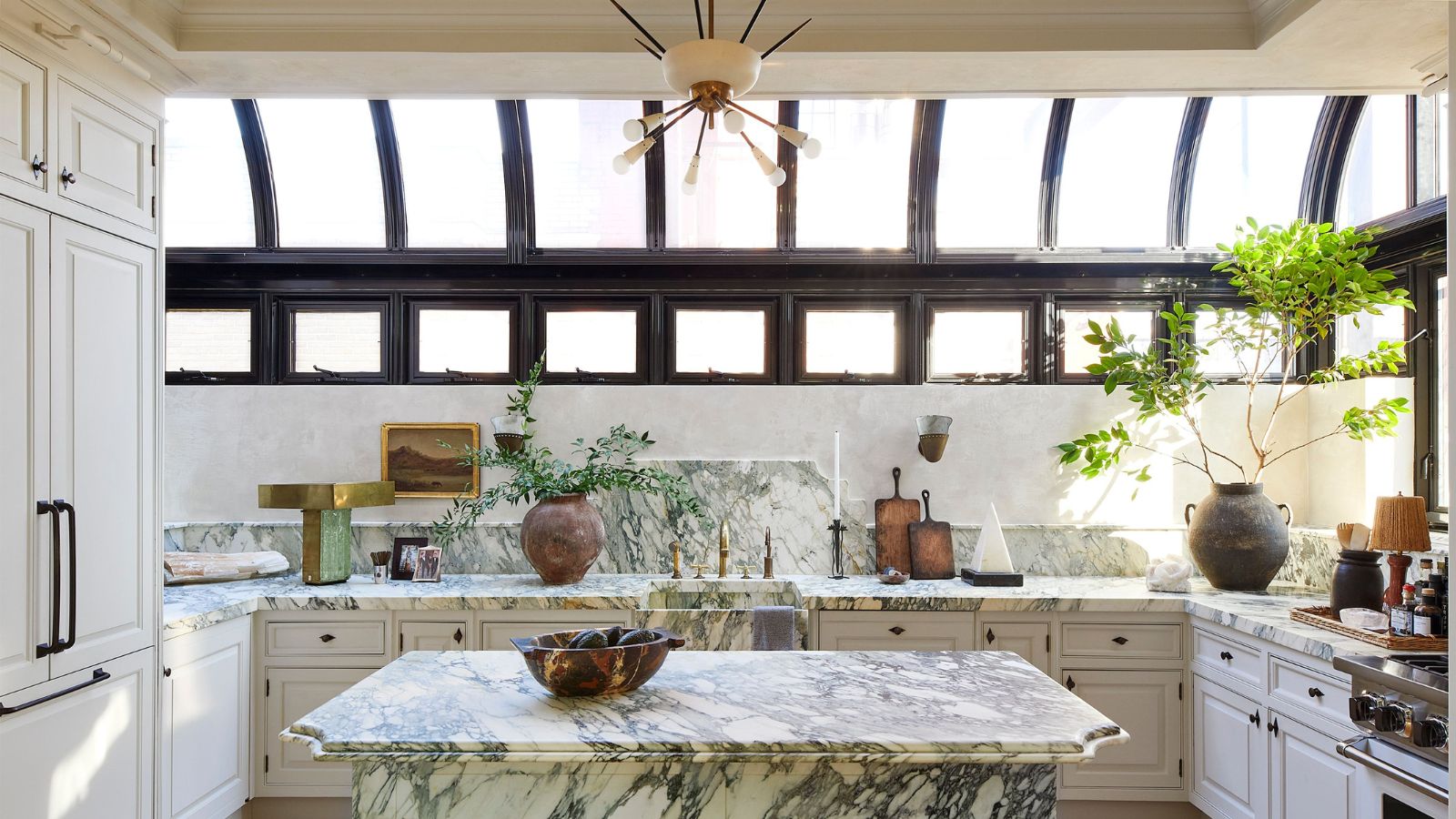
The kitchen may be one of the home's most functional spaces, but that doesn't mean you should hold back with decor that's special to you. The first kitchen counter shot shared by Nate features two framed family photos and a moody landscape painting in a gold, gilded frame. Accompanied by layered lighting and branch of a nearby plant, these personalized touches level up the entire room.
Bringing family photos and other unique-to-you pieces into the kitchen gives it a homey, welcoming feeling that's otherwise hard to achieve. Choose a relatively empty corner and layer in artwork and mementos of your choosing. Not only will you be reminded of your loved ones while you cook up a storm, but visitors will get a glimpse into the moments you most cherish.
2. Keep clear of the sink
While layering on the accessories is well and good, the second photo Nate shared reminds us of an important rule: keep the kitchen sink clear. The last thing you want is a carefully curated vignette getting splashed with suds when it comes time to clear away the dishes.
Take your decor and mementos to the emptier corners of your kitchen, and make sure there's enough room to work in the sink's immediate vicinity. Aside from soap, a sponge, and any other dish implements you use on the daily, there's no need to clutter this high-traffic spot.

3. Think beyond the kitchen
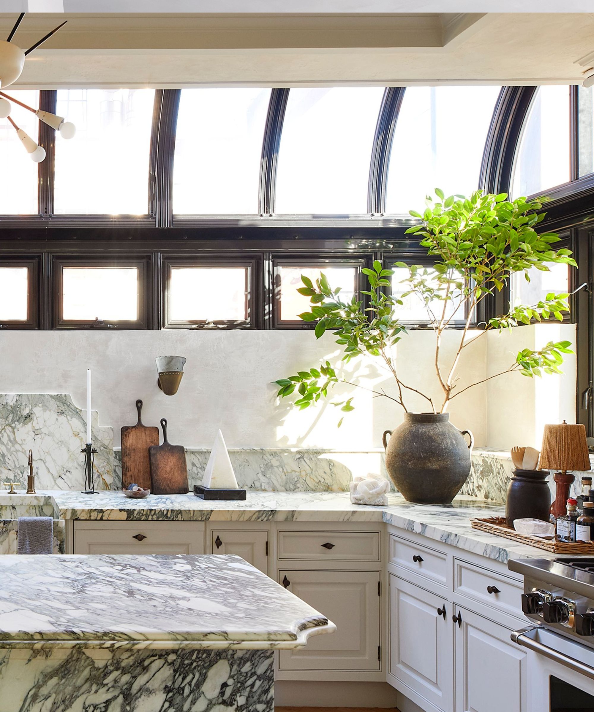
The most stylish kitchens don't just make use of pots and pans for decor – they look beyond the kitchen, and integrate decorative items from across the whole home. In Nate and Jeremiah's home, a small bowl of crystals and geometric objects find starring roles on the countertop, and an impressive candlestick adds some height.
While cutting boards are an easy (and practical) item to layer on the counters, these unconventional add-ons ensure your culinary space is stylish in its own right, and not just leaning on kitchen clichés.
4. Make use of vertical space
Though helpful advice for vignette styling of any kind, Nate and Jeremiah's kitchen counter reminds us that it's always wise to make use of your home's vertical space when designing. Though the pair is especially fortunate to have lofty, expansive skylights in their kitchen space, every kitchen has a bit of vertical space to work with.
A large ceramic pot in the corner holds tall, sprawling branches that lead the eye upwards, and each smaller vignette throughout the space has a considered mix of short, medium and tall objects to choose from. This approach creates depth, and makes the entire room feel larger – a goal nearly all of us have for our spaces.
5. Bring the outdoors in
Interior spaces that include natural elements and bring the outdoors in are charming and cozy, inviting visitors in to enjoy the calm. And though the kitchen is often associated with sleek lines and harsh materials, embracing the great outdoors in your culinary space can lead to great results.
In Nate and Jeremiah's kitchen, plenty of natural light and two sizeable potted plants – combined with the marble's earthy veining – create a nature-inspired space that puts the mind at ease.
By taking vertical space into account and creating characterful vignettes on the kitchen counters, you'll create a culinary space that's anything but boring. On those nights you're dreading making dinner or clearing dishes, you'll have a beautiful environment to lift you right back up.


