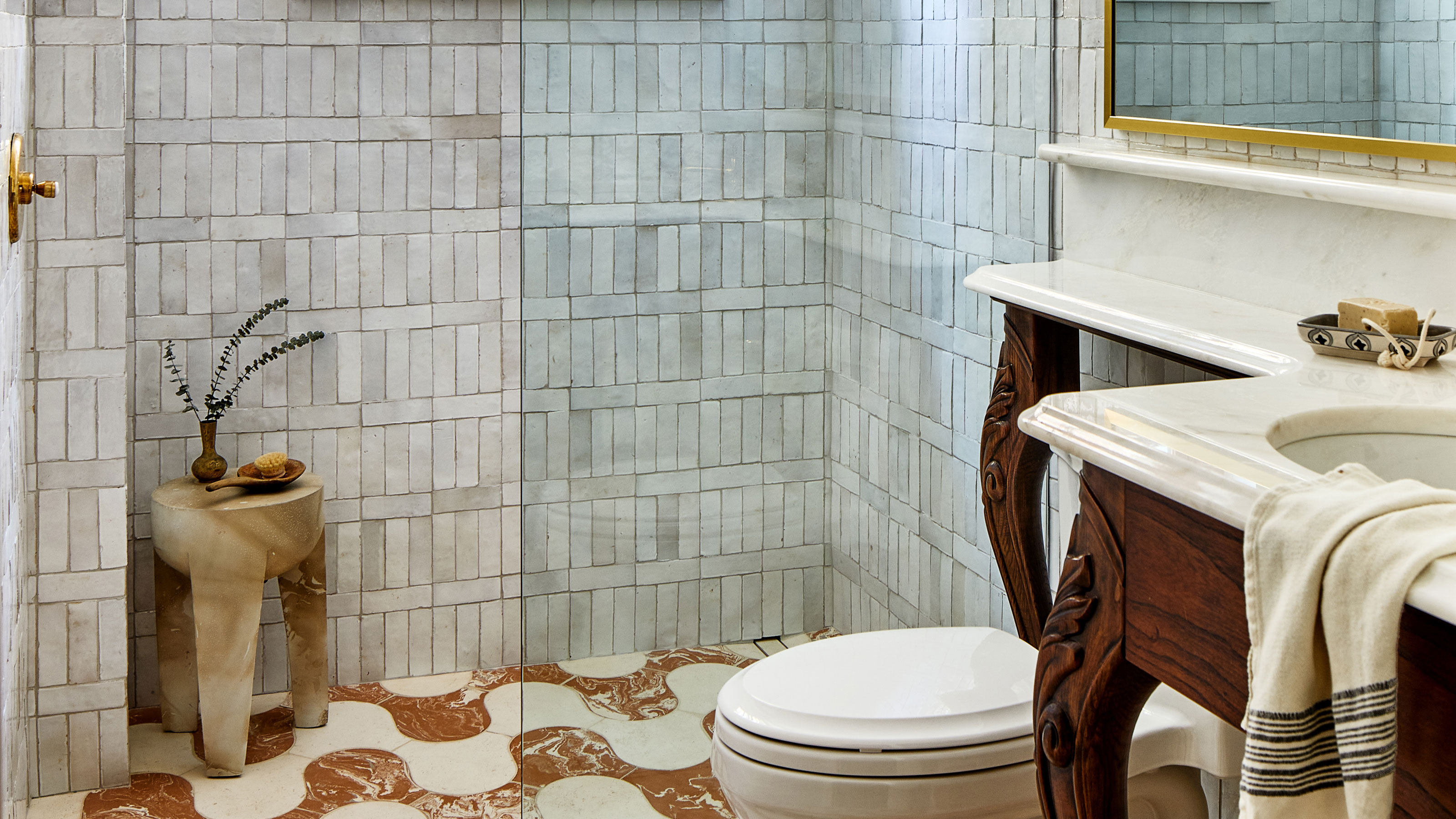
Not everyone is blessed with a generously sized bathroom in their home, but whether you've got space to play with or yours is lacking in the square footage department, you'll want to make the most of it.
But how creative can you really get with a bathroom layout? After all, it's a functional space that has very specific demands in terms of your bath, shower, sink and WC. Well, the best ideas I think you'll find for the bathroom aren't unexpectedly wild new layouts, but rather small shifts that can really help you get more from every inch.
Ready for some simple yet clever ideas that will help your bathroom work harder? Here are 5 I love.
1. Re-think your shower seating
Shower seating is a must for anyone looking for some luxury in their bathroom — however, in most instances, it can be a bit of a space-eater. It cannibalizes some of your shower's floor space, meaning you may have to make your enclosure larger and lose even more of your bathroom's footprint. So how can you make this element work harder?
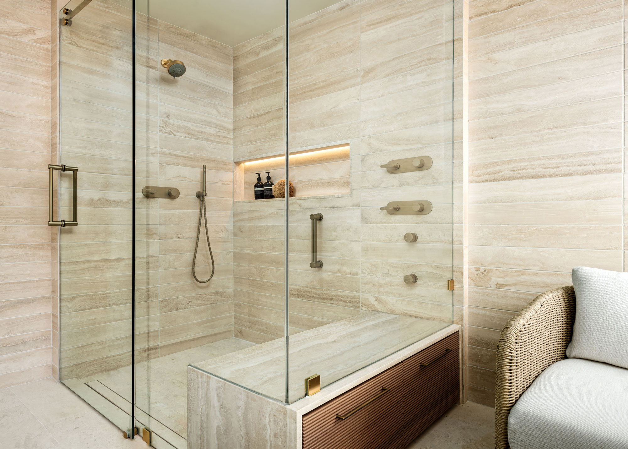
Shower seating is usually built against a solid wall, but in this walk-in shower by interior designer Lexie Saine, shifting the seat against the glass enclosure has opened it up to be put to better use.
'The primary bathroom, although not the most spacious, required a design that would elevate its perceived size to the utmost grandeur,' Lexie explains. 'To achieve this, we meticulously removed the outdated enclosed shower and built-in tub, as the limited space couldn't comfortably accommodate both, imparting a sense of confinement. The transformative process involved enlarging the shower, introducing a thoughtfully crafted sitting area both inside and outside the shower, and illuminating the entire space with natural stone in earth tones.'
'Notably, we went beyond conventional design by fashioning a bespoke custom piece that serves dual functions, resembling a sophisticated furniture item,' the designer says. 'This unique creation seamlessly integrates with matching storage incorporated into the shower bench. While my typical approach involves floating shower benches, this project prioritized maximizing storage within the bathroom. Thus, the innovative design not only provides a relaxing spot for the indulgence of jets and an oversized rainshower head but also offers valuable storage space, ingeniously blending luxury and practicality in this refined sanctuary.'
2. Use walls to your advantage
You may think the best way to make use of a bathroom is to have it as open concept as possible, but as some of the elements of a bathroom's design can create awkward spots to use. Introducing walls, or half-walls, can help you fit more into your space, and allow you to play more with a small bathroom layout.
Half-walls, sometimes called pony walls, are one such idea that works particularly well for a bathroom. They can be used to replace the bottom half of shower enclosures so you can place furniture or fixings against the shower, in a way you wouldn't be able to do with glass.
'Bathrooms can benefit from a pony wall,' interior designer Marie Flanigan agrees. 'I’ve used it as the exterior of the shower surround and thought it created beautiful symmetry between the paneled bathroom walls and shower. Further, it added privacy to the shower stall, which can be important to homeowners.'
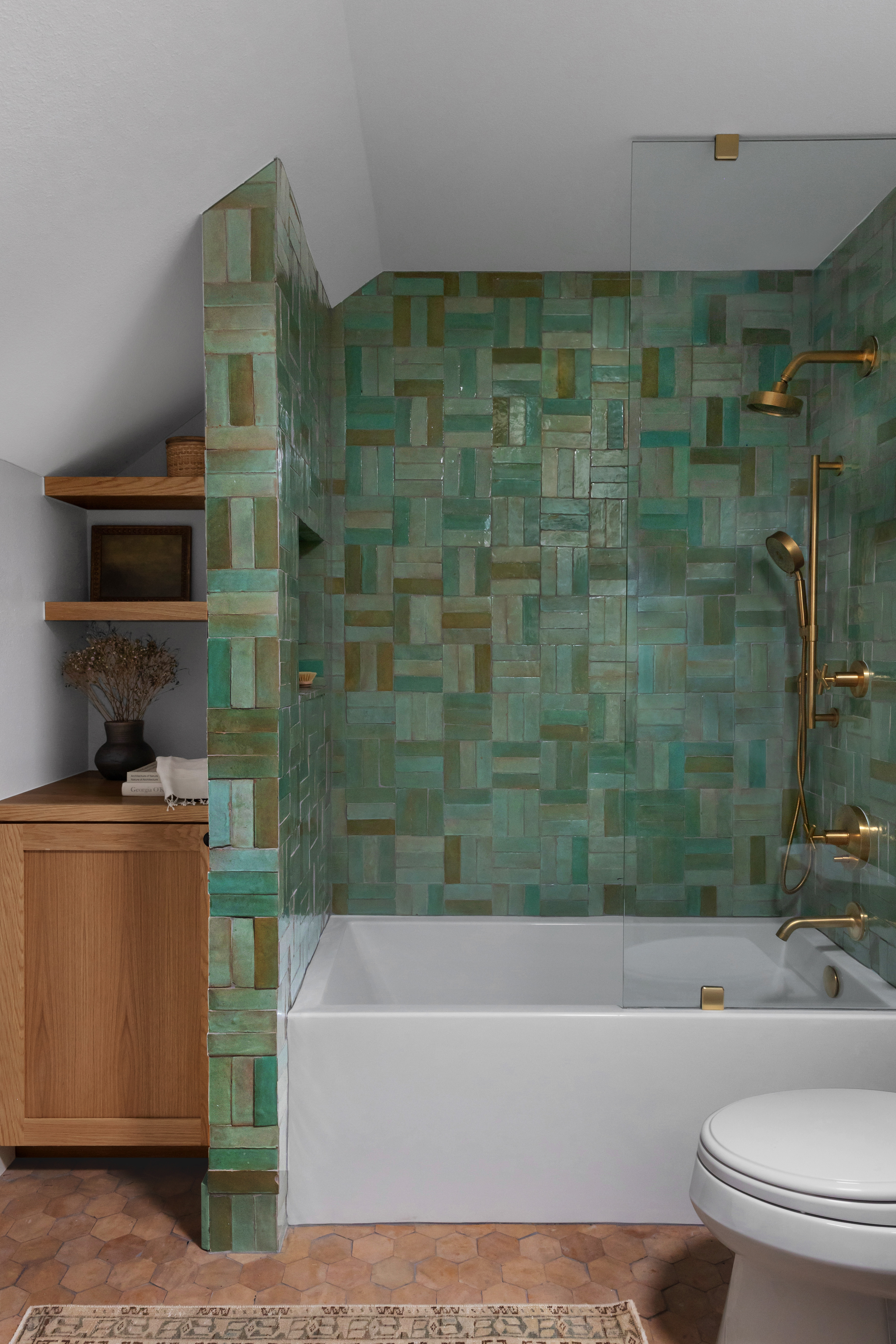
In this bathroom by interior designer Audrey Scheck, a full wall has been introduced next to the bathtub, allowing storage to fill out the width of the room. This bathroom may have otherwise been an awkward size to make work, and this interjection makes for a cleaner finish to the whole design.
3. Narrow where you need to
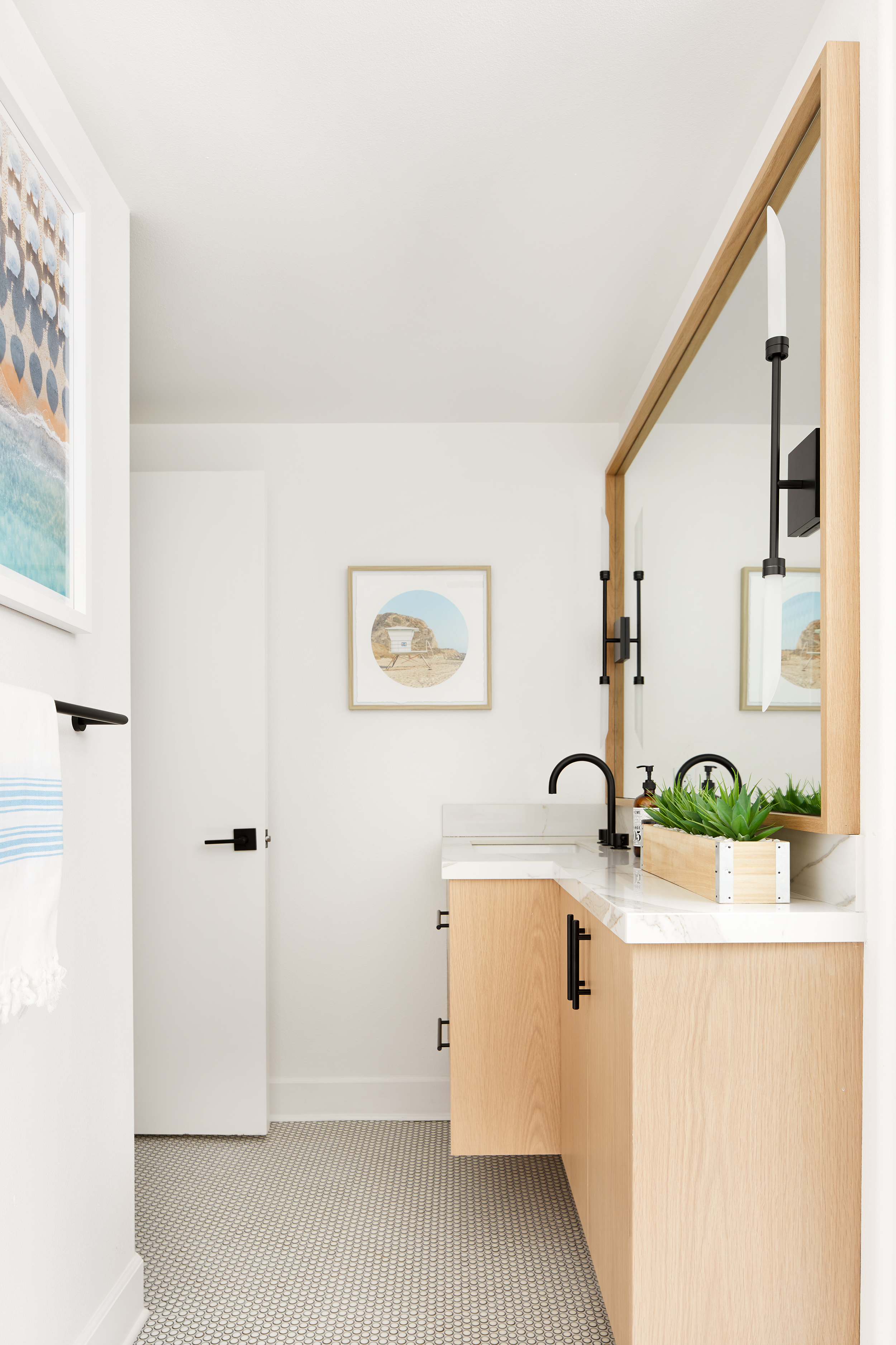
Long bathroom vanities that include a basin and extra storage are a great way to add function to a space, without cluttering it with too many separate design ideas. However, in a narrow space, like this bathroom also designed by Lexie Saine, it can cause issues, especially when you want a generous basin for your bathroom.
'Navigating the quirky layout of this bathroom presented a design puzzle,' Lexie explains. 'Faced with the dilemma of settling for a standard vanity that might seem a tad undersized or opting for a custom solution to infuse the guest bathroom with extra storage and a dash of character, we leaned towards the latter. Our goal was to strike a balance between functionality and aesthetics, ensuring the space was not just efficiently utilized but also visually pleasing.'
'In the spirit of customization, we crafted a vanity that stretches across the entire wall, cleverly tapering in the "hallway" leading to the shower and toilet,' Lexie explains. 'This bespoke approach not only sidesteps any feelings of confinement but also adds a touch of elegance. Think of it as a smart blend of practicality and style, transforming that bathroom into a welcoming and intelligently designed haven.'
4. Make use of space over a WC
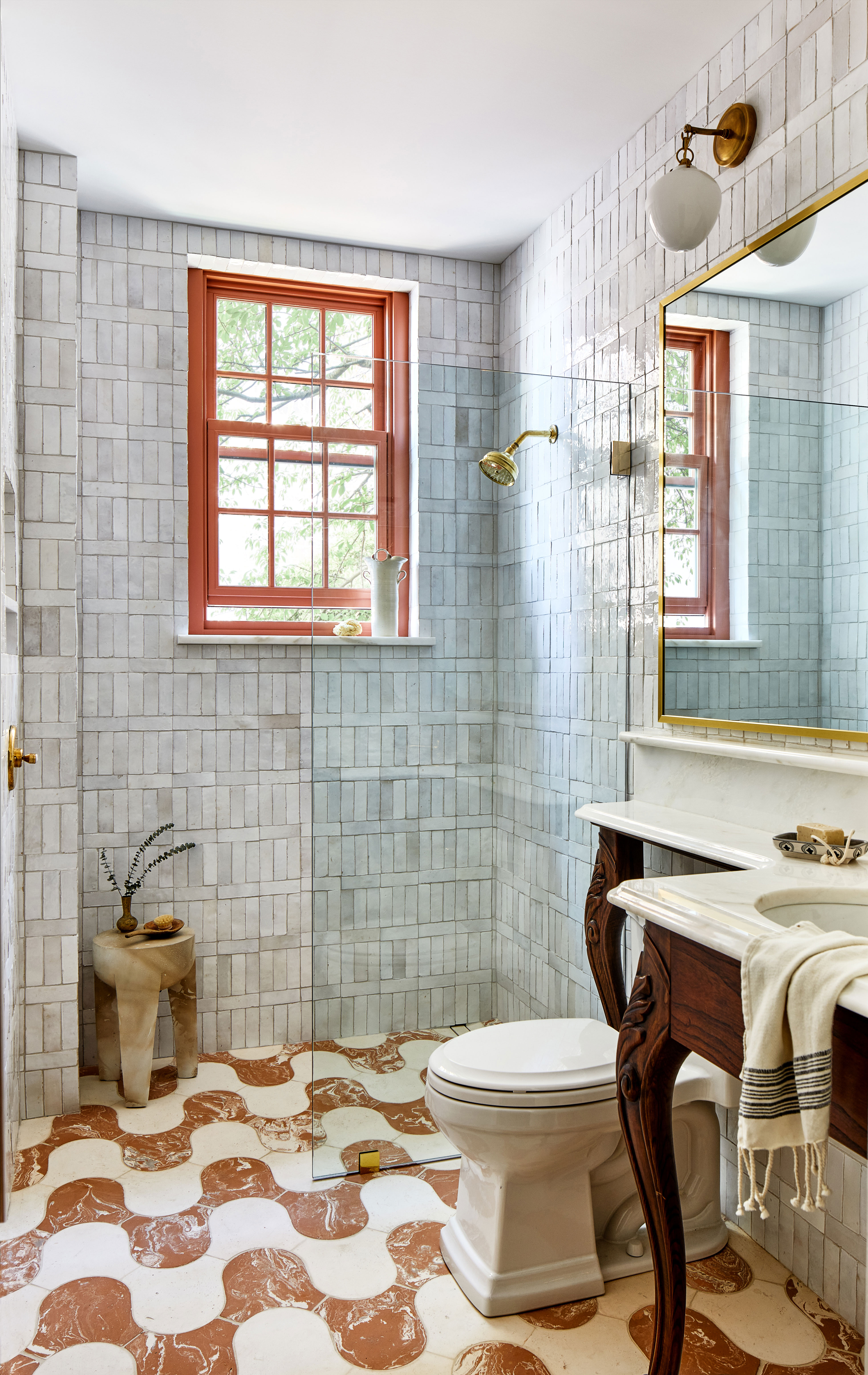
If there's one place that you're underutilizing in a bathroom, chances are it's over your WC. This space is, generally, wasted, where a clever design might mean you can add in more storage, or countertop space. ' If you lack shelving but don't have space on the wall, I can almost guarantee you have space above the toilet,' says professional organizer Ben Sorreff, of H2H Organizing. 'If that's the case, utilize it.'
It's one of the benefits of wall-hung toilets, but if you're sticking with a standard WC, there are ways around it. There are plenty of over toilet storage shelves out there on the market - some stylish, some less so. However, I like a super simple idea like this bathroom vanity designed by Zoe Feldman, where a bespoke piece extends out over the cistern, helping not only to hide it slightly more from view, but also creating a small ledge that you just know comes so in handy for its owners.
5. Try this bath and shower layout
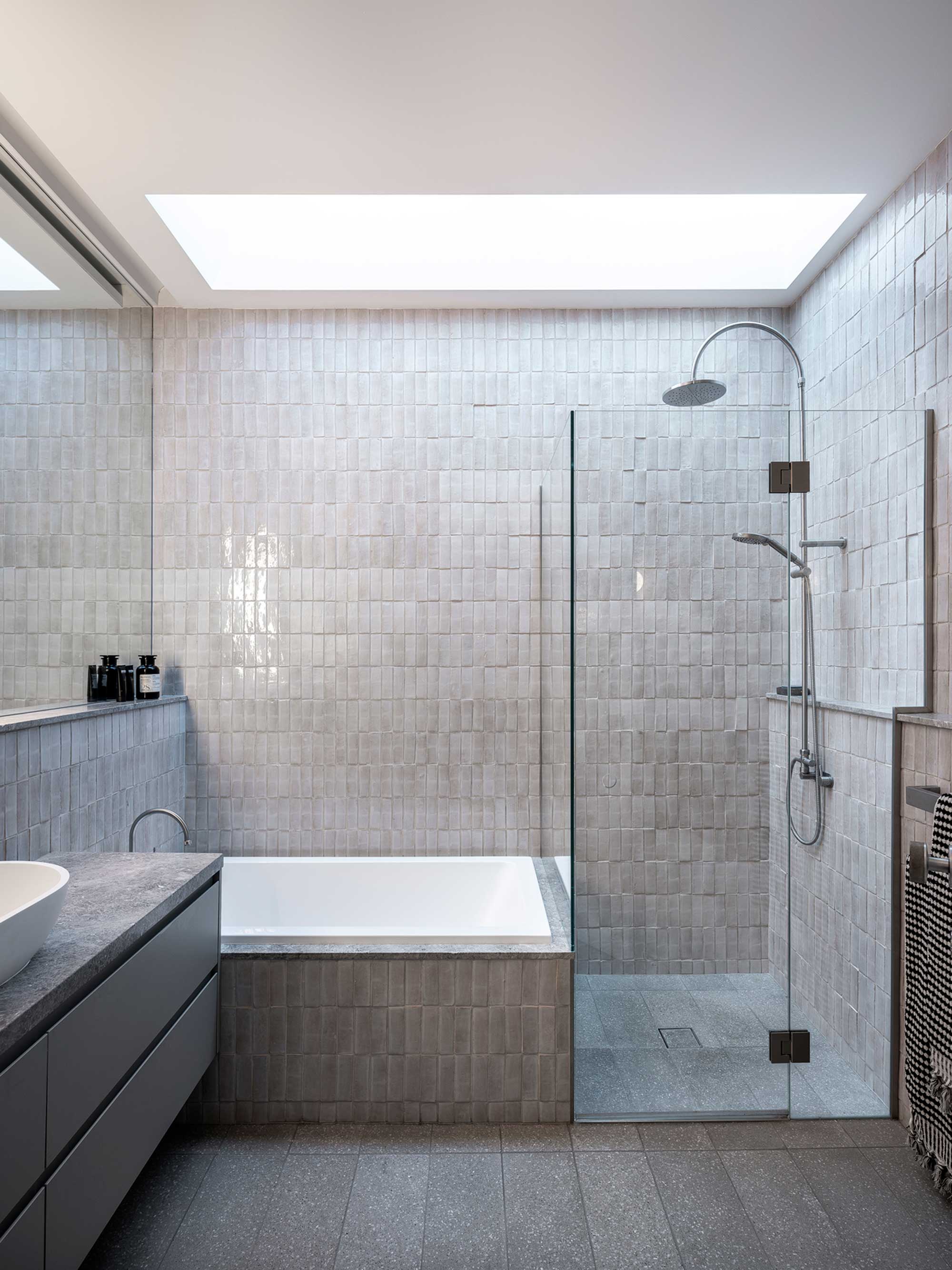
One of the hardest demands to meet of a small bathroom is including both a shower and a bath, but there's a layout idea I'm noticing more and more as a way to make sure spaces answer the call for both.
This bathroom designed by architecture firm Studio P is the perfect example. The layout pairs a smaller, often wider bath adjacent to a shower to squeeze both elements into a restricted floorplan.
'The bath had to be small due to the requirement not have have a combined bath shower and the restricted size of the bathroom and the overall home, but it's wonderfully deep and comfortable,' explains Pouné Parsanejad, director of Studio P. 'It is not square but a small rectangular shape that has been tiled into the walls for simplicity and to look like it is almost moulded out of the wall.'


