Introducing a rug to a room is always a good way to ground the space and introduce color and pattern to the scheme. But, in some instances, there can be rug colors to avoid that may outweigh the space or make it feel off balance.
Of course, there are not usually hard dos and don'ts when it comes to color, as it's often a personal preference, but there are some general guidelines to choosing rug colors that will help to create a well-balanced, thoughtful finish.
So which living room rug colors should you be wary of?
Rug colors to avoid for perfect balance in a space
'There's no hard and fast rules to follow when picking a rug,' says Molly Torres Portnof, principal at DATE Interiors. 'Sometimes a rug is the starting point in a design, where everything else is built around it.
'Other times, a rug is sourced to complement specific pieces that have already been picked, like a sofa, coffee table or artwork. While there are no rug colors that are technically 'off limits', I tend to shy away from intense or heavily saturated tones that draw the eye in a negative way and weigh the space down.
'Instead, I focus on choosing rugs that have an interesting pattern, a soft texture and act as a grounding force in a space.'
1. Cream or white

Whilst cream rugs are certainly appealing, they're often not the most practical choice for most rooms, particularly high-traffic areas like living rooms and kitchens.
'A color that might be hard to maintain is white,' says Dan Mazzarini, Creative Director of BHDM Design. 'It’s less forgiving when it comes to messes.'
'Think about your lifestyle when selecting the color for your rug,' agrees Tiffany Leigh, principal at Tiffany Leigh Design. 'For example, if you have pets or young children, you might want to avoid a light cream or white rug and opt for something darker and more patterned instead.
If you love a neutral look, soft vintage prints, stripes, and jute rugs are all stylish choices that will hide dirt and offer a more practical choice.
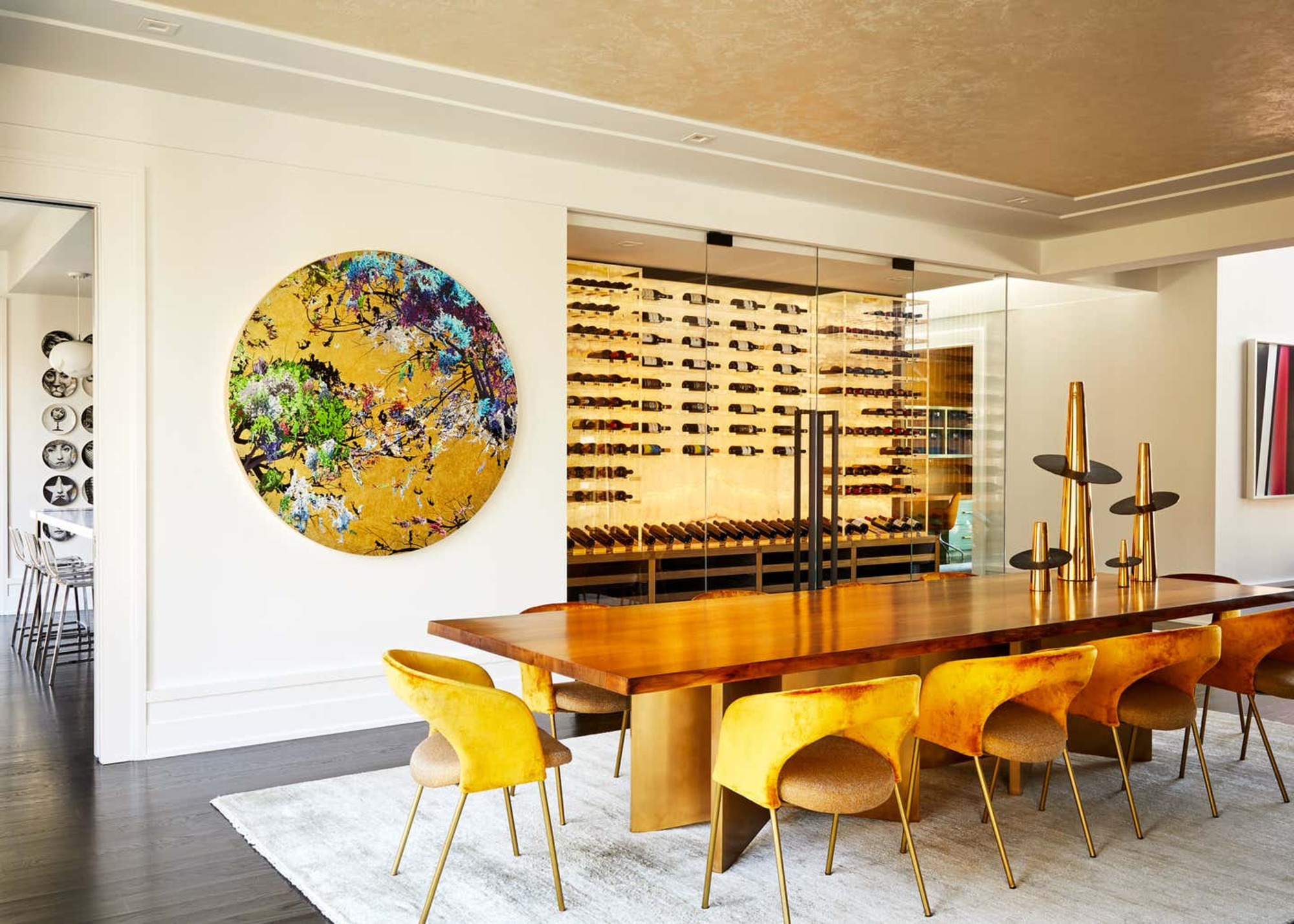
Or, if you're keen to add a white or cream rug to a space, place it in an area that is a low-traffic area, like an elevated dining room that's mainly used for hosting (see main image).
2. Black
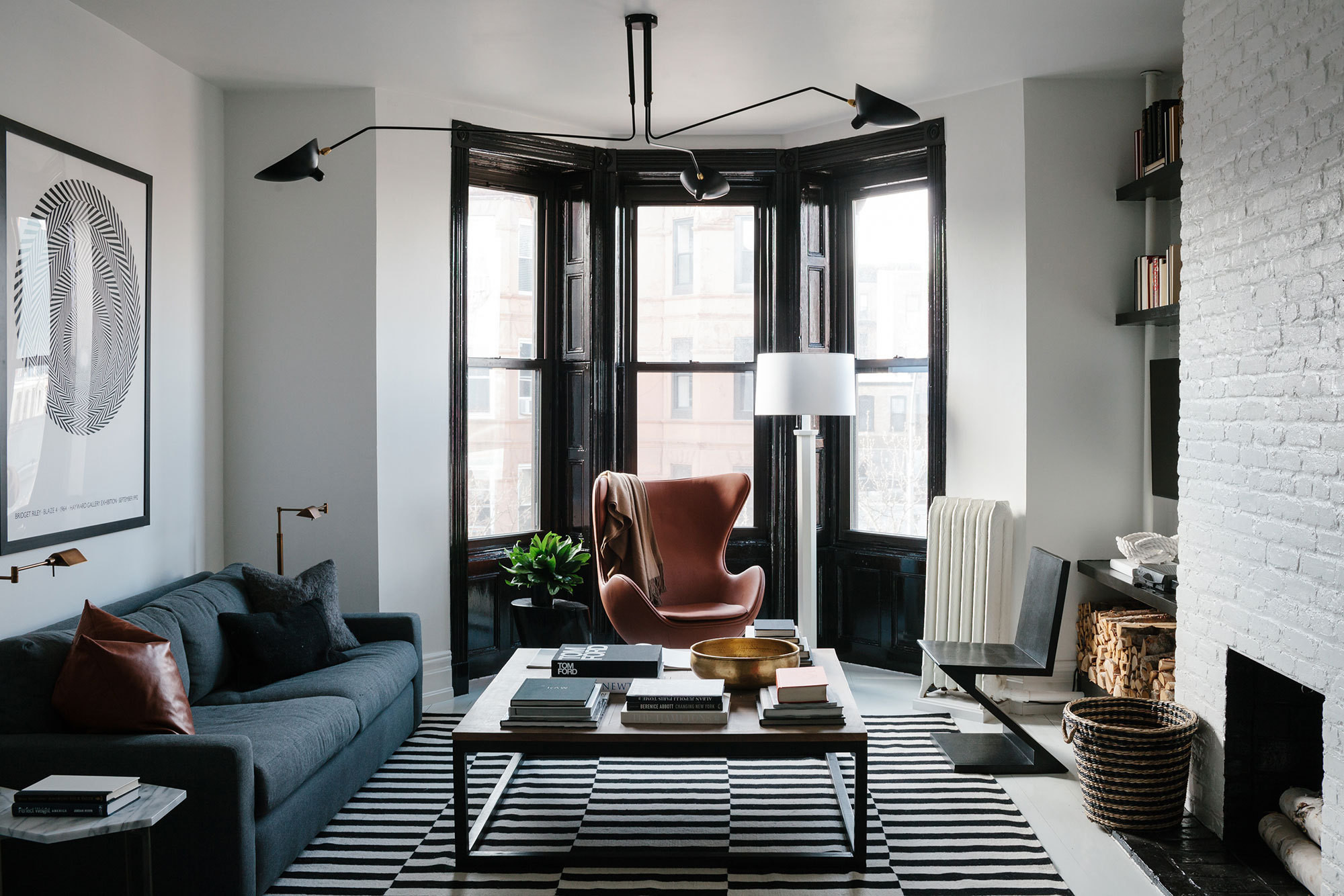
While in some cases an all-black rug can work as a dramatic foundation for your furniture, more often than not it can feel a little too visually heavy - a big living room decorating mistake. Instead, look for rugs that have black threading through them if it's a hue you want to incorporate into your decor scheme.
'When choosing a black rug it’s good to go with options with texture or pattern,' says BHDM's Dan Mazzarini. 'Look for either a Barber Pole yarn or a woven rug – anything like that is going go the distance in hiding things like pet hair.'
Interior designer Marie Flanigan, founder of Marie Flanigan Interiors, agrees that heavy block hues can visually weigh down a space, adding: 'One thing I would try to avoid is choosing a rug that is one large block of color, especially a dark color, with little to no variation in the weave.'
'This can leave the space feeling heavy and detract from other design details,' Marie says.
3. Red

Color psychologists have long confirmed that red is a stimulating color that should be avoided in large swathes in interior design if you're looking to create a relaxing, restorative sanctuary. This is a shade that's particularly better avoided in the bedroom, as it can even affect your sleep pattern according to color psychology in interior design.
If you're looking for a warm color but want something a little more relaxing, try choosing a vintage-style rug in earthy russet tones that will add color to the space yet feel calming and inviting.
'Think about the feeling you’re trying to promote in a room,' says Tiffany Leigh. 'If you’re looking to create a calm and serene environment, a vibrant red rug might be too energetic for your space. In color theory, red is known to be a passionate and stimulating hue, so a softer blue or earthy tones might be a better fit for the mood.'
Molly Torres Portnof, of DATE Interiors, created the look above, and says: 'This living room design was informed by the vintage Persian rug. Its subtle pattern and natural, earthy tones create interest and tie all of the other pieces together beautifully.'
4. Bright orange

Orange is a bright, stimulating color, which, along with red, is associated with fire energy in Feng Shui. Traditional Feng Shui works with the elements of earth, metal, wood, water and fire.
'Every property, from the neatest bijou apartment to the largest mansion has a unique energetic blueprint, and by tapping into the specific elemental requirements, it’s easy to boost the positive energy surrounding individuals and families to help them flourish and thrive,' says Suzanne Roynon of Interiorstherapy.com.
'Each of the elements are supported or depleted by certain colors,' she continues, 'and sometimes we’re naturally drawn to colors the home needs. Unfortunately, however, that’s not always the case and we inadvertently choose a rug which actively drains positive energy from a home and our lives. This can happen for a variety of reasons including stress, anxiety, long-term illness and not being fully in-tune with the home.'
Suzanne warns that 'fire energy' colors can be over-stimulating, commenting: 'These fiery colors can boost energy and activity, but too much can be super-stimulating, leading to arguments, anger, high blood pressure, hot temper and ultimately burn-out. '
She adds: 'All homes need some fire colour to motivate and encourage, but be sure to position a fiery rug with caution.'
And, whether you follow living room Feng Shui rules or not, a number of designers suggest it's a good idea to steer clear of large blocks or swathes of heavily saturated tones.
'Rugs should also be an inviting component to a space, so try to avoid jarring colors that dominate the overall palette,' says Marie Flanigan.
And, says Marie, makes sure the color works within the space. 'If your room is more earthy and neutral, you’ll definitely want to avoid any harsh or hard colors, like a bright red or orange on the rug.'
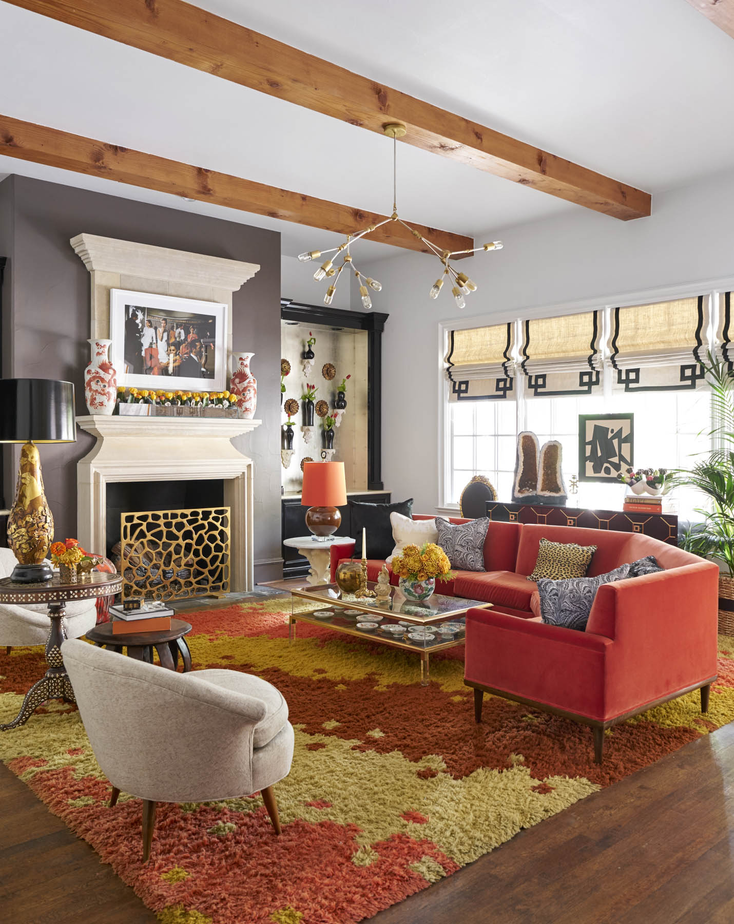
If you love orange, try weaving the color into the scheme through a vintage or patterned rug (as above), or opt for soft shades of the hue. Tying the shade with other items in the space, like artwork and cushions, also makes for a balanced aesthetic.
It's always a good idea to think about the context of the space too. A shag rug - a top rug trend for 2023 that feeds into the 1970s style we're seeing right now, and orange is a color that will work in this type of scheme when mixed with other hues (below).
5. Cool greys
'Metal energy manifests in grey, white, pastels and metallic colors,' says Suzanne. 'In Feng Shui, it has been the element most necessary in all homes since 2004, so it’s no surprise grey and white color schemes have been in vogue since then.
'The challenge with too much metal, however, is that it can feel bleak and unyielding. It often cuts into emotional and physical energy, leaving people feeling dull, brittle, tense, fatigued and worn-down. If you feel much better while you are away from a predominantly grey/white home, it’s time to revitalise the space and avoid bringing in more metal energy in the form of grey, cream, white and silver rugs.'
And, speaking about the grey trend, Suzanne adds: 'For the last 19 years, homes have needed a lot of metal energy, which means that the trend for greys and light neutral colors has been incredibly advantageous. When used in the right place, rugs in greys and earth colors helped bring balance to a lot of homes.
'As we move into a new 20-year Feng Shui cycle in February 2024, we’re already seeing grey schemes losing their appeal and anticipate a shift towards a greater requirement for colors associated with wood energy and plants. These are represented by shades of green rather than the more obvious browns of wooden furniture. It’s interesting to see change beginning to happen with design schemes.'
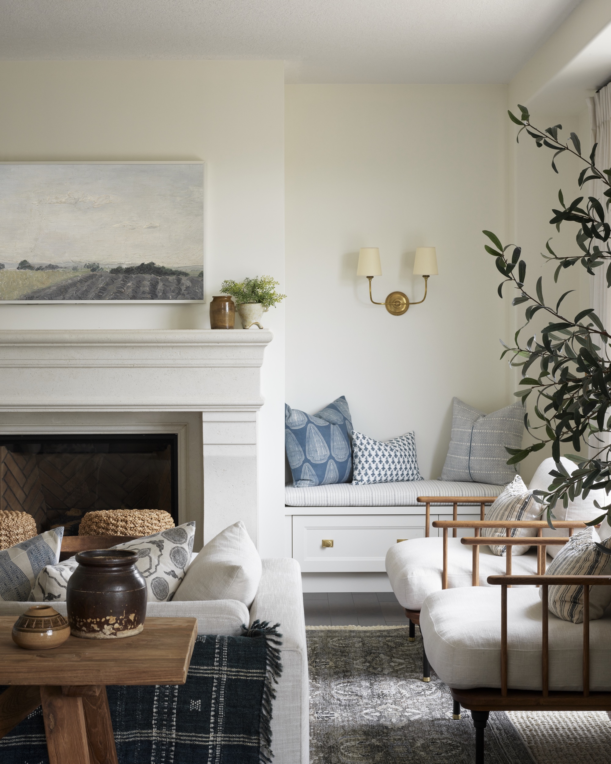
A grey rug is a perennially popular choice, and we're not suggesting it can't look chic and stylish. Introducing grey through pattern is always a good idea, so its effect is subtle and softened (as above). Utilizing different textures will also soften the look, as will layering your grey rug. Layering rugs is an interiors design trend often used by professionals to offer contrast in color, texture or pattern, as well as added comfort.
How to introduce color through rugs
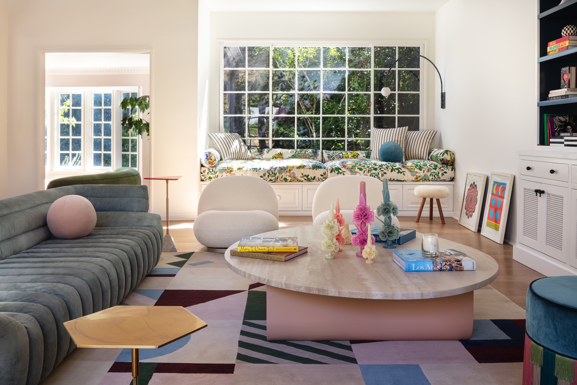
'Rugs are a foundational piece in any room,' says Marie Flanigan, of Marie Flanigan Interiors. 'A rug can reinforce the room’s existing color palette or even introduce accent colors into a space.
'I use rugs for each of these purposes and how I select a rug’s color typically depends on the room. When selecting a rug’s color, it’s important to make sure that the overall rug design or detail is in line with the room’s aesthetic. Any color can be the right color if they complement the design.
'If you’re looking to add interesting or less common colors through your rug’s design, like a purple or orange, make sure you add a few similar color details throughout the space, whether through a pillow, throw blanket or artwork for continued cohesion.'
She continues: 'Vintage rugs or hand-knotted Turkish rugs can be a great way to add unexpected colors to a room.'


