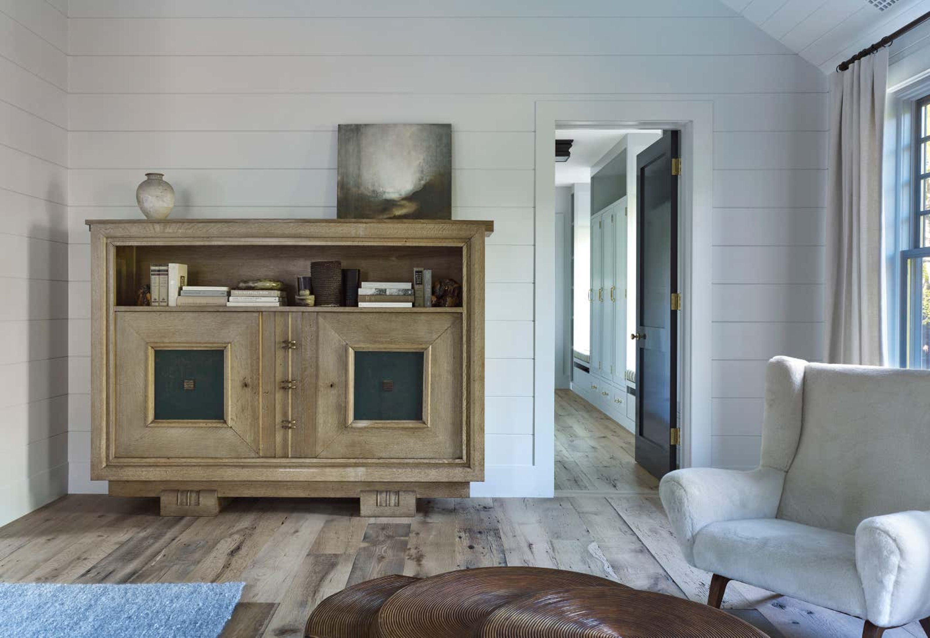
Storage isn't the most exciting aspect of home design. It's functional and requires you to think practically. But get it right and the design of a room will flow. Get it wrong and your storage solutions can feel bulky and overwhelming. 'Storage should never be more than a supporting character in a living room,' says Greg Howe of Searl Lamaster Howe Architects.
You might not have thought it, but there are trends in storage styles too, from materials in fashion to colorways. There is a general trend towards pieces that are slimmer, with concealed features and lighter in coloring. For a living room that is in vogue, these are the storage solutions designers suggest ditching.
1. Blanket boxes
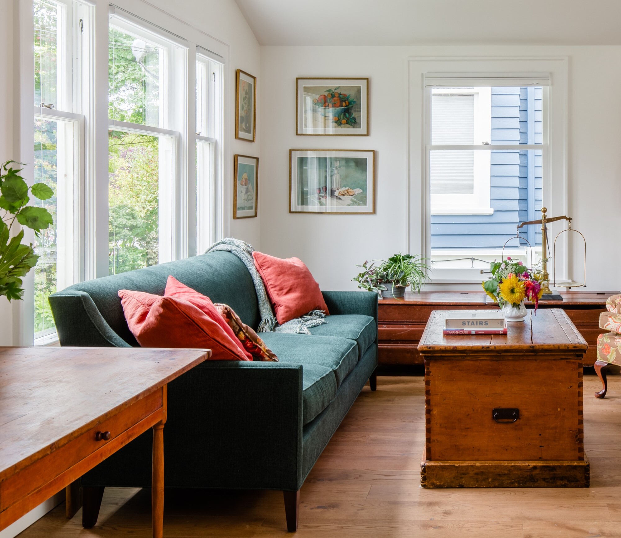
Blanket boxes have come in and out of fashion, but at this current moment, we're steering clear of the blanket box. Its rustic, farmhouse living room vibe feels a little at odds with a more modern, minimaluxe aesthetic that has been coming to the fore the last few years. Ultimately, it's a little too countrycore and can end up making a living room feel a little dated.
‘A big bulky chest might be functional but can easily throw off the harmony of a space,' says Greg Howe of Searl Lamaster Howe.
What's more, what we are used to storing in them - blankets - are actually better out the box than in it, as we strive to make our living rooms more cozy by embracing texture. Instead, invest in an open basket or actually use the blankets, draping them over your sofa and chairs to add warmth and depth.
'While a large enclosed coffee table might seem like a great place to hide belongings, they often take up a lot of visual space in your living room,’ says Marissa Hagmeyer, co-founder of NEAT Method. ‘Utilize alternative storage solutions for your items and opt for a lighter-looking coffee table.'
2. Overboard media units
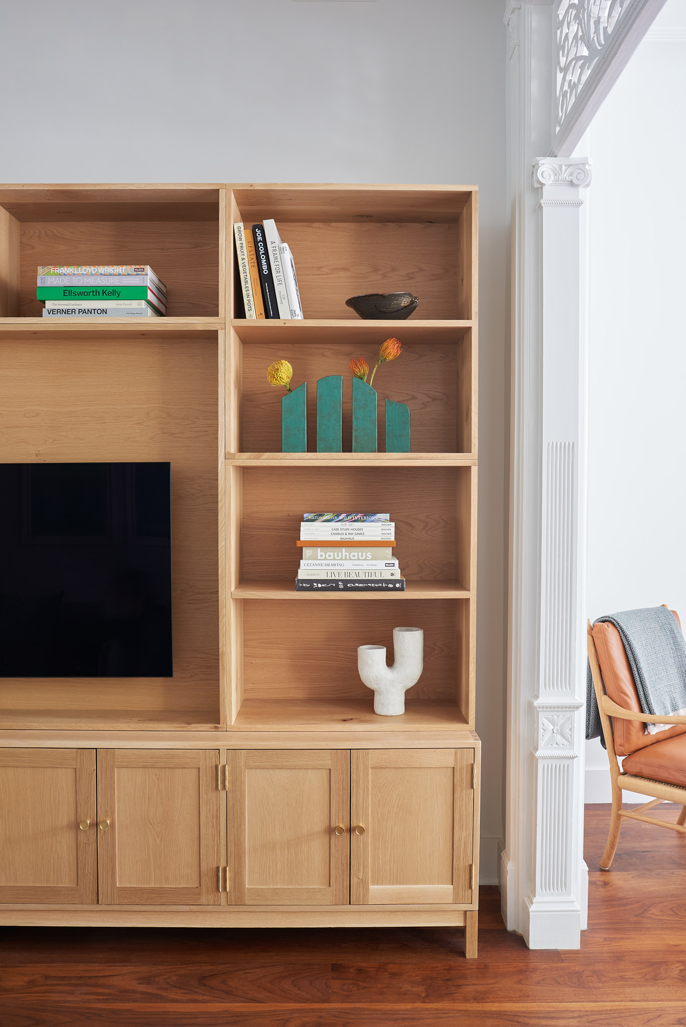
The media unit is another storage solution that is becoming outdated. It can make the room feel a little claustrophobic and boxed-in. Storage does not need to be this bulky, and a bulky media unit or media wall feels a little intense for all styles of living room. ‘Oversized media units are so outdated,’ says NEATMethod’s co-founder, Ashley Murphy. ‘These can feel overpowering in a space and provide ample shelves for clutter to collect.’
Instead of bringing the living room focus to your TV, think about what kind of atmosphere you want to create. Your living room should be more about engaging in conversation and relaxing.
‘Bulky media furniture used to be necessary in living rooms in order to store sizeable televisions and all of the accessories that went with them,’ agrees Sandy Wolf of Seattle-based Office of Ordinary Architecture. ‘With the advent of much slimmer televisions, streaming, and wireless technology the spatial requirements for media centers have been nearly eliminated.
'Instead of the hulking media center as the centerpiece of a room, Office of Ordinary often uses a slim console and a wall-mounted television, ideally one that can disguise itself as a piece of artwork, to provide an open and airy living area.’
3. Dark woods
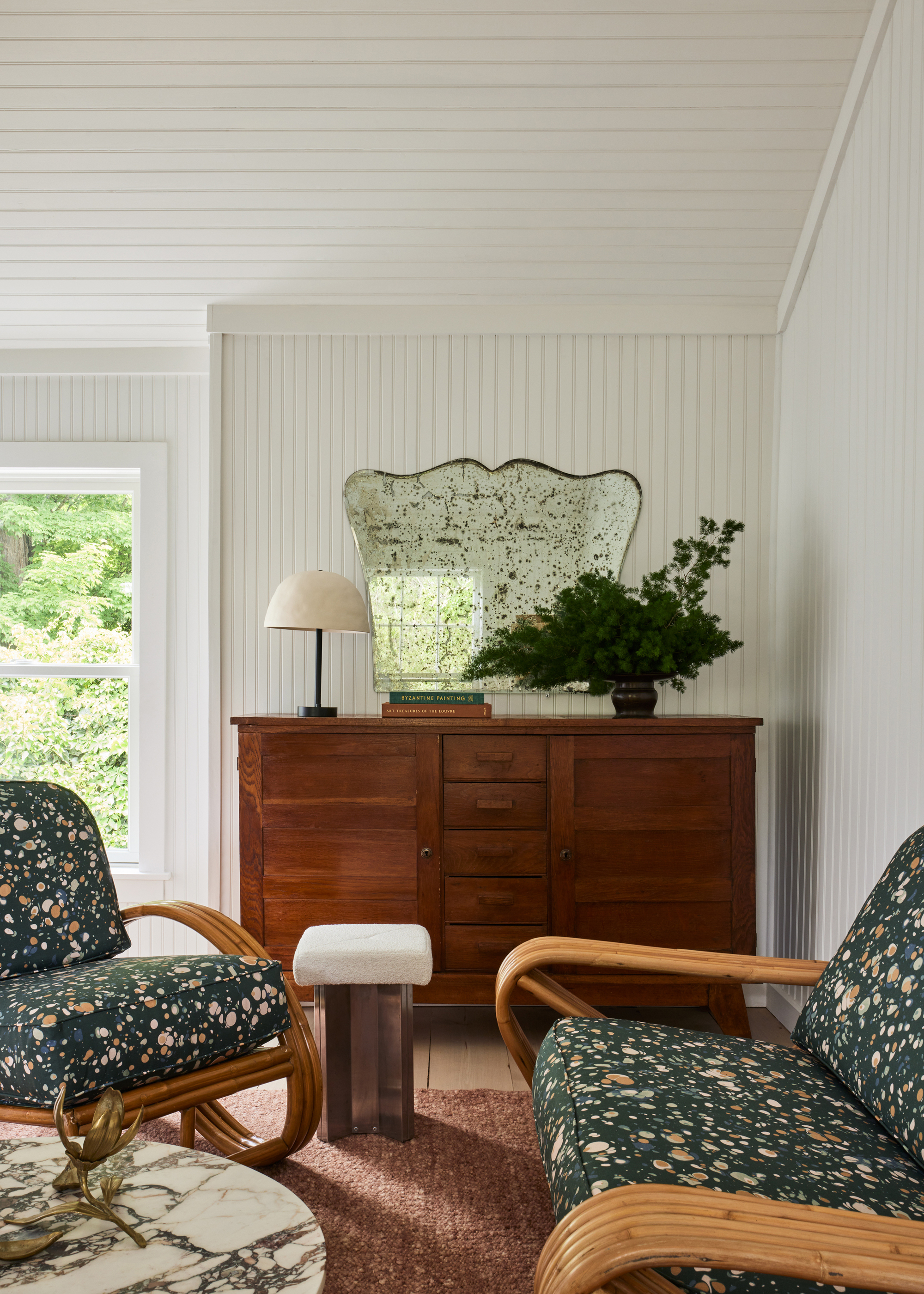
More and more, we're noticing a move away from dark woods towards white oaks and lighter woods that has a brighter, Scandi living room feel. 'Dark, ornate storage pieces, once popular, are now seen as too dominating, clashing with today’s preference for light and airy interiors,' says Artem Kropovinsky of Arsight, an interior design studio based in New York.
'Dark freestanding storage units tend to feel like a big box and tend to be impersonal,' agrees Heather Peterson of Heather Peterson Design. 'With the move towards curated, personal interiors, consider a light-colored armoire. There are great cabinets available in almost every style - English pine for Country, Chinoiserie for Regency, Painted Swedish, mid-century modern.
'We use them in many projects and they can work to your advantage. Not only do they store a ton, but they add height to a room and can create a focal point. We often flank them with pairs of chairs or art to make them even stronger.'
'Depending on your scheme and size of your room, choosing darker finishes for larger furniture accents can sometimes overpower a room causing your space to feel a little more compact than intended,' says Nora Chou of New York and Hong Kong designers. 'To create a more cohesive or timeless look, choose finishes that are within the same family, which I find marries better. If you have large or heavier furniture in your living room, pairing these with furniture where you can see through can assist in lifting your space!'
4. Overly curated shelves
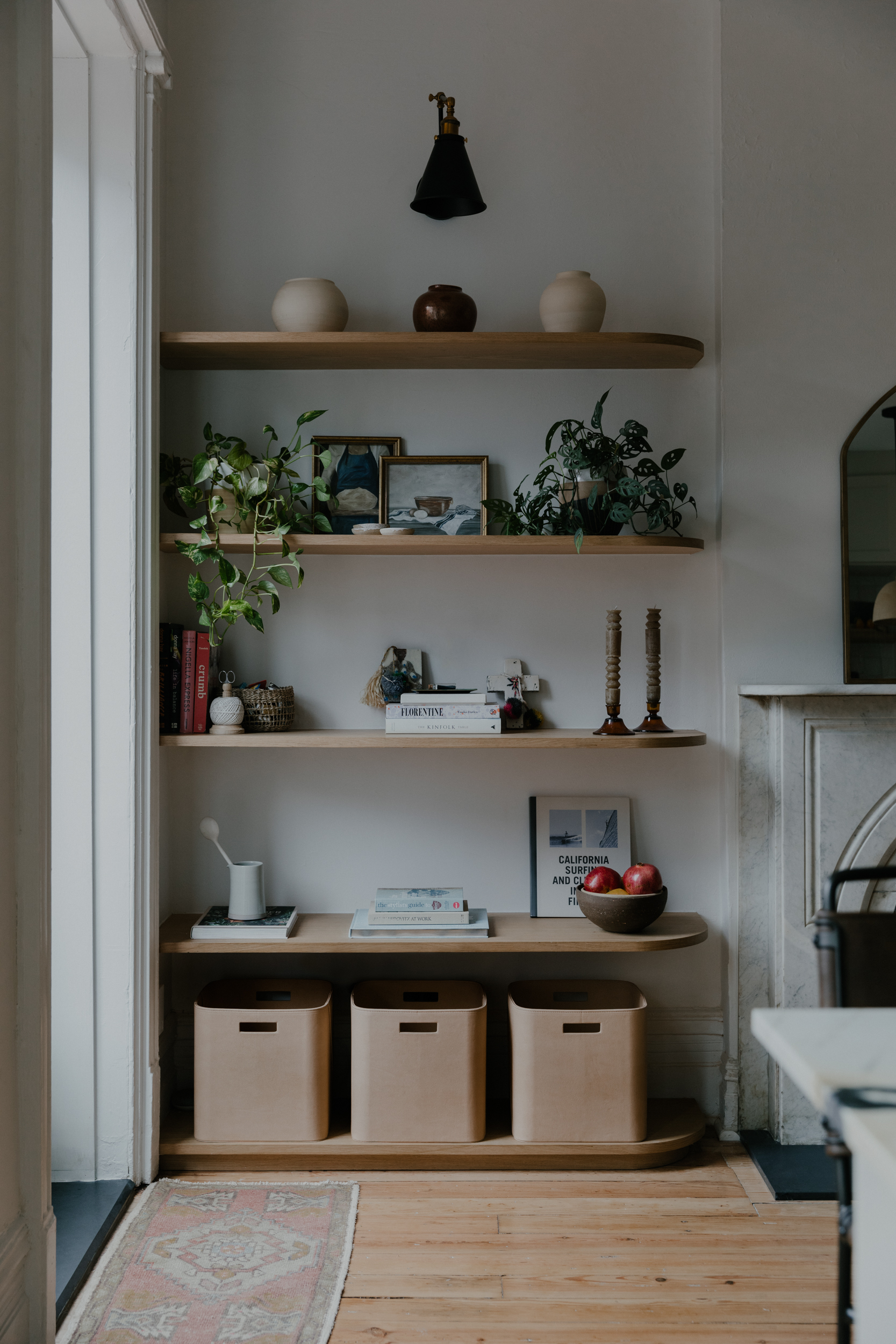
We've certainly seen the rise and fall of the affectionately named 'shelfie'. What was once a cute social media trend gaining traction across Instagram and TikTok is now feeling a bit overdone. And let's face it, they've never been the most practical storage solution. 'The overloaded floating shelves disrupt the clean, simple lines preferred in current interior design styles,' says Artem.
Another issue that the designers take with the floating shelf aesthetic, is that the shelves are hogging the wall. 'Floating shelves are great if homes are sparsely furnished and occupants are prepared to regularly curate their spaces, but finding alternative storage ideas leave walls open for art and accent finishes often offers up a cleaner aesthetic and more contemporary look,' says Sarah Ebner founder of California-based architecture and design firm, See Arch.
When it comes to shelving, if in doubt, take the less is more approach, advises Sarah. You don’t want lots of items on your shelves, overcrowding the space and making it feel smaller than it actually is. 'Less is more, we live by this sentiment and encourage our clients to do the same. Fewer things mean less space needed for storage, and when storage is necessary we encourage separate, practical closet spaces over bulky built-ins that may weigh a space down as visual clutter.'
5. Storage ladders
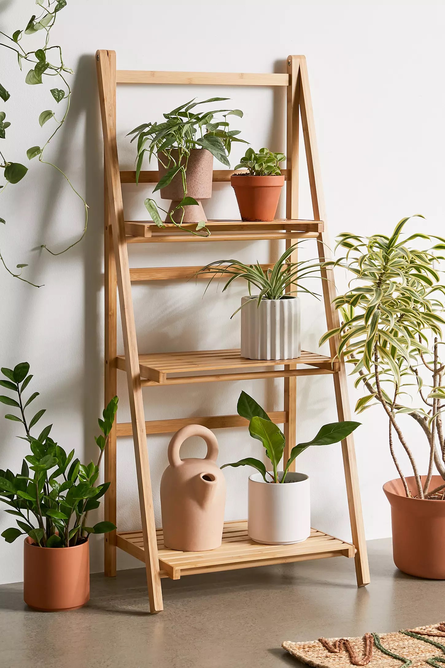
There was a period when the humble ladder was used in the home as an aesthetic tool that also provided storage, but in my experience, they are surfaces that just accumulate clutter, and take up valuable space. This means they should be banished from the living area, especially if you have a small living room.
'Ladders used for storing blankets are definitely outdated,' says Ashley. 'A great solution for displaying a few throws that match your home’s decor but not practical if you have a larger collection of mismatched blankets. Instead, try an oversized basket.'


