In interiors, as in fashion, the trend cycle is relentless. Things fall out of fashion, popular styles become antiquated, color schemes start feeling tired. And, of course, patterns become dated. We need only look at the psychedelic swirls of the '70s or the damask curtains of the '90s to know that.
Of course, if you're using pattern in a smaller way through accessories, it's easy and relatively cheap to refresh your scheme when something falls out of favor. But when it comes to investing in bigger pieces – a patterned sofa for your living room, for example, or new curtains – it pays to be aware of what's actually timeless, and therefore worth your money, and what's going to date.
To find out which patterns we should be avoiding right now, we spoke to interior designers who were more than happy to spill their opinions on the interior design trends that are passé right now – as well as which patterns they'd use instead for a future-proof scheme.
Which patterns will date your home?
There's a fine line between patterns that are timeless and patterns that date, and it all comes down to trendiness, says Yoselin Castro, senior interior designer at Phoenix practice Mackenzie Collier Interiors.
‘Patterns that tend to date a home are ever-changing and it’s never going to be one specific pattern or color trend,' she explains. 'They are typically those that tend to be trending one moment and so including them in a current remodel seems like the right thing to do – only to then realize three to five years down the line that you are tired of looking at that pattern.’
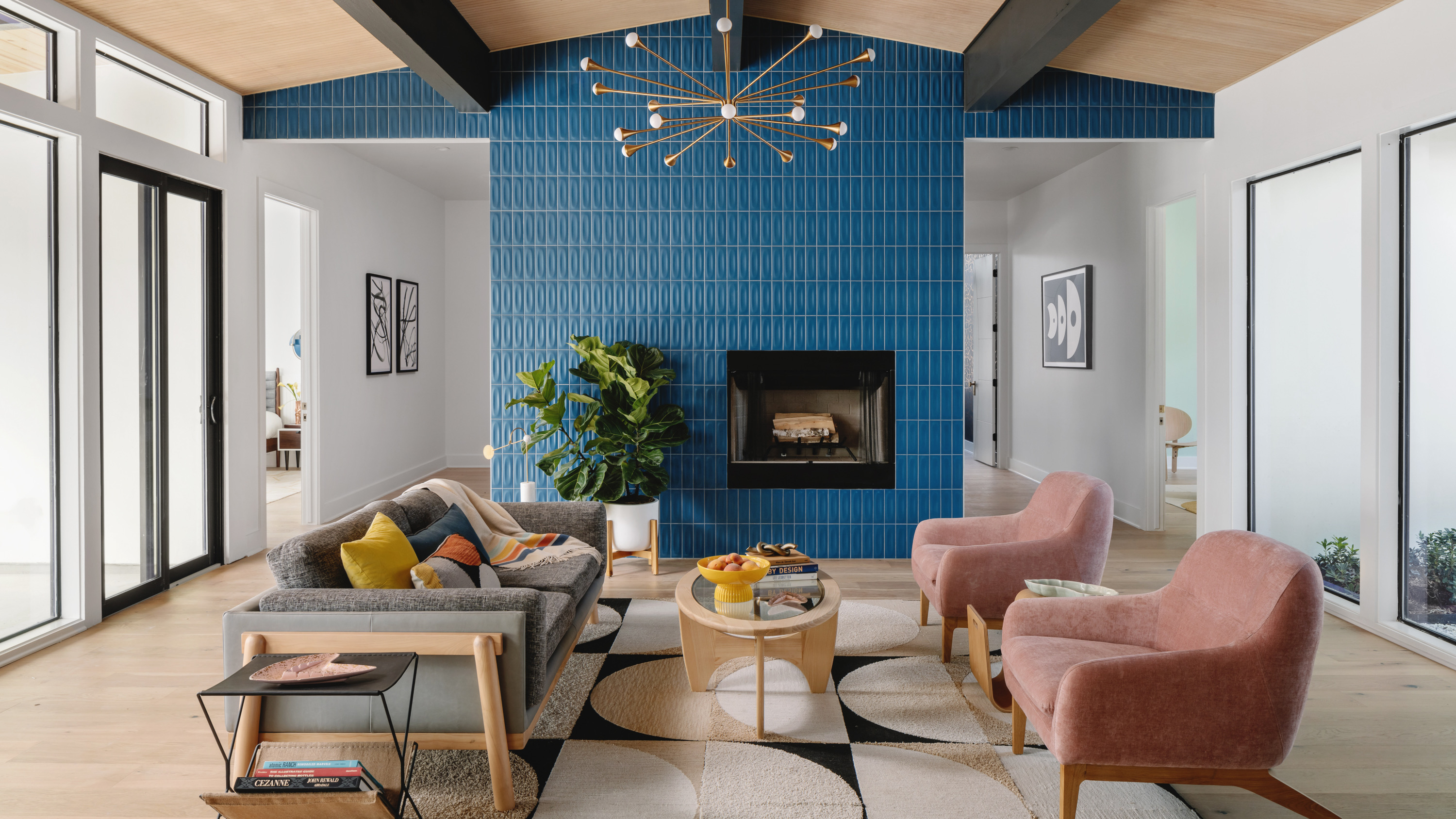
Then there's the fact that mixing patterns can add an immediate contemporary edge to a scheme – as the above living room by Breathe Design Studio shows. ‘In general when using patterns, I think it’s important to think outside of the box and bring joy to the process – mix them (but be sensitive to their scale), be open to using ones that you never thought you’d like, and see where different color combinations and styles take you,’ says Nick Spain, founder of multidisciplinary design studio Arthur's. ‘It also helps to approach selecting a pattern by not being so literal – think about the feeling you want a pattern to evoke first, and then back your way into it.’
Of the interior designers we spoke to, all had their own opinions about which patterns date a home – but, here are the five that kept cropping up.
1. Florals
Before you balk at the very suggestion, let us explain: designers aren't doing away with florals altogether, but they are moving away from certain types of print that feel a little tired. ‘For the last few years we have seen an explosion of William Morris-inspired floral patterns everywhere, on wallpaper and textiles,’ explains Kirsten Blazek, principal designer at A1000xBetter.
‘While the 1970s have returned to the fashion scene, it doesn't imply you must reintroduce your grandmother's flowery wallpaper,’ adds Artem Kropovinsky, founder of Arsight, an interior design studio based in New York. ‘If you appreciate flowers, incorporate them in a contemporary manner, like adorning a vase or a cozy blanket.’
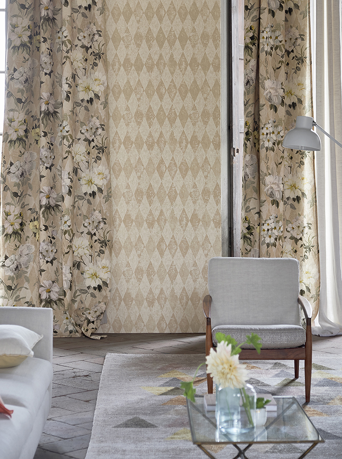
What to use instead: pattern on pattern.
The good news is you can keep your beloved florals – just introduce another pattern in the mix for a cool contrast. ‘We really like florals for pattern mixing,' adds Kirsten Blazek. 'I am seeing a move away from rooms that are all floral and have more of a mix of floral with a grounding geometric or tribal inspired pattern.' Geometrics in particular will naturally offset the softness of a floral. 'We also like to use stripes – they are a great way to balance a more whimsical pattern.’ Luckily, florals are the number one patterns that go with stripes in our opinion.
2. Trellis and lattice
Trellis and lattice patterns have long been in rotation, and are particularly popular as an outdoor furniture trend – but no more, say designers. ‘Quatrefoil and trellis patterns, which were everywhere the past few years, are moving out of rotation for most designers,’ says Jerad Gardemal, principal of JF Gardemal Designs in Baton Rouge, Louisiana.
Los Angeles-based designer Victoria Holly agrees. ‘We're seeing a move away from high-contrast patterns such as Moroccan trellis or lattice prints, which feel very reminiscent of the early 2000s,’ she says.
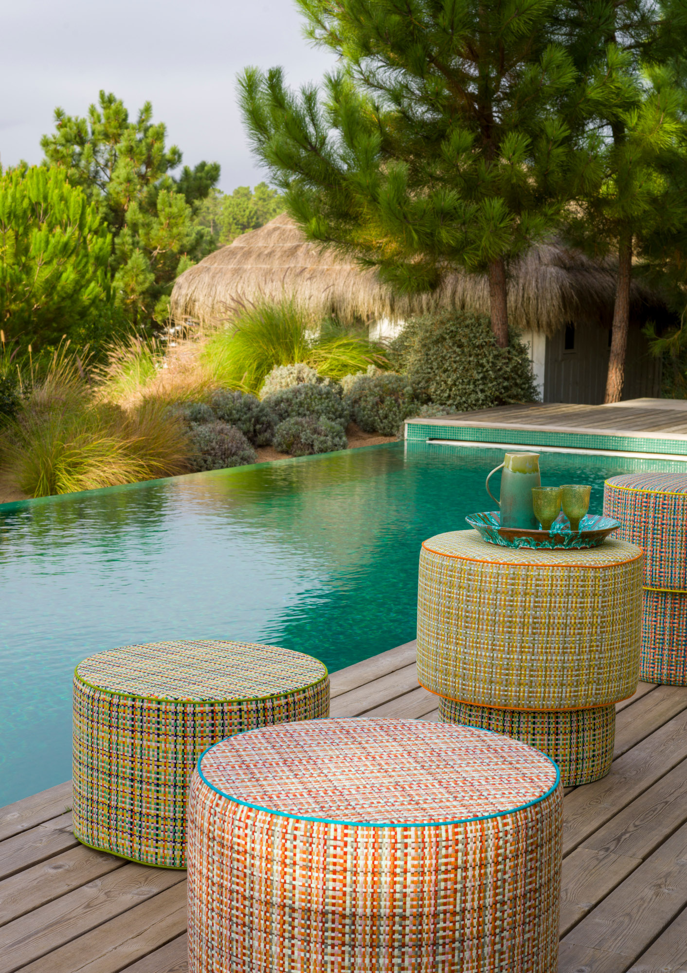
What to use instead: texture.
Part of the appeal of a trellis pattern is their intricacy – but designers have other ways of creating this kind of interest in a scheme. ‘Adding visual interest without patterns can be achieved through texture,’ says Artem Kropovinsky. ‘Experiment with textured fabrics like velvet or linen, or incorporate accessories with unique textures, such as a woven basket or metal sculpture.’
‘There's been a movement towards utilizing thicker and heavier textures such as boucles and weaves that aren't one color but multi-thread,’ agrees Victoria Holly. ‘It allows clients to add color without committing to one specific bold color.’
3. Tropical prints
Does this one come as a surprise? Tropical prints were everywhere just a few years ago – but they've fallen foul to the trend cycle Yoselin Castro explained earlier. It's a view shared by Nick Spain. ‘Personally, I think the patterns that date your home are ones that were selected to follow trends and not because they work contextually in a space,’ he says.
Banana leaf print is his example. ‘In the late aughts to early 2010s, tropical banana leaf prints were being used all over the place in a way that instantly dates a space to me, mainly because oftentimes they don’t feel like they really belong there. If you’ve got an oceanfront home in Palm Beach, then maybe a banana leaf print isn’t half bad, but I’m not sure it belongs in a suburban home in Connecticut.’
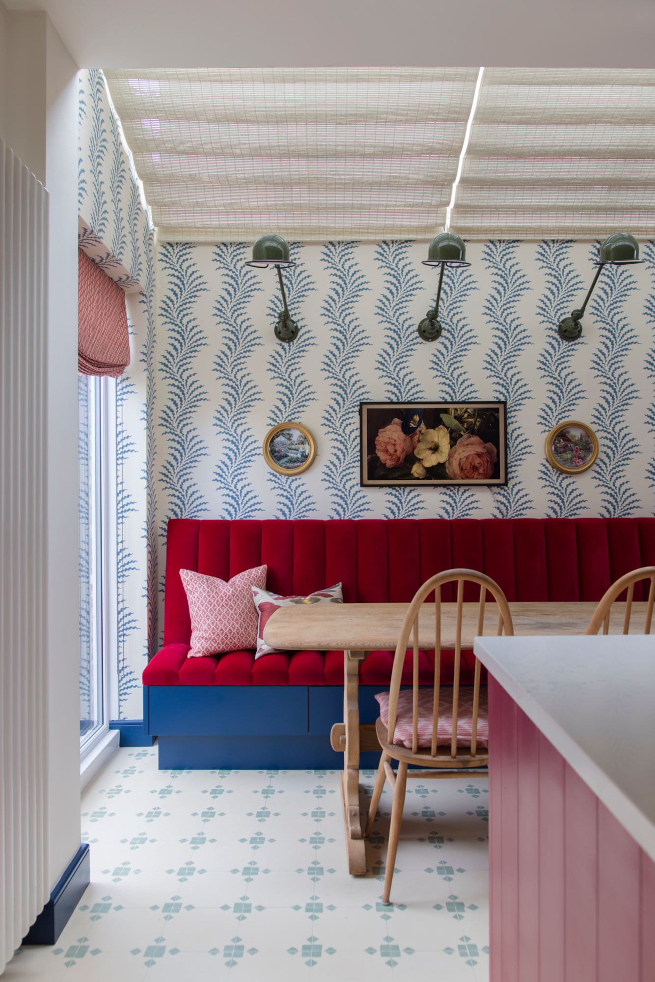
What to use instead: organic patterns and prints.
If you enjoyed tropical prints, chances are you're a fan of a bold interior scheme. If so, look to abstract patterns to create a similar maximalism, or employ organic, nature-inspired prints – like Soane Britain's Classic Scrolling Fern Frond, used in this kitchen-diner by Brooke Copp-Barton.
If your taste is more minimalist these days, look to the more subtle side of the great outdoors. ‘Use patterns found in nature – for example, hides or marble veining,’ says Victoria Jones of Colorado’s Studio James. ‘This is especially important when working in large rooms where a fussy fabric pattern will feel out of proportion.’
4. Chevron
Although it's still a widely used pattern, the uniformity of chevron can feel a little out of date – and it's not helped by its strong association with the 1970s. ‘Chevron pattern was once a designer darling,’ says Allison Garrison of Seattle-based Allito Spaces. ‘Now it’s definitely feeling dated.’
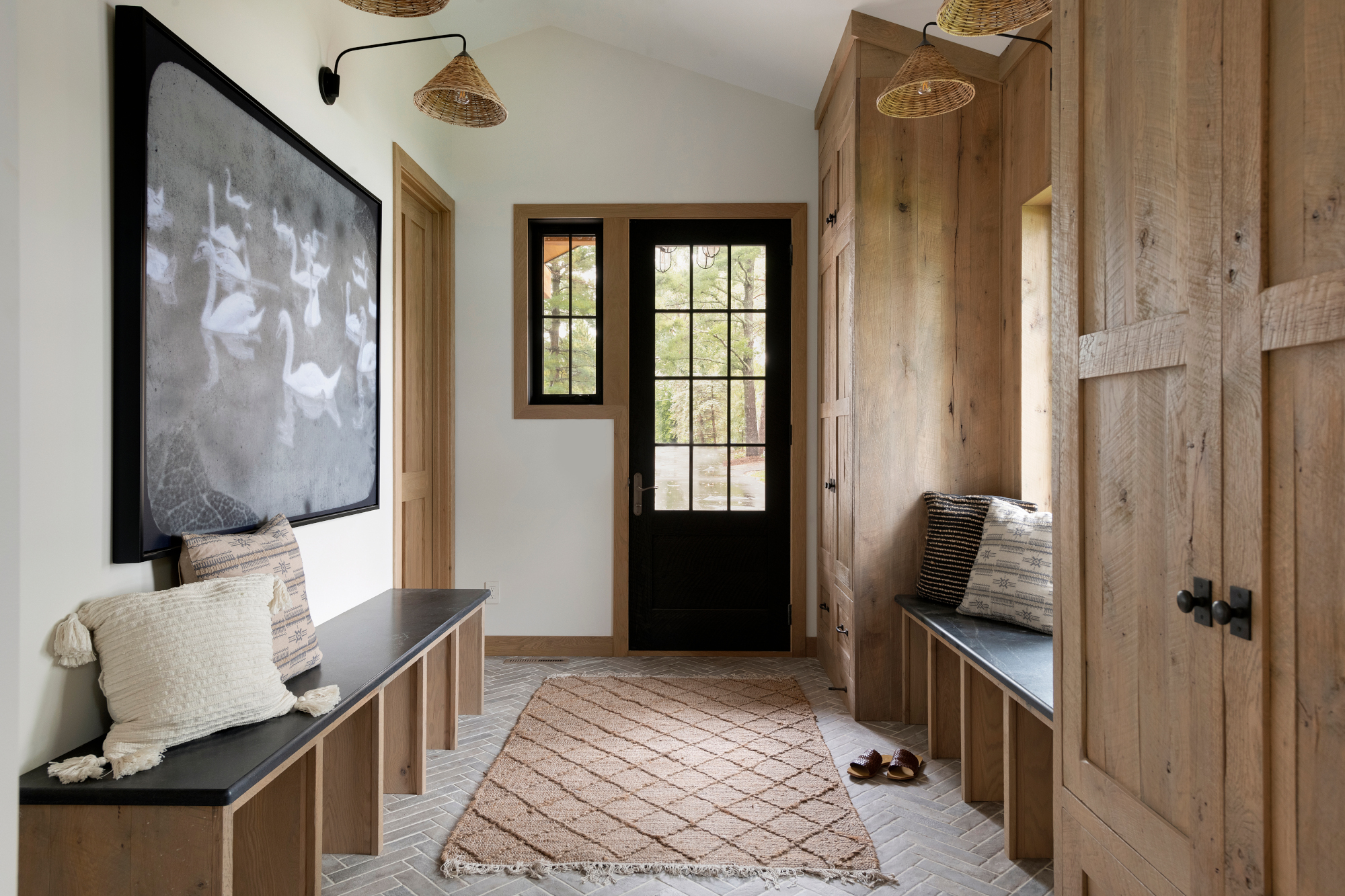
What to use instead: Herringbone
As far as enduring patterns go, herringbone is up there – and its subtlety makes it an easy swap for chevron, as demonstrated by the hallway floor in this scheme by Tays & Co.
'Herringbone is a much better choice,' says Chicago interior designer Elizabeth Drake. 'It’s the epitome of “old school is the new black" – and a far more timeless pattern than chevron.'
5. Plaid
‘Plaid is another timeless design that might make a space feel dated,’ says Artem Kropovinsky. Still, he doesn't necessarily think we should rule it out – instead, we need to rethink how we use it. ‘Experiment with plaid in unconventional ways, such as on a headboard or decorative cushions,’ he adds.
‘Here in Colorado, entire homes are consumed in plaid,’ agrees Victoria Jones. ‘You’re far better off using a Pendleton pattern for a fresher, less themey way of getting your check fix.’
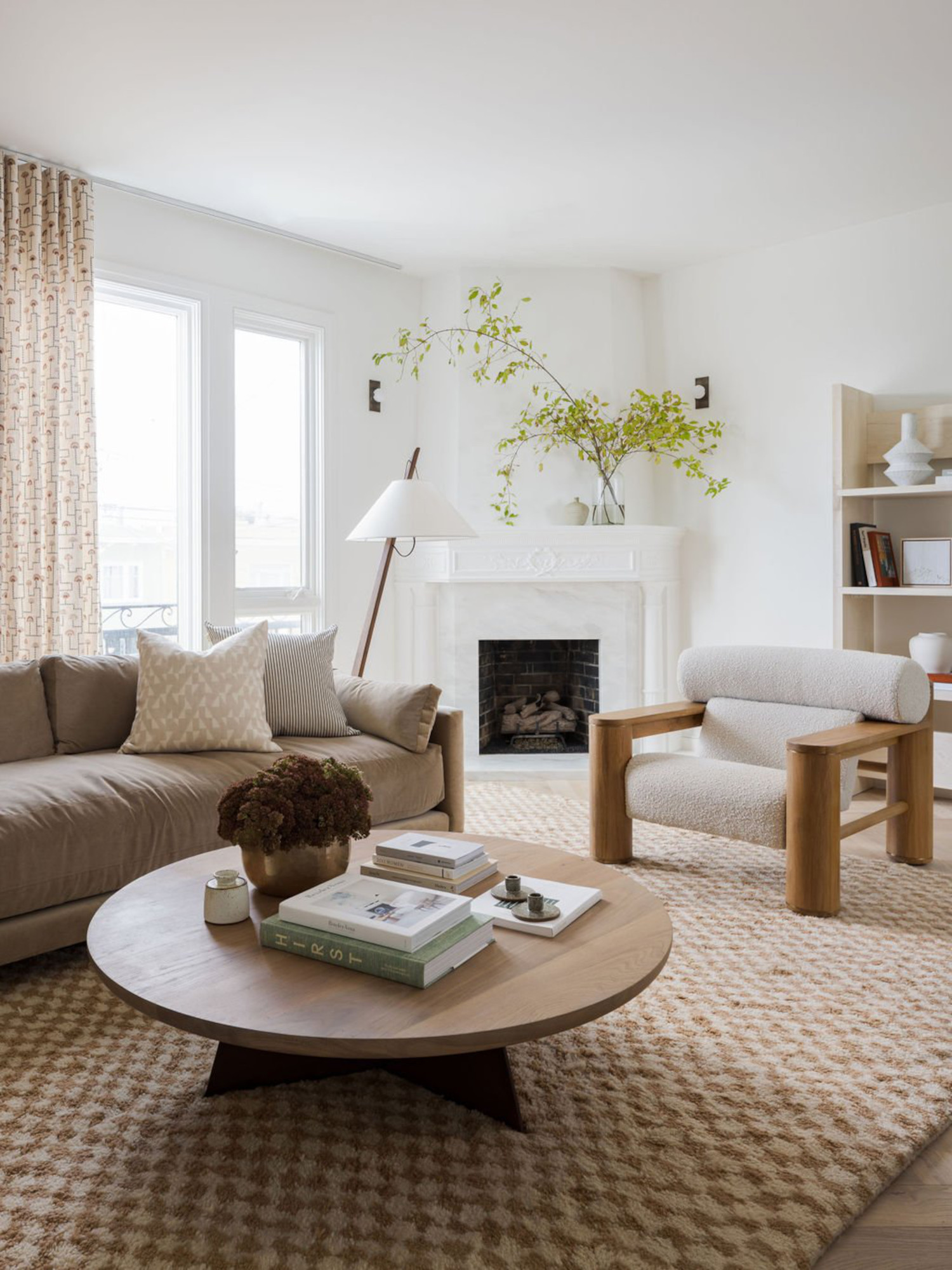
What to use instead: a twist on checks.
We've all seen the rise and rise of the bold checkerboard pattern over the last couple of years – but checks in all their forms are a great alternative to plaid. Try a line-drawn check pattern, like in Victoria Holly's lounge scheme, or opt for a more subtle rug, as seen in this living room design by Katie Monkhouse.
Alternatively, inject freshness into a check by adding a twist. ‘Take a super classic pattern like checks and opt for an unexpected color like bright grass green,’ says Elizabeth Drake. ‘It is guaranteed to feel fresh and will withstand future trends.’


