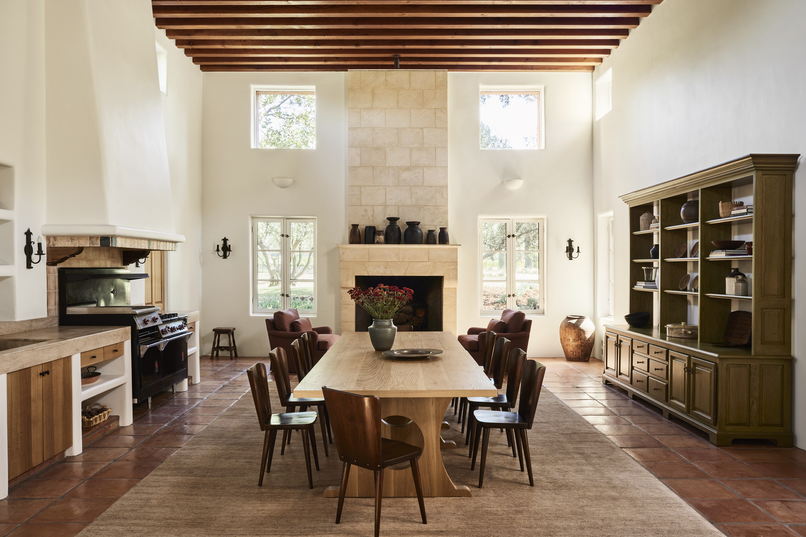
The Grassinis were looking for the perfect family home that reflected their European roots when they stumbled upon La Tarantella, the pink Tuscan-style home surrounded by the lush vineyards and olive trees of California's Santa Ynez Valley. Enlisting the help of Corinne Mathern Interiors, the next step was to create a space that had a soothing feeling in every room.
'The clients wanted the property to have a calming feel the moment a guest enters,' explains Corinne. 'The aesthetic brief was a designer’s dream - "design an elegant and modern home that is welcoming and warm”.' Corinne was able to take that brief and run with it, achieving that coveted calming feeling using a rustic palette of creams, browns, russet reds, oranges and - crucially - pink. The outside walls of the home are drenched with a pink plaster that contrasts elegantly with the green of the surrounding landscape. Inside, the pink terracotta tile floors bring a dewy light to every room. To pinpoint exactly how Corinne mastered this rustic color palette, I spoke to the designer.
1. The perfect base
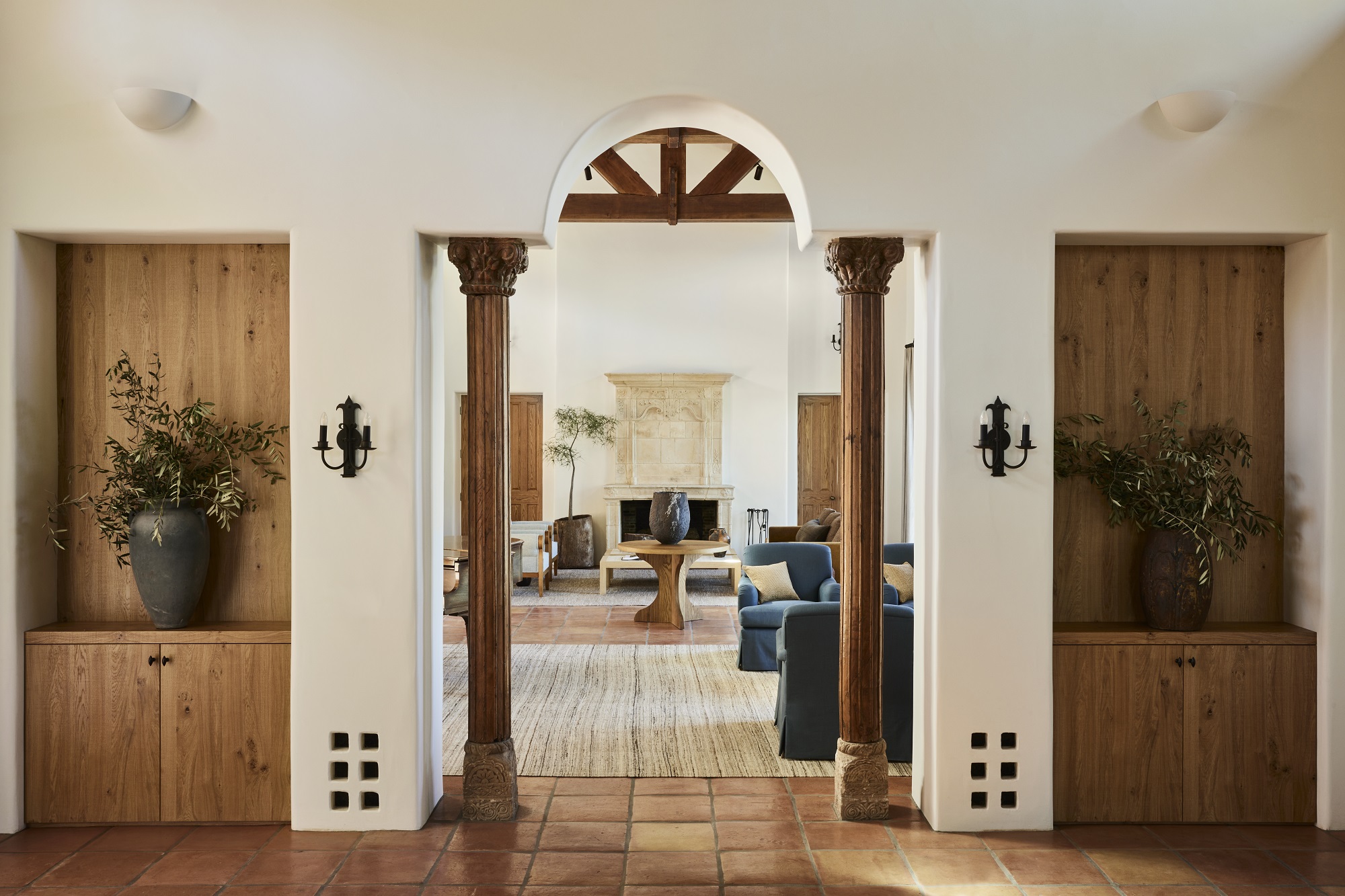
The perfect foundation for La Tarantella's rustic color palette is the off-white paint color chosen for the walls by Corinne Mathern and her team. 'As a studio, we always approach a natural palette to extend a grounded element to the properties we work on,' says Corinne.
To achieve this, Benjamin Moore's Swiss Coffee adorns the walls of every room of the home. This allows the decor and furniture to drive the color scheme. By contrast, there is one cozy living room in the home where Corinne decided to go for a dark lick of paint on the walls instead, opting for a moody, monochromatic color scheme using Benjamin Moore's Temptation.
2. The mix of materials
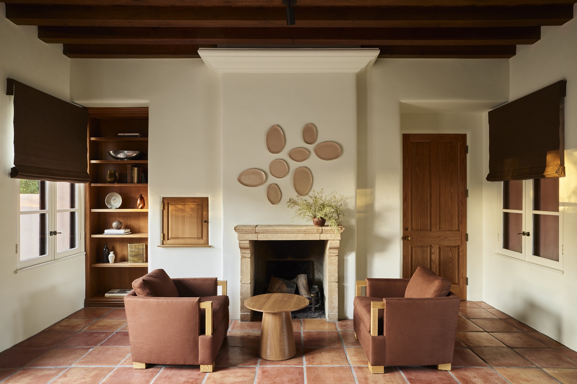
Material is another element that adds richness to the color palette. Wood plays a vital contribution to the scheme. The 16-foot-high beamed cedar ceilings in the living room, the clerestory windows the Douglas fir and the cedar beams in the lounge create an incredible labyrinth of architecture that has a distinct European flair.
The team worked with stain-grade oak throughout to bring the natural element of wood throughout the house. 'To play off of the wood tones throughout the property, we brought in chocolate browns, deep rusts, tans, and creams.'
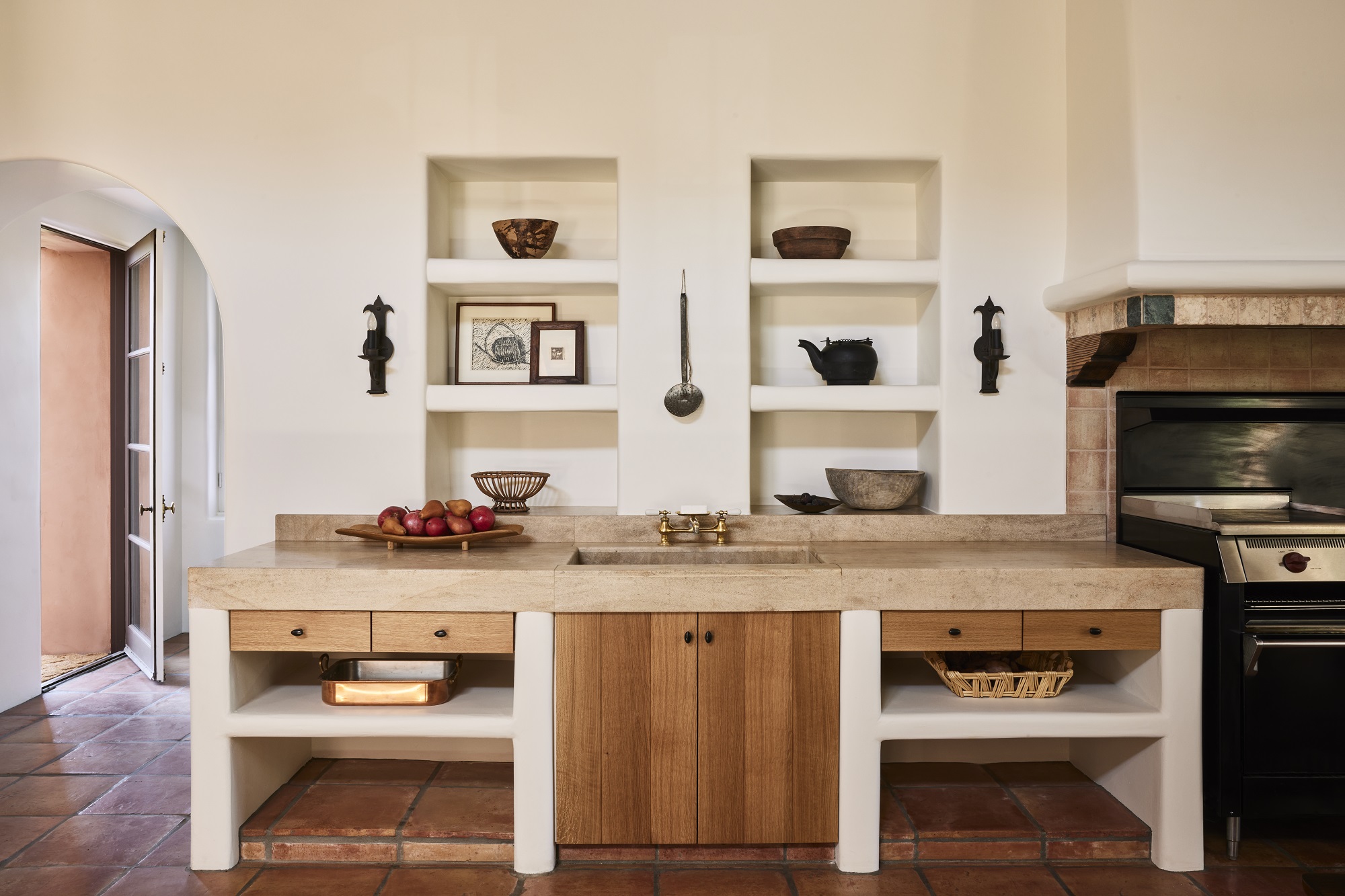
The large format Saltillo tile floor also contributes with its sun-baked pink hue. Original to the home, they act as a crucial part of the villa's color palette. 'It’s not easy to work with a big pink floor but we embraced it and were very happy with the results,' says Corinne. 'We covered the floors in expansive wool rugs to calm down the pink of the original floors in some rooms.'
The team added to the existing limestone palette on the fireplaces by bringing in a custom white travertine table and dark grey travertine details. 'Two tables were fabricated with handmade tiles to create an earthiness on the table tops 'to complement the wine that would be served,' says Corinne.
3. The Decorative touches
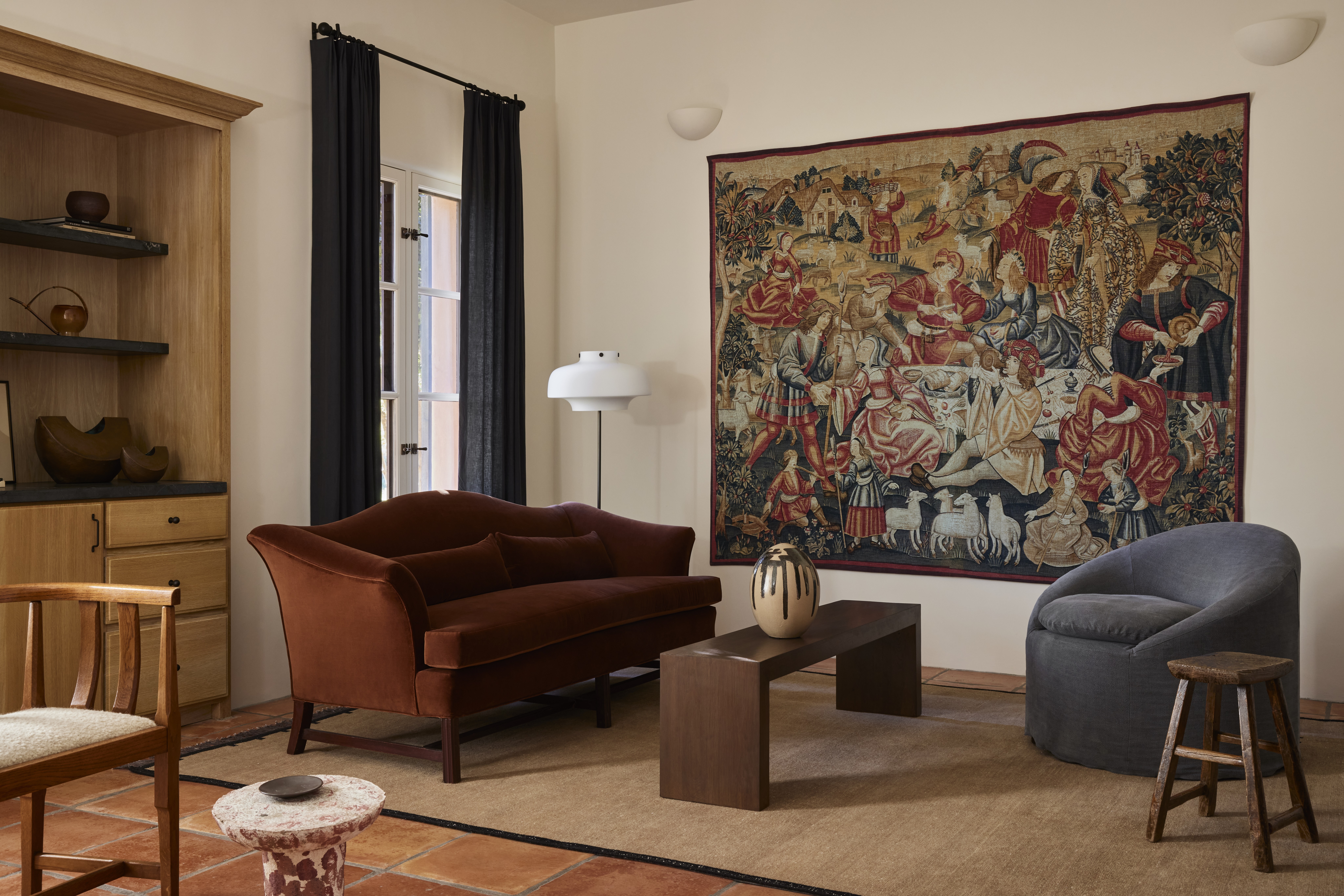
Decor and furniture also reinforce the earthy color palette, with 90 percent vintage and custom pieces furnishing the home. 'The original owners had embedded vintage European architectural elements into the property when it was first built,' says Corinne. 'Our clients wanted us to expand on that by selecting vintage furniture with a story and to create custom pieces that could speak to the solidity of the property and its history.'
Highlights include the vintage green cabinet in the open-plan dining room, the fireplace surrounds, (imported from France), and the 18th-century vintage Göran Malmvall pine chairs. 'All upholstery was muted, textural and colors were of the earth,' adds Corinne.
4. The Open plan and double height layout

The way the home plays with natural light is also key to the color palette, helping the space feel airy and bright. The main room is a dining room, living room, and kitchen all rolled into one, yet it feels open and communal. The double layer of windows is original and the light that filters into the interiors is incredible, giving it a soft, calming feel.
'These features were a part of the original architecture of the property and were necessary to keep in place to create the welcoming, open dining space that the Grassinis wanted.'
5. The exterior
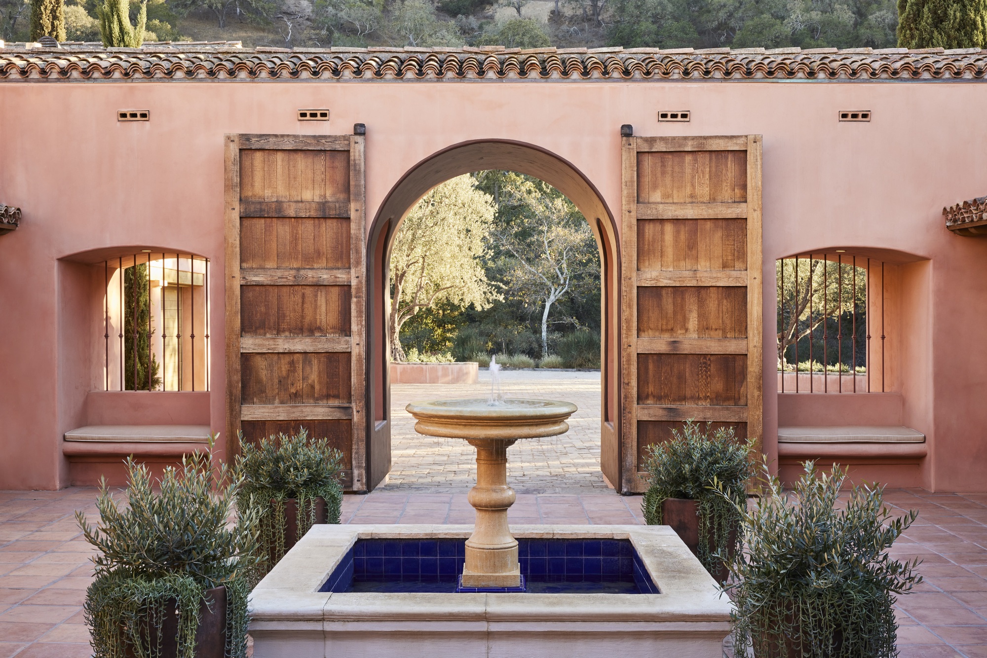
Making a statement in a plaster pink with bold green shutters (and a courtyard with a French limestone bird bath to boot), the exterior of La Tarantella vineyard perfectly marries with the surrounding landscape of lush vineyards and olive groves.
'The exterior of the property is a terracotta-colored plaster so we wanted to let that color sing and play off its lightheartedness,' says Corinne. 'We specified a deep brown Benjamin Moore paint for the exterior window trim to make the plaster feel more elegant and grounded.'
'We were inspired by the landscape, pulling the exterior hues of the olive trees, vines, and acres of hills into the interior with muted colors including neutrals, sage greens, and dusty blues.'


