When you're designing your kitchen, you likely gravitate towards the traditionally favored layouts. Maybe it's the classic island design, or perhaps a U-shaped layout seems to make the most sense. But every kitchen is different, so why not opt for a more unexpected arrangement?
There are a lot of kitchen layout ideas to consider when you are planning your kitchen design, and it's an easy choice to opt for a layout that is proven to work in a multitude of spaces. But sometimes, creating the best flow in your space can mean leaning away from the status quo and creating something more unique.
The prospect of introducing an unexpected design to your space probably feels daunting, so we've listed a few kitchen layouts you never thought to try, and why designers chose them – and they're less risky than you might think.
5 unexpected kitchen layouts to try
Sometimes, choosing the right layout for your space can mean going against the status quo, and other times it's a case of reimagining classic layouts. These five kitchens prove that a tailor-made layout can be the key to a beautiful kitchen design.
1. Designing an island around a chimney
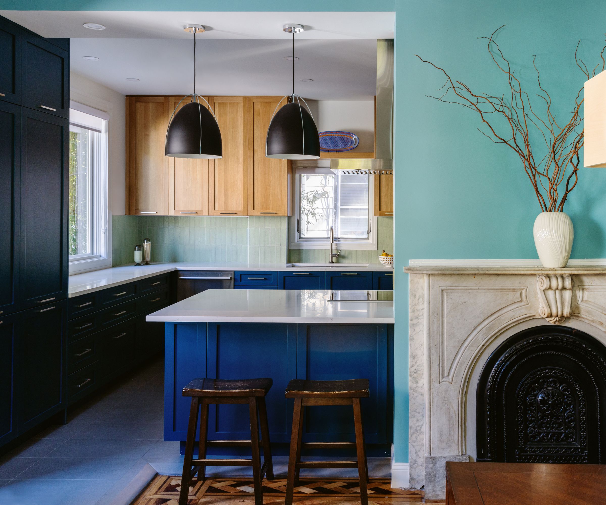
Often when a structural feature is obstructing the natural flow of a kitchen – whether it's a supporting beam or something like a fireplace – it can be tempting to want to either remove it, or completely change the layout to avoid it all together.
However, making the obscure feature a part of your layout, rather than treating it as a hindrance can give your kitchen unique appeal. In this scheme, interior designer Natalie Rebuck, principal designer at Re: Design Architects, created the kitchen island to work around the chimney, rather than removing it.
'I wanted to make the space as open as possible between the kitchen and dining room, so we worked around the chimney and made it the centerpiece of the dining room,' she explains. The result is a space that feels open with an easy flow, but the two spaces still feel like they have their own zones.
2. A wide galley with a dining nook
Kitchen island seating or a formal dining table seems like the obvious and perhaps best way to introduce a seating area to your kitchen. But only having bar stools around your kitchen island isn't ideal when you want to have a formal sit-down meal and to add a dining table, you need a lot of space.
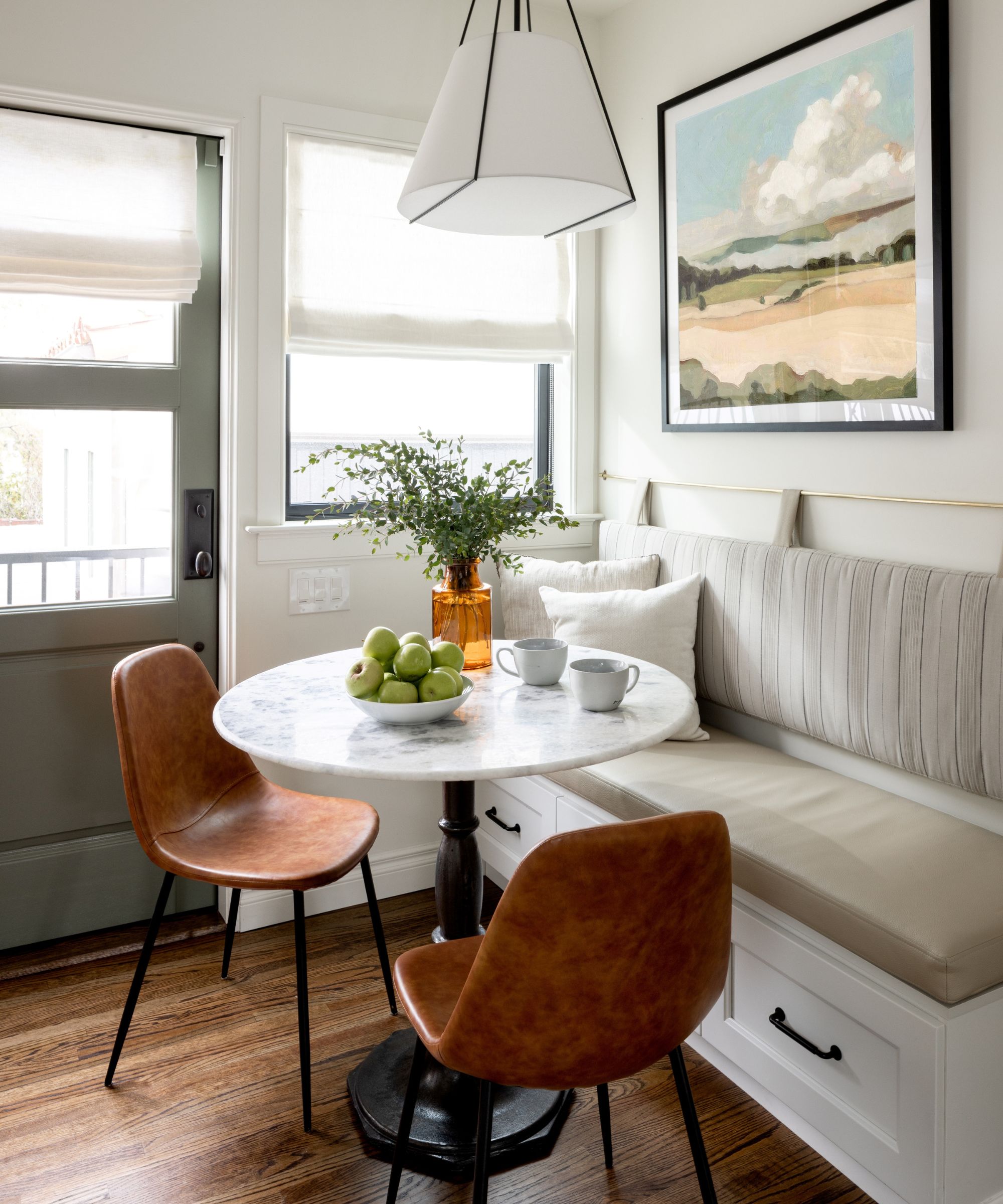
Instead, creating a more cozy, casual dining spot within your kitchen layout not only creates a lovely dining nook but also helps you maximize the functionality of your kitchen if a traditional island isn't the best fit for your scheme.
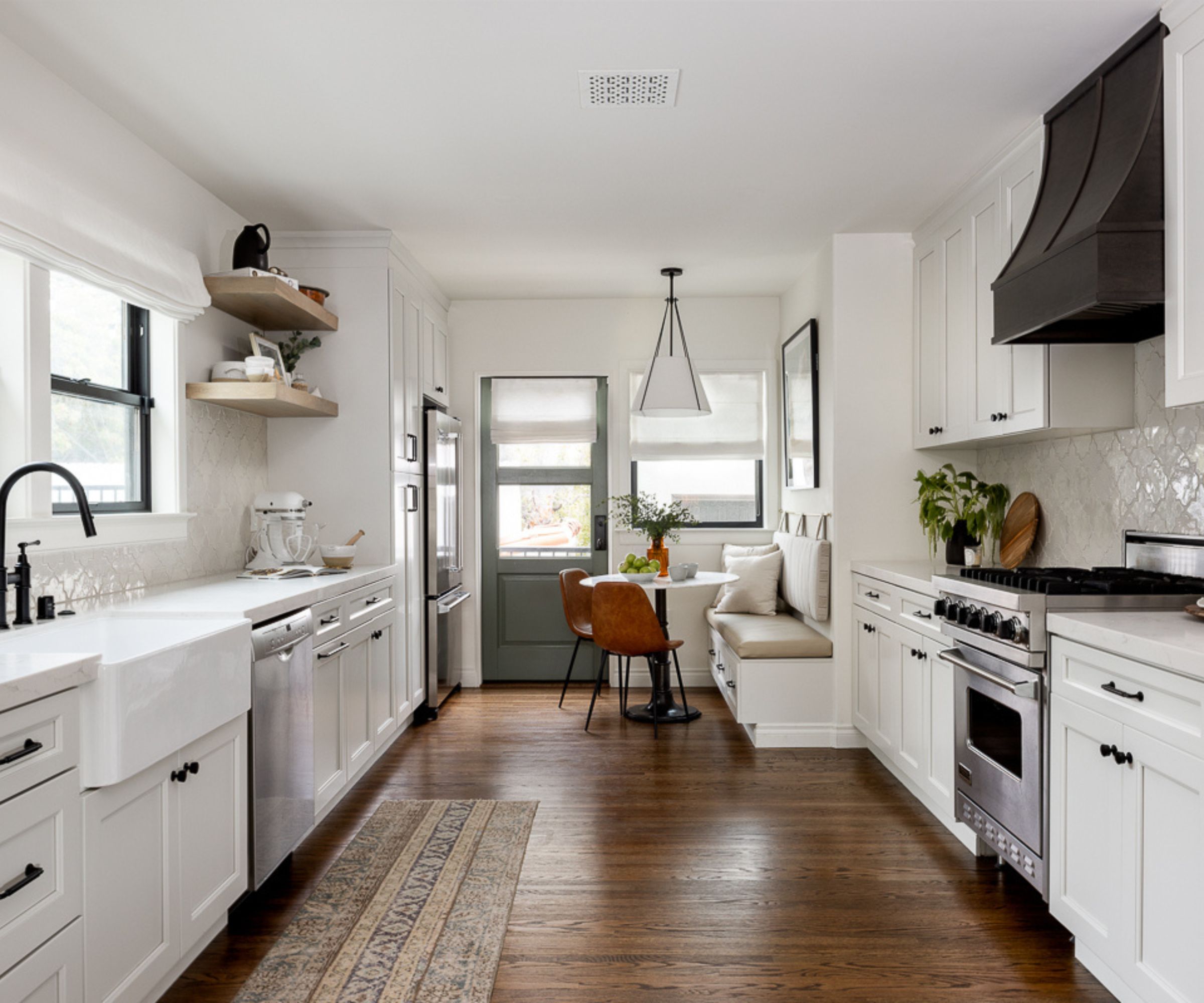
'Oftentimes in historic homes with smaller footprints, we see that modifications have been made through the years to accommodate how people lived at the time of the renovation. For example, in this home, the space we turned into a formal dining room, was previously a home library/sitting room. This meant they had the formal dining area in the kitchen space which made the usable area feel cramped and small,' says Mollie Ranize, founder and lead designer at Dmar Interiors.
'As a way of solving this problem, we removed a pony wall and full-height window in the kitchen and replaced it with a standard-height window so that the wall cabinet could run further into the space. This decision made the footprint of the kitchen larger without moving any real walls,' she explains.
While this wide galley layout doesn't have room for a kitchen island, it has maximized the amount of cabinetry that could be introduced, giving the home owners ample storage, as well as plenty of space to move around and use the kitchen. A new pantry also helped with hidden storage.
'By creating a more functional flow, we were also able to squeeze in a small breakfast nook with a custom banquet. It is a little tight and a little close to the back door, which makes it a bit less obvious of a solution, but it was worth thinking outside the box to pick up a place to do coffee and quick meals with the little ones.'
3. A kitchen with two islands
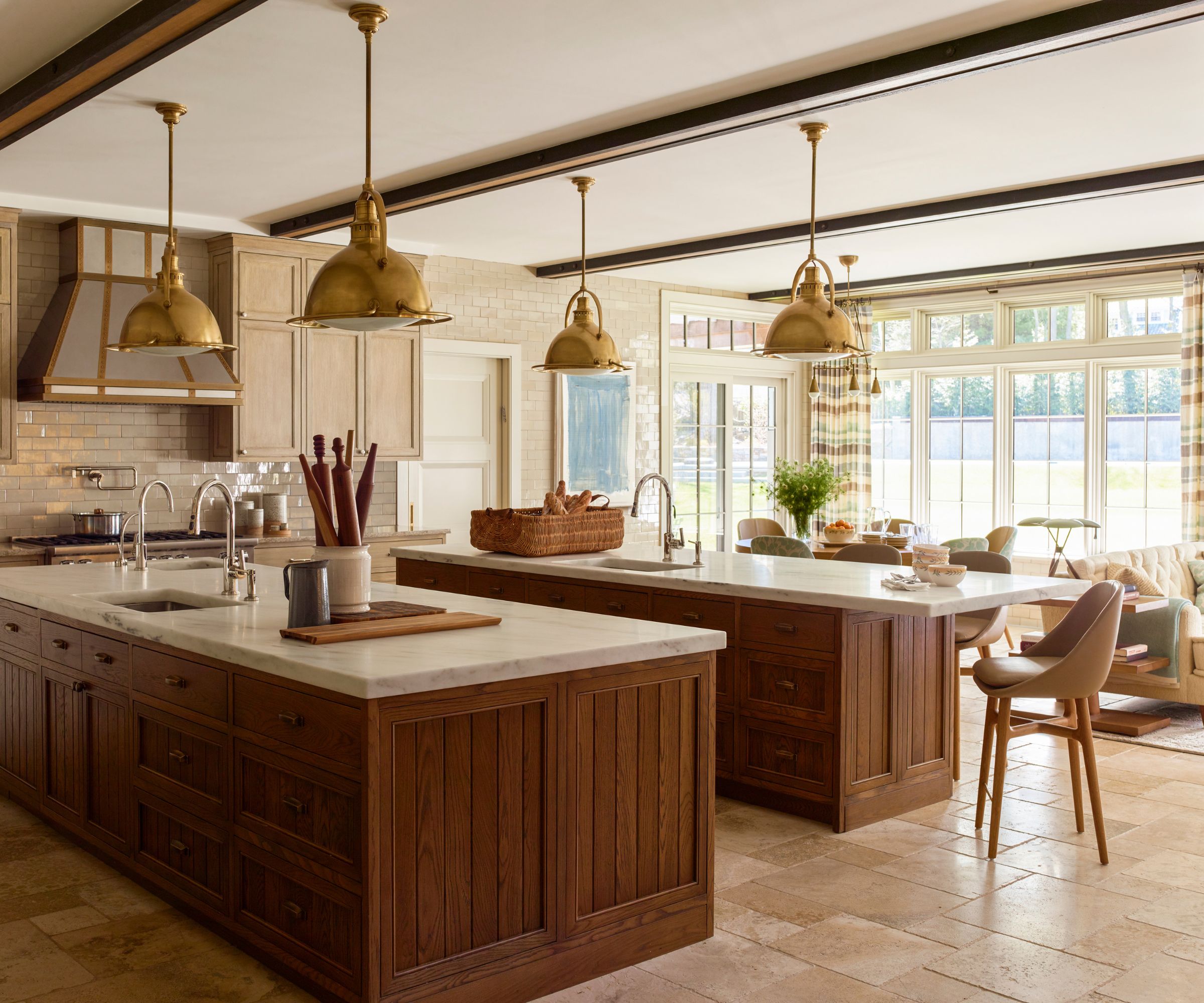
If you benefit from a sprawling kitchen, it might seem like the obvious choice to introduce one expansive kitchen island. And while this does have its benefits – extra storage, surface area, and an abundance of seating space – there may be an alternative layout that works better.
Instead of one extra large island, why not opt for two standard-sized ones? You will still benefit from additional storage and kitchen countertop space, but it will help you to create designated zones.
The back island can be used for food prep and cooking, while the second island can be the social hub with lots of seating. With this layout, you'll actually end up with more useable space, as the center of an extra large island typically goes unused.
4. A galley kitchen with a peninsula island
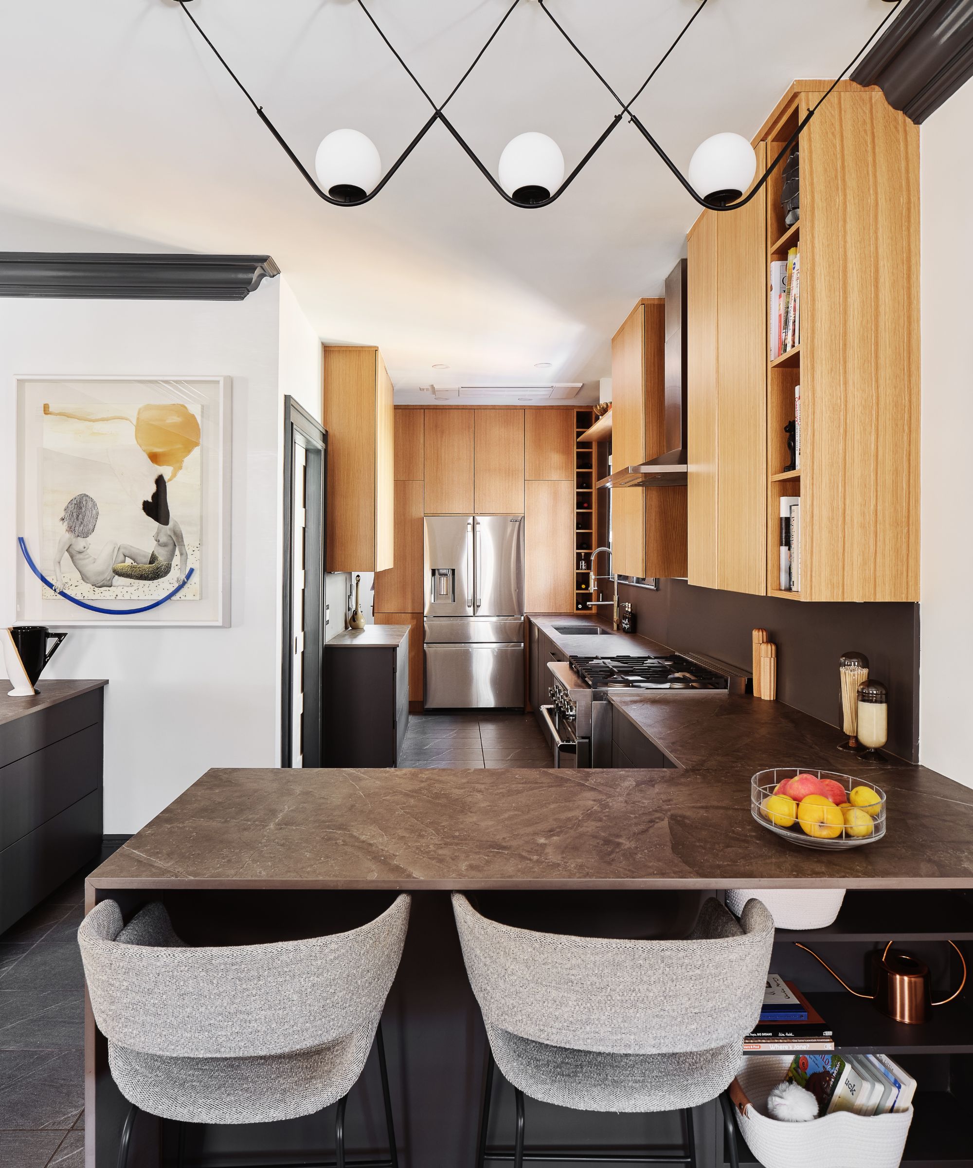
There's no reason you have to stick to one of the classic kitchen layouts. Every space is different, so blending features from a few different tried-and-tested layouts might maximize your space more effectively.
In this kitchen, the space is too narrow for a traditional island, so a galley layout has been blended with a kitchen peninsula island instead. 'Islands are ideal, but not all spaces allow for them. So, in this Brooklyn home I placed the island at the "end" as a seated bar, leaving the rest of the space open,' explains Natalie.
This layout makes the most of the long, narrow kitchen, ensuring there is enough space for the required cabinetry, but still maintaining a more social aspect with the bar-style island. It also creates an unobtrusive visual divide between the cooking space and open-plan living area.
5. A refrigerator used to hide the sink
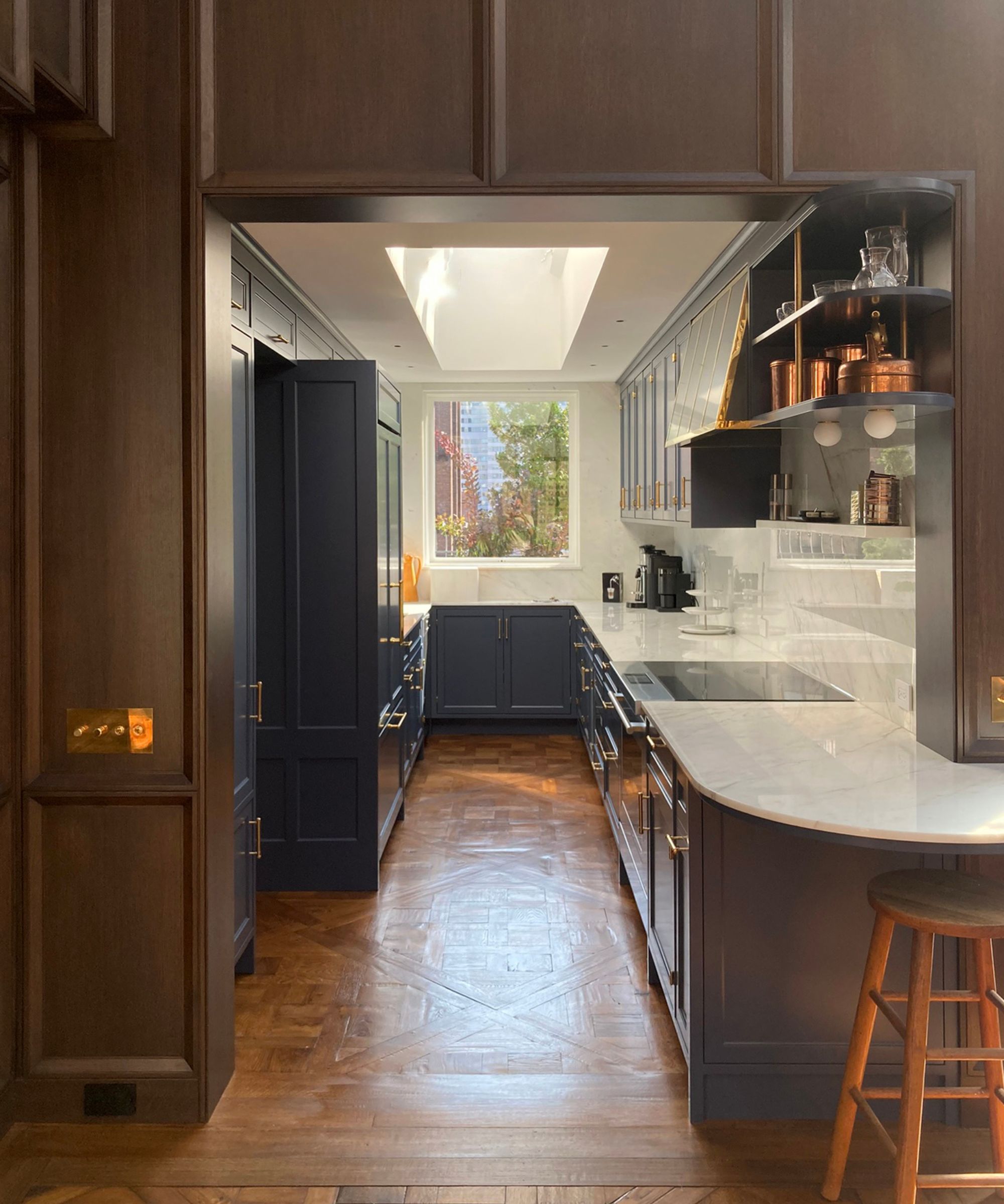
It's not unusual in smaller spaces for the kitchen to form a connection between two rooms, especially if you have a galley kitchen. In these cases, the view of the kitchen from adjoining rooms needs to be visually appealing, so you don't want to be able to see a sink or cluttered counters.
'In this small galley kitchen with openings on three walls and a new open view into a beautiful conservatory dining room, we placed a custom panel-ready refrigerator in the middle to block the view of the sink (and dishes!) from the dining area,' says Andrew Franz, AIA and founder of Andrew Franz Architect.
'To avoid the range being back-to-back with the refrigerator, inhibiting dual activities and blocking traffic, we placed it in the middle of the counter, which is centered on the opposite doorway. This also allowed the kitchen to feel centered and grounded in some existing geometry, and for the upper cabinets to be equally spaced on both sides again, creating a quiet rhythm in an otherwise imbalanced space,' he explains.
While these kitchen layouts might be more unexpected, the spaces they've been used in prove that sometimes choosing something different can be the best choice for your space.


