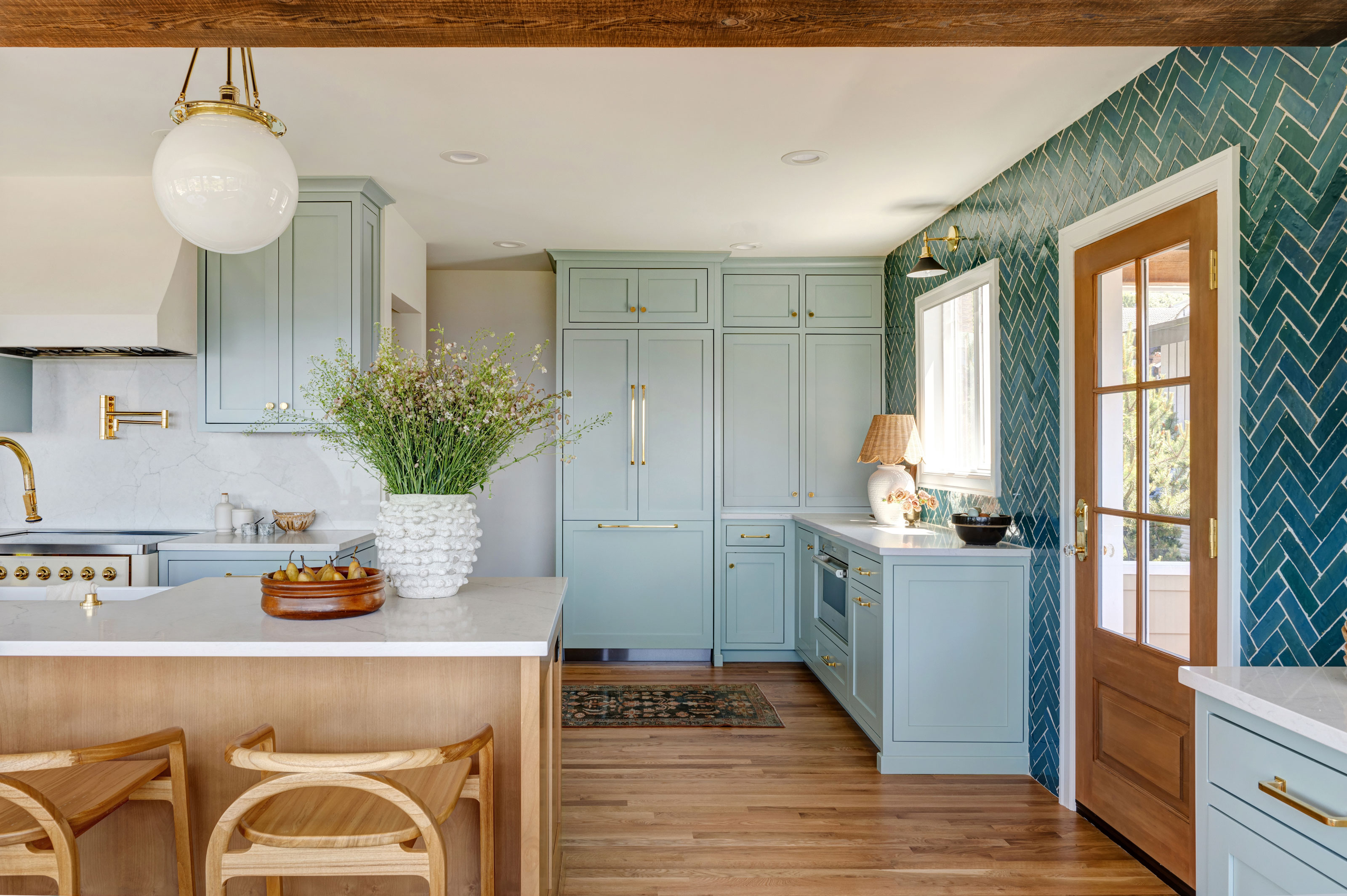
Most of us design lovers aim to make something of a statement when it comes to our kitchens. A beautiful kitchen takes a lot of thought, detailed planning, and decision-making with a view to design a space that you’ll love now, and for a good many more years to come. In terms of style, while faced with several options, it’s nothing compared to the myriad number of colors you’ll have to go through, test and review, before being confident in your final decision.
Let’s face it. The color of your kitchen is not something you can afford to get bored of anytime soon. So, what should you go for? I spoke to interior designers who create beautiful, timeless yet modern kitchens, and they assured me that no matter your taste, there will be a color out there that you’ll stay in love with. And one of them is actually your favourite! From warm neutrals to bold hues, here are the experts’ top picks.
1. Natural green
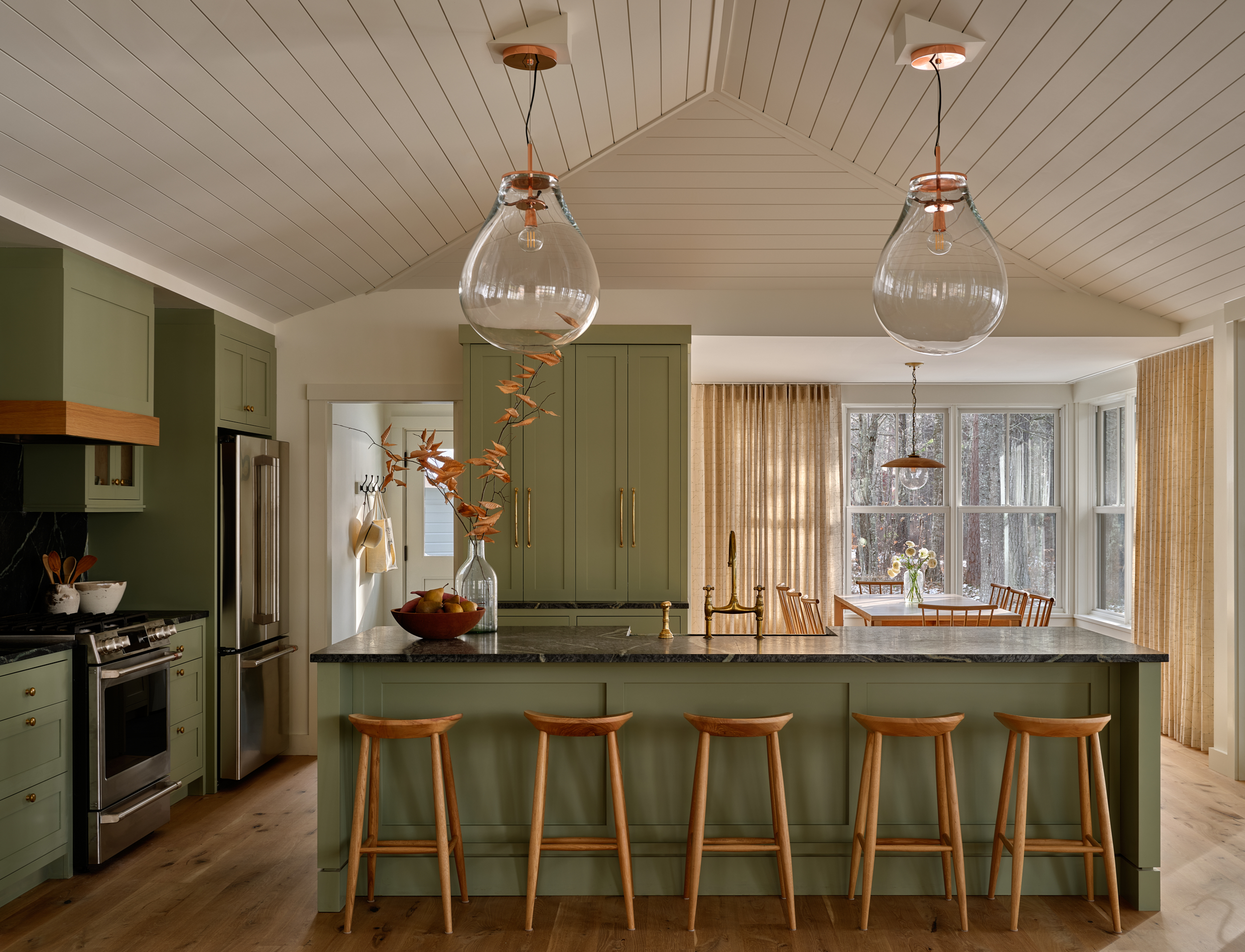
One of the most versatile colors out there, and considered a ‘new neutral’ for many, natural greens have been on designers’ radar for a while and will continue to go strong in 2024. As a color we associate primarily with nature, green has an incredible way of reconnecting us with our surroundings, creating moments of calm and positivity. Thanks to the variety of its different shades, from pale sage to dark forest green, it suits all styles and sizes of kitchens. ‘Green is a timeless choice as it is known for creating a cozy and rejuvenated atmosphere,’ says interior designer Lindsie Davis.
When deciding what tone to pick for your green kitchen, go as natural as possible. Olive green is a stunning color with earthiness and depth that leaves you feeling nourished and full of life, perfect for your culinary hub.
Interior designer Kristen Harrison tells me that Farrow & Ball’s Treron is a stunning grey / green that pairs very well with neutrals, and so is Benjamin Moore’s Raindance. ‘I love when people come to your house and can’t tell what exact color they are looking at. Is it green? Is it blue? Is it grey? This color will adapt depending on the light... a sure way to never go out of style,’ she says. ‘Opt for a darker green, like Sherwin Williams Pewter Green for a bolder vibe, while Benjamin Moore’s Norway Spruce is a go to for a soothing splash of color,’ advises Lindsie, while interior designer Christine Vroom swears by Farrow & Ball’s classic Ball Green.
2. Calming blue

Another one to remind us of nature, the calming attributes of blue are unparalleled in a home, and a blue kitchen will look elegant and timeless. ‘Blue is a classic and one the easiest colors to use as it pairs well with a variety of cabinet styles and colors combinations,’ explains Lindsie. ‘Sherwin Williams Sea Serpent is a great choice when you are looking to add more of a true-blue punch while keeping an overall darker tone. If you’re leaning more towards an English Cottage style kitchen, try Woodlawn Blue by Benjamin Moore,’ Lindsie adds.
If you love a cooler, stonier look that will always look good, Kristen recommends Sherwin Williams’ Grays Harbor, ‘a great slate blue that can give you a lot of drama in your kitchen. Dark cabinets are classic, don’t be fooled you into thinking otherwise,’ she says.
3. Deep black
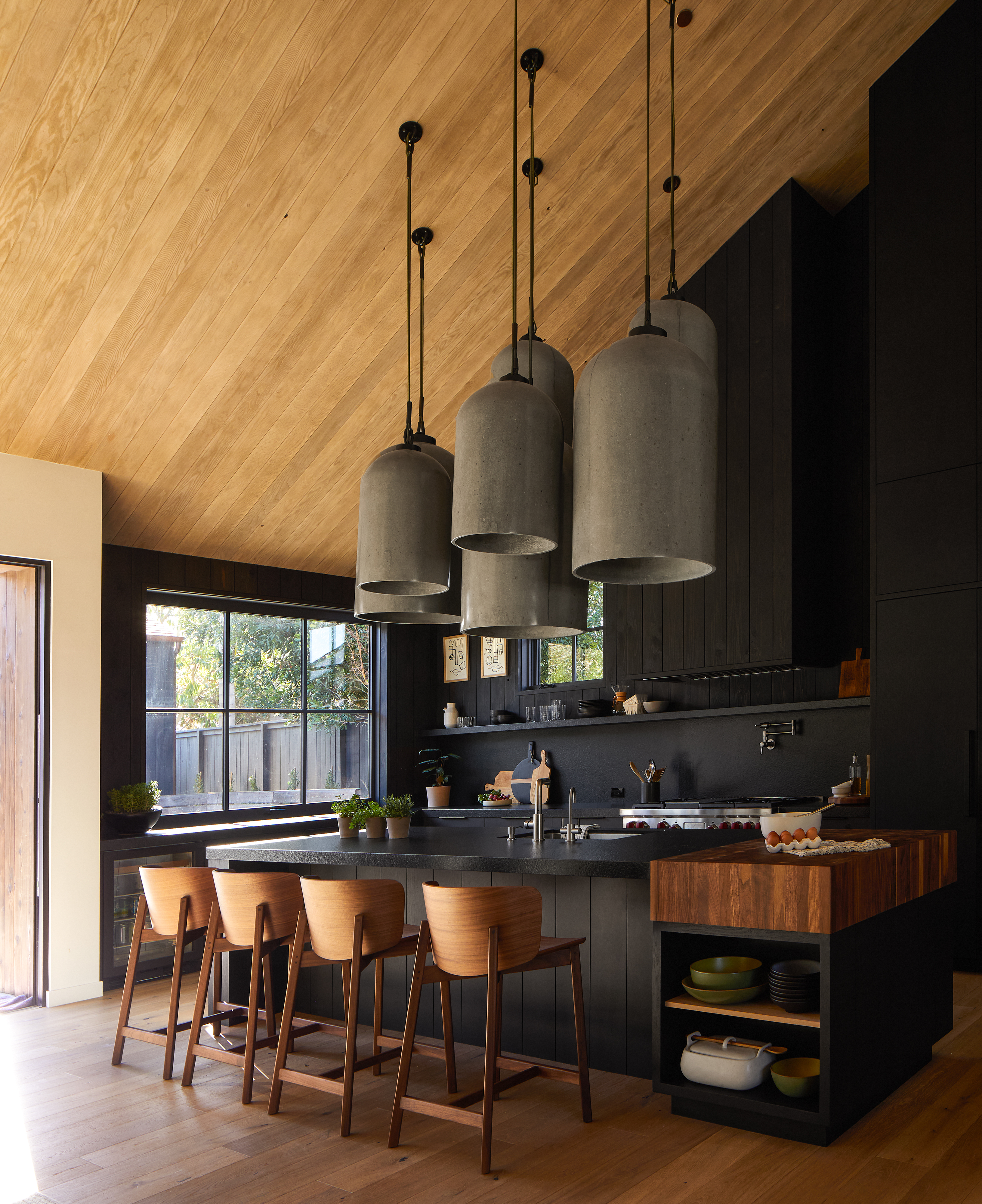
For those who dare, there isn’t a chicer option than a black kitchen. Some might say not the most practical, but if maintained properly, and paired with a beautiful stone kitchen countertop, will it look stunning for years to come? It absolutely will. ‘You can never go wrong with a classic black kitchen. It stands the test of time and tends to never fail,’ Christine tells me, and adds that her go-to is Caviar from Sherwin Williams. While it's a very sophisticated choice, make sure you balance it out to. ‘Black is never out of style, just pair it with warmer accessories so it doesn’t feel like a super villain’s lair,’ advises architect Katherine White of Teass Warren.
When choosing your tone, if a pure black sounds a bit much, then think more along the lines of kitchens with dark cabinets in a deep charcoal, to achieve a similar effect. ‘Deep, almost black charcoal tones will always be a favorite pairing for a modern, sophisticated look,’ explains Lindsie. ‘Iron Ore by Sherwin Williams is a go to when creating contrast with lighter cabinetry as well as wood,’ she adds.
4. Warm neutral
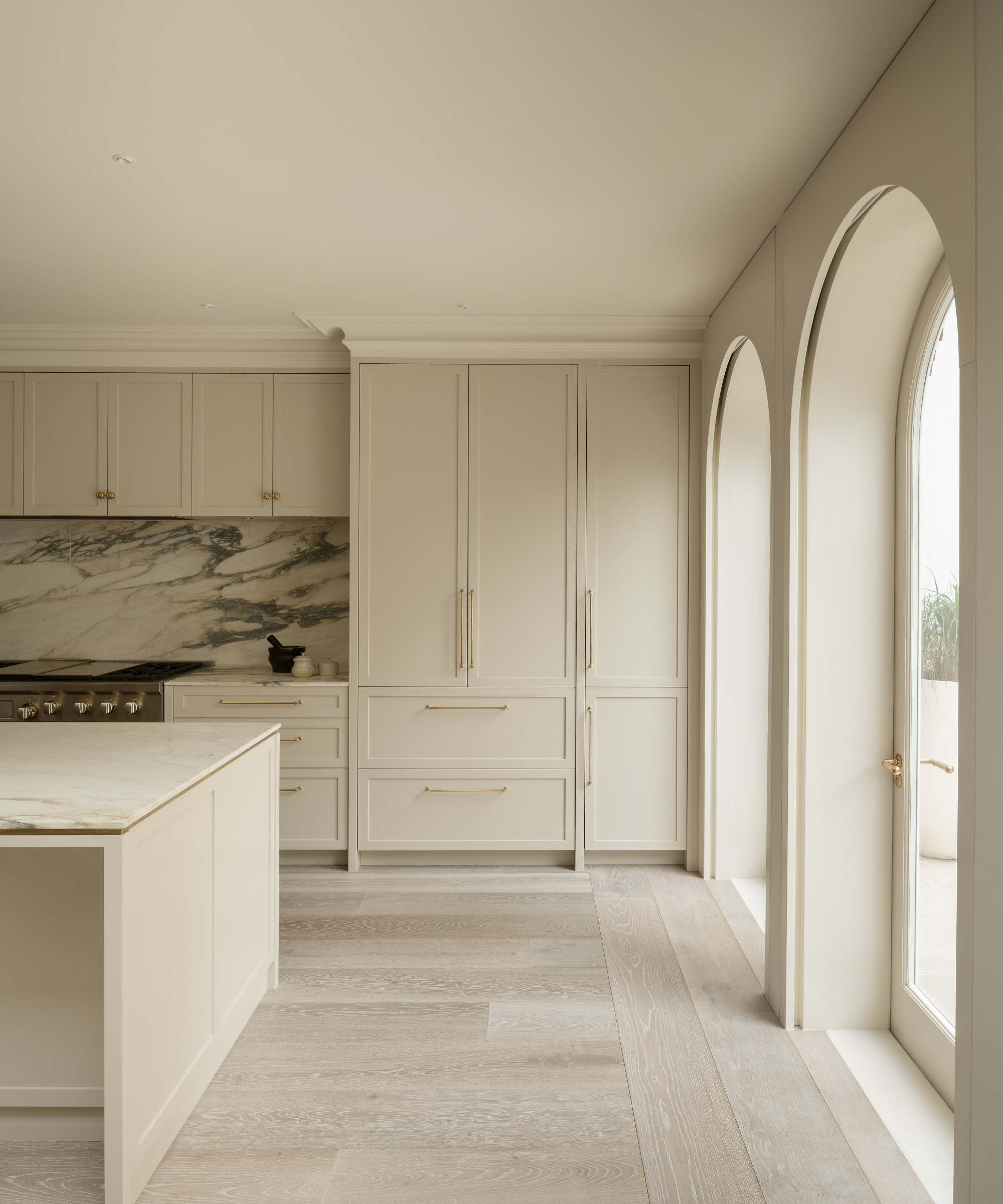
Think warm off-whites, creams, and light taupe tones. ‘Neutrals bring warmth to a space, but still keep things light and bright,’ says Christine, and Katherine adds that ‘light and airy whites and creams seem to never go out of style’. Benjamin Moore’s Natural Cream is Kristen’s choice. ‘A bit warmer than a classic white and goes beautifully with a variety of finishes and textures,’ she says and adds that Farrow & Ball’s All White is, in her opinion, the perfect, absolutely timeless white.
‘I don’t think a white kitchen is going anywhere anytime soon,’ Lindsie tells me. ‘White is a classic that exudes elegance. While there are so many great choices, I often find myself reaching for White Dove by Benjamin Moore, as well as Alabaster by Sherwin Williams,’ she says.
And if you want to take it one step further and add a bit more pigment to your neutrals, Lindsie recommends going for light taupe tones. ‘From Benjamin Moore’s Balboa Mist to Sherwin Williams Gossamer Veil, taupe tones will always be a go to for adding contrast without reaching for white. Taupe tones not only pair well with blacks, blues, greens, reds, but they are great to use with one another. Try opting for a light taupe paired with a darker taupe for refined pairing with your statement countertop stone,’ suggests the expert.
5. Your favorite color

This was a pleasant surprise! Very easy to get right with minimal effort. Sign me up! When in doubt about what color to paint your kitchen, simply think about your favorite. ‘Color trends come and go, but most of us have colors we’ve always gravitated toward,’ advises Katherine. ‘If you love yellow kitchens or royal blue, for instance, it doesn’t matter that greige is all the rage. You’re more likely to enjoy it longer if you choose something that is personal,’ she says.
And if you think your favorite color is a bit too bold, or might be a bit much in a kitchen, the designer advises combining it with white, or neutral wood tones. Bear in mind you can choose to use your favorite color sparingly, as an accent, only on your island or bottom cabinets, and paint the rest in a neutral tone to get the best of both worlds.
Price: from $59.84 per gallon of Emerald Interior Acrylic Latex Paint
A deep, natural green, will look best on your kitchen cabinets with brass hardware.

