Yes, your kitchen cabinets are probably the most important part of your remodel, but I always think that it's the tile choice that really sets the tone for a space. Even the most beautiful millwork can be made to look pretty pedestrian when paired with an uninspired choice for a backsplash.
Right now, you can't go wrong with zellige tiles if you want a kitchen that has soul. 'Zellige tiles have an inherent and hand crafted beauty like no other,' architectural designer Britney Groneck tells me. 'They add depth, texture and movement to any type of space and in my opinion, will never go out of style.'
By themselves, they're enough to make for an incredible detail in your kitchen, but designers are exploring new and interesting ways to decorate kitchens with tile, especially zellige tiles, that have me feeling inspired. Take a look at 5 of my favorite modern kitchens using clever tiling ideas, and get your creative juices flowing for a kitchen remodel in 2024.
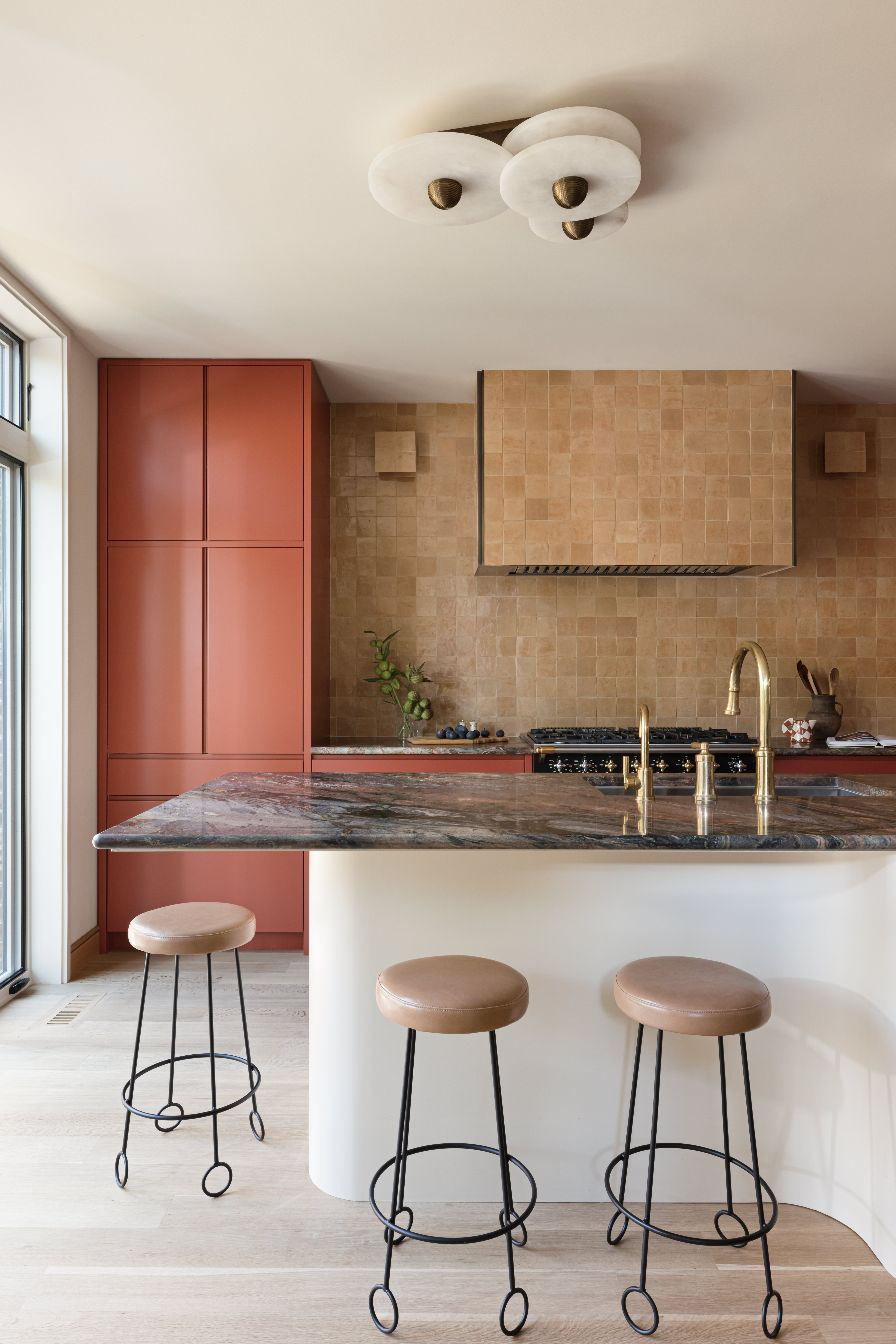
1. This tiled cooker hood

When you're working with a material like zellige tiles, you want the design of a kitchen to really highlight their beauty, and avoid too much visual clutter where your tiles will get lost in the mix.
The approach Toronto-based designer Gillian Segal took with this beautifully bold kitchen backsplash provides an idea for showcasing your tiles to their fullest. 'We opted to use the same material on the hoodfan, backsplash and sconces with a few goals in mind,' Gillian explains. 'Firstly the inherent beauty of zellige tiles is the variety in tone from one tile to the next, and I find this can be lost on smaller spaces. We wanted to emphasize the drama of this texture and variety, so carried this over as much space as possible.'
'We also wanted to create a quietness in this area of the kitchen – both to make it feel larger and allow other special elements in the space (the lighting, the curvilinear forms, the bold stone and color) to be focal points,' Gillian adds.
It's an idea that streamlines the look of this kitchen, all the while letting the texture of the zellige tiles make the scheme feel richer and more organic.
2. This backsplash color-matched to the cabinets

When designers create two-tone kitchens, you'll often find the upper cabinets are kept in a lighter shade - an old trick for making your kitchen seem more spacious. This scheme from Arkansas design studio MeetWest elevates the idea by color blocking not only the upper cabinets, but the backsplash too.
'The homeowner is a ceramicist, so we knew we wanted to add touches that were a connection point to her craft and the Arkansas landscape, but also felt like they could be original to the home,' Whitney Romanoff, founder of MeetWest. 'The zellige tile has a super dimensional, earthy glaze and no two tiles were exactly alike.'
'We thought carrying the sage green onto the upper cabinets broke up the visual weight of the warm walnut lower cabinets and connected the eye more to the greenery outside,' Whitney adds. This idea brings a lightness to the space that helps to balance the darker, more dramatic features like the kitchen countertop and terracotta flooring.
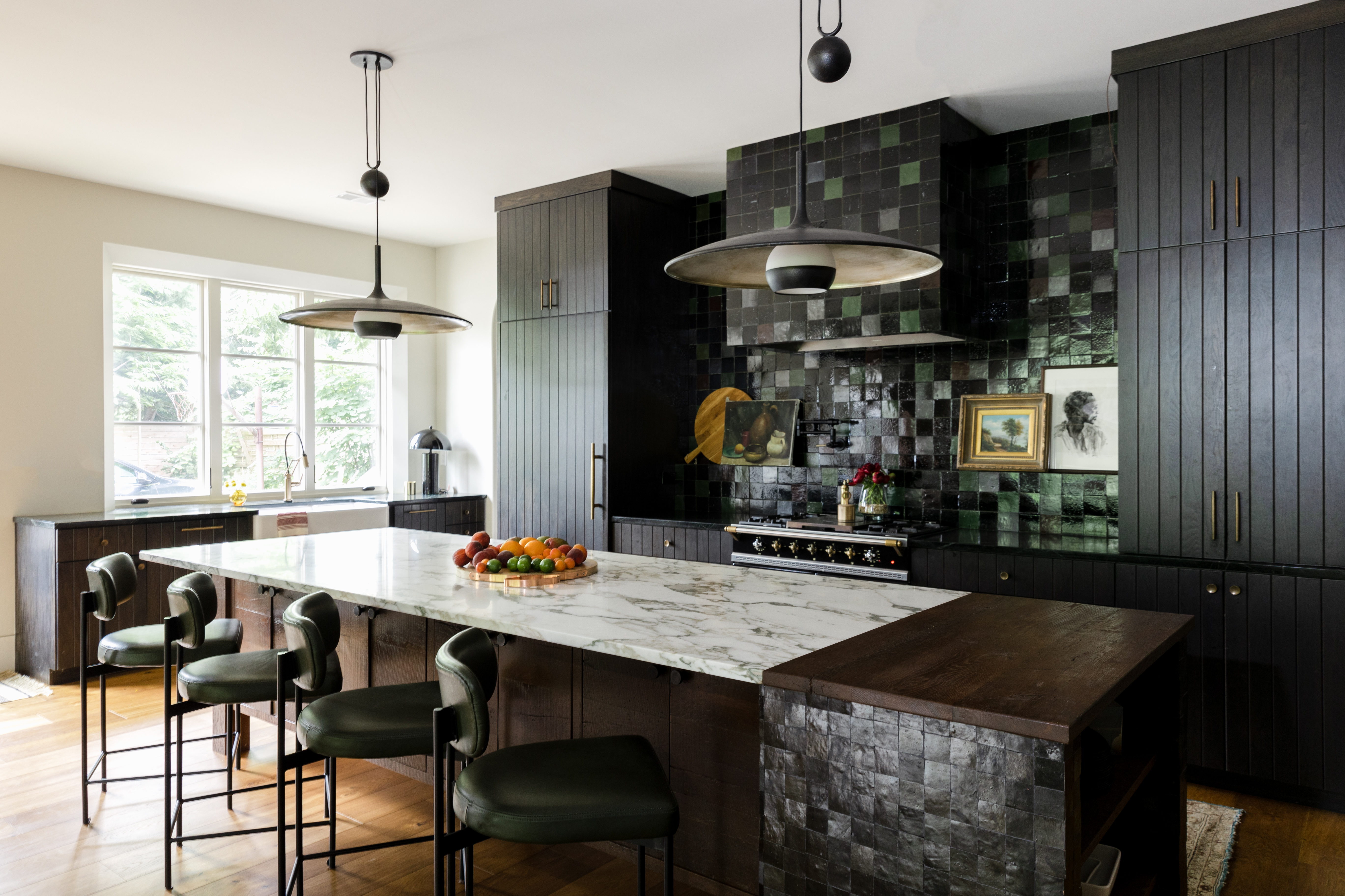
3. This backsplash made of mixed colors

In this over-a-century old property, architectural designer Britney Groneck wanted to design in a backsplash that would make an impact. 'There is a large window opening above the kitchen sink that allows natural light to pour into the room and that I wanted to take full advantage of,' Britney explains. 'The kitchen backsplash required a material that would immediately draw your eye into the space.'
'We ordered many samples of the zellige tiles and loved all the dark hues of the greens, deep browns, and maroon tones,' Britney explains. 'Instead of keeping the backsplash as one consistent color we decided to get creative and design a random pattern by utilizing five different color options which allowed for more depth and movement.'
'We are really proud of the outcome and the zellige tile was exactly what this project needed to elevate the space in a unique and modern way,' Britney adds. 'These hand crafted tiles give a timeless look and embody the most beautiful sheen and texture that felt appropriate for this home and became the highlight for the kitchen.'
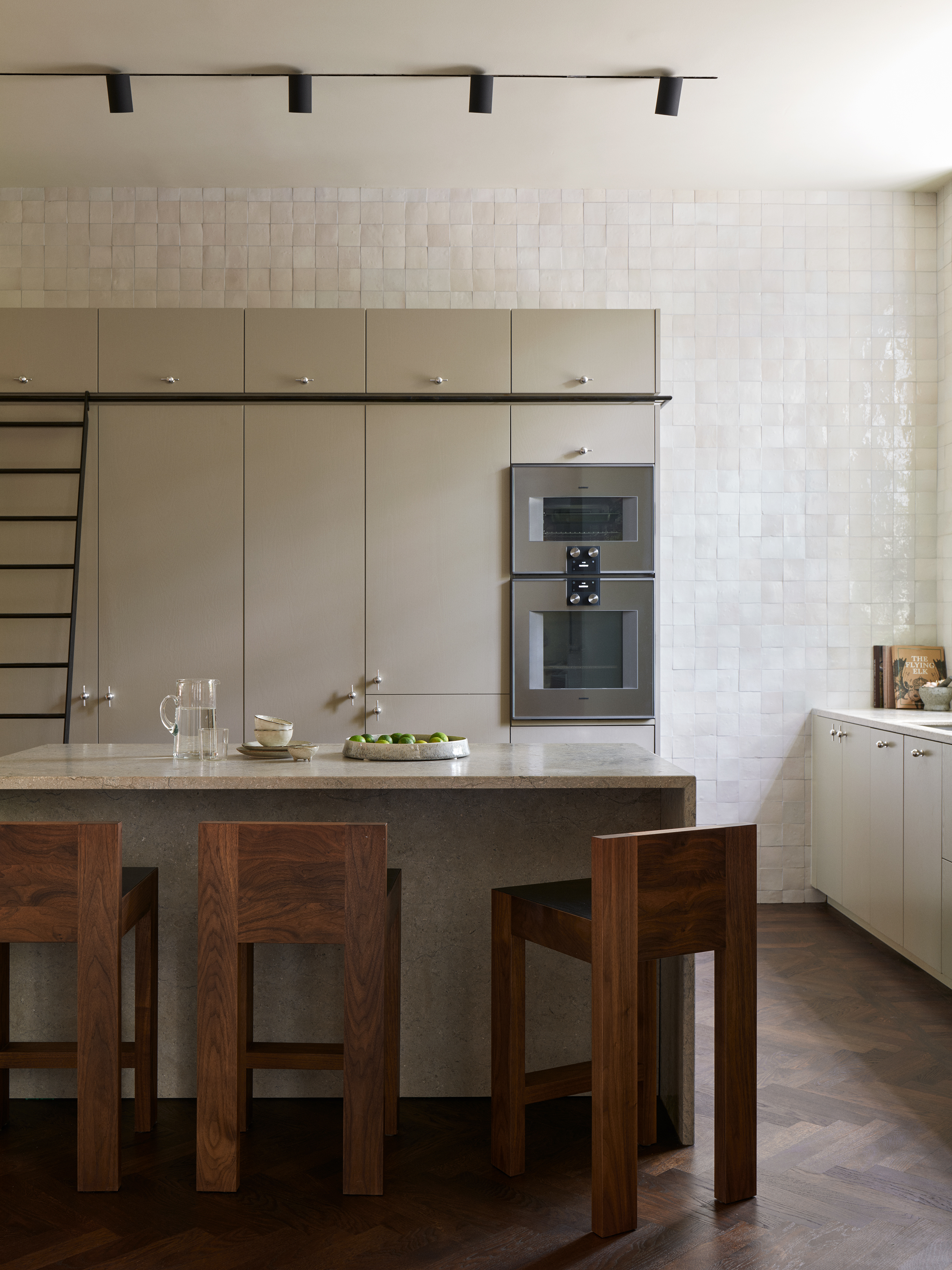
4. This full wall of tile

You'll need to make a decision when tiling a backsplash about how far up the wall to go. This can be made a lot easier when you've got a dividing line like upper cabinets or floating shelves above your counters - otherwise, it's often a sleeker look to tile all the way up the ceiling.
Of course, there's no real rules about where you should and shouldn't use kitchen tiles, and this beautiful white kitchen by Stockholm-based design studio Liljencrantz Design might just convince you to think outside of the box.
The designers used an off-white zellige tile from counter to ceiling on one side of the kitchen, but continued the tile up onto the adjoining wall and above the kitchen cabinets. It's an idea that goes beyond the practicalities of a backsplash, but that makes this simple, understated kitchen feel incredibly special.
5. This backsplash with chunky grouting

Oversized grouting is a relatively new kitchen trend, but one that can really highlight the irregular beauty of a tile like zellige and create a bold feature of a splashback.
'It creates a secondary pattern without only relying on the tile,' says Ginger Curtis, founder of Urbanology Designs who designed this kitchen. 'And it is surprisingly practical. In fact, it is easier to clean than tiny, impossible-to-clean grout lines.'
It's a different look to a plain zellige tile backsplash - more graphic in its nature, but beautiful in its own way, and it opens up clever ideas for playing with different tile layouts.


