Bold colors may seem daunting to decorate with, but they can add a lot of value to your home. Ranging from deep and dark hues that feel moody to saturated primary colors, there are plenty of bold colors that can transform how your space feels.
And while it's well-known that bold colors add impact, you may be wondering how to use these statement shades without going overboard. After all, we need our homes to feel liveable and comfortable for many reasons.
Below, we've rounded up color consultants' take on the best bold colors that are surprisingly liveable. From red to dark brown, there's plenty of advice here to allow you to benefit from these bold hues while maintaining stylish room color ideas.
5 bold colors that are surprisingly liveable
‘It can be tempting to opt for neutral colors within your home, but introducing bolder hues will create a dynamic and vibrant space full of personality and charm. Even in smaller spaces where more impactful colors are often avoided in fear of being too overwhelming, ensuring the ratio is just right will deliver a harmonious space that has depth and interest,' says Ruth Mottershead, Creative Director at Little Greene.
Deep greens and blues
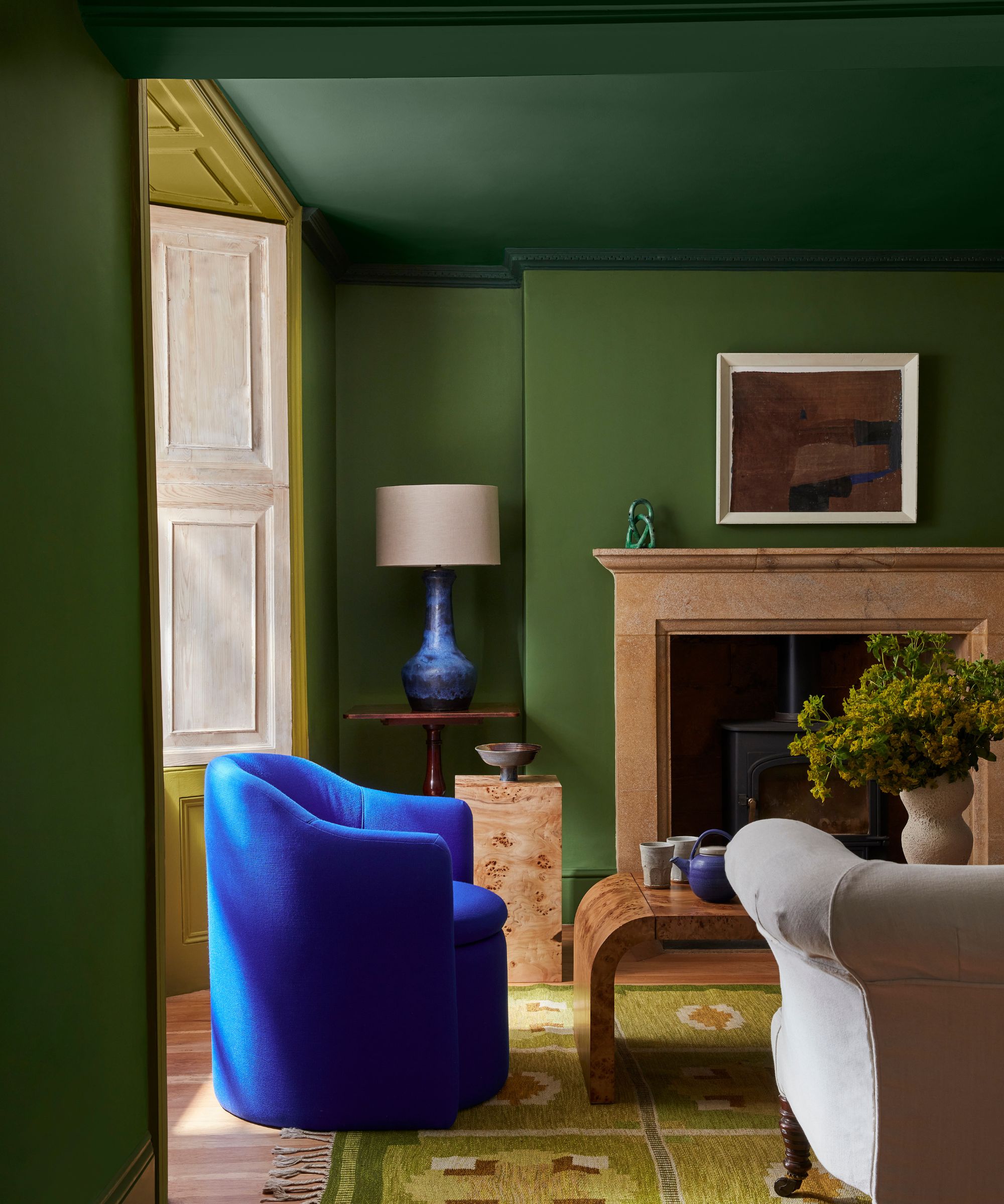
Dark paints have been hugely popular in interiors of late, filling homes with a moody and sophisticated feel. Within them, dark blues and greens have become go-to's, used commonly on kitchen cabinets or in small rooms like home offices to create a cozy effect.
However, deep blues and greens can feel daunting to decorate with if you tend to favor lighter hues. But since both these hues are reminiscent of the natural world, these bold colors can actually feel comforting, especially when used together, as Ruth Mottershead explains below:
'Green and blues are commonly found in nature and can evoke the tranquillity of forests, fields, skies, and oceans. This is a combination that we are naturally drawn to and comforted by because we are so accustomed to seeing it in the world around us. Although both colors are impactful and bold in their own right, the combination of the two brings a calming and soothing effect, making spaces feel more serene and connected to the outdoors.
'Additionally, the combination of dynamic greens within an interior can capture the power of nature whilst feeling cohesive, sophisticated, and visually engaging. The bold green Hopper, a vibrant and highly pigmented shade reminiscent of leafy summer foliage, can be combined with similarly invigorating colors such as the contrasting zesty Citrine and smart and confident Dark Brunswick Green in a scheme that will feel cohesive, harmonious, and visually exciting.'
Primary colors used together
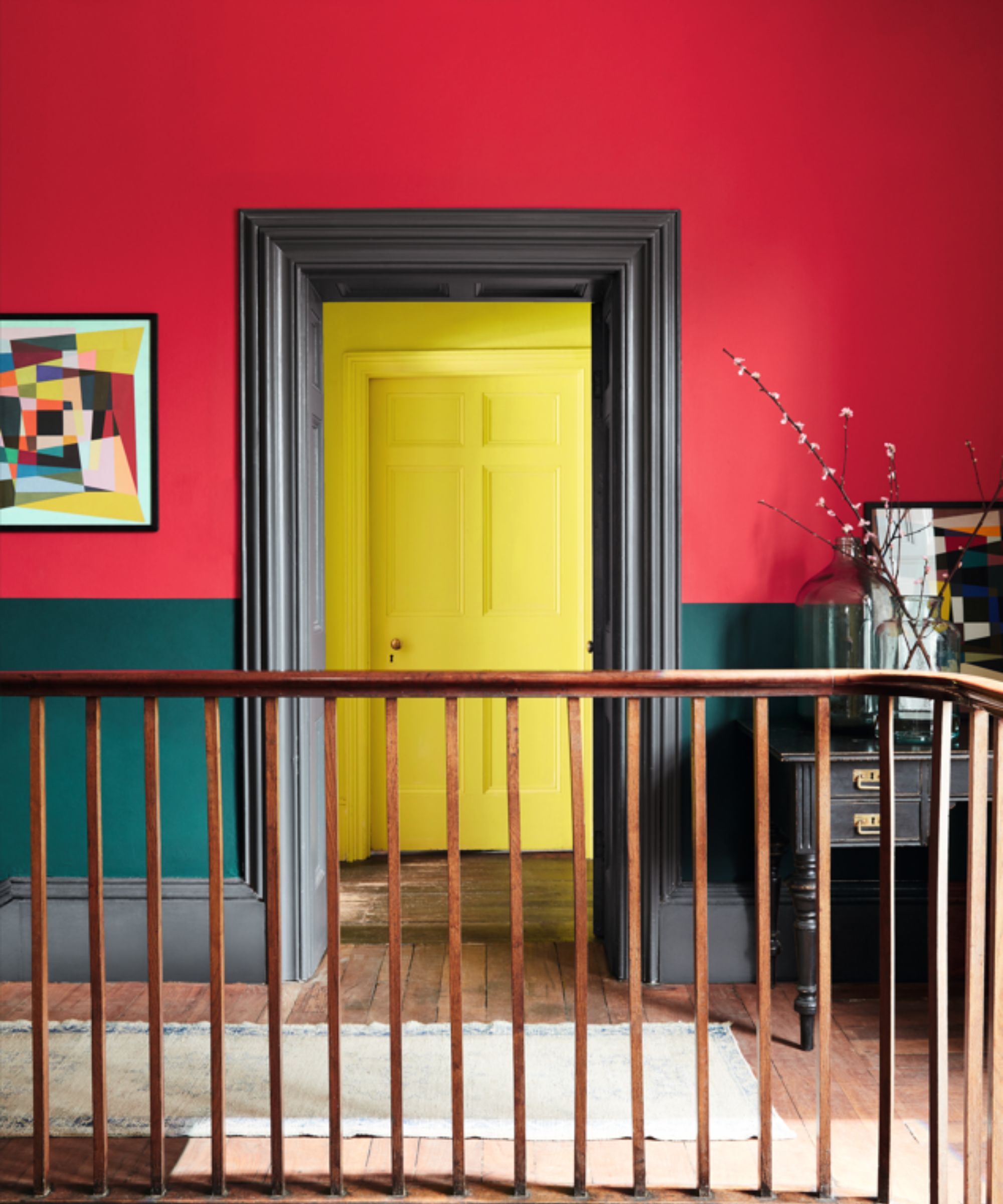
Primary colors are no doubt some of the boldest out there. Saturated and lively, decorating with primary colors makes a confident statement while feeling energetic and playful, much like the red and yellow color scheme in this hallway. While you may, understandably, assume that sticking to just one saturated color in a room is enough, Ruth Mottershead says using them together can actually create balance:
'Bold colors work well together when they have a similar strength. The bright yellow Trumpet is as strong as the richly colored Cape Red and Mid Azure Green in tone, but the strength of both colors makes each instantly easy for the eye to appreciate. The key is to add a neutral color that will ground the palette such as Scree, a blue-based gray that will add balance to the warmth of the bolder shades, and when painted across woodwork and doorframes will work as a frame between the two impactful colors.'
Dark brown
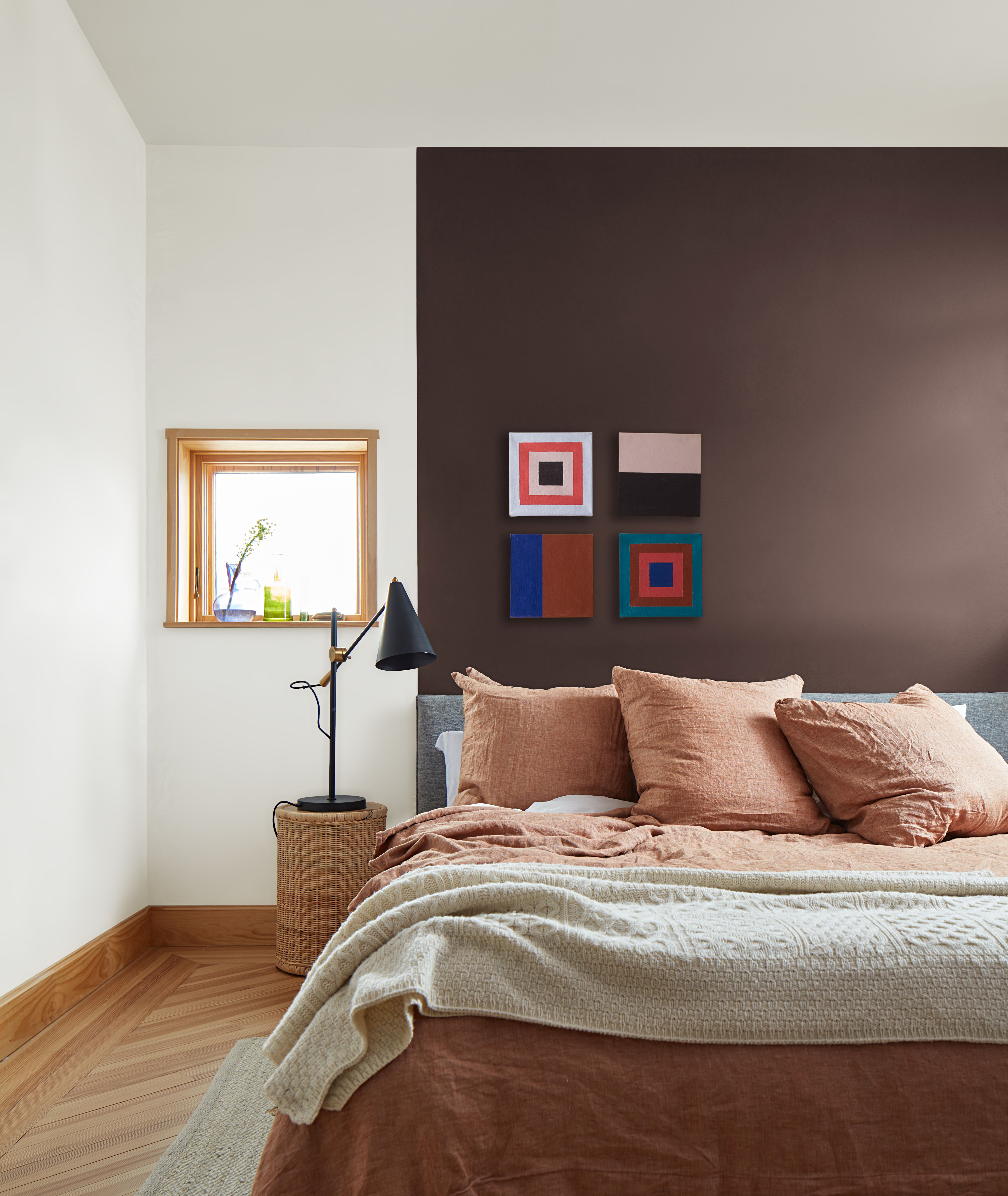
One of the most on-trend colors right now is dark brown, and while it falls into the neutral category, it can be a bold shade to work with depending on its intensity. The key to decorating with brown and maintaining a liveable feel is to consider which rooms you're using it in. Its dark tones can have a cocooning effect, so it's well-placed for spaces you want to relax in like living rooms and bedrooms.
One recommended dark brown paint is Benjamin Moore's Wenge, as used as an accent wall in this bedroom. 'A deep chocolatey hue with violet undertones, this deep brown is both romantic and refined. Neutral yet rich in character, it seamlessly pairs well with a wide range of hues, from wooden frames and gold accents to bold pops of red. With a cocooning effect, Wenge creates an inviting space, making any space feel cozy and enveloping,' explains Hannah Yeo, Senior Manager of Color Marketing at Benjamin Moore.
Another way to pull off bold shades such as dark brown is to fully embrace them with color-drenching ideas, as Tash Bradley, Director of Interior Design and Color Psychologist at Lick explains: 'If you color drench a room, what it actually ends up doing is making the room feel calmer because there’s less contrast. So you can actually afford to go one to two shades stronger.'
Teal
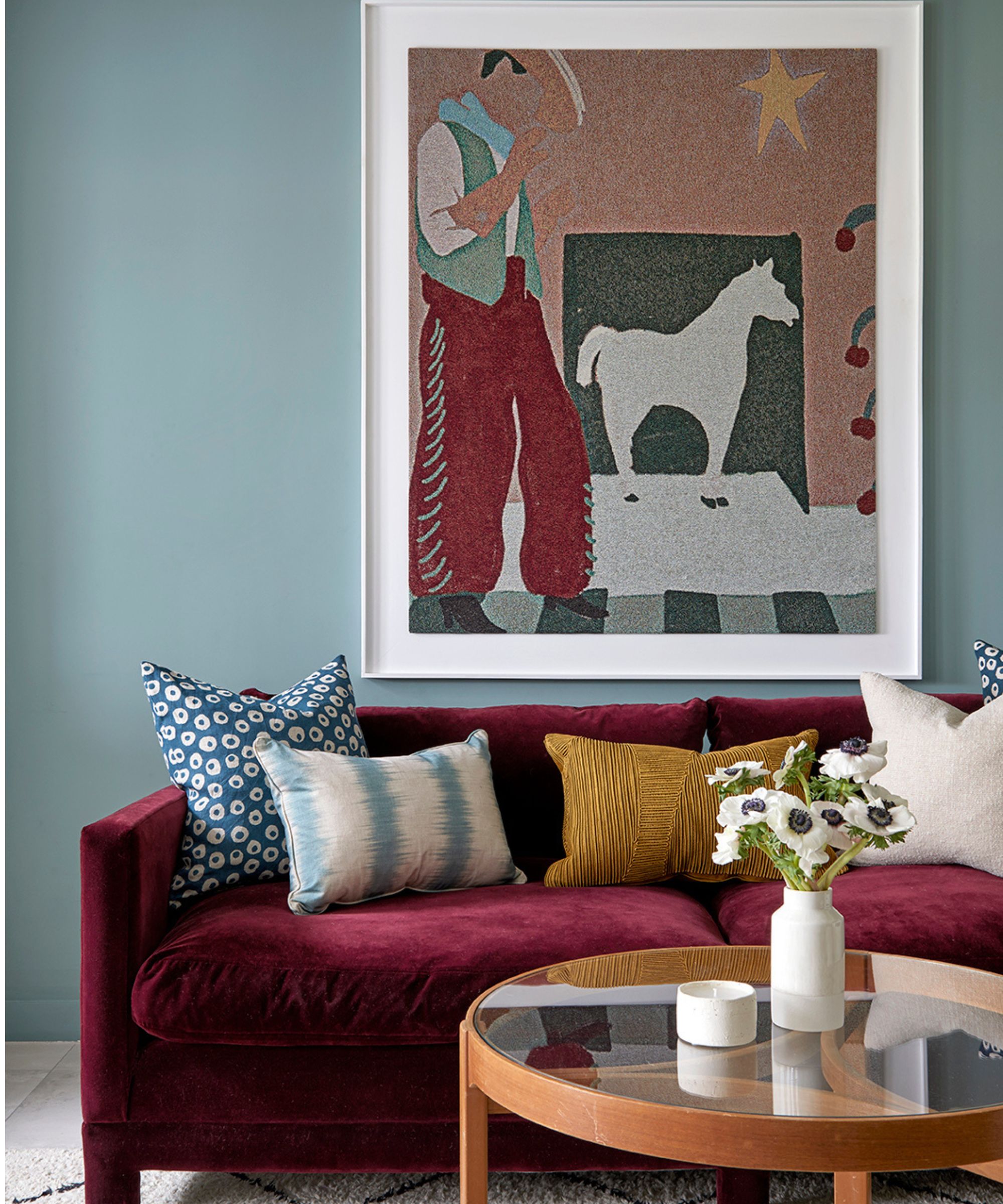
Teal is typically a bold and opulent color choice that feels reminiscent of decorating with jewel tones. And while this color can indeed feel incredibly statement, the right teal paint can be easy to live with.
Tash Bradley recommends Lick's Teal 01 and Teal 03 if you want to decorate with teal without overpowering a room, she says: 'they’ve got that perfect balance between the green and the blue.'
Talking about Teal 01, Tash explains: 'When I was trying to make this color, the blue pigment in this was very much to focus on the mind and be a very mentally stimulating color; and then with the injection of green – I wanted to soften it, balance it out and not make it overstimulating. Teal 01 is one of our perfect bolder colors for anyone who wants to lean into it and color-drench a bedroom. It looks so nice as well when you do a complementary color scheme and do a plum or a rust tone paired against it.'
'Teal 03 is a really, really stimulating color that has a lot of energy to it and that’s why it looks so good in a darker room or a room that you go to at night and it’s under artificial light,' adds Tash.
Red
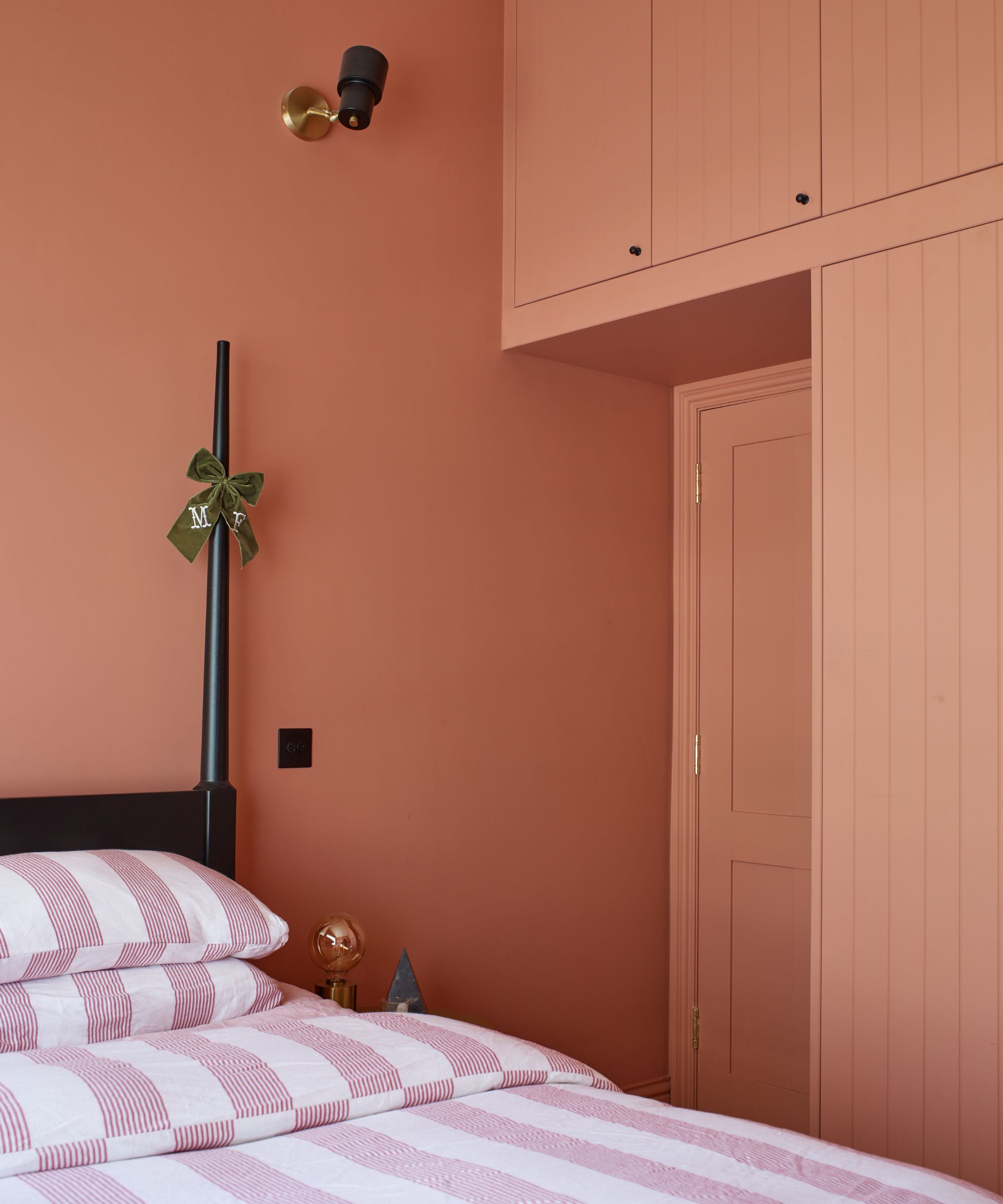
It goes without saying that red should be included within the boldest colors. A warm color that's seen plenty of love this year, not least through the unexpected red theory, red is invigorating and a great way to add drama to the home. That said, red paints can feel incredibly daring, and perhaps not the most relaxing.
However, there is a way to decorate with red while keeping things liveable. Tash Bradley highlights Lick's Red 03 as a comfortable red paint that isn't going to overwhelm your room, as used in this color-drenched bedroom.
'Red is normally seen as a very stimulating color that most designers use in a very small proportion of a room. However, when I was creating Red 03, my mission was to create a color that you could color-drench a room with; that could be used on every surface and not feel too overwhelming. So what we did is add lots of black and lots of brown pigment that makes it a bit muddier and a bit dirtier. What I love about it is it’s the perfect color to then layer on other fabrics,' says Tash.
If you want to add impact to your color schemes for the year ahead, why not try out some of these shades? Although bold, they should feel grounding and liveable in your space, while aligning with the latest color trends.


.jpg?w=600)


