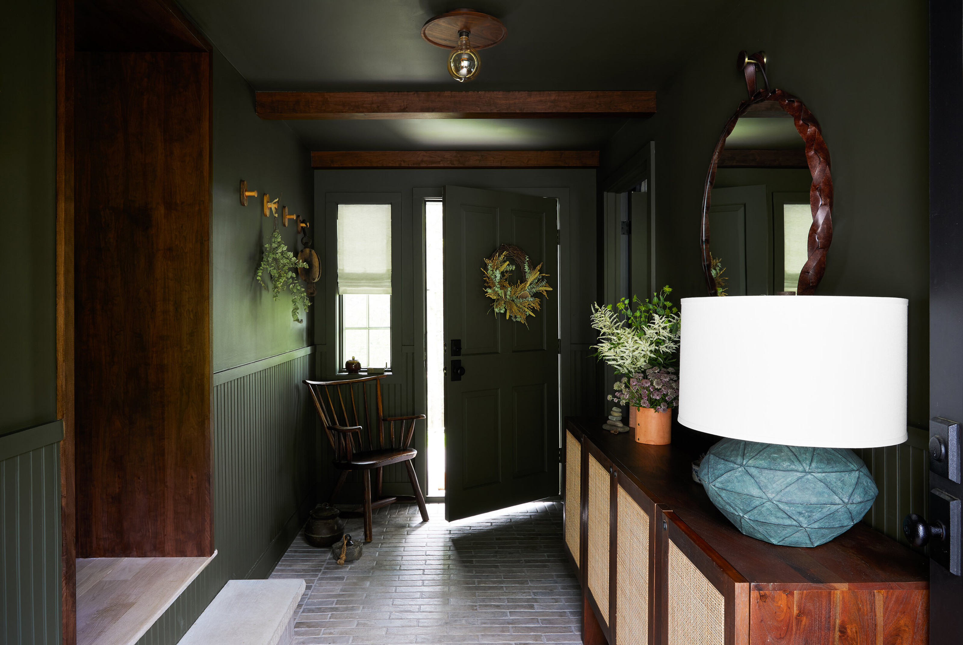
A well-designed entryway is crucial in making an impact as you enter the home. 'It's important not to forget about the hallway when decorating your home,' says interior designer Bethany Adams of Bethany Adams Interiors. 'But since this space connects to so many others, it can be quite tricky to make a statement here.' Dark entryways are a great way to create a statement as you enter the home, and when paired with the perfect lighting and accessories, they can transform into transition zones that feel warm and inviting as you step inside.
Going dark with your entryway is also a clever way of playing with perception and creating optical illusions - pushing dark paint to the ceiling and going for a monochromatic look can make your living room feel bigger as you move from one space to the next. For the best entryways that feel luxe and expensive-looking, I've spoken to interior designers to find out their favorite dark colors to try at home.
1. Burgundy
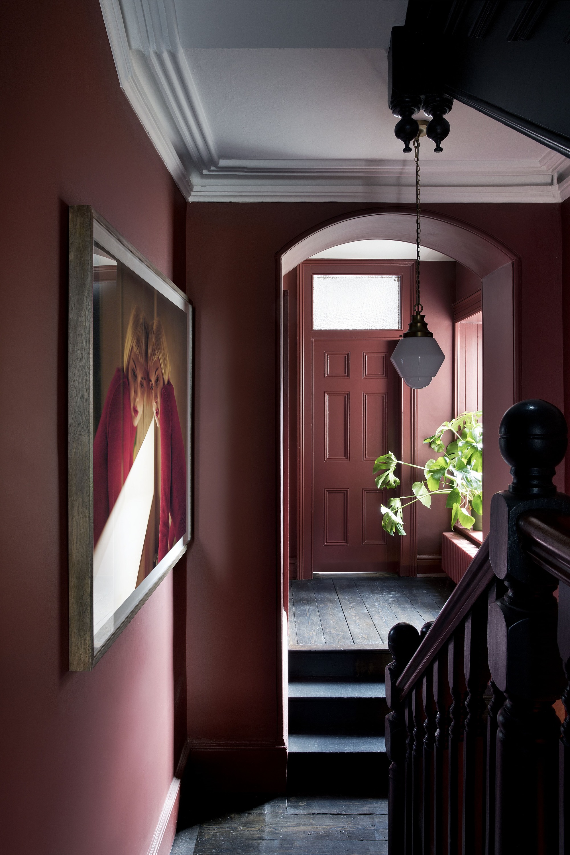
Burgundy is one of the best colors for an entryway to make it feel luxurious and expensive. Entryways are often the narrowest part of your living space and don't receive huge amounts of natural light, so when going dark with your entryway paint, opting for something with warm undertones is a great strategy.
'Elevate your entryway with the timeless sophistication of burgundy,' says Apartment 48's designer, Rayman Boozer. 'These dark colors, often favored by those with opulent entry spaces, contribute to an upscale and inviting atmosphere.'
Enhance the mood of your entrance by embracing this classic shade, creating an entryway that exudes refinement and elegance. This entryway painted in Farrow & Ball's Eating Room Red is a great example.
2. Black
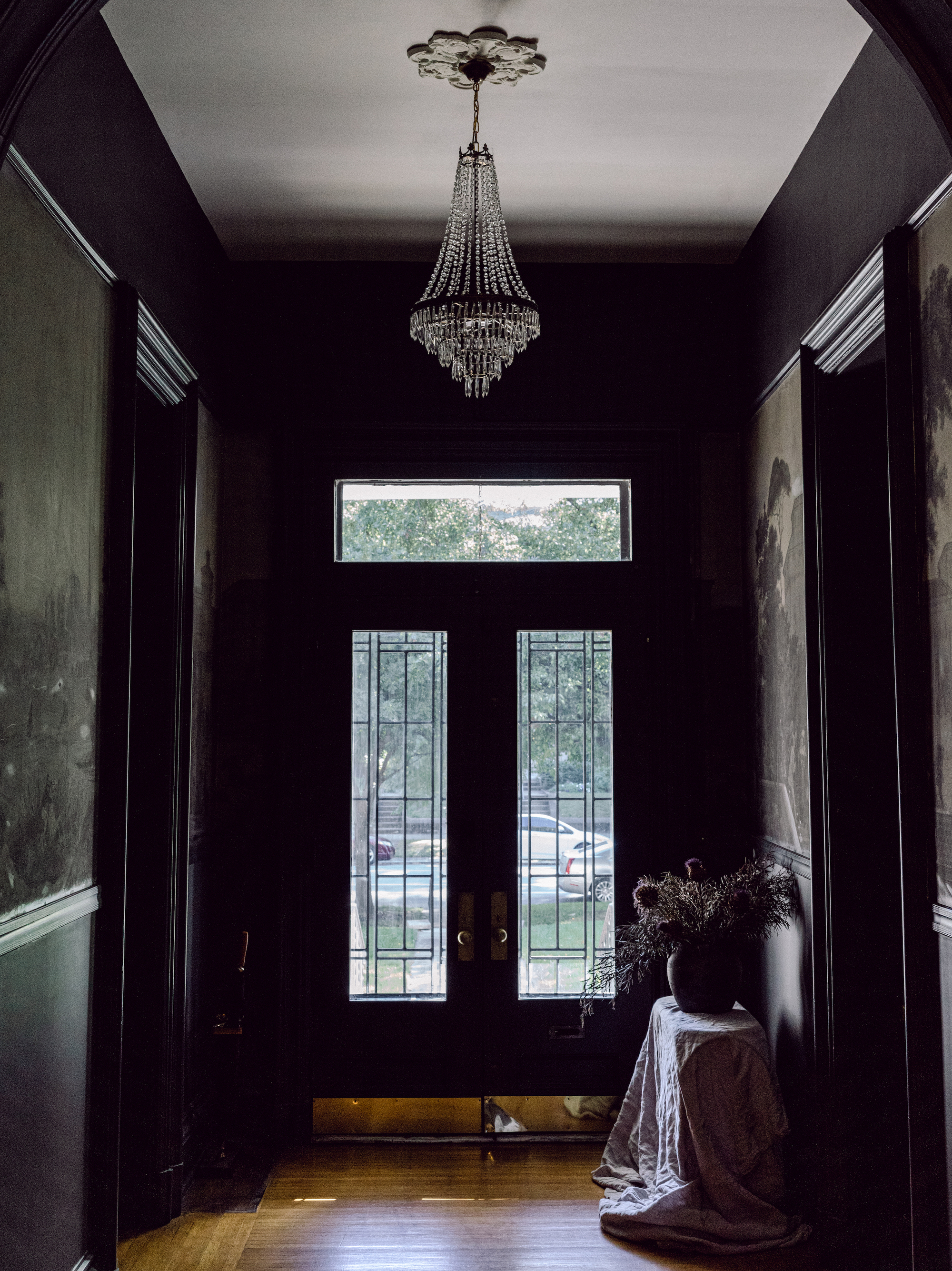
I've noticed designers selecting black paint in rooms with a minuscule footprint, like small entryways, using its inherent drama to create a real statement. Black is one of those colors that can't go out of style. It oozes sophistication. Black is to be approached with caution, but with a subtle gloss you can use what light this narrow space might have, creating a subtle sheen.
Designer Bethany Adams of Bethany Adams Interiors opted to go to the dark side when she painted this entryway jet black. Painting the hall in this near-black moody grey adds intrigue to a space that might otherwise be overlooked.
'It is a principle of good design that an entryway should be small and dark so that as you pass through, you feel "compressed" only to be released into larger, lighter spaces beyond,' says Bethany.
'You'll see this in the architecture of medieval churches--the dark, small Narthex funnels worshippers past its doors into the other-worldly Nave. Your home may not be quite so lofty just past the entryway, but Railings by Farrow & Ball brings the drama to any entryway and can make your home look outrageously chic and expensive with very little effort.'
3. Dark taupe
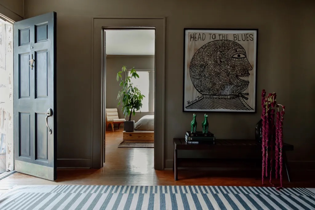
Going for a dark neutral or taupe is also a great shade of paint to make an entryway look more expensive, for an elegant-looking entryway, adding warmth and oozing coziness, without feeling too dark and moody. This entryway by Stelly Selway is a brilliant example and has been brought to life with pops of color in the entryway that accessorize the space.
'We breathed new life into this circa-1915 stilted Craftsman bungalow, proving 650 sf can feel at once intimate and expansive,' explains Benjamin Stelly, co-founder of Stelly Selway. 'Designed intentionally for its mindful resident as a halcyon respite amidst a bustling urban landscape, calm emanates through the space via warm wood furniture and diffused natural light.'
The color palette was inspired by military camping gear originally designed to integrate seamlessly into nature and the studio chose Behr's Light Truffle from Home Depot on the walls. 'While the interior gives rise to looking inward, the eye- from any vantage- is pulled to the outdoors, reverence for surrounding nature being the most significant aspect of the concept,' explains Benjamin.
4. Dark green
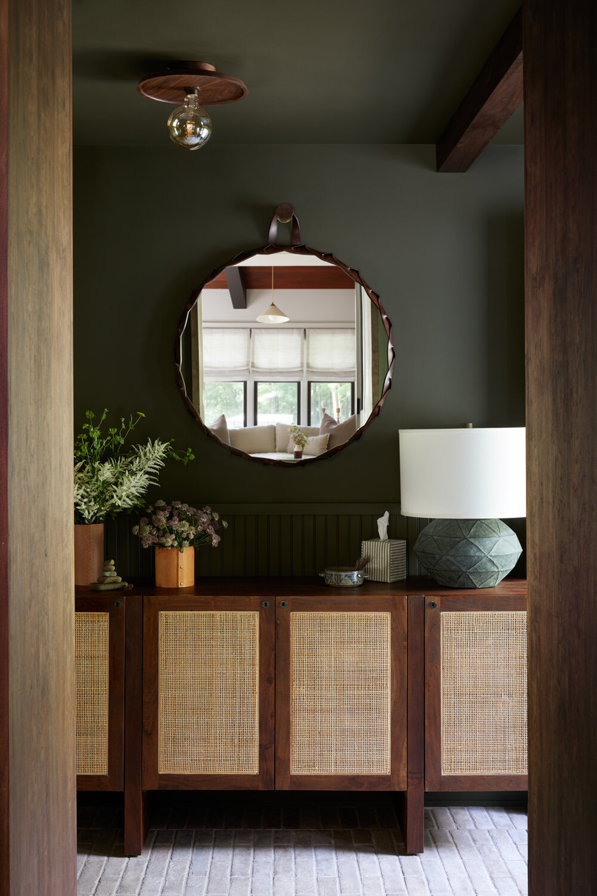
Green in all its varying hues feels timeless and classic, exuding elegance. Calling to nature, it makes perfect sense for the walls of this transition zone as you move from outdoors to inside.
This example by interior designer Becky Shea has taken paint across the ceiling too for a monochromatic color scheme, creating a cozy sanctuary and beckoning you inside, but there are other ways of applying green paint.
'Adding an accent wall with a darker paint color is a lovely way to give your entryway a moody sense of intrigue,' says Kathy Kuo of Kathy Kuo Home. 'I love Benjamin Moore's Deep Sea Green as entryway colors that exude an effortless sense of luxury and sophistication without feeling overwhelmingly dark.'
5. Dark blue
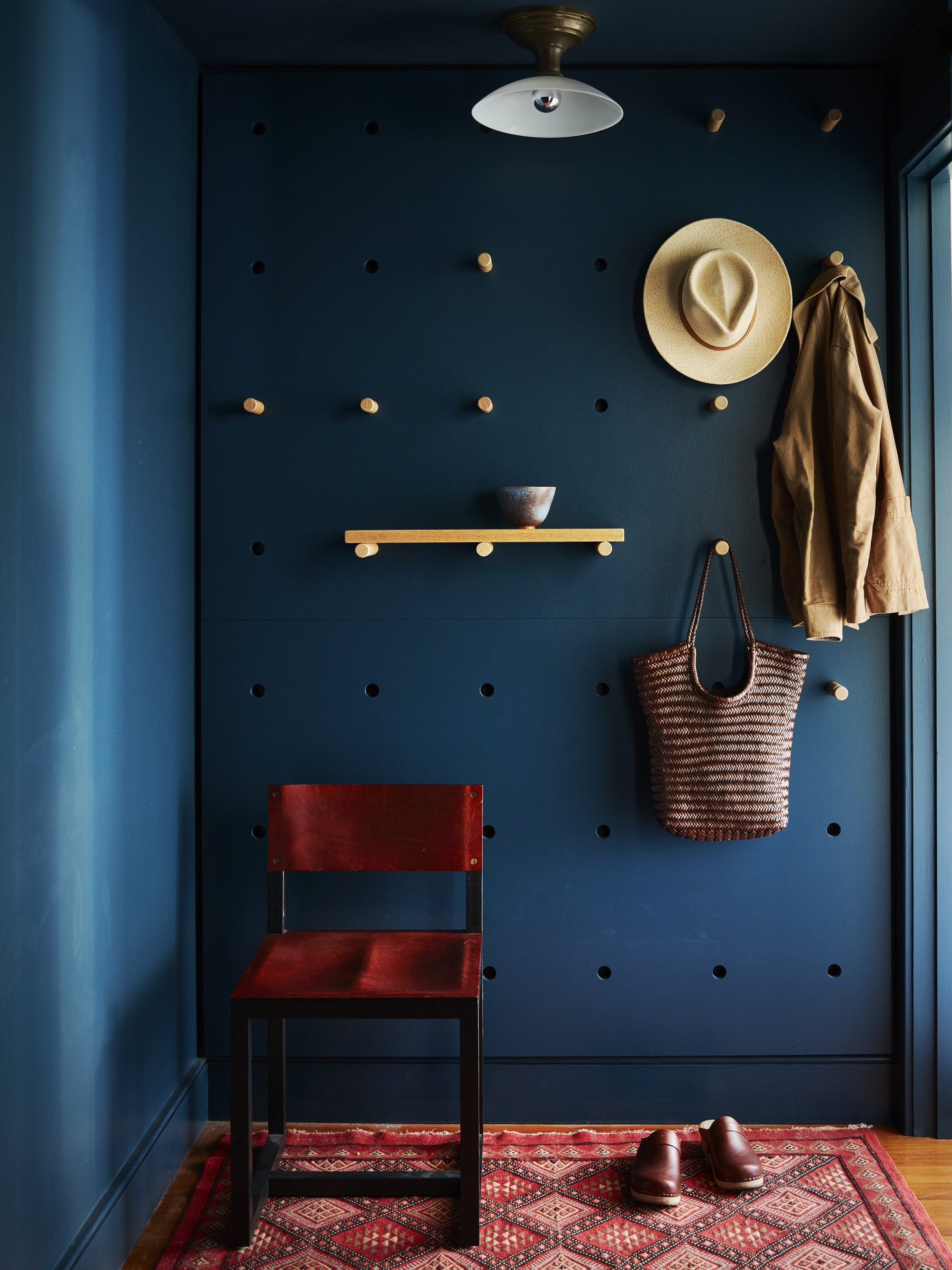
Finally, there is something sultry and enticing about an inky dark blue shade used in the entryway, and certainly is the color to go for to make your entryway feel all the more luxurious. The thing with blue is that it is inherently cold, so it will need warming up with texture (think a welcoming low pile rug, as per this example by by Atelier RO founded by New York-based interior designer Juliette Spencer. Well-distributed lighting is also essential in a cold blue hall - a console table lamp would work wonders.
But if applied well, dark blue paint can feel timeless. The paint itself also doesn't need to be that dark, because even a pale blue pigment will work with the natural light to produce dark shadows to make the space feel moody yet chic.
'I always like to make a moment out of the welcoming area, to keep it separate than the rest of the home and make it feel more private,' says New York-based designer Lucia Galeano founder of Studio Galeon. 'Usually, darker tones can set an intimate mood, so lately, I have been using dark indigos. You can play and go dark here because it doesn't matter if the space feels small or too enclosed.'
