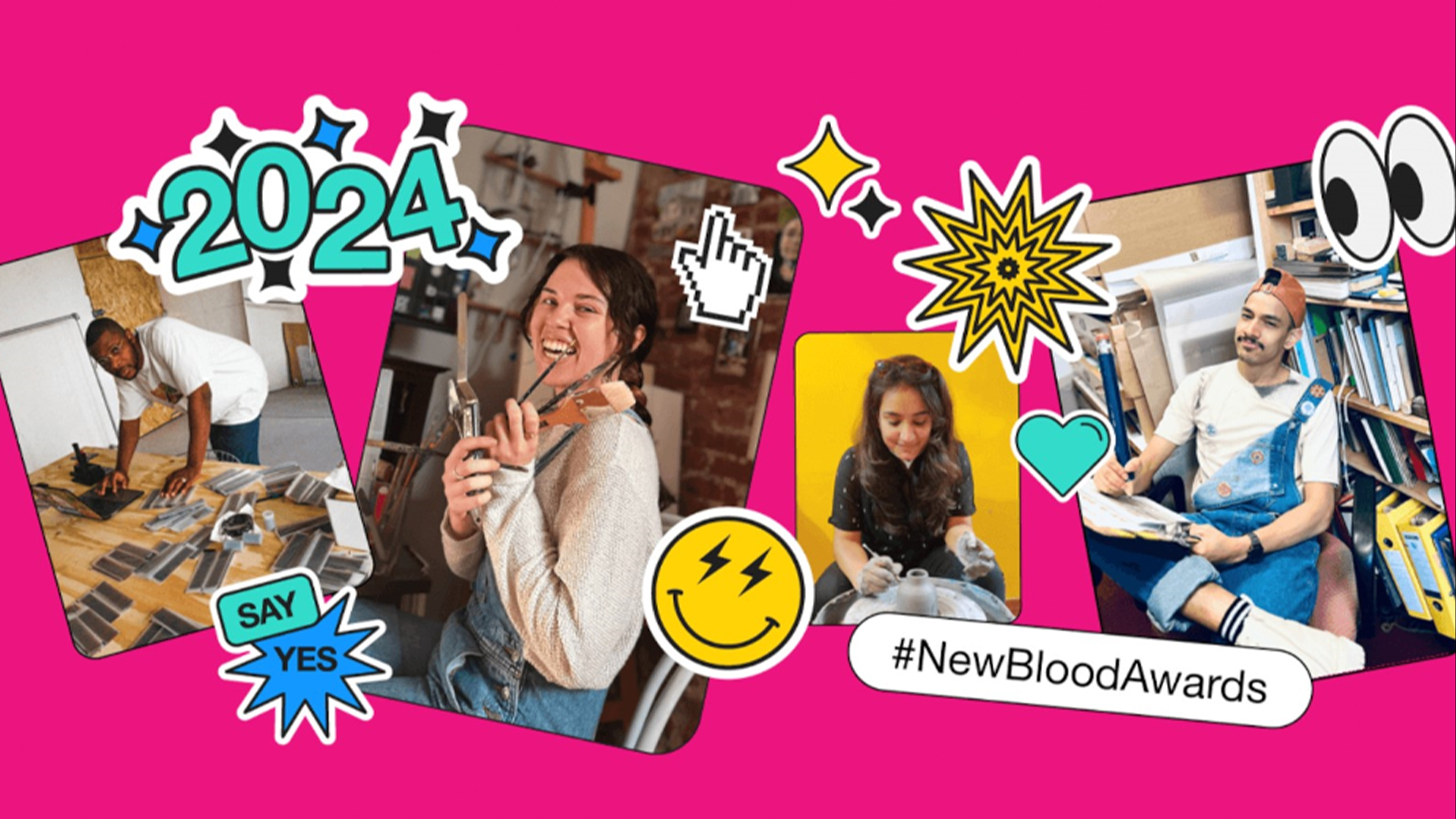
I recently had the pleasure of attending this year's D&AD New Blood Festival – celebrating the best-emerging talent in the creative industries. It's a delightful melting pot of design inspiration, shaking up the creative climate as we know it and promising an exciting new generation of creative minds.
The soon-to-be graduates showed a thirst for innovation and a fearlessness towards breaking the rules – challenging the comfort and convention of the current design sphere. If we can take anything from New Blood, it's that creatives should be learning from the up-and-coming generation – here are the ones I think you should watch.
01. Grace Smith

Project: Outpack
Socials: @andgracedesigns
Grace's project 'Outpack' is an innovative solution to the mass amounts of waste left over from festival camping (I'm looking at you Glastonbury). It also serves to make camping more accessible, allowing prospective users to rent all the necessary gear, taking the hassle out of getting back to nature.
To create her display piece for D&AD, Grace shares "I sublimation dyed it onto ripstop fabric myself," pairing familiar fabric motifs with a contemporary twist. "I've gone really graphic with my visuals to bring in a city-based audience," Grace says. "I wanted to use bright colours, none of the typical khaki."
02. Alex Bartlett
Project: HYFEE
Socials: @b_r_d_studio
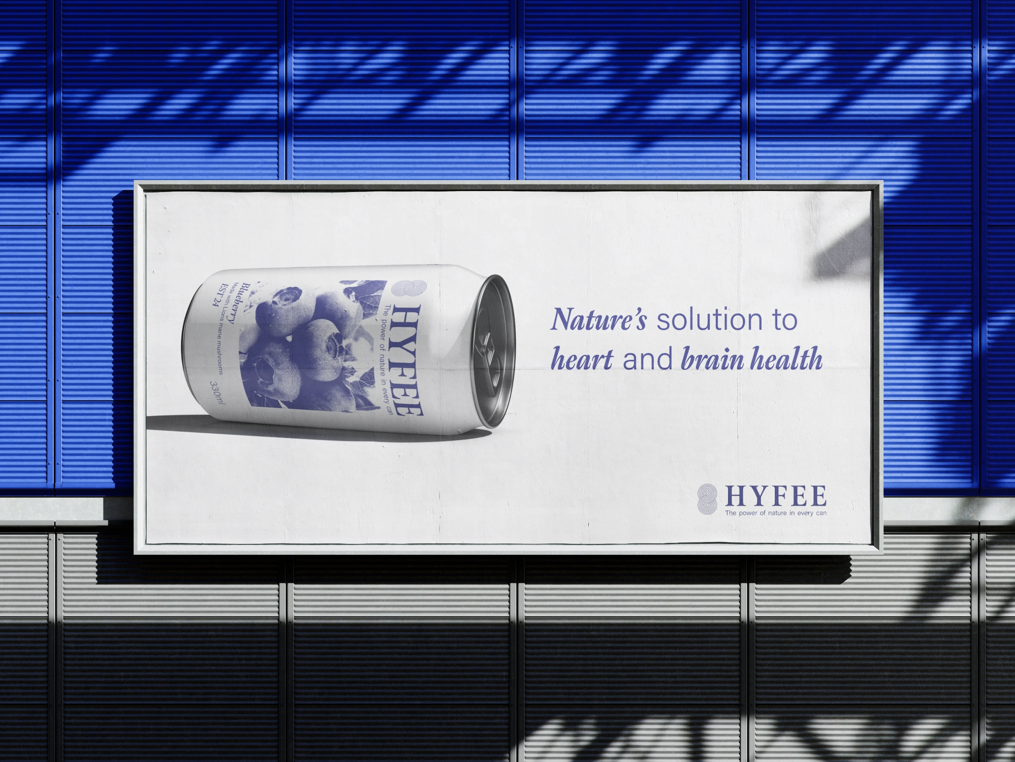
HYFEE is a branding project that redefines the supplement industry. Envisioned as a healthier, caffeine-free alternative to traditional energy drinks, Alex's lion's mane-powered product embraces sleek design to make a mark in a packaging sphere that's ladened with visual oversaturation.
"I wanted to make the product the focus – strip it back" Alex says. The result is a refined design that feels elevated amongst competitor brands in the energy drinks market. Adopting a soft colour palette and sleek, minimalist design, HYFEE stands out for its contemporary elegant packaging – a product worthy of pride.
03. Jadine Jackson
Project: It's all a Dream?
Socials: @jadinejacksondesigns
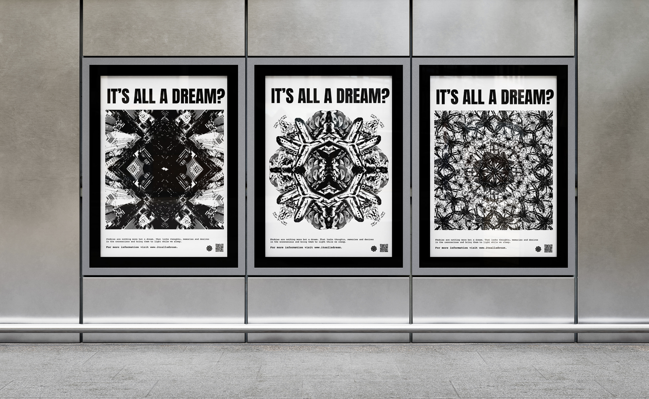
Jadine's mind-bending project "It's all a Dream?" is a campaign centred around phobias. To raise awareness around common fears such as Acrophobia (heights), Arachnophobia (spiders) and Ophidiophobia(snakes) the kaleidoscopic designs each have a unique pattern that emulates the transcience of dreams and memories. The grungy, punk aesthetic of Jadine's work is a refreshing reinvention of the genre, feeling unique without being overplayed or derivative.
'When I was researching, I saw there was a lot of overlap between phobias and dreams – the idea of the subconscious," Jadine says. "I started to question, could phobias just be dream manifestations?" For her ophidiophobia-inspired piece, Jadine shares 'my favourite design is the fear of snakes because it features my pet snake – his name is Franklin."
04. Theo Nicholas Gaimster
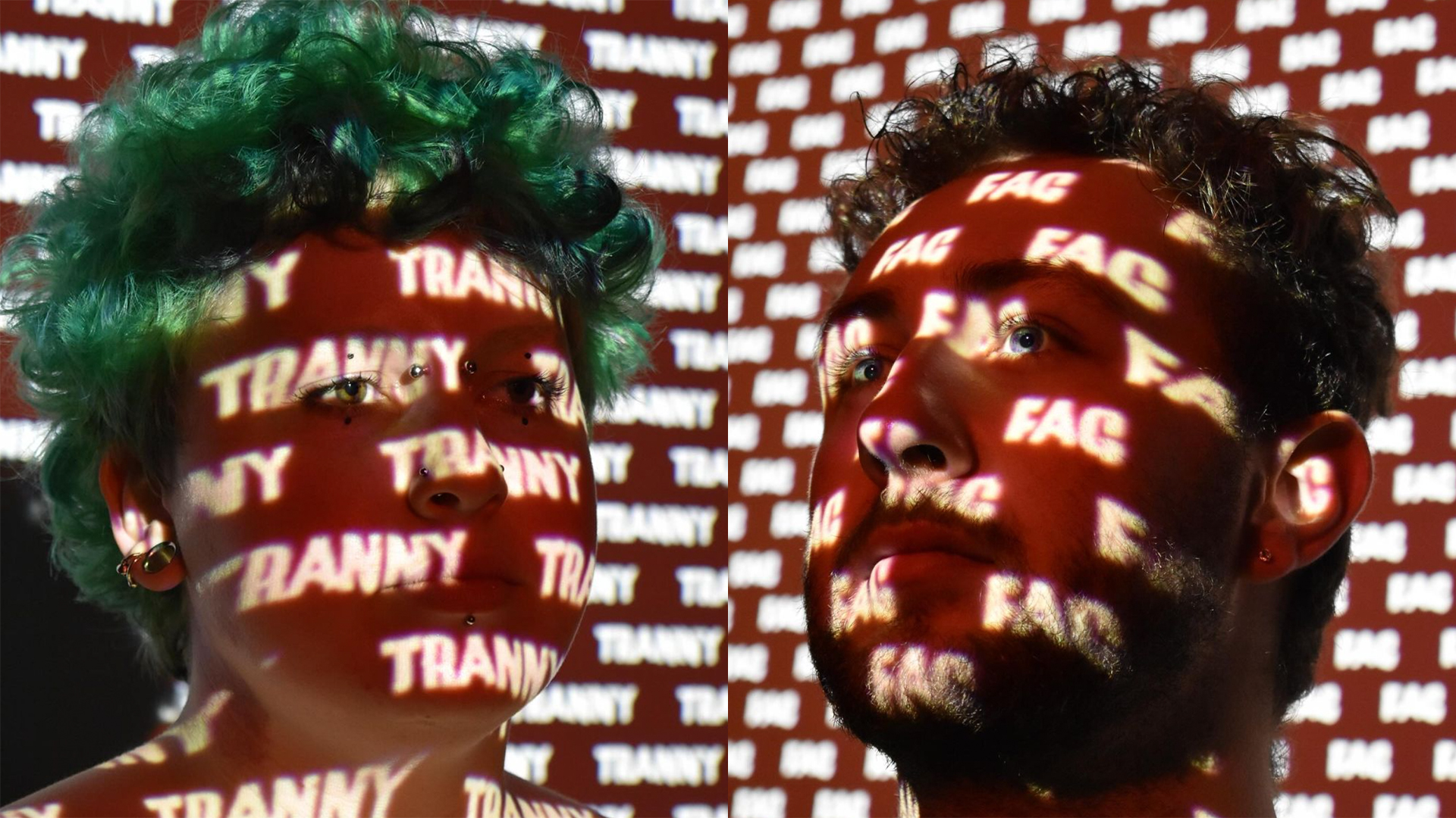
Project: Grindr Campaign
Socials: @theonicholas.art
Theo has already been shaking up the design industry with their 'Do Not Ignore The Signs' campaign for Be Good Falmouth, creating signs that raise awareness around unhealthy relationship cues. His dissertation project tackles the rise in homophobic language, offering a stark and provocative reflection that illuminates the intensity of language.
" I work behind a bar and you wouldn't believe the type of things that get hurled at me," Theo says. "Social change is a big theme in my work," they add, "this project was a great way to tie in my advertising skills and make something more than just a poster."
05. Natasha Kemp
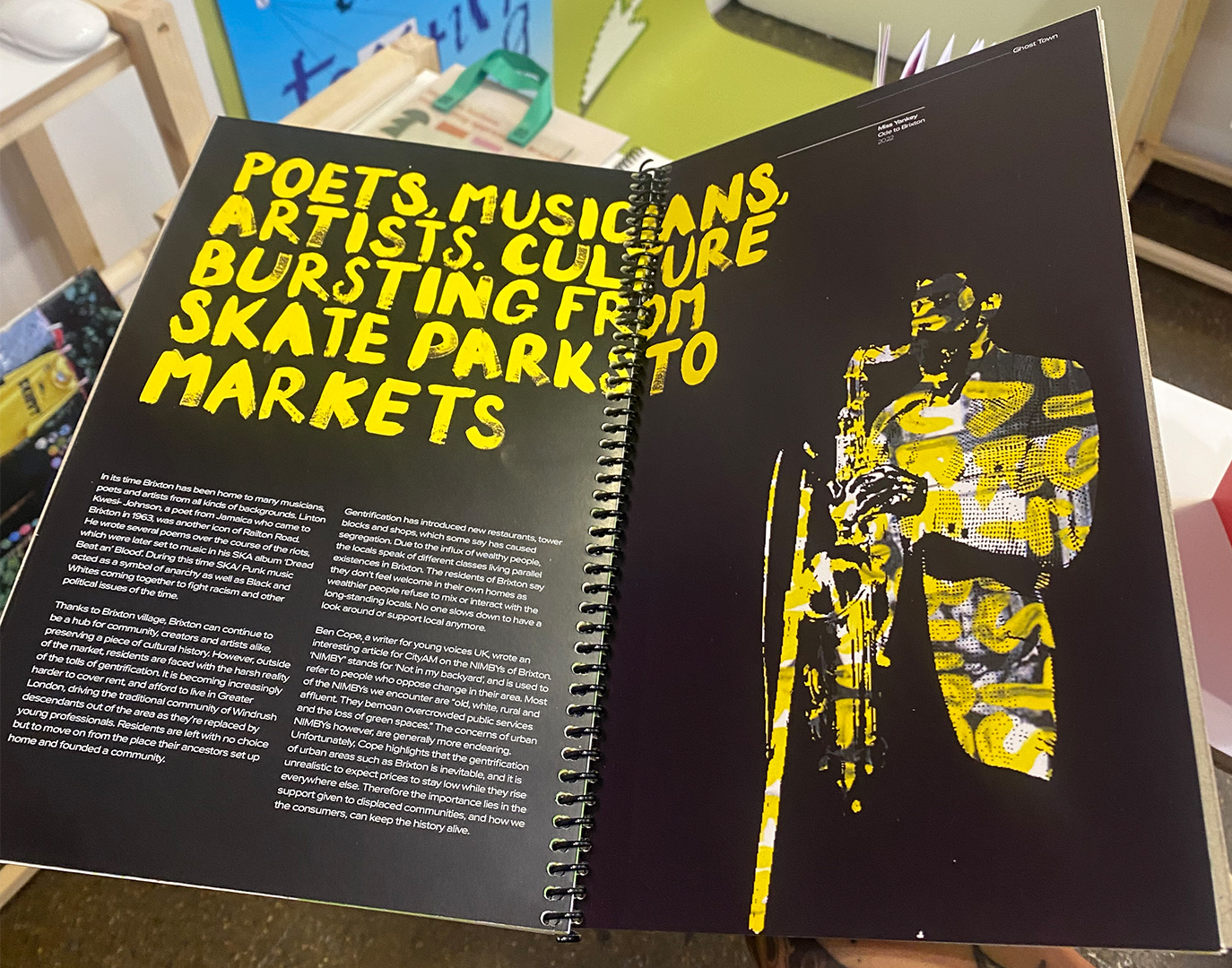
Project: Ghost Town
Socials: @n4t.cr
Natasha's project Ghost Town explores the theme of gentrification, exploring how its effects have caused the demise of culture in Brixton, London. Recognised by the ISTD, the project is a poignant reflection of social flux, challenging the sensitive topic with a contemporary confidence that's unafraid to question convention.
"We were given a brief by ISTD – 'The Death of the Centre'," Natasha says. "London isn't dead, nor is it dying, but gentrification is a big issue." Weaving lyrics throughout her project, Natasha's piece is both a visualisation of cultural decline and a poetic homage to an era that deserves to be commemorated.
For more fresh creative inspiration, check out what brands can learn from Charli XCX's Brat marketing or take a look at the way brands can appeal to Gen Z.


