A pantry is an ultra desirable feature of any kitchen. But just as for the kitchen itself, decor counts. Select the wrong paint color for a pantry and it can make it look dingy, unappealing, and fail to complement the kitchen.
Generous super organizable storage, and maybe extra utilities like a sink and faucet put pantry ideas at the top of many a kitchen wish list, so it’s vital not to spoil your plans with a paint color that’s a let down – and that’s where interior designer advice comes in.
Here, interior designers share the colors they would never paint a pantry in and – for inspiration – those they would.
Pantry paint colors to avoid – according to experts
A pantry can be open to the kitchen, or a separate space but, either way, it’s one part of a whole and needs to be considered in that way as well as individually. Color has an influence on atmosphere, too, and a pantry should be decorated to suit the tasks that go on there. These are the paint colors to avoid, plus the ones you might like to use in your own home.
Red
Red is a powerful color that designers typically don’t recommend for the kitchen, and the same goes for a pantry although here it’s also the room’s size that makes it a paint color you shouldn’t use. ‘Bold, bright colors can seem excessively intense in a compact space like a pantry,’ says interior designer Artem Kropovinsky.
That doesn’t mean you can’t use pops of a bold hue, but go carefully, advises Artem. ‘If you’re attracted to a vibrant color, attempt to employ it sparingly,’ he recommends.
Green
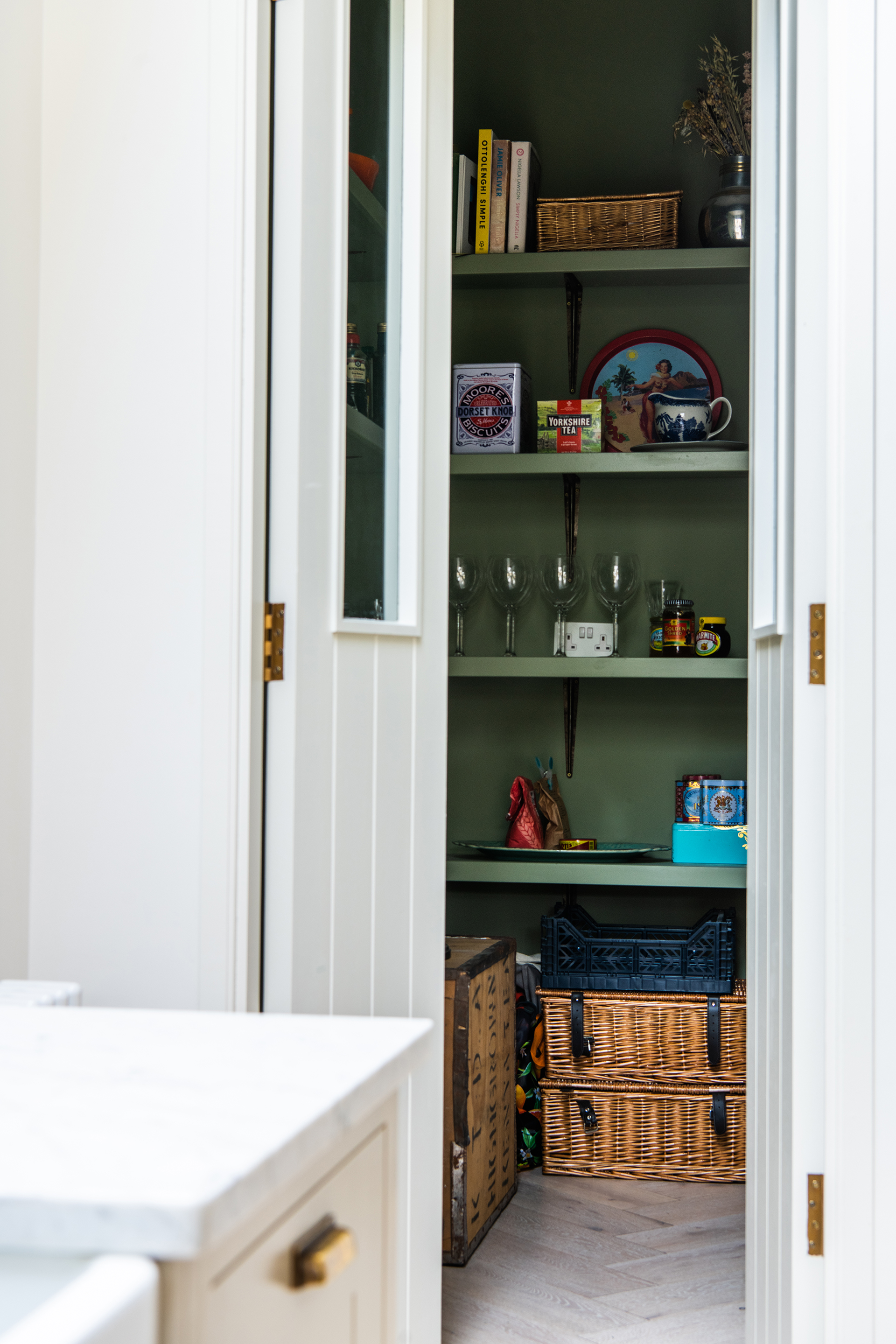
Green is another colour to avoid for a pantry as it could cast a green light on the food that won’t be welcome for this hard-working part of the kitchen.
‘When considering the pantry, this is often an extension of the kitchen and should function properly to allow for meal preparation and hosting or entertaining,’ explains Angela Hamwey of Mackenzie & Co.
Blue
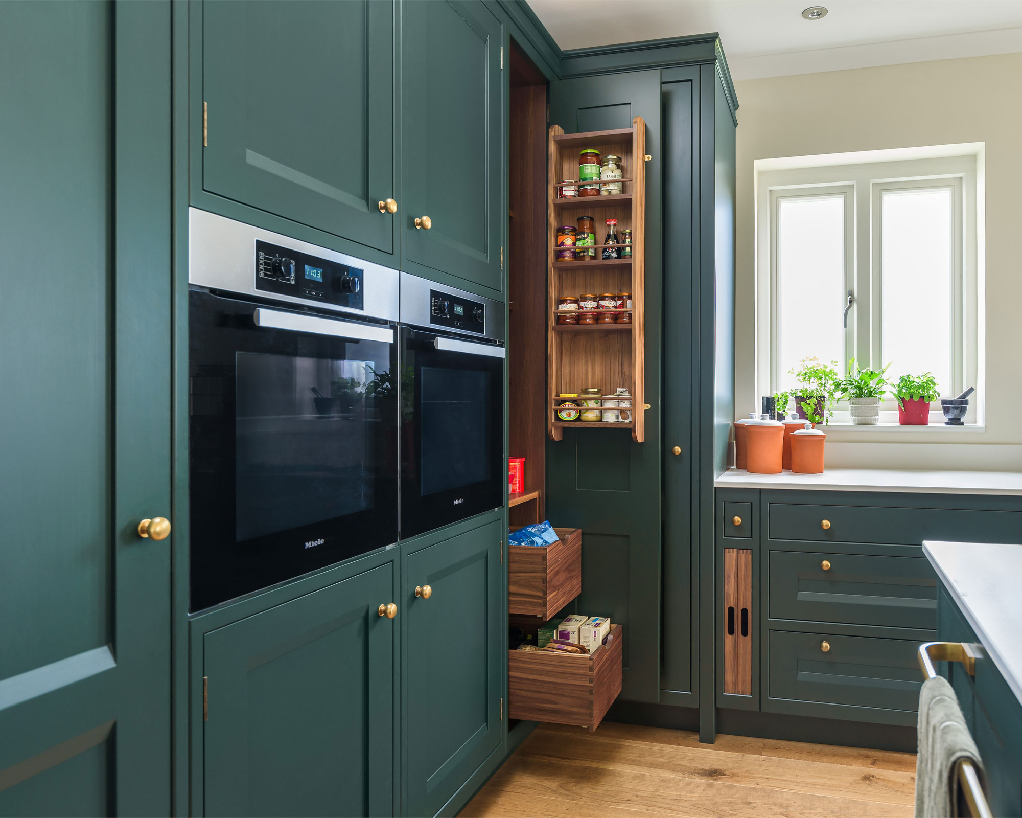
Also on the list of paint colors you shouldn’t use for a pantry according to experts is blue – at least in its darker incarnations. ‘As a general rule, we tend to avoid dark or saturated colors in the main living spaces as they are distracting and usually don’t have a positive effect on the overall mood and ambience of a space,’ explains Angela Hamwey.
A dark blue can also make the space seem cramped. ‘Dark shades can shrink a pantry visually, making it seem confined and congested,’ says Artem Kropovinsky. ‘If a darker color is your preference, consider limiting its use to a feature wall or a small section.’
Yellow
Another color that designers advise may not do a pantry any favors along with those we’ve already mentioned is yellow. ‘Paint colors such as red, green, blue, or yellow may make the area feel unorganized or disheveled,’ says Angela Hamwey. ‘Additionally, the pantry should not make a statement and detract from the rest of the home.’
And if you’re thinking that a subdued take on yellow might make the grade, the advice is that this takes work to pull off. ‘Understated, muted colors could result in a pantry appearing uninspiring and dull. If you wish to use a muted color, consider pairing it with colorful accessories such as baskets, jars, and labels,’ says Artem Kropovinsky.
Bright white
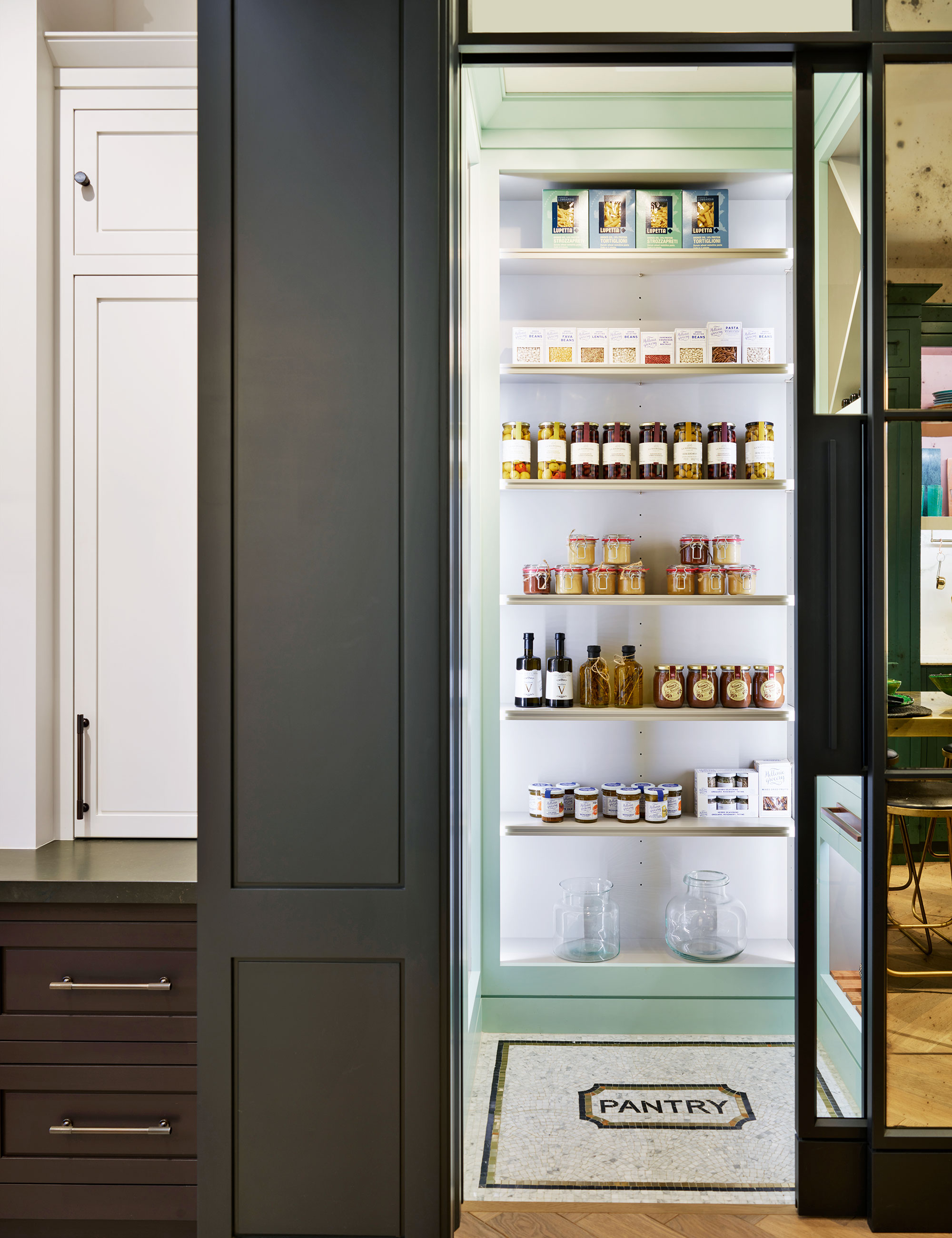
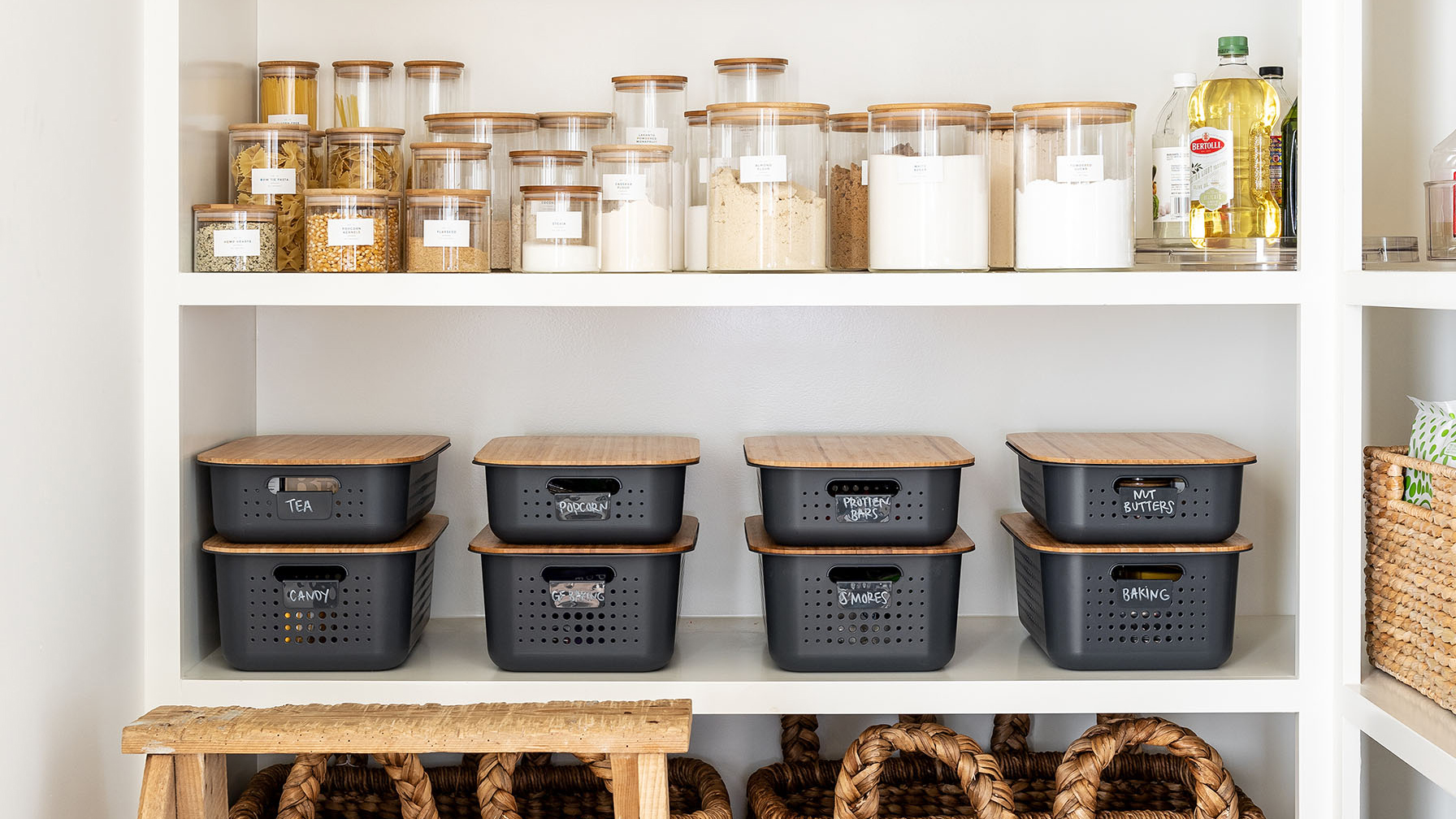
While it might seem as if it’s the perfect space-expanding shade for a small room like a pantry, you may want to steer clear of bright white. It’s a color that can feel clinical and stark – not the ambience that’s desirable in the kitchen area.
But that’s not to say white is completely out. Try off whites that offer warm takes on the color. The result if you take this route? ‘A classic pantry color that perpetually remains in vogue, white can render a pantry light and spacious,’ says Artem Kropovinsky.
FAQs
How can I make my pantry look better?
Cohesion with the kitchen will make a pantry look better. ‘We recommend keeping the paint color consistent with the kitchen in order to create a seamless flow,’ says Angela Hamwey of Mackenzie & Co.
‘We suggest soft, neutral paint colors that complement the architecture of the home and work to create a welcoming and inviting atmosphere.’
What are the best colors for a pantry?
Colors that tend to work well in pantries include soft white, which won’t go out of style and makes the space feel larger. Or try a light version of gray. ‘Another fitting choice for pantries, light gray offers a similar lightness to white but with an added character,’ says interior designer Artem Kropovinsky.
Artem also recommends the qualities of beige. ‘Beige's warm and welcoming tone works well in a pantry,’ he explains. ‘It’s a great base if you aim to add color pops with accessories.’
And bear in mind that you can have fun with color in a pantry, according to Ami McKay, president and principal of Pure Design: Interior Design, Build & Shoppe. ‘If you have several shelves, do something exciting on the ceiling, a bold color or maybe a botanical wallpaper,’ she says.


