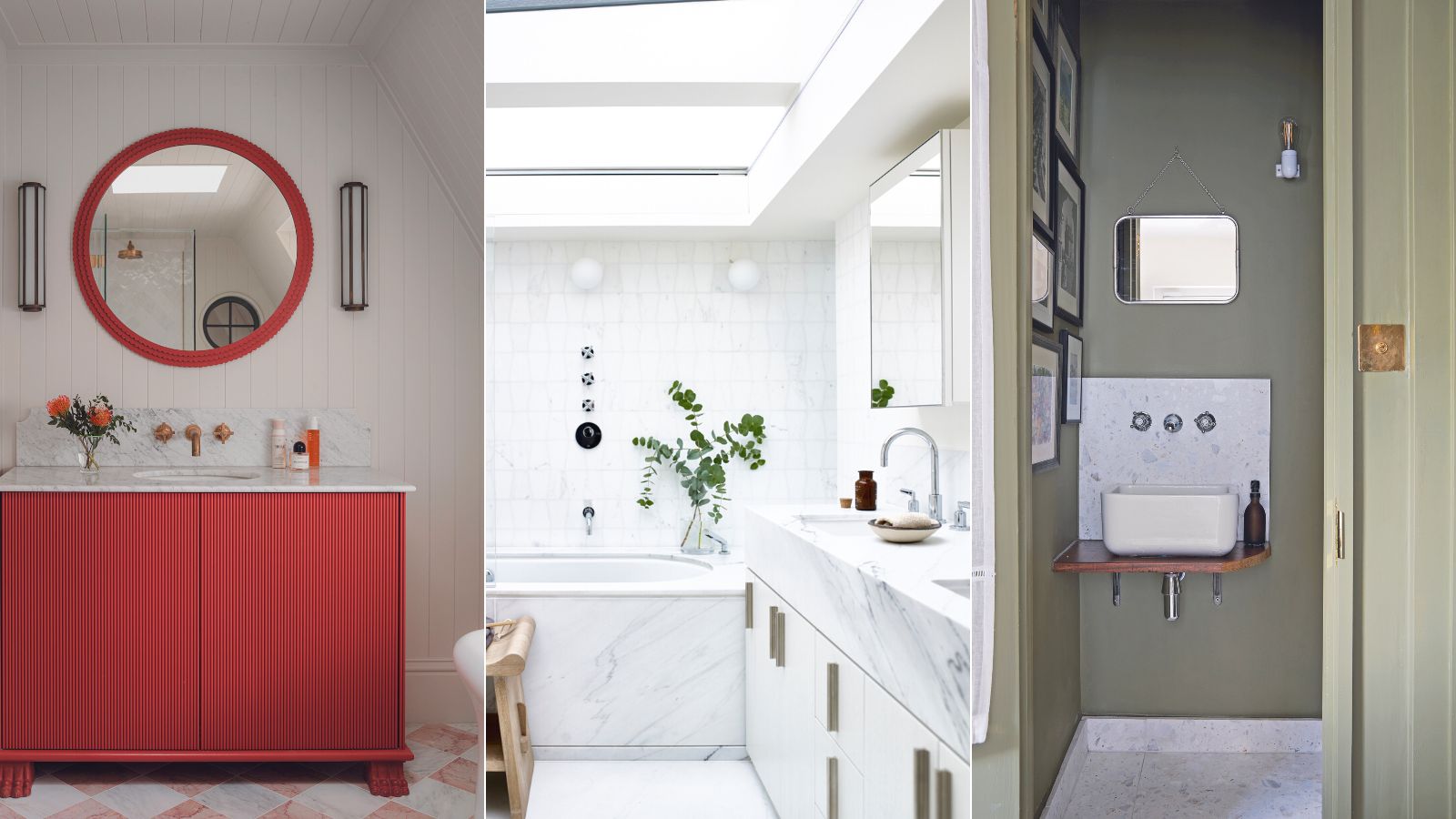
Bathroom paint colors have power. They can influence our mood and wellbeing for the better, as well as making an impact aesthetically. Select the wrong shades, in other words, and you can compromise the room’s look as well as how you feel each time you use the space.
Any bathroom ideas therefore need to include careful consideration of paint colors for the room – and above all else to avoid the shades that are unflattering to you and to the room itself.
The colors to spurn and those to adopt? We’ve asked design experts to share their secrets.
Bathroom colors to avoid: hues that can ruin the mood
On the list of must-have criteria for a great bathroom design is a color scheme you’ll enjoy spending time in. That means it should be space stretching if the room is small, able to energize you in the morning but relax you in the evening, and practical to keep clean. Tick all the boxes with this insight into the colors to avoid and the hues you should go for in their place.
Green
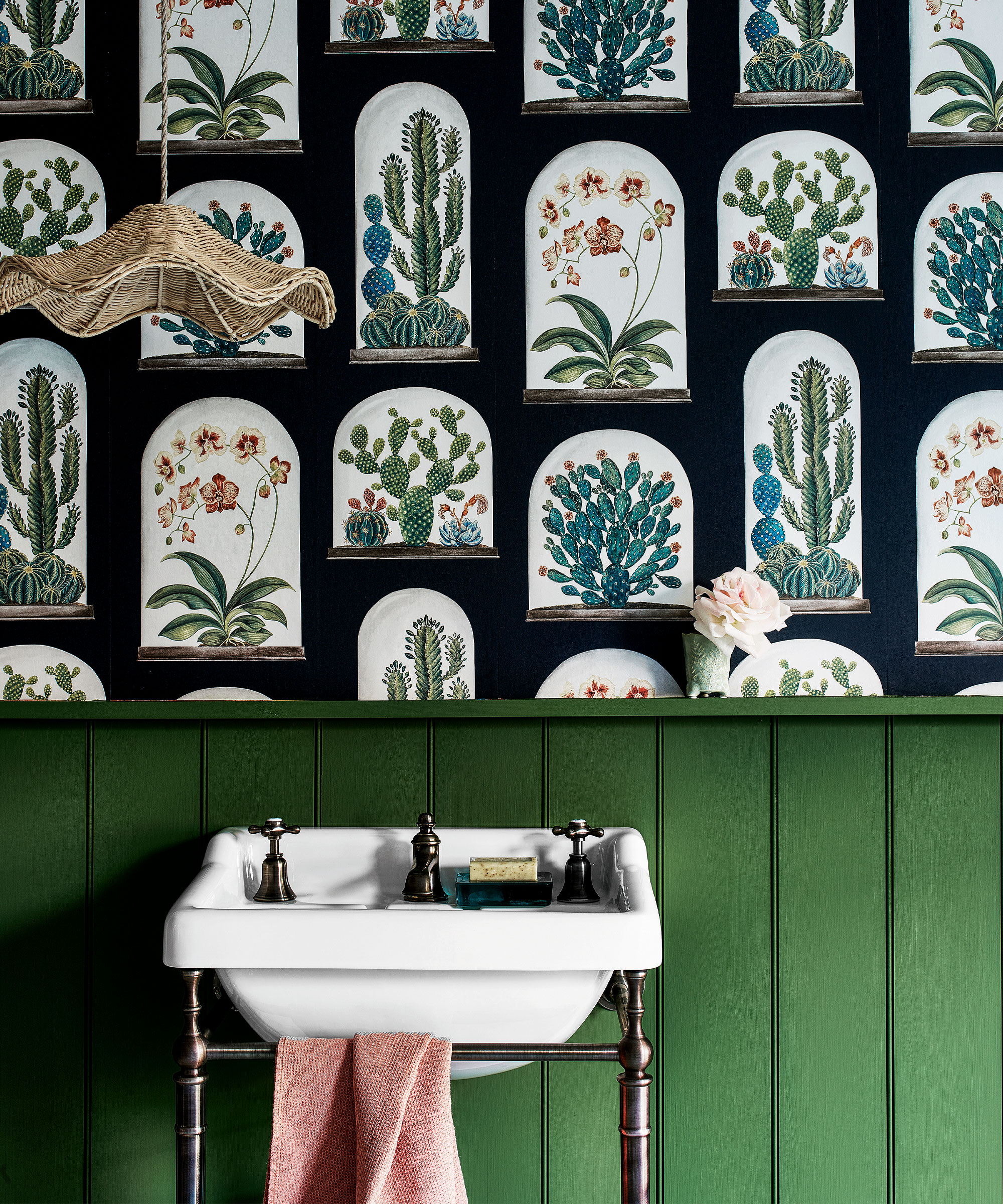
While green might seem like a great choice for painting a bathroom because of its associations with nature, this could prove a poor choice.
‘It depends on the type of bathroom and window exposure but green is usually a no-go,’ advise Kiley Jackson and Aileen Warren of Jackson Warren Interiors. ‘Green colors tend to make your skin look a bit green and no one wants that.’
If you are tempted by green, and want to make sure it doesn’t cast an unflattering light you can test the effect in your room before going ahead. Paint a large piece of liner wallpaper and hang it in the bathroom. Take a look at different times of day and under both natural and artificial light to check the effect it has.
Red
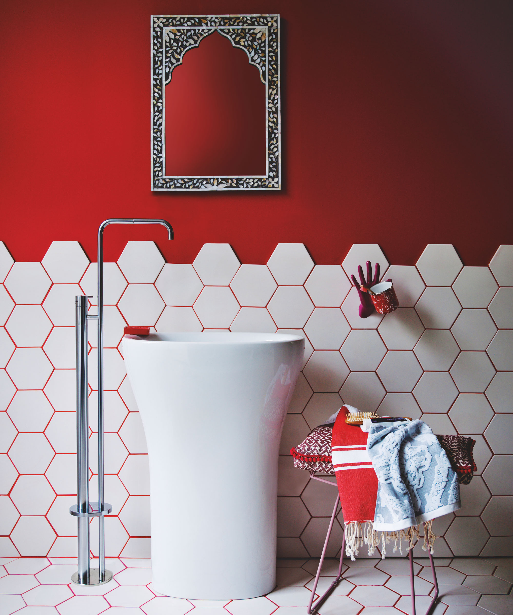
Red is another shade that interior designers advise saving for spaces other than a bathroom. ‘We would probably steer clear from red,’ say Kiley Jackson and Aileen Warren.
The problem? ‘Intense, bright colors can seem overpowering in a confined space like a bathroom,’ explains interior designer Artem Kropovinsky.
However, that doesn’t mean you have to ban red entirely from the bathroom. ‘If you're looking to add a pop of color, you may consider incorporating colored decorative elements such as towels, rugs, or artwork,’ suggests Angela Hamwey, founder of Mackenzie & Co.
Saturated primaries
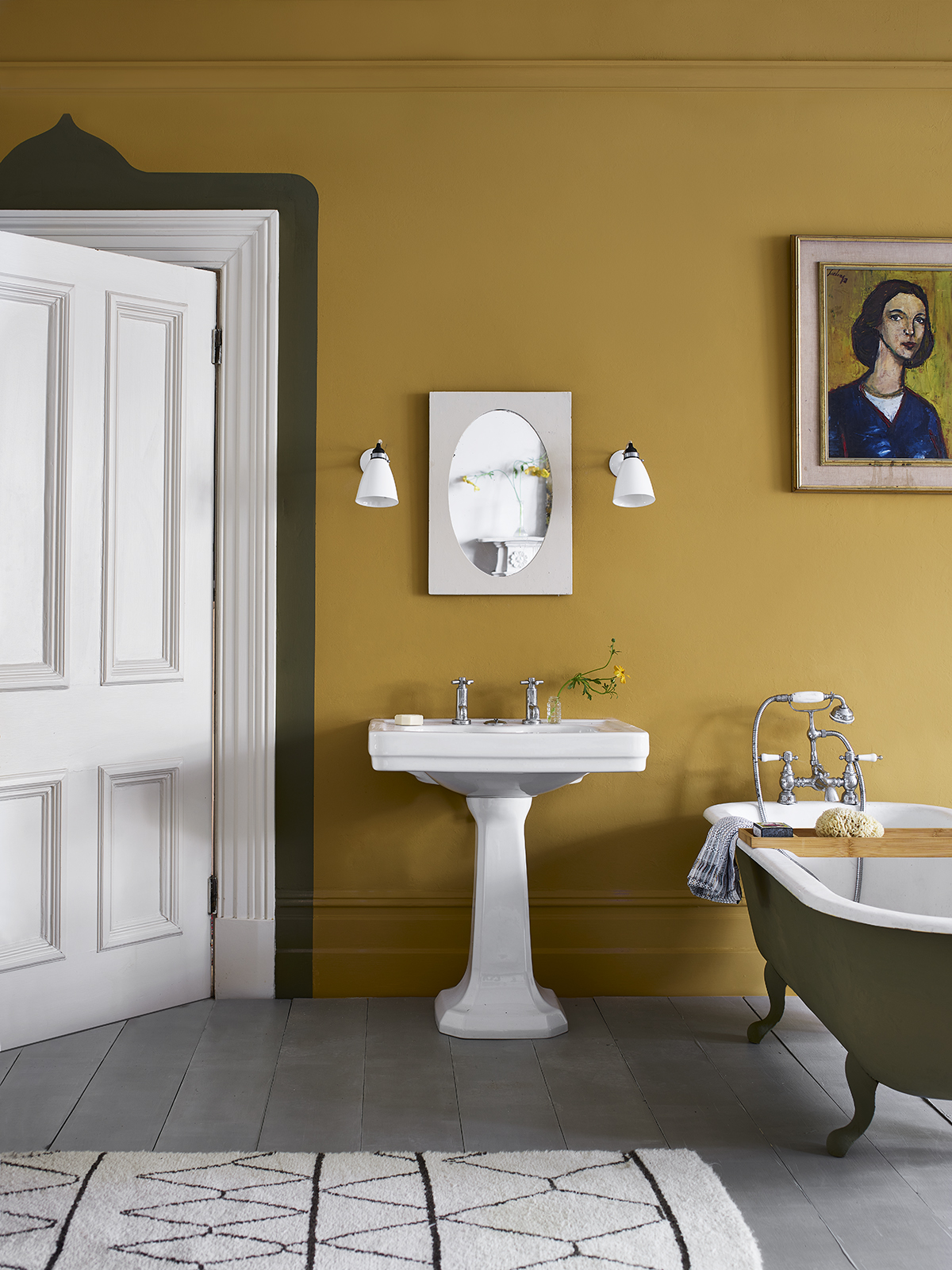
What goes for red, goes for other hues with similar characteristics, Angela Hamwey cautions. ‘We specifically suggest avoiding fully saturated primary colors such red, yellow, or blue that can be visually shocking,’ she says.
‘We tend to avoid using bold, jarring paint colors, especially in a bathroom as it should feel bright and welcoming in order to promote feelings of relaxation,’ Angela explains.
What to use in their place? ‘Bathrooms are often smaller spaces of the home focused on cleaning and selfcare. It’s important to use light, neutral colors to make the space appear fresh and inviting,’ she recommends.
Bright white
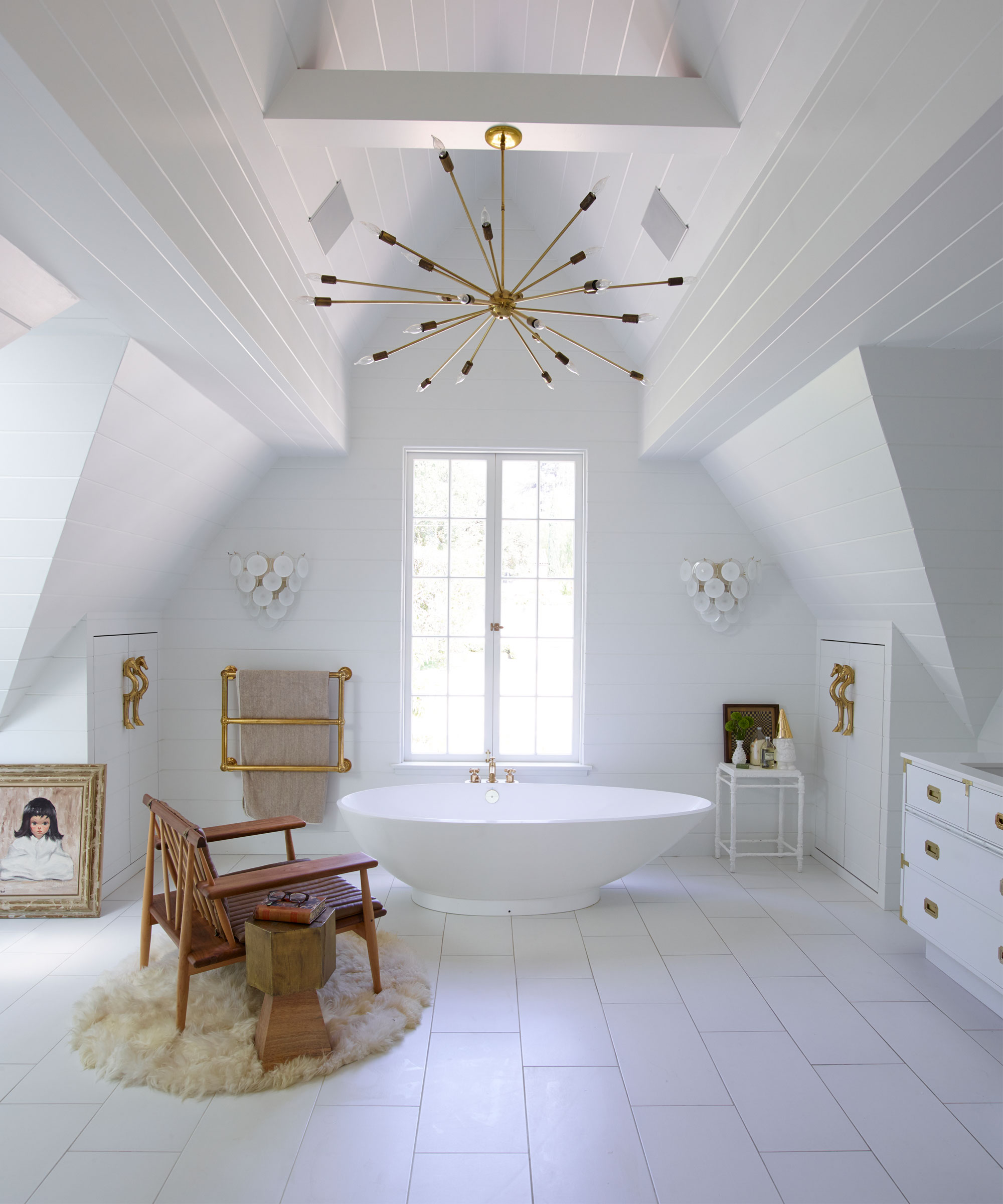
While interior designers recommend light shades for painting a bathroom, be cautious about one. ‘Bright white may not be ideal as it will easily show dirt and stains and require more maintenance,‘ says Angela Hamwey.
‘Instead, we recommend soft, neutral paints in shades of grays, blues, and off whites to create a serene space. Ultimately, a well designed bathroom with the right paint color will energize you in the morning and offer calmness at night.’
Kiley Jackson and Aileen Warren agree, recommending that for primary bathrooms, it’s best to ‘go light – you want it to feel open, relaxing, and energizing’ .
Dark colors
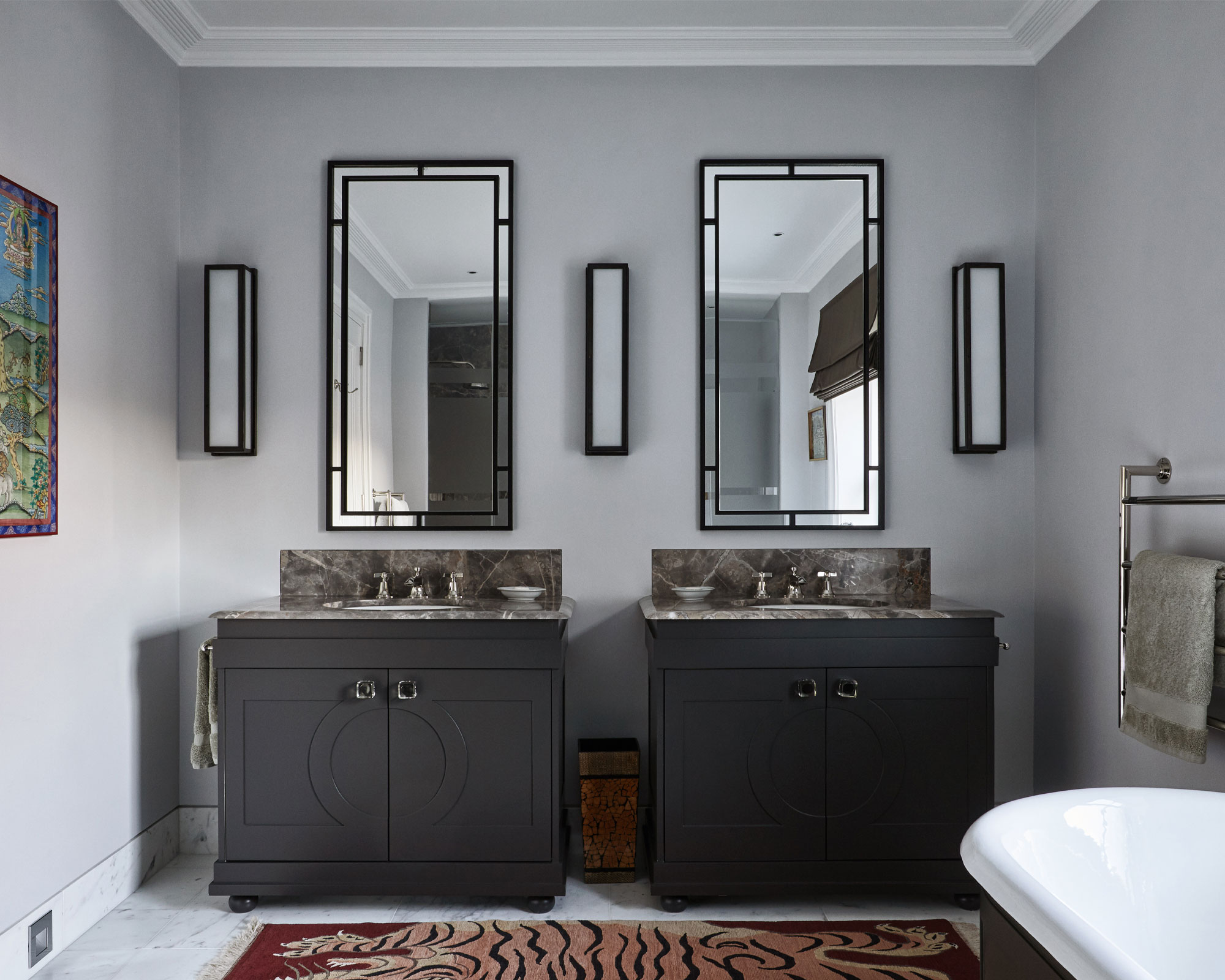
Any bathroom paint color can be an error if it’s too dark a shade. ‘Dark colors are also not ideal for a bathroom as they can dampen the mood and make the space feel smaller,’ explains Angela Hamwey.
There is an exception to this, however, according to Kiley Jackson and Aileen Warren. ‘In powder rooms, we love to go dark and moody – turn the drama up in the tiny space. It is a great spot to show personality.’
FAQs
What color goes best in a bathroom?
Focus on light colors for bathrooms, advises Kate Figler of Kate Figler Interiors. ‘Bathrooms are spaces that should be simultaneously calming and practical – a place to both unwind after a long day and get ready in the morning,’ she says. ‘Because of this, the ambiance needs to be universally flattering without being too bold. Think warm whites, crisp grays or other calming tones.
‘One of our tried and true colors is Benjamin Moore White Dove which pairs beautifully with marble – we love to add an accent ceiling in a pale blue as well for interest. The warmth of this white is a perfect backdrop for plumbing and lighting and complements a variety of skin tones which is critical in a space where clients frequently look in the mirror.’
Are lighter or darker colors better for a bathroom?
Typically, lighter colors are better for a bathroom. Interior designer Artem Kropovinsky suggests those you might consider include ‘White – this timeless bathroom color never loses its charm,’ he says. ‘It aids in giving the bathroom a light and spacious feel.’
Alternatively, think about using light gray. ‘This is another suitable option for bathrooms, offering a similar brightness to white but with added character,’ he explains. Or perhaps beige. ‘This warm and inviting shade is a great fit for bathrooms, offering flexibility for adding vibrant accessories,’ says Artem.


