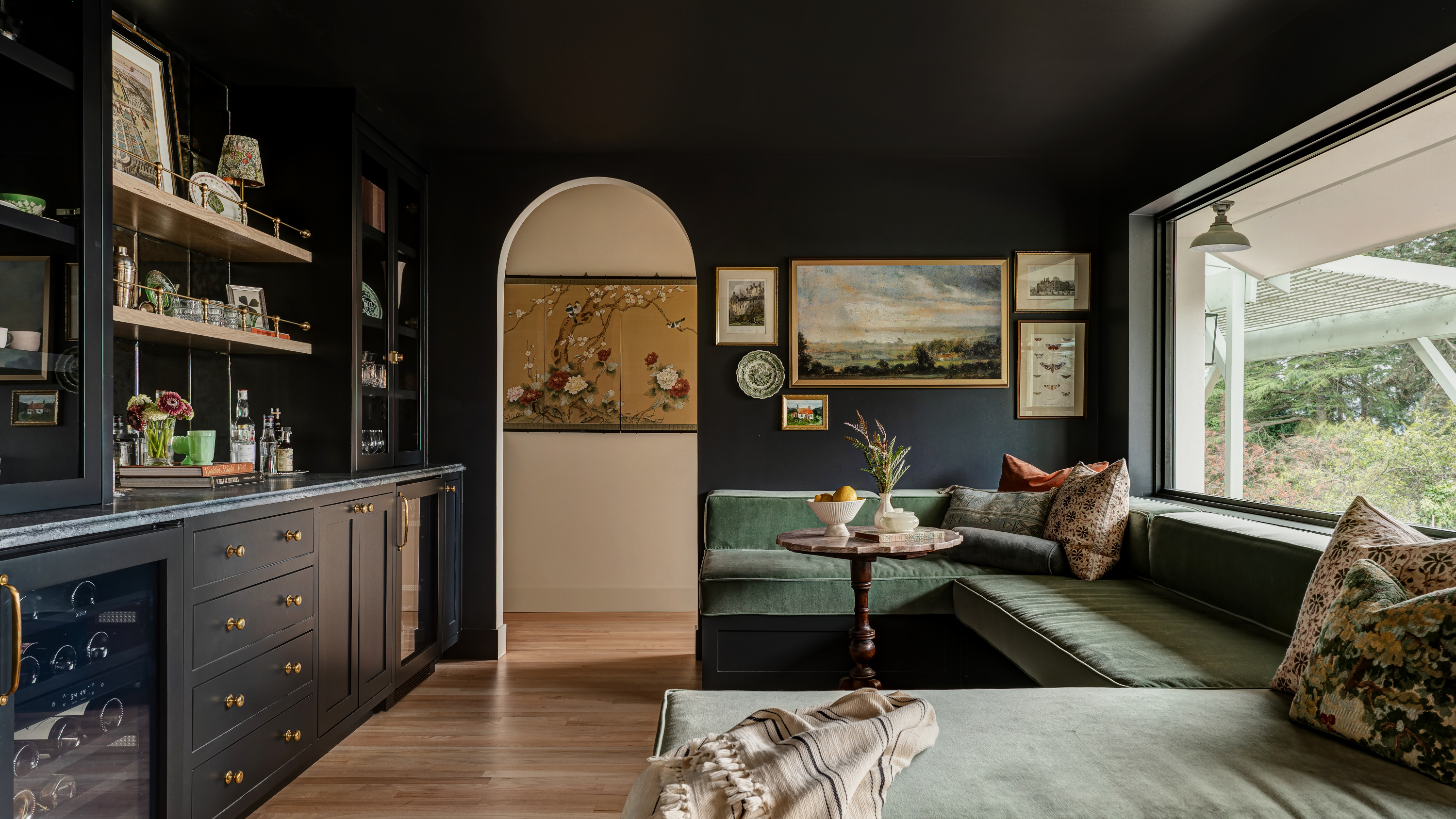
It’s always exciting, at this time of year, to ask designers to predict trends for the year ahead. From the decorating ideas we’ll be using to the furniture shapes we’ll be seeing everywhere, it’s fun to look to the future - and see, in another year’s time, how many of them came to fruition in our own homes.
But another question we also love to ask is: what about the interior design trends designers actually want to see? When it comes to color, it is, of course, entirely personal. But in asking designers what they hope to see people using in their homes in 2024, one theme was clear: they want people to be bold, and they want homes to feel moody, cozy, cocooning.
Unsurprisingly, many of the colors the designers we spoke to chose also tied in to expressive elegance, the term we’ve coined for a mood that’s elevated but creative, understated yet full of personality. So what are the colors designers want to see being used next year? They reveal all below.
1. Hot red
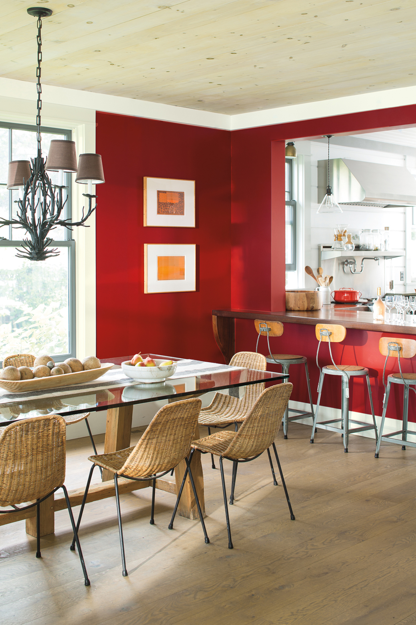
As red grows in popularity in fashion, so it does in interiors as a color trend, too. Designers are taken by this color in all its iterations – be it a deep, rich burgundy or a bright, bold fire engine hue. And for anyone who’s not up for painting their walls in the loudest possible shade any time soon (that will be most of us), there are plenty of calming ways to use red to help you integrate this hue into your scheme.
‘Red is the "it" color for 2024 – it is hot, hot, hot,’ says New York interior designer Sarah Tract. ‘I used to dislike the color but now I cannot get enough of it! Bring it in through pillows, throws, linens, accessories. I even suggest ditching your black and white marble color scheme and bringing in marble with red, burgundy, chartreuse accents. This vibrant hue brings such an elegant edge to any space!’
2. Deep purple
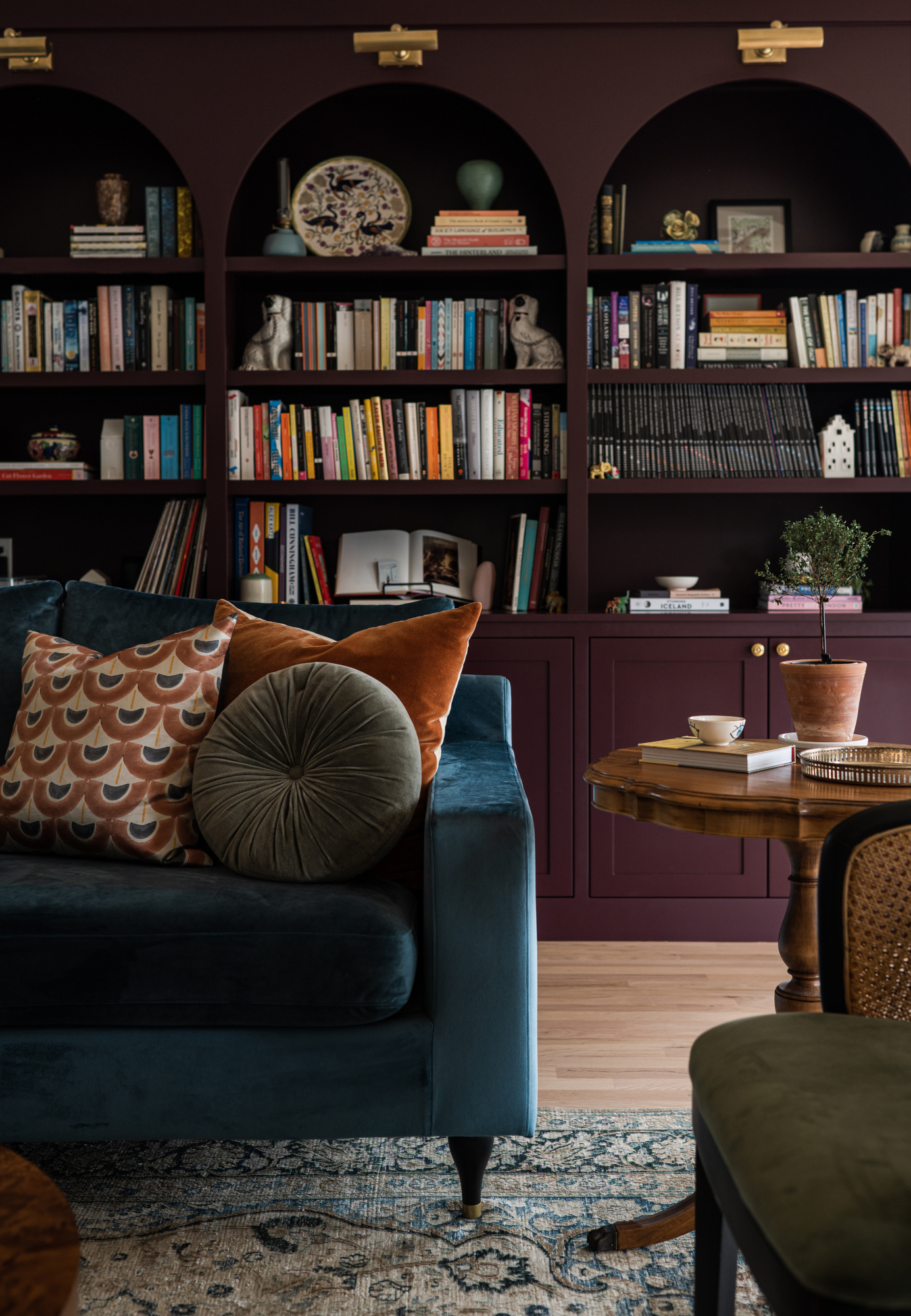
Burgundy might be one of the trending colors of 2024, but purple is also making waves. It's also surprisingly easy to find colors that go with purple, which helps take the edge off this sometimes daunting-sounding hue. ‘We saw this emerge slowly, but a new color family has now taken the town by storm,’ says Dorset, VT interior designer Joshua Smith. ‘Think deeper shades like plum and amethyst, even deep magenta. I think everyone should join in on the purple mania. Besides being aesthetically pleasing, from a psychological perspective purple contributes to mental balance and stability, calming the mind and nerves. We’ve even seen companies shift to purple violeta marble now instead of the typical carrara or calacatta.’
There’s also a Gen Z influence behind the rise of other, softer shades of purple. ‘We are loving the influence the younger generation is having on the interior design world,’ says Isy Runsewe, NY-based interior designer and founder of Isy's Interiors. ‘In 2023, we saw a lot of bold playfulness with color— from the inescapable pink manicured grip the Barbie movie had on just about everything, to the more frequent use of hot yellow oranges and electric reds. While “Gen-Z Purple” is every bit as mesmerizing as the energetic pinks, reds, yellows and oranges; these vibrant lilac-purples (like Pantone’s Veri Peri) are a welcome, fresh addition to the typical colors we've seen in interiors.’
3. Moody blue
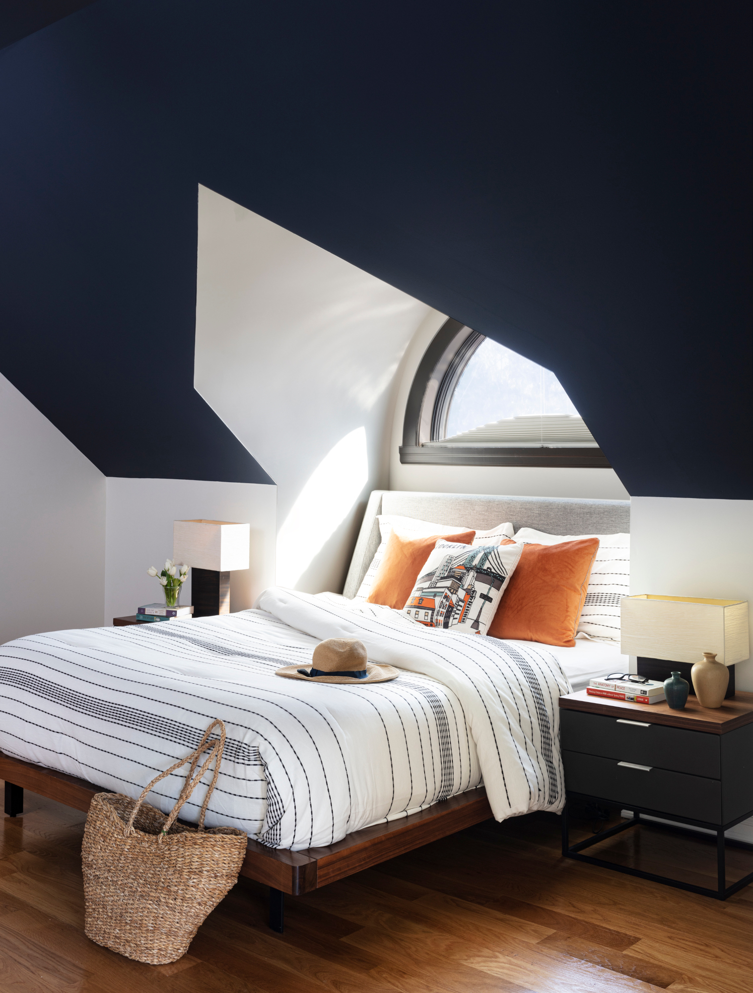
Another dark color trend, steely blues were top of many designers’ lists of the colors they want to see more of in 2024 – especially used in a monochromatic scheme. ‘Whether you prefer bold or soft colors, a monochromatic approach can add a touch of sophistication and elegance to your home decor,’ says Malka Helft of New York practice Think Chic Interiors. ‘In particular, I’m drawn to the deep, moody blues that transition into lush teal tones. Brands like Benjamin Moore offer an array of colors that embody this trend perfectly, with options like Polo Blue and Gentlemanly Grey. Pairing these rich wall colors with complementary decor items like navy throw pillows and dark tea rugs can create a cozy yet luxurious atmosphere that guests and family members alike will enjoy.’
'The use of blueish green is a timeless choice that creates a sense of depth and sophistication to any space,’ adds Seattle interior designer Jessica Dorling. ‘Whether incorporated in the tiles or cabinetry, or daringly embraced in both, these hues can transform the aesthetic of a room. If you're hesitant to apply a more saturated color in larger living areas, consider experimenting with these shades in smaller spaces like bathrooms, mudrooms, or wet bars.’
4. Dark brown
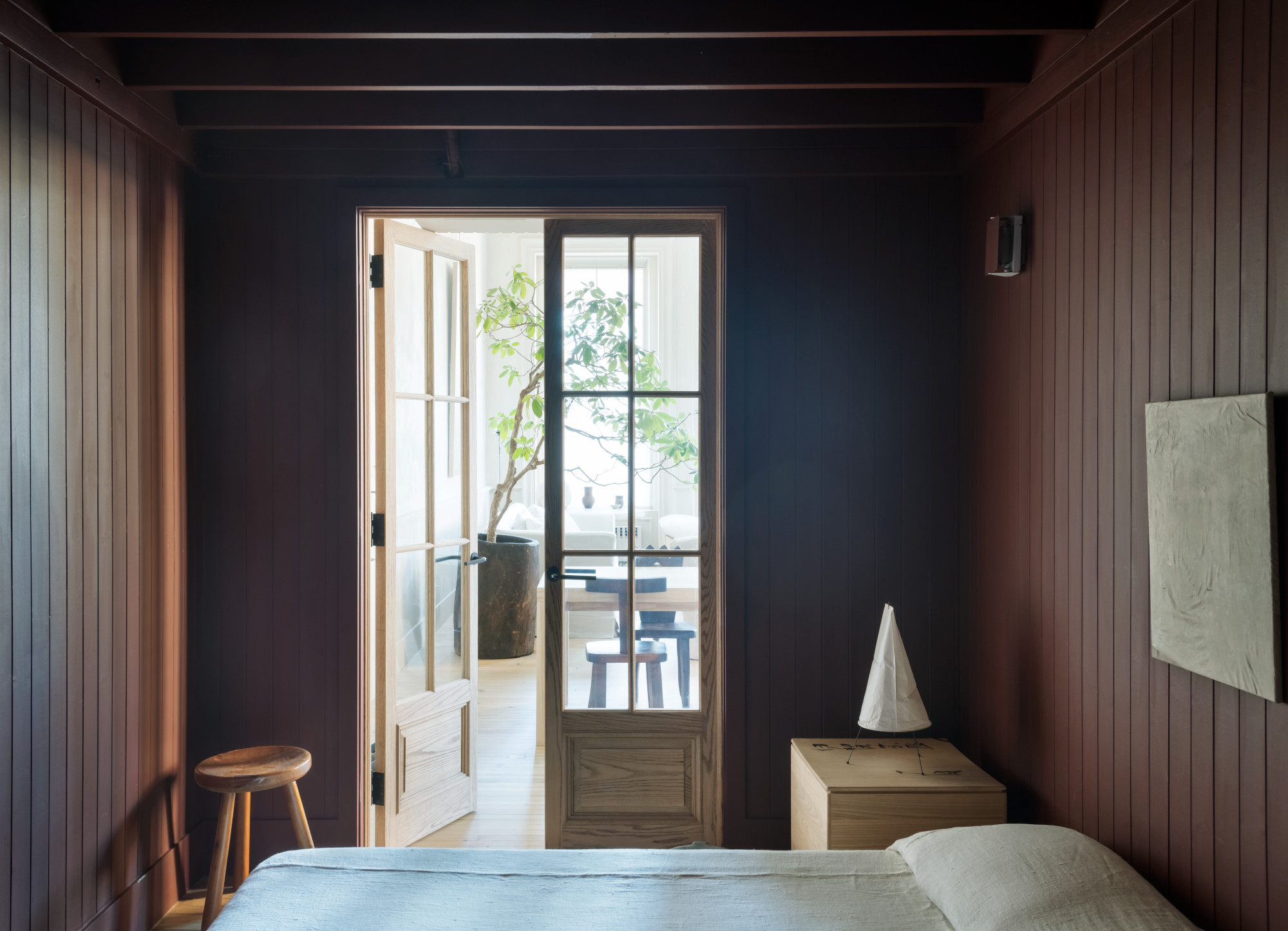
As in fashion, so in interiors: chocolate brown continues its reign as an on-trend shade for 2024, and Brad Ramsey, principal and founder of Nashville, TN studio Brad Ramsey Interiors, can’t wait to see more of it. ‘We'll be drowning in brown in all the best ways in 2024,’ he says. ‘Think about coffee, cappuccino and lattes and how those warm colors hit the spot just like your afternoon Starbucks fix. I’m currently loving Sherwin Williams’ Iced Mocha 9092.’
Layering brown in your home is a fine art, however. ‘You can't just purchase brown accents and toss them into your existing space,’ Brad says. ‘Brown is grounding and therefore if you make the move to this, be bold and consider multiple layers of brown from your paint ideas for walls to your upholstery. Use lighter softer tones like a muted green, terracotta, creams and natural linen in your accents to layer your space and keep it from looking dark and bland.’
5. Jewel tones
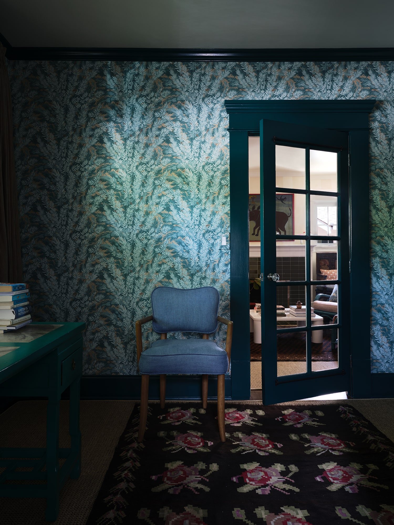
We’ve already hinted at it, but jewel tones are a color trend designers want to see much more of next year – and it’s all down to their role as a ‘bold’ choice for interiors. ‘I love jewel tones and keep finding myself coming back to rich greens, sapphire blues and aubergine,’ says interior designer Sarah Storms of Maplewood, New Jersey studio Styled by Storms. ‘It doesn't take much to make this bold statement. Paint the whole room a bold color; recover a beloved occasional chair or ottoman; add fringe or a tape to your solid drapery for a pop. If you really want to go for it, wallpaper in what I call a "conversational" pattern – a pattern that sparks a conversation or laugh.’


