There’s a substantial case to be made about kitchens becoming, in recent years, more and more of a design statement. With the kitchen being such a high traffic area that is often the heart of a family home where a lot of time is spent, there’s no wonder the need to create a tranquil, sophisticated look is prevalent.
Tidiness and functionality aside (which is, of course, the most important aspect of a kitchen – no matter the look, you will never feel right if you’re always annoyed by a lack of proper utility) the kitchen color that you choose for your walls and cabinets will have a great impact on how the space feels. I spoke to interior designers who create the most beautiful, calming homes, and, together with color experts they agree on the best five color pairings you should choose from for a tranquil looking kitchen.
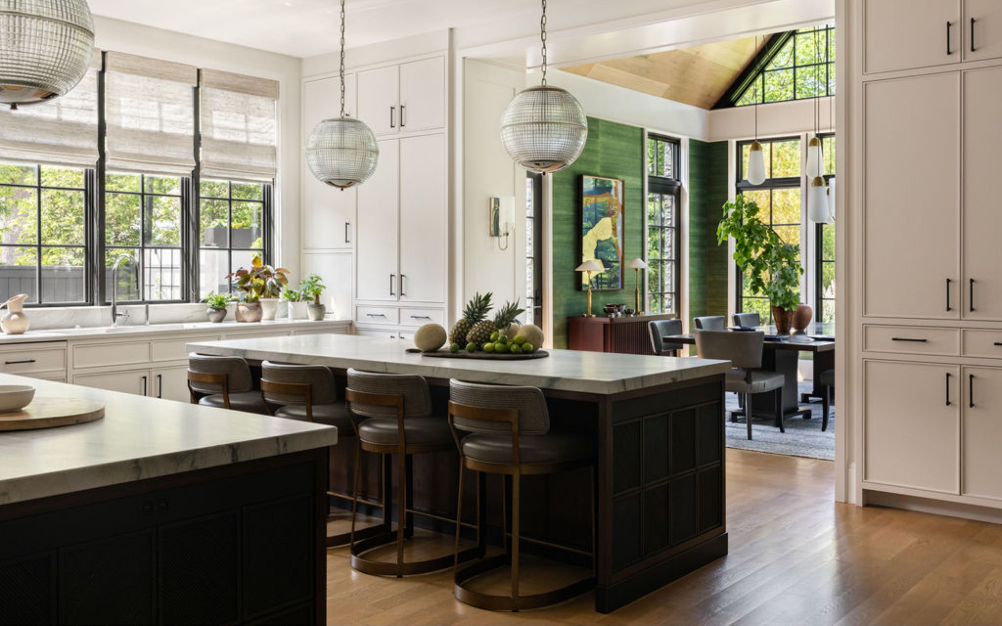
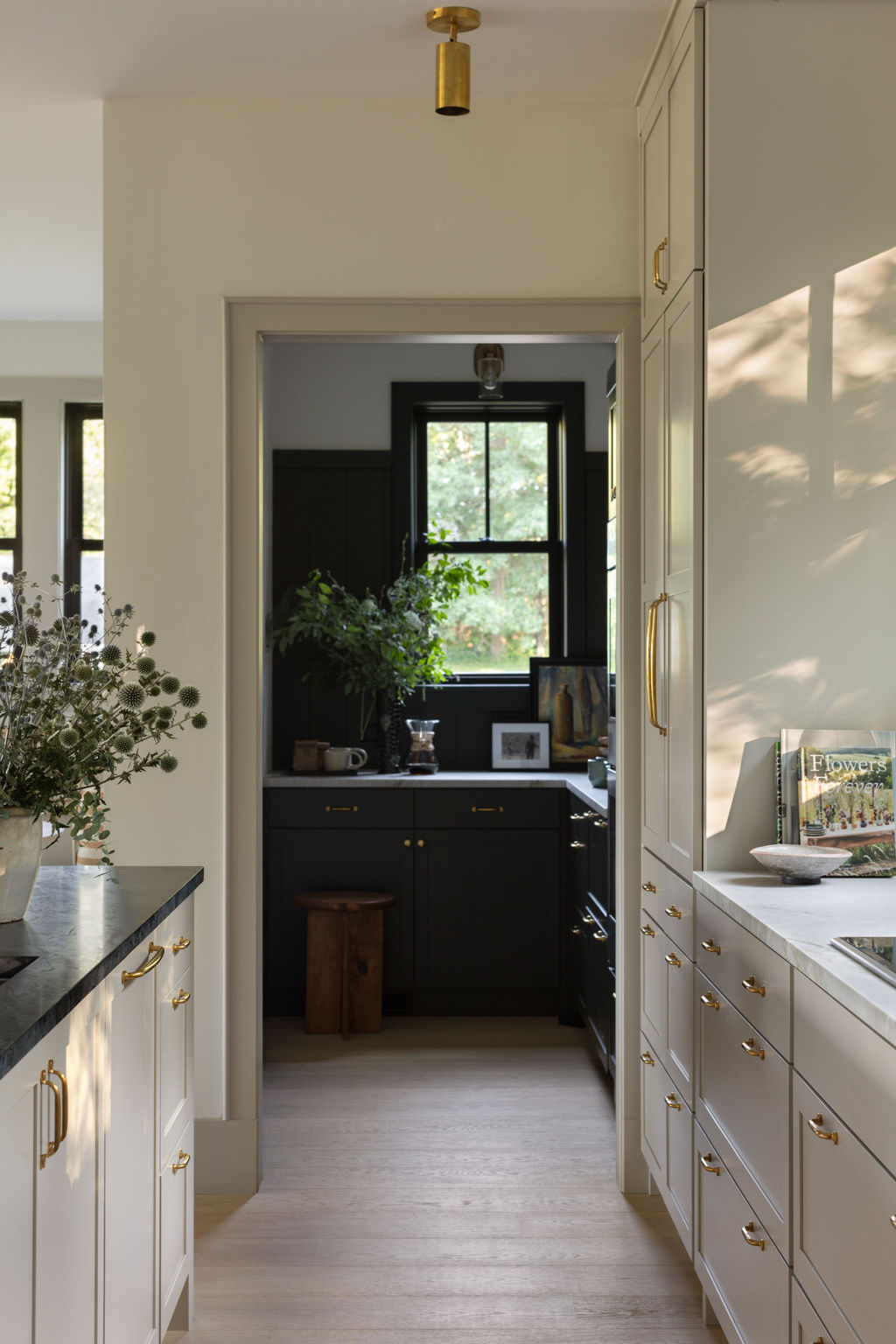
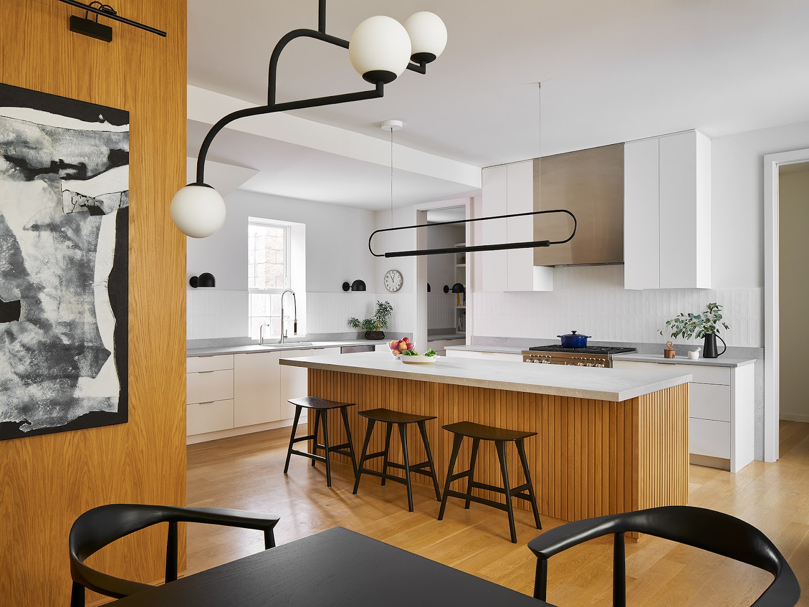
1. Off-white and walnut tones
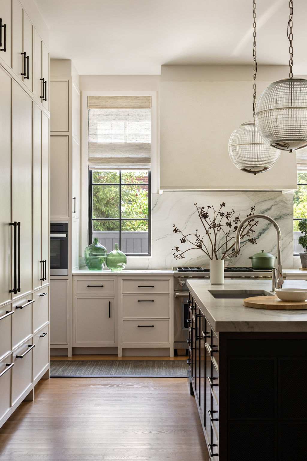
The classic combination of black and white, but softer. Replace the pure white with an off-tone, and the sharpness of black with a warm, dark walnut and you’ll be amazed by how sophisticated and calming your space will look.
‘A classic white kitchen with really tailored and considered details can feel very tranquil but often lacks a place for your eye to rest,’ says Lucas Golbach, Partner and Design Director at En Masse Architecture & Design. ‘In these instances, we like to include moments of contrast. Our North Shore kitchen features black painted windows, a dark walnut stained kitchen island, and custom metal panels on the ends of the island. This lets the calm white kitchen wrap the space and fall away while the island feels solid and sturdy to work on or sit around,’ he explains.
Pick one other element, like the marble veining of your kitchen countertops, to incorporate a darker tone, and create a cohesive look between the off-white and the walnut.
2. Mushroom and dark green
When you feel stuck for color ideas, look no further than to nature for the best inspiration. In the studio’s lake house project, Lucas tells me the kitchen derives its palette of materials and colors from its natural setting. ‘The pantry is a dark mossy green while the main kitchen is a mushroom tone. The lighter tone, Sherwin Williams High Sierra, relates to the wide plank white oak floors and lets the forest view shine through the row of windows over the cooktop,’ he says.
Natural greens are known in color psychology to have calming properties, making them perfect for creating tranquil looking kitchens. ‘For an on-trend look opt for a deep pine shade of green,’ Benjamin Moore’s color expert Helen Shaw tells me. ‘Regent Green is the perfect example of a gripping hue that will add depth and comfort to any scheme. The green undertones create a richness, offering a softer alternative to black and a more modern substitute to a dark gray kitchen. This darker shade will envelope a kitchen and works beautifully when paired with natural materials to achieve an organic, fresh look,’ she says.
3. Blue and gray
Gray and blue kitchens are a much loved color combination. It achieves a tranquil look because, just as green, we associate blues with nature, and therefore we instantly feel more relaxed. To achieve this effect, however, you need to make sure the color looks as nature derived as possible (think summer skies and ocean waters), steering away from anything too vibrant that will become tiring in time.
‘Blue and gray tones are known to have soothing and atmospheric properties,’ Helen tells me. ‘Not only are these shades reflective of those we see in nature, bringing about a sense of connection to the planet which many find calming, but they are also cool toned and non-conformational in nature, evoking a feeling of tranquillity,’ adds the expert.
4. White and light oak tones
The juxtaposition of light tones will always be among designer favourites when it comes to creating tranquil looking spaces. The less that the eye needs to process, the better, but the key to this minimalist kitchen keeping this look interesting is the layering of textures.
‘A limited palette of materials can lend a sense of tranquillity and in one of our kitchens we used a serene palette of white cabinetry, a slatted white oak island, and concrete quartz countertops combine to a serene effect,’ Lucas tells me. ‘These materials pick up on the palette of other elements in the open concept home and that repetition provides unity to the overall space,’ he adds.
5. Off-white and sage green
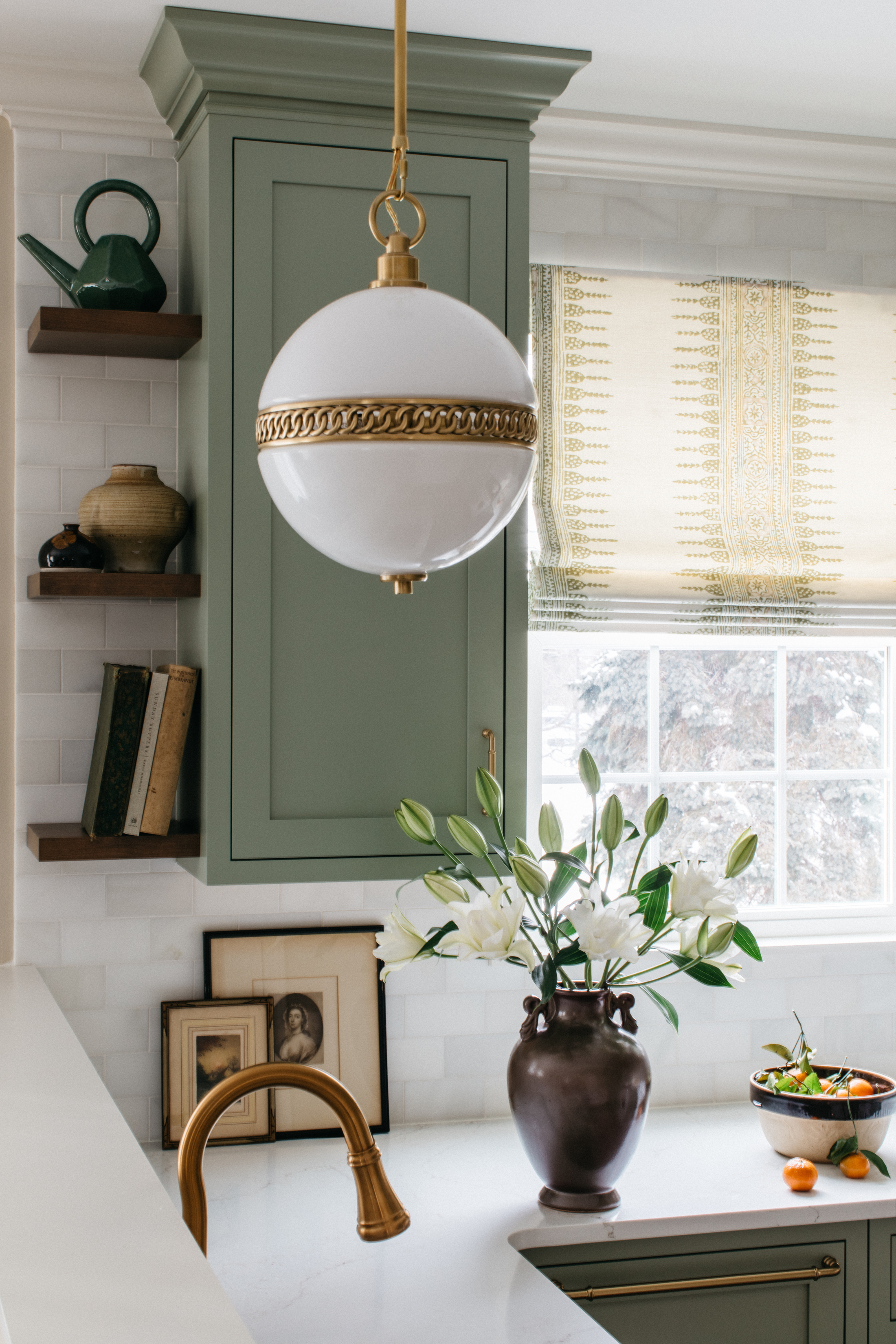
The popularity of sage green kitchens is still going strong, with designers going back to it again and again for its relaxing properties in any living spaces, including kitchens. ‘A color pairing to cultivate a tranquil atmosphere in the kitchen is sage green and off-white,’ explains interior designer and architect Martha Franco. ‘Achieve a timeless look by pairing sage green cabinetry with off-white walls, complemented by natural wood cabinet interiors behind glass doors and black handles. This classic palette is extremely appealing visually. For a cohesive and calm kitchen, the accent colour may be solely on the island, while keeping the cabinets and walls consistent. These combinations foster a serene and tranquil ambiance, perfect for both cooking and gathering with loved ones,’ she tells me.
Interior designer Alexander Adducci also likes using sage green, and he mixes it with warm wood and metal accents for that sophisticated look. ‘For a serene kitchen ambiance, opt for hues that evoke tranquillity - think sage greens, soothing grays, and the comforting warmth of natural woods. Incorporating lighter finishes can help achieve a spa-like feel. And don't overlook bronze and gunmetal accents; they add depth while maintaining a calming atmosphere in the space,’ he suggests.
Buys to bring tranquil color to your kitchen
Price: $770
This soft light blue bowl collection has a cool, calming feel to it.