Styling a coffee table might seem like a simple task, but designers say these living room must-haves require quite a bit of consideration. From selecting the right color and material to choosing the perfect items to top the table, there are so many decisions to make – and a lot of room for coffee table mistakes.
Whether you're picking out new furniture, or simply styling the coffee table you've got, you'll want to make the table an eye-catching centerpiece that still serves a purpose. To get a better sense of what to avoid, we compiled a list of the top five coffee table mistakes designers say to avoid at all costs. Here's what the experts had to say.
5 mistakes you're making with your coffee table
If you're sure to avoid these common pitfalls, designers say you'll be well on your way to creating an organized, proportional, and aesthetically pleasing coffee table. Here's how to achieve the look.
1. Ignoring design potential
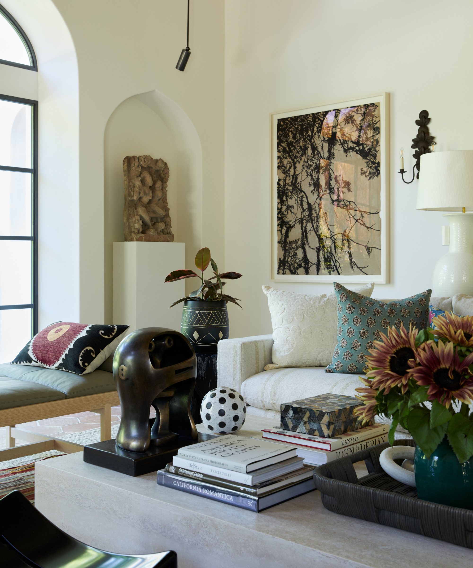
Beyond stocking up on coffee table books, it's easy to treat your table as a footrest or catch-all – and not much more. But Kathy Kuo, interior designer and CEO of Kathy Kuo Home, says that viewing your coffee table as a chance to elevate your living room's design scheme is the first step to styling success.
'There's really no one right way to style a coffee table, but it's definitely a mistake not to use your coffee table surface as an opportunity to create a really beautiful, styled vignette. I recommend starting with a decorative tray and experimenting with different combinations of coffee table books, scented candles, framed photos, and sculptural treasures,' says Kathy.
2. Piling things on
Though curating a selection of items to top your coffee table is a great start, you won't want to go too far. Too many decorations can cause a cluttered look, and quickly turn the coffee table into a disheveled mess.
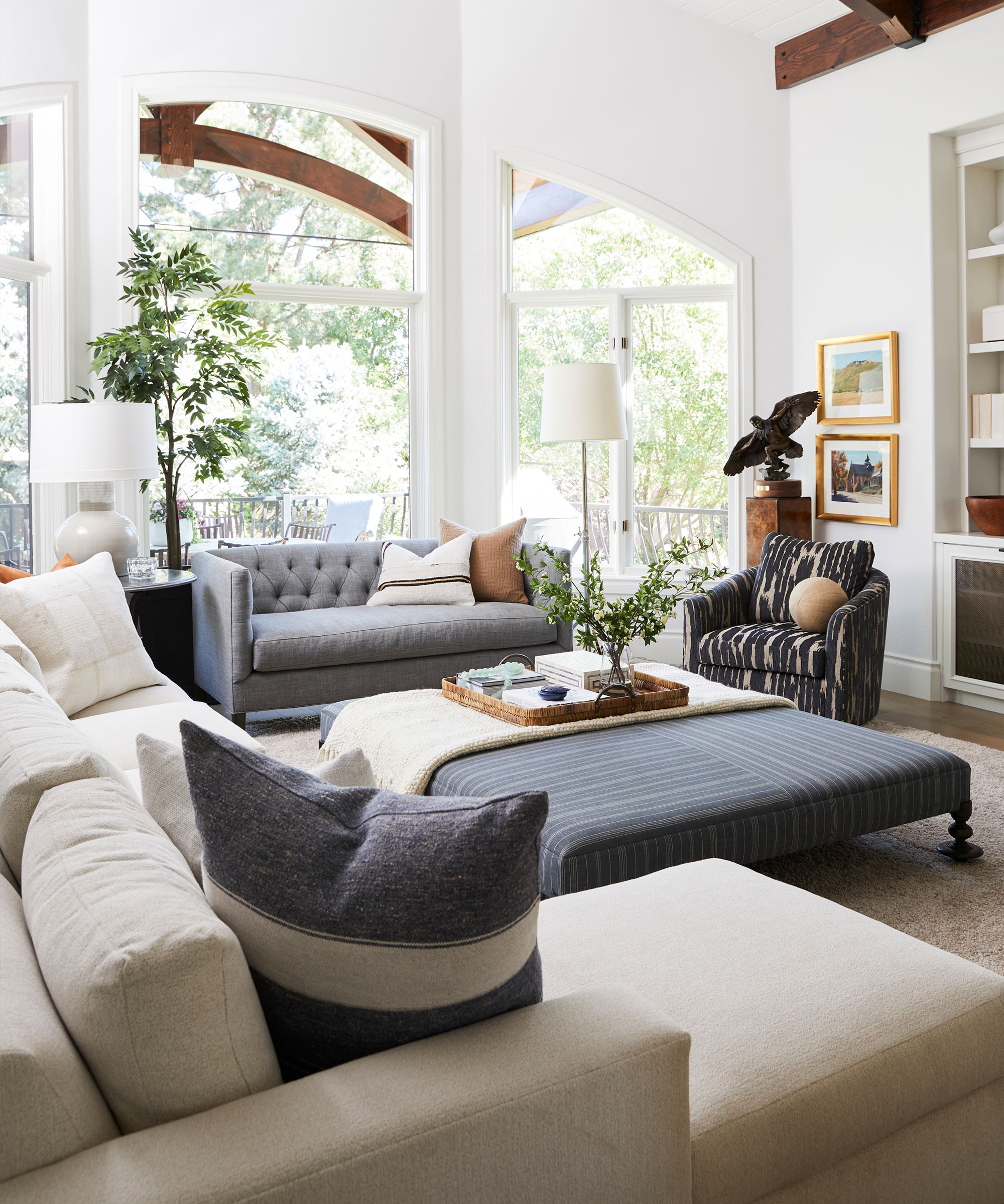
Helen Ashmore, head of design at Laura Ashley, offers a simple solution to an over-the-top approach to coffee table accessories: decorative trays.
'I like to create zones on the coffee tabletop through the use of decorative trays. These are perfect for storing your remotes and devices. Furthermore, I would add a stack of design books to create some height difference, candles and a gorgeous bouquet of fresh flowers,' says Helen.
Trays offer organization in disguise, making sure every item is in its place without unsightly storage solutions. By stashing objects in zones and adding a bit of dimension with additional decorations, you can design a curated, clutter-free coffee table.
3. Mismatching the table with the room
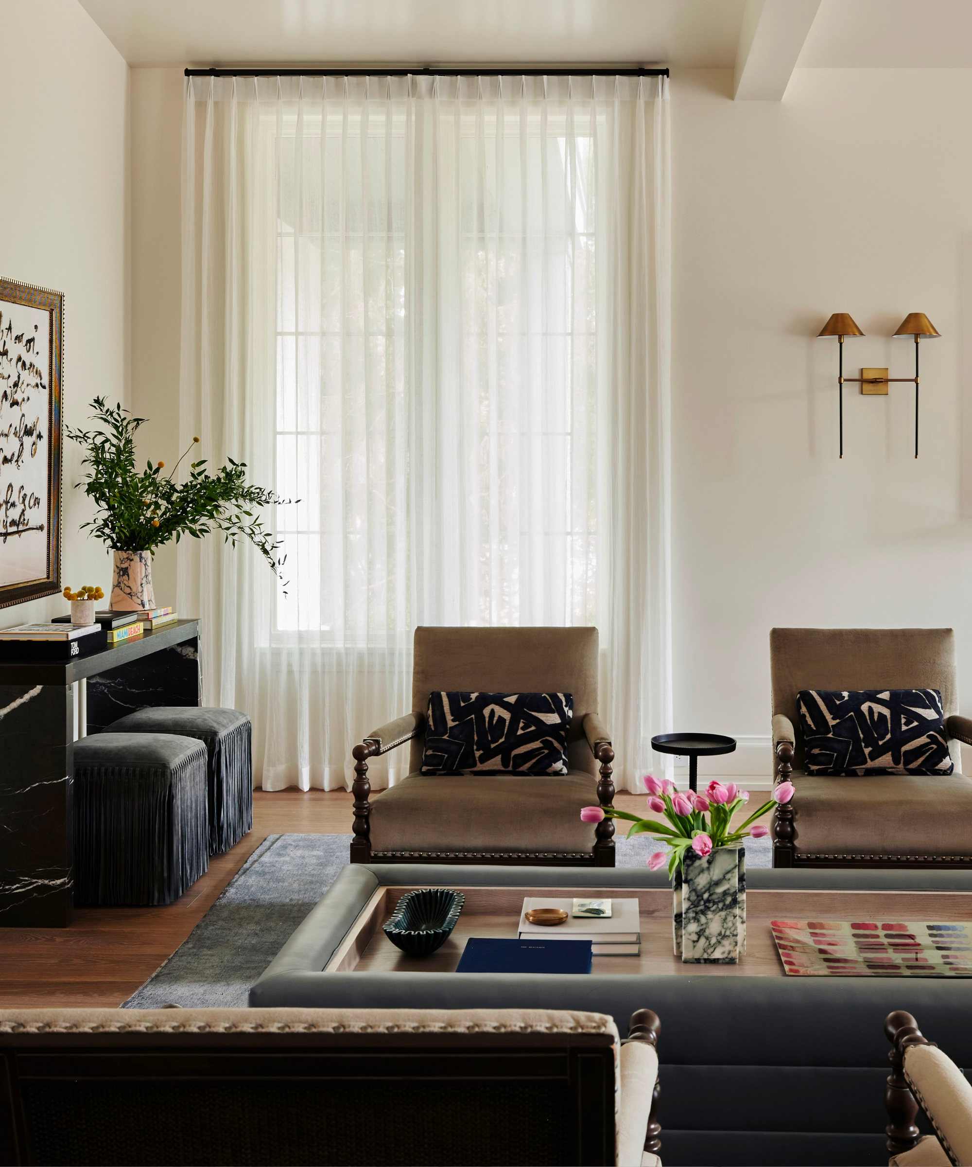
When it comes to the table itself, there's more to keep in mind than aesthetic appeal. Elizabeth Krueger, principal designer of Elizabeth Krueger Design, says a common living room design mistake she sees is a coffee table that doesn't match up with the rest of the room.
'Material is important, depending on how you use the space. I love an upholstered ottoman in a room where I'm watching TV and a harder surface if it is more of a conversational area,' she says.
Size and scale matter as well, making or breaking a coffee table's impact on the rest of the room. Elizabeth says a table works best when placed 15 to 18 inches away from the sofa's edge, so suggests picking up a measuring tape before committing to one design.
'Check the height of the table too – a table that is too high or too low can make the space uncomfortable,' she says.
4. Opting for the wrong size
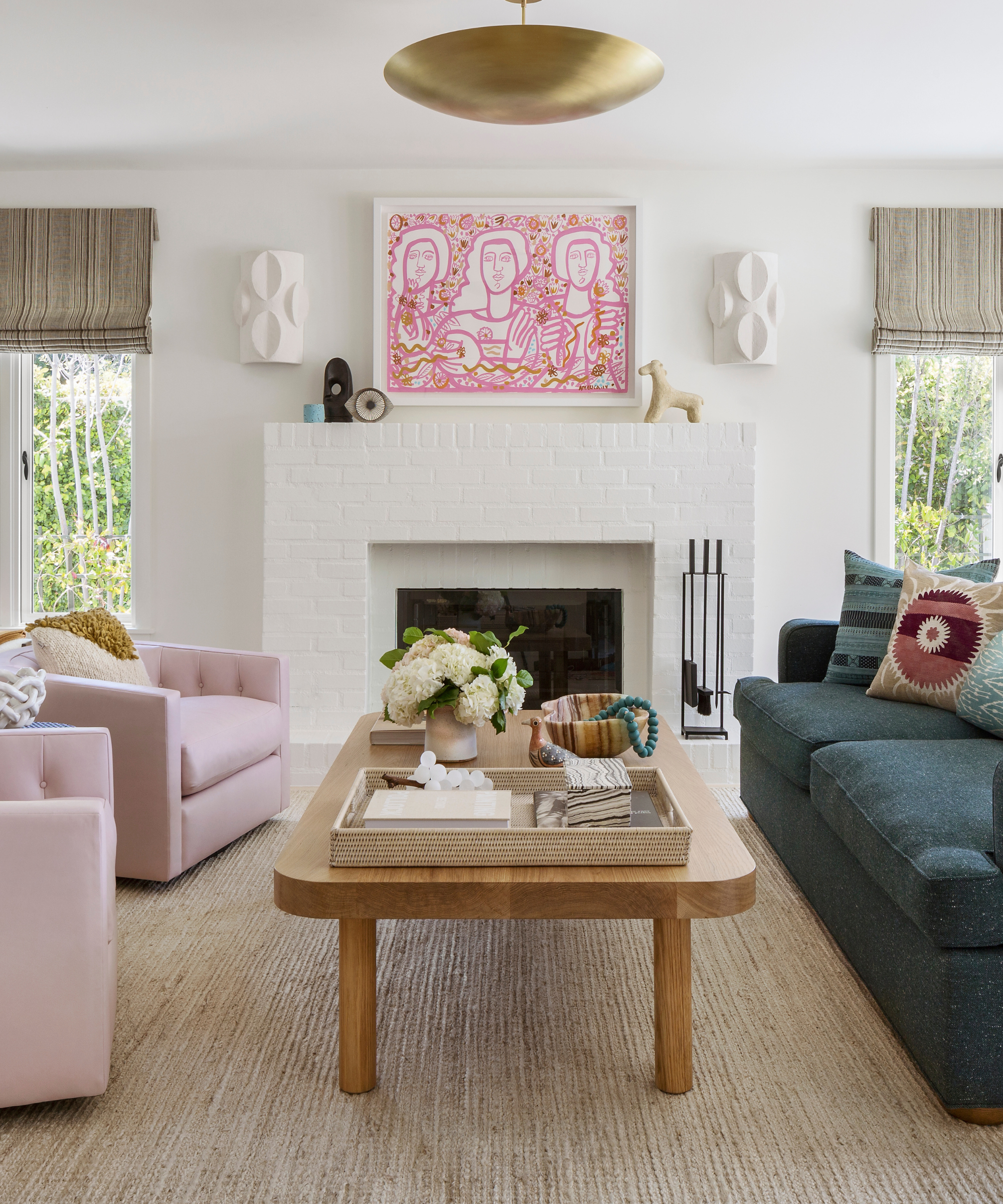
Alexandra Denburg, principal designer at New York-based M&P Design Group, also urges the importance of picking a coffee table of appropriate size for your space.
'Coffee table mistakes tend to be less about the style of the coffee table, and more about shape, size, and placement,' she says.
If all living room seating – whether sofas, benches or armchairs – is within reach of the table, you've found one of the right size. If not, the table is likely too small, she says.
'Should your lucky problem involve a room so large that one coffee table can’t possibly aid each seat, allow the sofa to dictate the coffee table’s length. Additional seating can be accompanied by side tables or drink tables,' says Alexandra.
When placing the main coffee table, make sure to leave enough space between furniture that you're able to easily navigate the room – but not so much room that the table is difficult to reach. Alexandra suggests between 15 and 25 inches from the edge of each seat to the table.
4. Limiting your personality

Betsy Burnham, principal designer and founder of Los Angeles-based Burnham Design, emphasizes the importance of finding a coffee table that works well with the rest of your living room furniture. She suggests avoiding tables that are far too short to be functional.
'Most sofas and chairs have seat heights of 18 to 19 inches, and ideally the height of a coffee table should align. A little shorter or taller can be interesting – if you’re a pro, playing with scale is a lot of fun – but still, I typically avoid tables that are on the low end because they’re often difficult for clients to use,' says Betsy.
Perhaps the most important part of styling a coffee table, though, is letting your personality shine. Betsy says that coffee tables are 'wonderful design opportunities,' offering homeowners a chance to personalize their space.
'They can serve as sculpture, a splash in a quiet room, or a quiet backdrop for accessory styling. It’s fun to play with materials (from wood or stone to metal or glass) and to use either vintage or new pieces,' she says.
When styling coffee tables, the team at Burnham Design opts for stacks of 'graphically interesting books' that align with clients' personalities, sculptural accessories 'for added height and interest,' and trays or boxes to hold smaller items. Betsy also suggests introducing vases, ideally handmade, to bring a bit of life and texture into the mix.
'Table accessories are another place to play with high and low, and depending on the aesthetic of the room, your accessories can be spare and textural, or bursting with color and personality,' she says.
Curating a coffee table that's both functional and suited to your design preferences can take some time and thoughtful contemplation. But with these designer don'ts in mind, your living room's centerpiece will be simply stunning, and perfectly suited to you.


