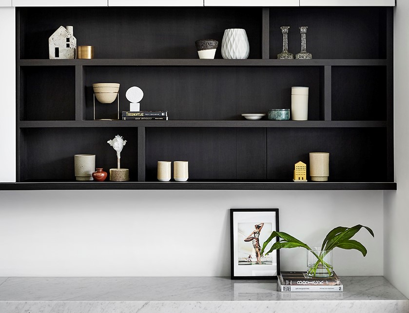
When done well, you can't beat the open storage look. Clean, considered and curated almost like an exhibition of your favorite things, it can help create a feeling
and atmosphere in a space. But when done badly, open storage just looks out of place and cluttered.
I've always thought of open storage as something that will never work for me and my home. This is because I seem to own a lot of 'stuff', and so instead of the decorative minimalist look, open storage on my shelves would just end up looking like untidy clutter.
But after discussing with the interior designers who are masterminds at organizing open storage, I've got some ideas for how to make my open storage attempt look cleaner and more elegant. Here are 5 ways to elevate open storage in interior design for a tidy and curated look.
1. Incorporate a mix of open and closed storage
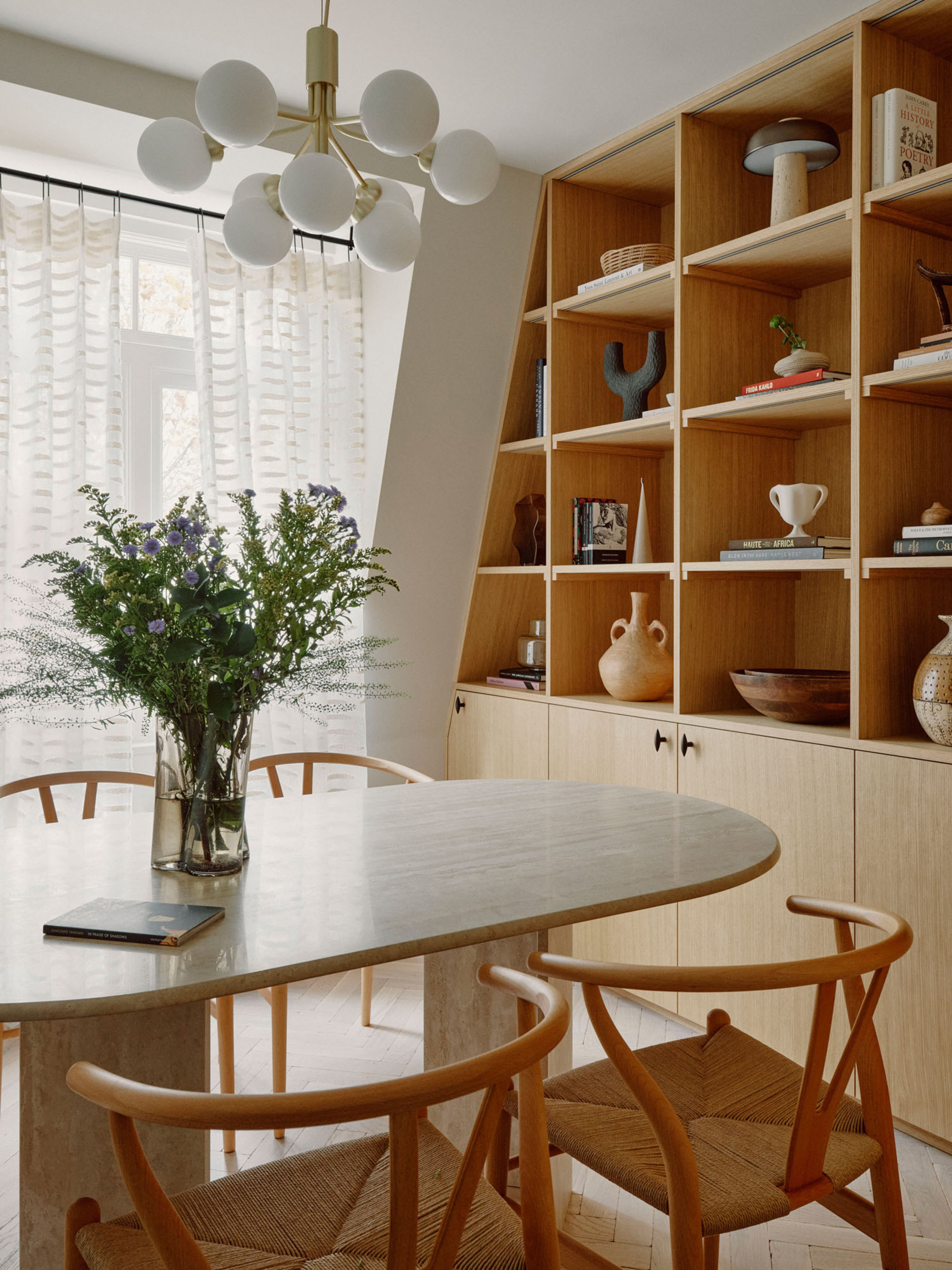
First up, accept that your whole home can't function without closed storage, unless you are a die-hard minimalist with very few possessions. So aim for a split of open and closed storage. A space for the decor to sit proudly, but also room for those clunky bits of furniture you want to stow away, awkward kitchen gadgets you haven't used in years, and the more unsightly items that you don't necessarily want on display.
This bespoke display cabinet in a dining room designed by Atelier Ochre is the perfect example, with a grid-like design perfect for showing off decorative items, with room for the bigger, bulkier pieces in concealed cupboards below.
2. Style it up
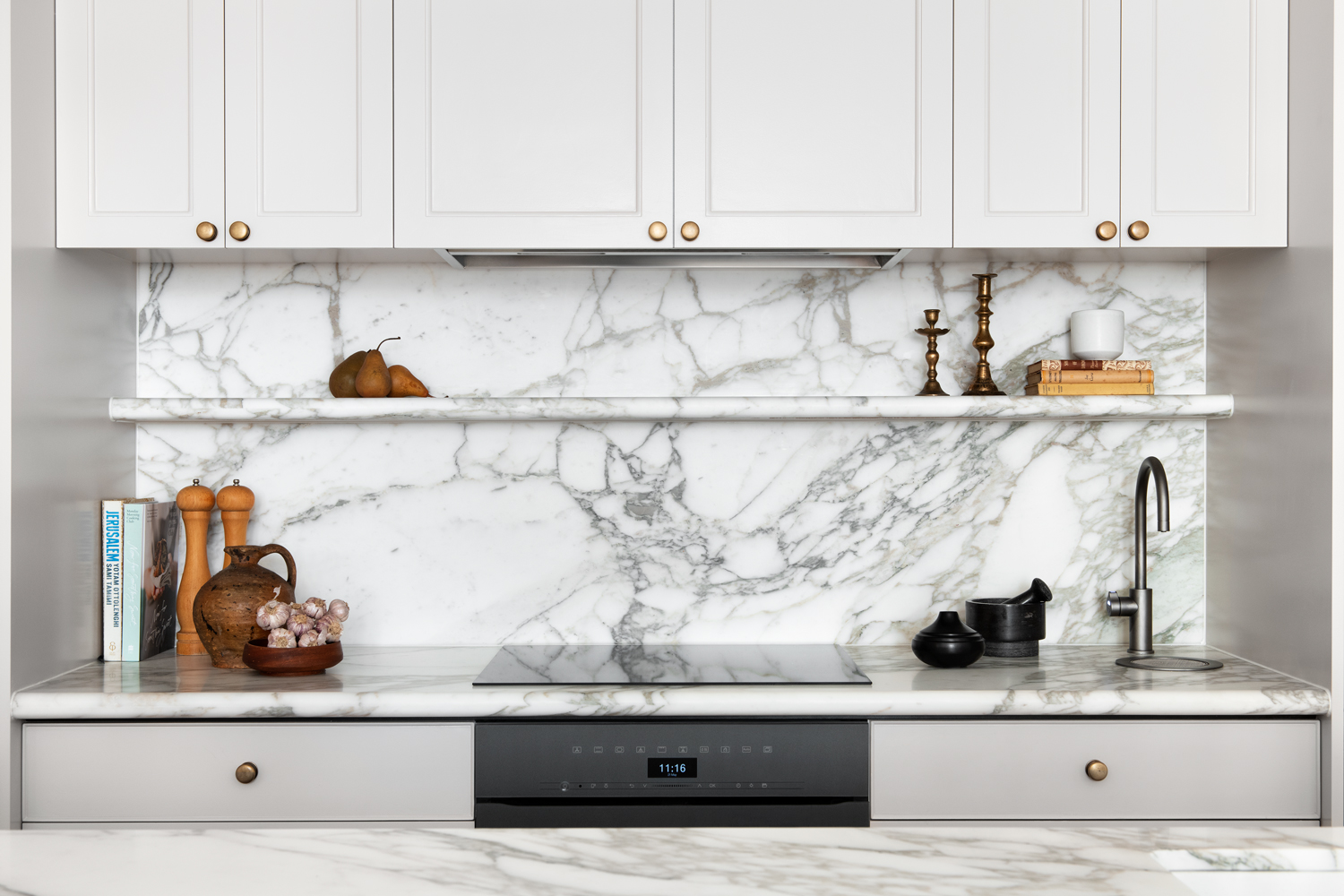
We're no strangers to the power of a vignette here at Livingetc, so it will come to no surprise that one of our top tips for open-storage styling is about how to place your pieces of decor on your open shelves.
There is so much more to creating the perfect vignette than just picking your favorite pieces to display. It's a balancing act and more of a science than you might have initially thought.
Start by adopting Nadia Watts of Nadia Watts Interior Design's minimizing tip that encourages you to really assess what you have on your shelves and forces you to question whether you really need something on display. 'Try the minimizing trick of taking half the things away and start fresh by styling the remaining items creatively,' says Nadia.
When putting items back, organize by color and shape. 'Placement of decor is important, says Wendy Davey of Cranberry Design. 'Add items at different heights, go against the laws of symmetry for an interesting balance, and add some decor in small groups to balance your shelves, using various textures from matt to glossy, draping greenery.'
For example, go for tall taper handles for some height, plants that drape down from your shelves for a sculptural aesthetic, and introduce luxurious materials through trinket pieces like bowls, ceramics vases and marble trays for smaller pieces.
When it comes to arranging open shelves in a visually appealing manner, the concept of visual weight must be centerstage. 'We believe that achieving balance is key to creating an aesthetically pleasing display,' says Richard Misso, director at The Stylesmiths. 'The fundamental principle to remember is mixing heavier items with smaller and mid-sized objects. This way, you'll strike the perfect equilibrium and curate a captivating composition for all to admire.'
Finally, don't be afraid to change your items around seasonally to keep things interesting.
3. Light it up
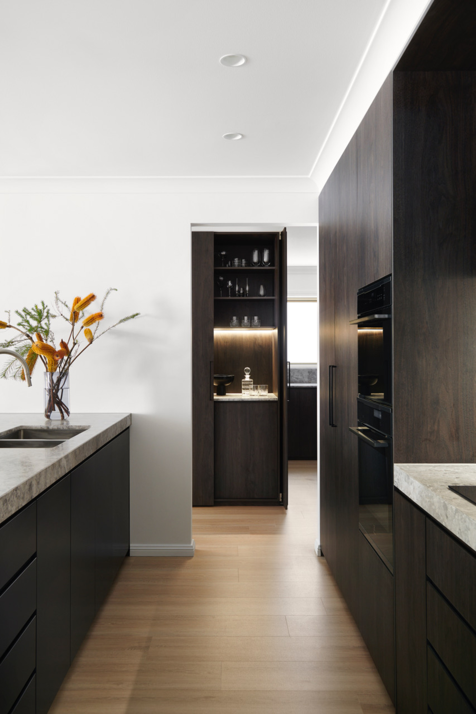
Lighting is always a reliable tool to help your design really shine, so consider lighting your open storage to really show off the craftsmanship of the furniture and the decorative details you’ve placed on your shelves. 'Under-shelf lighting is a great way to highlight items of interest,' says Nadia.
Try a strip of LED lighting or a light bar placed neatly where the shelf meets the wall, adding atmosphere in abundance and removing any need for a lighting fixture. LED strips can be cut and adjusted so they fit whatever space you might have. Light strips can also look more like thin light bars - these are shorter and might cast more of a spotlight. They are plug-in or battery-operated.
You can also get spotlights that can be fitted under your shelf. These cast individual pools of light and help accentuate specific sections of the shelf.
Alternatively, pick a mini table lamp that fits snugly on one side of the shelf. Choose with a shade that casts the light downwards to highlight your open storage shelf and decor.
4. Try a mirror background
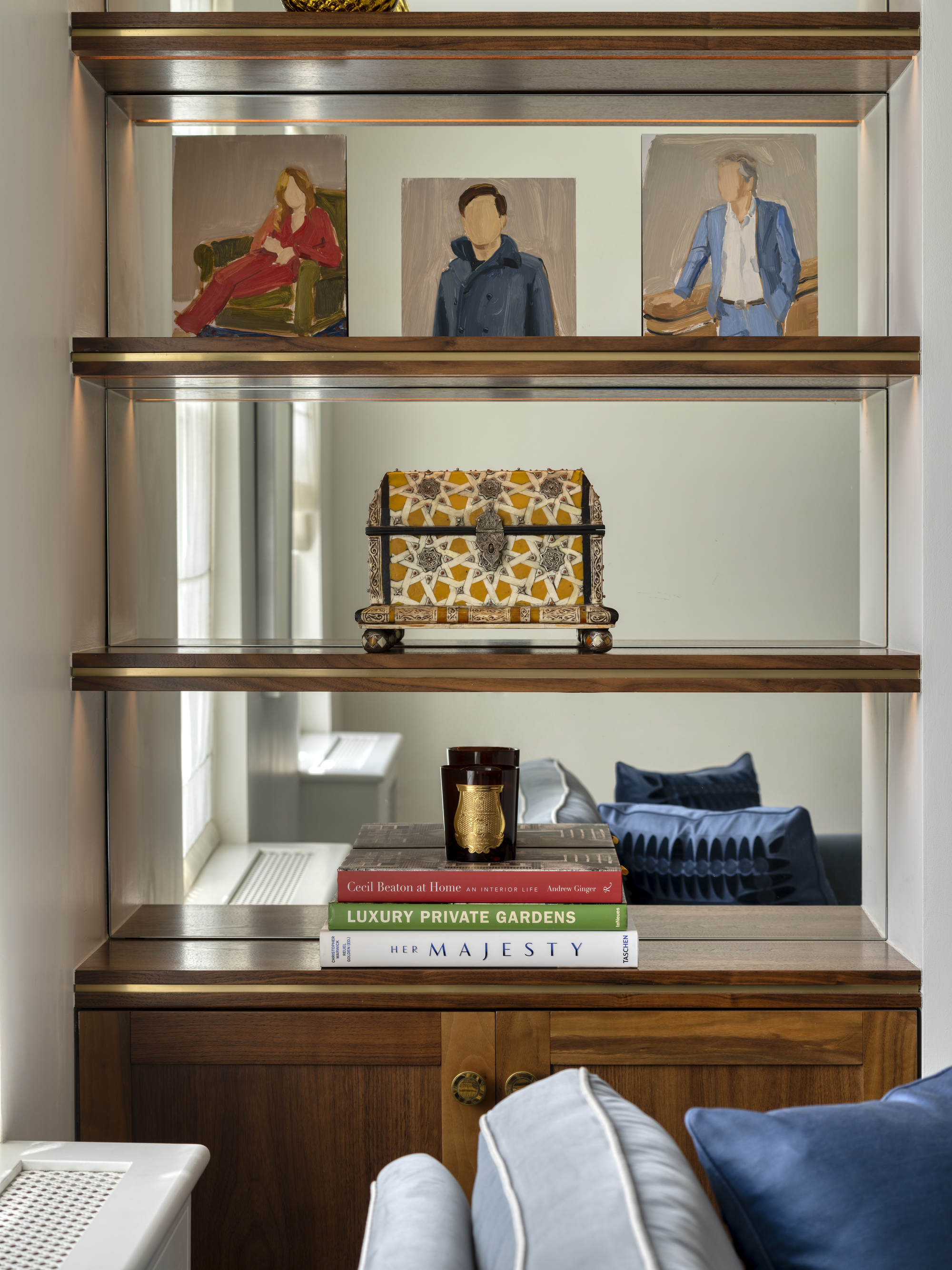
You can infuse elegance into even the most functional pieces, using light and clever tricks to make open storage a visual delight. A shelf just might be one of the places you didn't know you needed a mirror. 'Light and shadows are magical elements that can transform open storage into something extraordinary,' says furniture designer, Tom Raffield.
'Playing with these, using materials that cast intriguing patterns and create a dance of light, makes each piece as captivating as it is functional. A shelf with a built-in mirror is a great way to try this,’ says Tom.
Incorporating a mirror behind the shelf in question adds interest, and also creates the illusion of a larger room, using what light you have in the space to make the whole room feel more open, airier, and bigger.
When creating a mirror shelf, it pays to be on top of the clutter, and remember that any clutter unsightly addition to your shelf display will only be doubled.
5. Create order with a grid-like design
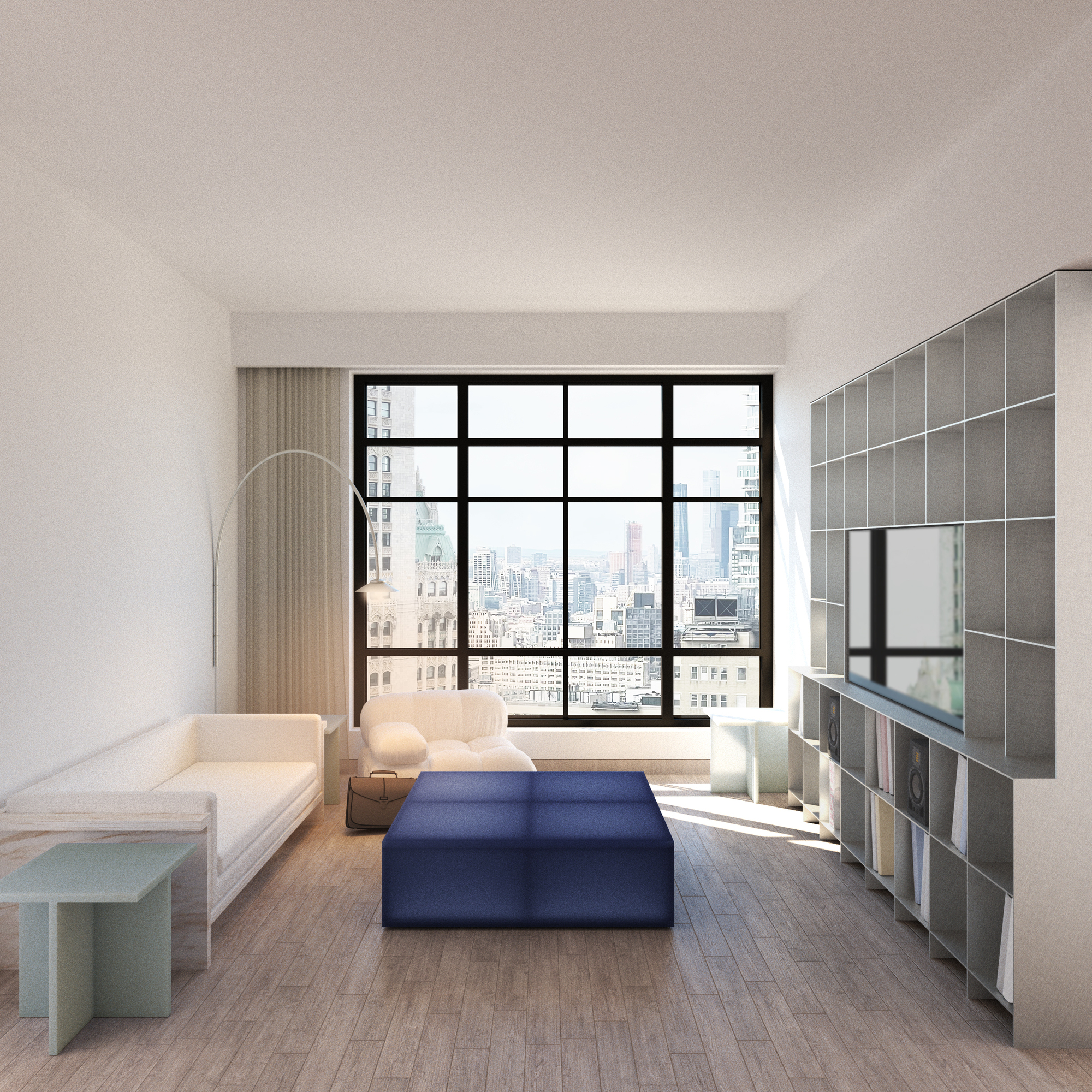
Try the grid trick when organizing your open storage, this can help create a sense of order when it comes to organizing your open storage, helping everything look clean and considered, and using the lines of the grid system to your advantage.
'Using a grid-like design for open-space storage systems allows shelving to blend in harmoniously with the overall space,' says Kyle May, principal and architect at Kyle May, Archiect.
'It's a cleaner, more streamlined look, regardless of the various items you place in the storage system — be it books, plants, or other miscellaneous articles.
'We custom-build our storage systems in-house for each architectural project, which allows us to have creative control in sizing, and ensures that the storage unit exactly suits the surrounding space and the client’s needs.' If you aren't planning on commissioning or going bespoke, you might be able to fashion shelf dividers from MDF, or even use an up-right coffee table decor book to zone the spaces neatly.
An advantage of grid-like storage designs is that they allow you to strategically use negative space by placing items on select shelves, while intentionally keeping others empty. This gives your objects – and overall spaces – visual breathing room, and helps avoid clutter.


