A bad backyard can be a real downer. When you look outside your kitchen window and see a space that's dated or uncared for, it can be hard to make plans to enjoy the weather during the summer months.
However, backyards also provide the biggest scope for real transformation. Re-landscaping can change your yard in the same way completing remodeling your home's insides can, and even small changes like swapping out fences or changing up your planting can really transform how a space feels.
To showcase just what's possible, I picked 5 of my favorite before and afters across backyards big and small, in varying styles, to kickstart your landscaping plans for this year.
1. This Mediterranean-inspired yard in Los Angeles

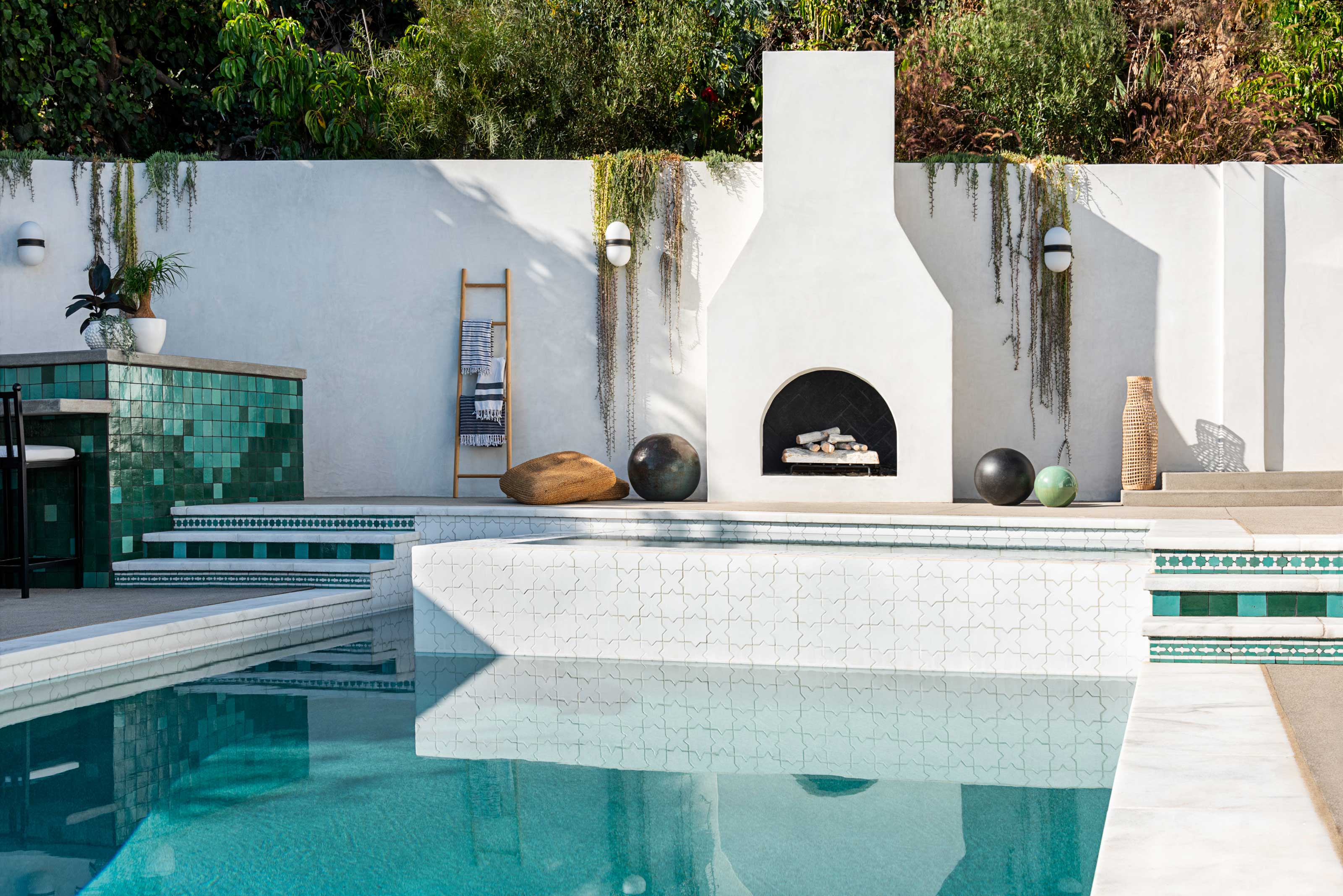
Interior designer Jessie Lane's Spanish-style LA home original backyard felt like a pretty soulless proposition. Split concrete flooring and dated tiles were contributing to an outdoor space that didn't feel fit for purpose, including a pool that monopolized the whole yard with its unusual shape.
''The lot is a strange shape and the former pool followed the lines of the lot,' Jessie tells us. 'It was unnecessarily large with little hang-out space around it, but we knew there was great potential hiding beneath the awkward layout.'
The re-imagination of this year sees a smaller, rectangular pool used instead, now set out symmetrically with a Mediterranean-style outdoor fireplace and tiling inspired by Morocco, Greece, and Spain. Surrounded by white render on the yard's walls and the rear of the home, it's become a bright, happy space that feels like you're on European vacation.
View the rest of this Los Angele's backyard.
2. A basic Calgary backyard turned into a social space
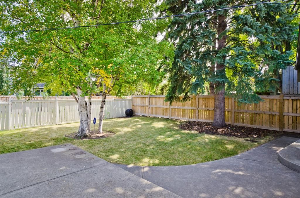

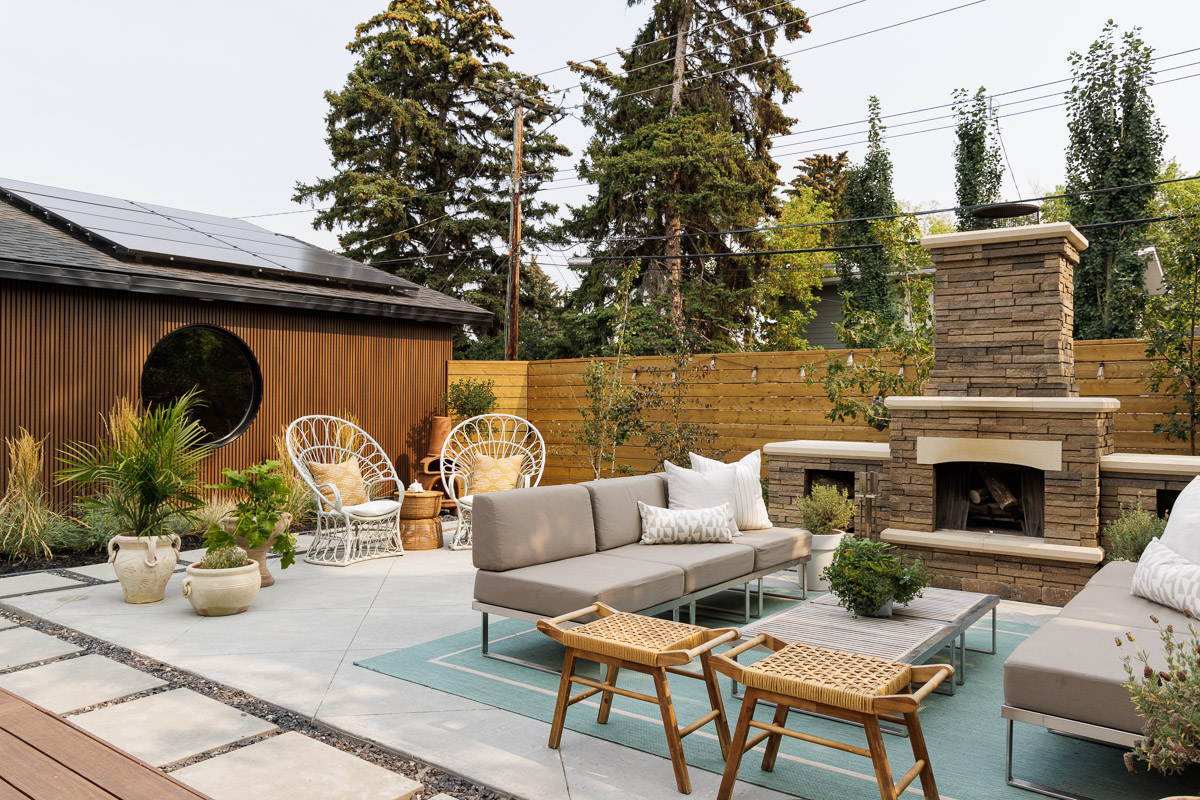
A plain concrete patio and a stretch of lawn — this backyard belonging to designer Aly Velji, founder of Alykhan Velji Designs, couldn't have been much more basic. However, when the designer bought the house, he imagined 'transforming the backyard into an extension of our living space' — and that's exactly how it's turned out.
An outdoor fireplace centers a new patio, complete with a sofa set, coffee table and outdoor rug for a cozy set-up. The lawn has been switched out for pavers, gravel and a new deck, while a characterful fencing new cladding for the exterior of the property offers a better backdrop than the previously mismatched fences.
View the rest of this home's before and after.
3. This unloved Chelsea terrace transformed
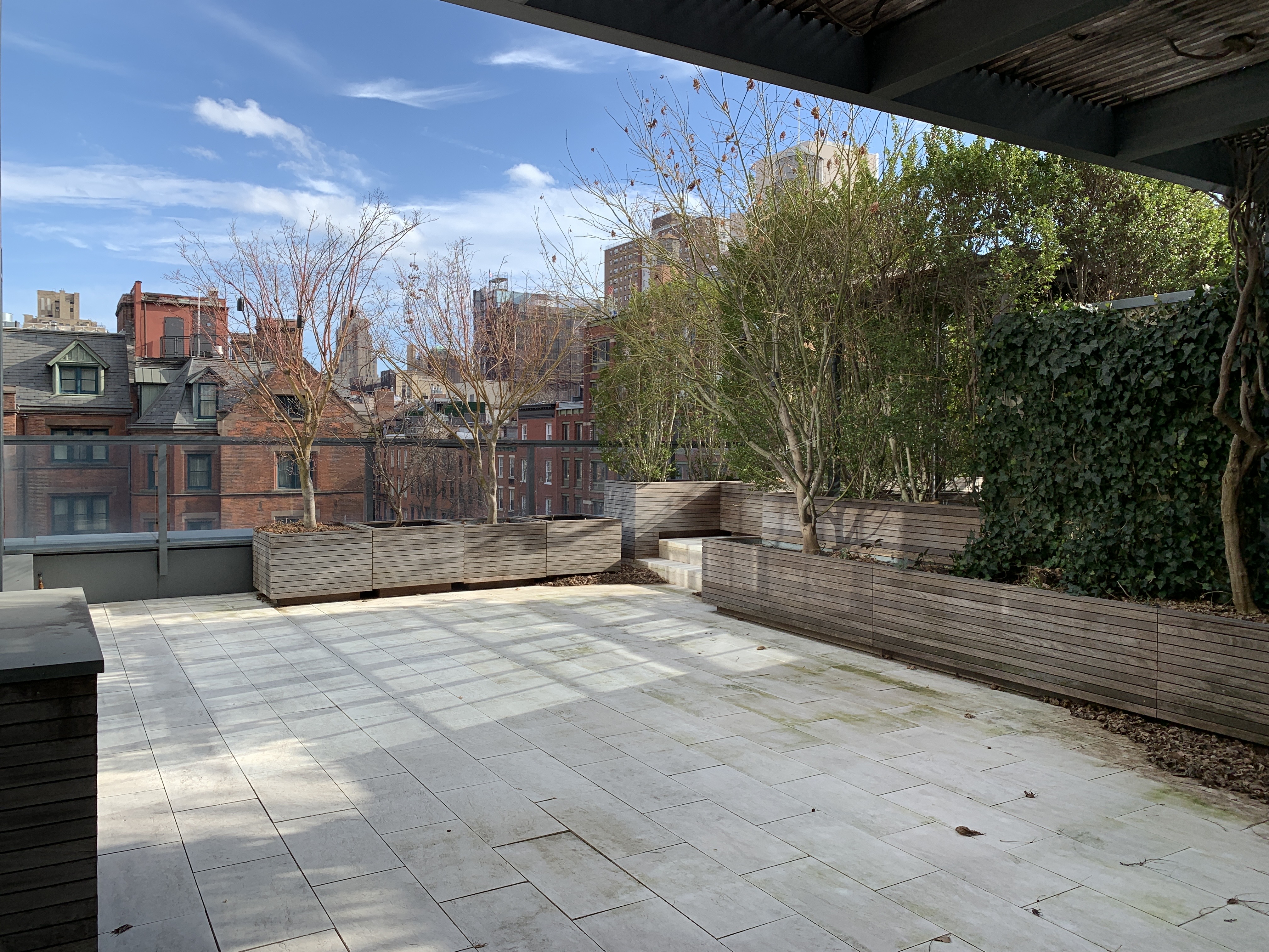
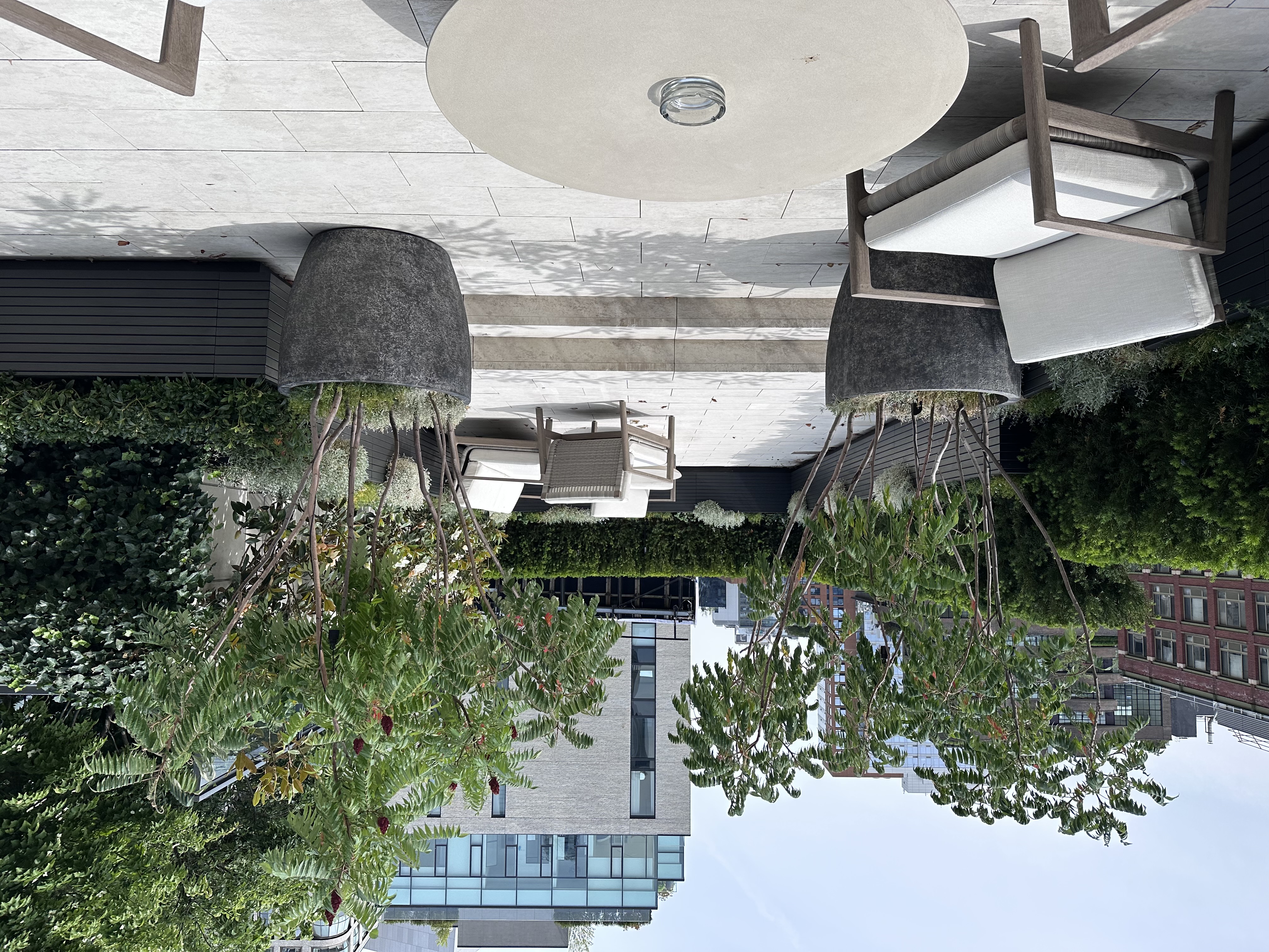
This terrace in Chelsea was in need of some TLC when landscape designer Jon Fargion took on the project, and it also needed a rethink in terms of its layout. 'When first approached the terrace was heavily planted with tall Ilex plants for privacy,' Jonathan tells us. 'There used to be an outdoor shower surrounded by planters for privacy. My approach was to eliminate the outdoor shower and increase the feeling of open space.'
'The planters have been restored, reduced in size, painted and located against the railing of the terrace,' he explains. 'A belt of an evergreen plant has been installed, creating a soft limitation between the terrace and the city. We decided to use English yew (Taxus baccata) as it is a very versatile plant that can thrive in full sun or part shade, acccompanied with the soft touch of candytuft (Iberis sempervirens), white geranium (Geranium sanguineum ‘White’), and snow in summer (Cerastium tomentosum). These three perennials are sun loving and have a really nice sequence of white inflorescences, which ties them together.'
4. Feldman architecture
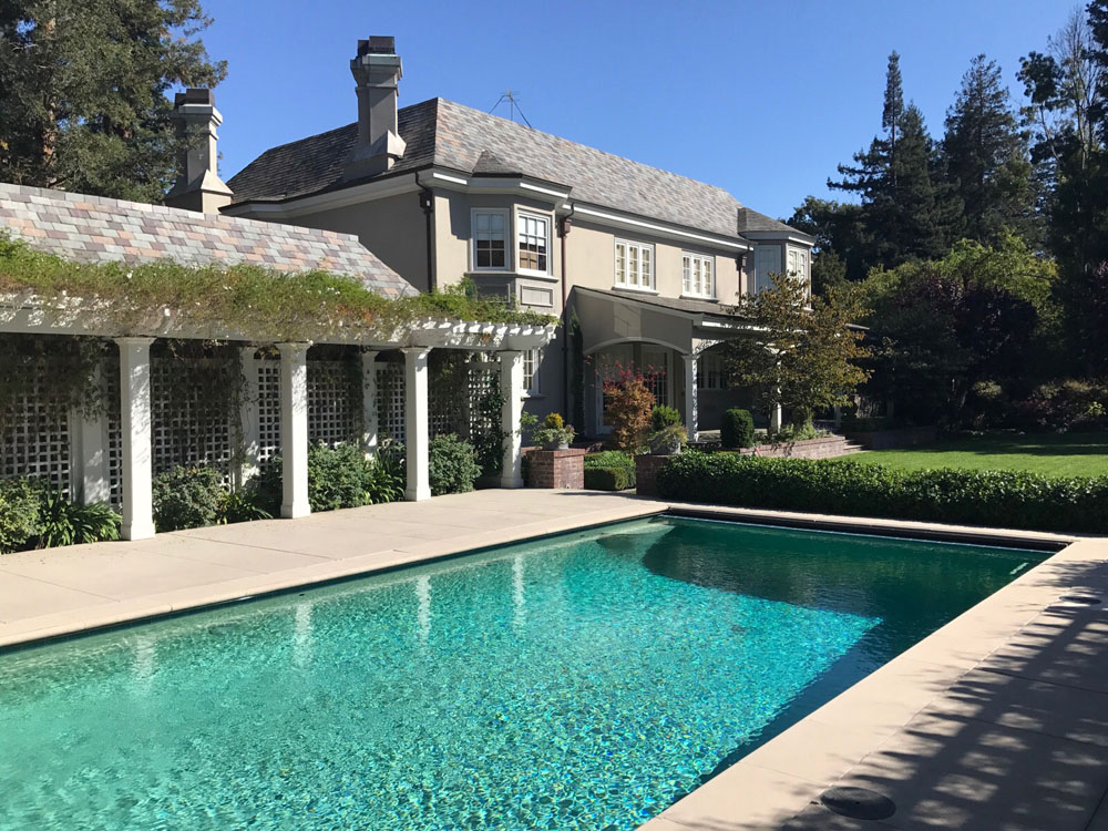
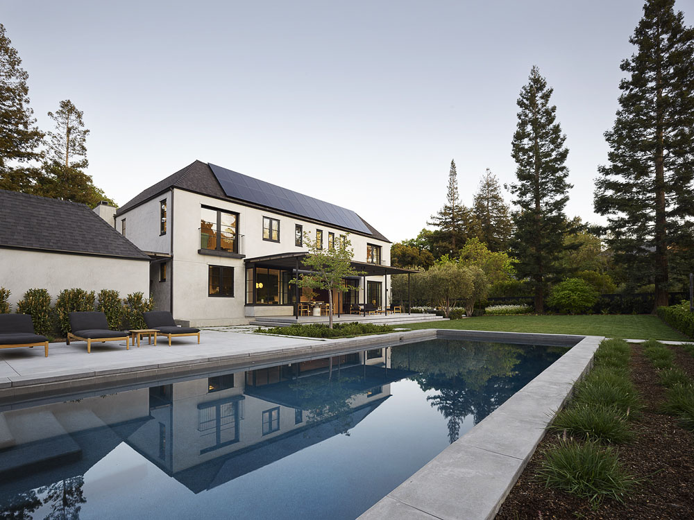
There might not be anything wrong with the before of this Californian home, but re-designed by Feldman Architecture, the new look backyard transitions the space from formal and more traditional to something a little more relaxed and modern.
A cooler colored patio finish, and a change from more structured hedging to naturalistic planting that feels more casual not only makes the outdoor space feel more contemporary, but makes the pool, and the whole yard feel larger, too.
View the rest of the before and after of this home.
5. Floisand Studio Architects

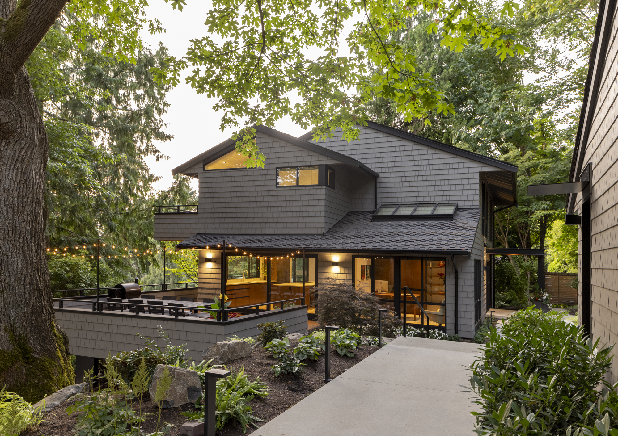
This home's unusual layout means that the front door access is down a side yard, while the "backyard" is actually at the front of the house. This meant that the designers at Floisand Studio Architects had to make sure it brought curb appeal as well as an enjoyable space for the owners to use.
'New hard and soft scape elements create landscape moments around the home, buffering the walkway from the home and offering some privacy to the spaces inside where it was needed,' Allison Hogue explains.
A re-imagined deck, beautiful new planting scheme and the introduction of guiding modern garden lighting make this yard feel so fresh and inviting.
