The best band logos can become truly iconic, and sometimes even come to represent more than the band themselves. Like with any brand, band logos sometimes change over time, but many of the best music logos have serious staying power, adorning album covers and posters for years if not decades.
It's hard to define what makes a great logo design for a band. Many rock logos and pop logos are very simple but apply a unique detail or clever concept that makes them memorable. Others seem to break all the usual rules of logo design but work because they're so original, while others may become iconic simply because they're seen so often.
Below, we've picked out our own favourites: the best music logo designs past and present, from pop to metal and electronic music, in no particular order. For more inspiration, also see our picks of the best TV logos and the best sonic logos.
The best band logos in history
01. The Beatles logo
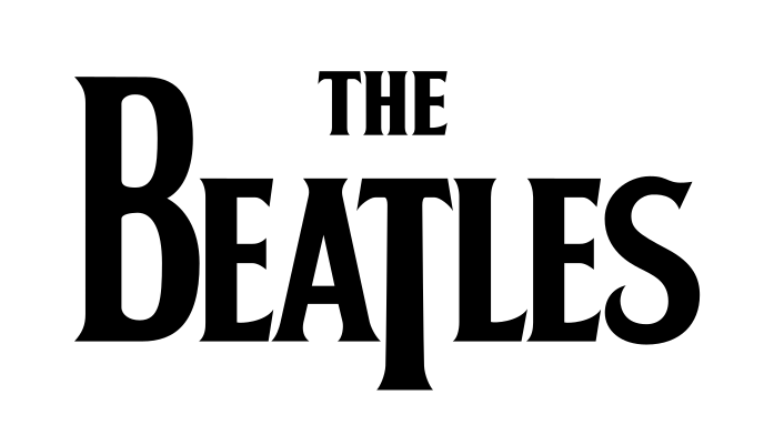
The Fab Four remain one of the most successful and influential bands of all time, but their famous drop-T logo wasn't used on any of their original album releases. Designed by Ivor Arbiter, the owner of a shop called Drum City, and refined by a sign painter called Eddie Stokes, this Beatles logo initially appeared on Ringo Starr's drum kit instead.
With its oversized letter B and elongated letter T, the logo is a simple but effective piece of type design. It wasn't until the 1990s that Apple Corps decided to trademark the design. Since then, the logo has become a sleek way to represent The Beatles catalogue.
02. Abba logo
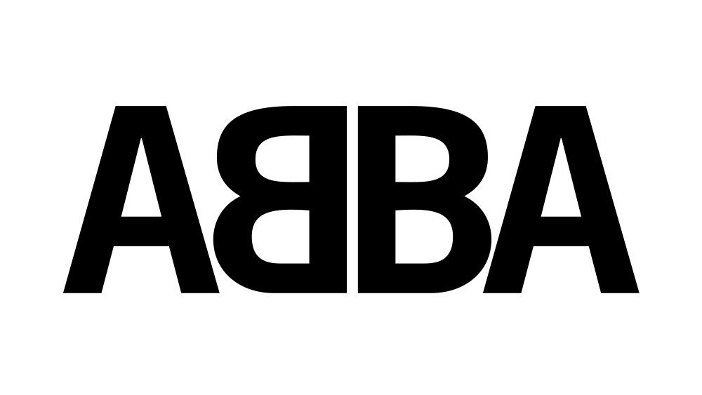
The Abba logo is the most pop entry in our pick of the best band logos. The famous ambigram design with its mirror 'B's has been with the band for most of its history, having first appeared on a 1976 compilation album. It's distinctive and it's clever because it takes the existing palindrome of the band's name further by making it read the same visually in each direction.
Like many moments of inspiration, the initial idea came about by accident. During a photoshoot, each member of the band was holding up the initial letter of their name, but Benny Andersson held his letter 'B' the wrong way around. Rune Söderqvist, who designed most of ABBA's record sleeves, ended up adopting the mistake in the band's logo.
03. Rolling Stones logo
How could we not include the famous Rolling Stones logo in the list? It was created by John Pasche in 1971, and the designer is said to have been influenced by Mick Jagger's appearance, noting that the singer's lips were the first thing you noticed about him. But Jagger himself has suggested that the Rolling Stones lips logo was also influenced by an image he saw of the disembodied tongue of Kali, the Hindu deity, in a book about India.
Either way, the striking design has continued to work well for the band, who have been working in music for over 60 years. And it's become much more than a band logo, becoming a general symbol of rock and pop culture and even helping to sell football shirts.
04. The Monkees logo
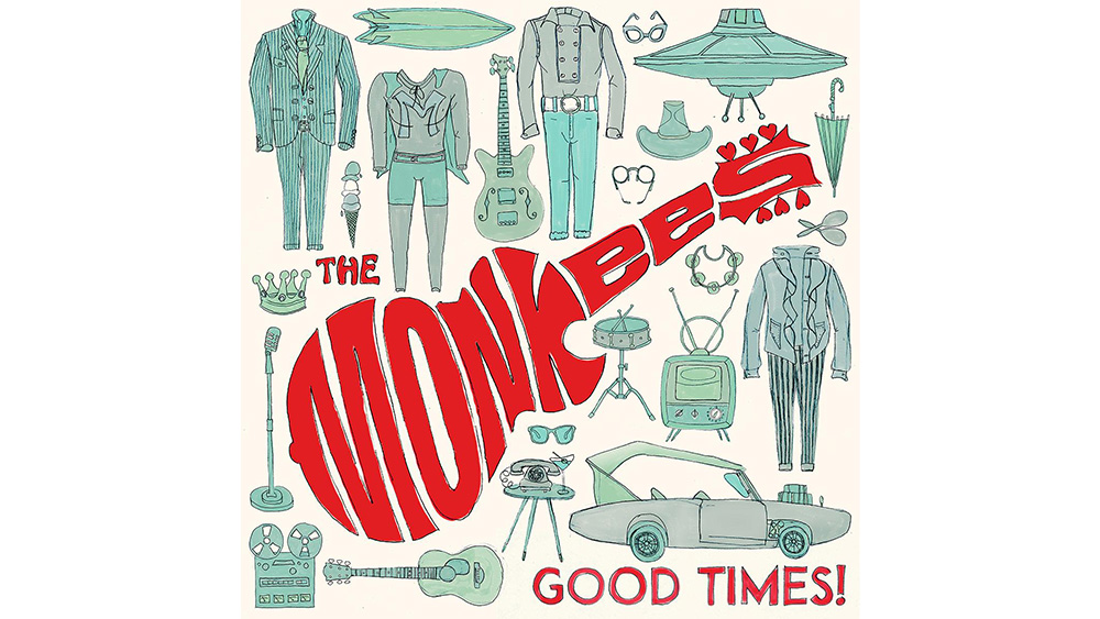
Infamously manufactured for TV, The Monkees still had a bunch of great tunes thanks to a roster of top songwriters and session musicians. Their fantastic guitar-shaped logo, was conceived by the show's publicity man and drawn for $75 by Nick LoBianco. It's stood the test of time, still looking fresh in a hand-drawn version on the cover of 2016's Good Times.
05. Led Zeppelin logo
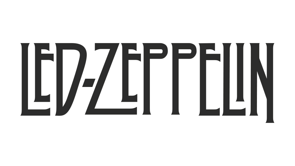
Along with the Rolling Stones logo, the Led Zeppelin logo is one of the most recognisable brand identities in rock, seen on worn T-shirts and vintage posters everywhere. The bespoke text was designed in 1973 by Storm Thorgerson and Aubrey Powell of the famed London design group Hipgnosis.
It was originally intended for the cover of the band's fifth album Houses of the Holy but, whether intentionally or not, it became the default logo for the band. The design highlights the benefits of bespoke type, while the precise but disproportionate letters give this band logotype an experimental but balanced feel, with tall, stretched forms sitting well alongside the band's use of occult symbolism.
06. Adam and the Ants logo
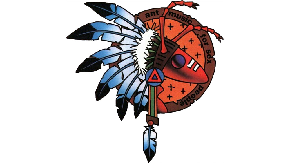
Who says a great band logo has to be simple? Adam Ant, with his background of art school and the DIY punk ethos, always had a keen interest in getting his band's image right. From his early punk singles, for which he drew the cover artwork himself, through to his later chart-toppers, he'd mastermind powerful, eye-catching looks. And this Adam and the Ants logo, designed by Danny Kleinman and known as the Warrior Ant, is a corker. Kleinman went on to create the title sequences for James Bond films
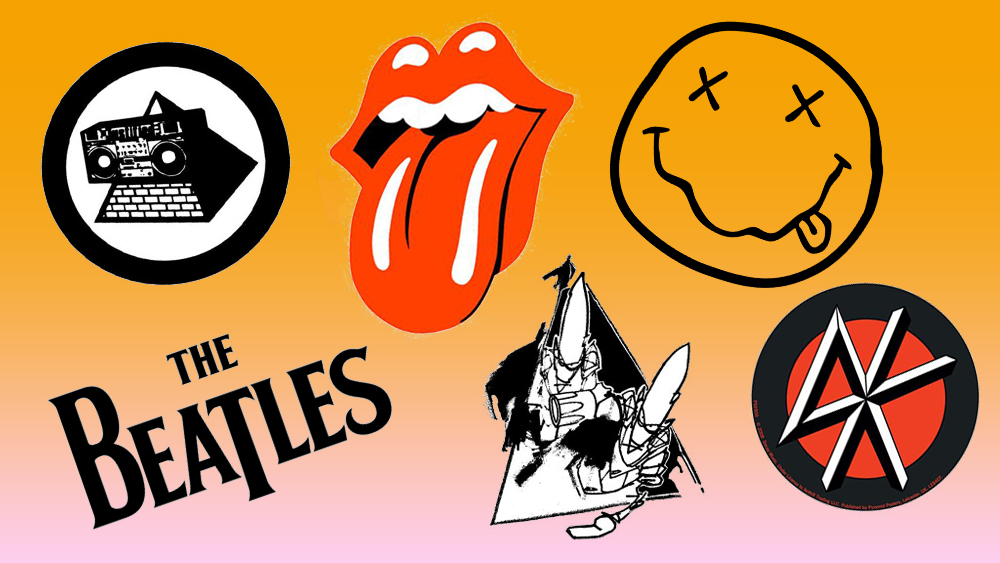
07. Unkle logo
This band logo is something completely different. It breaks the rules but works perfectly. American graffiti artist Futura 2000 (now known as plain Futura) had form as an illustrator and graphic designer for music, most notably for his work on The Clash's Combat Rock.
But it was his work for James Lavelle's Mo' Wax records that really launched his design career, and which also led to him creating the logo and other imagery for Lavelle's Unkle project. The two scratchy, pointy-headed alien figures are a perfect match for the first Unkle album, Psyence Fiction.
08. The Doors logo
More complex than it looks, this bold, geometric design with the tiny, psychedelic, Art Nouveau-like italicised 'THE' is another of the most recognised band logotypes in the world. Perfectly summing up the trippy, hippie counter-culture of the late '60's, The Doors didn't need a symbol or an image. Their typographic design alone communicates the doors to altered perception.
09. Dream Theater logo
The Dream Theater logo is proof of just how abstract a logo can be and still work. Few people question why the design appears to feature a whole bunch of letters that don't appear in the band's name, but the explanation is because it was created as the logo for a different band. Singer Charlie Dominici created the logo when the band was called Majesty.
His design was inspired by the mark of Mary, Queen of Scots, which included the Greek letters, Φ, Μ and Λ. Some decades later, fans would realise that Dominici's reinterpretation featured all of the letters of his own surname. After the band changed their name, they decided to keep the logo anyway, and it's since featured on nearly every Dream Theater release.
10. The Dead Kennedys logo
Designed by artist Winston Smith, the Dead Kennedys DK logo is a perfect example of simple, easily imitable graphic design. Singer Jello Biafra is quoted as saying: "I wanted to make sure it was something simple and easy to spray-paint so people would graffiti it all over the place." Smith came back with several designs, including one with bricks, but Jello decided the simple red background was "the boldest and the best.
11. Nirvana logo
One of the most recognisable logos in music history, the Nirvana logo design has been a common sight on T-shirts and hoodies for over two decades. Featuring an Onyx typeface and a hand-drawn smiley face, said to be inspired by a strip club in Seattle, the simple but enigmatic form and juxtaposing colours make this an iconic band logo design.
12. Weezer logo
Designed by the band's drummer, Patrick Wilsen, in 1993, the Weezer logo was originally in lower case. The 'flying W' used the Futura Medium font before a few alterations were made. Fans are known to recreate this logo design at shows using hand signals, showing that a good logo design can sometimes go on to be interpreted and applied in ways that weren't initially expected.
13. Jurassic 5 logo
Perfectly combining the 'J' and the '5' to represent Jurassic 5, this epic hip-hop logo also has the perfect shape to fill the disc the centre of vinyl release. it was designed by band member Charlie "Chali 2na" Stewart, who was a graffiti artist in his youth, and it's been produced in a wide range of colours over the band's career.
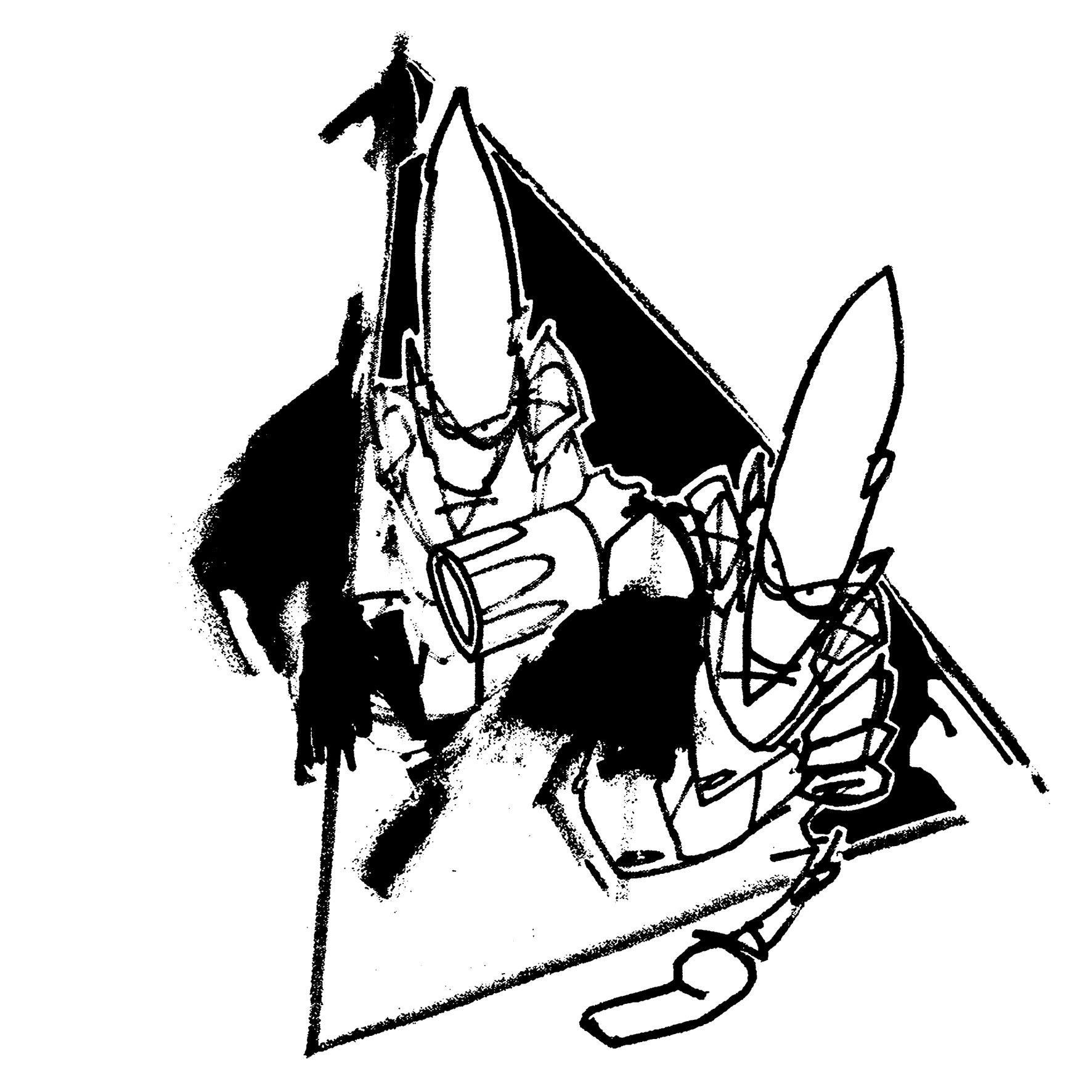
14. The KLF logo
Stadium house pioneers and situationist pranksters, the KLF had a razor-sharp eye for powerful iconography, which manifested itself in their record covers, videos, legendary Top of the Pops performances and, of course, their logos. Their pyramid blaster logo, perfectly shaped for vinyl, is a masterpiece that combines the duo's interest in the rave scene and artistic aspirations. Both Bill Drummond and Jimmy Cauty went on to work as visual artists after famously quitting music following a chaotic noise-metal Brit Awards performance and their high-profile stunt of burning a million pounds.
15. Metallica logo
Metal logos are in a genre of their own, but the Metallica logo stands out for combining both clarity and dramatic lettering. Clearly inspired by metal logos that came before it, it was created by Turner Duckworth and redesigned in 2008. Duckworth also designed the identity and packaging for the band's album Death Magnetic. Like countless other metal bands, Metallica's own take on the metal aesthetic is something that their fans cherish; whether it be in the form of tattoos or scrawlings on school books.
16. The Grateful Dead logo
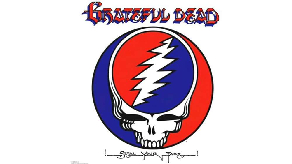
The Grateful Dead used a vast array of symbols but the 'lightning skull' that appears on the Steal Your Face album cover is the most recognisable and iconic. Comprising a skull and a 13-point lightning bolt, the logo was designed by the sound engineer Owsley Stanley and the graphic design Bob Thomas some years before the album was released, and it was used to promote the band's concerts. It became so iconic, that the band decided the logo was the perfect option for the Steal Your Face album cover in 1976.
17. The Ramones logo
The Ramones' logo was designed by New York City artist Arturo Vega, a longtime friend who lived with several members of the band. It's proof that when you get a band logo right, it can go on to become one of the most iconic brands in the world. Basing it on The Presidential Seal, Vega wanted the design to portray an 'All-American Band’.
18. Black Flag logo
This has to be one of the most iconic band logos of all time. Created for Black Flag by guitarist and chief songwriter Greg Ginn's brother Raymond Pettibon, he once stated in an interview that the black flag design was designed to represent anarchy. The four black bars combined with the bold typography make for a solid band logo.
19. Daft Punk
The French electronic duo Daft Punk took inspiration from the 'punk' part of their name for its logo. Designed by band member Guillaume Emmanuel "Guy-Manuel" de Homem-Christo, the logo ties in with band's ethos and uses bold colours and textures. Daft Punk's visuals are just as important as their tunes.
20. Public Enemy logo
Another hip-hop gem on our list, this logo for Public Enemy was designed by Chuck D back in 1986. It was tightened up ahead of the release of Yo! Bum Rush The Show in 1987 by New York artist Eric Haze. Many claim the target to be a state trooper but it is in fact a silhouette of a B-boy. It was also announced in 2013 that the group were to be added to the Rock & Roll hall of fame.
21. Wu-Tang Clan logo
The Wu-Tang 'W' is one of the most distinguishable logos in hip-hop culture, with its members adorning the 'W' on everything from clothing to chains, but it is most prominent on dozens of their album covers. Created by DJ and producer Mathematics, the band have stuck by the original design throughout their expansive career.
22. Yes logo
English artist and graphic designer Roger Dean created the iconic, bubbly Yes logo, which first debuted on the band's 1972 LP Close to the Edge. He also crafted Yes' album artwork and stage shows; solidifying the band's brand throughout the ages. It has had a variant of colours but that never makes the typography any less engaging. This is a logo that perfectly sums up the 1970s.
23. Aphex Twin logo
OK, so Aphex Twin isn't a band, but we feel that it's worth mentioning Richard D. James's logo because it's one of those music logos that seems to break the rules. Strictly speaking, It’s unbalanced and pretty much illegible, and yet there’s something about it that sits just right with Aphex Twin's music, perhaps precisely because it feels experimental and unconventional. First appearing on the 1992 release Xylem Tube, it was drawn by hand by the type designer Paul 'Terratag' Nicholson, which gives it a slightly organic feel that feels a little unsettling and alien.
24. Justice logo
Choosing to use such a universal symbol as your band's logo is a dangerous path. However, this creation for French electronic duo Justice works fantastically with their dramatic sound. Band member Gaspard Augé once said the idea was inspired by the fact that "a music venue is like a church in that everyone is gathering together and focusing on one point.' Fittingly, the logo has appeared above the altar, I mean stage, at the band's live shows.
25. Radiohead logo
Radiohead haven't really had a regular band logo throughout their career but this is one that truly stands out (and adorns many a fan's body.) Designed by artist Stanley Donwood and Thom Yorke, the 'modified bear' was created for the release of Kid A.
The name of the bear either ironically or purposely contributes to the influx of modern art without meaning, without complexity, and without use. If Radiohead's career is anything to go by, we're guessing it's on the ironic side of things.
26. Misfits logo
The Misfits' skull logo first appeared on the Horror Business single, based on a poster for the 1946 film The Crimson Ghost. It proved so popular that the image quickly became the mascot for the band and has been used frequently on the band's releases and merchandise ever since.
27. Darkthrone logo
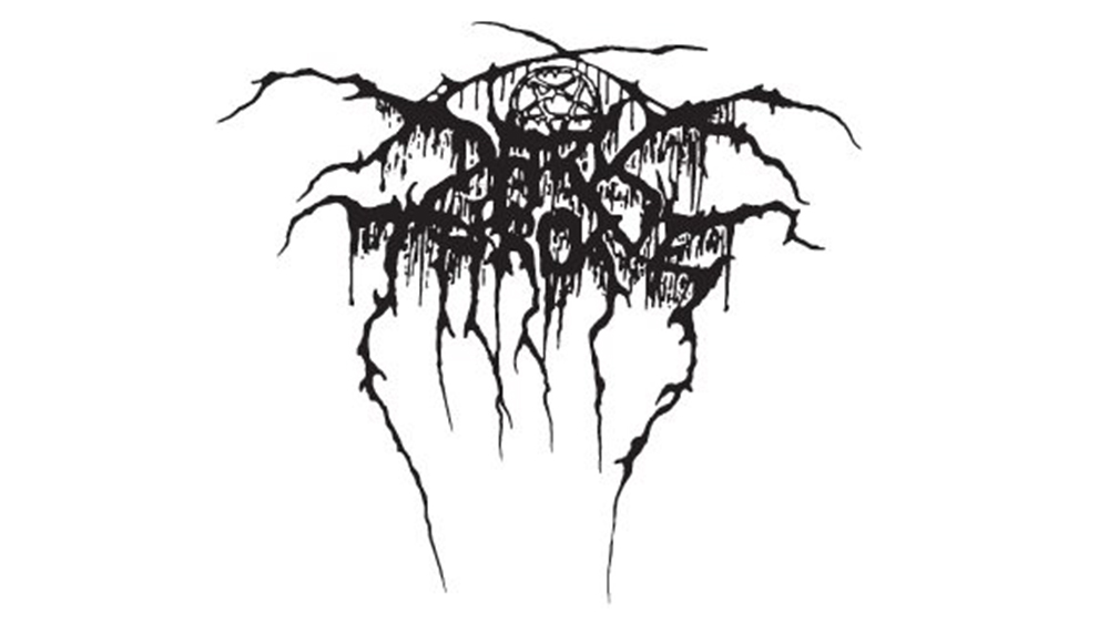
Black metal and death metal logos are a whole genre of their own, and one that spits in the face of some of the usual rules of logo design. Legibility? That's for god-fearing folk, in the world of death metal, no band would be seen, well, dead with a legible logo. The more illegible the better in fact, so that only the initiated know what it means.
The Darkthrone logo is one of our favourites. Unlike with some metal logos, the spidery scrawled letters are discernable, but there's still a mass of lovely gnarly tangled roots and enough of a subtle lack of symmetry to suggest the logo could have been a first sketch in the back of a school exercise book. There's even a pentagram in there somewhere.
28. Oasis logo
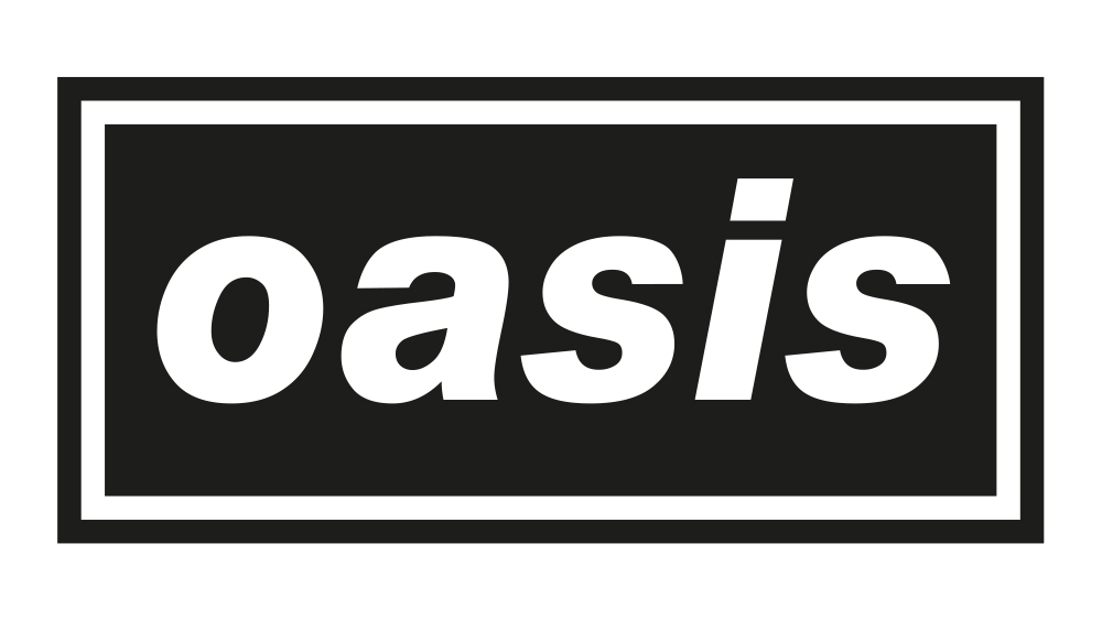
The best-known Oasis logo is eminently simple, featuring the band's name in white text on a black rectangle with white and black borders. It was heavily influenced by the Decca Records logo, but it's no less more effective for it.
Designed by Brian Cannon of Microdot back in 1993 when the band was still unknown, it was intended to be highly versatile design, working in different types of media, including black and white press ads. It made sense for the band to go back to this design to promote their 2024 and 2025 reunion tour.
For more design inspiration, see our pick of the best logos of all time, the best sports logos and the best fashion logos.