The idea of decorating with neutrals may suggest subdued and safe. To some, it's even boring (there, I said it). But these shades have come a long way and are now far from dull — they speak of sophistication, delicacy, and curation, and can fill the home with personality, depth, and richness. The overall spectrum is organic and grounding, and as such, wonderfully timeless.
Technically defined as 'color-free' tones, neutrals are to be found somewhere beyond the color wheel, where shades exist outside of pigment in a land where visual subtlety reigns. These hidden hues rely on undertones; their temperature (and attitude) defined by whether they lean pink/yellow (warm) or blue/green (cool). On the warm side, we have cream, almond, beige, sand, mushroom, camel, clay, cinnamon, and coffee, while the likes of soft white, ice gray, oyster, dove gray, pebble, steel, pewter, slate gray, and charcoal are cool.
Decorating with neutral color schemes in the home is a soothing salve for the soul, allowing the eye and the brain a moment to rest in a world filled with color and busyness. Their lack of extreme pigment balances us, and they adapt smoothly to moods and aesthetics without overpowering them, instead feeling calm, comforting, and quietly confident.
"‘In 2026, neutrals will be given more prominence than in years before — the fact Pantone finally made a white Color of the Year says a lot," says Kelly Hoppen CBE, owner of interior design company Kelly Hoppen Creatives. So, here’s how design-forward neutral homes will look (quite dramatically) different for 2026.
1. The New Way to Neutral
Decorating with neutrals in 2026 bears little resemblance to the cream, beige, and magnolias of the early 90s, the beige, taupe, and stone of the late 90s and early 2000s, or the grays of the early 2010s and the greige that followed. Neutral room ideas have evolved once more, and even with a more limited palette than most, the modern neutral color wheel feels fresh, exciting, alluring, and surprising.
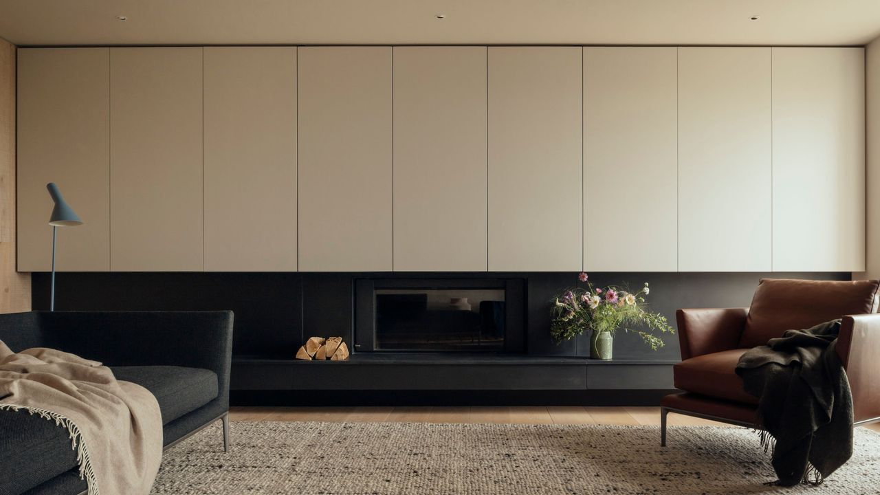
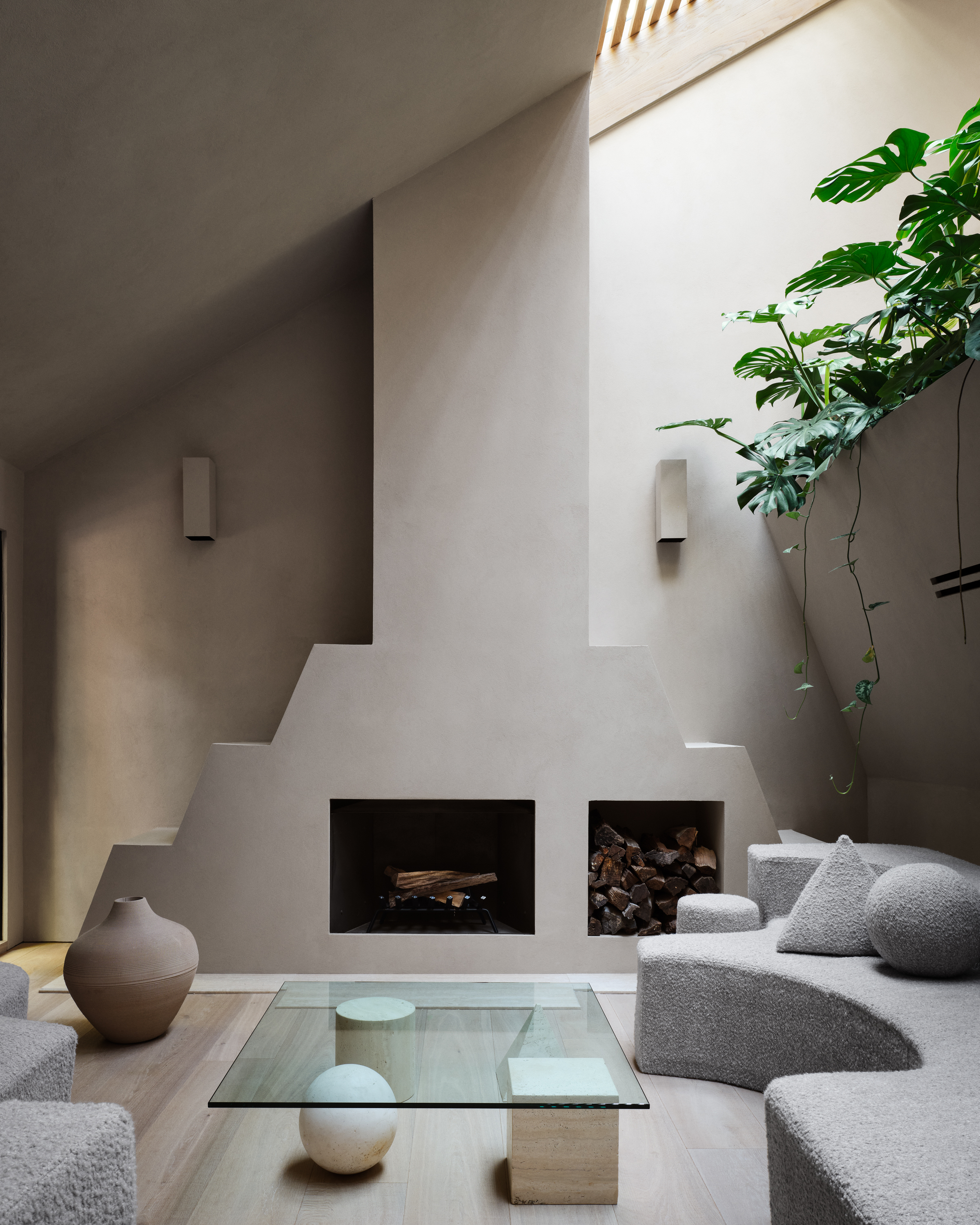
"We’ve seen an absolute shift to much richer neutrals — butterscotch, chocolate, and terracotta — tones that are enveloping and cocoon-like, which centers around our desire for our homes to be more nurturing than ever," explains Sheena Murphy, founder of interior design studio Nune.
As our decorative awareness matures, the role of decorating with neutrals has turned to well-being. "There’s a pull towards warm neutrals that are comforting and easy to live with, such as caramels, mellow beiges, chocolate browns — tones that are more relaxed, for calm and inviting interiors," adds Emma Shone-Sanders, founder of interior design firm Shone Sanders Studio. "It’s less about making a statement and more about creating a space you feel peaceful in."
"So much research is beginning to appear on the neutral palette being better for your nervous system," adds Kelly Hoppen, as the tones step up to the plate to become acts of self-care, as well as self-expression.
Shift to richer neutrals such as butterscotch, chocolate, and terracotta — like seen in this runner from H&M.
2. Not-Always-So Neutral
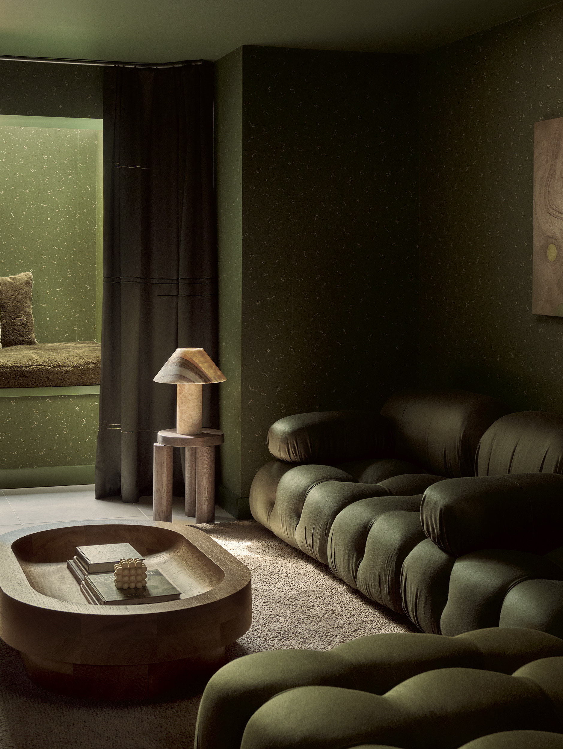
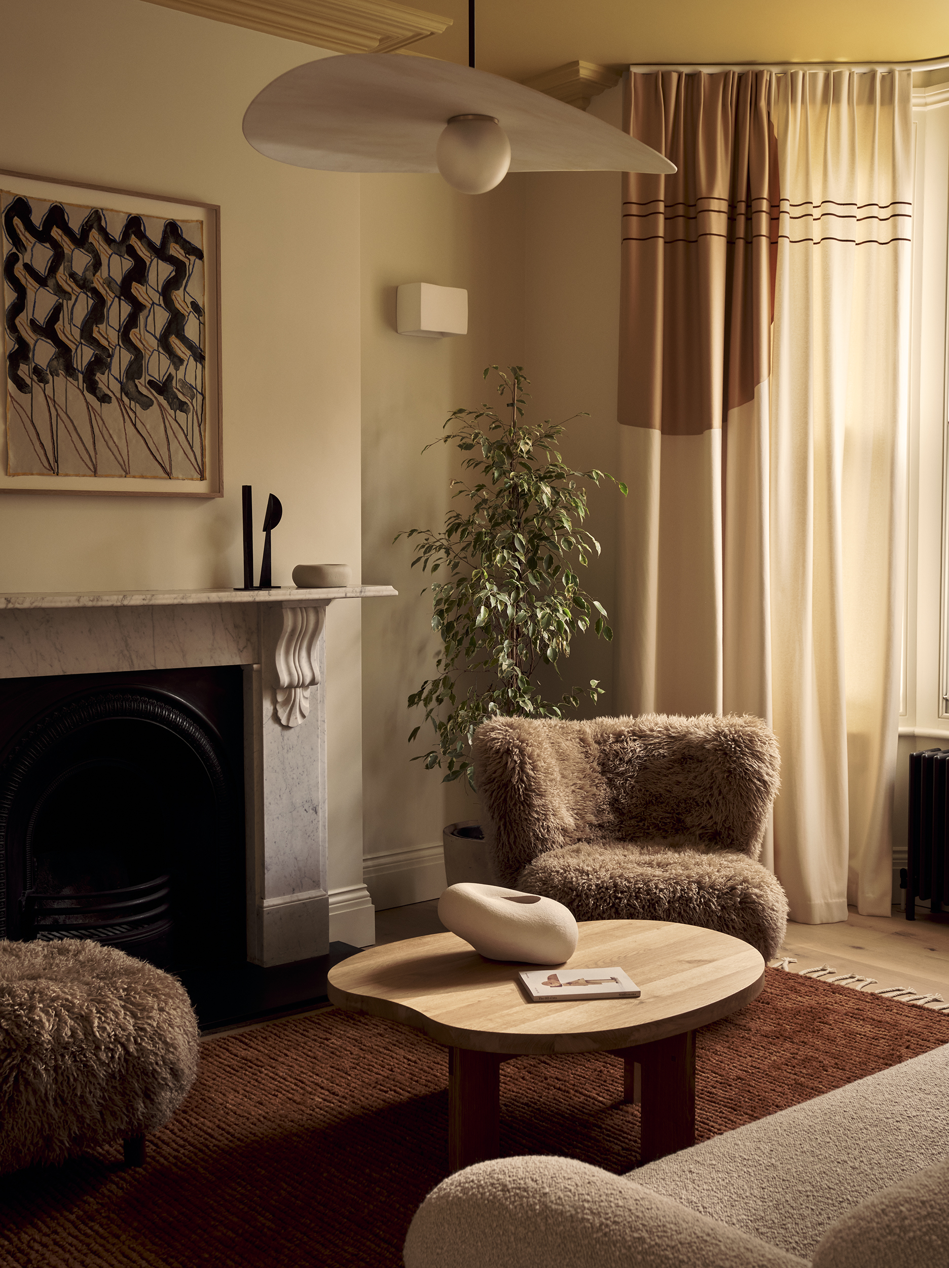
Neutrals are truly morphing. Before it existed literally, as hues devoid of much pigment. But now, the rules are changing, and color is entering the arena. This broader definition of new neutrals marks a move away from purity and restraint towards nuance, character, warmth, and atmosphere.
"In 2026, neutrals will have a slightly broader palette, bringing in muted, earthy hues that act like neutrals," says Emma Shone-Sanders. "Nothing too bright — more those warm, pared back colors that feel restful, such as understated rusty shades and tonal greens paired with soft creams or woods to ground a room."
Greens are key to the reimagined neutral shades. "Sage is rising as an accent tone to white, beige, grays, taupes, and look out for a khaki tone," says Kelly Hoppen.
"I’m really enjoying seeing tones like olive with buttery creams and chocolates," adds Sheena Murphy. "I also love dusky pinks with dark terracottas, which evoke a feeling of harmony and nature."
The new neutral color spectrum is wider than we previously considered, and spans all these cushion covers.
3. The Neutral Materials to Choose
Material-wise, 2026 is set to be the year of tactility drawn from nature, meaning decorating with neutrals should engage the senses as well as the gaze. "Material and finish-wise, sustainable, earthy, and raw materials will reign, with woods and stone leading the way," tips Kelly Hoppen.
Materials that tempt touch are playing a leading role in interior design trends, expressing this more tactile approach. "We’re seeing a lot of linen, because it feels so relaxed and organic, and richer textures like velvet, chenille, mohair, and cord," adds Emma Shone-Sanders. "These materials work so well with neutrals because they bring interest and depth without shouting."
Tapping into the psychology of nurturing and belonging, decorating with neutrals is about imbuing spaces with personality and emotional reassurance. "As the need for homes as sanctuaries continues, we’ll see amped up texture on fabrics — more tactility in general — and more age and character on surfaces like metals and woods," says Sheena Murphy. "These elements often remind us of the past and make us feel nostalgic, providing both emotional and physical comfort."
This Purple Breccia marble trinket tray demonstrates how decorating with neutrals in 2026 is just as much about material.
4. A Nice Neutral Canvas
When seeking to refresh your neutrals, the wrong approach can leave a home at best, uninspired and like something we’ve all seen before, and at worst, physically unpleasant and unwelcoming. "Don’t go too cool with your neutrals — not only does it feel dated, but it also evokes a sense of cold and discomfort in an interior," advises Sheena Murphy.
"If there isn’t a lot of natural light, neutrals can easily become too cool for a space," agrees Emma Shone-Sanders. This is where using paint samples comes in — test as many materials as you can at different times of day to make sure they feel warm and friendly (like tones you want to be around).
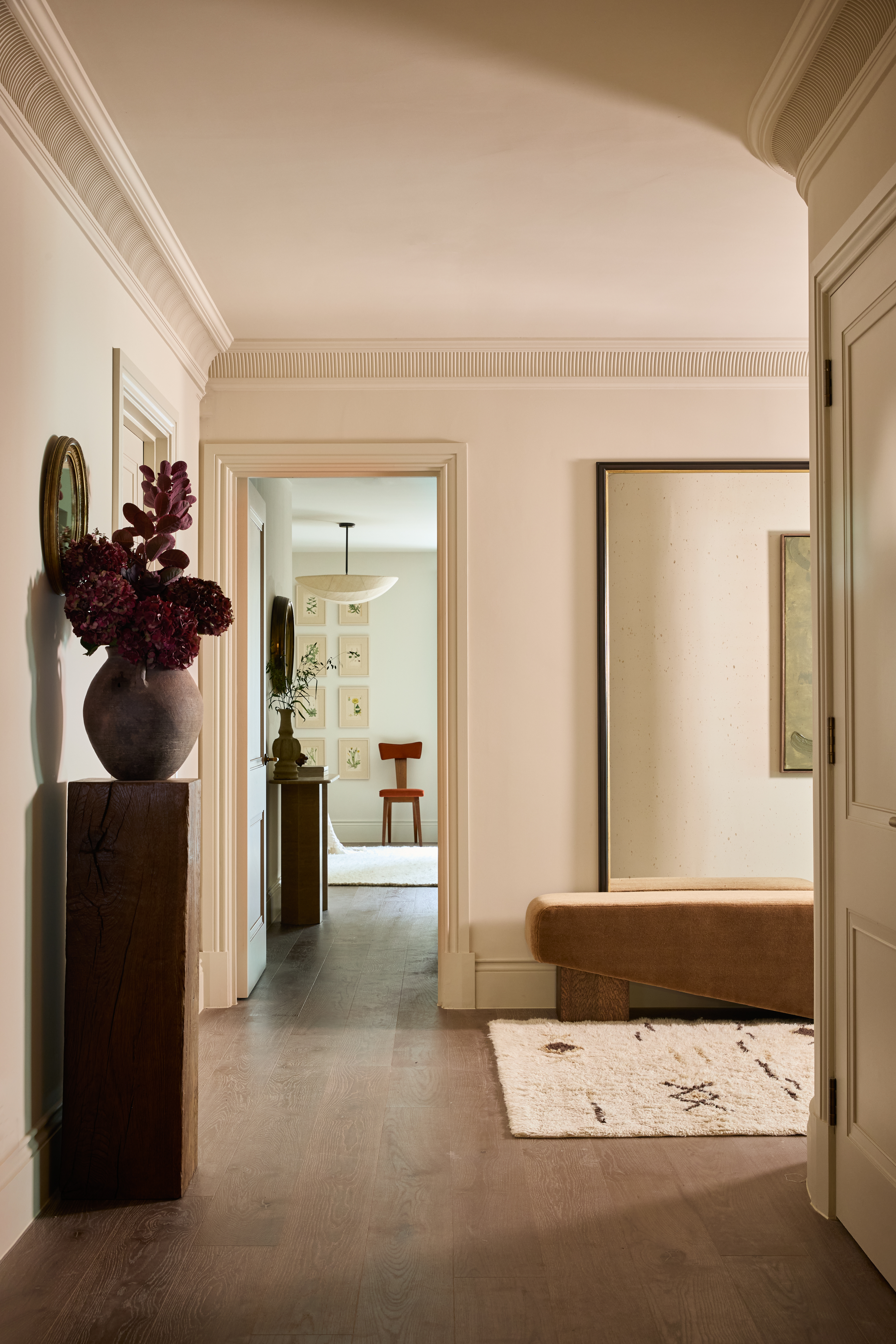
Still think decorating with neutrals is for the unimaginative and unadventurous? It just takes a sprinkle of confidence and creativity. "Be brave and play with deeper tones that provide more dimension to your space," says Sheena Murphy. "Amp up the contrast for drama and interest, and experiment with unconventional tonal and more colorful pairings." How about ivory with soft mocha? Light gray with dusty peach? Or charcoal with truffle brown?
The modern neutral palette is one of variation. "Matching everything too perfectly can make a room feel a bit stiff — mixing shades within the same family usually looks much more natural and relaxed," says Emma Shone-Sanders. "Try layering different tones and textures, and pairing with other finishes like marble, onyx, aged brass, and bronze."
If you still feel stuck, refer to the neutral color wheel, which works exactly like its rainbow-like counterpart and will point you in the right direction for shade combinations and tonal temperatures.
And if all else fails, there’s one key rule to follow, as Kelly Hoppen sums up: "Always follow your sense rather than fashion, and choose what you love."
Sheena Murphy agrees: "The most important thing for real longevity is to be guided by the neutrals you’re instinctually pulled toward."