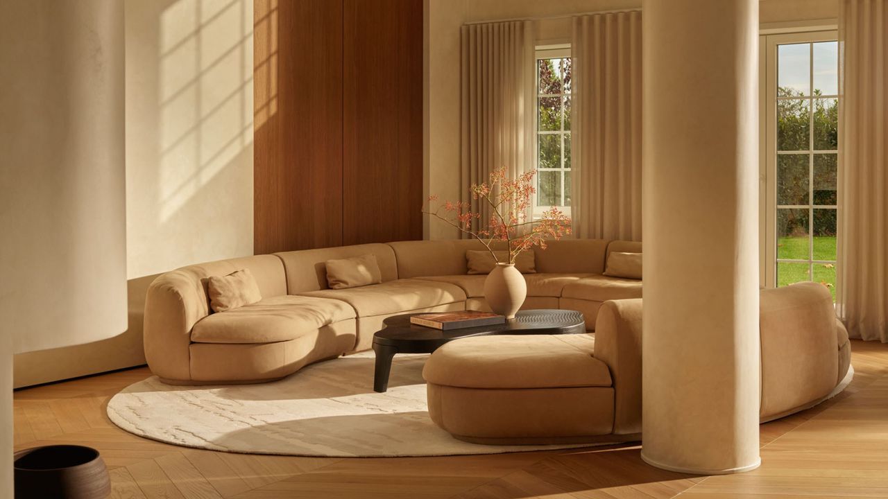
“As many of us move away from the trend for minimalist and pared-back decorating designs, it's becoming clear that some of the paint colors that defined that look can now seem a little flat," says Lucy Steele, senior brand manager and resident color expert at Valspar. Unfortunately, this leaves many of us stuck with shades that lack warmth or depth, which no home deserves.
So what's the fix? It starts with identifying any shades that look rather lackluster on the wall. As you can imagine, stark whites and cool grays are the most common offenders, but there may be a few on this list that surprise you. A flat or dull paint color doesn't necessarily mean the shade itself is a bad color, but rather that it isn't doing your specific space any favors.