If you're in the midst of renovating, or planning any home updates large or small, you may well be wondering what trends look set to fall out of fashion in 2024. Even timeless colors, materials and design elements can benefit from a little update every now and again, which is why we've gathered a few expert ideas that could help upgrade your space.
In general terms, we all seem to be feeling the urge to make our homes feel ever warmer and more cocooning. Think rich and earthy colors, textured surfaces, comforting materials and undulating curves.
We've also noticed that the more traditional closed floor plan appears to be having a renaissance, and with it the rediscovered joys of secluded dens and living rooms, elevated dining spaces and kitchens of cozier proportions.
That said, there's no one-size-fits all approach to good interior design, and the best interiors are always the ones that feel authentic. However, if you're in search of a few insider tips to help reinvigorate your home or inspire a redesign, read on.
1. SWAP SLEEK SURFACES FOR TACTILE TEXTURES

Textured wallpaper is having a comeback, but Irene Gunter, founder of Gunter & Co, has long extolled the virtues of this versatile wallcovering.
'I always enjoy recommending it to my clients. There's something truly special about having texture on your walls,' says Irene, who chose Altfield's grasscloth Casablanca wallpaper for the bedroom of this elegant London home. 'Not only does it create a cozy and inviting atmosphere, but it also offers practical benefits such as improved acoustics. The way sound travels and resonates within a room can significantly impact the overall comfort of a space.'
2. RECONSIDER IMPLEMENTING AN OPEN FLOOR PLAN

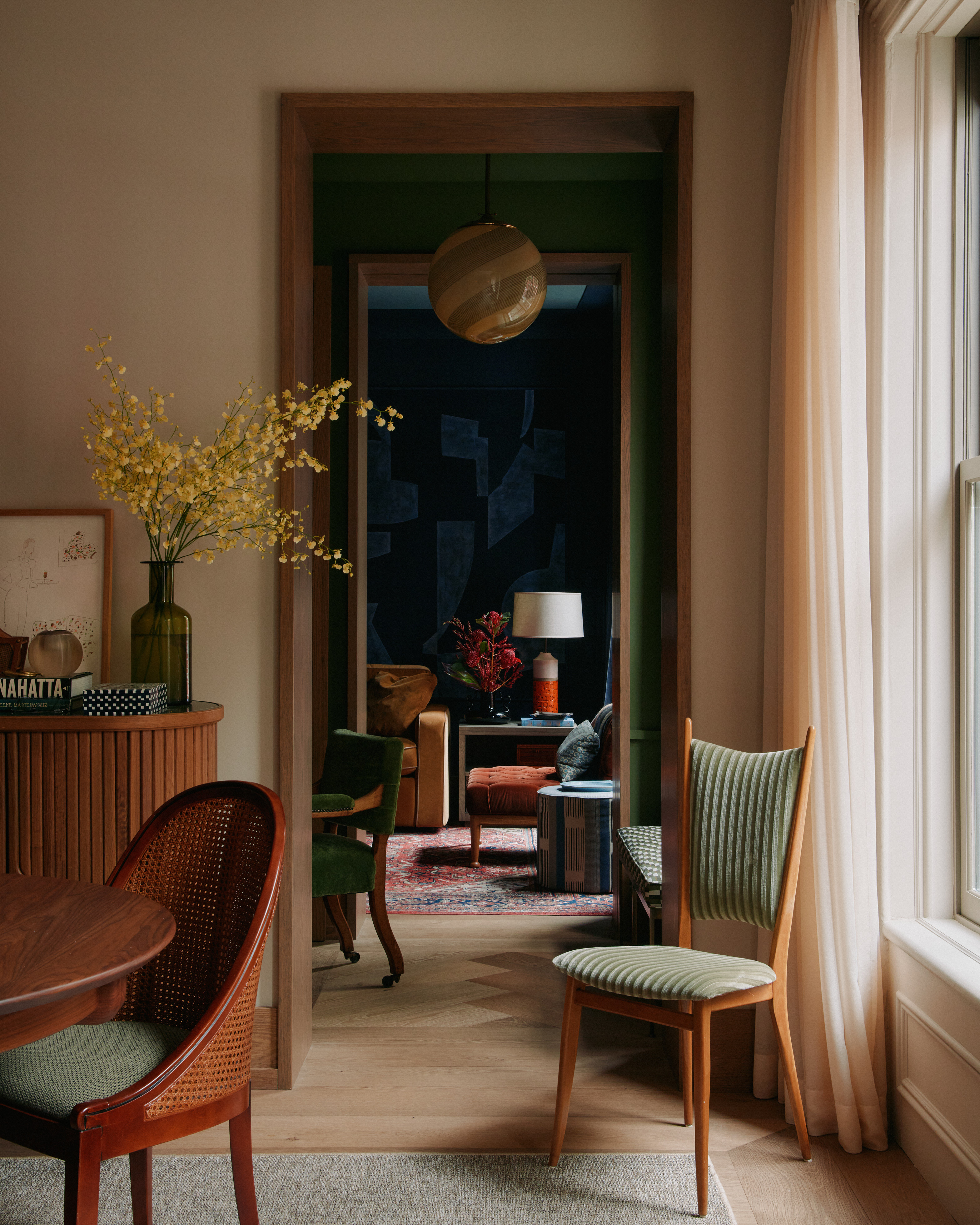
This compact home in Manhattan's West Village owes much of its charm to its clearly defined floor plan, which Brooklyn design firm General Assembly implemented when they knocked together a studio and an adjacent one bedroom apartment. Instead of trying to feign spaciousness with an open concept, the firm capitalized on the experience of moving between the various areas.
'The layout feels thoughtfully compartmentalized with multiple small rooms, each with their own distinct aesthetic traits by way of rich color and comforting materiality,' say designer Sarah Zames of General Assembly, who devised a scheme with contrasting colors, warm wood and sumptuous fabrics.
3. TRY A FRESH TAKE ON CLASSIC CRITTALL DOORS

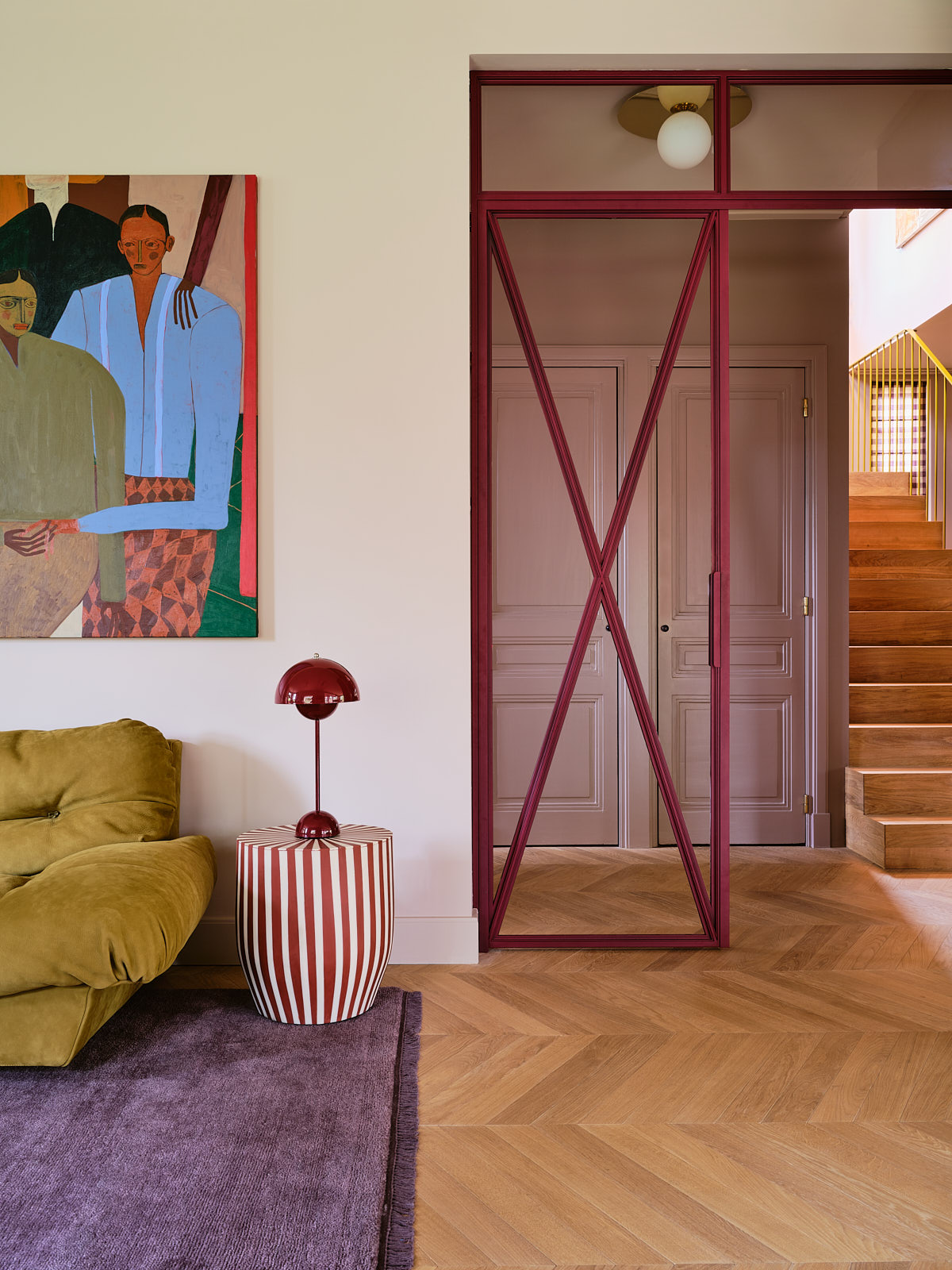
We hate to say it, but Crittall-style doors don't work in every space, and nor should they have to. Their black-framed design, while classic, can sometimes feel a touch jarring, particularly when installed internally. If you're looking for something softer – and more original – take inspiration from these burgundy metal doors, which Dutch Studio Atelier ND Interior installed in this Amsterdam home.
Studio co-founder Nicole Dohman chose a range of expressive colors for this project. These purple-hued, powder-coated doors feed into a scheme that includes pink polka dot wallpaper by Kelly Wearstler in the home's entrance, as well as accents of lilac, magenta and eggplant. 'The trick is to keep the overall feel balanced, and repetition throughout works well that way,' says Nicole.
4. CHOOSE SCULPTURAL CURVES OVER ANGULAR FORMS

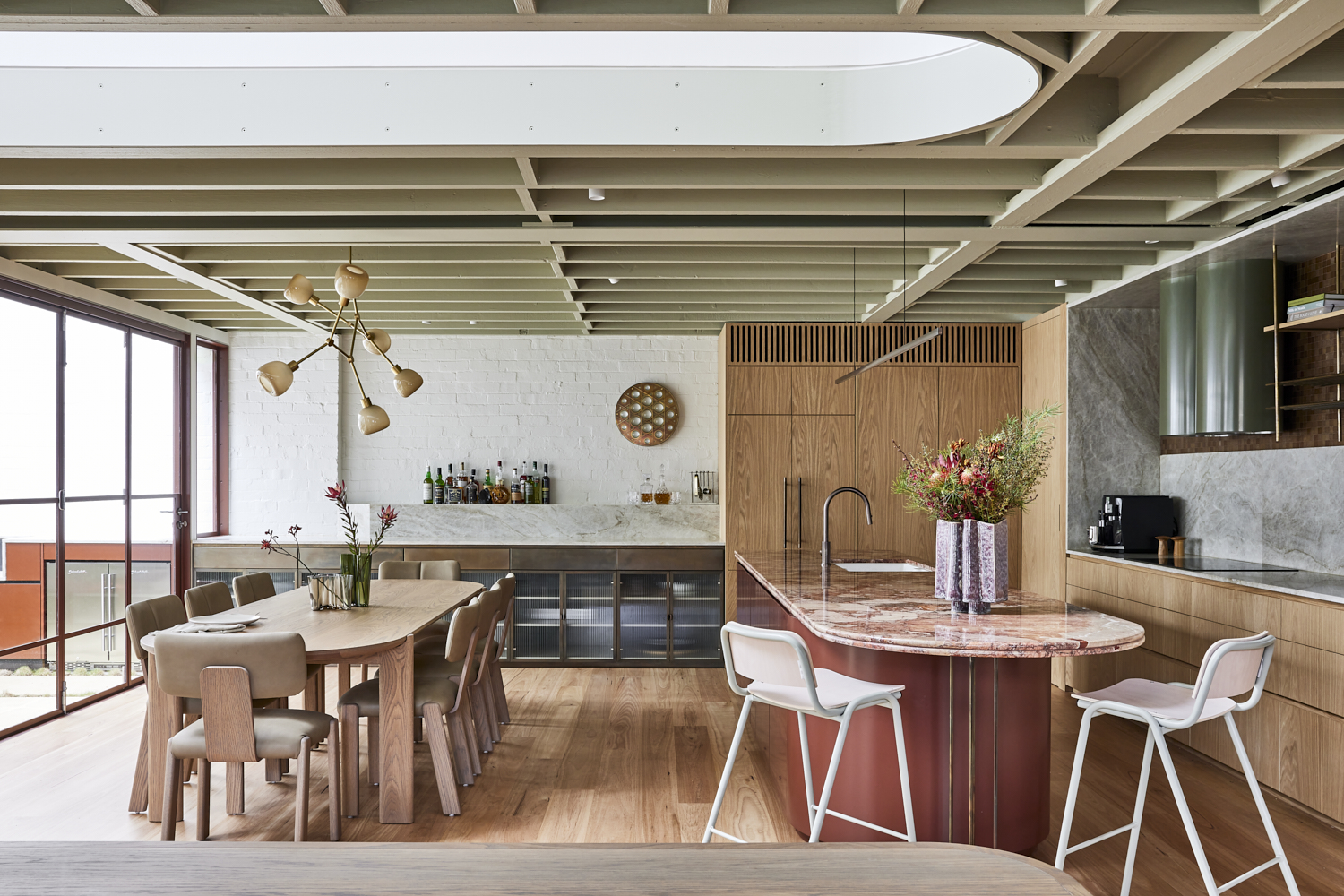
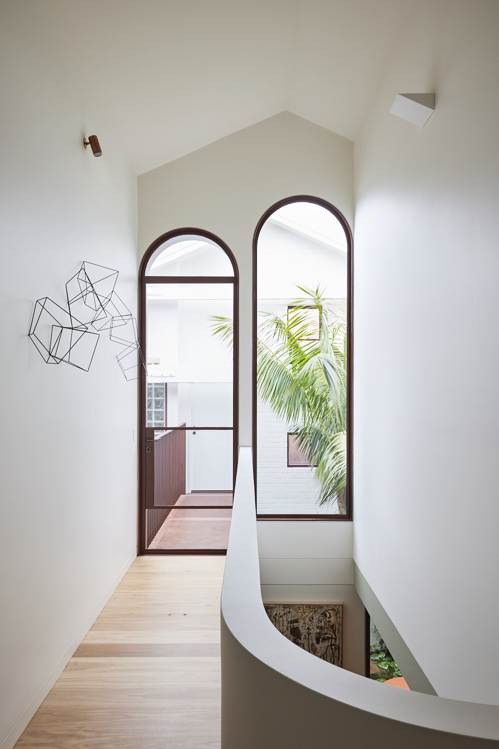
It's no surprise that with the pursuit of comfort comes a move away from hard lines and sharp angles. It might seem like curved elements (whether in architecture, furniture or accessories) are everywhere at the moment, but that doesn't mean this interior design trend is waning – as this recently converted warehouse proves.
Sydney studio Carter Williamson transformed the building into a home filled with luxurious materials, sweeping curves and warm hues. 'The ceiling is punctured by an arch-shaped double-height void that joins the two levels, drawing the eye up and the light in,' says Julie Niass who worked on the project's interiors. 'Its sculptural form is a motif repeated throughout the design in arched windows and doors framed in elegant, deep-red steel that defines the courtyard façade, softening the building’s industrial bones.'


