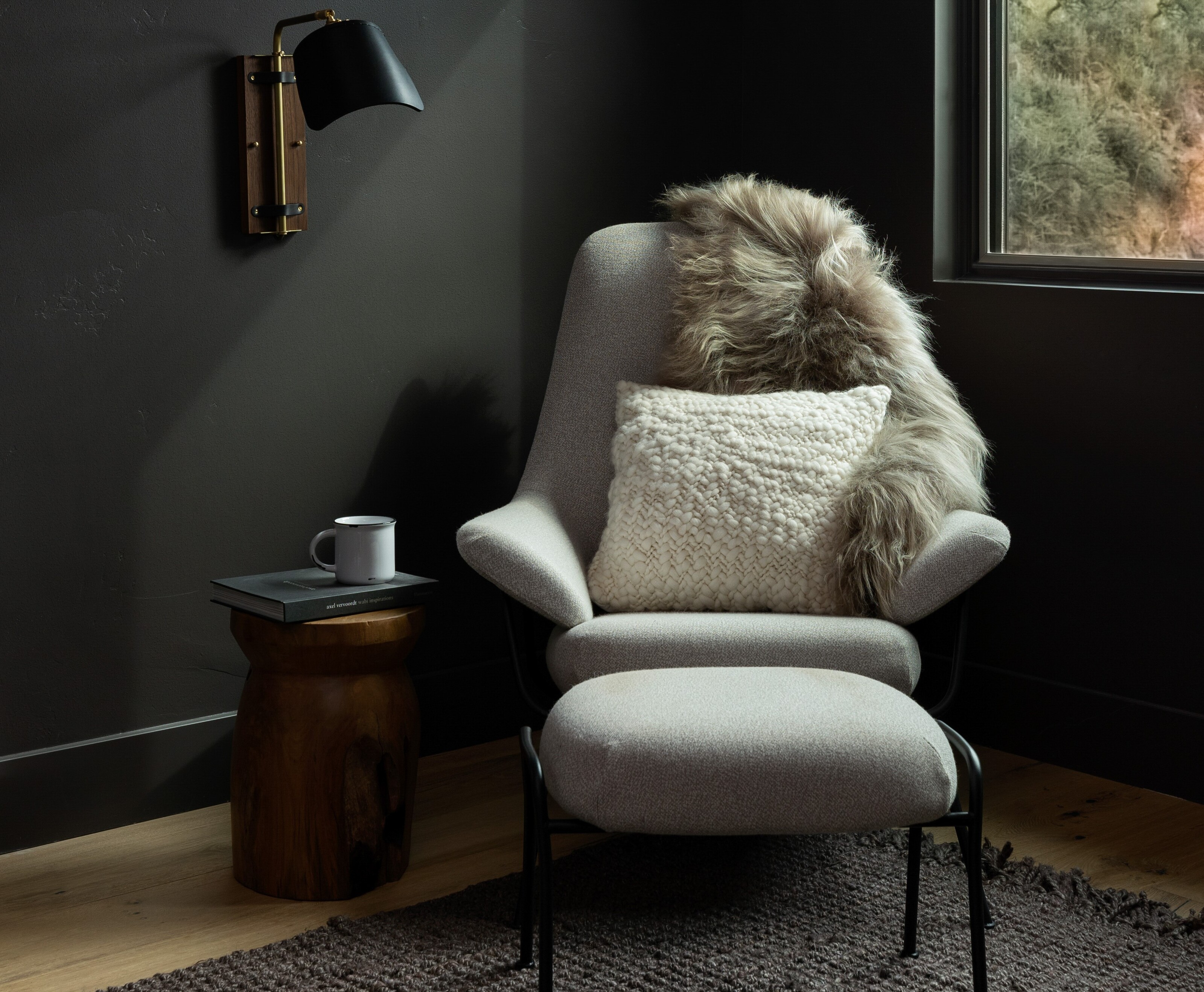
More and more, designers are embracing dark palettes in the home. Making a statement, darker shades can bring a serene and restorative environment, and we've seen plenty of brilliant examples that shun the myth that dark palettes contribute to a gloomy and claustrophobic feel.
It seems that the mood is shifting towards those earthy shades instead of the more rich and luxurious dark colors like forest green, royal purple and navy blue. 'When most people think of darker colors in home design, jewel tones usually come to mind, but I would encourage digging deeper and exploring muted earth tones,' says interior designer Kathy Kuo of Kathy Kuo Home. 'In the year to come, alongside the rise of design concepts like wabi sabi and organic modernism, dark earth tones will prove popular.' As we head towards 2024, we're all for turning to the dark side. I've spoken to the designers who have picked their favorite dark paint colors to embrace (as well as the dark paint color to leave behind in 2023).
1. Terracotta
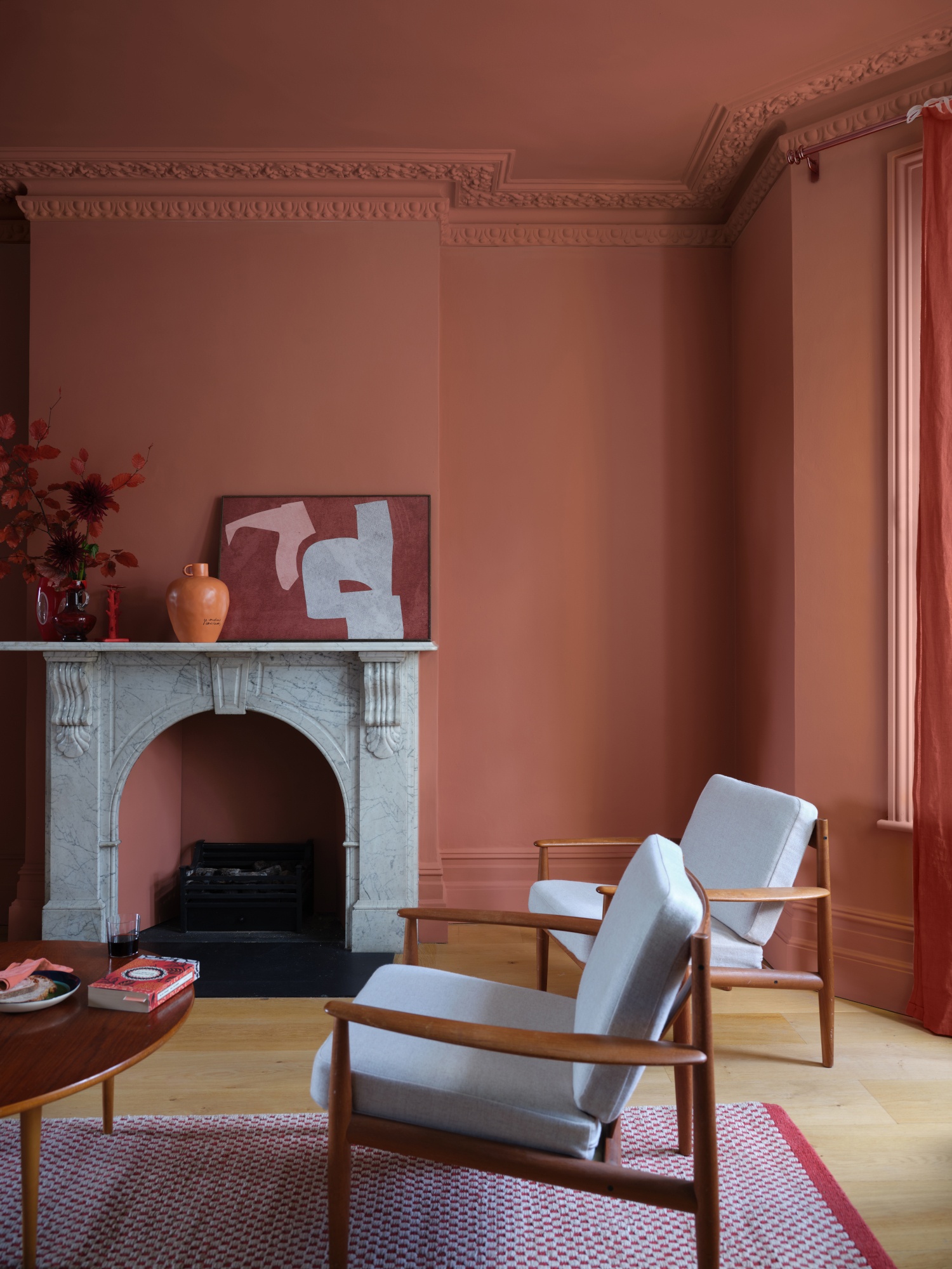
The main thread for color trends in 2024 is a move towards earthiness instead of those more vibrant jewel-like tones. ‘For many years, the design world has been dominated by cool greys and stark whites, but a noticeable shift in preferences has emerged,’ says Sara McCarthy, designer at Vesta Home.
‘People are now eager to not only connect with the natural world but also to bring that earthy warmth into their homes. While I don’t think we’re going to say goodbye to the grey living room just yet, their presence is decreasing, giving way to a more moderated usage with warmer undertones as a replacement.' Terracotta is a prime example of a color that has this earthiness in abundance.
'Terracotta has a warm quality and it ground spaces beautifully,' says Artem Kropovinsky of Arsight, an interior design studio based in New York.
Terracotta might not be the first color you think of when you imagine a dark room, but the way this rusty color plays with light and shade is a great feature. North-facing rooms are typically the coldest room in the home, getting the least amount of light. A shade like terracotta can help warm up even the coldest of spaces.
2. Dark olive green
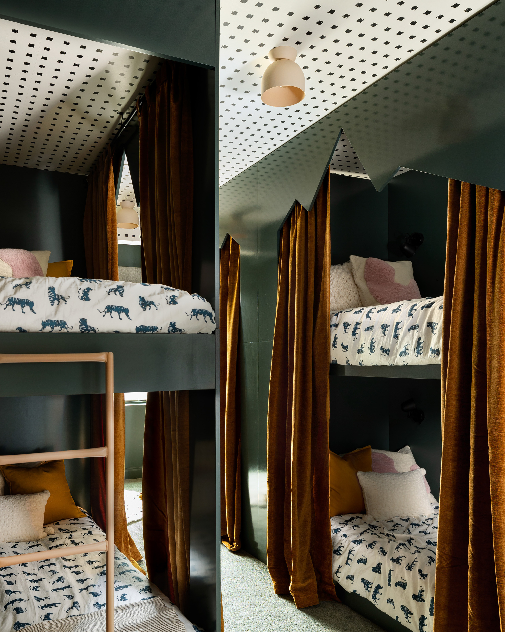
Instead of brighter forest green or vibrant mints, dark olive or bottle green is a color we're seeing used more and more in the home. Its deep tone feels sumptuous and cozy and when used on the walls, it brings depth to any room.
Olive green is often pale, sitting somewhere between green and olive on the color wheel, but dark olive has a lot more of a deep and dark tone which means it can sometimes look like a dark brown.
This children's bedroom design by Salt Lake City-based Susannah Holmberg Studios incorporates shade and works well against the ochre tint of the interior curtains that have been used to give each bunk some privacy.
'Dark olive is an often underappreciated color when going with a dark room,' says Juan Carretero of Capital C Interiors. 'It has an incredible beauty that is soothing, yet uplifting. It goes with every other color so well. It adds depth and earthiness.'
3. Deep brown
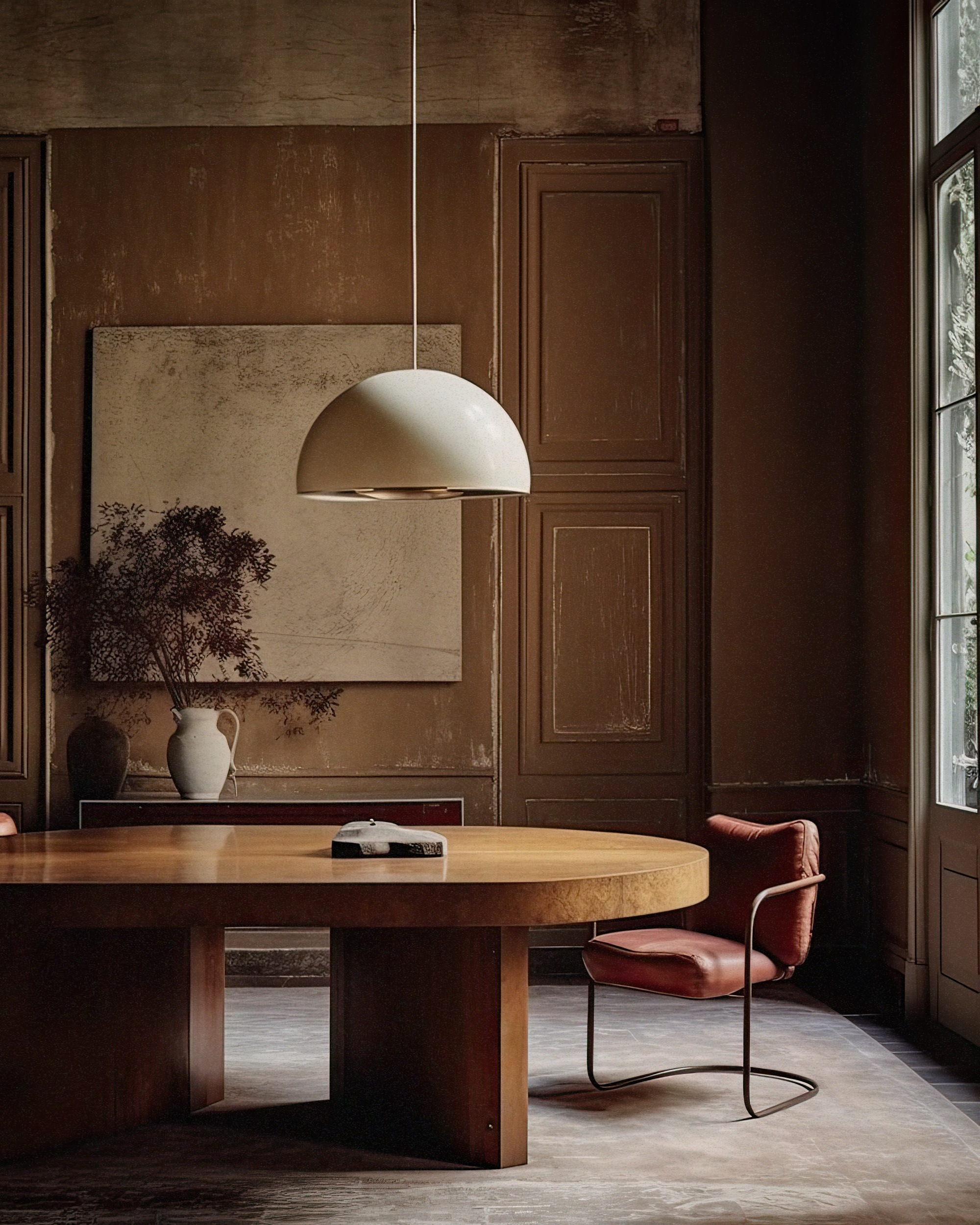
Browns have seen quite the revival in the home over the last year, and that isn't showing any sign of slowing down, continuing as a color trend for 2024. The undertones of the color brings a really warming quality to your home, and it's so omnipresent at the moment that it feels like it's taken grey's crown as the go-to paint color for a cozy space.
Brown is a great color to break up with a textured finish. It stops it from looking too flat and again brings that earthy feel, so think Venetian plaster or even micro cement that creates an earthy interior.
'Neutrals, specifically browns, are far from boring,' says Leslie Murphy, principal designer of Murphy Maude Interiors. 'Browns are so popular right now because they connect us further to nature and give off a comforting and warm tone, evoking calm and restfulness, while still being upscale and elegant.'
'I also find that browns pop much more as dramatic, moody paint colors and keep the design feeling very clean and contemporary.
'Adding warm color also makes your space cozy as we go into the winter months and this trend will continue well beyond 2024,' says Christiane Lemieux, who designed this space with a textured finish. 'Adding a warmth also ushers in the ability to mix in woods and warm accents like burnished brown, brass and bronze easily. All of these finishes, color and textures are coming back and bringing a beautiful natural palette with them.'
4. Slate grey
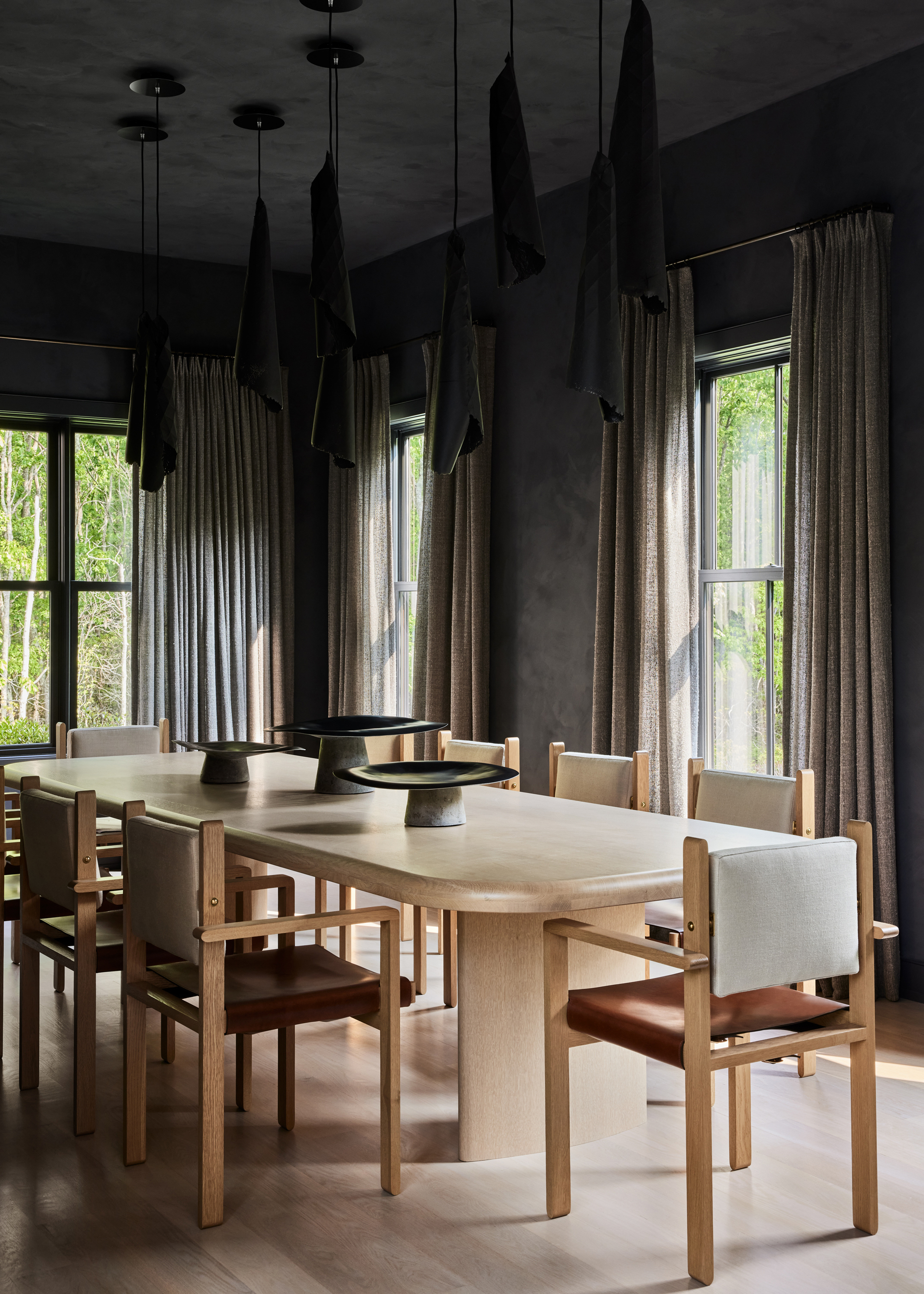
We've seen the rise of dark black rooms in the home, but we're noticing more and more a move towards an ashier, lighter black. Sleek and sophisticated, it brings the same refinement as grey always did, but has a more contemporary edge and added depth. If you need proof, the aptly named 'Cracked Pepper' was crowned Behr's color of the year.
'In the year to come, dark earth tones like slate gray will work as fresh takes for things like accent walls, statement furniture, wall art, and rugs,' says Kathy Kuo of Kathy Kuo Home.
I love how this dining room has used this dark shade on the wall for a cozy space, the walls are done in plaster to bring that oh-so-popular earthy feel.
What dark color should I avoid?
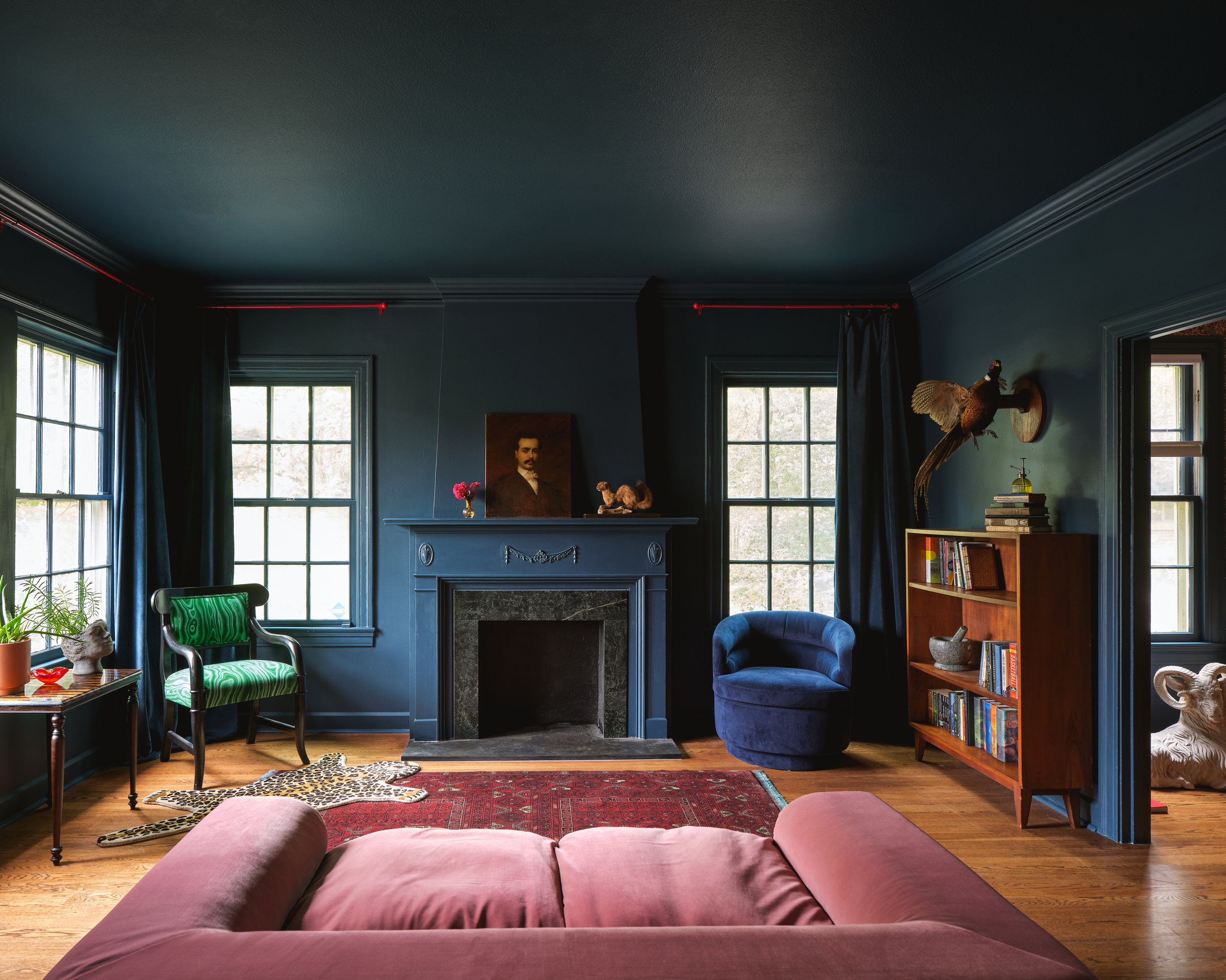
You heard it here first, say goodbye to the navy living room, because navy blue is over. Navy blue has been pretty popular over the last few years, but we're noticing the landscape changing. As with all color trends that come and go, when something starts getting overused, the chances are it will fall out of fashion.
Instead, designers and homeowners are picking darker midnight blues or smokier blues with a grey tinge. 'Embrace softer, more nuanced alternatives to navy,' says Juan. 'The use of a muted teal would make the pallet calmer.'


