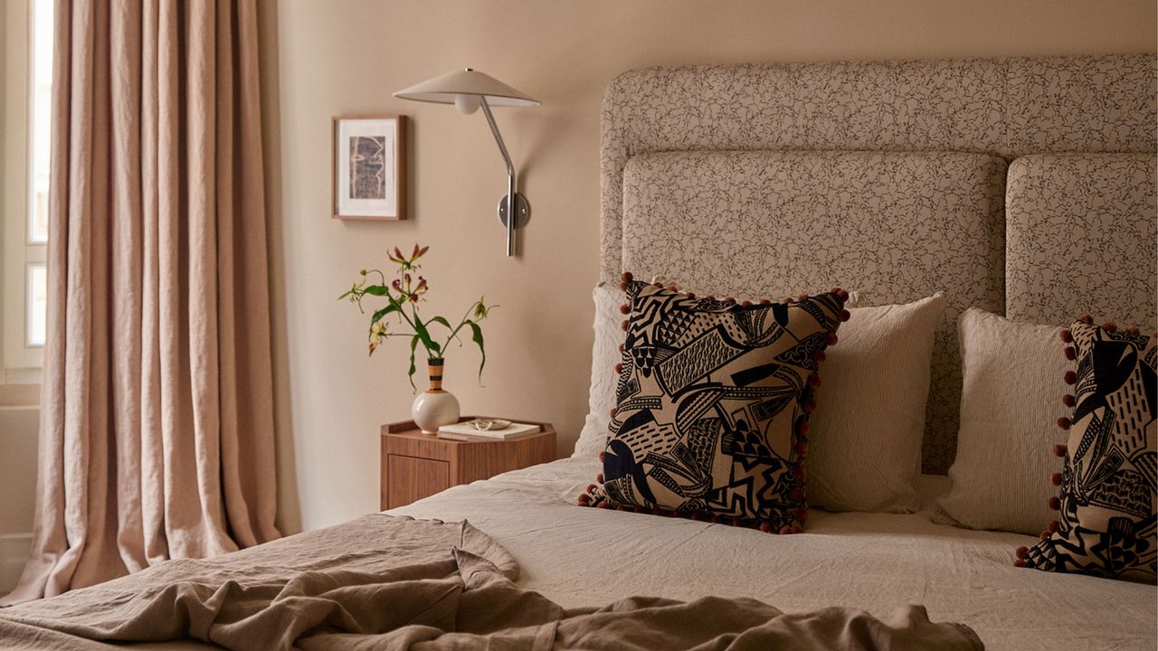
Designing a space with only neutral colors comes down to a fine balance — a lack of pigment makes things delicate and less tolerant of error, as there are no colorful, eye-pulling distractions; the entire mood of the space can be tipped by a clashing undertone, poor contrast control, or the wrong kind of light.
But don't let that put you off — there are rules to follow when it comes to neutral rooms. Spaces with low chroma (minimally saturated) shades rely on elements such as depth, light and darkness, undertone, contrast, texture, form, proportion, and materiality to create visual interest. Yes, pigment is ever so slightly present (tinting the shades a little to give them cadence and charisma), but such schemes eschew bolder hues in favor of cohesion and restraint.