The entrance hallway is an area that doesn't receive as much airtime as some of the other rooms in our home, yet it's worth giving some careful thought. No, you won't be spending hours there like you will in your kitchen and living areas, yet in terms of creating a first impression, the entryway is as important as a good handshake.
So, what to do with this space that sets the tone of your house? There are many factors to consider, and what you want to achieve might depend on functionality. How large is the space? Do you need to utilize storage? Is your house the backdrop to regular meet-ups with your friends?
The entry hallway has the power to shift your mood when you come home from work each evening, as well as that of your kids when they get home from school and the guests you're welcoming in. You'll want to make the space feel calming and inviting, a respite from the stresses of the outside world. However, as a transitional zone – not one we're going to spend hours in, you can push the boundaries with design, and go for maximum impact. Here are some smart and stylish entry hall ideas you might want to consider.
Entryway ideas that create the perfect welcome
As the ideas below prove, there’s more than one way to create a striking entryway. From clever uses of color to impactful patterns, to strategically-placed furniture, the inspiration below will not only make your home’s entrance grander, but they can also be applied to a breadth of spaces.
1. Mix and match styles for a characterful entryway
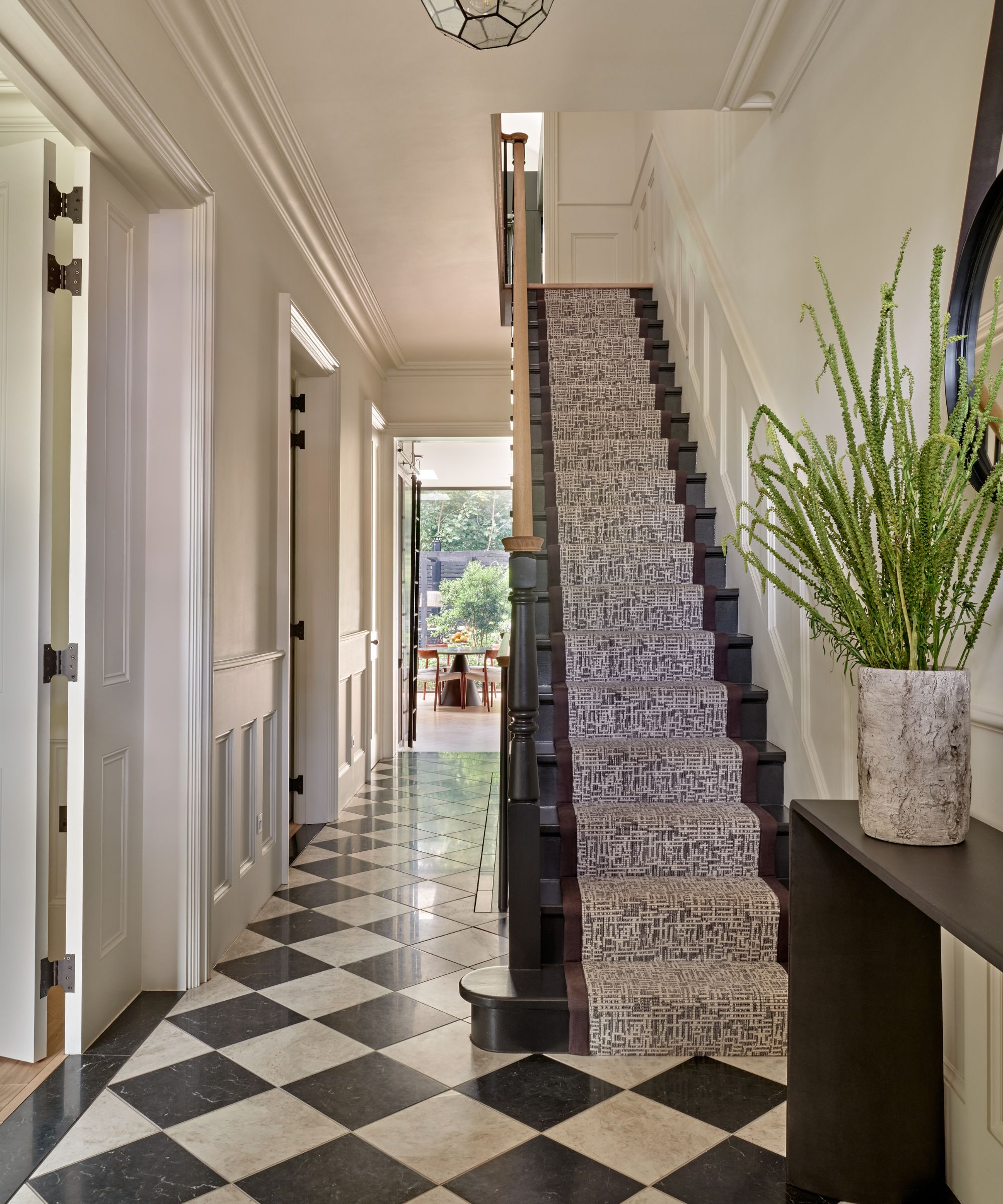
When Clare Gaskin was tasked with creating the entryway for this family home, she was asked to bring a “monochromatic, Parisian-chic” energy all while highlighting the space’s natural light and garden.
'Walking into a home it’s wonderful to be greeted by a space that feels exciting and elegant but also to be encouraged on a journey through the home which you get by leading the eye to a view,' Gaskin explains. 'As here with the inviting connection to an exterior green space or perhaps a statement artwork.'
But just because Clare stuck with a high-contrast color palette doesn’t mean this entryway is by any means stale. The designer used this simple scheme to deftly mix a bevy of interior design styles, as seen by the traditional tiled floor and contemporary console table.
2. Go big with color
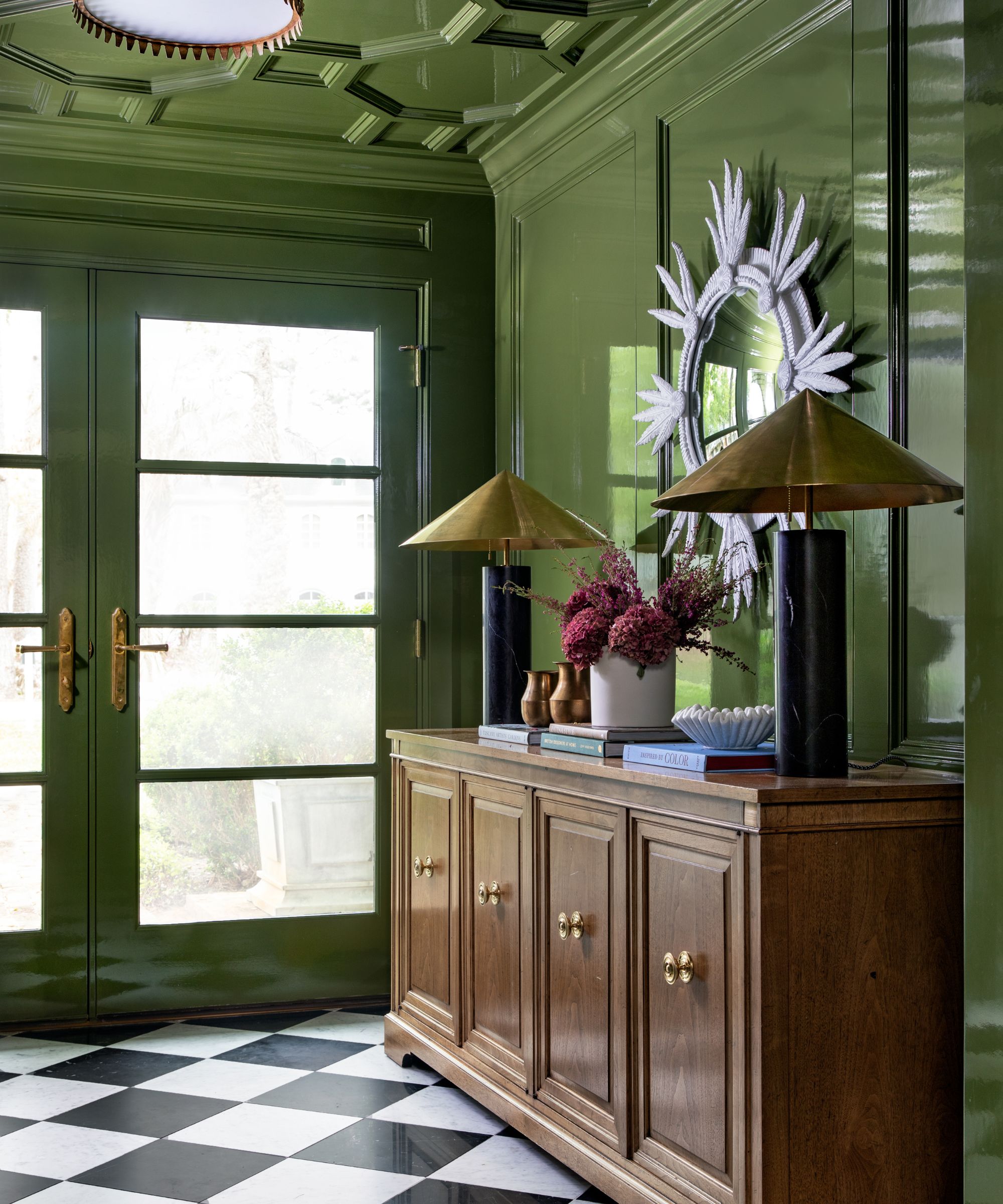
Or, if you want to make a bold statement with your entry, infuse a can’t-miss color. Here, Katie Davis employed an unapologetic, smile-inducing green. 'Bold walls and even bolder flooring give this entry a punch of glam that sets the tone for the rest of the home,' she explains.
While the glossy look of this verdant foyer might make an already bold color even more eye-catching, Katie argues the finish is practical, too. She says: 'The allover tone in a glossy application actually gave the space more dimension, making the entry feel even larger.'
3. Add drama with a dark color scheme
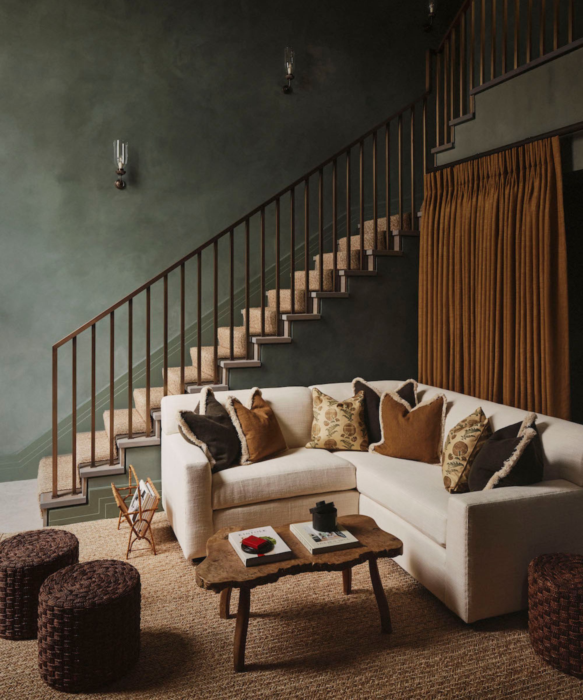
The entryway isn't a space where you necessarily need great visibility, so you can keep light levels low, and lean into creating a cossetting, relaxing atmosphere. Describing the entrance hall of this project, Ottalie Stride, creative director of Albion Nord comments, 'Entrance halls are often transitional spaces and the use of rich wall color can make a space feel cozy and inviting, creating a warm, enveloping experience'.
'Dark walls instantly add a sense of depth and luxury to a space. They create a bold, dramatic atmosphere that makes a strong first impression as people enter your home. High-traffic areas like entrance halls can be prone to scuffs, fingerprints, and dirt. Dark colors are better at hiding these imperfections compared to lighter walls, reducing maintenance efforts.'
4. Add pattern at floor level
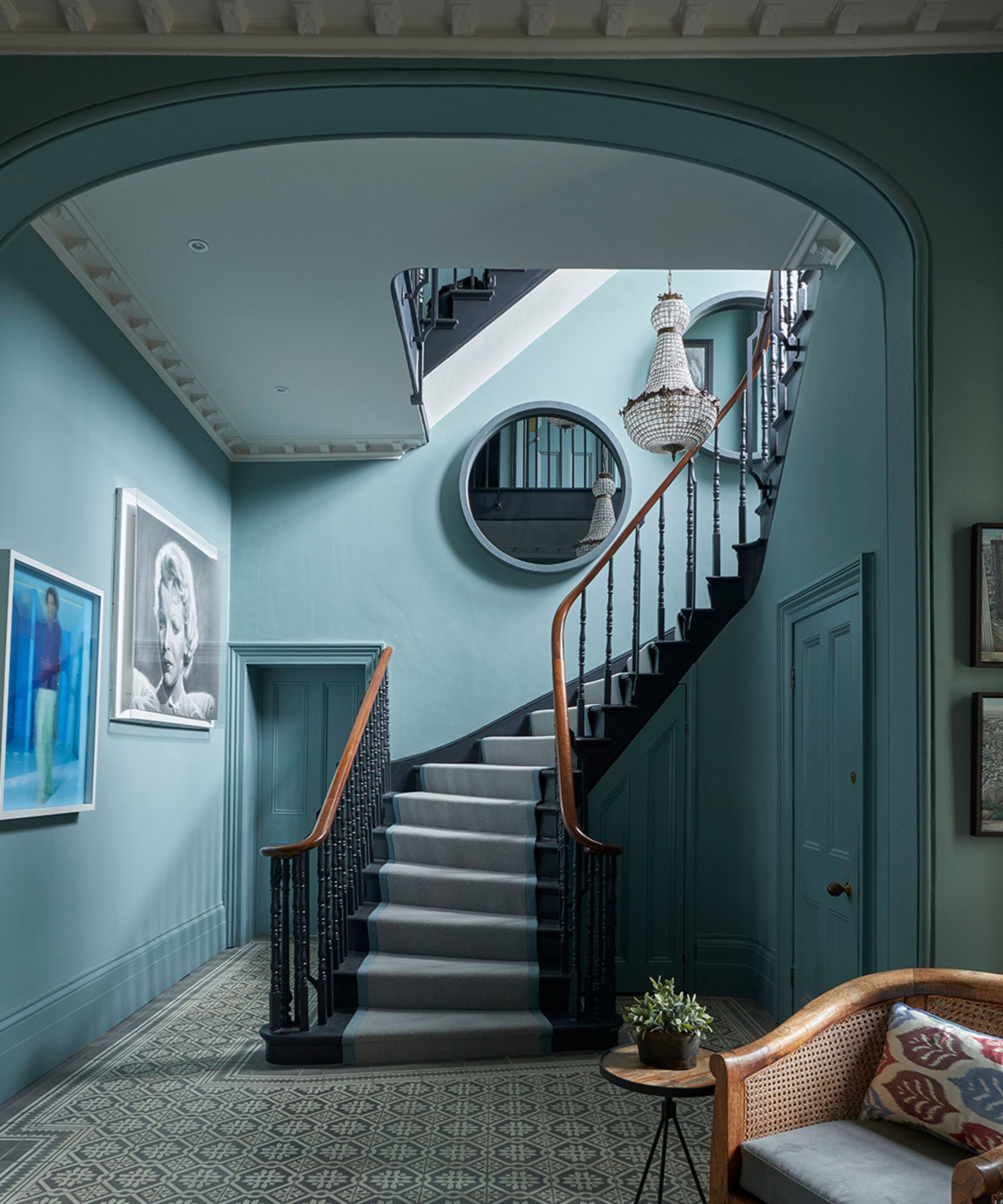
Choosing tiled flooring in an entry hall might not seem like an obvious choice, but it's highly practical and introduces an ageless elegance and European-style grandeur.
'A tiled entranceway is a design classic. Easy to clean and durable, tiles work well in areas with high footfall and create an impactful first impression' explains Lee Thornley, Founder of tile specialists Bert & May.
4. Create a warm welcome with layered textures
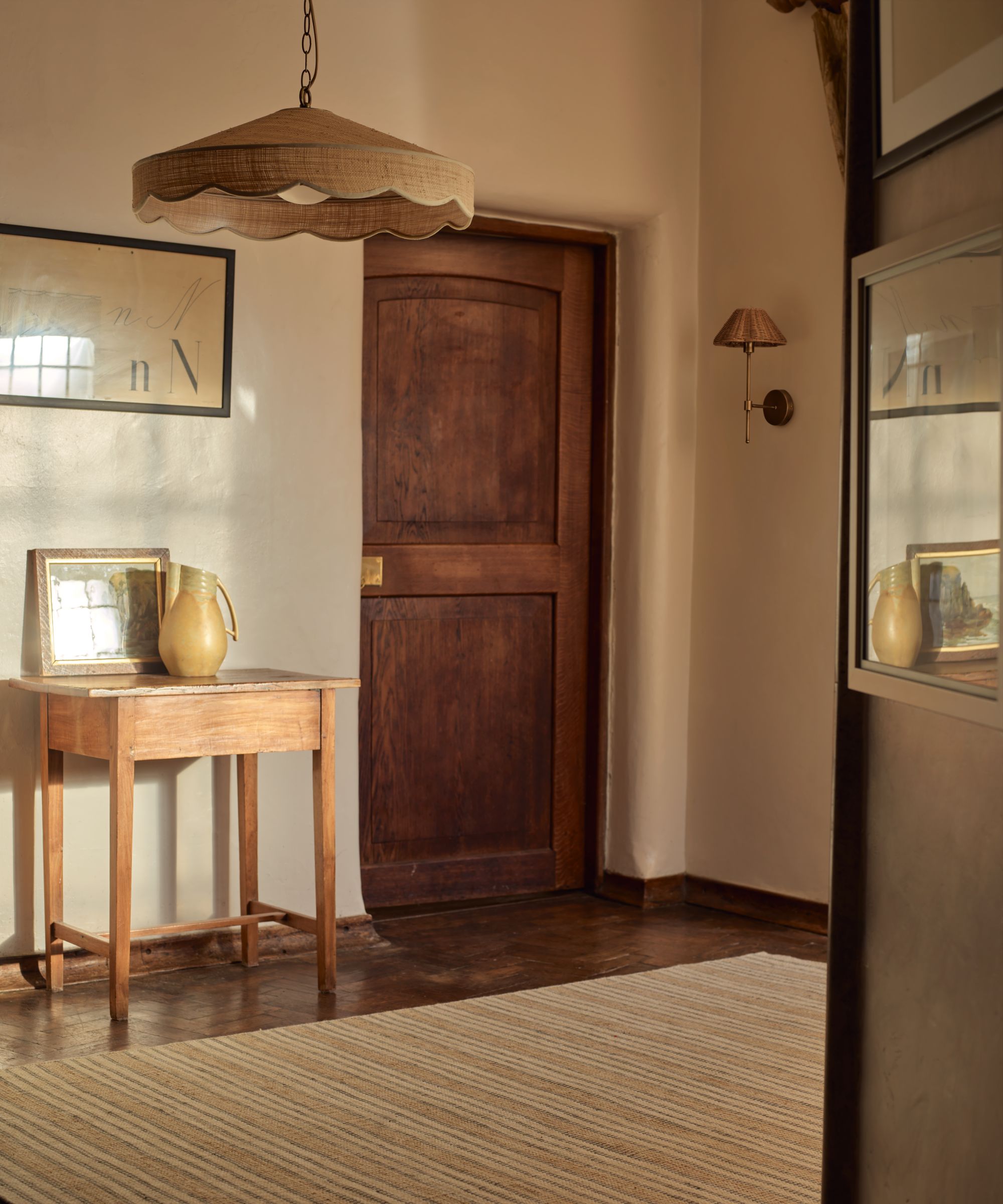
Creating an entryway with plenty of natural texture and warm neutral colors is a great way to make those who enter your space feel calm and at home, helping the stresses of the day melt away.
Fred Horlock, Design Director at Neptune explains, 'Layering natural materials in your entryway brings warmth and texture to the space. Pairing wooden furniture with accessories in materials like jute and raffia works to create an entrance that feels grounded and inviting.'
5. Try the Tonal Treatment
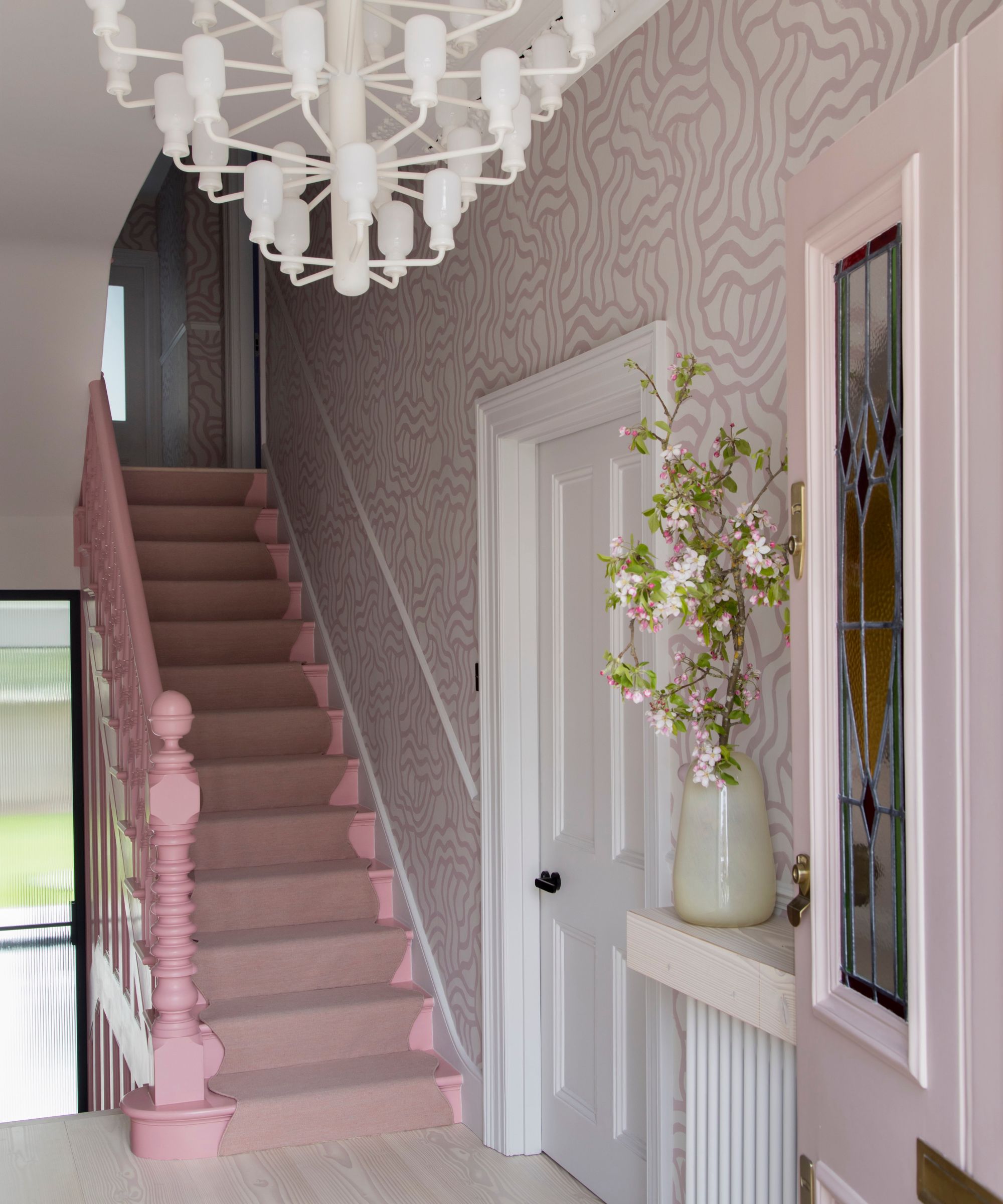
Make no mistake, it’s possible to make an entryway pop with pastels–just ask 2LG Studio.
'An entryway should be a place to make a bold statement, a warm welcome to all of your guests setting out your design ethos from the start,' says co-founder Jordan Cluroe. Though the British design firm stuck with a light pink for this foyer, they incorporated a series of fun patterns within the same color family. Highlights include a wiggle runner from Floorstory and 2LG Studio’s Tildẽ wiggle wallpaper, which was hand-painted by the firm’s co-founder Russell Whitehead to 'create a fun and playful entrance.' Mission accomplished.
6. Craft a Can’t-Miss Ceiling
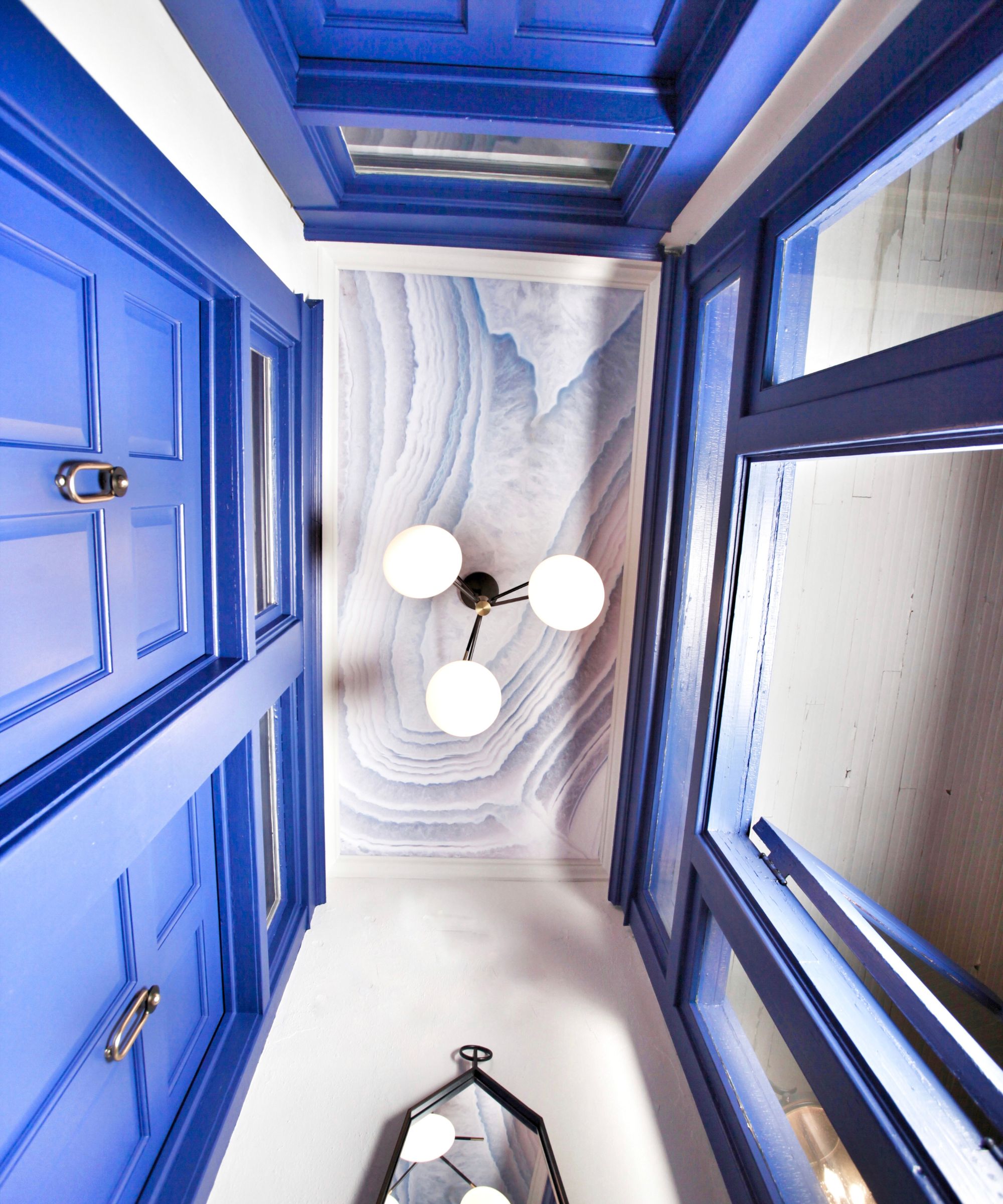
While an entryway can often be treated as a threshold from your outdoor space to your home’s common areas, this entryway from Chicago designer Joy Williams encourages you to pause and look up.
The sun-drenched space–which Williams says acts as an entryway, a lobby, and a foyer–has a cloud-like pattern on the ceiling to offer an unexpected statement. Drawing the eye upward is an accent of bright blue. 'We love color so one tip is to not be afraid to lather it on the doors and trim. Your eye never tires of the shock of blue because it’s balanced by all of the natural light that floods in from the glass doors and black and white flooring.'
7. Add interest with paneling
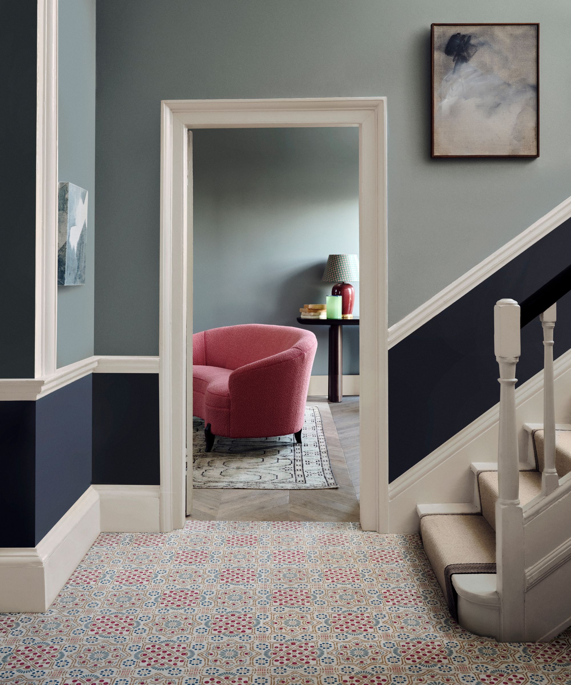
An entryway is a great space for trying out an interesting paint effect. As it's an 'in-between' zone where you won't be spending a huge amount of time, you can push the boundaries when it comes to creating impact. In this entry hall, two shades of blue are layered creating a horizontal emphasis that draws your eye up the stairwell.
Talking about the space, Carly Allison, Head of Product Design at Fired Earth, explains, 'Utilising your home’s existing architectural features like wall paneling as a natural divider between two cohesive paint colors is an easy way to create visual interest in an entryway. Choosing contrasting colors with the same undertones adds intrigue whilst maintaining a cohesive color scheme.'
8. Style a Seating Area
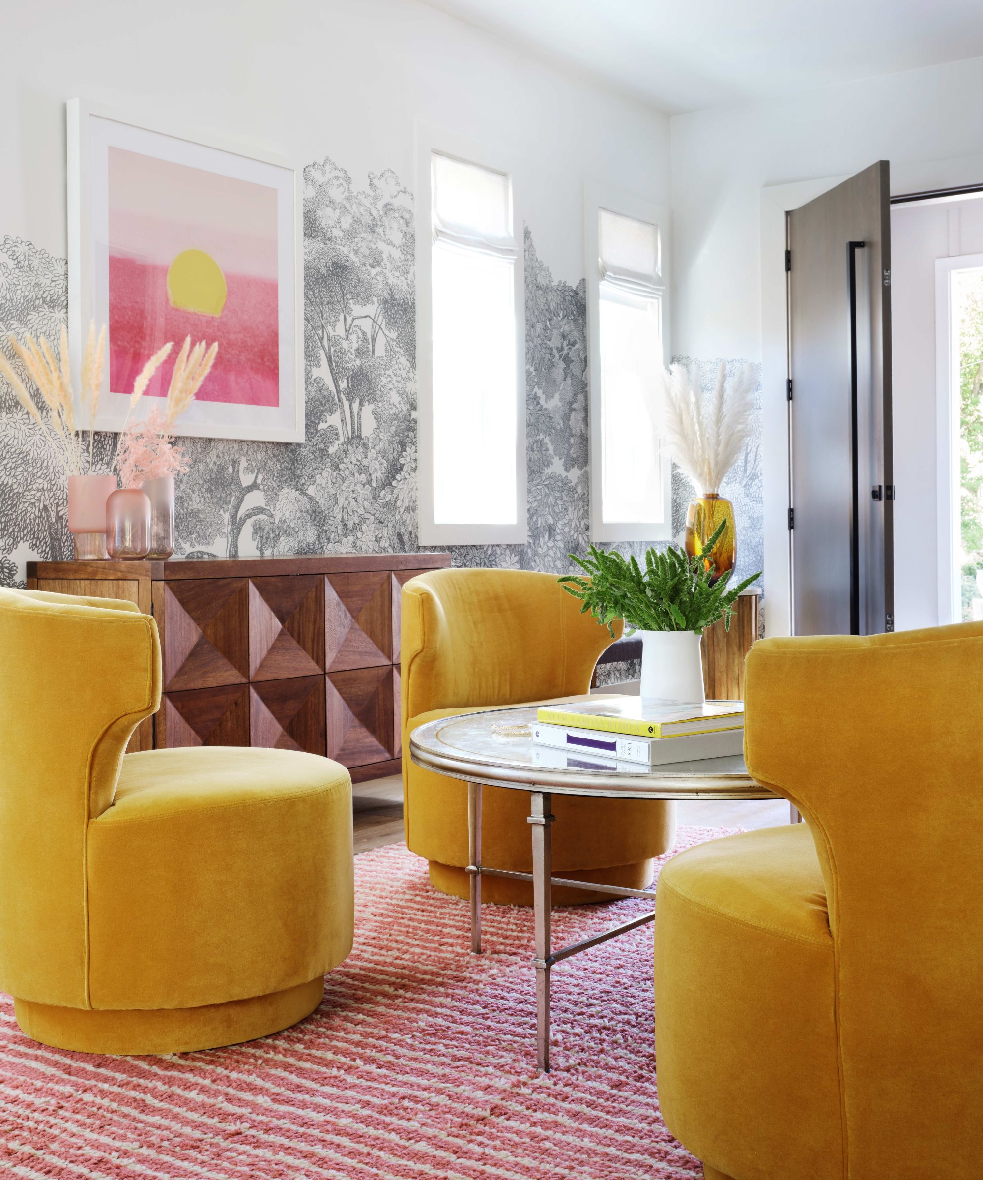
If you’re going to spend a lot of time thinking (and ultimately designing) your entryway, why not create a moment to kick back, relax, and enjoy the view?
In this open-concept space, designer Susie Novak turned the entryway into a parlor with a sweet seating area. 'The yellow chairs add a yummy invitation for a welcome cocktail or water when guests arrive,' she explains. 'Entries with drama create an immediate excitement when guests enter the house.' A charming wallpaper repeat, geometric credenza, and sunny vases round out the look into style, making this one entryway idea host-approved, too.
9. Add an Unexpected Alcove
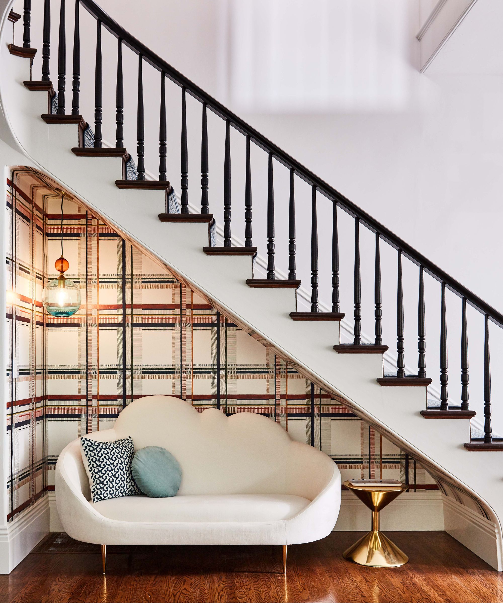
Like the idea of seating in your entry, but don’t have a large enough footprint to accommodate a few chairs and a table? Enter Emilie Munroe of Studio Munroe, who turned the overlooked spot under a stairwell into a usable alcove. The San Francisco designer outfitted this sweet nook with a fun, plaid wallpaper, and colored glass light feature.
'Contrary to popular belief, the more unique and small the space, the better equipped it is to carry an unexpected, bold wallpaper'” she says. 'Smaller spaces maximize a pattern's impact to create magical moments in the home.'
10. Rethink Your Wall Decor
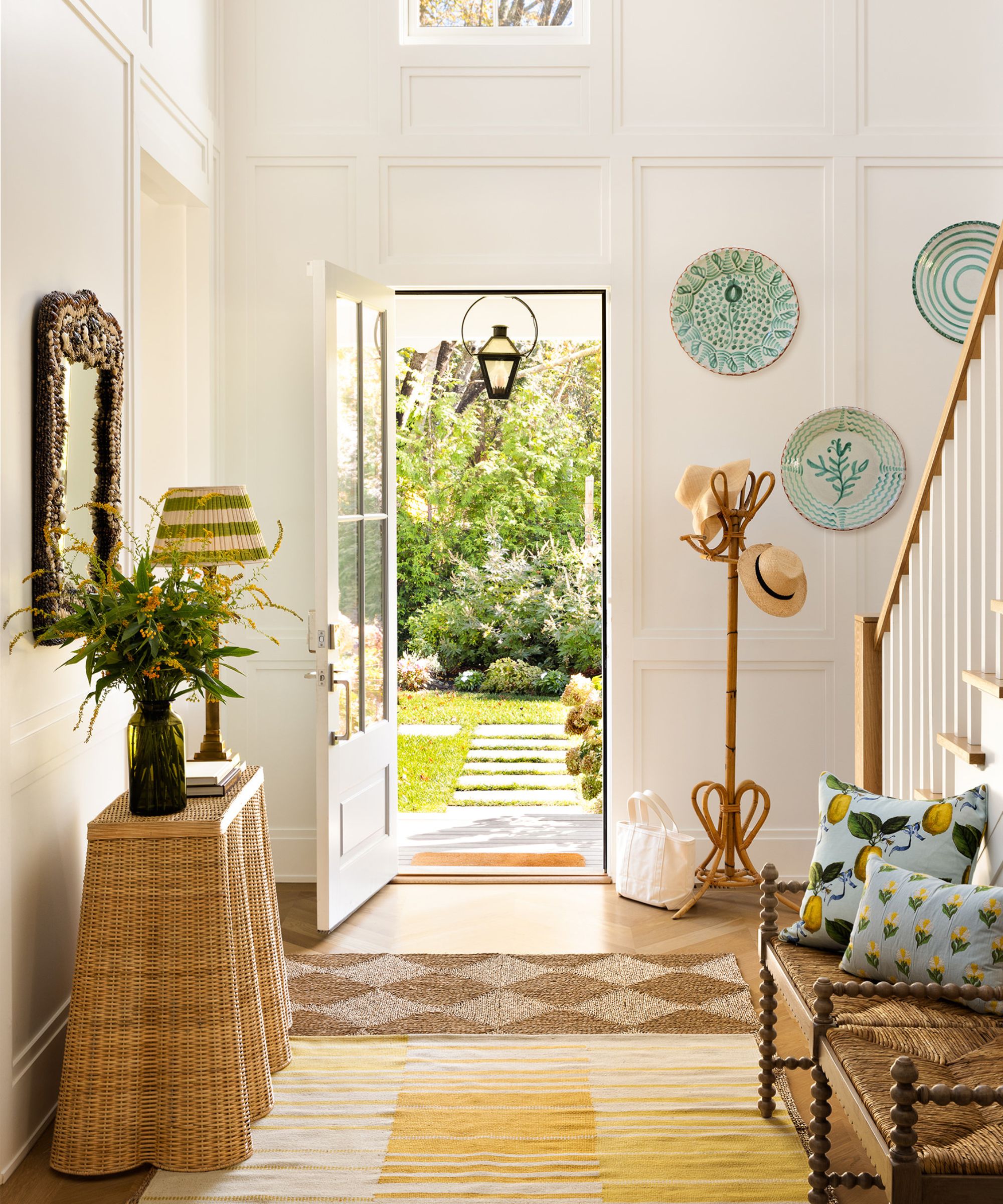
Mirror and framed pictures might be the status quo for entryway walls. However, Ariel Okin encourages you to think outside of the box.
'When designing an entryway, it's really important to add a sense of character and warmth,' the designer explains. “Especially in a new-build residence that might not have a lot of architectural character.'
Ariel employed an “eclectic, layered look” by eschewing the predictable picture frames in favor of hanging vintage pottery and an ornate mirror. The result? 'A personal touch that immediately greets a guest as they enter the home, relaying what you're all about in the first ‘hello!’'
11. Consider your front door as part of the room's design
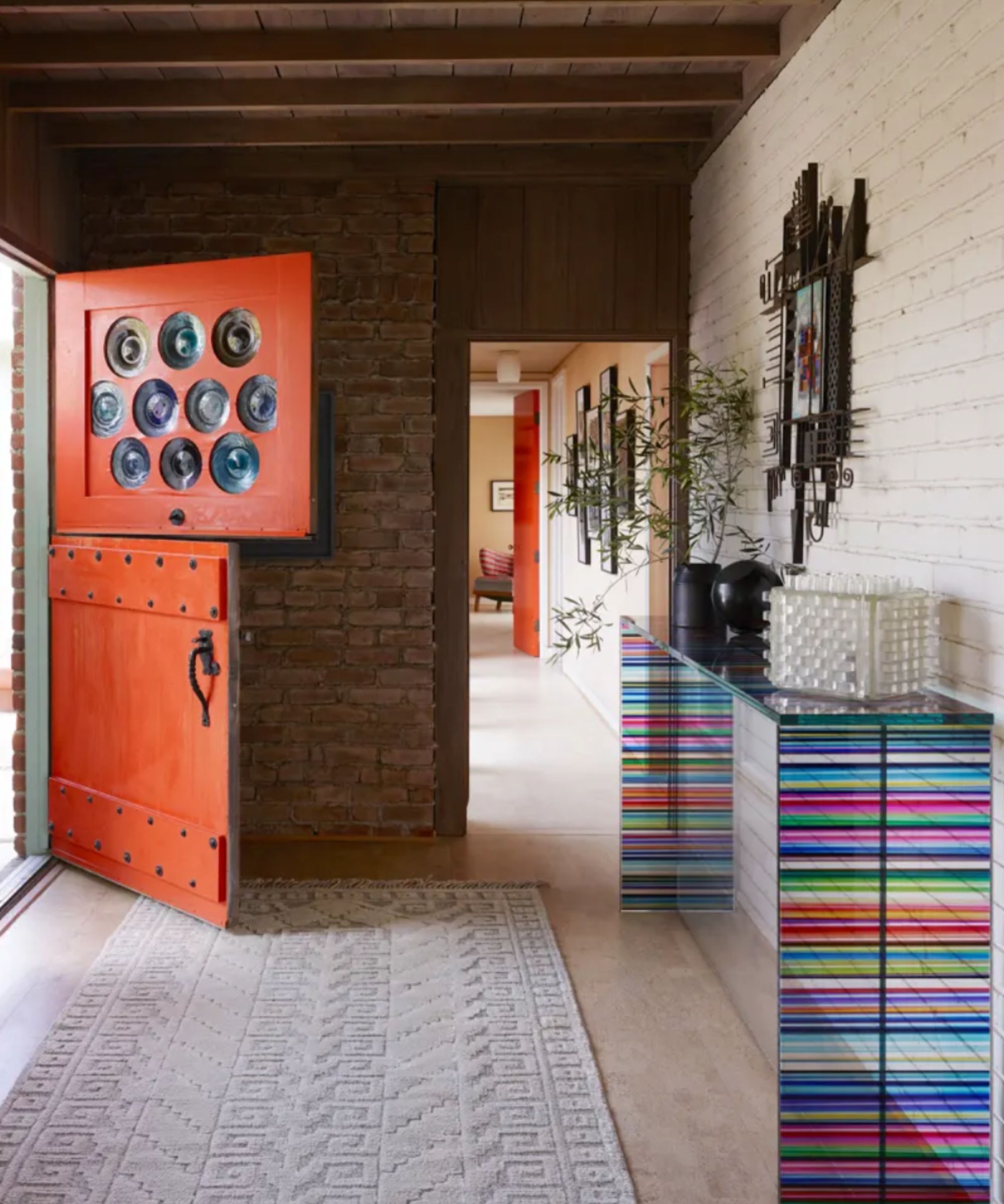
Create a “wow” moment well before you step inside with a bold front door idea, just like the one in this space from Oakland-based design firm Ike Baker Velten. 'The door has colored glass dinner plates for the lights,' says principal John Ike. 'The hardware is the original handmade brass and iron that was part of this reclaimed door when the house was constructed in 1947 by a naval commander using conscripted labor and stolen/found materials.'
The rainbow glass offers plenty of curb appeal–and once inside, when the light hits just right, it can offer a technicolor glow.
12. Soften the space and add color with a runner
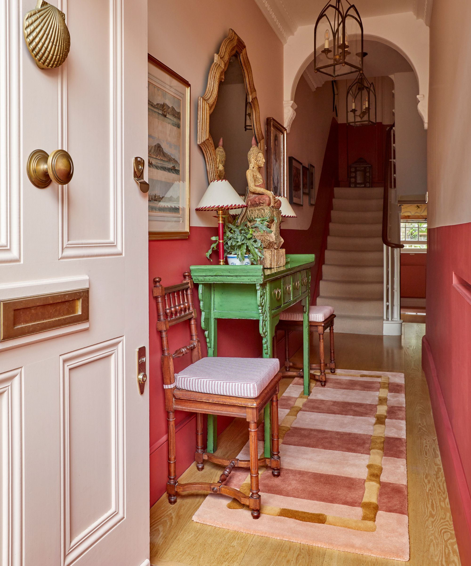
For a fast and hassle-free update, why not welcome a runner into your hallway? The injection of color and pattern can instantly shift the energy of a room, all the more crucial considering that its the space that gives the first impression and sets the tone of your house.
Malin Glemme, CEO & Creative Director of rug specialists LAYERED comments, 'A runner can bring an intriguing sense of depth to an entryway, guiding the eye and instantly infusing the space with character. We love to add a splash of color to make a hallway feel more inviting and dynamic.'
13. Soften an entryway with fabrics
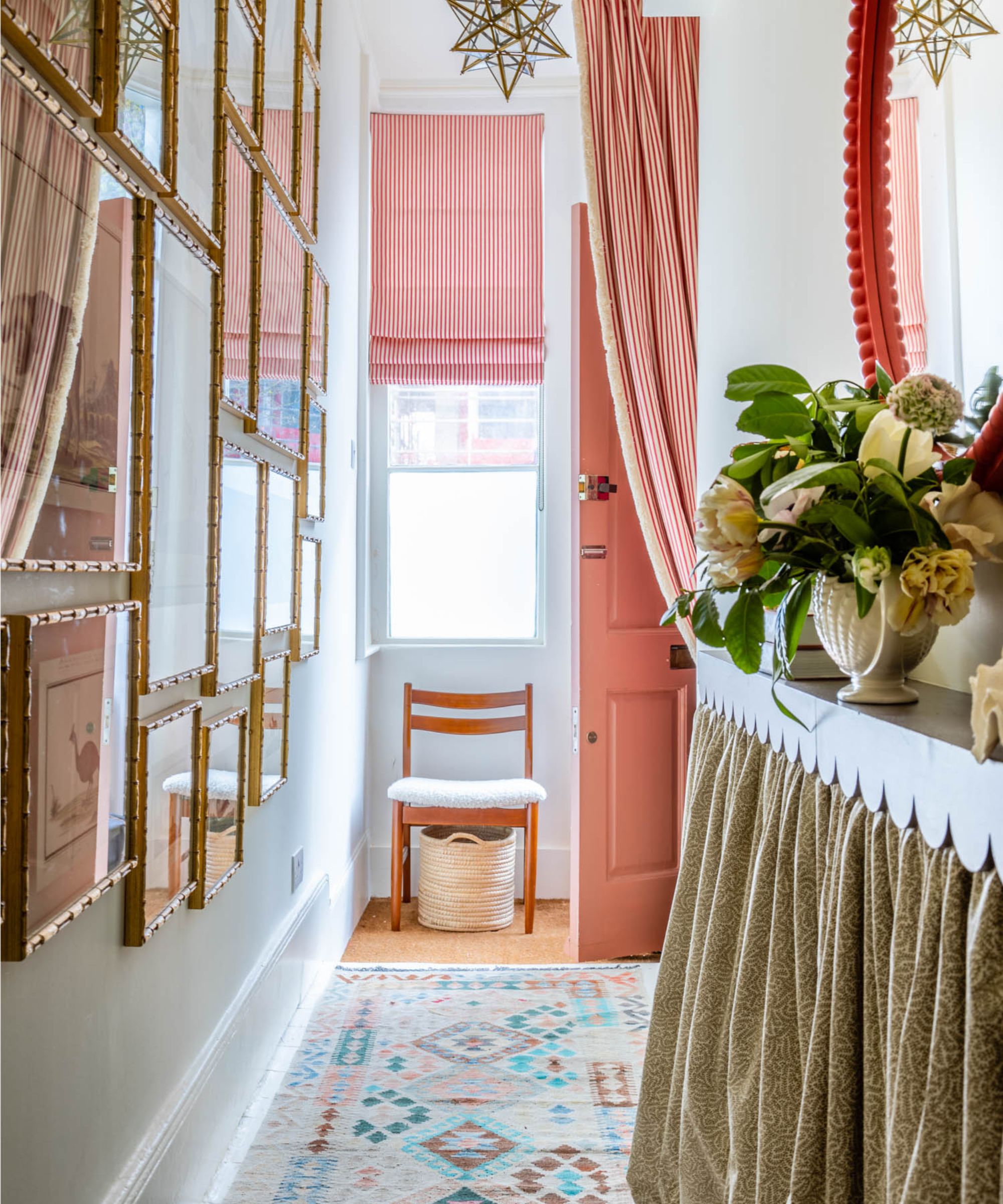
At first thought, incorporating excess textiles into an entryway can make an already small space feel cramped or claustrophobic. However, this frilly foyer from Sean Symington
proves otherwise. The window treatment idea, fringed curtain, and skirting on the console table lend a cozy, comforting feel to this light-washed area.
Meanwhile, thoughtful accessories add an extra dose of charm. 'We always try to incorporate a console table and artwork into every hallway that we design,' he adds. 'This one is particularly narrow, so it was important that we furnish it in order to create the illusion of more space.' Talk about a warm welcome!
14. Create contrasts
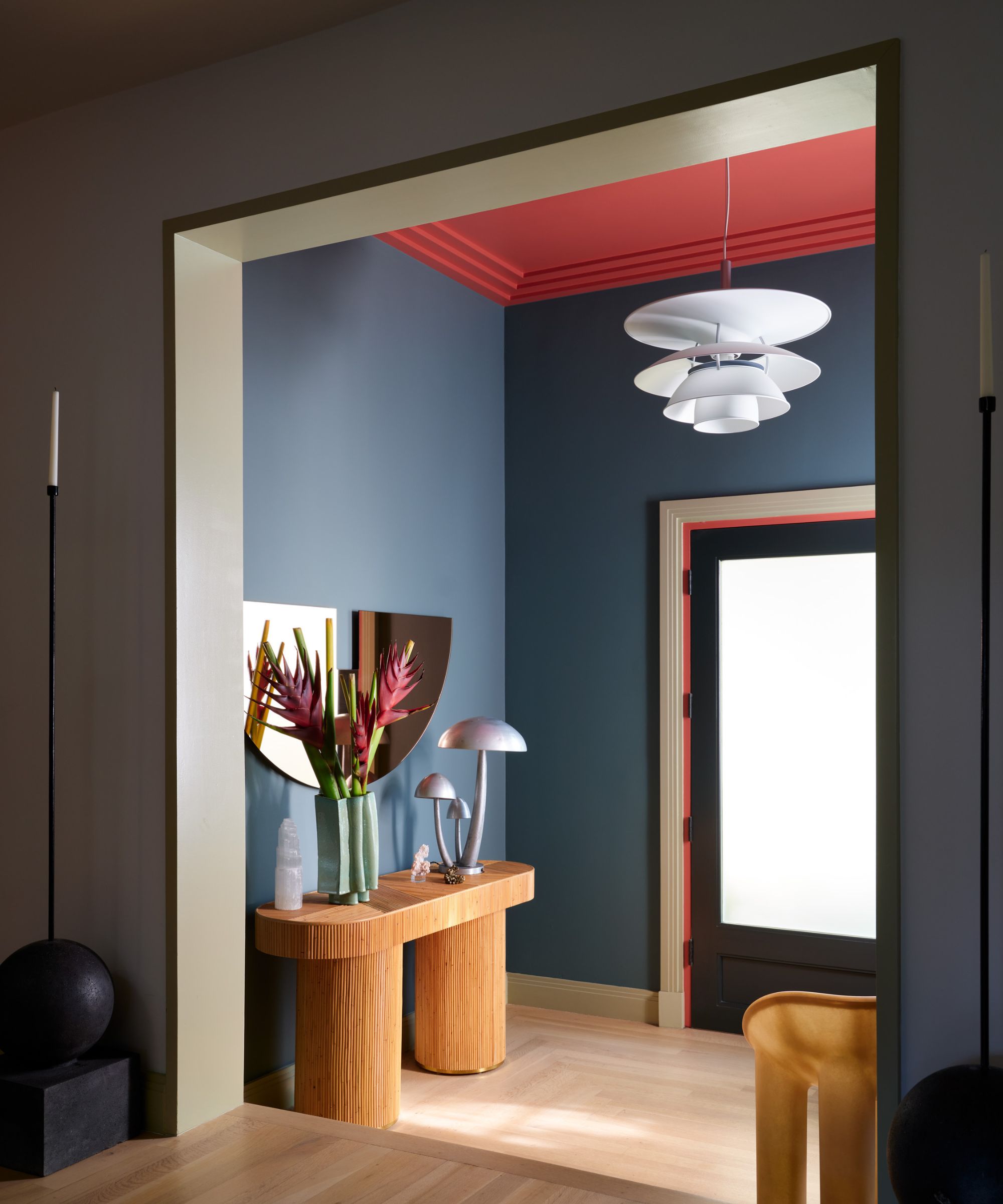
If you’re looking to make a high-octane entryway, opposites attract. Black and white might be the go-to colors to contrast, but this space from Oliver Furth is your cue to swap out the basic neutrals for a pigmented alternative.
'Paint becomes virtual architecture in this Los Angeles entry,' says Furth, who recently released his first monograph, OP! Optimistic Interiors . 'A persimmon ceiling advances, bringing welcoming warmth and intimacy, while contrasting with cool teal walls.' (Plus, the red ceiling creates the illusion of tall ceilings.) Meanwhile, a mix of vintage and contemporary furniture in rattan, cast resin, and spun aluminum brings texture and interest.
15. Store around the door
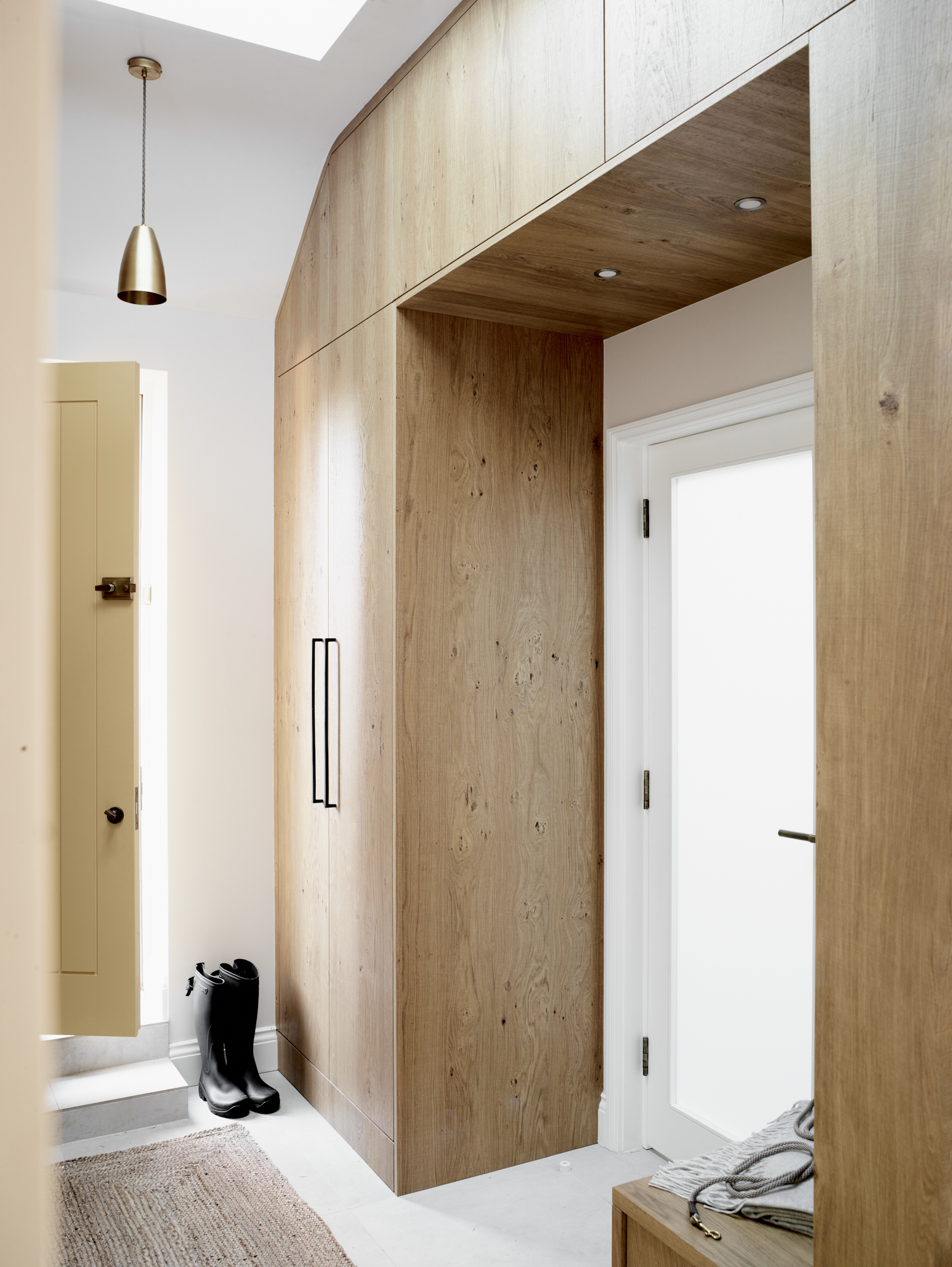
Avoid clutter in an entryway by fitting custom storage that becomes a hidden drop zone. This design uses the area above a door as well as the space on either side to maximize the space to stash. Storage instantly elevates any entryway, allowing you to reduce clutter and focus on what looks good in an entryway instead.
Custom designs can follow the lines of an entryway that isn’t conventionally shaped like this one to provide storage from floor to ceiling, making them well worth the investment. Follow the lead of this design with an oak veneer to bring appealing texture and warmth to the entryway.
16. Add an entryway bench
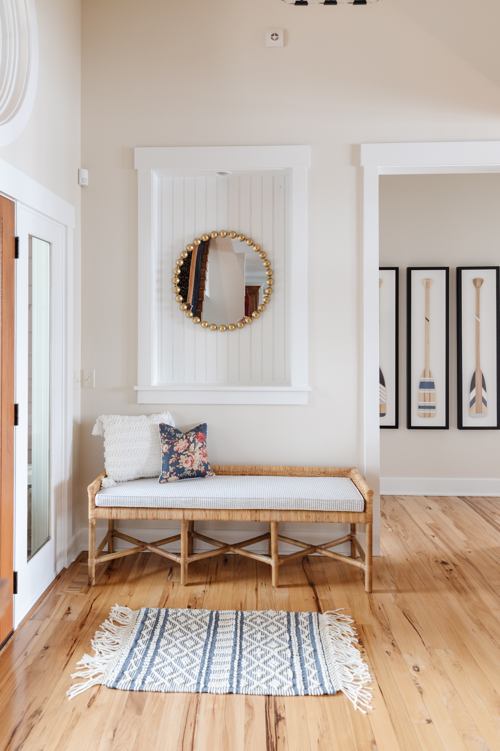
A bench is not only an elegant addition to an entryway, but also a practical feature, allowing shoes to be taken off when coming in and put on when going out with no awkward balancing act necessary.
A design raised on legs keeps the floor on show so the area feels as large as possible, but in a small entryway, it can be preferable to opt for a bench with space inside for shoes and other hallway storage essentials.
17. Consider the view
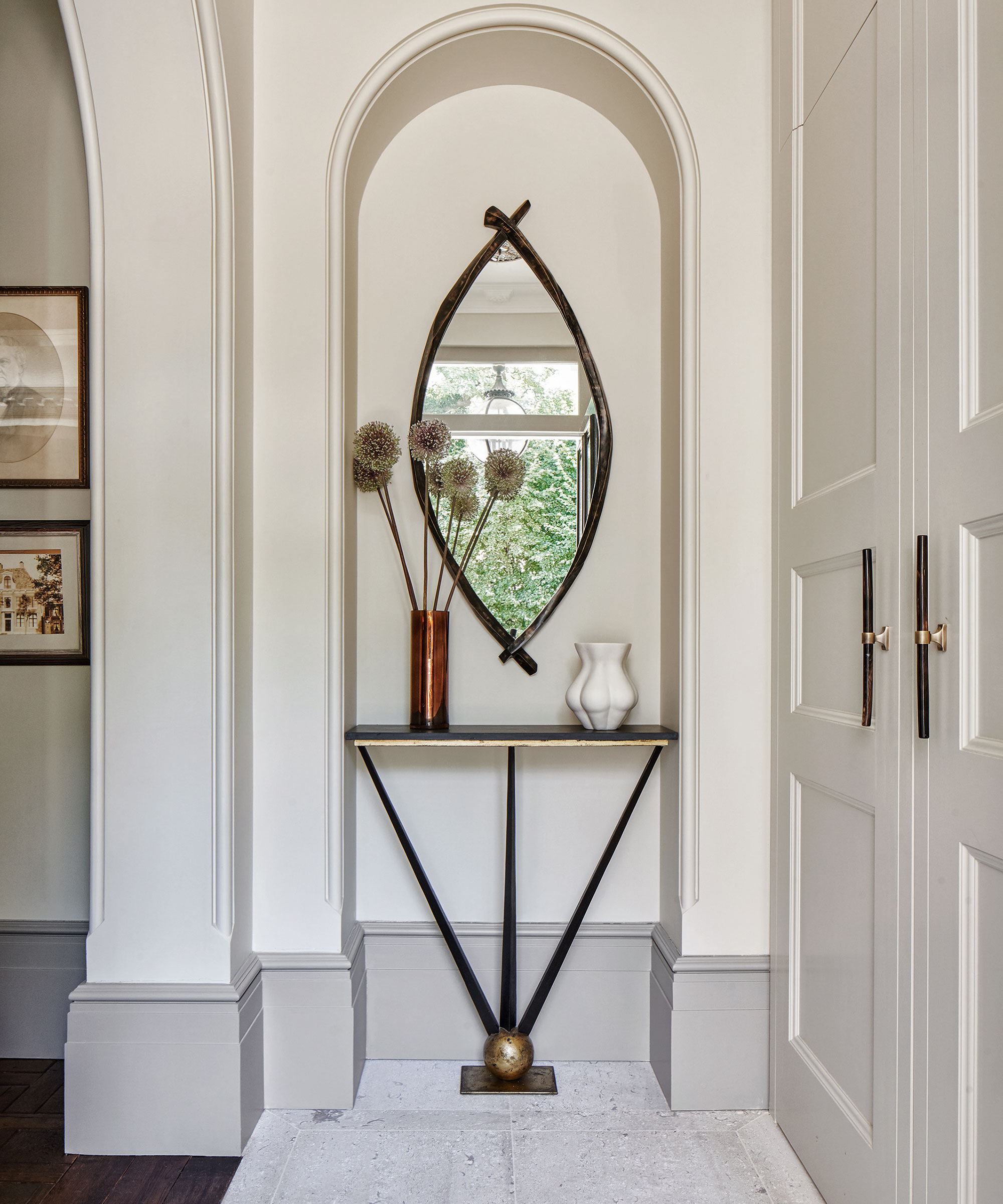
A mirror can be a stylish feature as part of modern entryway ideas or more classic designs. It’s also a functional one, allowing those going out to check their appearance. This version picks up the curves of the nook in which it’s hung, and draws attention to the height of the space, too.
Always think view when you hang a mirror – whether in an entryway or elsewhere. What’s reflected should be pleasing to the eye. Think about placement, too. In entryway Feng Shui, the mirror should not directly align with the front door.
18. Create a point of focus
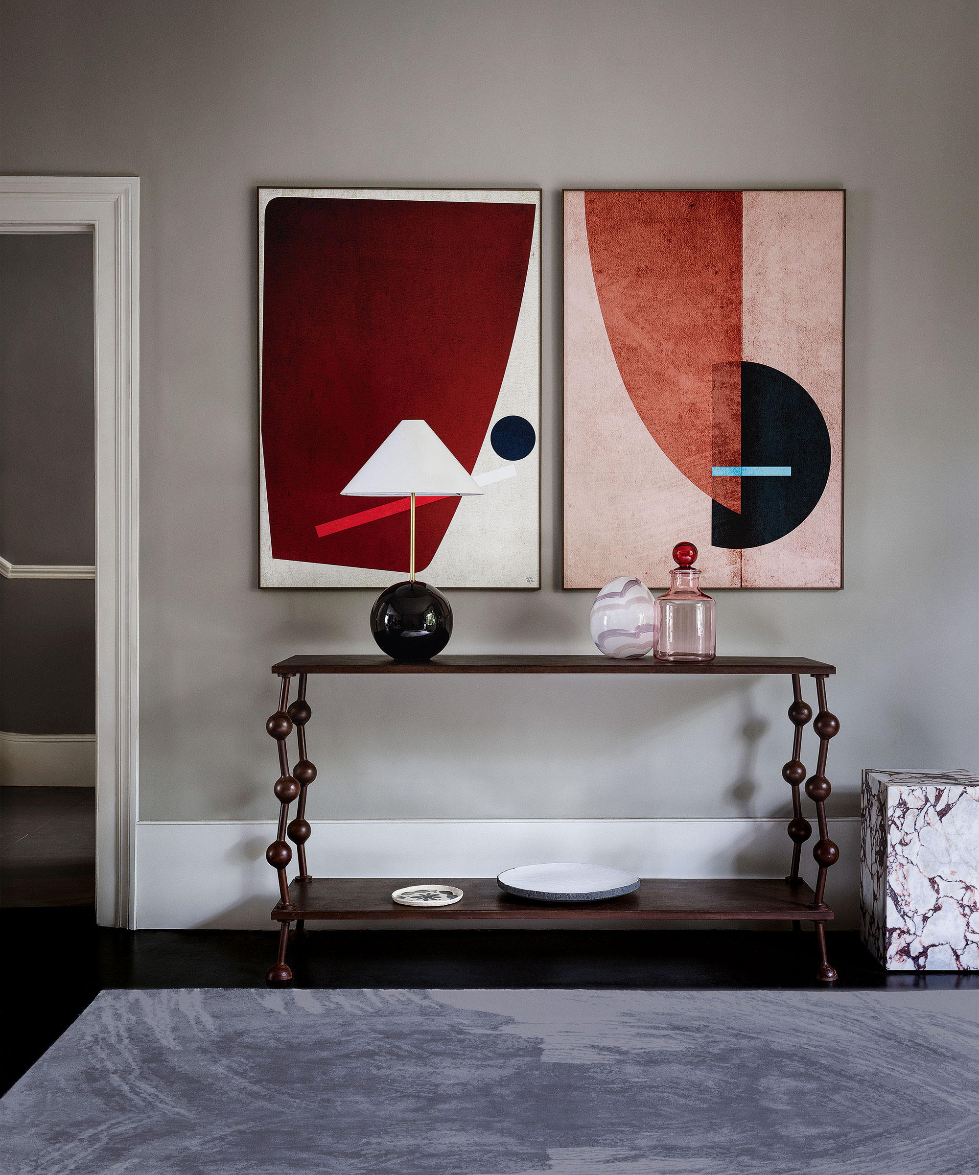
A standout, eye-catching design – and statement color palette – in an entryway not only tells a story, it also draws our attention and sparks wonder.
In this modern hallway, graphic prints hung side by side over a bespoke metal console create a striking impact. Shapely accessories in glass and marble further enhance the ensemble.
‘I love using this sort of color on walls as it allows paintings and portraits to really sing out,' says Anna Haines, founder, Anna Haines Design. 'It feels both calming and quiet and also works as the ideal backdrop for a range of rich textiles, decorative antique rugs and furniture.’
19. Add a statement addition to an entryway
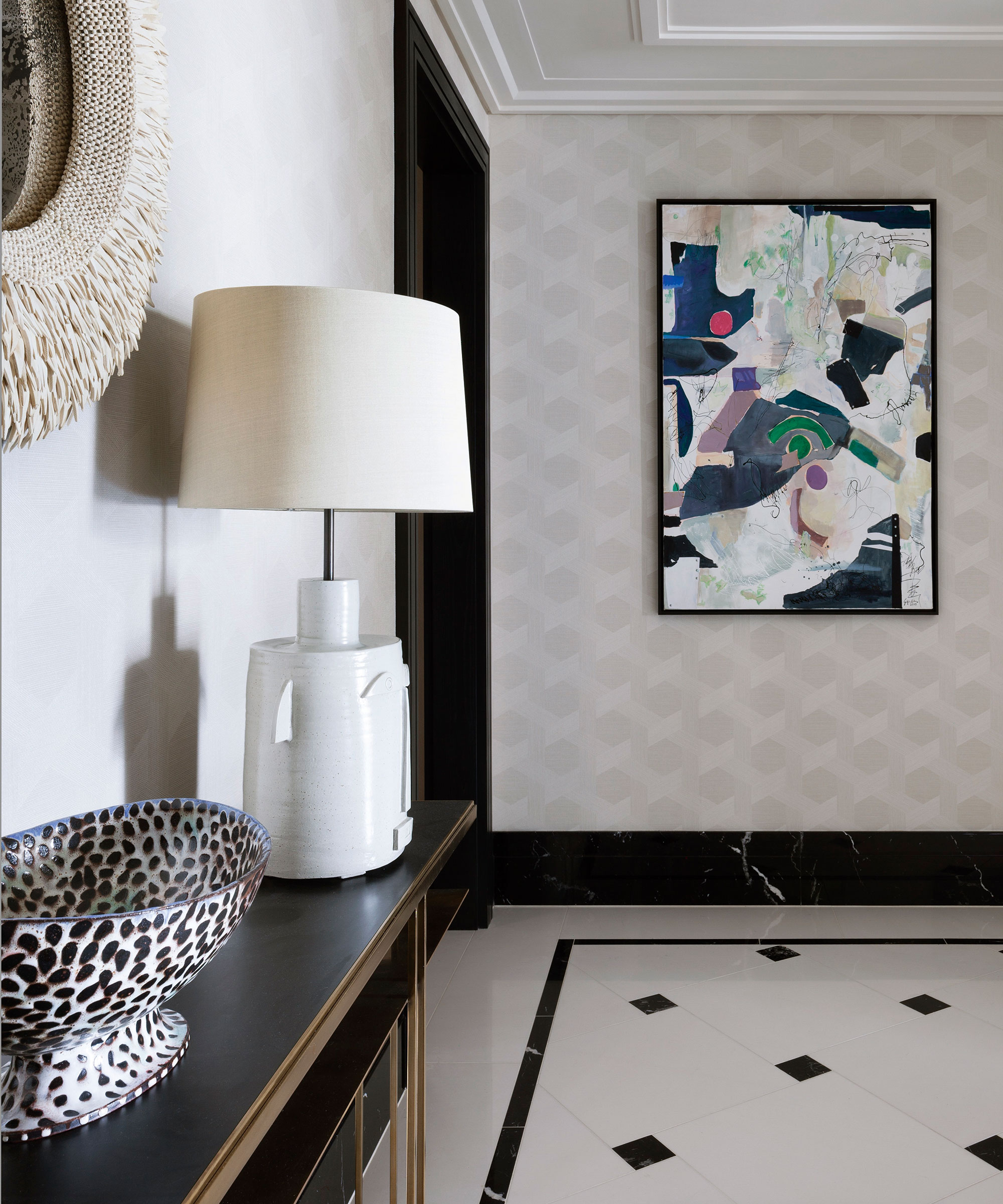
'I always advise using really interesting furniture in hallway ideas – a beautiful console table or a sculptural piece,' says Charu Gandhi, founder of Elicyon. 'It's unexpected and because it's not a space you're going to sit in for ages, you don't have to focus on functionality or, indeed, comfort, so you can get away with doing something that's quite frivolous.' Here, striking artwork and bold accessories set the scene in this bright entryway.
20. Make furniture the focal point

Entryways have a structure to them and you can add a very heavy, monolithic piece of furniture that's going to stay there.
'While you wouldn't necessarily want to have a very chunky, oversized marble table in the living room as you wouldn't be able to move it around, it can stay in place in the hall,' says Charu.
21. Allow space for easy movement
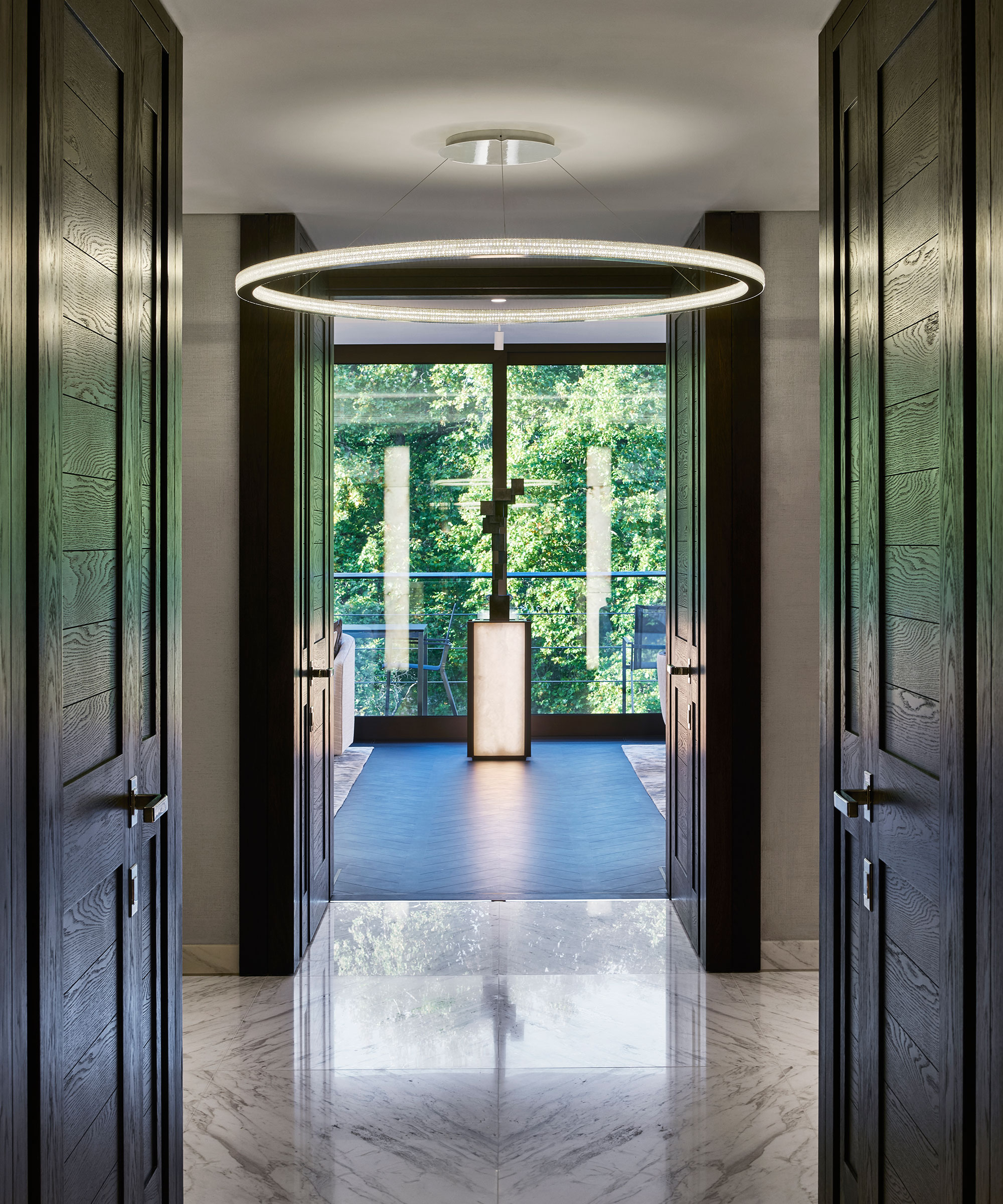
Make sure you don't select furniture that blocks the flow of the space from front porch ideas to entryway to hall. You really want to look at the entire journey and make sure that the flow and movement is protected.
Instead, for interest, invest in clever entryway lighting ideas. Getting your hallway lighting right is possibly the single most important decision you will make when decorating this space. It isn’t simply a matter of function. Ceiling lights can be objects of beauty and the right choice can transform the character of your scheme.
22. Add Warmth Underfoot
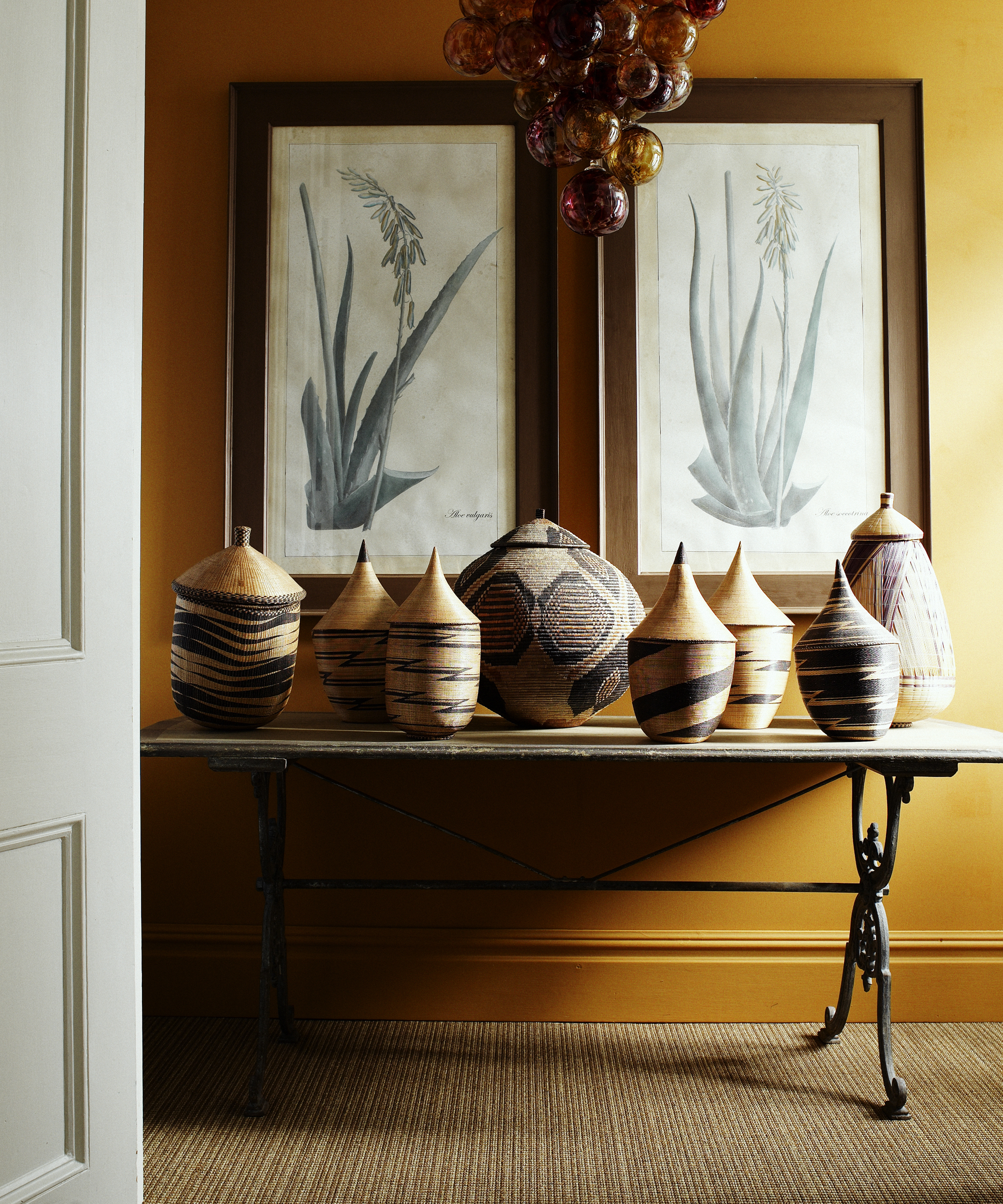
The main advantage of hallway carpet is the incredible range of decorating possibilities that it offers, thanks to the wide variety of colors and textures, as well as the feeling of warmth underfoot. Plus, it is an instant win for anyone hoping to add a seductive softness to their home’s entrance, or keep a house’s corridors insulated during the winter.
Natural floorings made from plant fiber are a versatile option for a high-traffic entryway. It can be fitted in the same way as carpet, used as a room square or as a rug or runner with a bound or decorative fabric or leather edge.
‘For comfort and longevity, a firm underlay is usually used and the flooring is stuck to that,’ says Michael Turner of Crucial Trading.
23. Factor in entryway storage
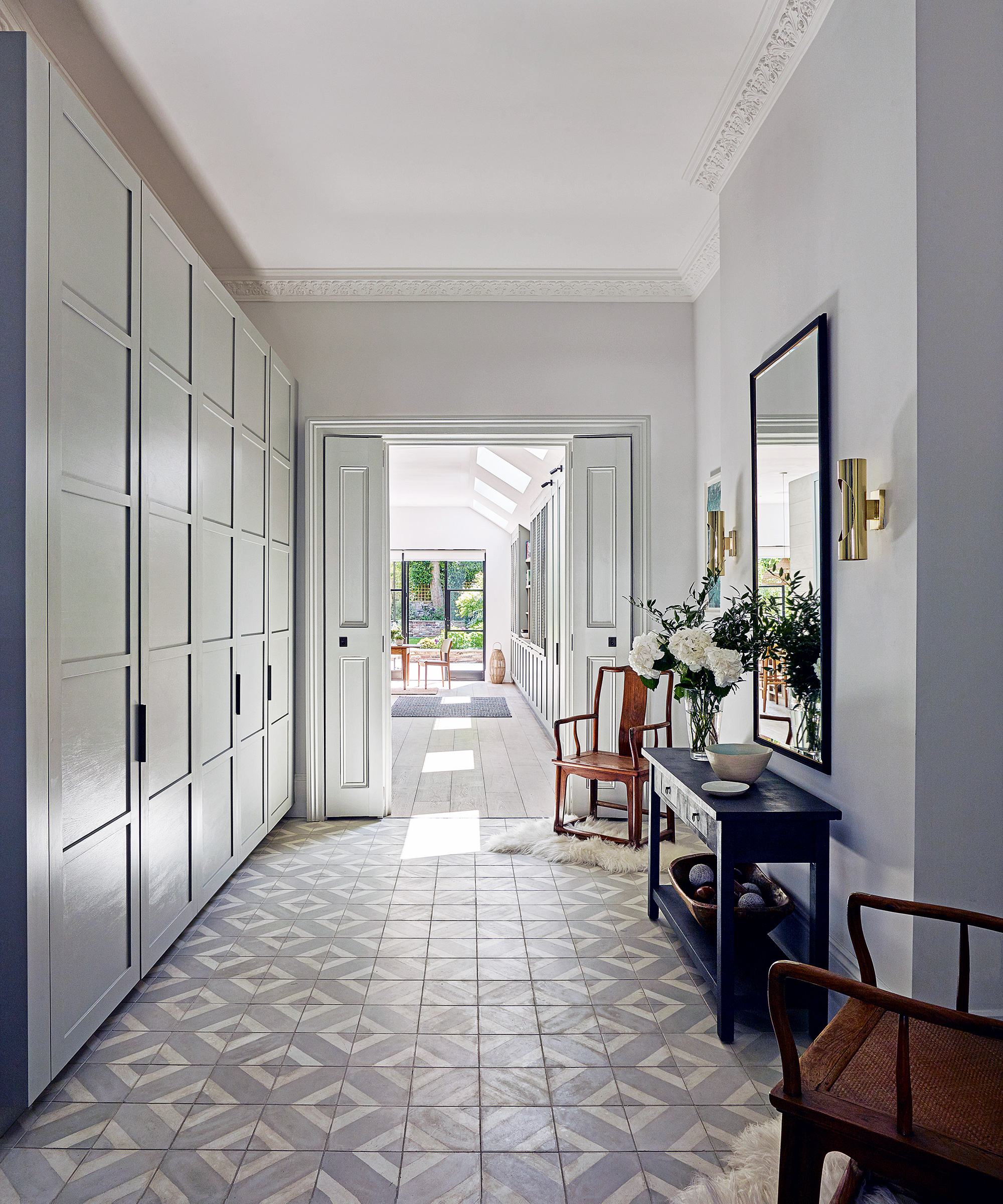
When in search of extra entryway storage space in an entryway, make the most of the ceiling heights available. Built-in joinery or off-the-shelf solutions can provide the perfect amount of extra room to house items only used for special occasions or rarely read books. To break up a large wall of storage, use a mix of closed and open solutions.
Do you have a narrow or small entryway? A clever trick to avoid overcrowding in an entryway that eventually leads to the space becoming a messy drop zone is to use a mix of closed and open storage – too many bulky units can make a room appear too practical – and detract away from its beauty. Include stylish entry table decor ideas to counteract this.
24. Keep the color palette neutral
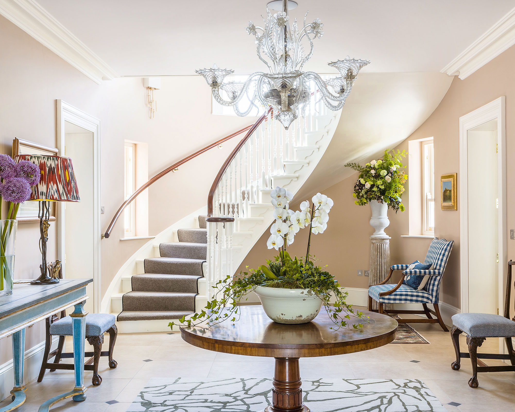
It’s a common decorating dilemma, achieving a balance in our entryways between what is beautiful and what is functional, so take a 'less is more' approach when it comes to designing a hallway or staircase.
One important aspect to consider, when decorating with a neutral color in an entryway is to bring in as much texture as possible as it creates interest and layers –important factors when strong colors are out of the picture. After all, this is the first room your visitors will see upon entry.
Invest in unfussy prints on fabrics for seat covers and blinds. Simple organic shape designs – rather than an off the moment pattern – will last the test of time. What's more, choose shades of taupe and mix in chocolate browns, greys and touches of black for a sophisticated take on a natural palette.
25. Mix the old with the new
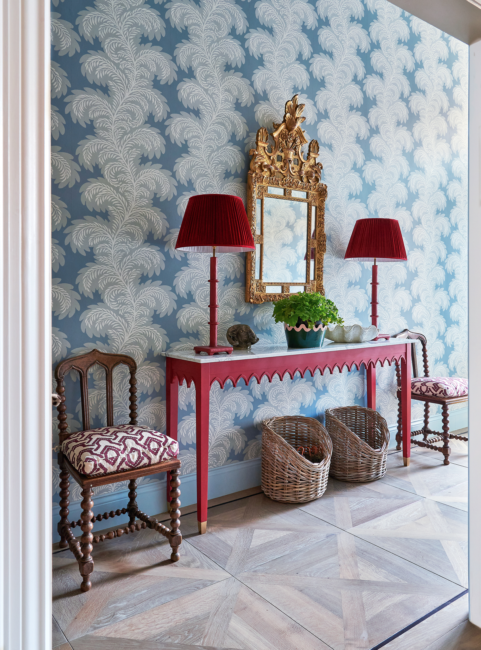
Interior designer Sarah Vanrenen is known for using strong-colored pieces of entryway furniture alongside more traditional florals and geometric patterns. ‘We designed the Augustus table for this entryway to really stand out and reinstated the cornice and architraves,’ she says.
'An entryway is a space you walk through so you can afford to use bold patterns on the walls and it's an important place to make an impact as you walk into the house.'
26. Create a mini room
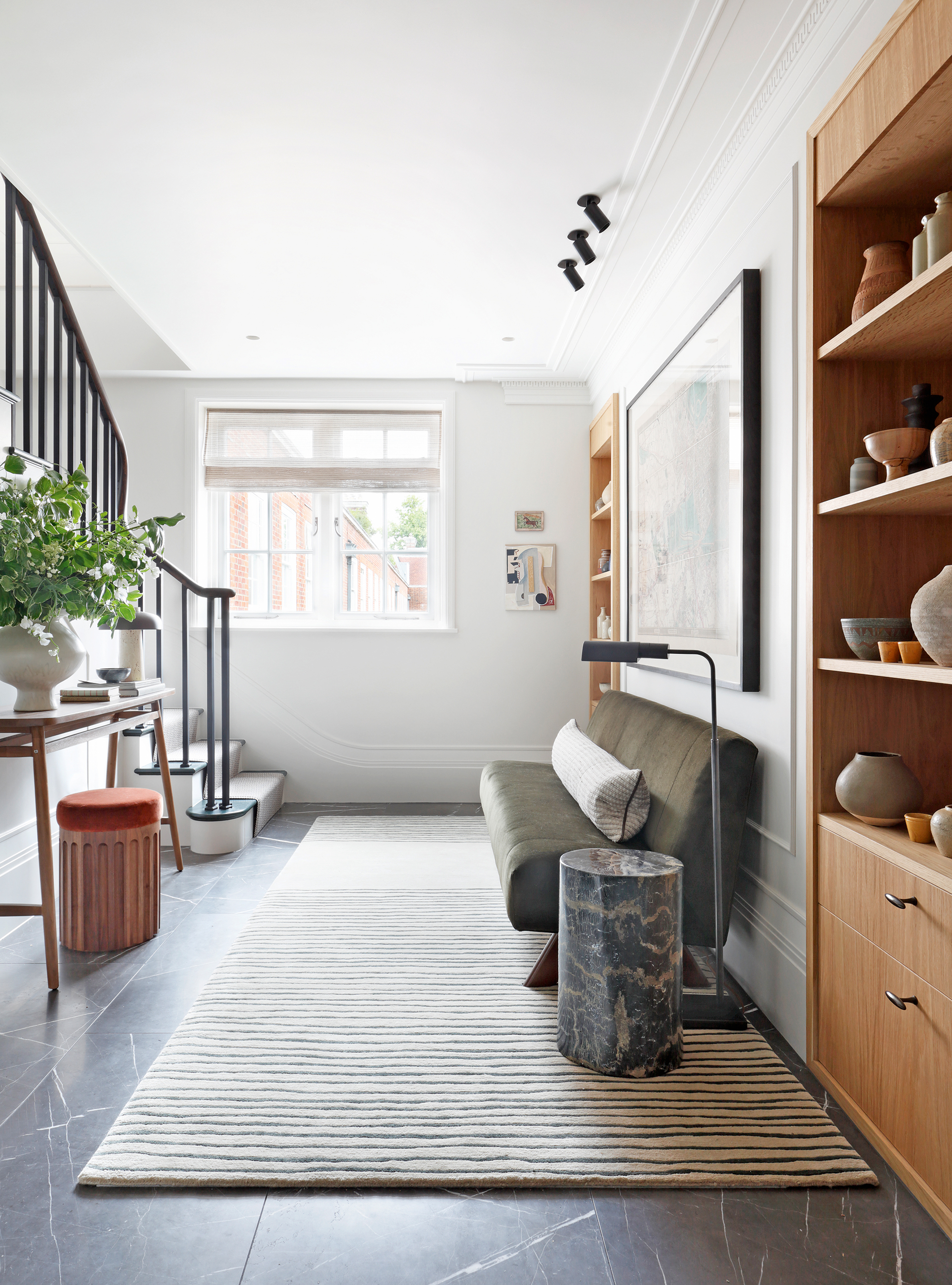
Where the entryway layout is more generous in size, make the most of it by introducing good-looking furniture and elegant fittings that result in somewhere that people might want to sit and linger. This was the approach that decorator Christian Bense took for this entryway idea for apartments.
27. Choose colors that work well with adjoining rooms
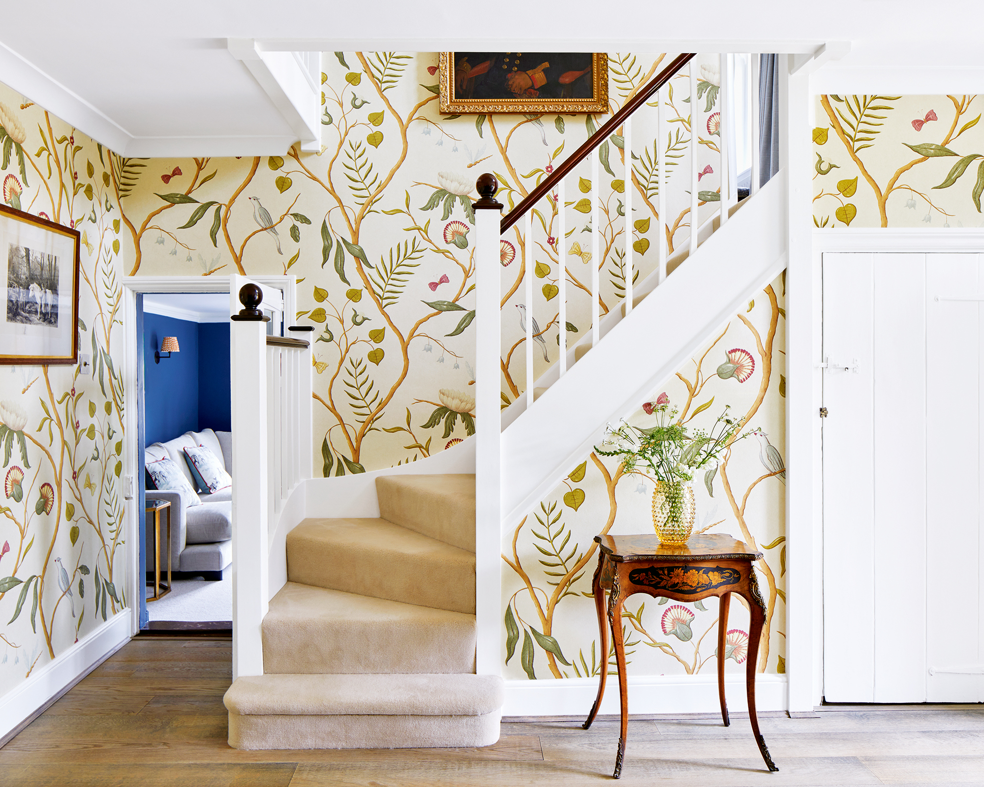
Interior designer Lucy Marsh chose Lewis & Wood’s Adam’s Eden wallpaper in ivory for this country house, which sets off the antique furniture. ‘I always choose an impactful design for an entrance hall and this paper brings real character,’ she explains.
'When working with bold patterns ensure the scale is in keeping with the ceiling height and size of the entryway and choose colors which work with the adjoining rooms,' says Lucy.
FAQs
What should I put in my entryway?
'You do need to consider the practical elements, then design around them so you don't detract from the beauty,' says interior designer Charu Gandhi. 'Things like where coats, shoes, and keys are going to go. If there's space, I think doing a seat or a bench that incorporates entryway shoe storage is great. We nearly always add a tray so you can lay your things out ready to go.'
'I also love putting mirrors in entryways because they can tend to feel quite dark, she says. 'Similarly, do try and add a floor or table lamp, especially when you are entertaining.'
How do I make my foyer brighter?
To make a foyer brighter, first think decor. Pale paint colors are a go-to to reflect the light but you might alternatively choose a wallpaper with a pale ground. If paint is your preference, glossier finishes are more reflective and are a practical choice for a busy area.
Consider the lighting, too. Lamps should supplement ceiling lighting and if there isn’t space for a surface on which to set a table lamp, think about installing wall lighting.
Make sure the entryway is clear of clutter, too. If it’s crowded with outerwear, achieving a bright and airy feel is out of the question. Plan in storage, and limit what’s kept there to daily essentials.
Entryway ideas are perhaps the most important to get right out of all the rooms in your home. It might not be a room you spend long periods of time in, but it is the space you, and your guests, see the most. It's a welcome to your home, setting the scene and teasing what is to come, so spend time considering the colors, patterns, and decor.
