There have been plenty of significant changes since the iPad debuted back in 2010, from the bigger iPad Pro with Apple Pencil in 2015, to external storage support with iPadOS 13 in 2019. But it still feels as though the entire line is confused, with accessories that work only with certain models and features that exist only on others, and even disparity between accessories, such as the function key row on the iPad’s Magic Folio Keyboard.
As it stands, before we see iPadOS 17 at WWDC in June, multitasking is frustrating, the entire iPad lineup is confusing as to which model serves which user, and an M2 chip in the biggest iPad Pro is not being taken advantage of. So with all of this in mind, here are three ways to improve the iPad.
Redesign the Lock Screen

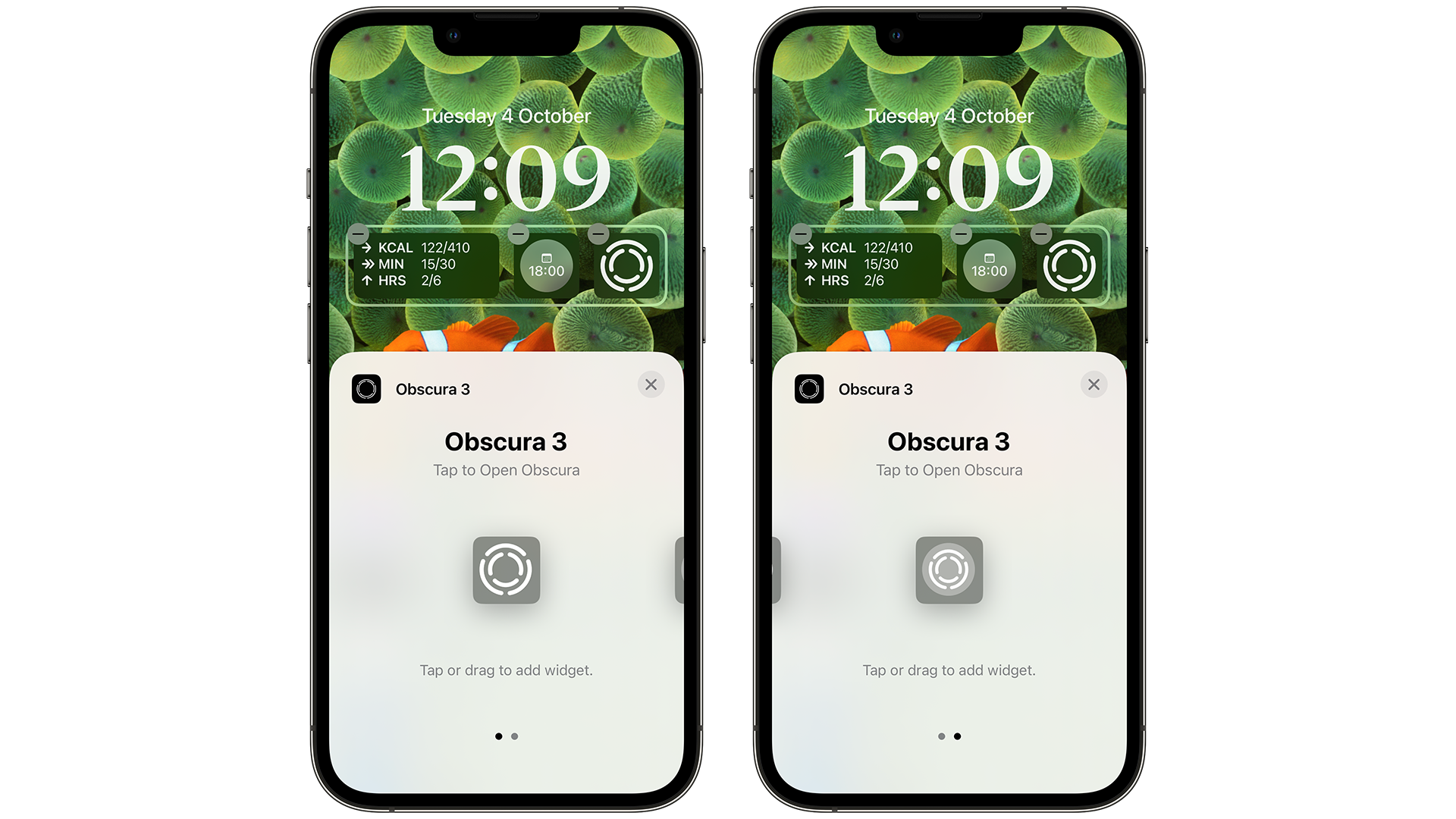
While some expect lock screen widgets to arrive in iPadOS 17, it would be great to see Apple go further here. There’s so much real estate to play with, so let’s see a return of the time and date moved to the left with bigger lock screen widgets that are inspired by iOS 16 placed below this.
To the right of the screen, notifications and a bigger Live Activities widget could be placed. The wallpapers could also be animated, and could be opened up to developers - so the weather app, CARROT, could have wallpapers that show the weather in your area, from rain to sunshine.
The lock screen is the first thing you see when firing up the iPad every day, so seeing it as something more than simply a bigger version of what iOS offers would be a refreshing change for the iPad.
Simplify the line

Picture the scene - you’re thinking of buying an iPad for a friend or family member, and you roughly know what they use their iPhone for. But where do you even start for this tablet?
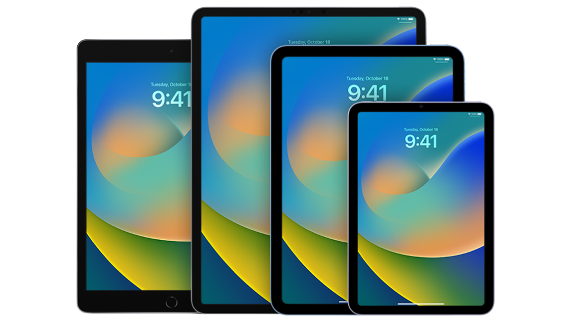
You have five choices, all with different cellular and storage options, alongside some color choices for a few models. Take a look, and tell me if you can honestly assign a distinct buyer to each one:
First of all, they all run the latest version of iPadOS, so you get external storage support, home screen widgets, improved Apple apps such as Mail, and new ones such as Freeform and the Weather app. So software differences are barely a consideration, and even performance across apps is only slightly different when going from the base models right up to the Pro options.
If you go for the cheapest, regular iPad (8th Generation), you won’t get the ProMotion feature that the iPad Pro line offers, nor will you get USB-C, the modern design, and only 4G if you pick the Cellular model, sure.
But if you’re deciding between the latest iPad (10th Generation) and iPad Air, it’s a much harder choice.
I could go on, but you could easily spend an evening deciding between an iPad mini, an Air, and an 11-inch iPad Pro and come out none-the-wiser as which is for you.
And then there are the accessories. The Magic Keyboard Folio aimed at the entry iPad is arguably better than what the Magic Keyboard offers for the iPad Air and iPad Pro, which is baffling. You get better viewing angles, and a function row key, so you can adjust the backlight for the keycaps, alongside shortcuts to enable multitasking and more. It’s a mess.
Instead, it should just go like this:
- Shop for iPad — all now powered by Apple silicon chips
- Choose the size, storage, color, and cellular options
- Choose an accessory if you want one
- Buy
This way, it gets rid of the confusing lineup, the confusing names, and the confusing approach as to which accessory works with certain iPads. It goes back to a tweet I remember from Apple, that there’s an iPad for everyone. Doing it this way, will not only prove that but will make it easier to discover which iPad suits you best.
However, all of this is only half the battle.
Introduce a ‘Pro’ mode when docked

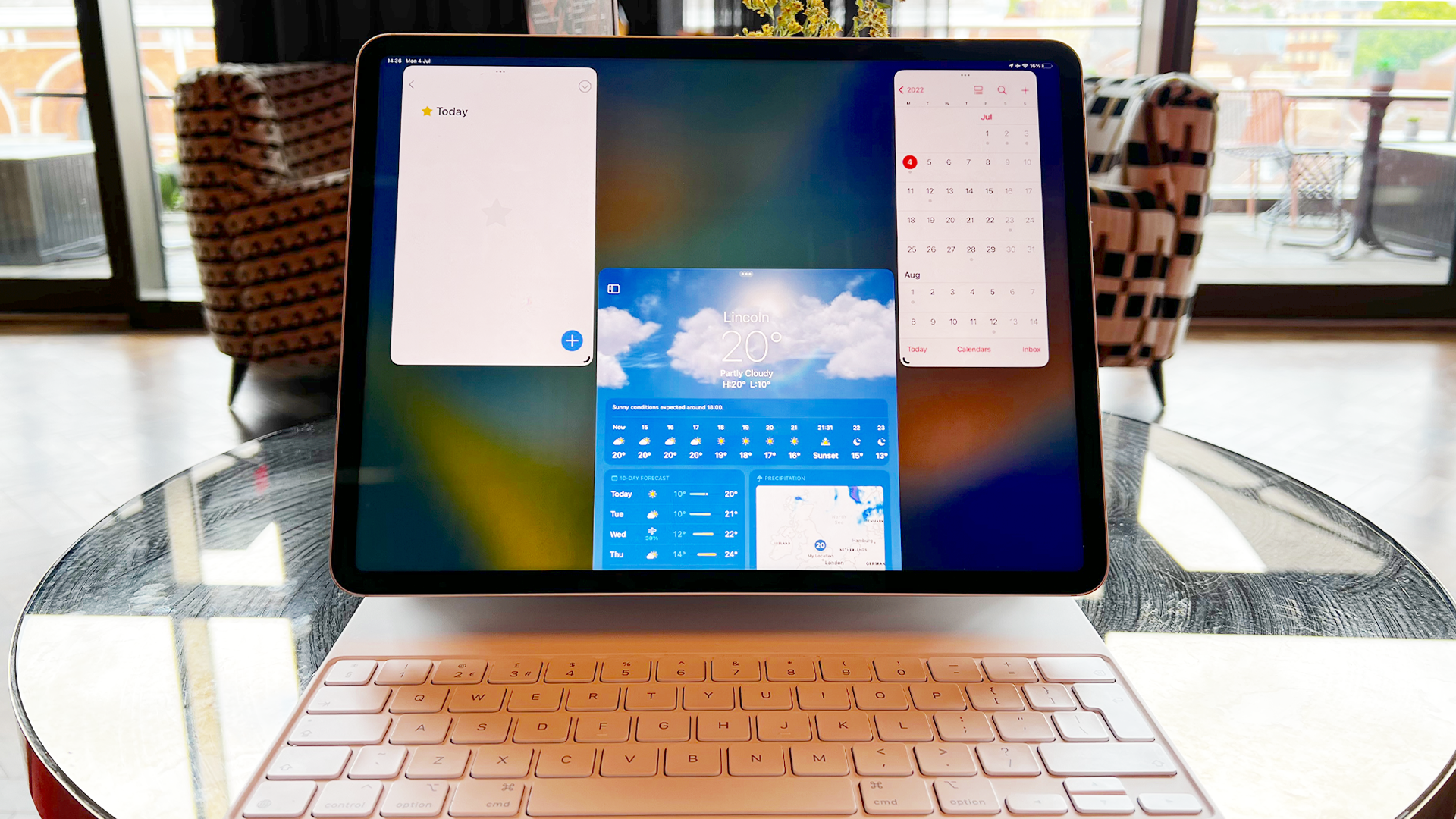
After 12 years, the software is also confusing. While it’s the same across the lineup, except for Stage Manager being available on iPad Air and the 12.9-inch iPad Pro, most of it still looks like a bigger version of iOS, even with the change of name to iPadOS back in 2019.
There’s also a pattern emerging where it lags behind other products in terms of the release of software features - iOS 14 brought widgets in 2020, while iPadOS 15 brought the same, and bigger widgets, the year after.
The same currently applies to lock screen widgets . You can add a bunch to your iPhone’s lock screen since iOS 16 debuted in September 2022, but you’re out of luck with iPadOS 16.
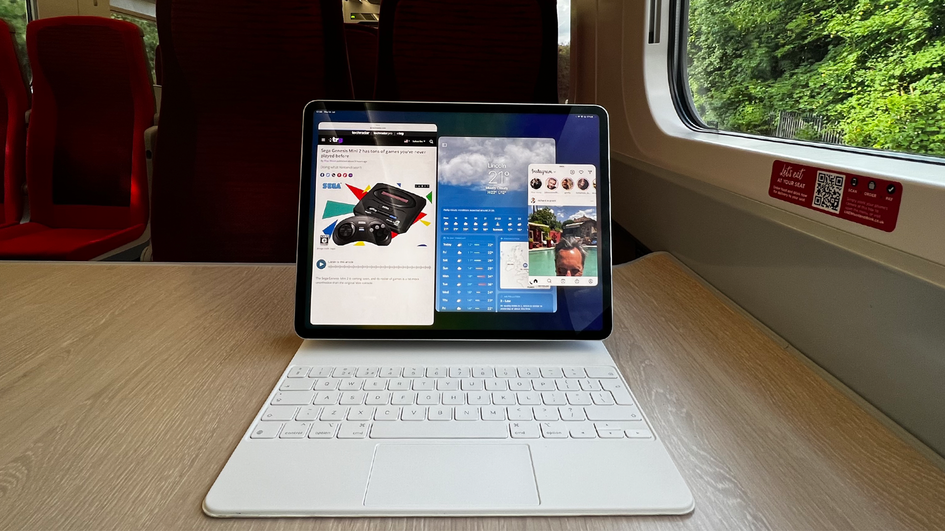
And that’s before Stage Manager is discussed. In my experience, from testing it with the first public beta of iPadOS 16 in July 2022 to iPadOS 16.4, it’s a mess. It crashes, it doesn't take full advantage of screen real estate, and the apps snap to an invisible grid so you don’t feel like you’re in full control. The only plus is when you hook up the iPad to an external monitor, but again, it’s still prone to crashing.
So instead, let's see a whole new OS for iPad, but with certain features, like a redesigned Stage Manager, bigger widgets and more restricted until the iPad is docked to a keyboard. When it is, the home screen looks like a macOS desktop, with a Menubar at the top. This way, it clears up the confusion as to what you want to use the iPad for, while having it ready for the more powerful features for other users.
It's time to shine iPad.
It feels like the iPad is approaching a fork in the road, both for casual and power users. There’s no question that the industrial design of the iPad, right across the range, is its best attribute, but it’s everything else that lets it down. The confusing accessories, the many sizes and models without knowing what accessories work with each iPad... the list goes on.
It should go back to basics. When it first arrived in April 2010, it was one model with different storage sizes, and by the time 2012 came around, the iPad mini arrived. It was a simpler time, but it should go back to this. Pick the size, pick the storage, and more or less leave it at that. The differences between the current models in the line-up are many, but the advantages of one over the other are few.
So while WWDC 2023 could hopefully bring some much-needed improvements to iPadOS, it’s only half the battle as to why iPad feels like a headache. Apple is hopefully aware of this, so fingers crossed we’ll see some changes soon.


