“Kitchens sell houses” was the catch-cry of all The Block contestants this week. This brought into focus the goal of the show, which is to sell the houses at the end of the season. Ultimately, they need to appeal to the mass market in order to go for top dollar, determining the prize money each team walks away with as well as the overall winner.
While judges Shaynna Blaze and Darren Palmer provided incredible insights when it came to interior design and what’s trending, real estate expert Marty Fox brought invaluable feedback as far as marketability is concerned. In his opinion, usual frontrunners Mimi and Kristian missed the mark this week. These are the biggest mistakes they made in their controversial kitchen.
1. Using a divisive colour
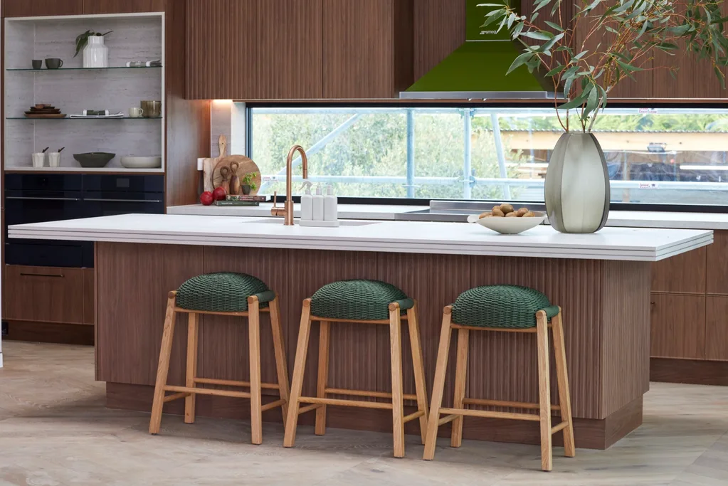
Mimi and Kristian loved the yellowy-green oven and rangehood in what they fondly dubbed their “Shrek kitchen”, but in Marty’s opinion it would polarise buyers. “I’m really unsure about the colour of these appliances and this rangehood,” he said. “No matter what we do, this colour would not be at the top of the shopping list for buyers. Unfortunately, when you segregate a market in the most expensive room of your campaign it’s risky, and I think this is a risk they shouldn’t have taken.”
2. Clashing greens
On the subject of green, the stools were a darker shade with more mass appeal, yet they didn’t match the yellowy green of the oven. Shaynna pointed out that they needed to be the same to make it work. If they couldn’t get ones that were a perfect match, they should have gone with a different colour altogether.
3. Mid-century mishap
The walnut cabinets and green oven gave a mid-century feel. While this is right at home with other buildings on Phillip Island, it isn’t aligned with the style of the previous rooms in their contemporary coastal house. “I feel that people will walk in and get excited to walk upstairs after they’ve seen the rooms downstairs,” said Marty. “But once they come through this hallway and look at this kitchen and their eyes land on [the green oven] as the focal point of the kitchen, I think the majority of buyers will feel let down.”
All of The Block 2024 kitchens
Here’s how the other teams went in the week five kitchen reveals, including their best features and biggest mistakes.
1st place: Kylie and Brad
- Best feature: Matte fingerprint-proof cabinets.
-
Biggest mistake: Trading practicality for novelty spin storage.
“This is moody and sexy,” said Darren. He loved the ultra matte cabinetry which doesn’t leave fingerprints, calling it a “clever decision” considering there are no handles. Their pared-back approach to styling was a big improvement from week one. “There are three things in here – a chopping board and plants – and it just works,” said Marty. “It’s so simple, but it’s so luxurious.”
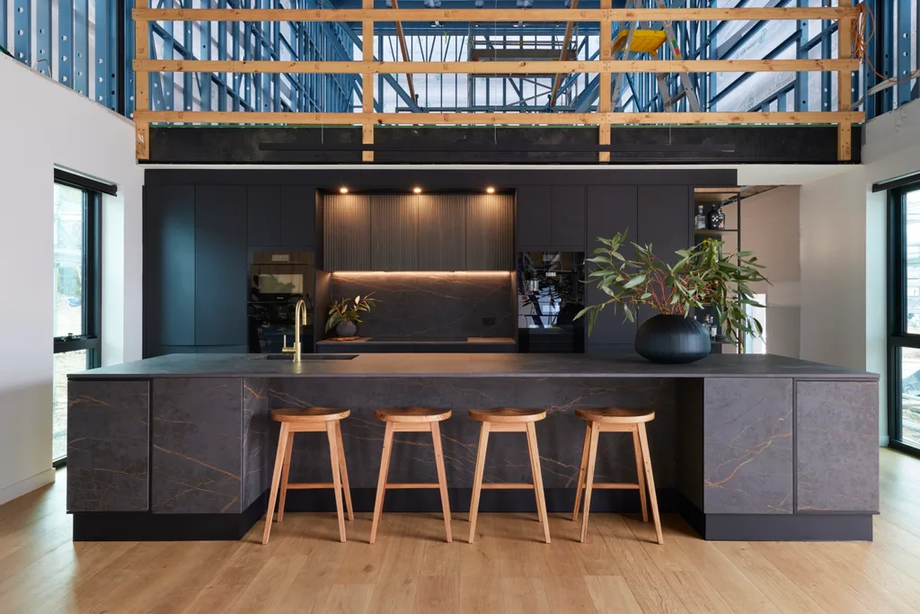
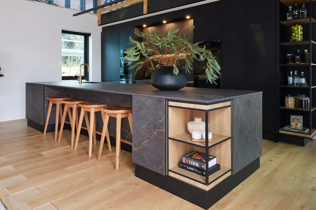
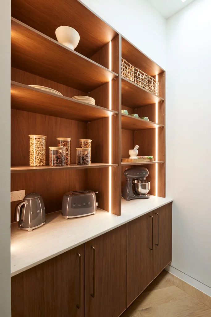
The pair won pantry styling on a chocolate wheel game during the week, which took their organisation to the next level. The judges loved the novelty of the FurnSpin cabinets on the ends of the island and wall joinery, but wondered if the kitchen could have done with some extra traditional storage. “This is space age,” said Shaynna. “This is Tom Ford meets James Bond.”
Score: 29.5/30 (After playing their penguin, which added one point.)
2nd place: Maddy and Charlotte
- Best feature: An elevated stone and cabinetry palette.
-
Biggest mistake: Sink placement opposite oven.
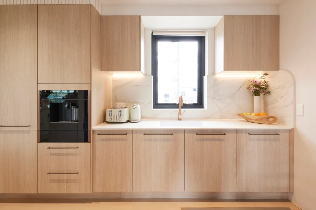
From the oak cabinetry to the quartzite stone bench and herringbone floors, a lot of the design decisions for the kitchen had already been made by Jesse and Paige before they left. So new team Maddy and Charlotte had to go with their predecessors’ plan, but it worked in their favour, as they came in second and would have won if Kylie and Brad hadn’t played the penguin for one point. “This is the most beautiful natural stone; it almost looks like crystal,” said Shaynna. “It feels so expensive,” agreed Marty. It was the perfect choice, given engineered stone is now banned.
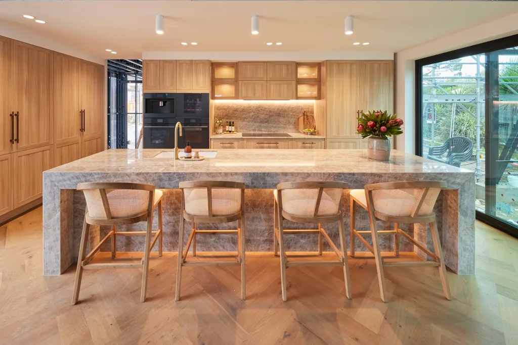
There was plenty of storage, with an appliance pantry concealed by pocket sliding doors and no butler’s pantry. “You don’t have a butler’s pantry in this kitchen and I couldn’t be more happy about that,” said Darren, who loved the inclusion of a luxuriously large island instead. The only problem was the position of the sink, which the judges said should have been further down the bench rather than opposite the oven.
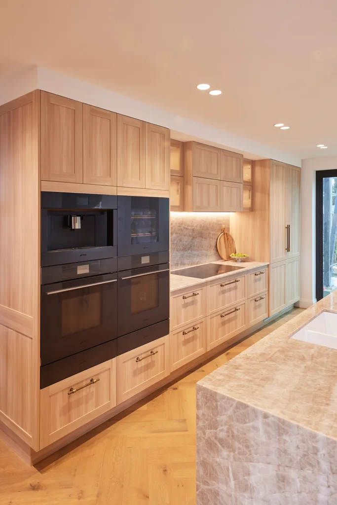
What was in Maddy and Charlotte’s power was the ability to choose a tap and handles to suit their style. These went down well, as did the styling by the sisters. “The styling is spot on. I’m loving everything that they’ve put out,” said Shaynna.
Score: 29/30 (Including a 10 from Darren, winning them $10k.)
3rd place: Courtney and Grant
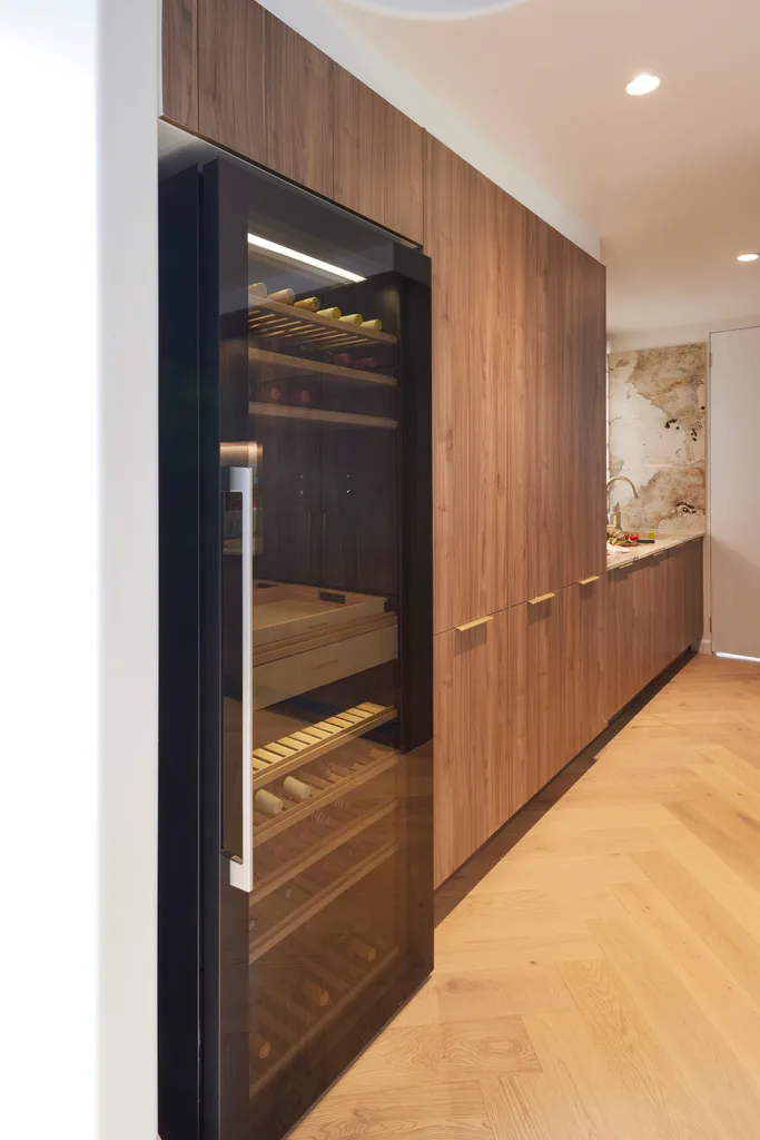
- Best feature: Wine fridge in butler’s pantry.
-
Biggest mistake: Not enough seating for a large holiday home.
Once again, Courtney and Grant “hit it out of the ball park” with their Modern Mediterranean style kitchen, which included an extravagant $8,000 tap that does chilled, sparkling and boiling water. “The talent here is off the charts,” said Shaynna, pointing out the way the porcelain on their four-metre island wrapped into the sink. However, Marty didn’t feel the quality was quite up to what he’d seen from the team in previous weeks. “I don’t see how this is Moderterranean,” he said.
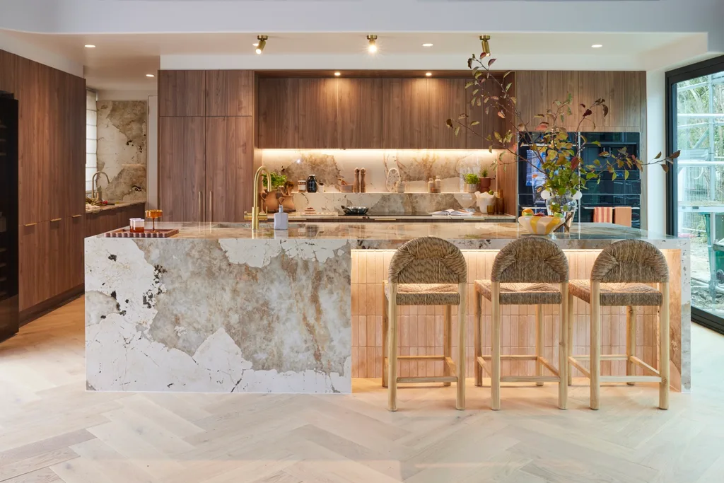
“The walnut colour could not be more on trend,” said Darren. “I’m besotted by the colour scheme.” He did point out that a more functional layout would have been to place stools on both sides of the island, so it could double as a casual dining space. “That’s where you sit when you’re having breakfast.”
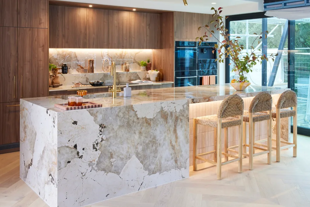
The wide sink, induction stove top and wine fridge in the butler’s pantry were all winning details. “There are so many high-end qualities,” Shaynna enthused.
Score: 27/30
4th place: Mimi and Kristian
- Best feature: Chevron flooring.
-
Biggest mistake: Controversial oven colour.
The “Shrek kitchen” may not be very marketable in Marty’s opinion, but it still exudes plenty of style. “I haven’t seen a triple stack before, with two shadow lines,” said Shaynna, referring to the Cosentino Dekton Marmorio benchtop. Yet Marty felt it was gimmicky. “This triple stack for me looks like a mistake,” Marty disagreed. “I would have preferred a thick stone – it’s a nicer, more refined look.”
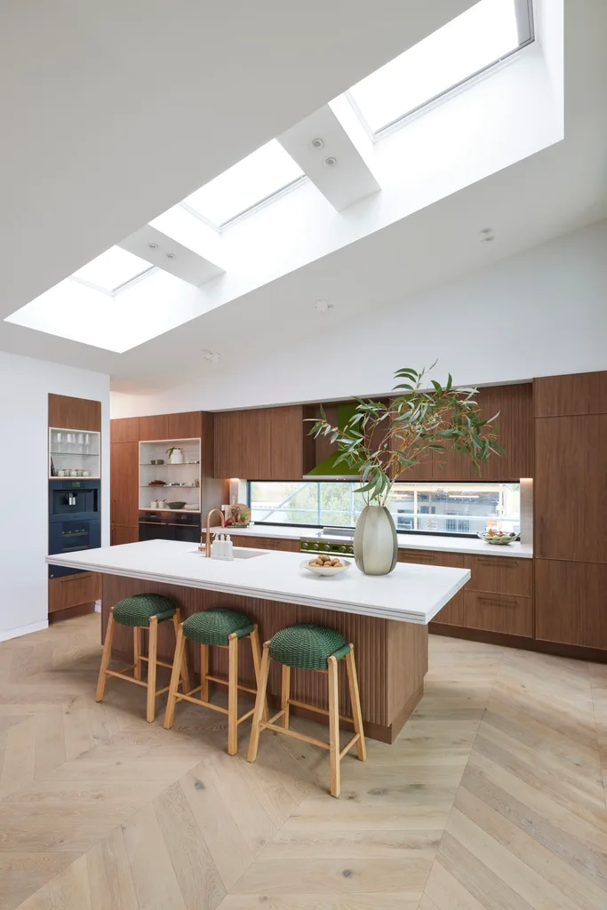
The walnut cabinetry, hardware and glass splashback were hits, creating an outlook over the backyard. “I love the natural light,” said Marty. Yet he pointed out the poor placement of the fridge. “If that’s the fridge down there, five steps away from the central hub of the kitchen, it’s just not right.”
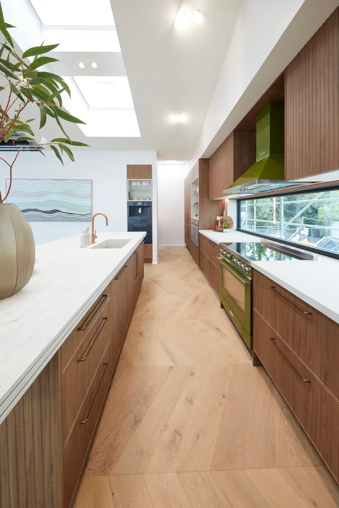
All the judges agreed the chevron flooring was a wonderful choice. “These would be my favourite floors of today,” said Marty. The “Shrek” oven colour was controversial, with Marty adamant that it would turn off buyers. Yet the space was striking from a design perspective, perhaps with a different choice of stools that didn’t clash so much. “It has a lot of drama to it,” said Darren.
Score: 26.5/30
5th place: Ricky and Haydn
- Best feature: Island suitable for large groups.
-
Biggest mistake: Fridge and oven positioned in a walkway.
There was relief to see a finished room in the boys’ house. The cabinetry from Kinsman was a hit with Darren, who has the same colour cabinets in his own Bondi reno. “Coastal Oak is probably one of my favourite finishes ever,” he said. “I think it’s absolutely appropriate for the beach. The lovely softness in grain, it works beautifully with these floors.” On the downside, the judges felt the white lower cabinets were too plain and the island base should be repainted in a different colour.
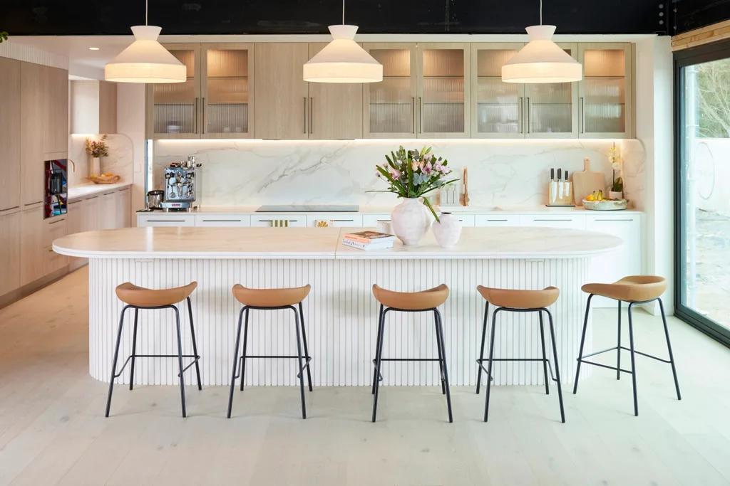
The brass strip in the centre of the benchtop and the shadow line in the stone were praised by Shaynna. “It’s so coastal, it’s so Phillip Island,” she said. All the judges applauded the expansive island, which a large group could gather around. “That’s what people are coming to Phillip Island to do with their friends and family,” said Marty. Yet he pointed out “one of the biggest no-nos when designing a kitchen”, which was positioning the fridge and oven in a major walkway.
Score: 23/30
Tune into The Block 2024 on Sundays at 7pm and Mondays, Tuesdays and Wednesdays at 7.30pm on Channel 9 and 9Now.
Take a tour of all The Block holiday houses so far
In case you missed it:
This article originally appeared on Home Beautiful and is republished here with permission.


