It was the last bathroom The Block 2024 contestants needed to design for their houses this season and they let out a collective sigh of relief to now be able to move on from this notoriously tricky space. “It’s easily the hardest room in your house to do and they’re all done,” said Scott Cam on judging day.
This week, the teams were tasked with completing a guest ensuite on the mezzanine level of their houses (except for Mimi and Kristian whose bathroom is on the lower level of their double-storey house). After already completing bathrooms in week one and main ensuites in week three, the teams now had some experience under their belts.
For this reason, risks were taken, and no one flexed their design skills more than Courtney and Grant. Despite this, they ended up in last place, which was a surprising result for interiors enthusiasts. Here, we break down three reasons why this team hit all the right notes with their ensuite.
1. It embraces current trends
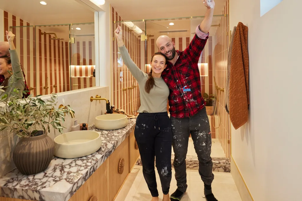
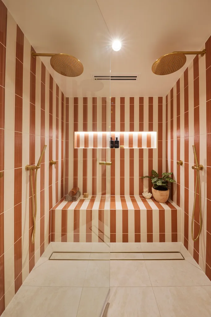
The shower was undeniably the hero of the ensuite, using bone and terracotta tiles to form a striped pattern. It’s a trending look in interiors right now, with Olli Ella co-founder Chloe Brookman doing something similar in her whimsical coastal renovation. Regardless, real-estate expert Marty Fox felt it was like walking into the Phillip Island maze and thought it would turn off buyers. Interior designer Darren Palmer disagreed, feeling it would tap into a design-savvy market. “They’ve swung hard for a designer market here and they’ve struck it out of the park,” said Darren. “You could open any number of magazines right now and see that. It’s so good and so exciting. It’ll look fantastic on a marketing brochure.”
2. It creates visual cohesion
The striped shower echoed the stripes in the rest of Courtney and Grant’s modern Mediterranean house. Similarly, the timber vanity, marble benchtop and travertine floor tiles brought in details from their previous bathrooms, without feeling repetitive. This cohesion without a feeling of repetition takes great skill to pull off. “The people who appreciate beauty will appreciate this house,” said interior designer Shaynna Blaze. “This is in a league of its own.”
3. It screams ‘luxurious holiday home’
Although Shaynna was on board with the interior design, she wasn’t convinced by Courtney and Grant’s decision to take space from their study to create a more extravagant ensuite. This is what allowed them to include a double shower with a bench seat. “I’m going to stand by their design choice but I’m not going to stand by their floorplan choice,” she said. Given this is intended to be a holiday house, it seemed to be a rather wise idea. “It’s definitely my favourite [house] of this season,” Darren declared.
“You could open any number of magazines right now and see that. It’s so good and so exciting.”
Darren Palmer
All of The Block 2024 guest ensuites
Here’s how the teams went in the week seven ensuite reveals.
1st place: Maddy and Charlotte
After inheriting Jesse and Paige’s house, this was the first room the sisters got to design on their own. They rose to the occasion, embracing a neutral palette and olive green basin and styling. “We’ve got a little bit of greenery but that’s the only colour in here,” Shaynna noted. “Everything’s completely neutral and textured… and works.” She thought the arched mirror and marble-topped vanity were gorgeous choices.
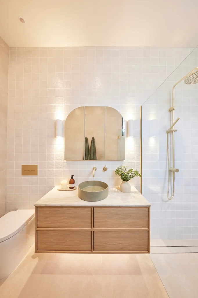
The change in style direction was a positive for Marty. “I find this is a more sophisticated palette than what Jesse and Paige were doing, and so marketable to a very broad range of buyer,” he explained. He had just one suggestion: “Having that toilet the moment you walk in as opposed to being hidden by the vanity, I think they’re actually the wrong way around.”
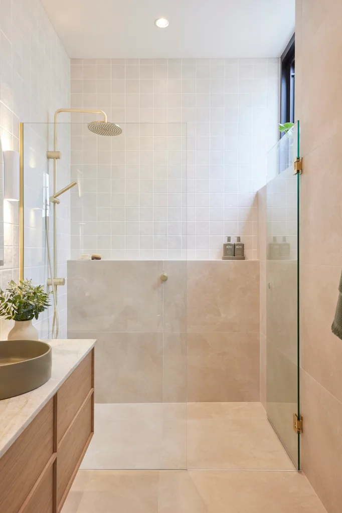
“To be the youngest couple we’ve ever had on The Block and to produce this standard, it’s absolutely remarkable.”
Shaynna Blaze
“There’s really not a lot to fault,” said Darren, who liked the “subtle and simple” colour palette, with champagne hardware. “To be the youngest couple we’ve ever had on The Block – they’re 22 and 24 – and to produce this standard, I think it’s absolutely remarkable,” said Shaynna, who described their style as “classic simplicity”.
Score: 27.5/30
2nd place: Ricky and Haydn
After working on bathrooms for 16 years, plumber Ricky was hoping for the win but proved he knows bathroom design. “This is a good layout,” said Darren. “That’s a really nice expansive shower. We have the toilet in an appropriate position and a nice big vanity with lots of space on either side.”
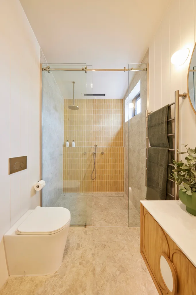
The boys were applauded for their “fun” design decisions, going with a Nood Co basin that embraced the butter yellow trend and yellow finger tiles in the shower. “It’s a bit of a sway from the masculine rooms we’ve seen,” said Marty. “It’s got a bit more femininity, which I really like. Is it an amazing bathroom that gets the senses going? No. But is it marketable to a large range of buyers? Yes it is.”
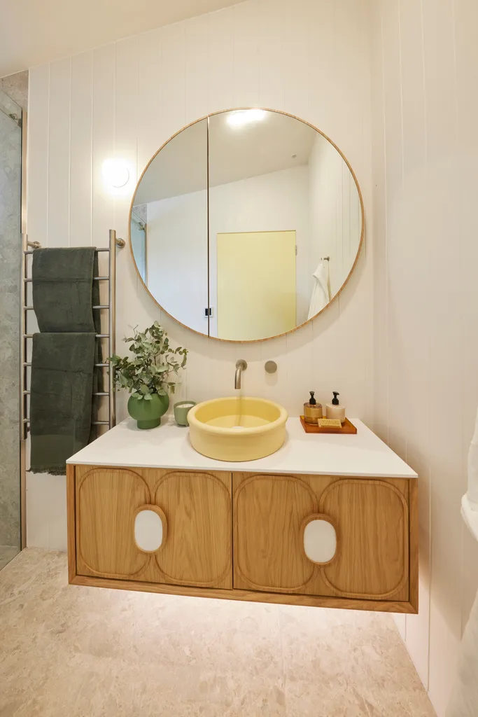
“The yellows are clashing,” said Shaynna, who suggested repainting the yellow door a different shade. On a positive note, the recurring circles and curves created cohesion with the rooms in the rest of their house.
Score: 25/30
Tied 3rd place: Kylie and Brad
The judges loved the black Dekton tiles in Kylie and Brad’s week one bathroom, so it was a safe bet to put them in their guest ensuite. Combined with the grooved panelling above, it was considered a good design move. “I love the fact they haven’t tiled the whole thing and they’ve done this board here, which looks fantastic, the Hardie Groove,” said Shaynna.
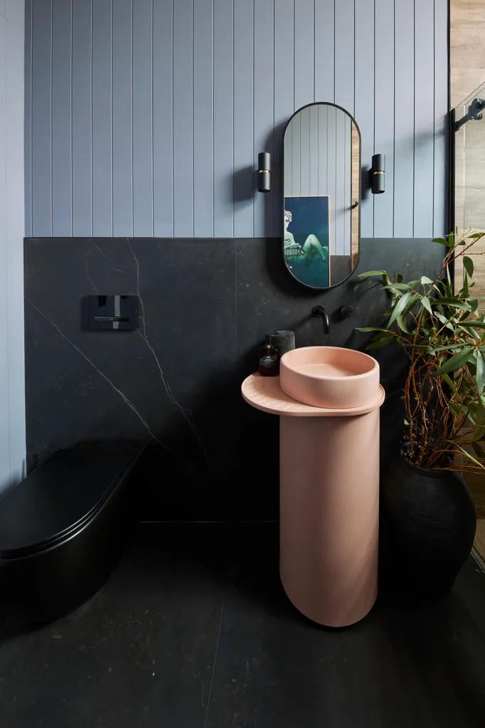
The dusty pink vanity was “a bit random” in Marty’s opinion. This was the hero in the room for Shaynna who only wished they hadn’t placed clashing pink products in the shower. “I keep going to the column basin because it’s the bright shining light in this room,” she said. “I’m looking at the shampoo and conditioner in this lolly pink and it detracts from what the basin is doing. If you’ve got a hero, leave it alone. You don’t have to match it with anything else.”
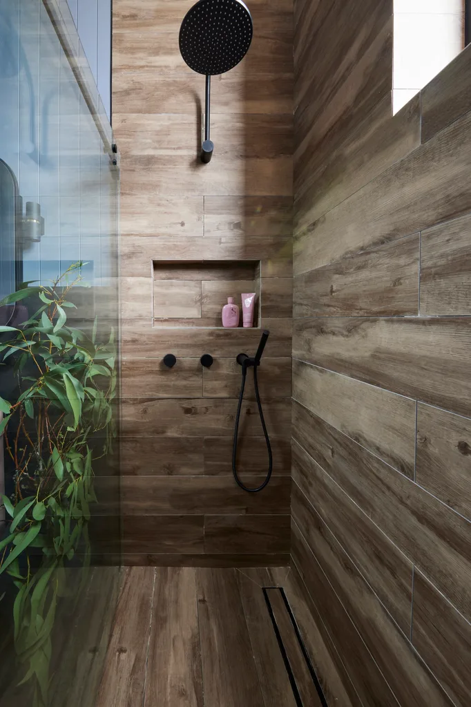
“Using the timber-look tile is not what I would have done. For me, it just feels a bit off.”
Marty Fox
Kylie and Brad went with contentious timber-look shower tiles, yet Darren approved. “I think it encapsulates that shower space so beautifully and it needs this balance. It needs that softness,” he said. “Even if it’s not real timber, I think it’s a really beautiful use of this tile.” Meanwhile, Marty was vocal about his distaste of materials masquerading as something else. “I think that’s a mistake. Using the timber-look tile is not what I would have done,” he said. “For me, it just feels a bit off.”
Score: 24.5/30
Tied 4th place: Kristian and Mimi
After their “Shrek” kitchen mishap in the previous week, Mimi and Kristian’s chic ensuite was more up Marty’s alley. “Now this is what I like,” he said. “This is clean, marketable. It’s just so well put together.” He liked how the timber on the ceiling warmed up the room and was a detail used in previous rooms. “It tells a story of the house, because it’s consistent with the other bathrooms, and buyers do like consistency,” he said.
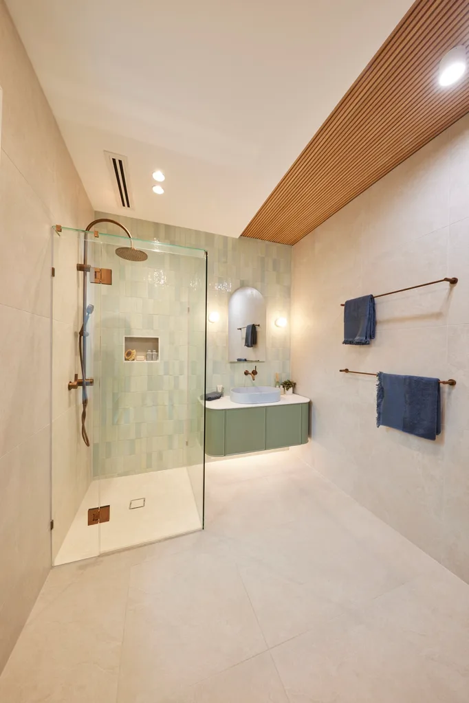
“I really dislike it,” Darren declared about the timber strip. “It’s an inclusion for the sake of an inclusion that doesn’t relate to anything else. I have a problem with it. It makes the room imbalanced.” It was a sentiment shared by Shaynna who felt Mimi and Kristian’s penchant for asymmetry was failing them. “It feels a bit odd because it’s off-centre,” she said.
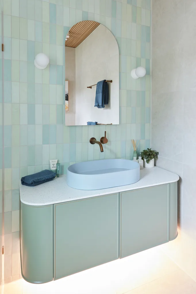
“It’s not exciting to me, because I’ve seen them do it. It’s rinse, lather, repeat.”
Shaynna Blaze
The blue and green tiles were a beautiful combination with the blue basin and green vanity, yet perhaps a tad formulaic in the context of a competition that needs to wow the judges week after week. “It’s not exciting me, because I’ve seen them do it,” said Shaynna. “It’s rinse, lather, repeat.” From a real estate perspective, Mimi and Kristian’s consistency was exactly what excited Marty, as he knew it would bode well for auction.
Score: 24.5/30
5th place: Courtney and Grant
The striped shower was a lot for the judges to digest. “I’m still trying to take it all in,” said Shaynna. “Which is a problem,” said Marty, who likened it to a play maze on Phillip Island. “Imagine how a buyer feels.” Springing to Courtney and Grant’s defence, Darren applauded their courage to push boundaries. “This is absolutely one of the most beautifully finished, luxurious, design-centric homes that I’ve seen on The Block ever and it’s definitely my favourite on this season,” he said.
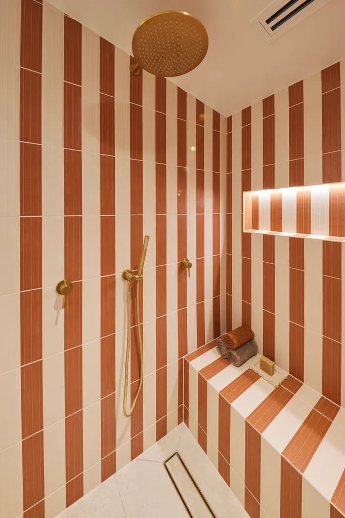
“It’s definitely my favourite [house] of this season.”
Darren Palmer
“It definitely has impact,” said Shaynna of the guest ensuite. Materials from their previous bathrooms were included for a sense of cohesion. “This marble and the vanity is probably the only thing I’m loving about this bathroom,” said Marty. The travertine floor tiles and sand coloured basin hit the holiday home brief.
Score: 24/30

Tune into The Block 2024 on Sundays at 7pm and Mondays, Tuesdays and Wednesdays at 7.30pm on Channel 9 and 9Now.
Take a tour of all The Block holiday houses so far
Week 5: Main bedrooms and walk-in robe reveals
In case you missed it:
This article originally appeared on Home Beautiful and is republished here with permission.


