The sun gently warming your skin, salty waves kissing the shore, and an icy cold Aperol spritz in hand — it's these blissful scenes from the Italian coastline that keep us dreaming of the Mediterranean long after the holiday is over. But even more memorable are the colors synonymous with these scenes. Orange rays across sun-bleached pink buildings, bright blue water, and the fizzling red of a spritz on yellow-striped beach towels. It's an array of colors that instantly boost serotonin, so why not bring these Italian color palettes into our homes?
Whether or not you've recently booked a flight to Sicily, Amalfi, or Cinque Terre, you can probably imagine life bursting with those zesty, familiarly faded colors; the pale oranges and bright blues that feel comforting and nostalgic as well as invigorating. "The northern Italian region of Liguria, between France and Tuscany, is particularly famous for clusters of trompe l'œil buildings that create a colorful amphitheatre across the coastline," explains interior designer and color expert Fiona de Lys.
"Here, towns come alive with pigmented facades that sing all year round in varying hues of pinks, oranges, yellows, and blues," she adds. These color trends feel timeless yet perfect for the summer season. It's not every day you can book a holiday to Italy, but styling your home in an Italian color palette means, in a way, you can enjoy the feeling all day, every day. To do it, below are three Italian color palettes to bring into your home.
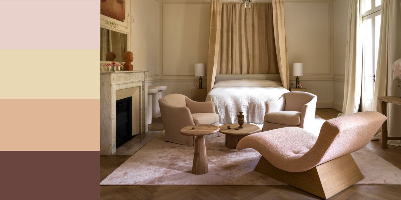
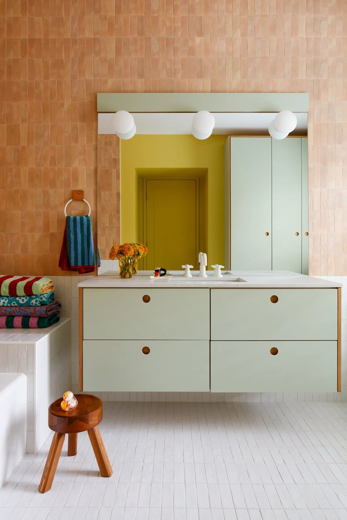
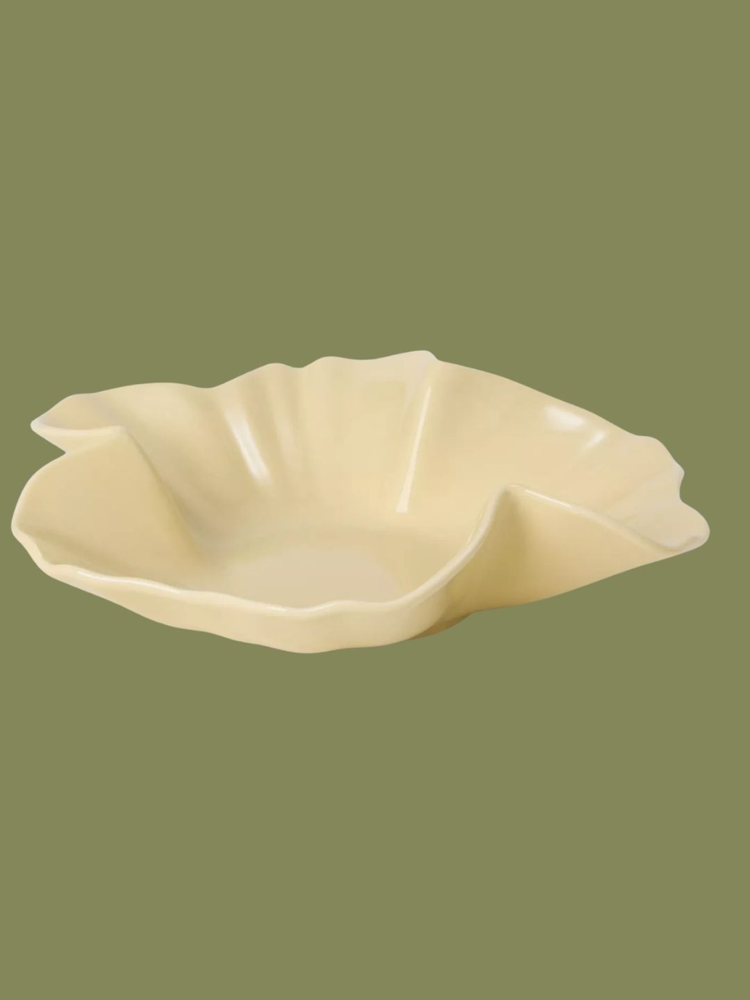
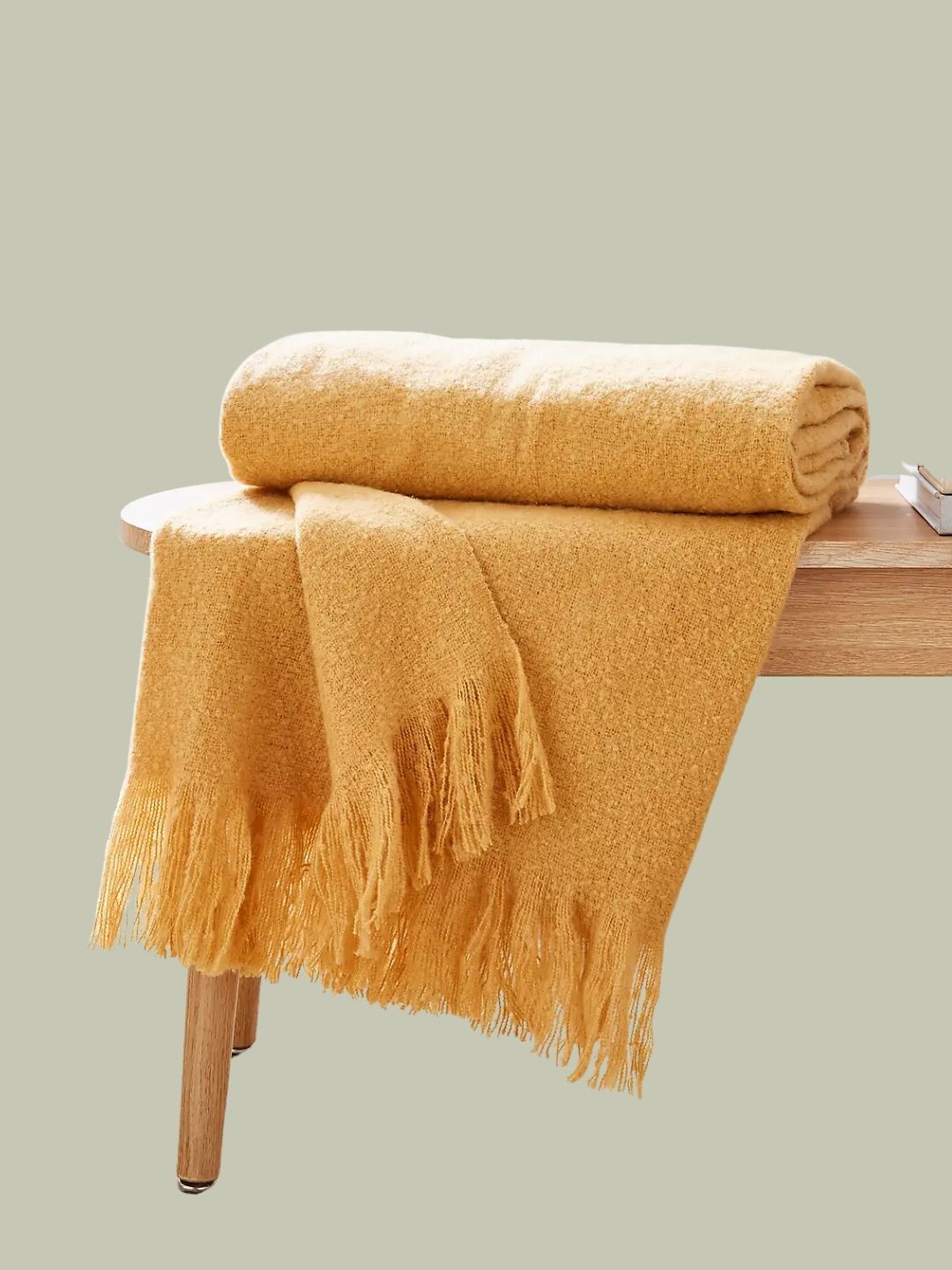
1. Soft Peachy Orange With Warm Yellow
The most obvious displays of color along the Italian coast come from the architecture nestled in the green hills and dry vegetation. Those peachy-orange and soft yellow faded buildings that make you want to snap a million photographs.
"The historical use of color for the rendering of architecture dates back as early as the 16th century, when fisherman lime-washed their houses to help identify their homes from the sea to navigate back," explains Fiona de Lys.
Originally, this could only be achieved by using slaked lime, with pigments from an earth-clay available in the local geology. And for much of the Italian coastline, "the buildings would have been soft pastels and beiges of varying warmth depending on the amount of mineral used from pigments such as Ochres, Siennas and Umbers," she adds. Today, getting the same Italian color palette is a little easier.


Hence, the most identifiable Italian color palette would be a peachy orange and sunshine yellow mix. "I absolutely love this concept of using color for identity," says Fiona. And this is an easy concept to translate to our homes.
You can try these shades together for a colorful, but natural exterior paint color combination, brightening your outdoor space while keeping it as serene as your favorite seaside village. Or Fiona notes that this palette is particularly welcome in living rooms, kitchens, and bathrooms.
A peachy terracotta fabric or wall color would bring delicious depth to a space, while butter yellows and soft ochres make a surprisingly elevated pop of joy.
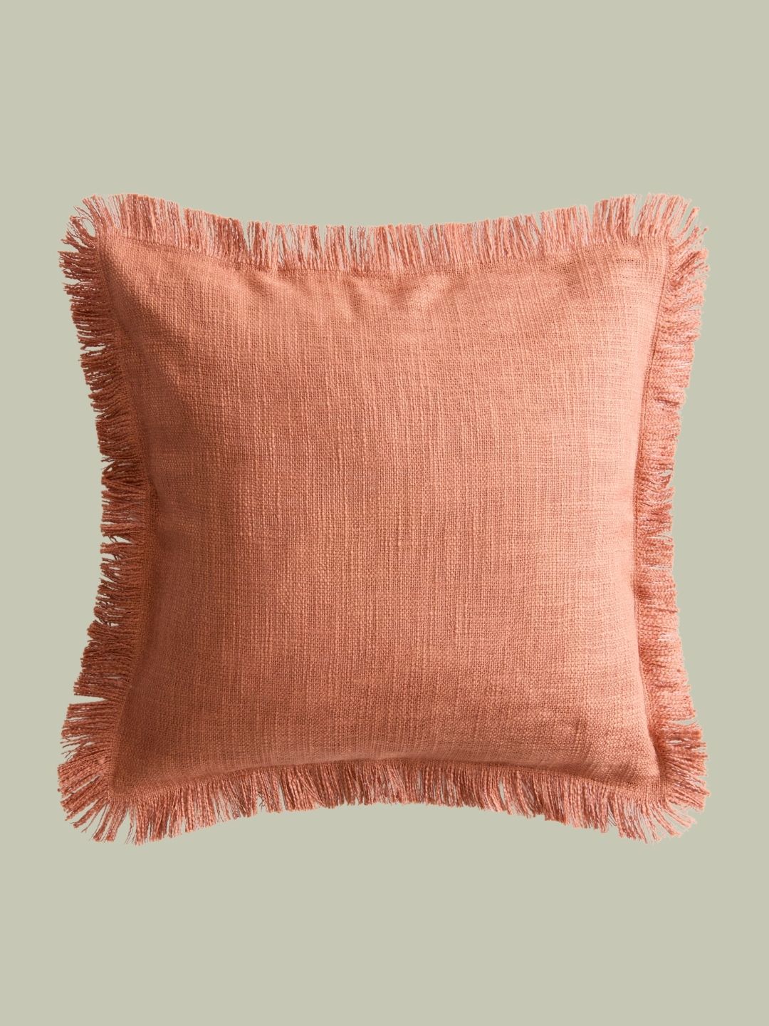
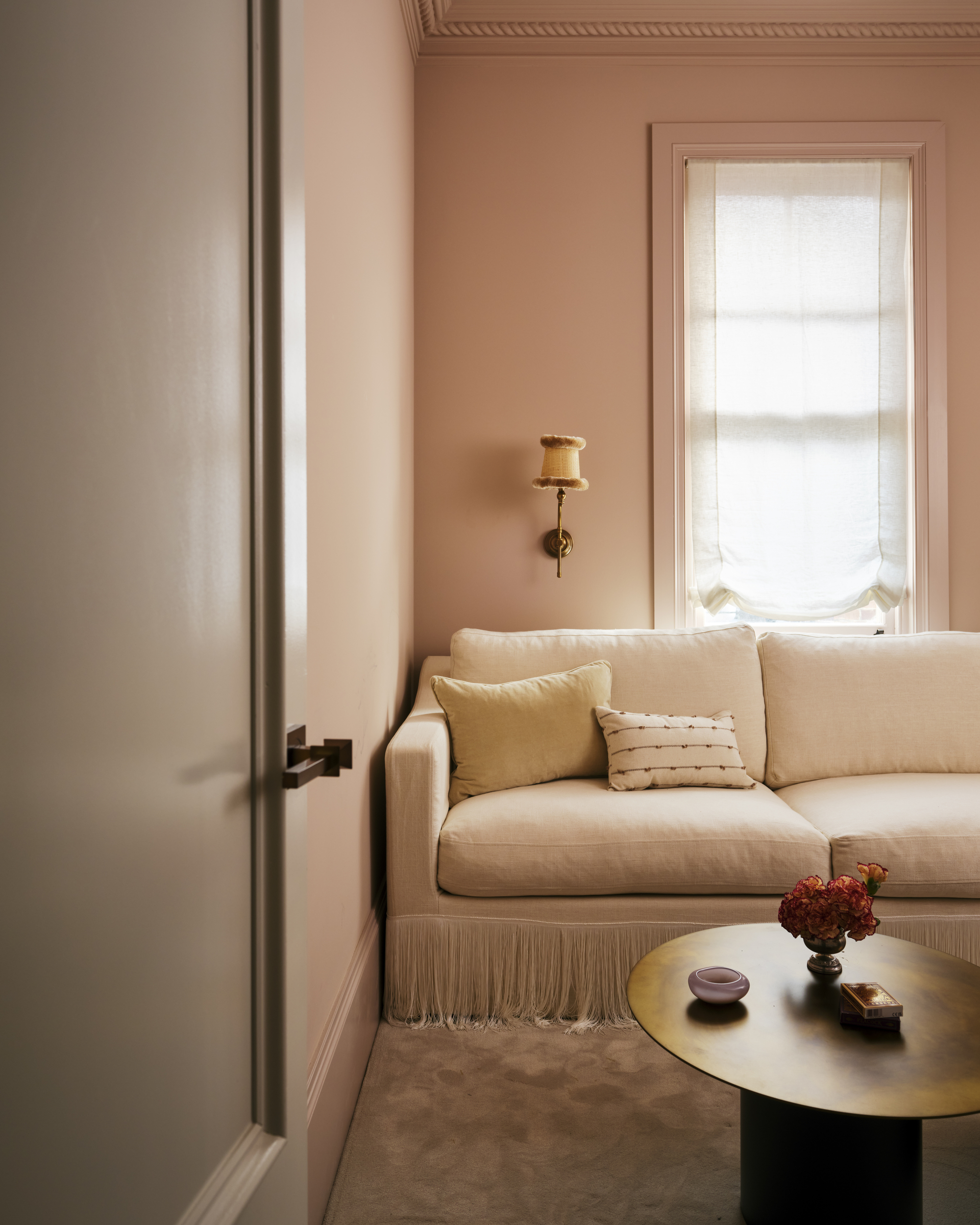
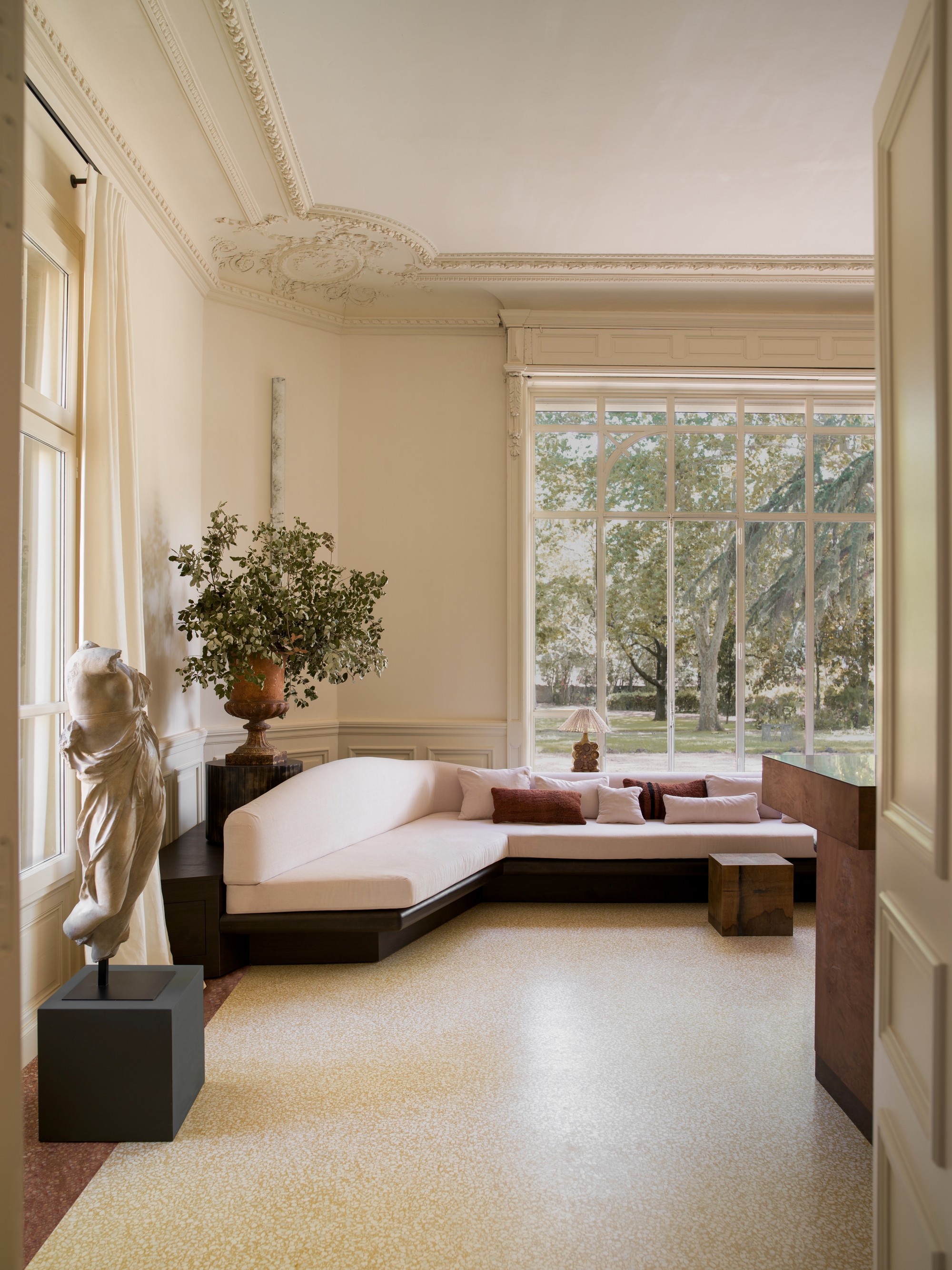
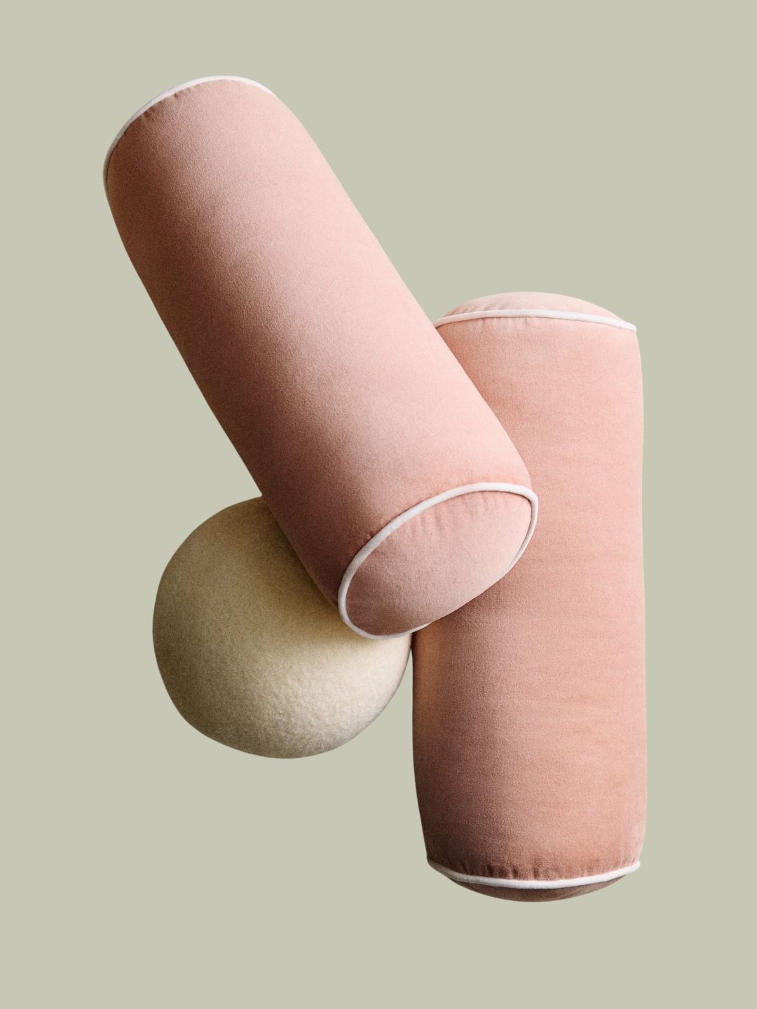
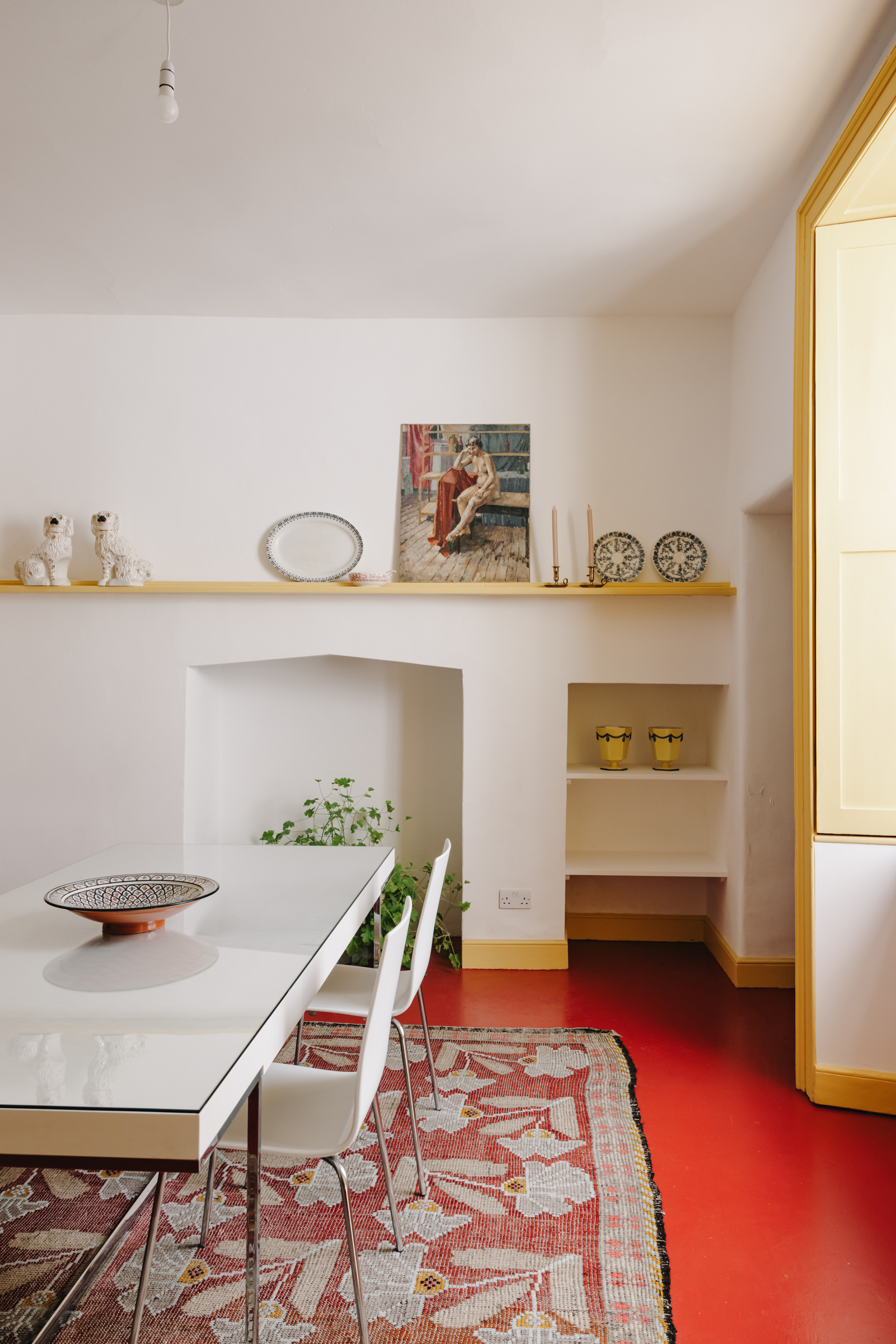
2. Dusty Pink and Soft Red-Brown
"Around the 18th century, the introduction of red and green pigments from further inland brought new and bolder colors for buildings," says Fiona. And so, while soft pastels might be the most popular Italian color palette, there is plenty of room to lean into deeper, moodier shades, too — so long as they embrace that natural aesthetic.
Decorating with pink is making a fashionable return this year. From dusty, pale pinks to peachy corals, pink provides that balance of sweetness and light against a darker room and keeps things slightly playful. A pale pink and red-brown palette mimics that contrast of sun-drenched facades and rocky coastlines across Italy.
"It is perhaps the way these pigments naturally age in the sunlight that allows so many colors to work beautifully together, and tells a story of a sun-kissed passage of time," adds Fiona.


To elevate this palette even more, try incorporating a few elegant Italian design trends. Sculptural art, intricate crown molding, modernist furniture next to antique pieces — these design choices will elevate your Italian color palette even further.
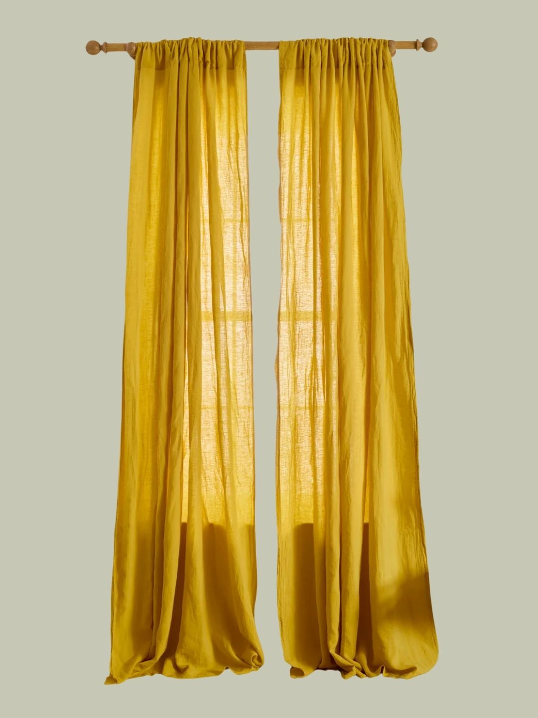
3. Yellow and White With a Pop
Perhaps the most outwardly 'on-the-nose' Italian color palette is one that Fiona describes as a yellow-and-white striped moment, and bonus points for adding a pop of blue or red.
"Nestled within the bays are private beaches that parade parasols during the summer months; the most popular being large stripes," says Fiona. She explains that the most common pairings you will typically see along the Italian coast are the 'Parma' yellow and white — the distinctive yellow seen on the branding of Aqua di Parma. Or white and 'Azure' blue — meaning 'color of a cloudless sky. Lick's Blue 19 paint is a fabulous choice to capture that blue pop.
And it may seem slightly kitschy to bring this combination into your space, but when done well, decorating with yellow and white can be a very stylish and elevated color palette.


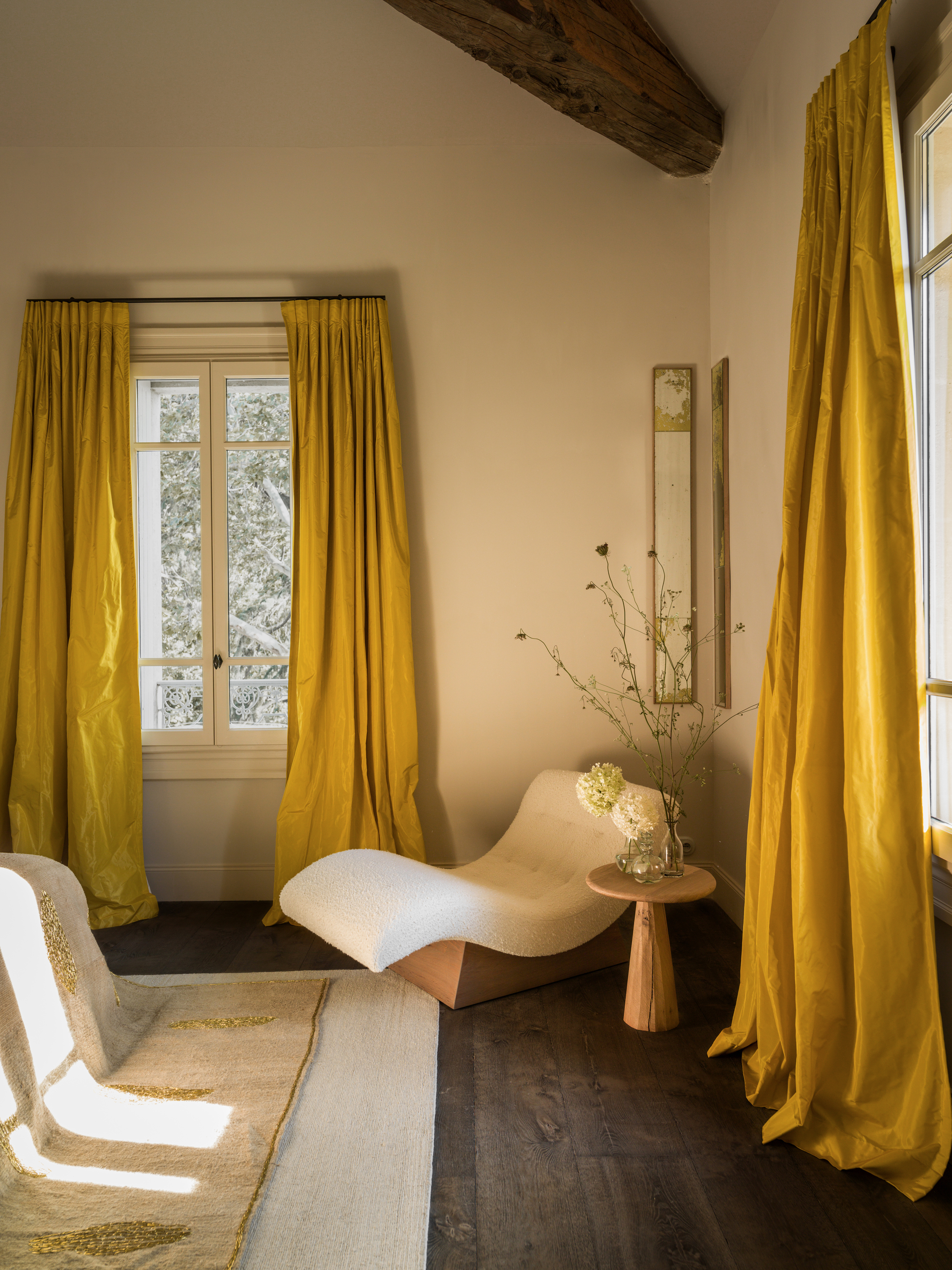
For instance, you don't have to slap yellow and white stripes around your house for it to evoke the essence of your favorite holiday (although a nice pattern sprinkling technique could make this work really well). Instead, try layering white and yellow in a way that subtly hints at the personality of those iconic striped parasols.
A dramatic drapery curtain trend in a soft or sunshine yellow against an off-white room would have a similar effect. Or perhaps even painting your trim or kitchen cabinetry yellow could provide that sense of color blocking that brings this palette to life. There are lots of ways to creatively elevate the look of summertime stripes in a space.
The joy of bringing Italian color palettes into your home comes from celebrating the identity, personality, and history of a region while also curating a space that feels as lively and playful as it does timeless.
You want to capture the relaxed aesthetic of Mediterranean-style interior design in a way that still feels your own. Mindfully using color makes an interior that much more fun to live in!
For more inspiration like this, be sure to subscribe to the Livingetc newsletter.