As summer slowly but steadily creeps towards us, we're all beginning to spend a little bit more time thinking about our outdoor areas and how to get them in the best shape possible for the summer months. And, in 2026, there's no outdoor space quite as desirable as an outdoor kitchen — so long as you know how to design it right, and that all starts with finding the best outdoor kitchen color.
You may think picking a paint color for your outdoor kitchen would be no different from what you'd choose inside your home, but you'd be wrong. You see, your outdoor kitchen doesn't exist in a vacuum; it is inextricably linked to your garden as a whole, and the color you choose will have a significant effect on the overall look of your outdoor space. You need to think about how the kitchen color will respond to its surroundings, how it will look against the background of nature, and not just how it will look on your cabinet doors.
I don't say this to incite fear; I say it to save you from disaster. To help you out, I asked the experts what they think the best outdoor kitchen colors are, and with their tips in mind, your garden is sure to be the hotspot of the summer.
1. Muted Greens
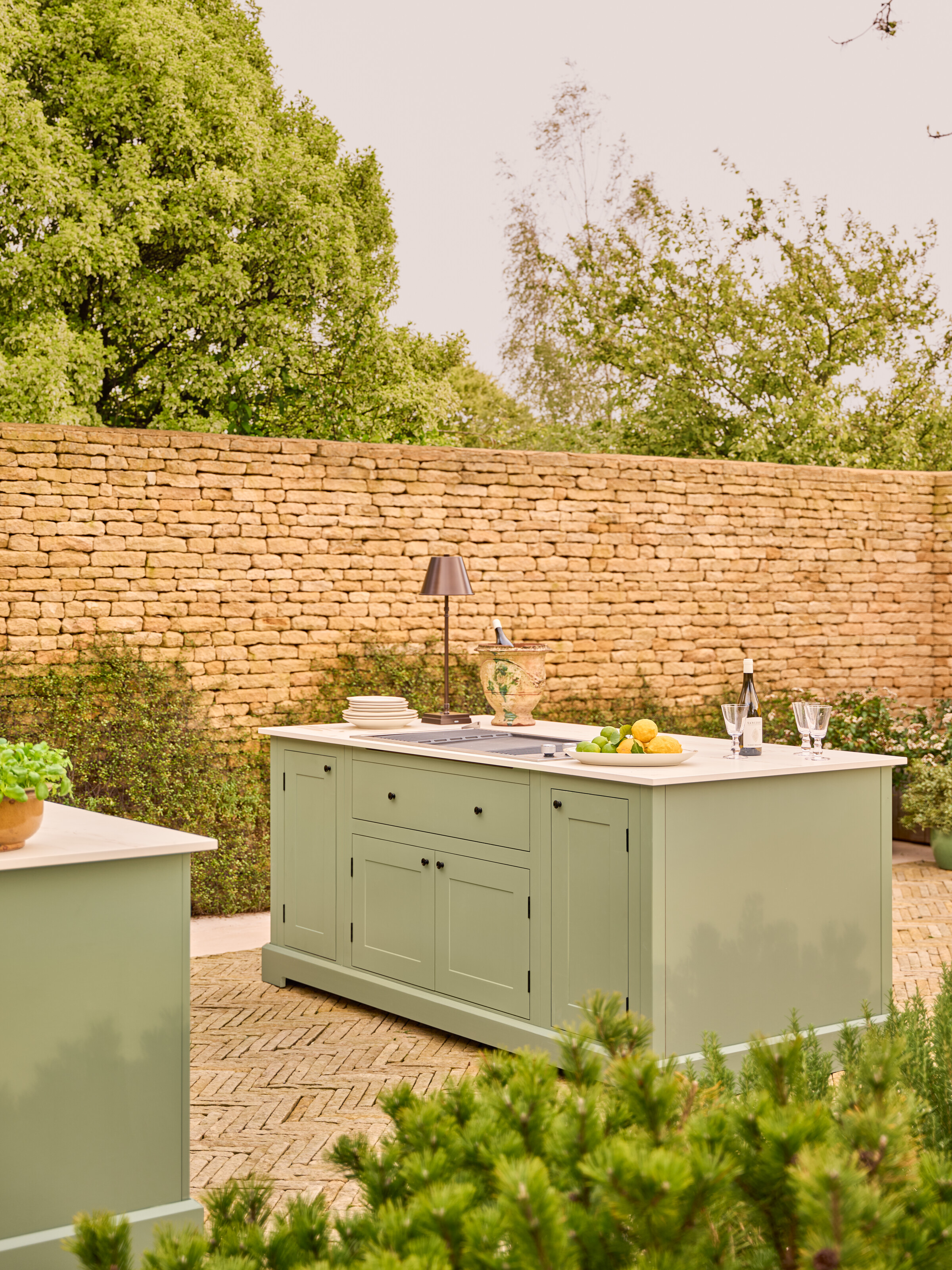
Sage green kitchen lovers, I have some good news for you. As it turns out, this super-popular kitchen color choice works just as well in the great outdoors as it does within your home, if not even better.
The best colors for outdoor kitchens are those that complement the nature surrounding them, and no color fulfils this role quite like green. It's the same reason you'll find so many green tones in the most popular outdoor furniture trends of the moment — it makes for a natural addition to your outdoor space, subtly blending in with the surroundings.
And it's not just sage that looks good. As Maria Ramirez, founder of BB Interiors, says, "Rich olive greens such as Farrow & Ball's Bancha or Edward Bulmer's Light Olive Green bring depth and character without overwhelming the space, while softer sage-inspired shades like Fenwick & Tillbrook's Moss or Little Greene's Sage Green create a gentler, more relaxed feel."
The subtle, muted quality of these shades stops your outdoor kitchen from feeling too stark a contrast to the natural outdoor world; it softens the design, making it appear less jarring and more fluid with its surroundings.
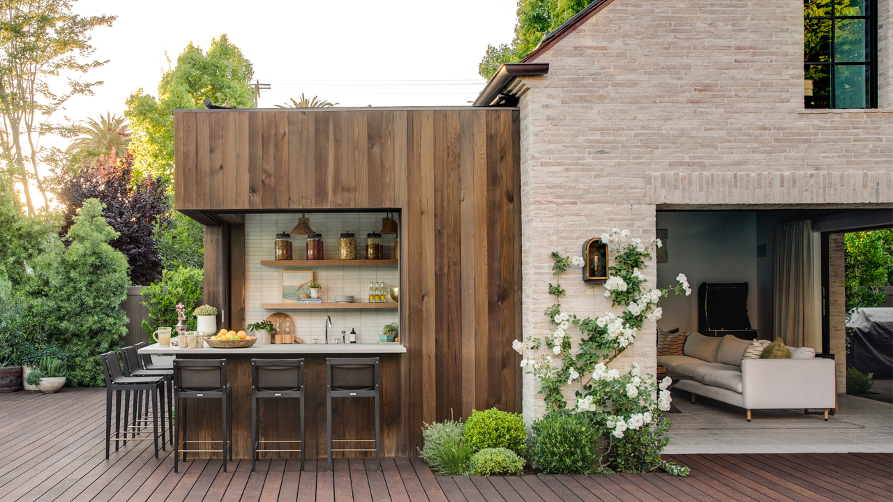
Just take the latest outdoor kitchen launch from Neptune as an example, with its lovely muted sage color, this kitchen would work beautifully in any garden.

A light, stony grey with subtle green undertones.

A mid-toned mossy green with warm yellow and brown undertones.

A true olive shade with a rich, earthy finish.
2. Deep Charcoal Shades
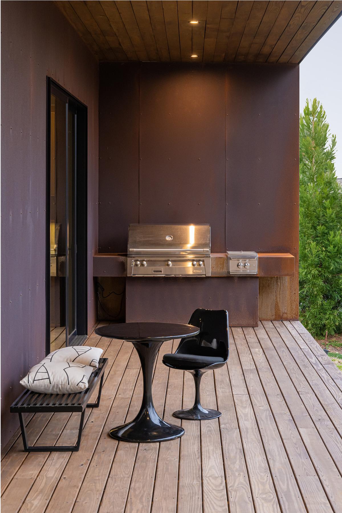
When it comes to interiors, dramatic, dark shades often fall under the category of colors to never paint a kitchen, with designers warning of their ability to make spaces feel smaller and less inviting. However, when it comes to outdoor kitchens, the same rules do not apply. In fact, many designers cite charcoal as one of their favorite shades to see used in these spaces.
Inside your home, especially in small kitchens, darker colors can feel suffocating, making your space seem even smaller than it is. However, in your garden, where you are freed from the confines of a permanent structure, these issues become irrelevant. Instead, these dark colors bring an air of contemporary modernity to your garden.
We don't just mean a flat, black paint, though. Nowadays, there's so much variation within this color family, and even the slightest shift in undertone can completely transform the feel of your design. "Dark hues for kitchen cabinets are making the transition from 'all-black' to rich shades such as charcoal, graphite, and espresso," explains Alan Solis from Solis Painting. These rich, complex shades bring depth to your outdoor kitchen design, with a sophistication and elegance that feels appropriate for modern gardens.
Plus, from a practical perspective, these shades are ideal for withstanding constant outdoor exposure. Unlike a bright, white paint, a darker shade can help hide any dirt or staining and will be less sensitive to the wear and tear that comes with outdoor use.

A favorite among designers, Railings is an inky, blue-toned black.

Inspired by the glossy skin of an Aubergine, Brinjal is a sophisticated, deep purple shade.

A glamorous charcoal grey with dark, blue undertones.
3. Warm Neutrals
The most significant difference between choosing an interior kitchen color and one for your outdoor kitchen is the fact that your outdoor kitchen will be fully exposed to natural light. Unlike your artificial kitchen lighting, the natural light your outdoor kitchen will be exposed to is constantly changing, shifting throughout the day and, with that, changing the look of your kitchen, too.
This is something Xhensila Lala, from William Morris Wallpaper Co, is acutely aware of. As she explains, "At William Morris Wallpaper Co., we work with historical pigment-based patterns that were originally designed before artificial lighting existed. Morris rejected synthetic dyes entirely and built his entire color system around natural light performance, and that education has changed how I read outdoor color entirely."
While people generally accept that the paint finishes we use outside have to differ from what is used inside your home, the understanding of how the colors themself should differ is significantly less established.
"Outdoor kitchens typically get 6-8 hours of direct sunlight each day, which can affect how colors look over time," says Xhensila. This direct exposure to sunlight can completely transform the appearance of your paint, and you may find that a color you absolutely adore in your living room looks completely different in your garden.
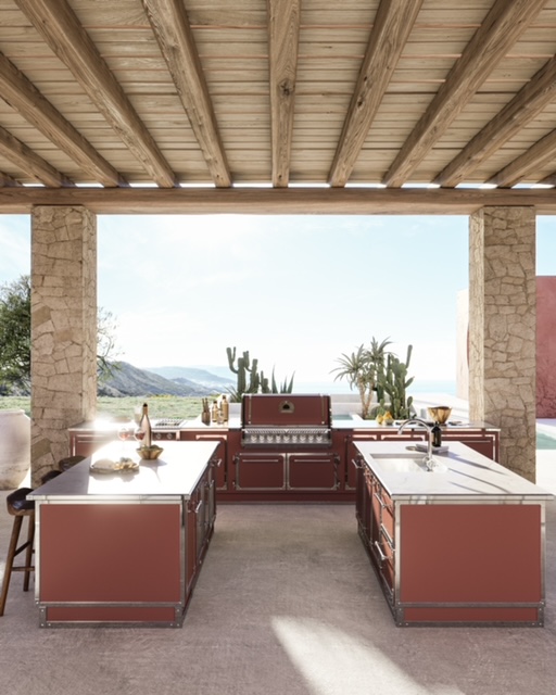
Intentionally selecting colors that respond well to this direct sunlight can help mitigate this. For example, Xhensila says, "Warm neutrals like terracotta and sandy beige work well because sunlight enhances their yellow and red undertones instead of fading them. We see the same effect in our botanical prints, where ocher and clay tones stay vibrant and consistent across seasons longer than cooler colors."

A light and warm terracotta tone that will be sure to add depth to your outdoor kitchen.
Described as sitting "humbly in all lighting conditions", this tone adds an air of warm sophistication.
A joyful, sunny shade, Orange 04 is a yellow-toned orange, with a touch of gray, to tone it down.
If you're on the hunt for some more ideas for how to decorate your outdoor cooking area, look no further; our roundup of all the best outdoor kitchen trends has got you covered. And for the rest of your design inspiration, subscribe to our newsletter.