Choosing the color palette for your kitchen is always an important decision, but when you're working with a north-facing space, it becomes crucial. As Ruth Mottershead, from Little Greene, explains, "North-facing rooms are frequently the darkest areas of the home, as they often experience very little direct sunlight and tend to appear consistently flatter and cooler than they would do bathed in natural light."
Because of this, you have to be even more careful than normal when choosing colors for north-facing kitchens. What may appear as a lovely fresh white in the store can look sterile and harsh under the cool light of your north-facing kitchen.
Thankfully, this problem is entirely avoidable, so long as you know the colors to steer clear of. Our experts have shared the three biggest offenders, along with the shades they'd use instead for a cozy and inviting space.
1. Blue Toned Paints
Love the icy blue kitchen trend? So do we, but it may be one to avoid in a north-facing kitchen, warn the experts.
"North-facing rooms amplify any cool undertone in a paint color because the daylight entering the space is indirect and often slightly blue in quality," explains Charlotte Butler, kitchen design manager at BK Eleven. This type of light can make any cool undertones become glaringly obvious, and more often than not, will end up making your kitchen feel unwelcoming.
This doesn't just apply to straight-up blues, either. Any paint with even the most subtle hint of blue undertones, that may not register as such in southern-facing rooms, can suddenly seem overly cold under a north-facing light.
Of course, some variables will affect this, such as your kitchen layout. "The effect becomes more noticeable in open-plan layouts where the kitchen sits alongside living or dining areas that may receive different light, because the cabinetry can appear disconnected from the rest of the scheme," says Charlotte.
So too will the shape of your cabinets. Shaker-style kitchens, with added texture and dimension, will respond to light differently from a flat, modern kitchen.
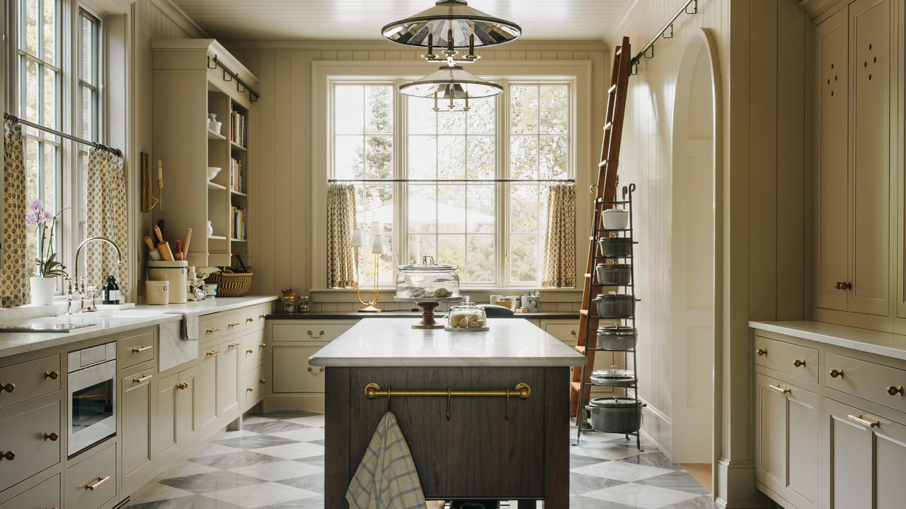
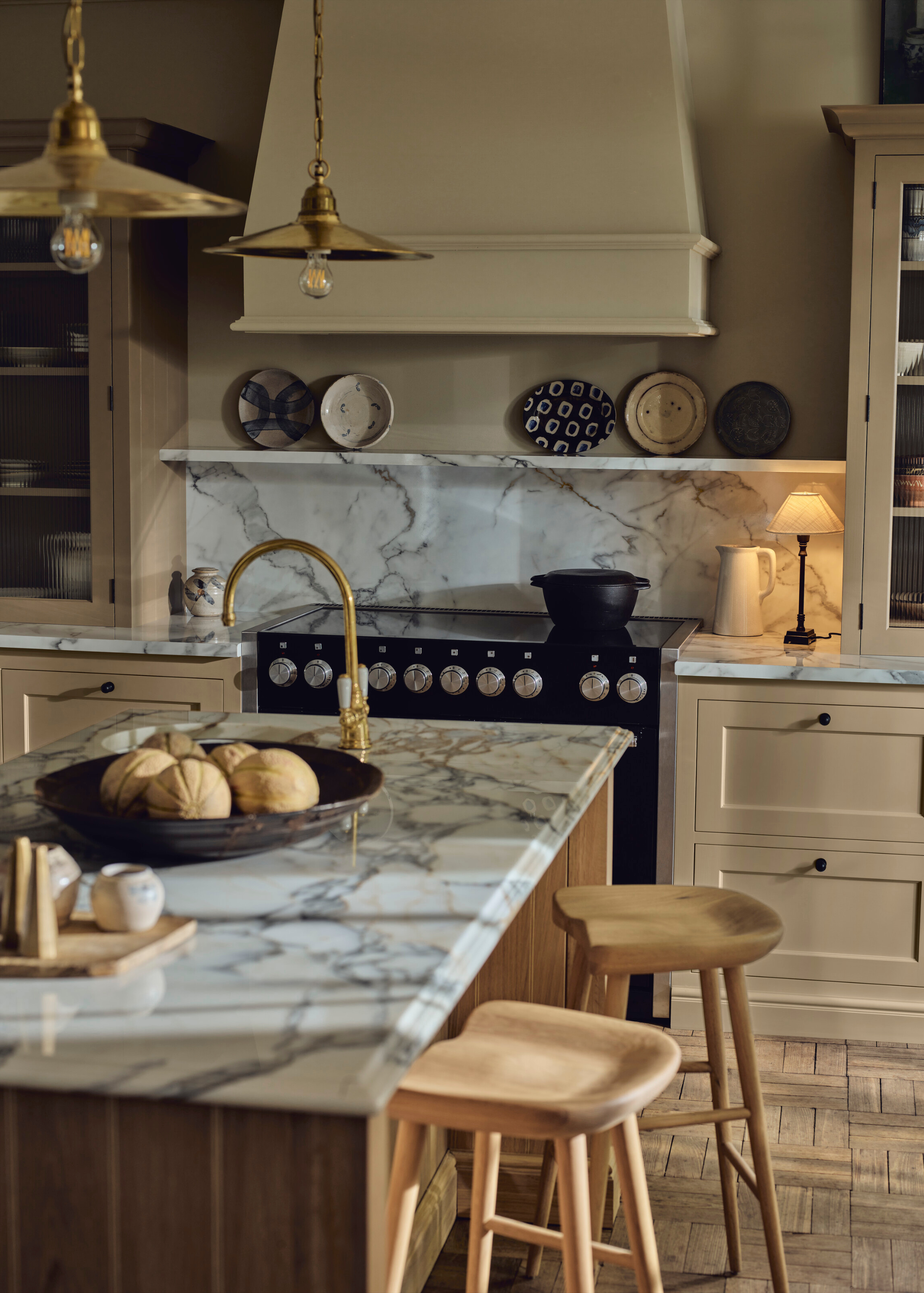
2. Cool Grays
A soft gray is often heralded as a fail-safe choice for your kitchen cabinets, but without the warmth of direct sunlight, these shades can end up looking uncomfortably cold.
"What may appear as a soft contemporary neutral in a showroom can shift towards something much more severe when exposed to northern light, particularly during the winter months when daylight hours are shorter and artificial lighting carries more of the load," explains Richard Davonport, from Davonport.
The harshness of the British winter can be rough at the best of times, so choosing designs that will accentuate the grayness of the world may not be the wisest decision. Plus, as Richard notes, your kitchen lighting will likely do no favors to this shade either, only accentuating its coolness.
To avoid this, Richard recommends thoroughly testing your paint shade before committing. "We always recommend testing large painted samples in situ for at least a few days, observing them from morning through to evening, because the absence of direct sun can exaggerate shadow lines around moldings and door frames," he says.
"In more traditional cabinetry with beading or raised panels, that effect can feel heavier if the base color is already cool."
3. Bright, Primary Colors
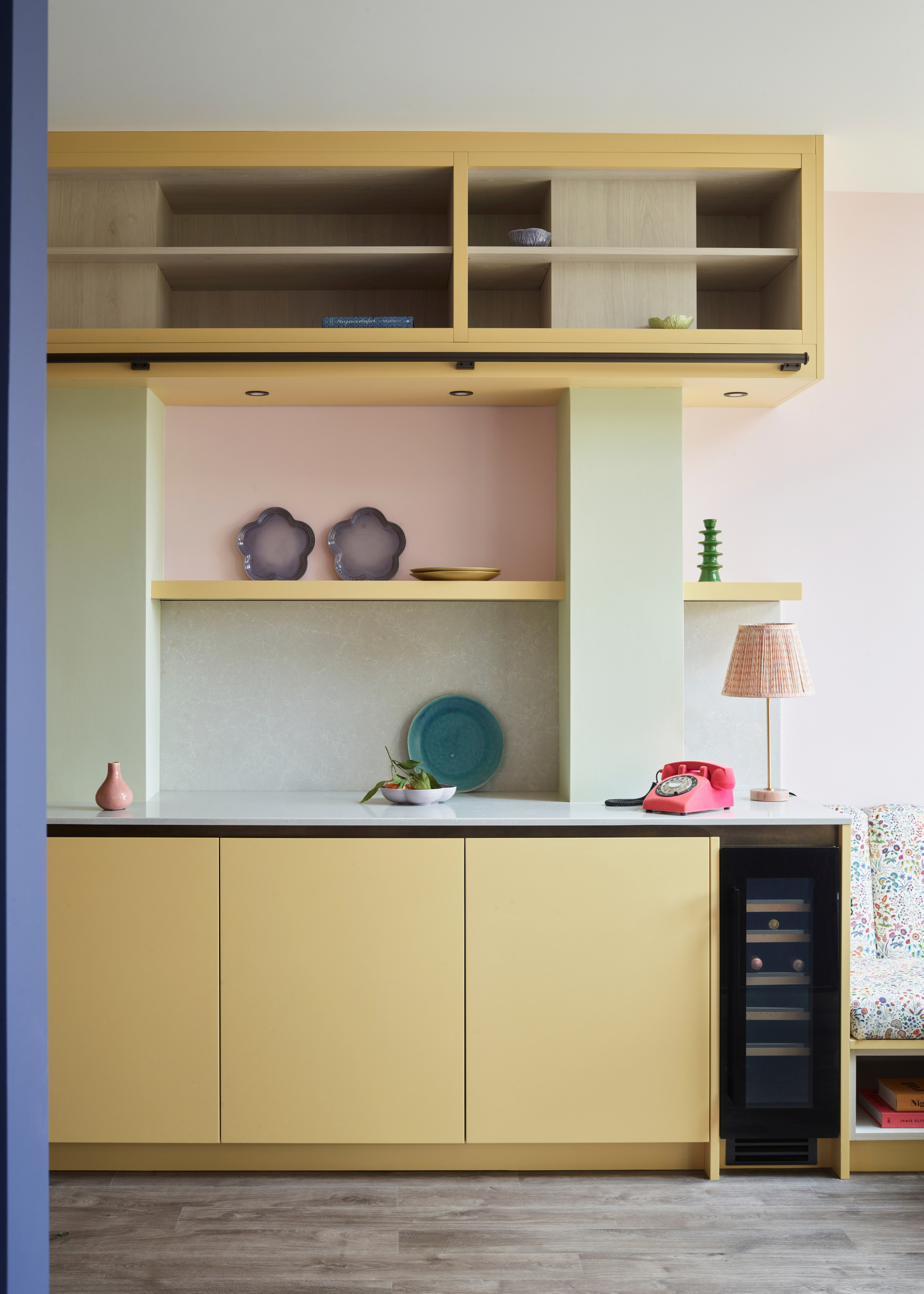
You may imagine that bright, punchy colors would fare well in northern-facing rooms, providing the brightness and excitement that the sun cannot. It's a sound theory, but in practice, you may find yourself disappointed by the results.
Brightly colored kitchens always carry a risk to start with — after all, you're far more likely to fall out of love with your neon yellow kitchen than you are a muted taupe one. And in northern-facing spaces, this becomes even more of an issue.
"I would avoid primary colors and very bright colors because they won’t have a variety of light and shadows to change the color, and will be too ‘loud’ for a room lacking lots of sunshine," advises Allison Lynch, senior designer at Roundhouse.
According to color theory, primary colors form the building blocks of the entire color spectrum — they are the fundamental shades. Because of this, they can often end up looking quite intense, especially without the natural warmth of sunlight to soften them.
This is not to say that red, yellow, and blue are always poor choices for north-facing kitchens; it's more about the shade you choose. While a bright, fire-engine red may come across too harshly, a muted maroon or burgundy color can look quite beautiful.
Colors to Try Instead
This aptly named shade is the perfect option for those who are naturally drawn to the simplicity of a gray kitchen, but need something slightly warmer.
Arguably one of the most iconic off-white paints, School House White is neutral and bright, without any of the cool sterility of a true white paint.
If you're searching for a cabinet color that will bring a smile to your face on even the grayest of days, this joyful pastel yellow is sure to do the trick.
Looking for some more tips on decorating your northern-facing rooms? We have a whole list of the best paint colors for north-facing rooms. And for the rest of your interior inspo, our newsletter is full of fun, stylish ideas.