One of the most important things in home decor is making sure that it reflects your taste, your interests, and your values. You should always gravitate to decor that reaffirms who you are and what matters to you, and hanging art in your home is one of the best ways to do just that.
Choosing the right art is one thing, but knowing how to hang a picture properly is another. From finding the right height to balancing it within the perfect frame, curating a home full of expressive wall art can be a headache, but we're pleased to say you can put the Tylenol away. That's because we've asked experts for the common mistakes to avoid when hanging art, alongside some tips on how to fix them. Follow these rules and your art is sure to have maximum impact.
1. Choosing the Wrong Size

Unless you're commissioning a personal piece, finding art that perfectly fits your space can be difficult, be it living room wall art ideas or a stairway gallery wall. "One of the most common mistakes is that people often don't know how to choose the proper size of art for a wall," says Cliff Fong, LA based interior designer and founder of Matt Blacke Inc. “Choosing the size of the wall or the size of the painting appropriately for the wall size is kind of key in making sure that you've got something that feels truly aesthetic and balanced.”
As a general rule, he recommends that you measure out the wall and select art that is no less than two-thirds the width or height of the wall. However, that rule isn’t set in stone — Cliff encourages a more fluid approach to art placement in the context of the entire space and says that honoring negative space in homes for lovers of monastic or minimalist design can be really impactful.
“Sometimes, you know, a painting or a piece of art has so much presence that if it did fill a wall, it could feel overwhelming,” he says. “It can be amazing if there's a big beautiful wall and a disproportionately small painting on it, because it forces your eye. It draws you in versus standing in a room and looking at, you know, something the size of Guernica on a big wall. It's something different.”
If you’re stuck with a piece of art that’s too small but also doesn’t carry much presence, don’t make a trip to the donation point just yet. Cliff advises finding some similar-sized pieces to organize into a salon-style gallery wall idea instead.
2. Too Much or Not Enough Art

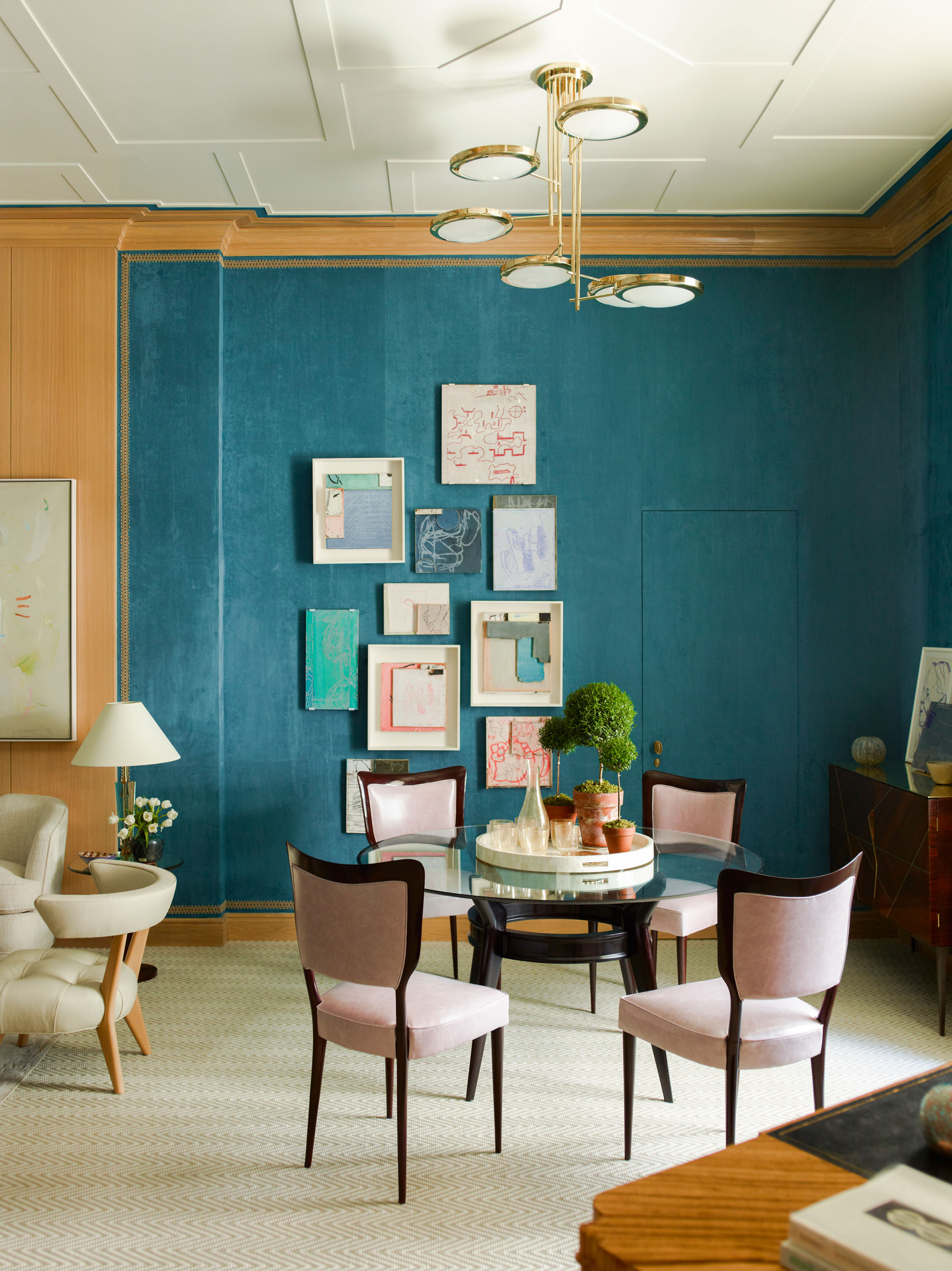
On the topic of gallery walls, another difficult question when hanging art is how much is too much in one space. A common mistake many of us make is creating a gallery wall that feels inharmonious, making you feel either overwhelmed or underwhelmed. Other times it can feel too cohesive, giving the space an inauthentic or sterile feel.
Before you buy into all the latest wall art trends, it may be worth assessing the purpose of the pieces you’re looking to hang. “A lot of times you just hang art for a decorative purpose or to communicate something about color, or contrast or mood but it also has the potential to have some personal meaning,” Cliff says.
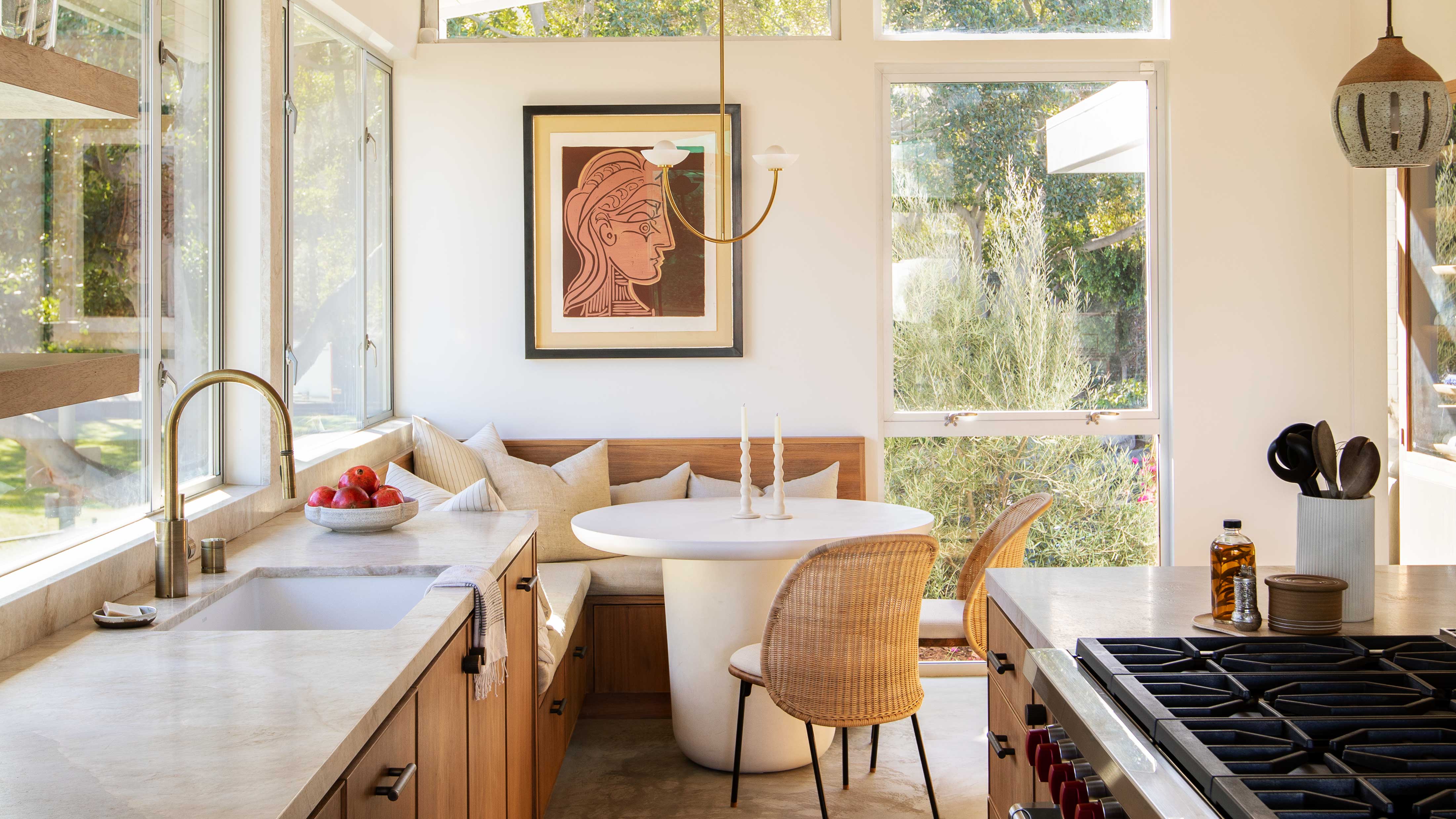
To avoid missing the mark, he suggests taking time to assess how they work together so that you don’t accidentally make the pieces compete for attention or minimize their overall purpose. “I imagine if you have a small Picasso on a big wall then you probably don't want to hang a whole bunch of other paintings around it," he says. "You just want to see that Picasso.”
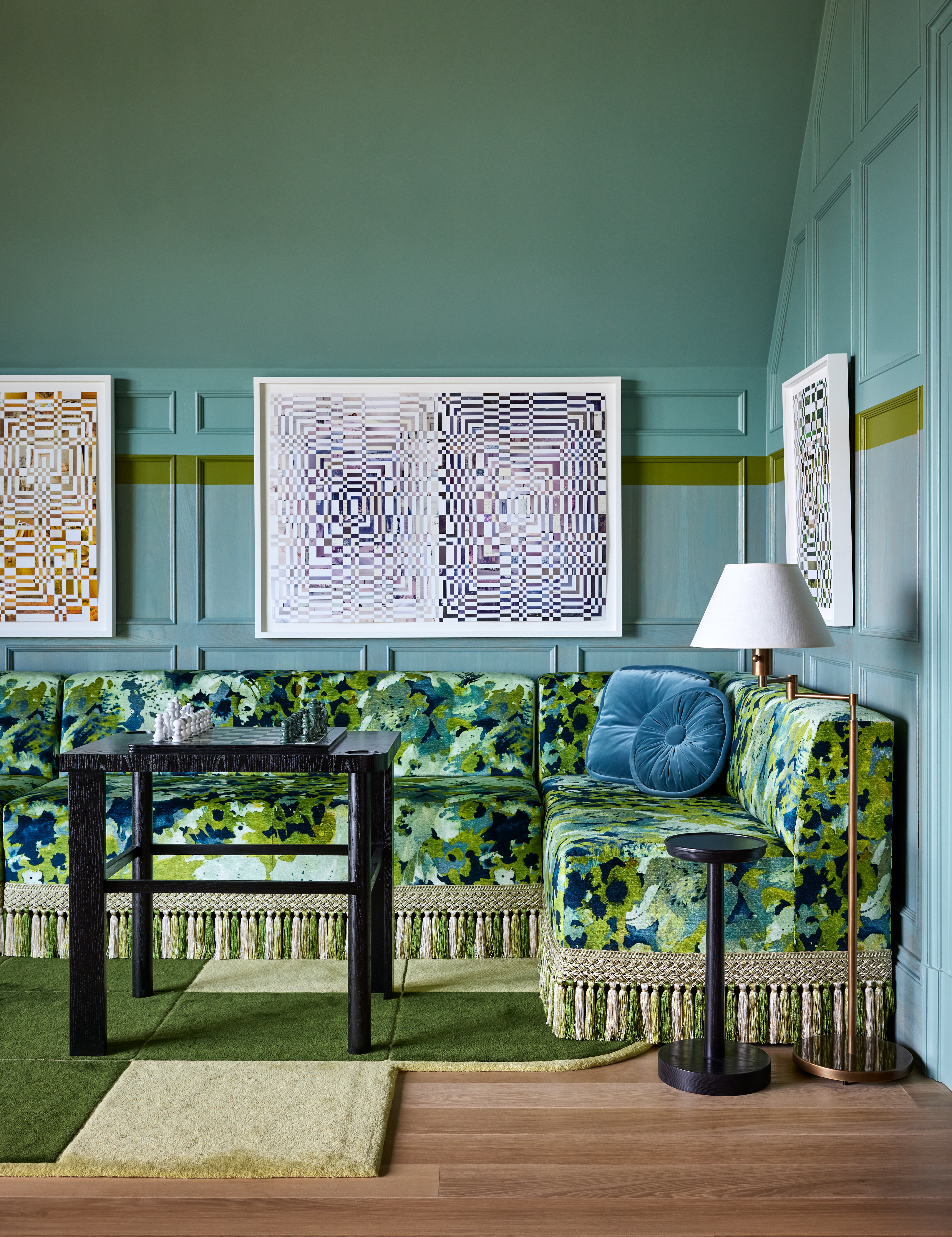
Annica Wallin, Executive Creative Director at wall art brand Desenio, adds that it sometimes helps to look at the bigger picture (quite literally). “Thinking of the gallery wall as one large picture can help you envisage each piece as part of a whole, to ensure all of the images work well together," she notes. "Including a range of sizes will help to make the wall more visually appealing.”
3. Getting "Hung up" on Positioning

There is something naturally pleasing to us about symmetry, patterns, and centering, however, homes have to balance the practical with the beautiful. Evenly spaced-out art isn’t always possible to do and light switches, thermostats, and other fixtures that contractors may have placed in the home can prove costly to relocate.
Luckily for your wallet, art placement doesn’t need to look geometrically perfect, and letting the quest for uniformity go can help create a more organic feel. Cliff suggests looking beyond rectilineal canvas art and trying to incorporate irregular shapes which are still very satisfying to look at when placed off-center.
Even in the case of uninhibited walls, not paying too much attention to the distance between art can give the space a more “lived-in" feel, which is especially helpful when hosting. Perfectly placed and curated art can transport any guest to a museum, but the grandeur risks reading as intimidating. Slightly off spacing helps guests to feel that they can be themselves in your space — who doesn’t want that?
If you're really worried about where your pictures should go or how high you should hang art above furniture, Annica does have a golden rule instead of relying on guesswork. “Applying the ‘57-inch rule’ is an excellent standard to follow when positioning wall art, as it’s commonly known as the most accurate height for hanging prints from the floor," she explains. “Simply measure 57-inches from the floor and make a mark on the wall in the middle of where the frame will be. The rule is designed to ensure the framed print is aligned to meet the eyeline of the average person." Annica
Whether you’re starting from a clean slate or have an art collection that you’re eager to reshuffle, avoiding these common mistakes will help you create the perfect environment for comfort and conversation.


