Whether you’re thinking of completely overhauling your home’s - or just a room’s - colour scheme or wondering what shade to pair with a colour that already features in your space, you’ve come to the right place to find the best colour combinations, as recommended and approved by colour and interior experts.
When trying to figure out what shades pair well together, utilising the colour wheel comes incredibly handy. But, of course, you need to know how to use it first.
‘The colour wheel is one of the most useful tools you can have when decorating, but I think people often assume it's far more complicated than it actually is,’ explains Tash Bradley, director of interior design at Lick. ‘The first thing to remember is that the colour wheel isn't there to tell you exactly which colours to choose. Instead, it's there to help you understand why certain colour combinations feel balanced and harmonious, whilst others can feel a little jarring.’
Below, we touch on some of the basics of using the colour wheel, while also providing a bit of a cheat sheet for the most fail-safe colour combos you could possibly go for in your home. And if you’re ever in doubt how much of each colour to use, refer to the 60-30-10 colour rule.
It’s also important to remember that a blue is not just a blue or yellow is not just yellow – every shade has a different undertone. And when pairing two (or more) colours together, it’s important for them to have similar undertones. ‘The most important thing to look at is undertone,’ says Emily Butterill, founder and creative director at Glow Lighting. ‘Colours can clash when their undertones are working against each other, even if they look similar at first glance. A warm pink, for example, will feel very different from a cooler, blue-based pink, so it is always worth checking how shades sit together in the room itself.’
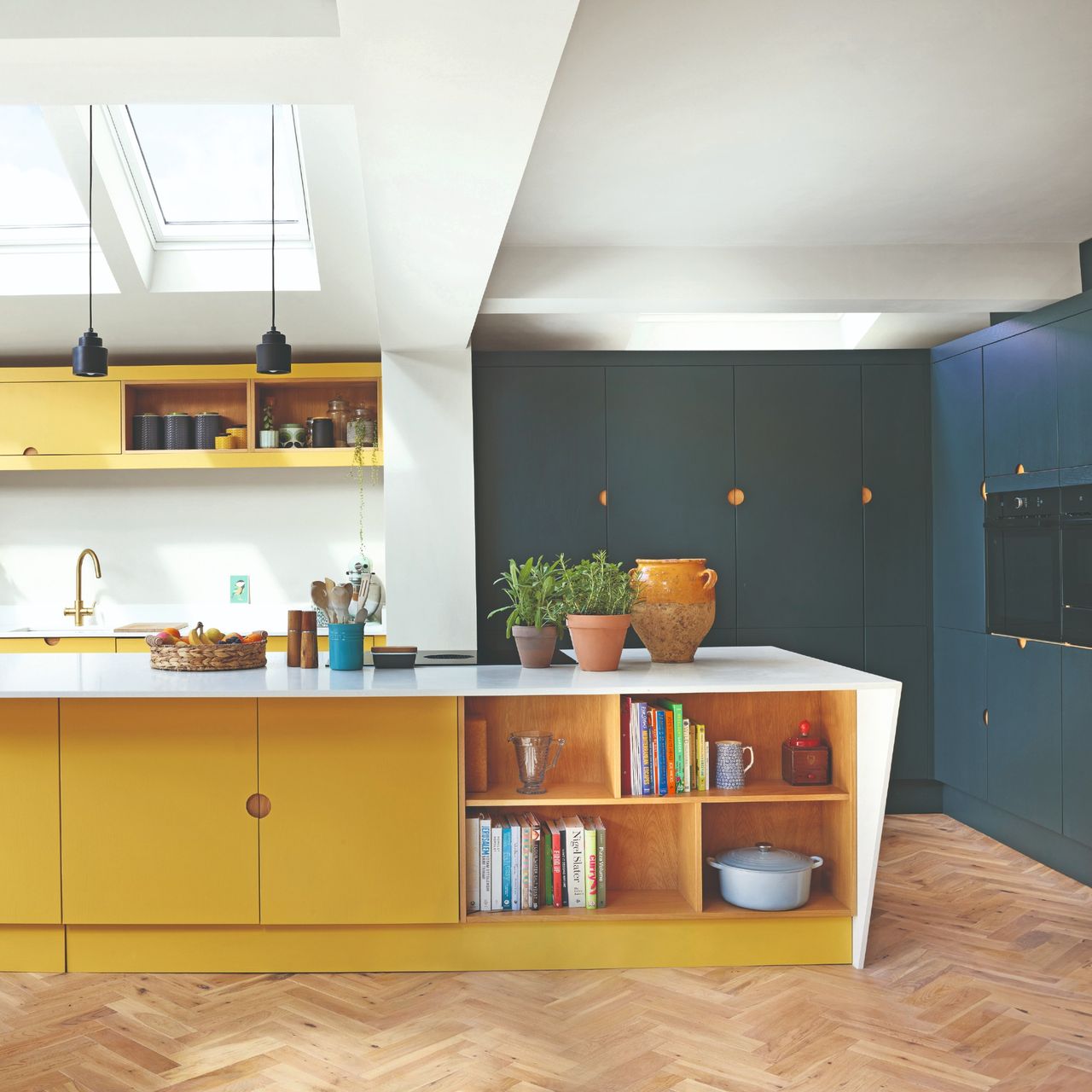
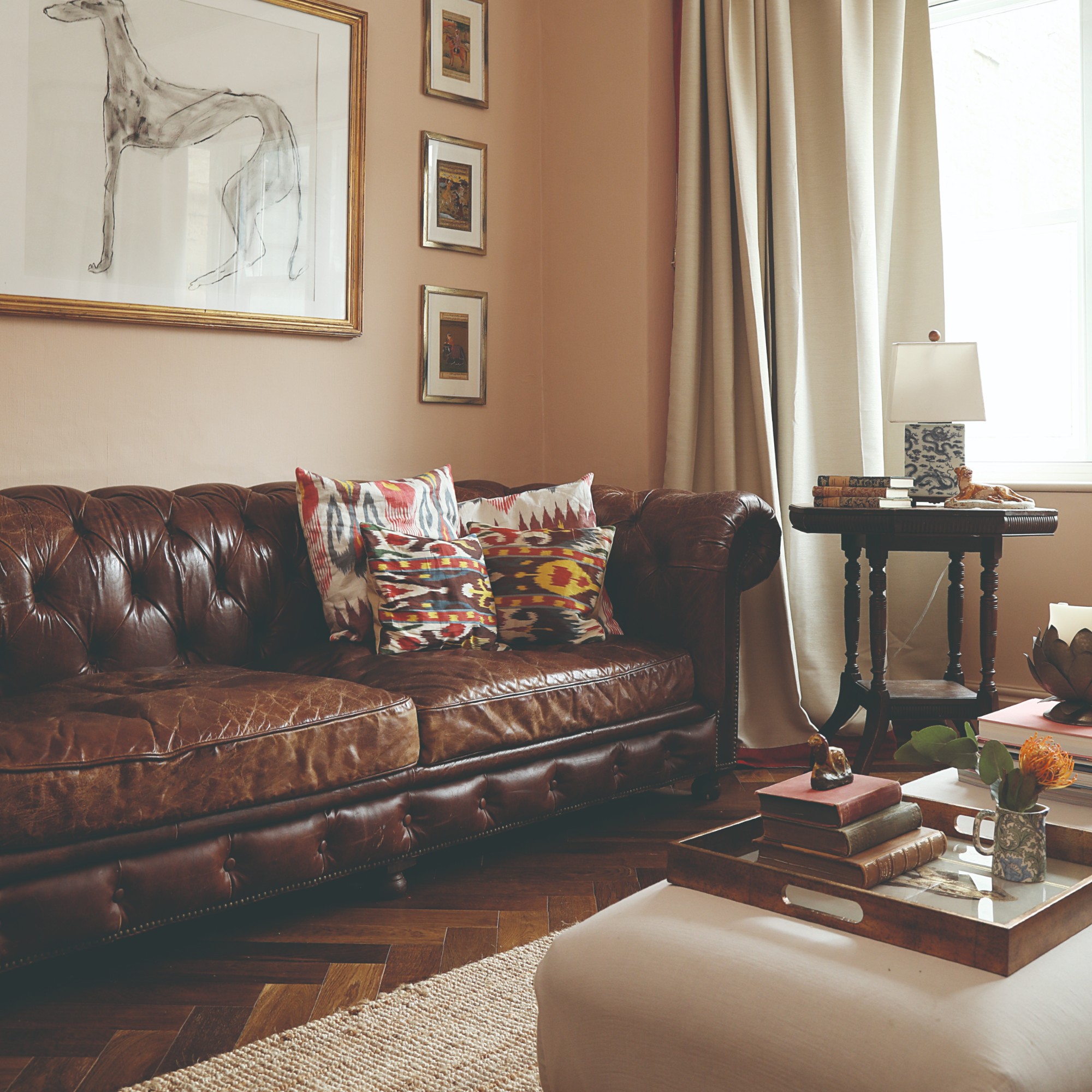
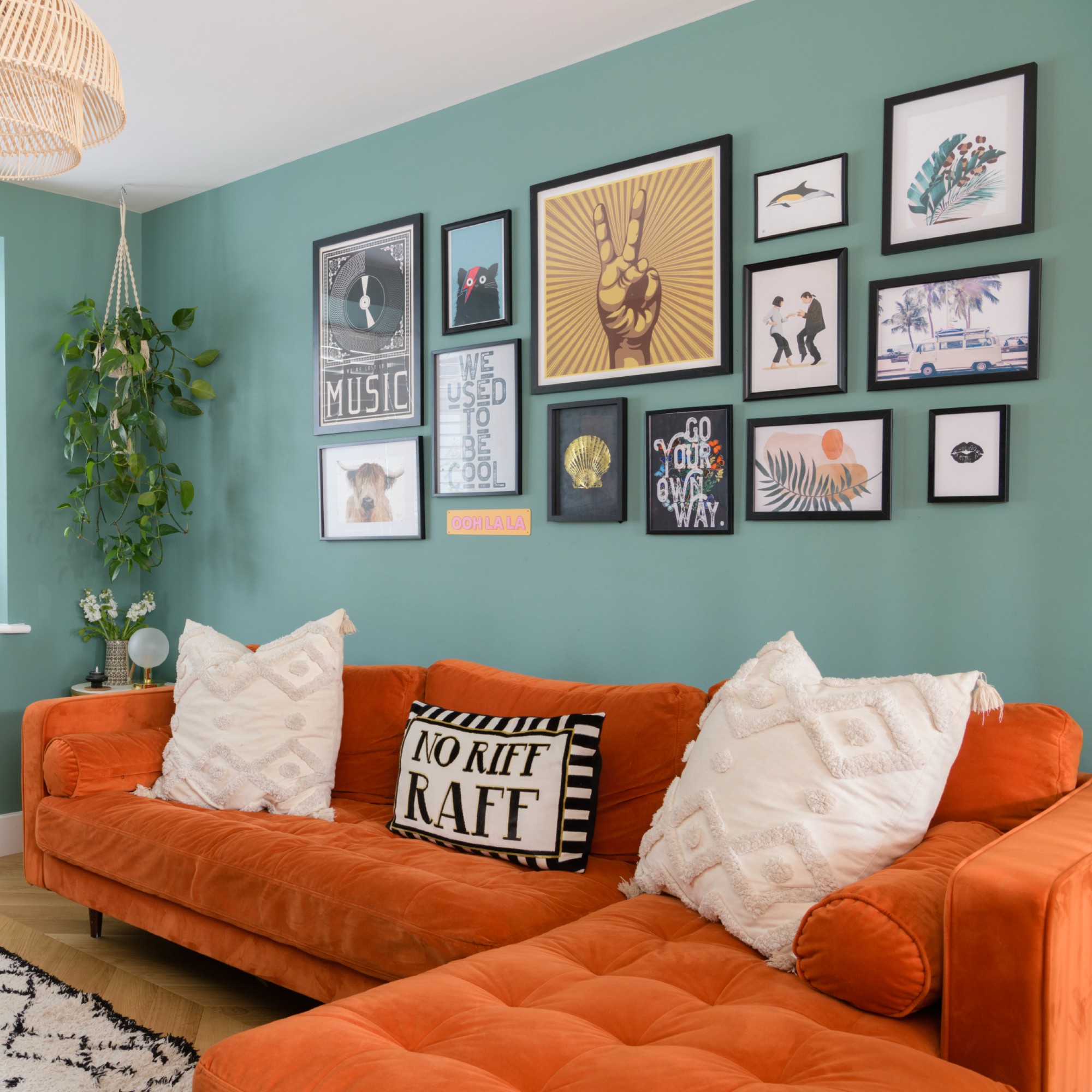
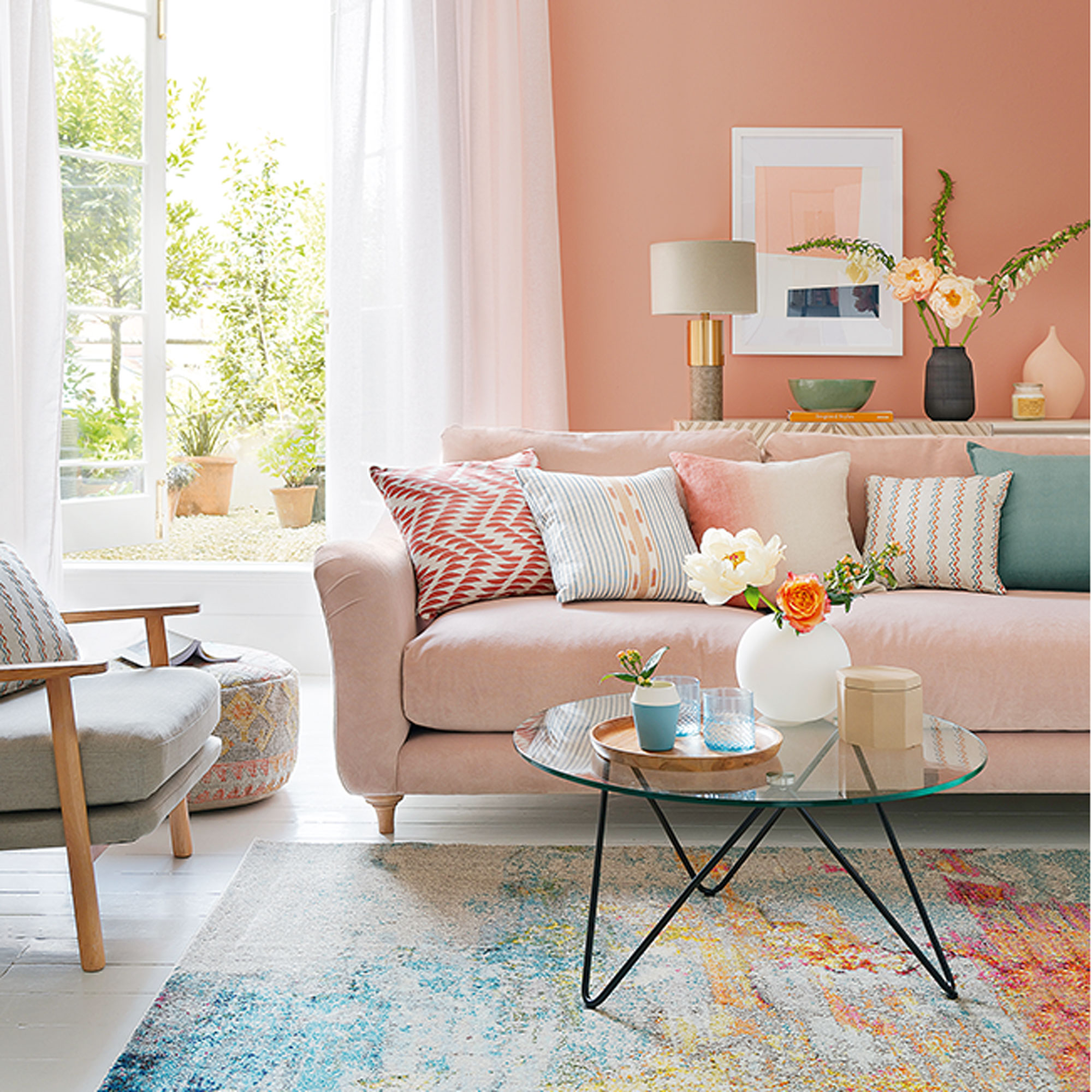
1. Soft blue and earthy orange
‘One of the easiest ways to use the colour wheel is to look at complementary colours,’ Tash at Lick starts. ‘These sit opposite each other on the colour wheel, such as blue and orange. Because they naturally create contrast, they bring energy and balance to a space.’
Pairing blue and orange is a complementary colour scheme that interior pros come back to time and time again. And while you can go for different shades of blue and orange, combining a soft blue with an earthy orange shade is one of the most popular takes on the look at the moment.
‘One of my favourite examples is a soft blue room paired with rust or burnt orange accents. The contrast makes both colours feel richer without either one overwhelming the space. Blue is often referred to as the colour of the mind, and the lighter the shade, the more mentally soothing it tends to feel. Colours like Blue 01 and Blue 02 [both available at B&Q] create a beautifully calm backdrop, whilst introducing a burnt orange, terracotta or rust tone through a sofa, armchair or textiles creates that wonderful complementary colour contrast. The result feels balanced, uplifting and effortlessly timeless,’ Tash says.
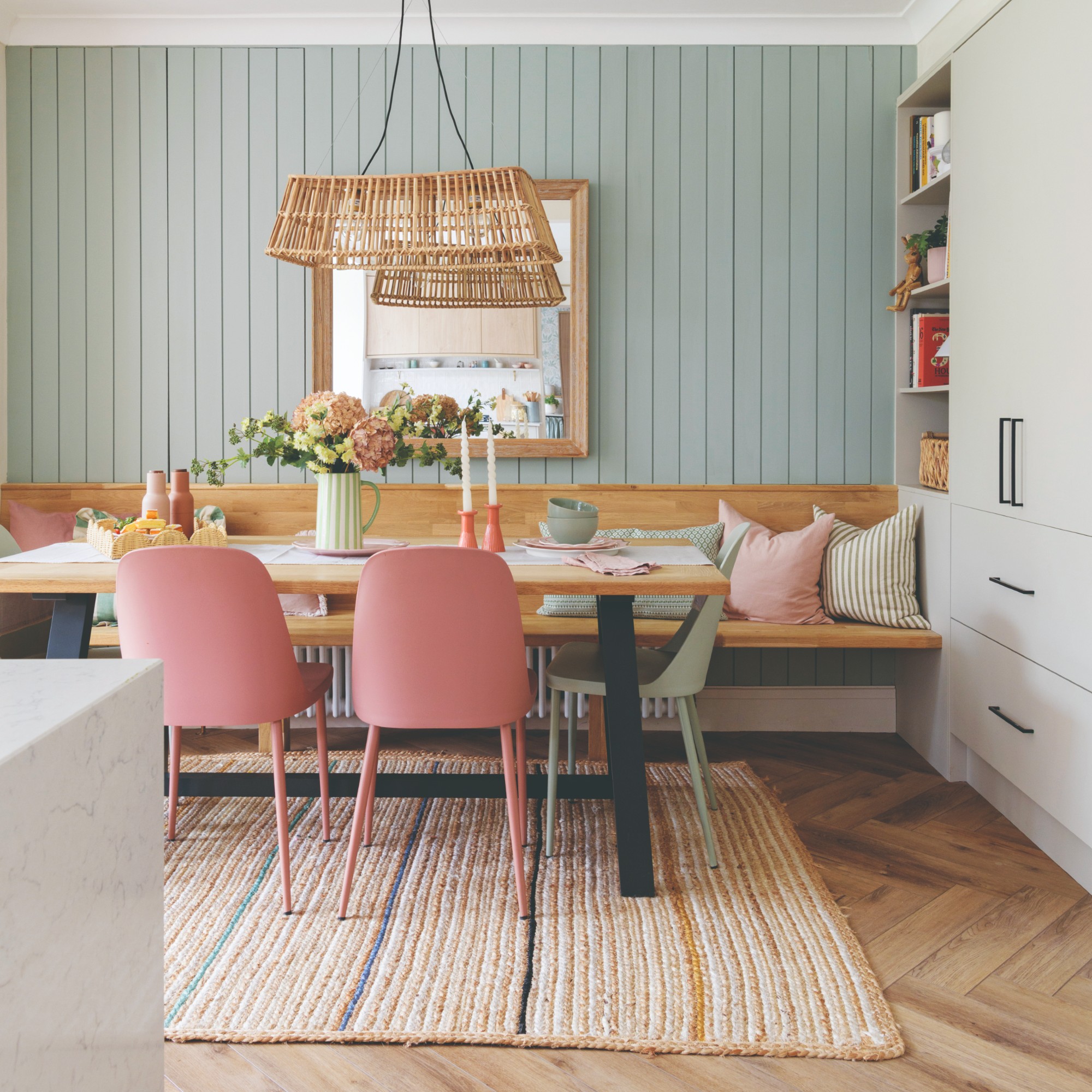
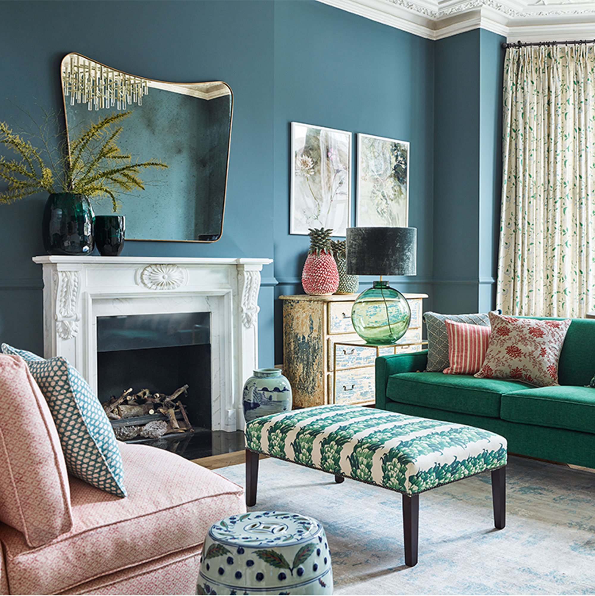
2. Dusky pink and forest green
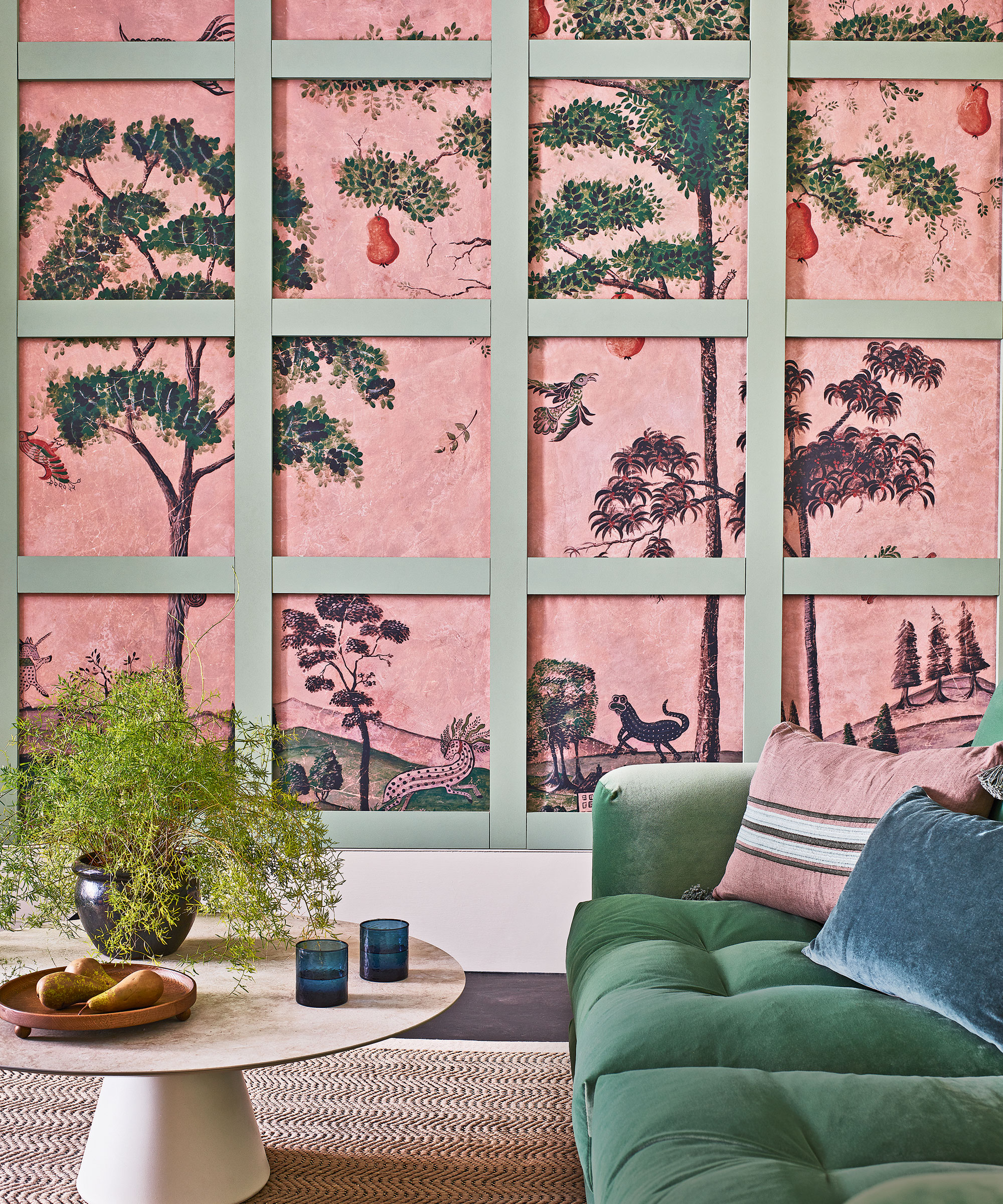
If you’re ever unsure about colour pairings, nature is a useful guide and inspiration for combining colours. One popular nature-inspired colour combination that many people opt for is pink and green.
‘Pink and green is a natural combination, reminiscent of the harmonious relationship between flowers and greenery,’ says Ruth Mottershead, creative director at Little Greene. ‘The traditional pairing of a natural green and light pink provides gentleness and tranquillity. But you can also bring a contemporary twist by incorporating unique, unexpected pink and green shades. Add impact to Pea Green walls with the statement bright pink, Leather.’
Tash at Lick adds, ‘Another combination I'm finding myself recommending more and more is a rich forest green paired with a soft, dusky pink. Through our recent collaboration with Hunter and the launch of Green 170, I've completely fallen in love with this palette. Green 170 is that beautiful heritage forest green with a strong blue undertone running through it. To balance that richness, I love pairing it with a pale pink or dusky pink sofa. The softness of the pink instantly lifts the scheme and stops it feeling too heavy, whilst the green provides all of the depth and grounding.’
3. Pink and brown
Speaking of pink, there are a few different colours that pair well with it, not just green. And if you want to create a more sophisticated yet cosy colour palette, pairing it with brown is the way to go.
‘The brown-and-pink combination in particular feels very contemporary whilst still being wonderfully cosy. You can create a scheme that feels sophisticated, layered and incredibly liveable,’ Tash at Lick says.
4. Red and green
Since green is a colour that you can see everywhere in nature, it pairs well with most colours – it’s almost a neutral really. But there are certain colours that really make green sing when combined with it – and red is one of them. In fact, this is another example of a complementary colour scheme, similar to the pairing of blue and orange.
‘Red and green is a tried and tested colour combination, these shades are on opposite sides of the colour wheel and provide a confident contrast. This pairing will fill your scheme with personality, creating an engaging and inviting atmosphere – ideal for high-traffic, energetic spaces such as kitchens, utilities and boot rooms,’ Ruth at Little Greene says.
5. Blue and yellow
There’s a reason why IKEA’s colours are yellow and blue – it’s a colour pairing that just works (while also referencing the colours of its native Swedish flag). But given the association, you can opt for different shades of yellow and blue than the retailer.
‘Blue and yellow is another inviting, complementary colour pairing. Depending on the shades used, this colour combination can have a charming, traditional feel. Or certain blues and yellows can appear striking and contemporary. Use the confident mid-blue, Air Force Blue, alongside warm yellows, Carys and Light Gold. Doing so will create a joyful living space that’s redolent of the sun in the sky,’ Ruth at Little Greene suggests.
6. Charcoal and terracotta
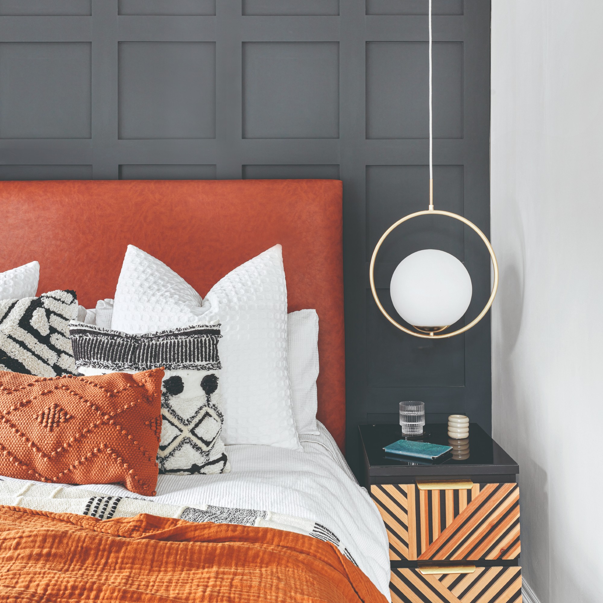
If you’re after a colour scheme that feels particularly sophisticated and grown-up then combining deep charcoal with earthy shades of terracotta and rust would be our top recommendation.
‘Charcoal with rust or terracotta is a combination that works beautifully in the home because it feels considered but still very liveable,’ says Spencer Lee, founder of Lakeland Furniture. ‘Neutrals and natural tones are particularly easy to work with because they create a calm foundation, while richer accent colours can be used to add personality.’
7. Soft green and off-white
When it comes to calm colour schemes, it doesn’t get much more soothing than the combination of soft green shades like sage and creams and off-whites.
‘Soft green with warm white is a particularly strong pairing because it feels calm, natural and architectural,’ explains Ian Reynolds, founder of Mittsu Japanese Tiles. ‘Green has an organic quality, while warm white keeps the scheme fresh and balanced rather than cold or clinical.’
8. Pastel shades
‘Some of the most effective colour combinations are those that sit within the same tonal family, because they feel considered without looking too matched. Pink, lilac and light blue work beautifully together because they are soft pastel tones. A pastel palette works because each shade has the same lightness. They create a calm, uplifting scheme that feels gentle, fresh and easy to live with,’ Emily at Glow Lighting says.
Pastel colour palettes are surprisingly versatile and work well in so many different spaces – whether it’s a calming bedroom colour scheme or as an edible kitchen colour scheme.
9. Blue and white
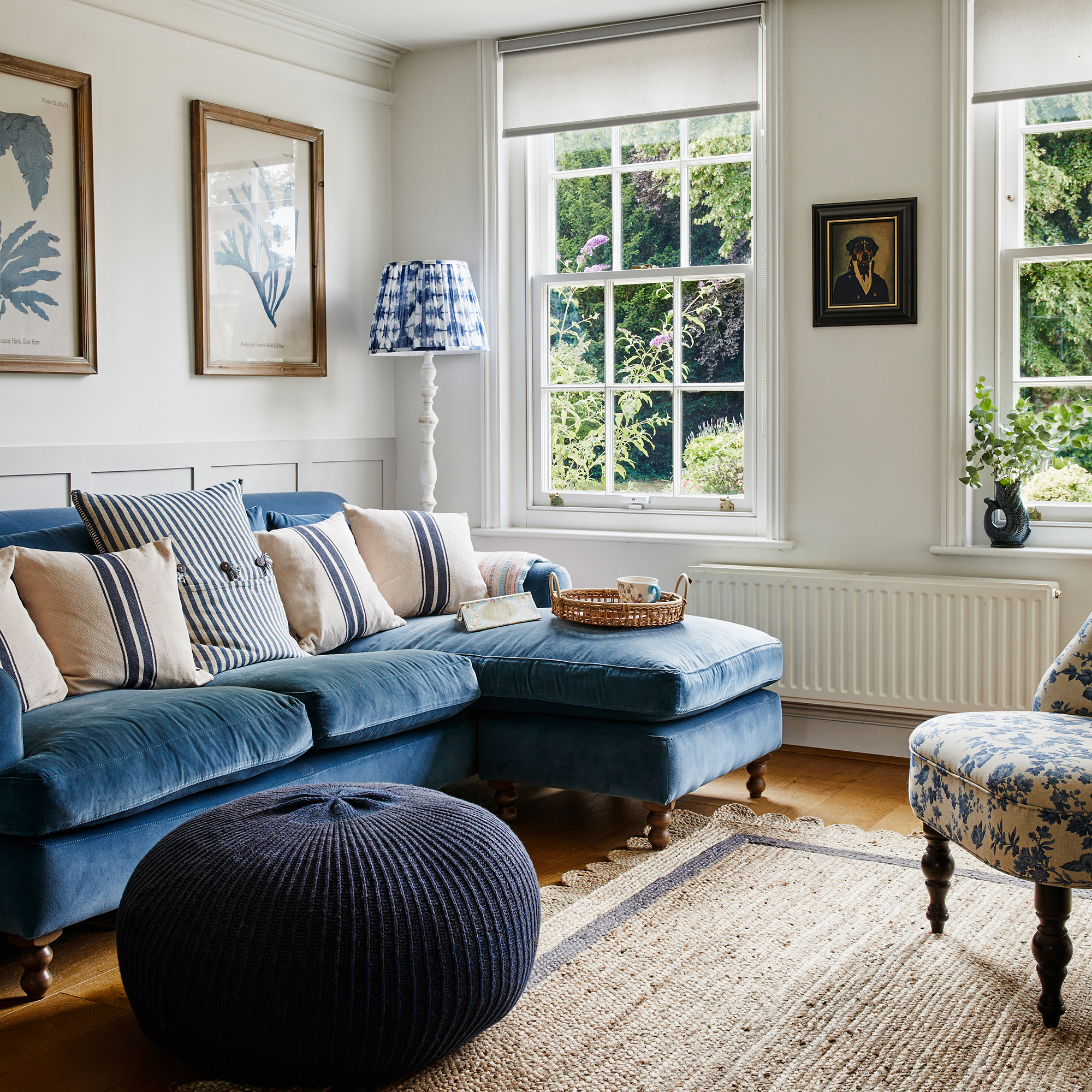
Not much beats the beauty of a blue and white coastal bedroom or living room scheme – textured panelled walls, a comfy blue sofa and perhaps even pops of pale blue and taupe.
'Deep blue with off-white is another beautiful combination, especially in kitchens and bathrooms where you want depth without making the space feel too heavy. Blue brings richness and atmosphere, while off-white softens it and keeps the overall look timeless,' Ian at Mittsu Japanese Tiles says.
10. Teal and mustard

If you're struggling to come up with a combo that you love then look to the past for inspiration – there are so many eras to choose from but the 70s are having a resurgence in home decor trends and they have some fabulous colour schemes to copy.
'For a statement look, opt for a 70s style colour combination, such as mustard and teal, and pair with dark wood cabinetry,' says Elizabeth Sherwin, creative director at Naked Kitchens. 'This unexpected combination oozes character, perfecting the balance of a vibrant yet mature space, creating a harmonious environment. To modernise the look, think about incorporating a bold pattern and select a few key features such as brass fixtures and make them work seamlessly throughout the design.'
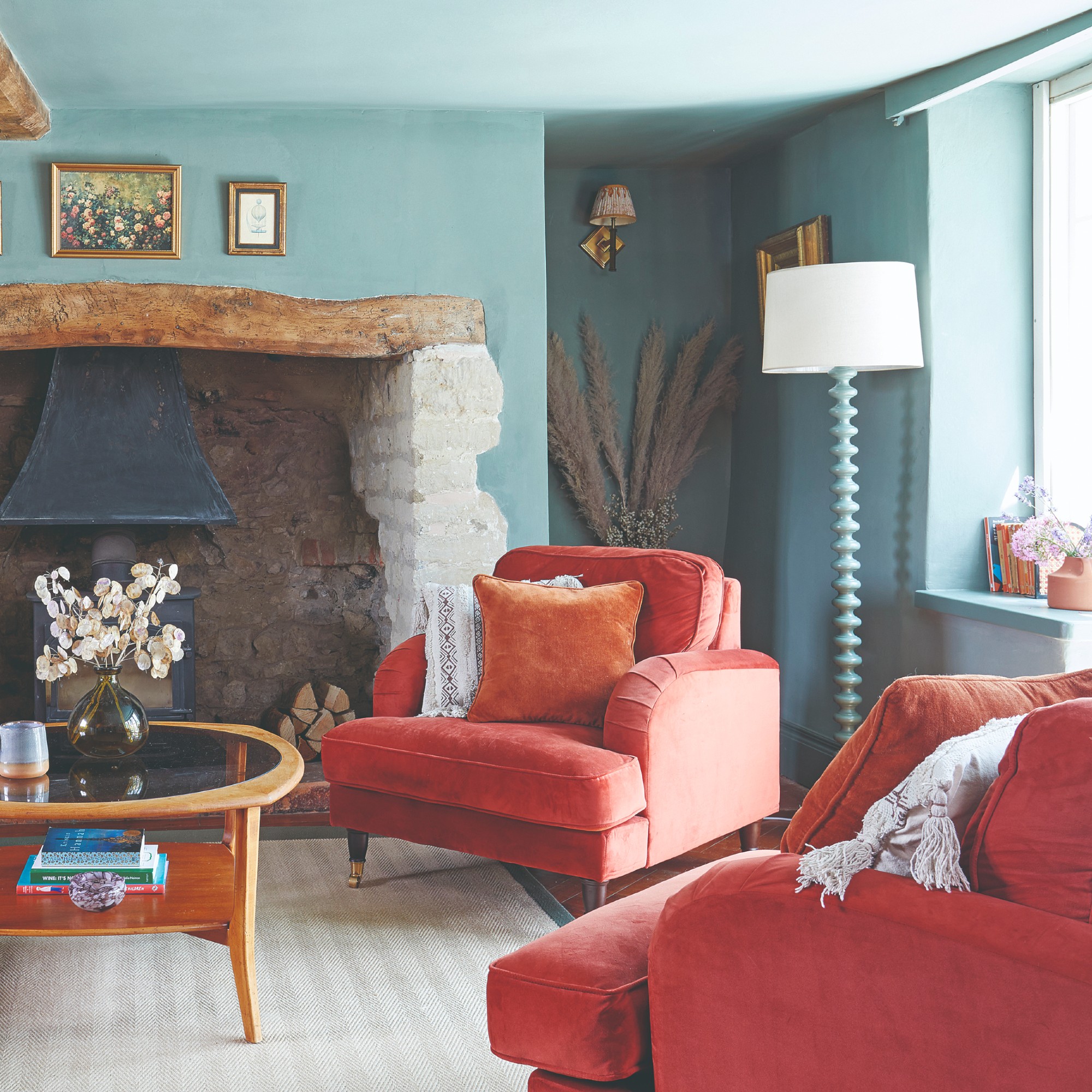
11. Charcoal and navy
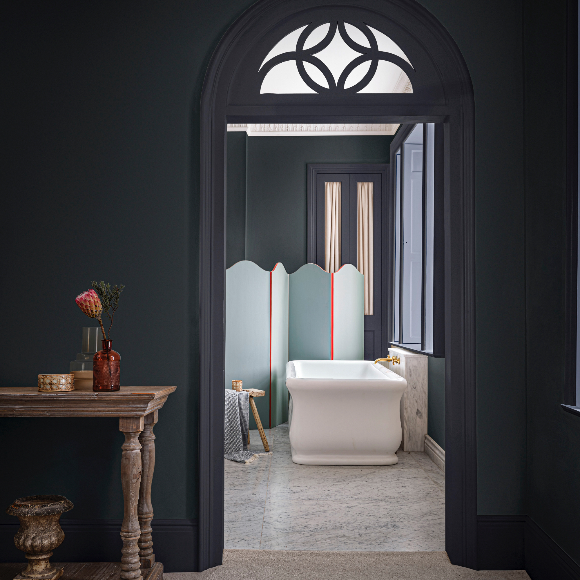
There are so many wonderful colour combinations to choose from and one way to create a soothing feel even if you prefer the moodier end of the colour palette is to pick two shades that are similar in tone.
'Blues are well-renowned for being the most calming of all colours, so pairing soft pale blues with a deeper blue creates a harmonious colour wash to create a restful environment,' says Anna Hill, brand director at Fenwick & Tilbrook. 'We love our Cool Breeze with Great Lake or Temple Linen, or as seen in this bathroom image, inky tones of Flat Iron and River Stone balanced out with paler Oceans and Aged Copper creating a rich and restful scheme.'
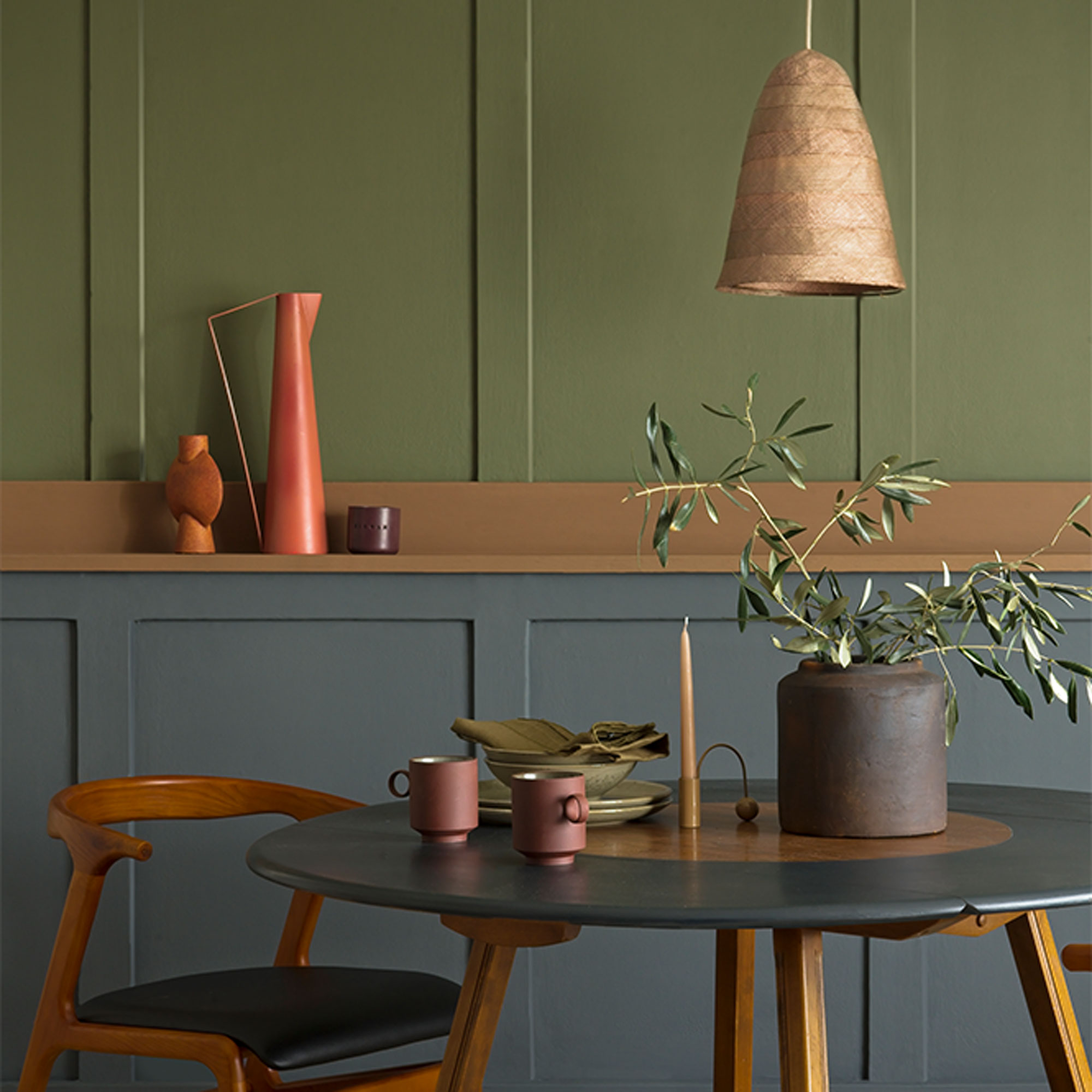
12. Green and orange
Green is a dynamic but refreshing colour that can make a relaxing backdrop for a living room. But it’s the accent details that will bring it to life, from burnt orange and tan leather on cushions and upholstery to flashes of gold and copper on accessories.
'Introducing burnt orange through upholstery or accessories gives the scheme more depth,' Spencer at Lakeland Furniture says.
13. Dusky pink and berry shades
Pink is a versatile colour that can work in any space. Try dusky pink teamed with swirls of raspberry and damson for a grown-up look that is anything but saccharine. 'You can also look at analogous colour schemes, which are colours that sit next to each other on the wheel, such as pink and red,' Tash at Lick suggests.
'It’s always interesting to see what the latest colour combinations are for the coming year,’ says Justyna Korczynska, senior designer at Crown. ‘Look at magazines, social media and blogs for inspiration and to see new trends and what colours you are naturally attracted to.’
‘People are becoming much braver with their painting skills, often creating impressive designs and effects with different colour combinations.’
14. Calming neutrals
Warm, earth-toned colours will make any space feel cosy and inviting, so a tonal neutral palette like this is perfect for a soothing bedroom scheme.
‘To achieve a chic and contemporary scheme, style pale and earthy browns with coral and salmon pinks. Finish with accessories in a bolder colour, such as ochre or burgundy, depending on the tone of pink you choose,’ says Sue Kim, senior colour designer at Valspar. ‘Adding textures, such as silk cushions and woven rugs will elevate this further and prevent the scheme looking dull or flat.’
15. Teal and emerald
Team plush teal with emerald green for a grown-up living room scheme that feels rich and enveloping. Darker colours like this, that sit next to each other on the colour wheel, add depth and visual interest but as there are no harsh contrasts the scheme won’t feel jarring on the eyes. Accents of warm corral picked out in patterns and prints will bring warmth to temper teal’s coolness.
‘Use touches of coral in three different areas to create a triangle that brings a sense of balance to the space,’ says Ideal Home’s former Decorating Editor, Nicky Phillips.
16. Coral and cool tones
Faded tones of terracotta and soft coral will give any room a warm, natural glow so are ideal for living rooms and bedrooms. Coral comes alive in summer sunlight, but on cold grey days it will lend a gentle warmth, so is an easy fix for north-facing spaces. Shades of cool grey and fresh blue are perfect accent colours that will bring balance to a warm coral scheme.
'For a soft, whimsical look, choose a warm neutral such as peach as your foundation, then turn to the colour wheel to find a complementary partner,' advises Helen Shaw, international director of marketing at Benjamin Moore. 'A mid-green works beautifully, striking an ideal balance between serenity and vibrancy.'
17. Stone and sunny yellow
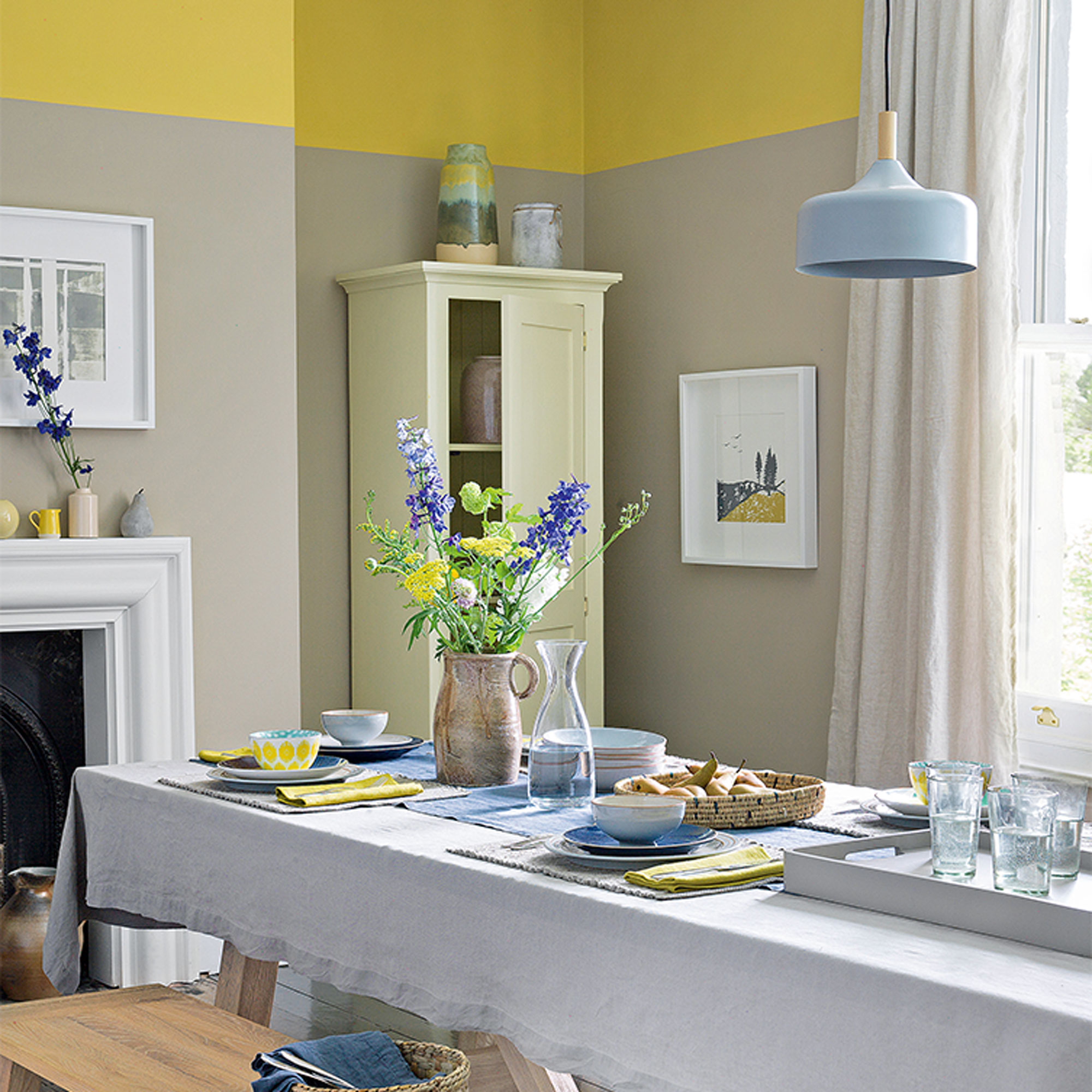
While neutrals make grounding backdrop colours, they can feel flat and cold without another colour to lift them. Warm yellow will bring instant sunshine to a space and it won’t take an overload of colour to work its magic. Brighten up a neutral dining space or breakfast room by painting a band of sunny yellow around the top of the room and tie the scheme together with warm yellow tableware, ceramics and linens.
‘Brown neutrals can be sludgy and dull unless you cut through them with the right accents. We used mimosa yellow and calm, denim blue,’ Nicky Phillips says.
18. Earthy naturals
It makes sense that colours that sit naturally together outdoors will work equally well indoors too. Colours of nature can have a calming, restorative effect when used inside the home and sit well with furniture in rustic timbers, natural stone and woven textiles. Bring outdoor greenery into the mix with plants and foliage that will aid the feeling of wellbeing.
‘Grey and brown are both earthy, neutral colours but they can go well together. If paired thoughtfully you get an organic look that captures the natural beauty of wood and stone,' says Marianne Shillingford, creative director at Dulux. 'Grey is cool, versatile and casual so it can work as a canvas on which to express yourself, whilst warming browns make a living room cosy and inviting.'
19. Midnight blue and blush
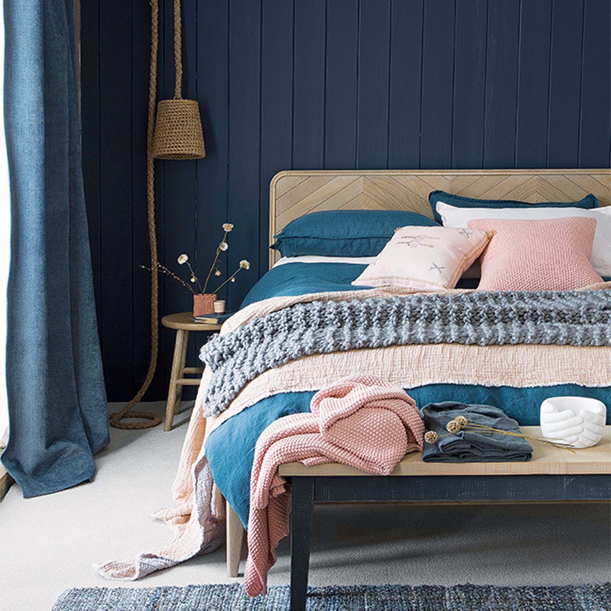
Ink is the darkest of the blues and the perfect colour choice for a blue bedroom idea, making the space feel instantly calm and relaxed. Dramatic and immersive when used on its own, give inky blue a softer, more feminine edge by pairing it with delicate blush pink. Faded linens and soft, tactile knits in delicate pinky tones will add warmth and help to lighten the mood a little.
‘With so much colour going on, don’t complicate a scheme like this with bold or busy patterns. A touch of stripe or a soft sketchbook motif is enough,’ Nicky Phillips says.
FAQs
What are the most calming colour combinations?
Calming colour combinations are those that have the same tonal value. This is they have the same visual impact as each other, one of the colours isn't brighter or darker than the other, rather they match.
Take pastels shades as an example, a pale blue and a pale pink will have the same tonal qualities which means they will be harmonious when used together. If you add in a dark or brighter shade you'll be adding contrast.
What colours work well together?
A tonal scheme is a good place to start if you are unsure about which colours to put together. Also known as tone on tone, this type of scheme is the simplest of all the colour recipes you can use to decorate with as it includes only different tones of one colour (both lighter and darker).
A harmonious scheme uses shades that sit next to each other on the wheel. Choosing adjacent colours is a straightforward way of creating an easy-to-live-with scheme and harmonious colours are the most widely used group in interior design.
A contrasting colour scheme (also known as complementary colours) is created by using two colours that sit opposite each other on the colour wheel. This is often the most challenging of the three schemes to get right, as colours can be cold and warm, or equally vibrant.
How do I choose a colour combination?
To choose the best colour combinations it can help to follow the 60-30-10 rule when choosing combinations and determining what colours go well togther. This works by dividing a colour scheme into percentages, with one main colour that represents 60% of the scheme - this could be wall colour, flooring or furniture.
The secondary colour should then represent 30% of the decor, which again, might be furniture, curtains or soft furnishings. Finally, the last 10% of the colour scheme should be designated to an accent colour, used for accessories, such as cushions, lamps, ceramics and wall art.
‘The best colour combinations are not always the most dramatic; they are the ones that still feel balanced and beautiful over time,’ Ian at Mittsu Japanese Tiles concludes.