Choosing a color scheme for a living room is an exciting project. Being one of the most used rooms in the house, it's a wonderful opportunity to create something unique that truly reflects your personal style.
However, as a space that often serves several functions, the living room can be tricky to get right when it comes to decor. Primarily used for relaxation, but also for entertaining, play, work, and hobbies, these multipurpose spaces need careful planning to ensure they capture the correct mood. Add to the mix the endless inspiration available, and living rooms can cause a color conundrum.
So, where to start with a living room color scheme? If you’re struggling to pin down a palette, then don’t fear. With the help of interior designers and paint experts, we’ve put together a handy guide to help you on a path to decorating success. Whether you’re after a serene and timeless retreat or vibrant living room color ideas that always put a spring in your step, these stylish schemes and helpful tips are guaranteed to inspire.
How to Choose a Living Room Color Scheme
Choosing a color scheme is one of the most important decisions you’ll make when decorating a living room, but it needn’t be daunting. Breaking it down into a 5-step process can make it more manageable. Of course, there’s no right and wrong when it comes to design – in fact, some of the best interiors come about after breaking design rules; however, having a structure in mind along with some basic design principles will help you on your creative journey. Before you start, it's also a good idea to familiarize yourself with the latest living room color trends for inspiration.
Step 1 – Review What You are Working with
When developing a living room palette, there’s such a wealth of inspiration that it’s easy to get ahead of yourself, but first and foremost, pay close attention to what you already have. The architecture, room orientation, vistas, materials, and furniture should all be considered and can help signal what palette may best suit the space.
Step 2 – Choose a Base Wall Color
The dominant wall color will set the mood for the room. Once you've noted all the existing features, ask yourself what mood you'd like to create in the space. If comfort is the priority, then warm, earthy shades are guaranteed to soothe. Alternatively, for fresh, uplifting yet calming spaces, cool greens and blues may be the way to go. If you're struggling for inspiration, a hero fabric or a favorite piece of artwork may spark an idea.
Step 3 - Build Your Palette and Select Supporting Colors
When creating color schemes, the rule of thumb for many designers is to limit schemes to 3-5 colors; too many and it can cause visual chaos, too few and the scheme can feel flat and lifeless. Once you have a rough idea of your base wall color, the next stage is to choose secondary and tertiary tones to support and complement the dominant color. To help with proportions, you can exercise the 60/30/10 principle outlined below.
Step 4 – Add in Accents and Contrast
Incorporating accent colors over furniture, lighting, soft textiles, accessories or artwork is a wonderful way to lift a scheme and create focal points throughout the room. The color wheel is a brilliant tool for finding complementary accent colors.
Step 5 – Create Layers and Depth
Texture and materials are integral to any successful living room scheme and are just as important as color in setting the mood. When color-scheming, it's important to keep the materials and textures you plan to furnish with in mind, as they can transform how a color behaves. Adding in warm, earthy textures will instantly ease cool blue schemes, while adding elements of black is a trick many designers use to bring definition to neutral schemes. Lastly, don't overlook paint finishes, as this can transform texture and atmosphere. Flat, chalky formulas can offer a rustic, calming feel, while glossy finishes add vibrancy and luxury.
How to Choose Living Room Colors That Work Together
Choosing colors that work together is one of the trickiest parts of interior design, even for seasoned designers, and it can take lots of sampling and trial and error to get right. However, there are some principles and formulas that can help you on your way. Below, we've outlined some ways designers reach their living room color combinations.
Ultimately, it all stems from what mood you want to create and how you plan to use the space. 'Every palette starts with a feeling. Before settling on specific shades, it helps to ask how you want the room to feel – calm and comfortable, warm and welcoming, or more layered and expressive. That emotional starting point shapes every decision that follows. Kayla Kratz, Director of color and design strategy at Behr.
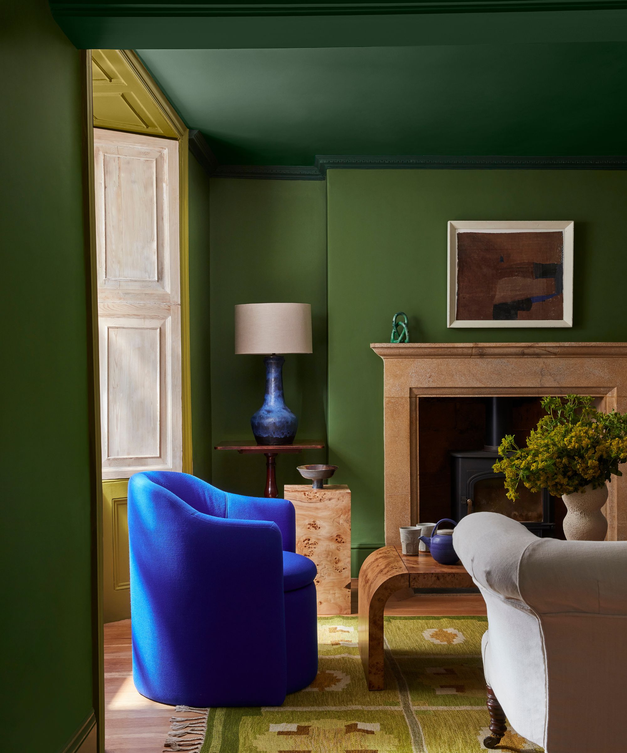
When it comes to room color schemes, there are three palette formulas which can be helpful to refer to: monochrome, which features multiple tones from within one color family; analogous, which combines colors that sit next to each other on the color wheel; and complementary, which pairs colors from the opposite side of the color wheel.
‘Subtle monochromatic schemes are the most accessible and use shades of the same color to add slight contrast. Analogous schemes, which employ adjacent tones on the color wheel, offer a more adventurous take, whilst complementary tones taken from opposite sides of the wheel always deliver drama whilst maintaining a sense of harmony,’ explains Helen Shaw, director of marketing, international, at Benjamin Moore.
The monochrome palette is often the best choice if you're looking for a living room color scheme that's harmonious and cohesive. 'Pair different values, the lightness and darkness of a color, and saturation, to create a subtle yet striking contrast. For instance, if blue is your focal color, combine a light sky blue with a deep navy and a neutral gray-blue,' suggests Hannah Yeo, senior manager, color Marketing at Benjamin Moore.
Analogous schemes comprise tones adjacent on the color wheel, for example, greens and blues, or oranges and yellows. These are great for creating cohesive living room color schemes with a little more depth. 'Analogous colors, found adjacent on the color wheel, can create harmonious blends. Pair a mossy green with a soft teal and sapphire blue for a soothing effect,' suggests Hannah.
On the other hand, a complementary scheme brings together contrasting tones, for example, orange and blue or pink and green. For those seeking a striking, dynamic space, a complementary palette of highly saturated, contrasting shades is guaranteed to turn heads. Alternatively, soft complementary colors can have wonderful interest yet remain soothing.
Playing with the intensity of two colors that sit opposite on the color wheel is a great way to create playful, colorful living rooms. ‘The more contrasting your color combination, the bolder and more dynamic the scheme will feel,' explains Ruth Mottershead, creative director at Little Greene. 'Pairing confident hues with softer, more muted tones helps the bolder color sing without becoming dominant.'
Consider the Architecture
To ensure a living room scheme sits happily within its surroundings, the architecture should always be at the forefront when color-scheming. Pay attention to size, architectural features, and the surrounding views, as these will all give clues as to what palette might suit. ‘Color is relative and reacts to its surroundings, so you need to choose a paint color that works with all the design elements in the space. These answers can help you narrow down your color choices,’ explains Arianna Barone, color marketing manager at Benjamin Moore.
It's also important to consider the era of the property and its surroundings, as this could give pointers to a color scheme. ‘Think about what the architecture asks for, is it a crisp, modern space, a warm mid-century, a proper traditional house?’ suggests Courtnay Tart Elias, founder of Creative Tonic Design. ‘Consider the bones of the room, the setting of the home, and what the views are like from each window.’
The orientation of the living room and the light it receives is another crucial factor, as this will have a big impact on how wall colors look and feel. Color shifts depending on light, and what can work well in one room may jar in another. North-facing rooms receive cooler light while south-facing rooms receive warmer light. East-facing rooms cast bright, warm light in the morning to cool, gentle light in the evening, while west-facing rooms are the opposite and have an intense glow of the evening sun.
Think in Tones
Rather than choose a living room color in isolation, think in tones. Whatever color you choose as your main wall color, pairing it with similar colors and opting for a tonal palette across a space is an easy way to achieve color harmony. ‘Repeat hues thoughtfully, varying their depth to create visual movement while maintaining cohesion. Each area can have its own emphasis, but all colors should feel connected through shared undertones,’ says Emily Kantz, Color Marketing Manager at Sherwin-Williams.
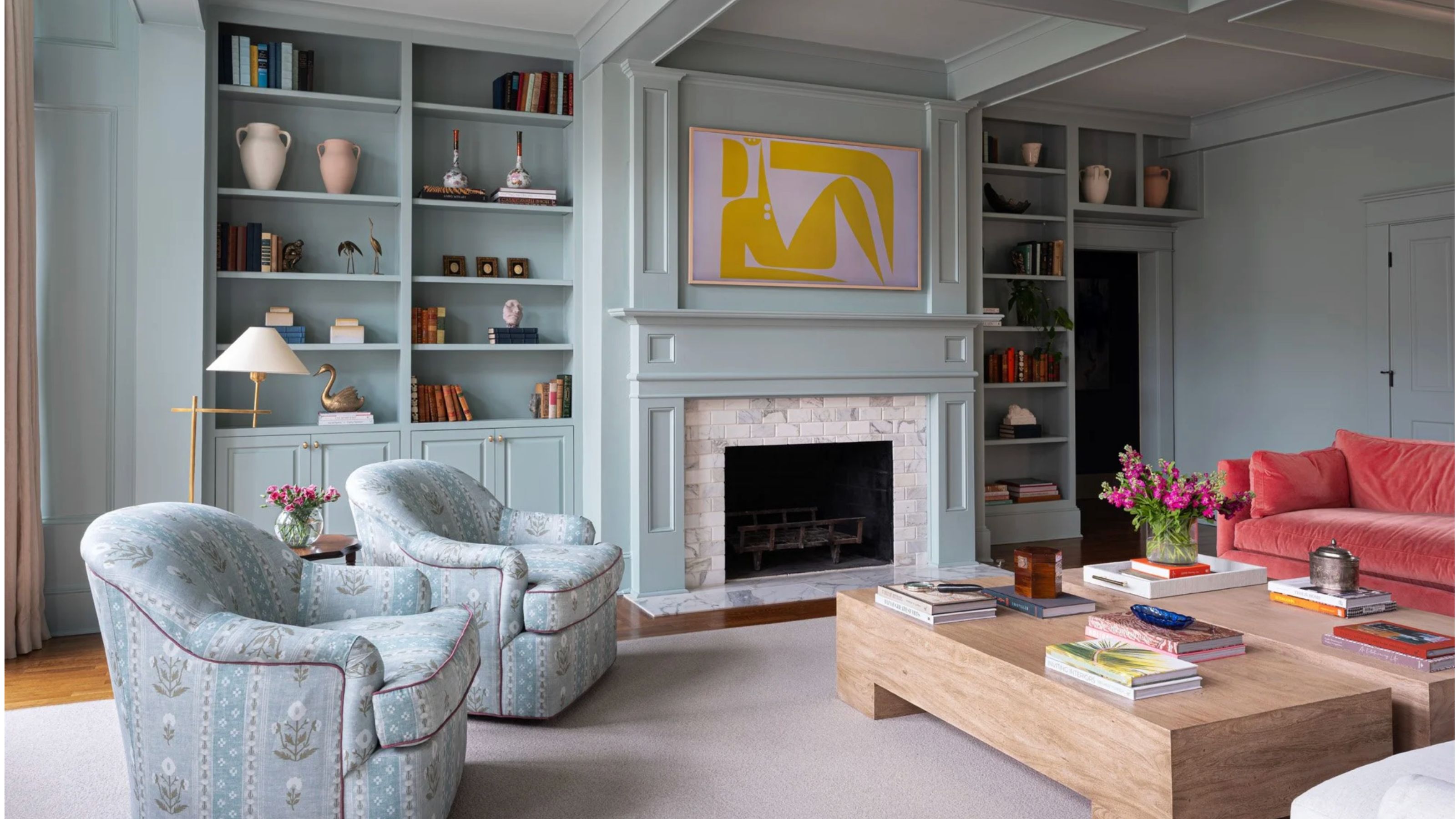
This tonal approach is an effective option if you’re looking for a calm, harmonious living room, especially if you opt for soft, gentle tones at the lighter end of the spectrum. ‘I love designing a living room with tonal variation; when the colors sit close to each other, with only subtle shifts in depth and temperature, the result feels very calm and cohesive. It creates a sense of continuity that’s easy to live with and doesn’t overwhelm the space,’ explains Louise Copeland, founder of L.B.Copeland.
Here, Louise used an array of soft blue tones across the walls, trim, and furniture. ‘It also gives you more flexibility to introduce bolder pops of color throughout the room, whether through art, textiles, or smaller accents, as the overall palette remains fairly neutral. Because the base is so considered, those moments of contrast tend to feel intentional rather than disruptive.’
Use the Color Wheel
The color wheel is a great visual tool to indicate analogous, complementary and contrasting colors. ‘If you look at the color wheel in its simplest form, it breaks down to warm and cool colors. Warm colors – reds, oranges, and yellows – are known to have more comforting, optimistic, energetic qualities, while cooler colors – greens, blues, and violets often exude tranquillity, relaxation, and calmness,' says Arianna.
'You can create a color palette using a monochromatic color scheme, which uses tints and shades from the same color family. Or create slightly more contrast with analogous color schemes that use color families that sit adjacent to one another on the color wheel.'
Start with a Furniture or Fabric
In most living rooms, the sofa, chairs, or other large pieces of furniture form the focal point, so these pieces can make a good starting point for a color scheme. ‘I usually start with the largest pieces of furniture in the room,’ says Hannah Oravec, founder of Lawless Design. 'Chairs, in particular, are one of my favourite places to begin because they can completely shape the personality of a room, whether through upholstery, texture, or color. Once those foundational pieces are established, the rest of the palette tends to fall into place more naturally.'
Alternatively, a beautiful piece of patterned fabric featuring multiple tones can be used to spark color inspiration. 'We rarely begin with paint. It usually starts with something we’re drawn to – a fabric, a piece of art, sometimes even a finish that feels a little unexpected,' explains Andrea Schumacher, principal and founder of Andrea Schumacher Interiors. 'It could be a richly colored textile or a vintage rug with just the right mix of tones. Once we have that, the palette reveals itself. Instead of forcing a color scheme, we’re pulling from something that already has depth, which makes the end result feel more natural and layered.'
Try the 60/30/10 Rule
The 60/30/10 color rule is a great method for creating balance within living room color schemes, which designers revert to time and time again. This is where 60 percent of the room is decorated in the main, dominant color, such as walls, large pieces of furniture, and cabinetry, 30 percent is dedicated to a secondary hue which supports the primary color, and the final 10 percent forms the accent color.
‘The secondary color brings visual interest and contrast to the design. This secondary color could be used on window treatments, built-ins, smaller furniture, etc. The final 10 percent is your accent color and includes smaller details in the space like throws, pillows, light fixtures, etc,’ explains Arianna Barone. 'When choosing these three colors, make sure there is cohesion among them and that they work together.'
Pay Attention to Undertones
When choosing colors for a harmonious scheme, they don't necessarily need to be different versions of the same color. A variety of colors can work, but in order for them to marry, it's best if they have the same undertone and warmth, say the experts. 'The easiest rule I know (and one that almost never fails) is to stay within the same tones and hues,' explains Courtnay Tart Ellias. 'When everything is pulling from the same temperature and intensity, it's cohesive and feels intentional.'
Often, mixing cool tones with warm ones can make rooms feel disjointed unless they are mixed with care. ‘My main tip for choosing complementary color palettes is to make sure that all of the different colors have the same undertones, says Jill Tran, co-founder of Tran + Thomas Design Studio. ‘If you use both cool and warm undertones in a living room, your eyes have a hard time harmonizing the two different palettes together, and it makes the room feel like something is off. I think the best way to choose the right color palette is to start with any wood components and find the right paint color to complement the undertones of the wood.'
That said, if you're after a dynamic scheme and something a bit playful, mixing undertones can add interest. 'If I have a client who wants to be a bit more daring, we’ll take complementary hues and let one of them slightly step out of line – a mismatched pop, if you will. You could have a dreamy, beautiful pastel palette, and then bring in a shock of neon blue on a pillow or in a piece of art. It’s something that shouldn’t really make sense on paper, but it’s often what really makes the whole room,' says Courtnay.
'We often work with complementary tones to create a bit of visual tension, pairing soft with structured, moody with bright, or warm with cool,' adds JoAnna Baum, founder of JoAnna Baum Interiors. 'The key is restraint. Introducing color in contained moments like alcoves, ceilings, or cabinetry allows it to feel purposeful rather than overwhelming.'
Consider Color Saturation
Saturation and vibrancy of color will instantly transform the energy and mood of the living room. For soothing spaces, muted, gentle shades are always the best option. For example, if you love yellow, opt for hay or mellow ochre rather than zesty yellow or rich saffron tones.
On the other hand, if you’re looking for a space with high energy and impact, make your dominant color a vibrant tone. For a real maximalist look, you can then pair this with equally powerful tones over secondary and tertiary colors.
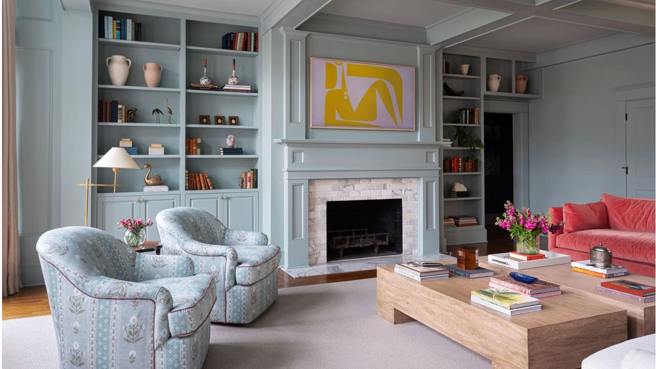
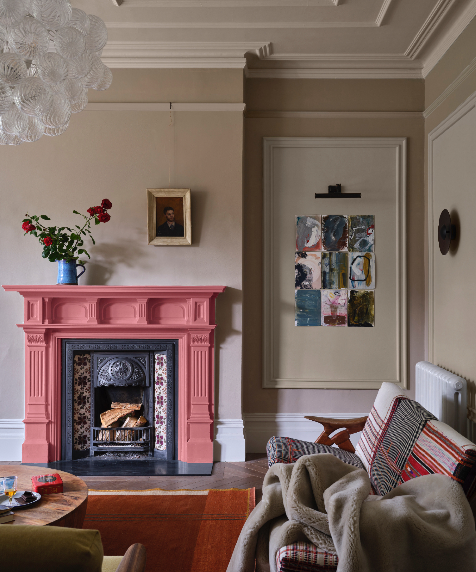
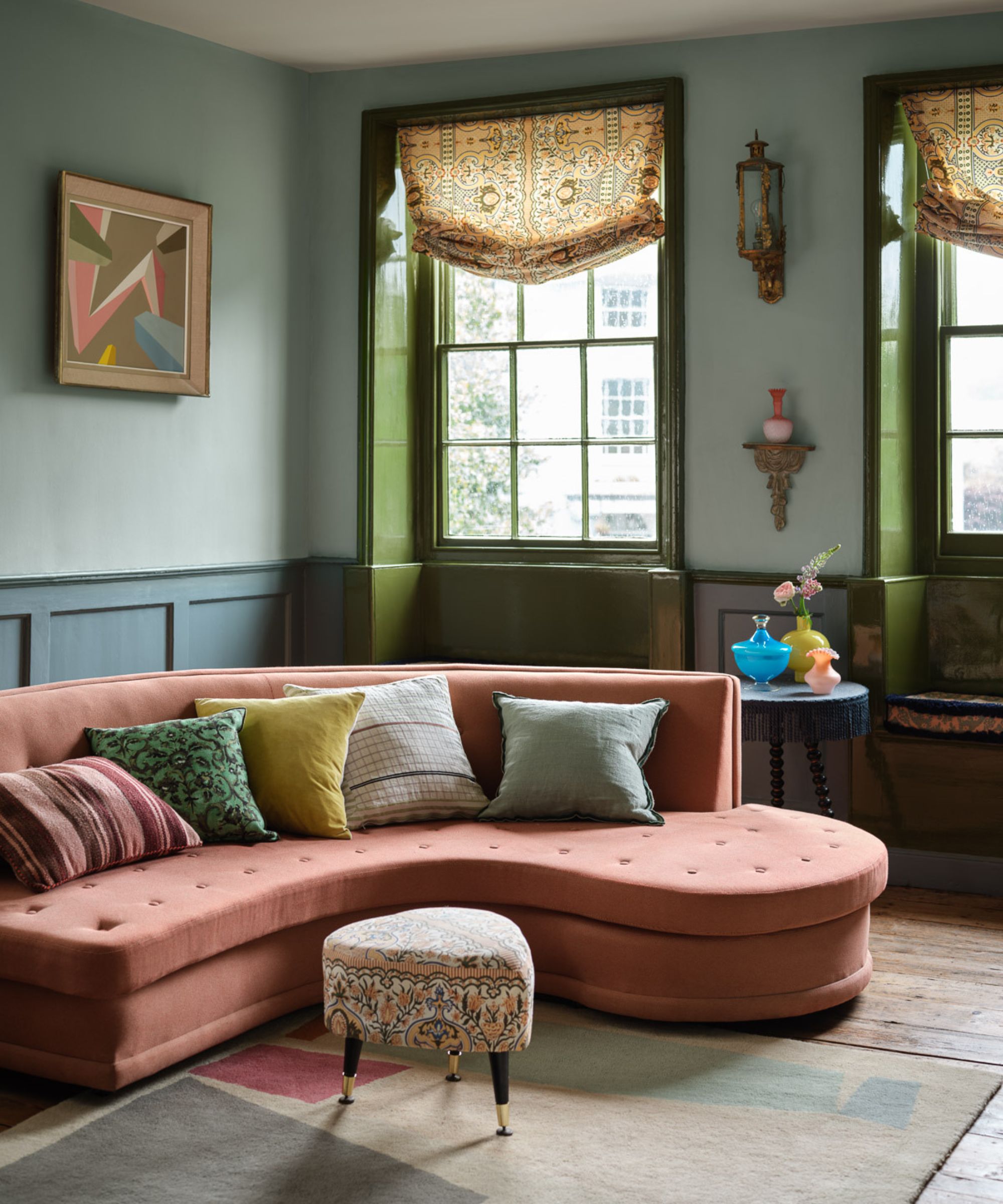
Intense, rich colors often don't need supporting colors to shine. For those brave enough, bold, saturated tones can be wonderfully effective in isolation when color-drenched over all surfaces, as demonstrated in this small living room above by Phillip Thomas Design. 'People tend to shy away from bold or saturated color in small spaces because they believe it will shrink the room, but I find it's quite the opposite. A room drenched in color feels like a jewel box and special!'
Alternatively, for a scheme that is colorful but is easier to live with, opt for a neutral wall color and introduce vibrant tones as accent colors in smaller quantities through accessories and artwork, as done in the living room above by Creative Tonis Design.
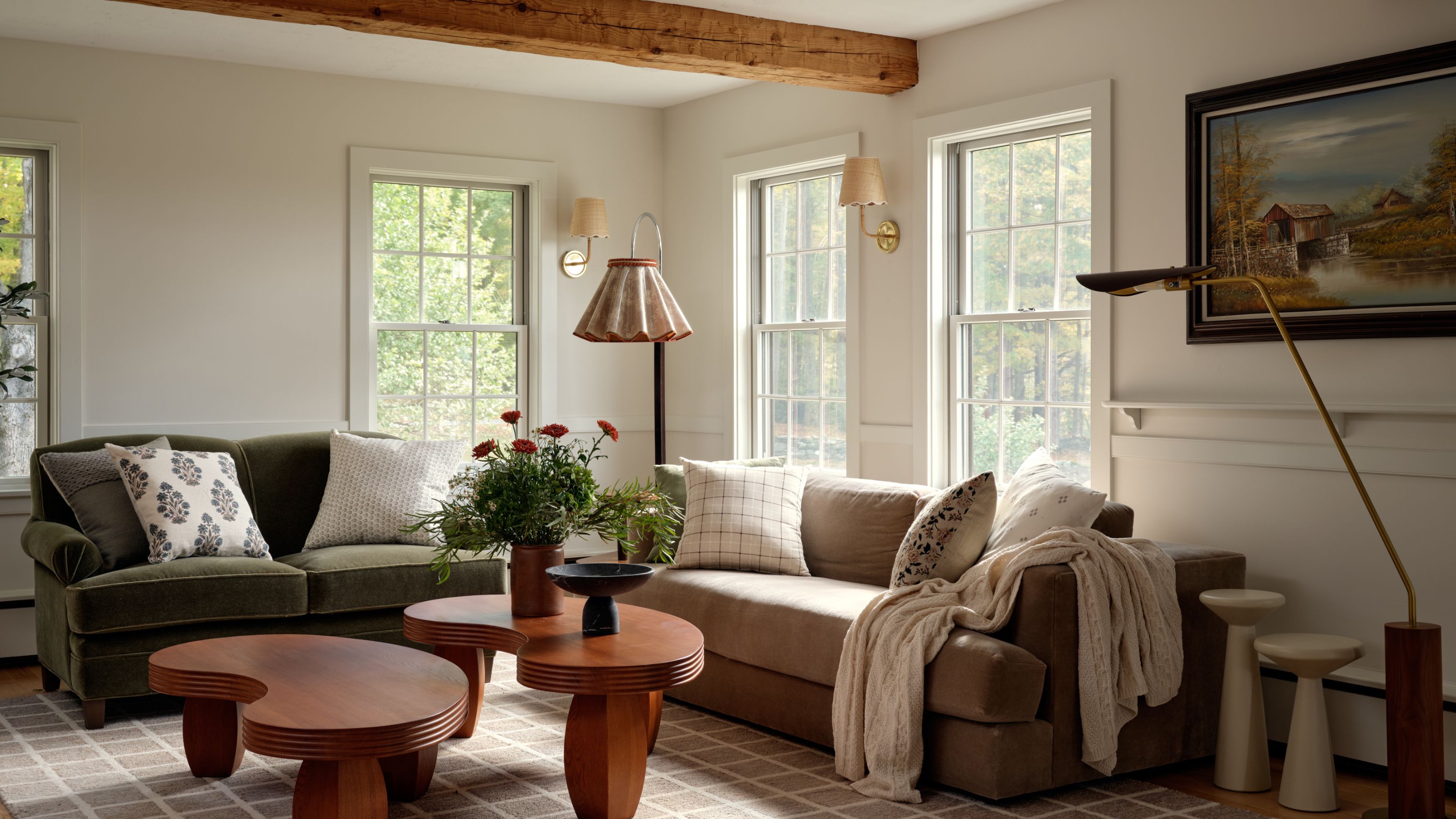
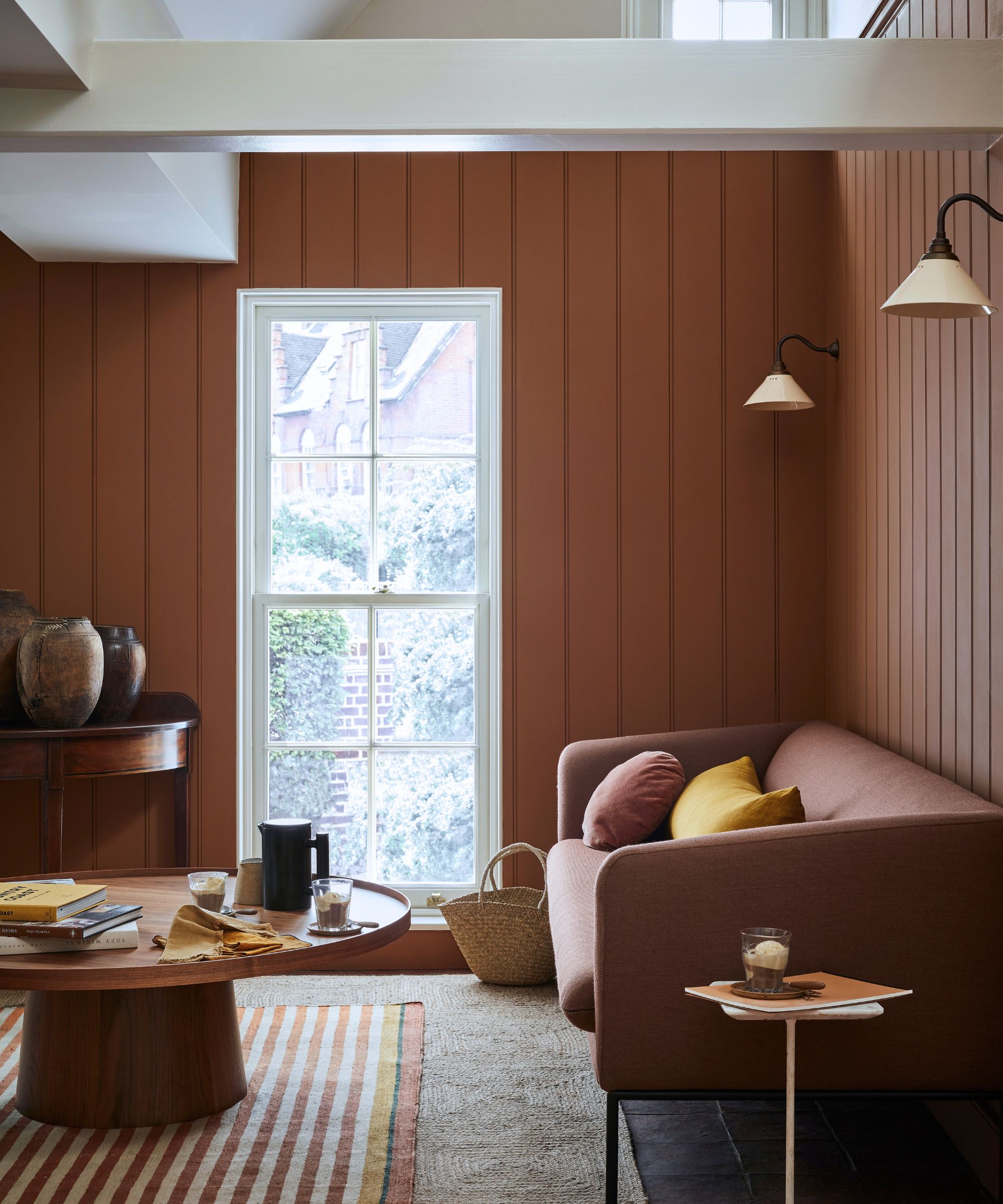
'This room is a perfect example of working with a warm palette and letting it breathe. The terracotta sofa is the hero, setting the tone for everything else, and from there, the forest green and soft blue-grey fall into place,' explains Courtnay. 'Those three colors live in the same earthy, saturated family, so even with pattern mixing across multiple fabrics, the room feels cohesive and intentional.'
If you're working with a rich color, then sometimes pairing it with a neutral rather than a color that matches the intensity can actually create more contrast and visual tension. Sometimes, pairing an intense color with another intense color is actually more soothing than you may realize.
'When selecting a very saturated color for a main living space, I like to select a color for the trim that is something in a similar depth of color.' explains Louise Copeland. 'For example, if the wall is bright blue, I would avoid using a white or off-white trim color. That would make the room feel more traditional and is very high contrast. I would instead choose something that is relatively neutral and blends nicely with the depth of the wall color, so that the bright wall color feels less jarring.'
Don't Be Afraid To Add Bold Accents
When decorating tonally or in a monochrome palette, a living room scheme can sometimes lack depth and interest. Adding a simple accent color through furniture, accessories, or even on the inside of cabinetry can be the perfect finishing touch to punctuate the scheme and bring it to life. The right accent color will focus the eye, but can also help showcase and highlight the dominant color.
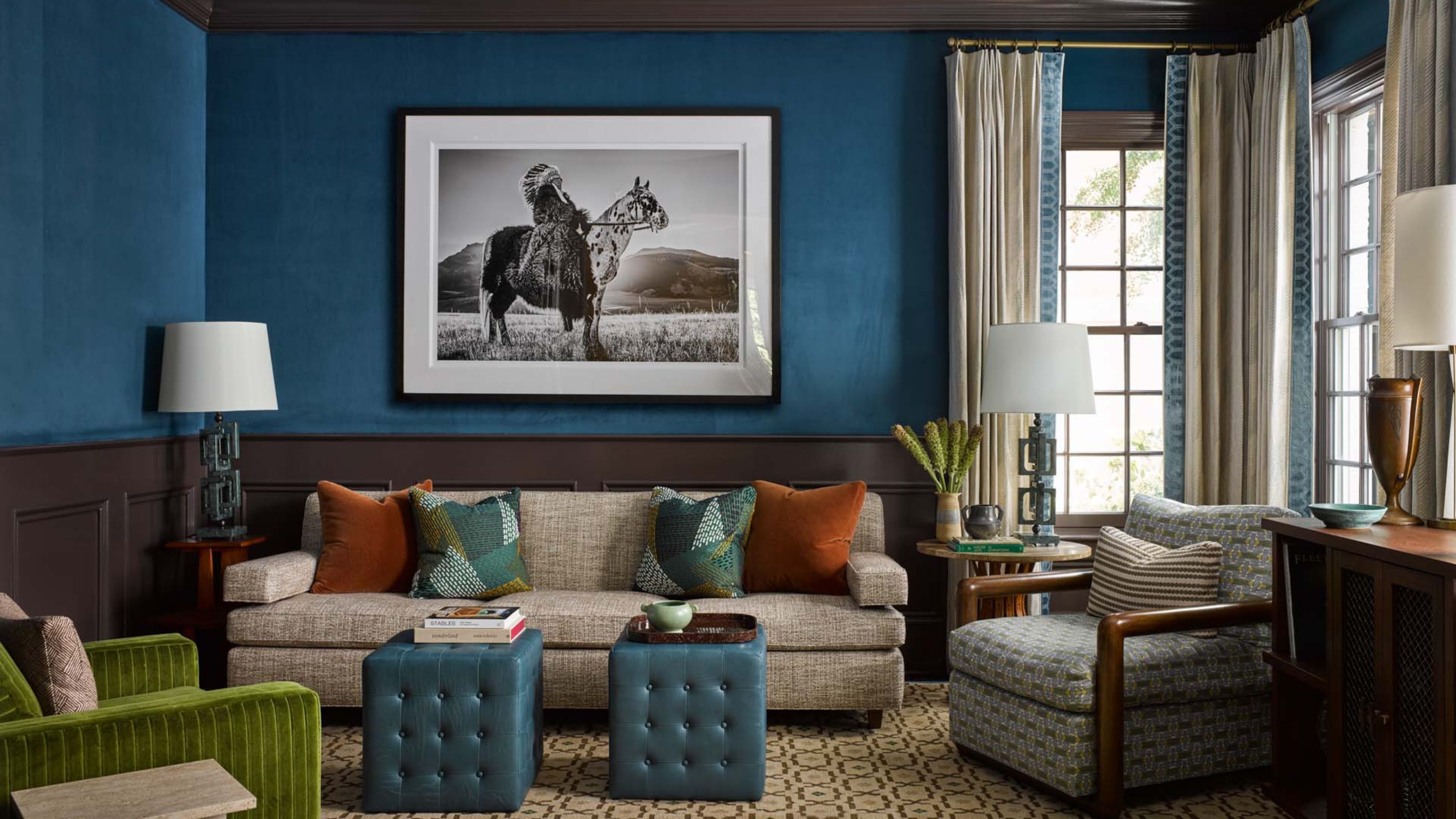
The color wheel is a great tool for choosing accent colors. Tones that sit opposite your dominant tone on the color wheel will work particularly well, such as blue and orange, as shown in the scheme above by L.B.Copeland. 'Combining contrasting colors can be really striking, but it has to be done in a controlled way. The key is to keep the stronger color contained,' explains Louise. 'That way it adds warmth and draws the eye without taking over. The blue keeps everything feeling grounded, so the palette never tips into being too much.'
Here Maggie Clarke, founder of Maggie Clarke Interiors, elevated a serene blue living room with a vibrant coral sofa, which makes a playful focal point that anchors the scheme.
'The bright sofa offers a deliberate counterpoint to an otherwise calm, cool palette. The room is very serene and cohesive, but potentially a bit subdued on its own,' explains Maggie Clarke, founder of Maggie Clarke Interiors. 'By introducing the saturated coral sofa, we created a focal anchor that immediately draws the eye and energizes the space.'
Courtnay Tart Ellias is also an advocate of embracing vibrant accent colors. 'You could have a dreamy, beautiful pastel palette, and then bring in a shock of neon blue on a pillow or in a piece of art. It’s something that shouldn’t really make sense on paper, but it’s often what really makes the whole room.'
How to Choose the Best Living Room Colors For Size and Light
An important thing to consider when choosing your living room color scheme is the size and the aspect of your room. Colors change in different lighting, and throughout the day so the orientation of your room will have a major impact on how the color looks in situ – never just trust a swatch in store or online!
The size of the room makes a difference too. You don't always have to go neutral in a small living room, that's an outdated rule, but you still will have to consider what color will work best with the smaller proportions. Likewise in a big living room you can use color to make it feel more warm and welcoming.
The Best Colors for Large Living Rooms
Large living rooms offer an opportunity to make a real statement. If the intention is to make the space feel cozier, then warm colors will make the room feel more intimate.
'Warm color palettes are very popular in larger living rooms. Larger spaces have more opportunity to feel overwhelming, and a warmer color palette is a good way of making a space feel cozy regardless of how open it is,’ explains Jill Tran, co-founder of Tran + Thomas Design Studio.
While color can bring warmth, take care not to oversaturate in large spaces, as this can easily lead to overwhelm. 'For larger open spaces, I usually see wall and ceiling colors as more base colors that every other finish in the room plays off of. I almost want the wall colors to recede into the background of the space and allow the other finishes to shine,' adds Jill Tran.
Alternatively, if you have a large, open plan living room, you're keen to accentuate the space and light and keep things feeling airy and open, then off-whites and neutrals always deliver. Earthy neutrals, warm off-whites, and even very soft pinks are a brilliant option, as they bring a sense of comfort and a hint of color, but can easily be dialled up with colorful furniture and accent colors. What's more, these can be easily changed as and when tastes change.
'For large living spaces, I recommend using softer, more nuanced tones rather than stark white or overly saturated colors. Larger rooms tend to amplify the color you put on the walls, so selecting one with a bit of depth and warmth – like an off-white, soft taupe, and muted green helps the space feel more grounded and inviting,' suggests Hannah Oravec of Lawless Design.
Best Colors for Small Living Rooms
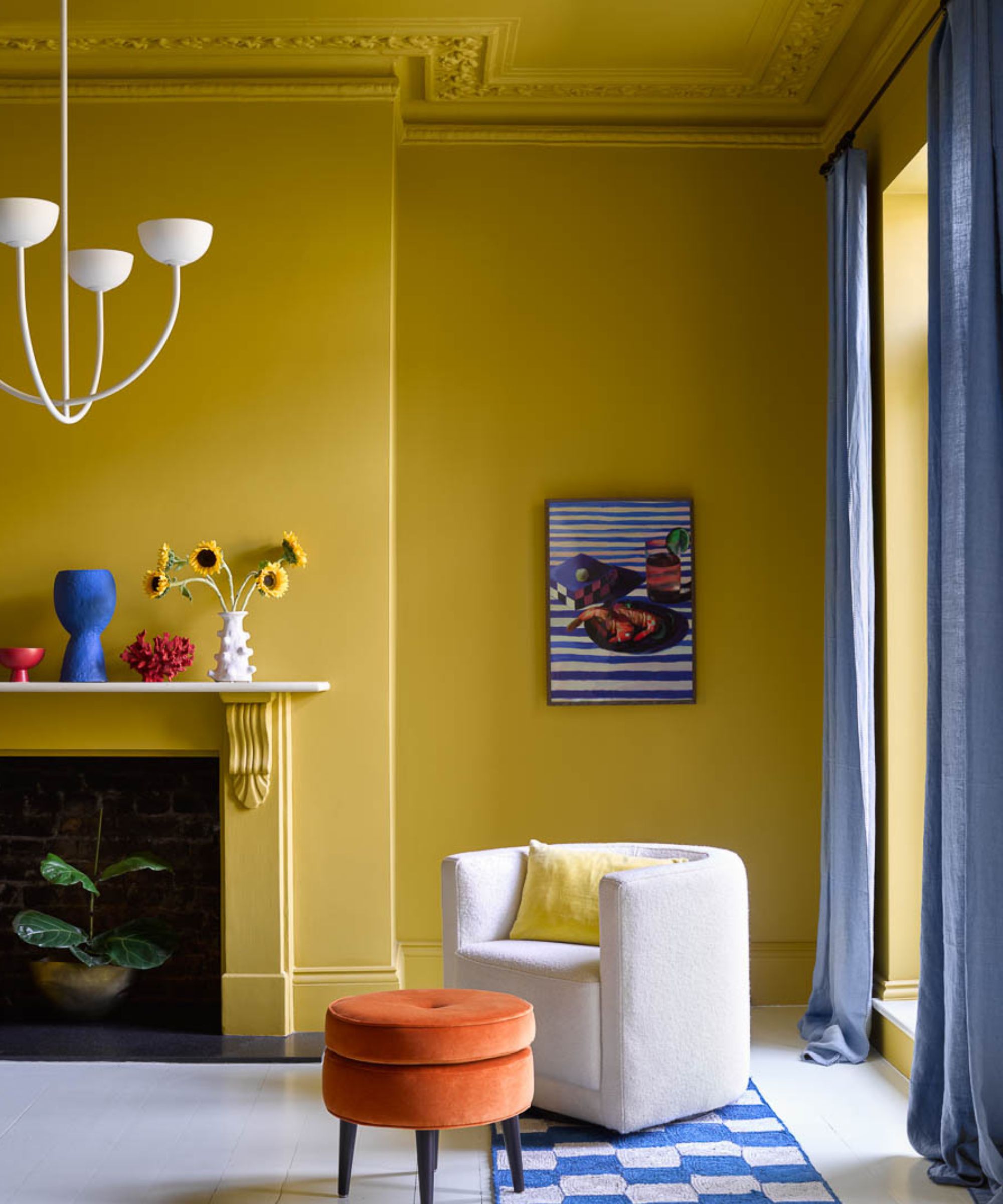
What color best suits a small living room depends on the mood you're looking to create. Often, homeowners are keen to make small living rooms look bigger, in which case, neutrals are the go-to. Alternatively, if you're looking to create a cocooning and cozy space, then color-drenching a small living room in a deep, saturated hue can make for a wonderful, intimate, and head-turning look.
If you're looking to decorate a small living room, then avoid bright white, say the experts. 'Many opt to use bright white in small rooms with the aim of making the room appear larger; however, light neutrals used in a tonal scheme will have the same effect whilst not appearing too stark. If there is a lot of natural light in a small room, then using soft, light tones will make the room feel more spacious,' explains Ruth Mottershead.
'Small spaces are a wonderful opportunity to embrace the color-drenching trend,' adds Ruth. 'Consider using mid-strength tones such as Garden, Etruria and Giallo. These strong, vivid hues work beautifully to create an enveloping interior even in a small space.'
'Dark colors are a wonderful way to create a sense of intimacy in a small room. Intense but natural cocooning colors such as Chocolate Colour, Sage Green, or Jewel Beetle, are perfect for enveloping a space with a sense of relaxation and comfort.'
Best Colors for North Facing Living Rooms
North-facing living rooms receive less light than other rooms, and the light is cooler, which impacts how a room looks and feels. As a rule of thumb, and depending on the function of the room, designers tend to turn to lighter, warmer colors to balance the cool light and create a more inviting atmosphere.
‘Look to colors that are warmer and have more of a yellow undertone than what you would typically consider. Warmer colors tend to feel more inviting, which can also help balance a space that feels sharp from cooler northern exposure,’ explains Arianna Barone. ‘Consider colors that are slightly lighter than what you may think you want as well. Start by finding a color that you like and then look for something lighter and warmer.' If you’re opting for neutrals, Arianna advises off-whites such as Benjamin Moore's Acadia White and Swiss Coffee.
‘Warmer whites such as Silent White Pale or Stock will appear more neutral in tone,’ adds Ruth Mottershead. While paler tones will maximize the feeling of light, sometimes, leaning into deeper tones can be wonderfully effective. ‘Paler blues and greens may appear cold, but experiment with stronger green-blues such as Air Force Blue or Canton for a warming impact,’ suggests Ruth.
Similarly, to create a cozy, enveloping space, Arianna looks to deep, earthy colors. ‘Consider color-drenching the room in enveloping colors like Chopped Dill or Antique Copper. Warmer colors tend to feel more inviting, which can also help balance a space that feels sharp from cooler northern exposure.’
Best Colors for South Facing Living Rooms
South-facing living rooms benefit from having lots of sun throughout the day, and the light they cast will be warmer. To balance out this warm glow, consider cooler paint shades. ‘Rooms that receive a lot of southern exposure tend to have a brighter, warmer cast. This can wash out paint colors or cause them to cast warmer. Look to cooler tones that have a little more depth or gray to them. Consider colors that are slightly darker, or cooler than you may typically prefer,’ advises Arianna.
‘South light is the brightest and warmest light and, therefore, it can seem a little bit intense. Here, cooler colors will often work better,’ adds Ruth Mottershead. ‘The warmer light can cause both colors and neutrals to appear more yellow. This means cooler whites, such as French Grey Pale or Gauze will read as more neutral whites. Whereas warmer whites such as Silent White or First Light, can appear quite cream in tone.’
Alternatively, leaning into warm sunshine and earthy shades can work particularly well if you’re looking for intense warmth, comfort, and cheerfulness.
Living Room Color Scheme Inspiration
If you are looking for inspiration for the right living room color scheme to choose, these are the most on-trend, yet timeless palettes designers turn to time and time again.
Classic Neutrals
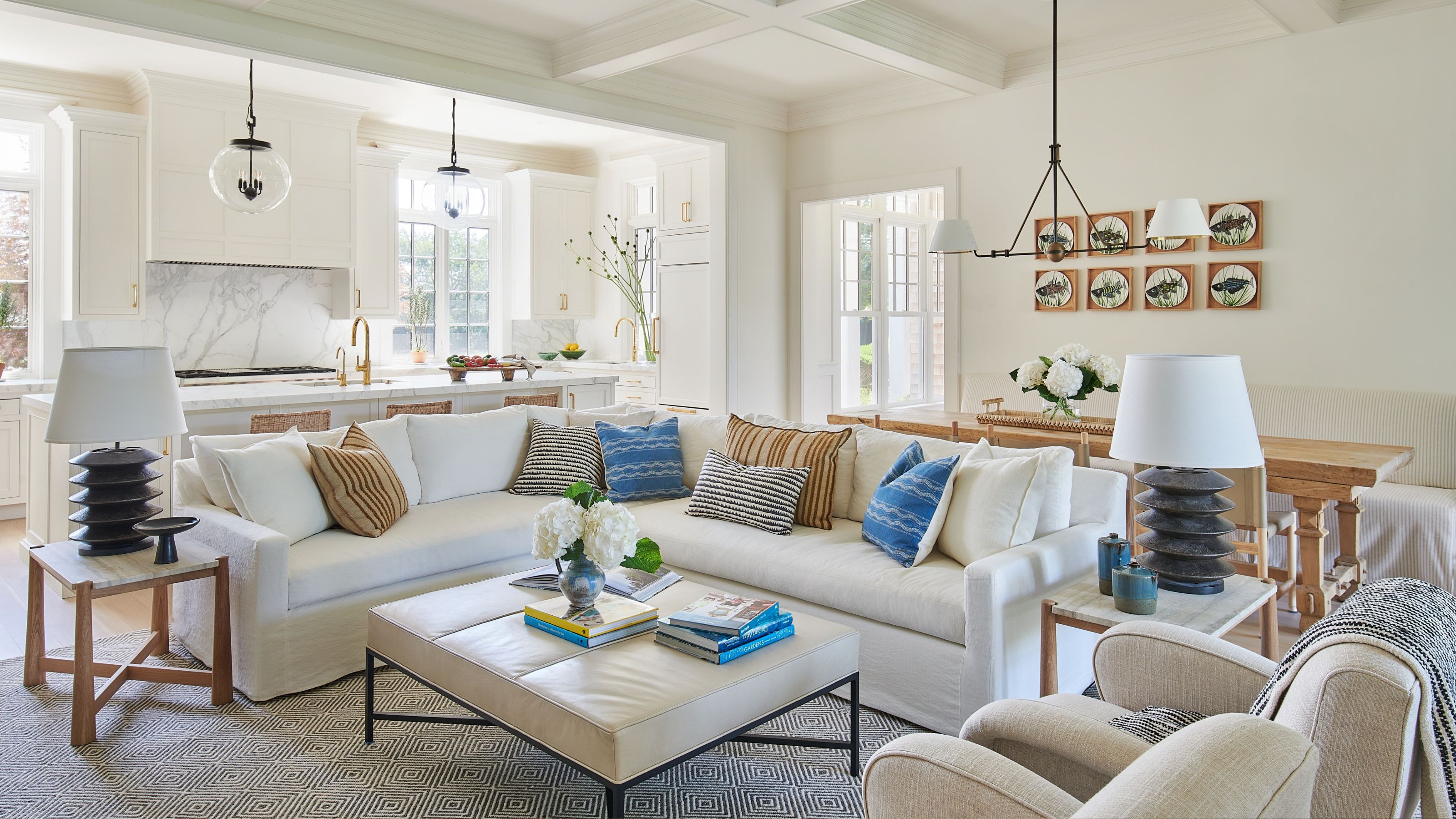
While they're proving particularly popular in recent years, neutral living rooms have long been a go-to, offering gentle warmth alongside a blank canvas for layering fabrics, furniture, and art, and they work particularly well in large open-plan spaces that require a unified look.
'I always recommend starting with one foundational neutral. A warm white or soft greige creates a cohesive backdrop that allows the rest of the palette to develop naturally,' says Kayla Kratz, director of color & design strategy at Behr. 'From there, you can introduce slightly deeper or more saturated tones in specific areas to add personality.'
'For 2026, we’re seeing a continued move toward richer, more expressive neutrals – a clear departure from the pale, cool whites that defined so much of the last decade,' adds Kayla. 'Tried-and-true warm whites like Swiss Coffee have always delivered this, and earthier greiges like Almond Wisp are increasingly valued for the same reason: they hold up across different times of day and different qualities of light in a way that flatter, cooler tones simply don't.'
Designer Alison Babcock loves decorating with neutrals, and Benjamin Moore's Swiss Coffee is a shade she returns to again and again. 'Classic and creamy, Swiss Coffee is the perfect warm white without any yellow or pink undertones. It is an ideal shade for any room in the house when you want the spaces to be light and bright yet evoke a sense of warmth and peace,' explains Alison. 'Swiss Coffee works with any style, from traditional to contemporary, and really allows art and textures from accessories, including decorative items, pillows, throws, and wooden features to shine.'
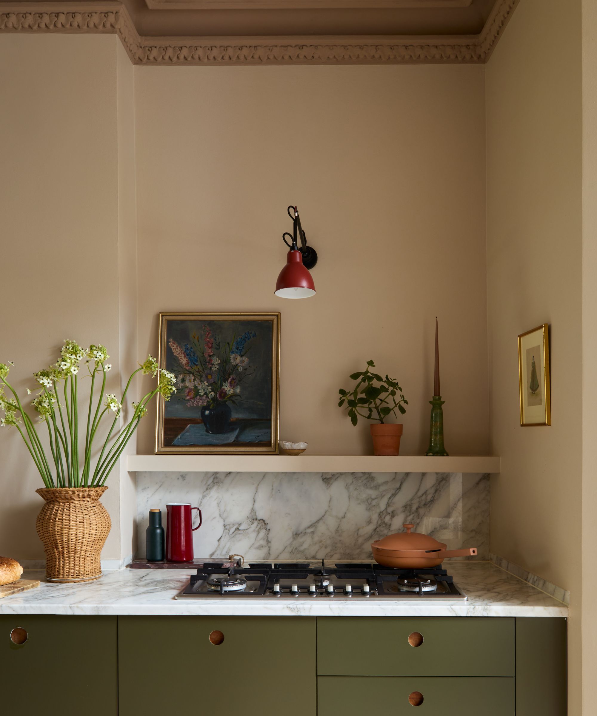
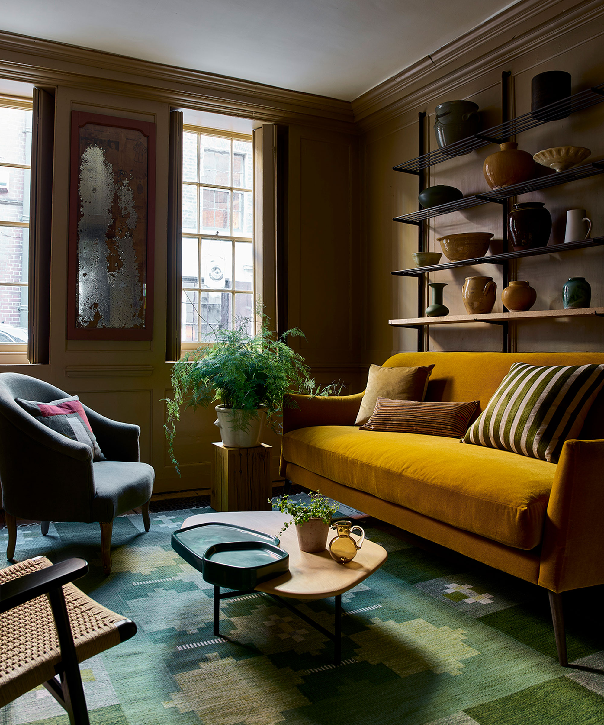
Warm Earthy Tones
In recent years, our yearning for cozy comforting spaces, along with a drive towards sustainable decor that embraces natural materials, has caused an uplift in warm, earthy schemes. From beige, taupe, and brown warm-toned neutrals to ochre, caramel, and deep chocolate brown shades, these grounding shades with earthy undertones are loved for their warm, soothing qualities and are often used in living rooms over cool greys and whites that can leave spaces feeling stark.
'The trend for rich, cocooning living spaces that bring a sense of comfort continues with a move toward the soothing power of darker and mid-tone caramels. Rich and indulgent mid- brown ‘Affogato’ perfectly combines the warmth of coffee with the gentle sweetness of vanilla hues to create a cocooning and comforting color,' explains Ruth Mottershead at Little Greene. 'Pair with smart, dark brown ‘Chocolate Colour’ or soft, off-black ‘Lamp Black’ to create a captivating, sophisticated scheme.'
Alongside earthy neutrals, nature-inspired colors are becoming popular supporting tones, says Kayla Kratz of Behr. 'Earthy greens such as Urban Nature and warm terracottas like Terracotta Urn introduce warmth and a quiet connection to the outdoors. Together, these palettes create living rooms that feel layered, calming, and rooted in nature.'
Nature-Inspired Schemes
Timeless and versatile but also soothing and uplifting, it's no wonder botanical greens are a popular color for living rooms. Synonymous with nature, it's perfect for bringing the outdoors in and has been proven to soothe the nervous system.
'Looking to nature for color inspiration is beneficial because those palettes are not only timeless but also inherently balanced and calming,' explains Hannah Oravec, founder of Lawless Design. 'Soft greens, warm woods, stone tones and natural textiles tend to create spaces that feel grounded and restorative, which is an important aspect of wellness-centred design.'
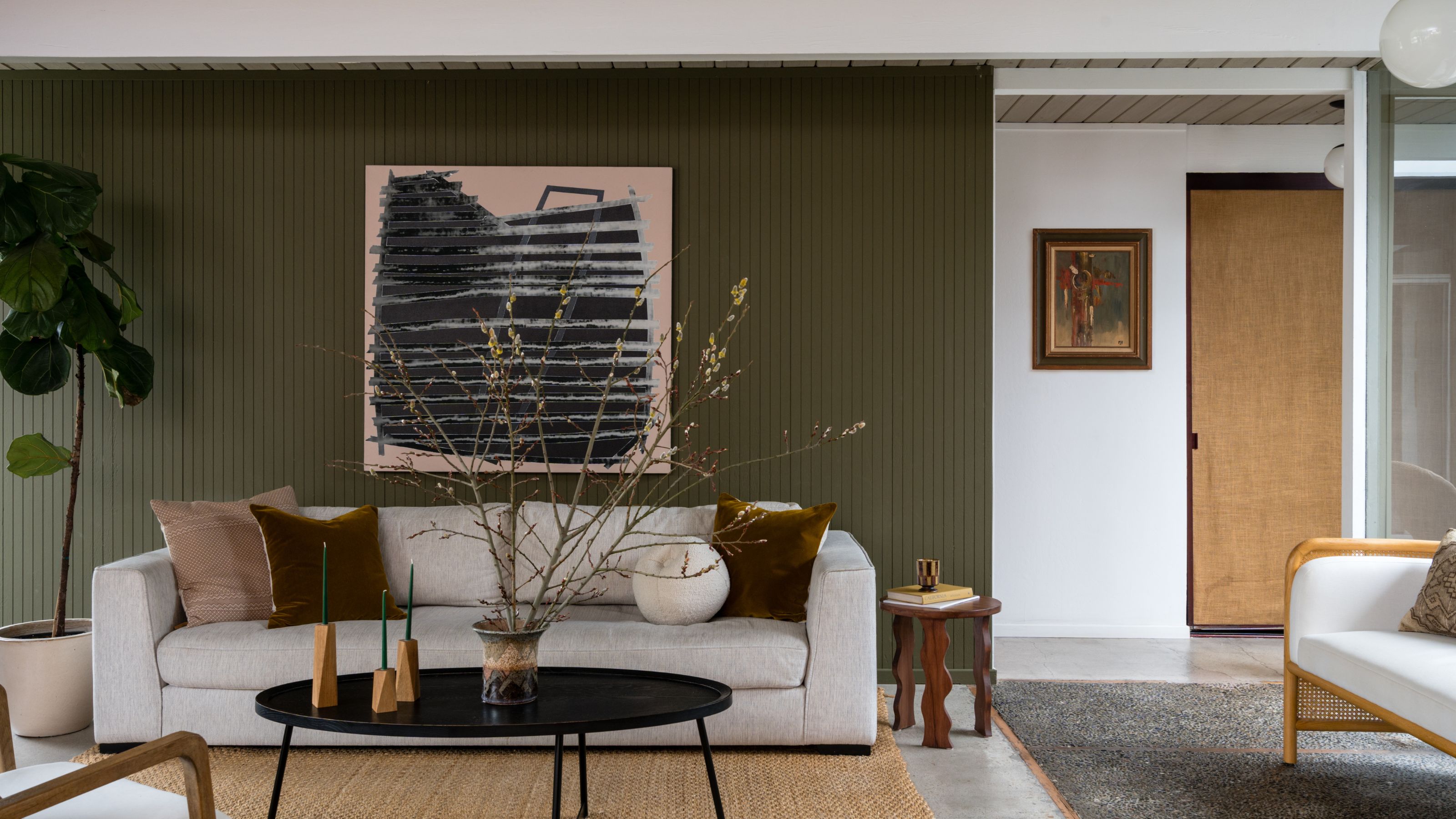
In this modern green living room by Et Sal Insteriors, the green feature wall was cleverly chosen to blur the boundaries between outside and in. 'The feature wall was used as an enhancement to the continuation of the sightline of the architecture of the house,' explains Sophia deDomenico, founder of Et Sal Interiors'. 'Through the glass window on the right was an atrium which featured a large living wall and the same muddy avocado green.'
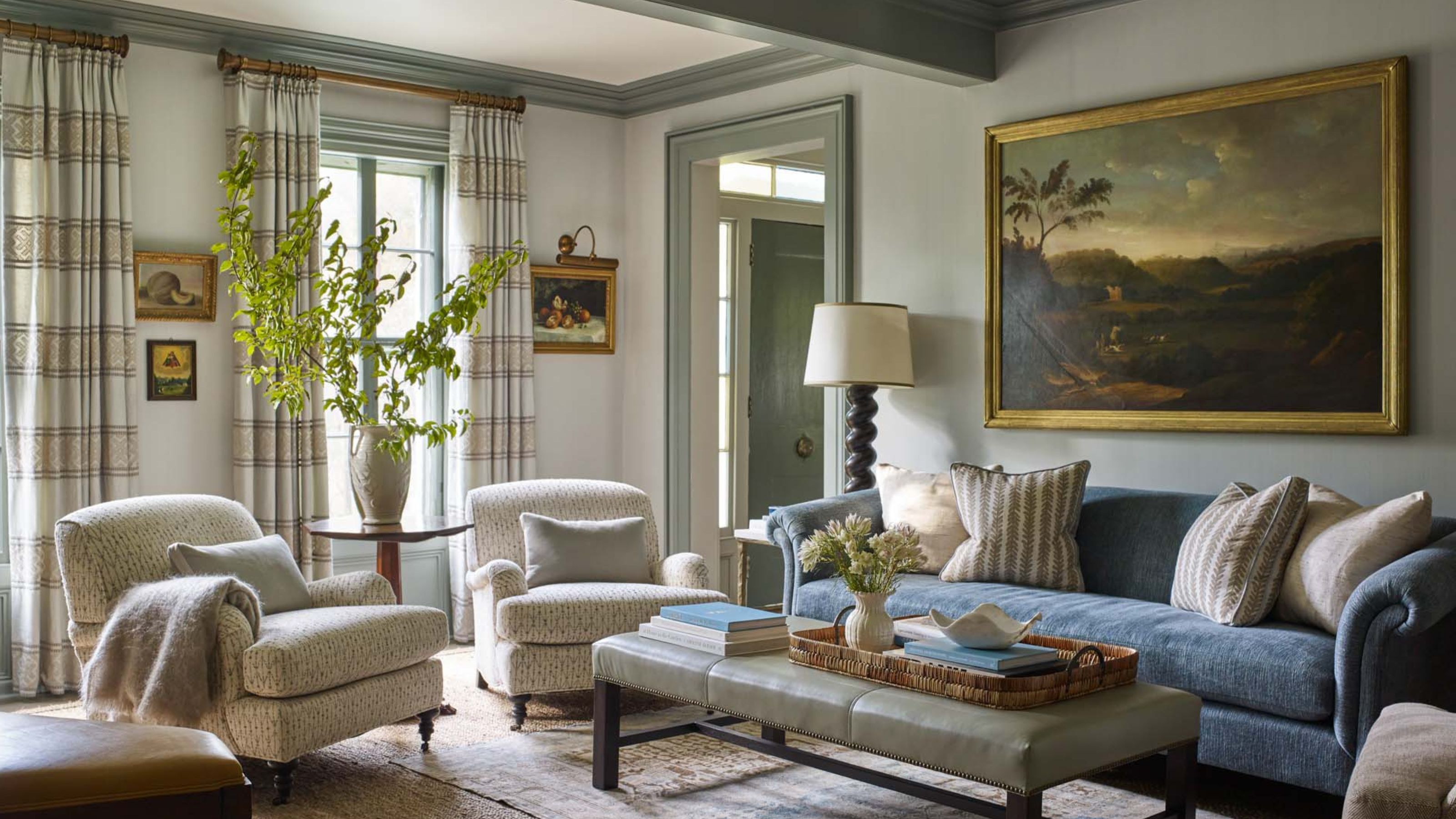
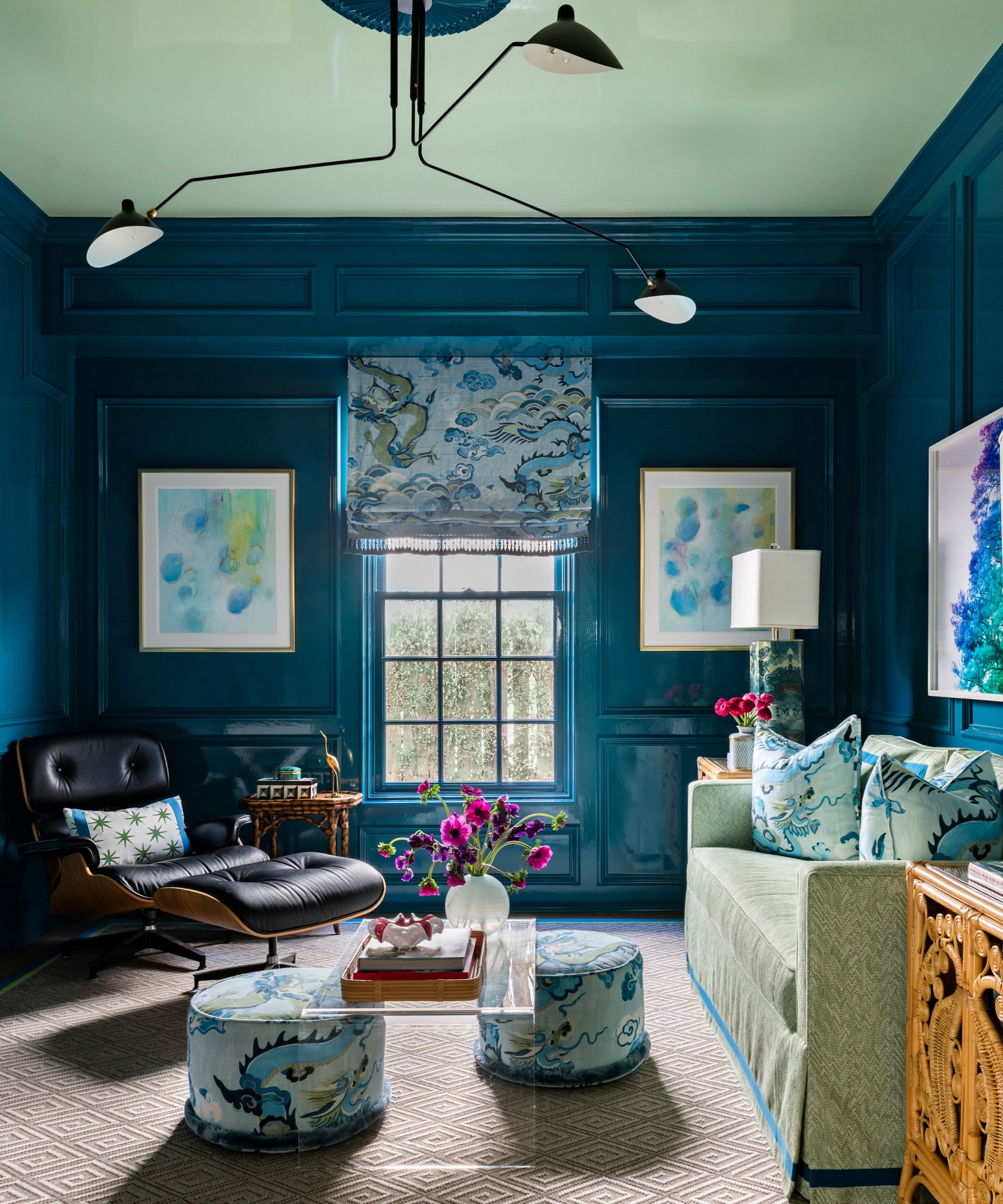
Cool and Calming Tones
Soothing blues are a timeless choice that see no sign of abating in living room scheming. 'For spaces meant to feel peaceful and calming, consider spa-inspired tones. Soft, nuanced greens or blues work especially well in areas where you want to relax and unwind,' explains interior designer Maggie Clarke.
Soft blues are perfect for south-facing living rooms that receive a lot of warm light, as they help prevent them from feeling too cool. As blue recedes, soft, cool hues are also a good choice if you're looking to make smaller rooms feel bigger, but you don't want to use a neutral like white or gray. When it comes to scheming, cool blues pair beautifully with warm, natural materials such as honeyed wood, tan leather, and burnished metals, as demonstrated here.
'We chose Pigeon by Farrow & Ball for this space because it has that perfect laid-back, masculine feel without being too heavy. It’s a soft blue-green that adds depth and mood, but still feels really livable and relaxed,' says Maggie. 'It works especially well with wood tones, leather, and warmer finishes.'
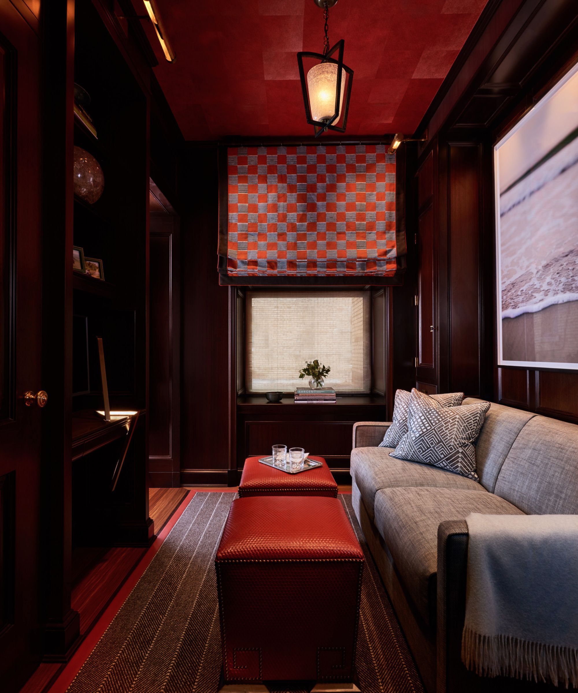
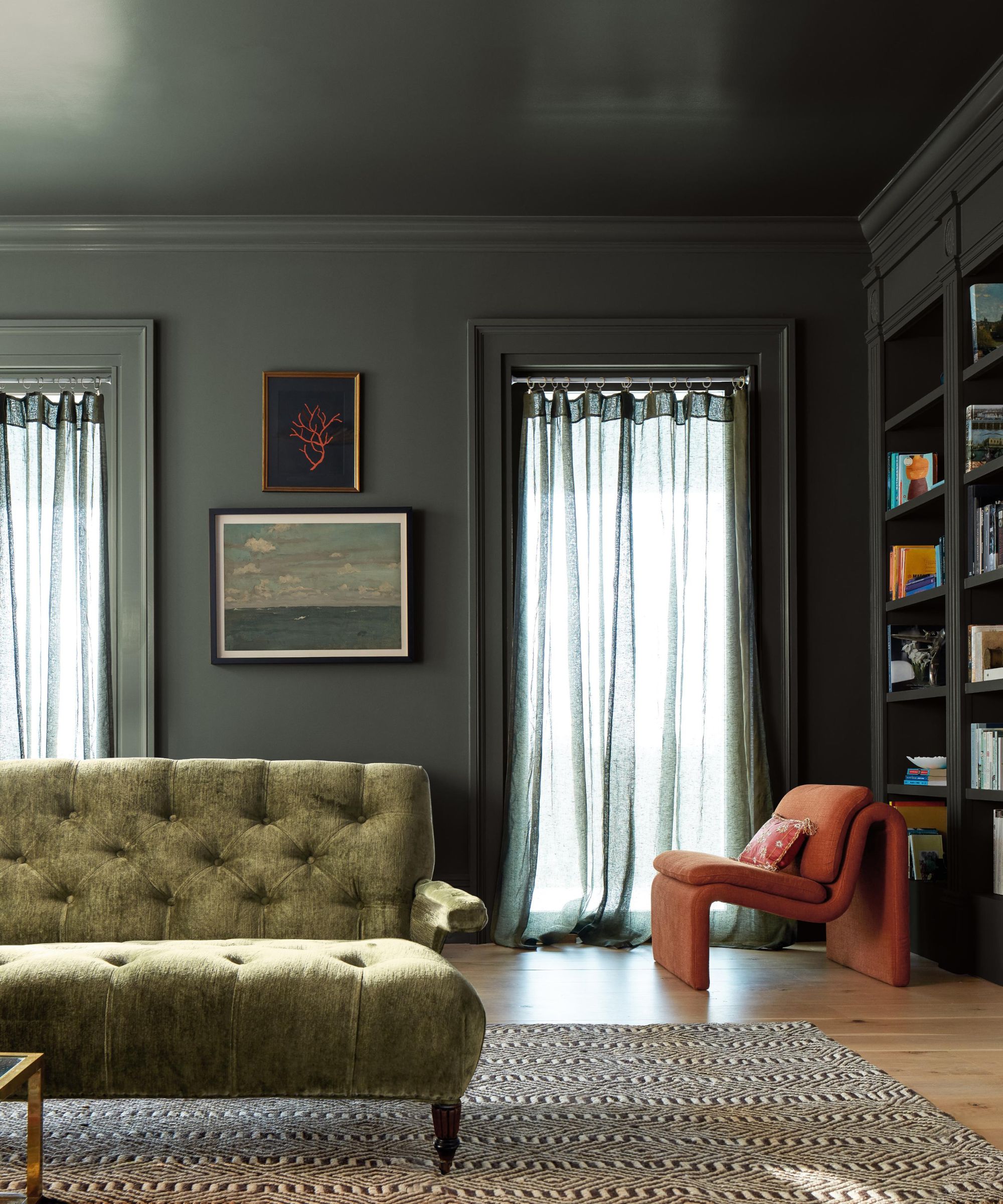
Bold and Dramatic
If you love color and you're a maximalist at heart, then being brave with color can have fabulous results. Channeling maximalism with a palette of several vibrant, highly saturated tones can be wonderfully joyful and uplifting, but it can be hard to pull off. Alternatively, color-drenching in a single shade can make a real statement.
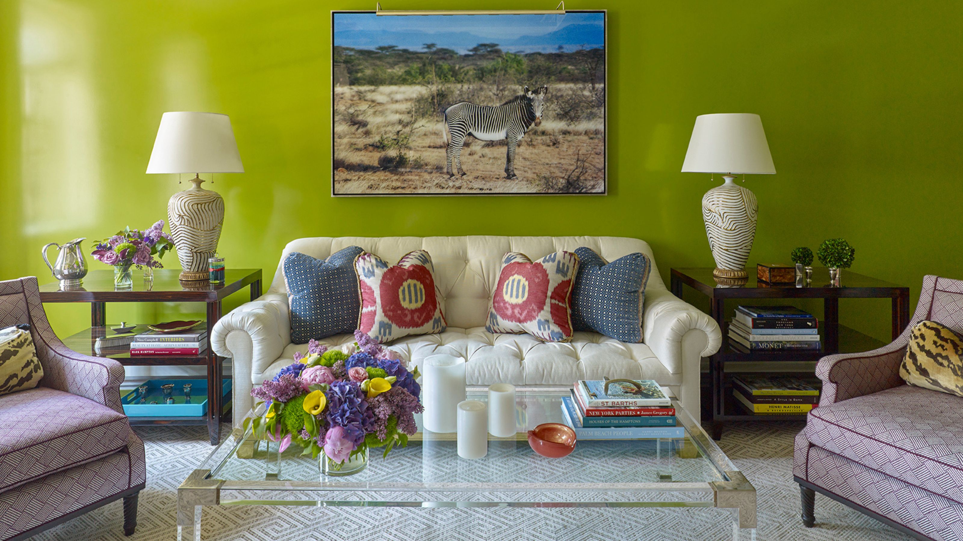
Unless you're opting for a head-turning color-drenched scheme, the key to working with bold color is balance. Often, if you have a powerful wall color, you'll need some equally punchy accents to balance the look. For ultimate drama, use tones from opposite sides of the color wheel to create high contrast. Here, Phillip Thomas introduced accents in red and hot pink to punctuate the vibrant green walls. By using a gloss paint finish, he cleverly brought extra vibrance to the space. 'Just go for it with color! Push yourself to be brave. It is only paint after all,' says the New York City-based designer.
'The biggest challenge with bold color is restraint,' explains Darci Heather, founder of Darci Heather New York. 'Without a clear throughline, a room can quickly feel chaotic – what I often describe as tipping into circus tent territory. However, when done well, bold color brings incredible energy and personality to a space. It creates depth, draws the eye, and gives a room a distinct point of view that feels both elevated and memorable.'
The key to mixing bold colors seamlessly is establishing a common thread, adds Darci. 'Whether it’s a tone, an undertone, or even a material, that sense of continuity is what makes a space feel cohesive. If a client already has existing furnishings, bold color can be introduced by pulling from what’s already there – echoing a hue found in a rug, artwork, or textile. From there, layering becomes effortless, and the space begins to tell a story rather than feel like a collection of unrelated moments.'
A high intensity living room scheme isn't always conducive to spaces designed for relaxation, so if you're looking for something timeless and serene, limit colors to art and accessories. 'Instead of saturating an entire space, I find the most effective ways to introduce color is through artwork, accessories, or a single statement piece that acts as the focal point,' adds Darci.
Key Living Room Color Mistakes to Avoid
1. Designing in Isolation
When developing a color for a living room, think about it in relation to the rest of your home, say the experts, if you design in isolation, the room may feel out of place. The best room designs thoughtfully flow from one space to the next, say the experts.
It happens more than you’d think, and it’s one thing that is sure to make a home feel disjointed, like a series of unrelated decisions rather than a place someone actually lives in. A living room doesn’t exist in a vacuum – there’s usually a hallway that leads to a dining room, or it opens to a kitchen, or there’s a powder bath tucked away – and the palette you choose for the living room needs to touch each of those spaces in some way.
2. Not Testing Paint Colors
Commiting to colors directly from a color card or from tin labels is likely to end in disaster. For a well-thought-out scheme, always test paints on different walls and watch how they react to the light during different times of day.
‘It is crucial that you test every paint color on your actual walls in the room you will be painting them and see how they stand the test of light over a few days. I find the sticky color samples are not very effective. I put large samples of each color on a few walls in the room and live with them for a bit,’ says Sophia deDomenico, founder of Et Sal Interiors.
3. Playing it Too Safe
Neutrals and soft tonal palettes are extremely popular and rightly so, because they are extremely soothing and versatile. While this is a perfectly fine path to take, it's the little risks that can really bring wow factor.
‘Playing it too safe is the biggest mistake,' says Andrea Schumacher. 'We see a lot of spaces where everything is too coordinated, which can make a room feel flat; without enough contrast, even a beautiful palette can fall short. Often, it’s not that something is wrong, it’s that the room just needed one more layer or a slightly bolder move.’
Love beautiful design ideas, expert advice, and inspiring decor trends? Sign up for our newsletter and get the latest features delivered straight to your inbox.