The best record label logos transcend the world of design, becoming timeless symbols of iconic musical movements. While these logos don't have the same tactile appeal as physical media like CDs and vinyl, record label logos are an integral part of music branding, creating an alluring identity for both artists and music fans to engage with.
Many of the most iconic record label logos have played an integral part in shaping the way we view design in the music sphere. From timeless minimalism to provocative illustration, there's no formula for creating a legendary record label logo, reflecting the diversity of the music sphere. For more musical design inspiration take a look at the best band logos or check out the best logo designer to create your own unique emblem.
The best record label logos
01. Death Row Records logo
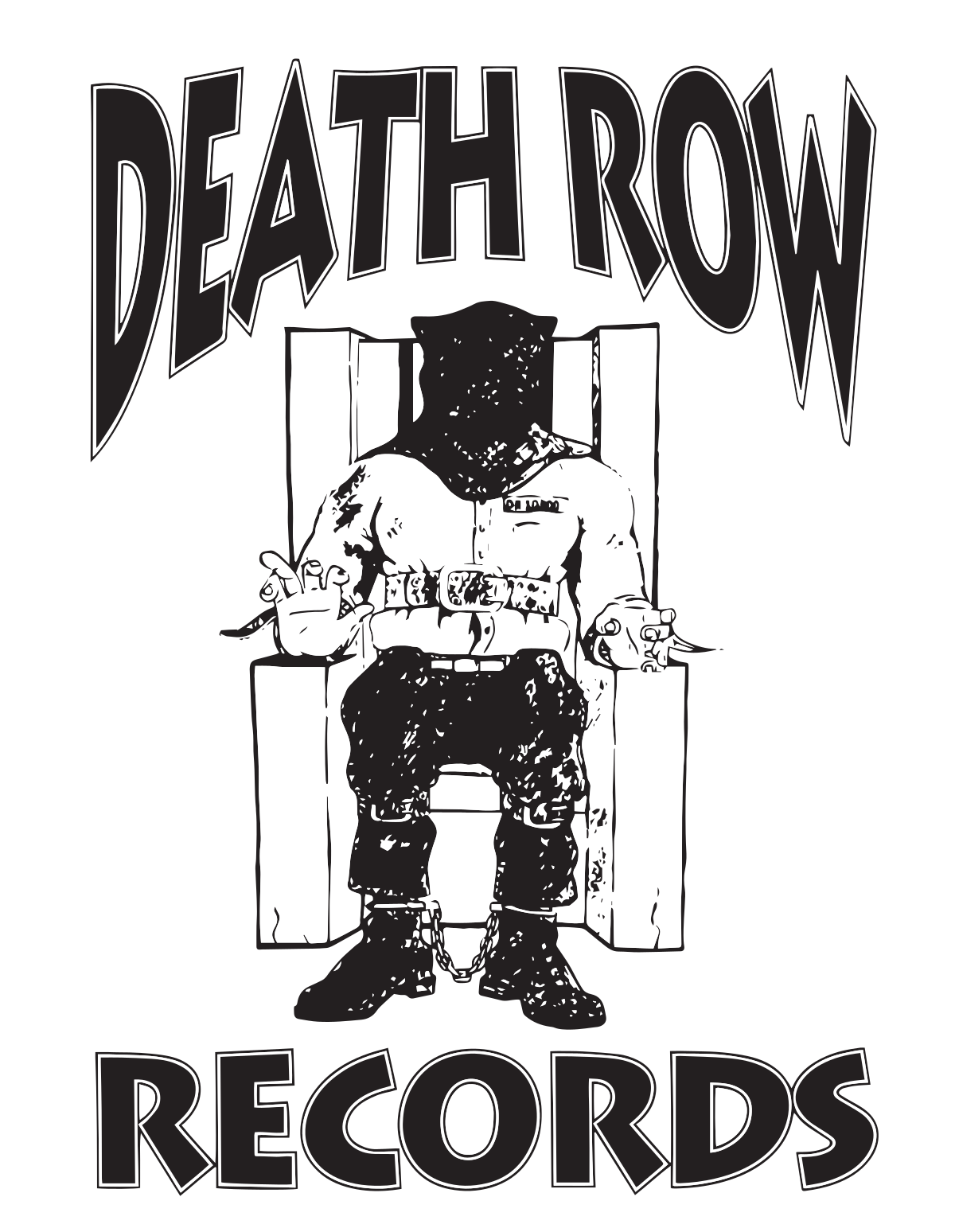
Death Row Records is responsible for launching some of the most iconic artists of the 90s hip-hop movement such as Snoop Dogg, Dr. Dre and Tupac Shakur. Founded in 1991 by The D.O.C., Dr. Dre, Suge Knight, and Dick Griffey, its influence on the music scene continues to this day.
Created by Henry "Hendog" Smith, the iconic yet provocative logo has a distinct feel featuring a figure in an electric chair framed by jagged, gothic-style writing. Since its initial release, the logo has gone on to be a symbol of the 90s hip-hop golden age, with the design appearing on merchandise that continues to be worn by fans.
02. The Sub Pop logo
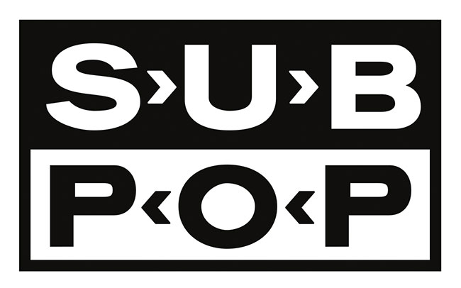
Inspired by the clean lines of labels such as Blue Note and Motown, Sub Pop founder Bruce Pavitt had a very clear idea of how he wanted to brand his legendary Seattle label, Sub Pop. And decision to go for a stark, comparatively corporate design paid off in spades.
"We were trying to be very consistent in our packaging, very consistent in our sound, really putting focus on the region, in the same way that Motown put focus on Detroit Soul," Pavitt told Fast Company in 2012. "We saw what was there; we connected the dots; and we tightened it up so that anyone in the world could pick up a record and go, 'oh, Sub Pop.' We created fans that would pretty much buy anything on the label."
03. The Alternative Tentacles logo

Established in 1979 as a label name for the Dead Kennedys' self-produced single, California Über Alles, Alternative Tentacles swiftly became home to many of the leading lights of the American alternative and punk scenes, including Nomeansno, D.O.A and the Butthole Surfers.
Its bat logo, designed by Winston Smith, a collage artist best known for his cut-up artwork for the Dead Kennedys, is a powerful punk-rock take on the Seal of the President of the United States.
04. The Factory Records logo
Legendary Manchester-based label Factory Records launched in 1978, and featured several prominent musical acts – including Joy Division and The Happy Mondays – until the early 90s. The record label's iconic logo includes a graphic rendering of Manchester's industrial skyline.
05. The Harvest Records logo
Internationally recognised artist and designer Roger Dean was the man behind the logo design for Harvest records. The label was launched by EMI in 1969 to market progressive rock music, and was home to artists such as Deep Purple and Pink Floyd. the logo is a minimalist interpretation of a harvest moon over a valley, showing that even complex scenes can be stylised in a simple memorable logo.
06. The Apple Records logo
The corporate logo design for the Beatles' multimedia company Apple Records was created by Gene Mahon. The simple yet effective design featured a bright green Granny Smith apple, obviously. Albums featured the common fruit whole on its A-side and the apple cut in half on its B-side. Famously, the company has sued the tech company Apple several times over its name and the Apple logo.
07. Nervous Records
Founded back in 1991, Nervous Records can be recognised immediately by its eye-catching cartoon character logo. The New York City record label for underground house music and hip-hop has been home to artists such as Armand Van Helden, Masters At Work and Kim English.
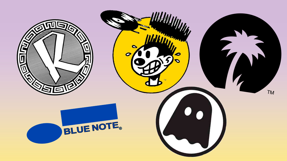
08. The Reinforced Records logo
Reinforced Records was started by Marc Mac and Gus Lawrence in 1989. Throughout the 90s, it earned a reputation as one of the most important and innovative drum'n'bass labels in the world. During this time, the duo met Goldie and, in exchange for artwork and logo design, let him work in their Dollis Hill studio. The logo design is a classic example of the aesthetic from the early days of breakbeat hardcore, combining a big graffiti-like letter, circuit boards and what looks almost like some form of alien hieroglyphics around the edge.
09. Sympathy for the Record Industry logo
This eye-catching logo belongs to record label Sympathy for the Record Industry. The independent, mainly garage rock and punk label has been active since 1988. Owned by American entrepreneur Long Gone John, notable artists who started with Sympathy include The White Stripes and American alternative rock band Hole.
10. The Warp Records logo
Warp (aka Warp Records) is an independent British record label, founded in 1989 by Steve Beckett, the late Rob Mitchell and Robert Gordon. The company's instantly recognisable logo was designed the same year by Ian Anderson of The Designers Republic. It's simple, bold and instantly recognisable.
11. The Island Records logo
Island Records was founded in Jamaica in 1959 by Chris Blackwell, Graeme Goodall and Leslie Kong. Its distinctive silhouette palm tree logo has been on many famous albums from artists such as Bob Marley and U2. It is now based in New York City, and forms part of UMG Recordings.
12. The Earache Records logo
Joshua M. Smith (the Orlando-based designer also known as Hydro74) created this amazing logo design last year as the label celebrated 25 years in the business. The distinctive graphic captures the label's extreme metal genre perfectly.
13. The Motown logo
Another legendary record label, Motown had a series of logos over the years. Probably its most famous is this square 'M' logo, which the company began using in 1965. The iconic graphic became instantly recognisable as the symbol for the Motown brand.
14. The Blue Note logo
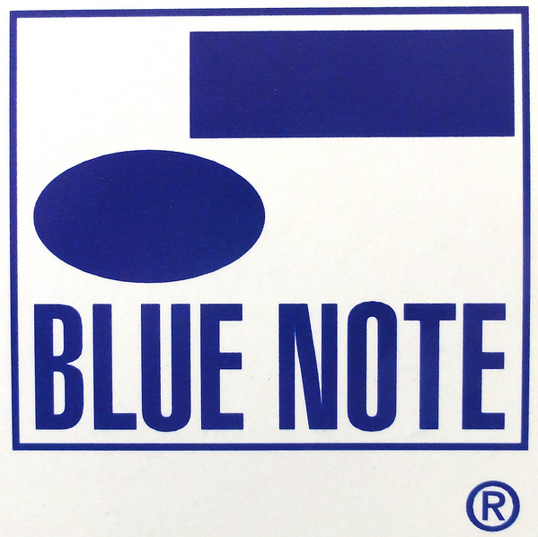
We mentioned Blue Note above for its influence on the Sub Pop logo, so it's only fair that its identity also makes it to our list of the best record label logos. Founded in 1939 by German-Jewish emigrants Alfred Lion and Max Margulis, Blue Note derived its name from the blue notes of jazz and the blues, and the logo design also alludes to this. It's a logo design that show how simple can be powerful.
15. The Ghostly International logo

Brooklyn-headquartered Ghostly International is known for its experimental electronic music, and its logo design, a very literal reference to its name has become iconic. Often seen as a sticker on everything from decks to MacBooks, its sleek minimalism has been backed up by stunning artwork and packaging across the record label's output. The design has made Ghostly merchandise popular too.
For more logo design inspiration, see our piece on Warner Music Group’s edgy rebrand or check out the most recognised album covers of all time.