Dieter Rams, the godfather of industrial design, defined ‘good design’ as making the product useful, understandable, innovative, aesthetic, unobtrusive, honest, and long-lasting. But that’s not even close to being all! It also has to be thorough to the last detail, environmentally friendly, and involve as little design as possible. Over time, these ten principles have become the blueprint for design, inspiring many creators worldwide.
However, not all stick to such guidelines, producing many various design failures, which this successful subreddit takes pride in collecting. We, at Bored Panda, have published quite a few articles reviewing them, and today we are treating you to a list of some of the best, or perhaps worst ones, that make people scratch their heads from confusion. To find them, all you have to do is scroll down.
While you're at it, don't forget to check out a conversation with lead industrial designer Elodie Delassus, who told us what good design means to her.
#1 This Captain Of The Submarine In My English Book
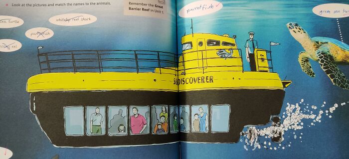
Image credits: reddit.com
"Good design to me is both people- and planet-centric," said lead industrial designer Elodie Delassus to Bored Panda. "As designers, we understand the user needs, their aspirations, the context, and the use requirements to bring to life a meaningful product that people will love having in their lives."
She adds that it's not only about the people but also the planet, as designers' responsibility is to understand the lifecycle of the product they create. Picking the right material and manufacturing techniques allows them to have a conscious impact on our world. "A good design, to me, is not only making sense in use and aesthetics, it is also a sustainable product in the long run."
On the other hand, a bad one "doesn't take into account the above, is often flawed, and has a short life in actual use. A bad design breaks easily, gets out of trend, and ignores the user's needs or context," says Delassus.
#2 Spoiler

Image credits: reddit.com
One of the most common mistakes Delassus notices in bad design is the poor choice of materials, like a product blending two different plastics. A toothbrush with hard plastic and a soft silicone overmold is a great example of this.
"This might look attractive, BUT it makes the plastic or product unrecyclable," she explained. "You can also think about products that mix organic material with plastics. It basically makes the plastic unrecyclable, and the product will end up in landfills or incineration."
#3

Image credits: itsodarkdownhere
Another aspect that creators overlook is the long-term appeal of the product. Designers should produce a product that is easy to maintain and clean (reducing any nooks and crannies), which also adds to its longevity. "One example could be a product using soft-touch paint - very desirable at first but becomes sticky over time, especially in humid and hot environments," said Delassus.
In addition, bad design adds unnecessary and unjustified complexity. "The design of a product is the voiceover that talks about what the product can do, guides how it can be used, etc. Design that doesn't guide its users ends up being confusing," explains the industrial designer.
#4 This Amazing Pregnancy Test

Image credits: Explodinator580
Moreover, bad design choices ignore the context of use. One example is a fan with a bright LED that can't be turned off when the fan is working. Users may be placing it in their bedroom and be disturbed by the light at night.
The last feature of a poorly designed product that Delassus mentions is exclusivity. "We usually design for the 50th percentile. However, the golden standard in design should be inclusive.
The best designs often start with an extreme user/context and have benefits to the broader community (it is called the curb-cut effect). Good design provides enough space between buttons, good ergonomics, and visibility."
#5 A Scene From An Indian TV Show
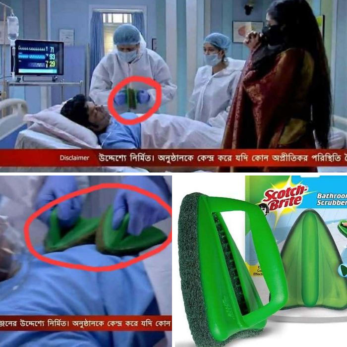
Image credits: reddit.com
Dieter Rams, a German industrial designer known for his less but better approach to design, outlined the characteristics of good design so creators know what is expected of them. He had immense influence in this field and helped to shape how products in the 20th and early 21st centuries looked and worked. Alarm clocks, toothbrushes, and coffeemakers are just a few of his hallmarks.
In the late 1970s, Rams tried to figure out the world around him, asking himself the important question, “Is my design good design?” The answer led him to his ten principles, which we’re going to discuss more below.
#6 Being Gay Was A Sin They Said
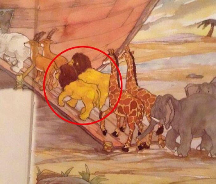
Image credits: TKZoroSantoryu
First, a designer should always strive for innovation. The world is constantly progressing, and new technologies are offering plenty of opportunities for novel and inventive ideas. Therefore, design has to keep up by taking these creative ideas and turning them into useful solutions to modern problems.
Innovation in design can take many forms. It can involve new materials or technologies, rethinking traditional ways of designing, or finding fresh solutions to impractical issues. By embracing innovation, creators can come up with products that aren’t only functional but also sustainable and cost-effective.
#7 These Pull Tabs That Never Come Off
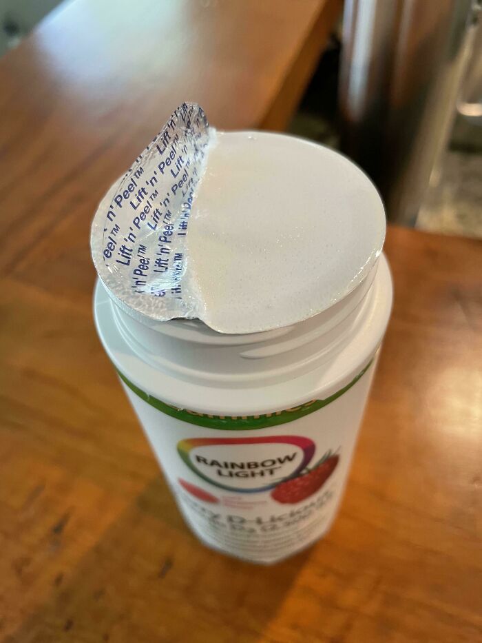
Image credits: willyism
#8 Smh

Image credits: mreynolds1023
#9 Tunashamed

Image credits: the_blueprint
Even in the 1970s, Rams was concerned with the environment, waste, and consumer culture. In his 1976 speech, he said, “I imagine our current situation will cause future generations to shudder at the thoughtlessness in the way in which we today fill our homes, our cities, and our landscape with a chaos of assorted junk.”
#10 I Didn’t Qualify For This Paid Survey After Selecting “No”
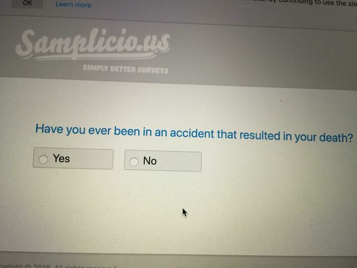
Image credits: bunnyxjam
#11 When Your Security Gate Is A Ladder
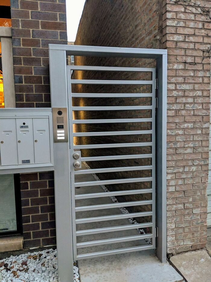
Image credits: pcjcusaa1636
#12 Unfortunate Dog Placement
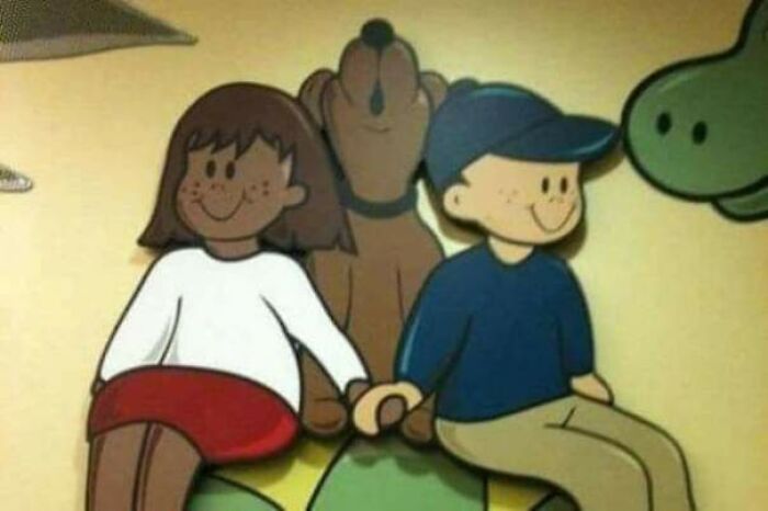
Image credits: reddit.com
With fewer and fewer natural resources, he believes that both buyers and designers should take responsibility for the state our world is in. He calls for an end to wastefulness and continues to advocate sustainable and innovative creations.
#13 The Elders At My Brother-In-Law’s Church Got To Design The Church League Softball Shirts. The Thought “Cli” (Christian Life International) Alone Wouldn’t Signify A Church, So They Added The Cross. Magnificent

Image credits: Iamabonermachine
#14 This Clothing Display
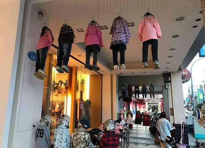
Image credits: Agent_Orange7
#15 Just Why
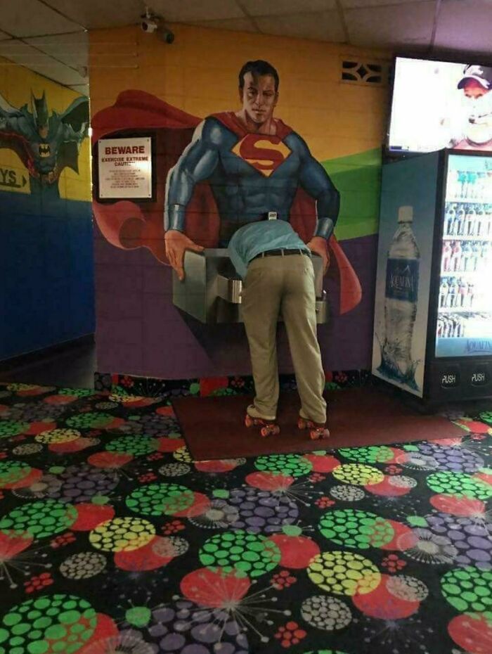
Image credits: ComunistCow
It's self-explanatory that the main reason people buy a product is so they can use it. That’s why design shouldn’t detract from its usefulness either. However, an item that is considered useful to one may be entirely useless to others, so the specific criteria that determine this remain difficult to define.
#16 I Think I Know Why

Image credits: TherRealMemeDemon
#17 The Pockets On Women's Trousers
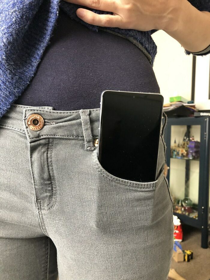
Image credits: Iwantmyteslanow
#18 Sign At A Local Beach
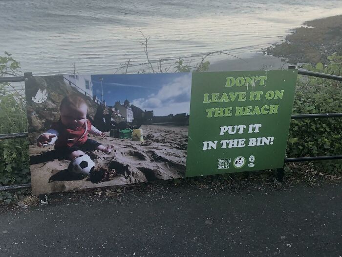
Image credits: joefife
Something that makes buyers use the item more is if it’s aesthetically pleasing. When we don’t enjoy the look of it, we are less likely to pick it up.
Without a doubt, it should also be easy to utilize without any details interfering with the user's experience. By saying that design should be unobtrusive, Rams is emphasizing the importance of simplicity and usability. Choosing a classic design that never looks outdated also prevents more products from ending up in landfills.
#19 Oh Boy, There's Platypus Period In My Tea!
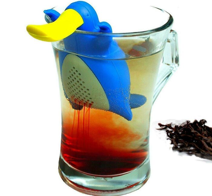
Image credits: Solero93
#20 Pretty Sure He's Using It Wrong
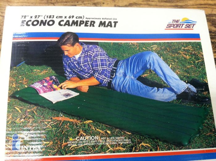
Image credits: AdamBarnhouse
#21 Professor, I Can't Get These Audio Files In Our Textbook To Play
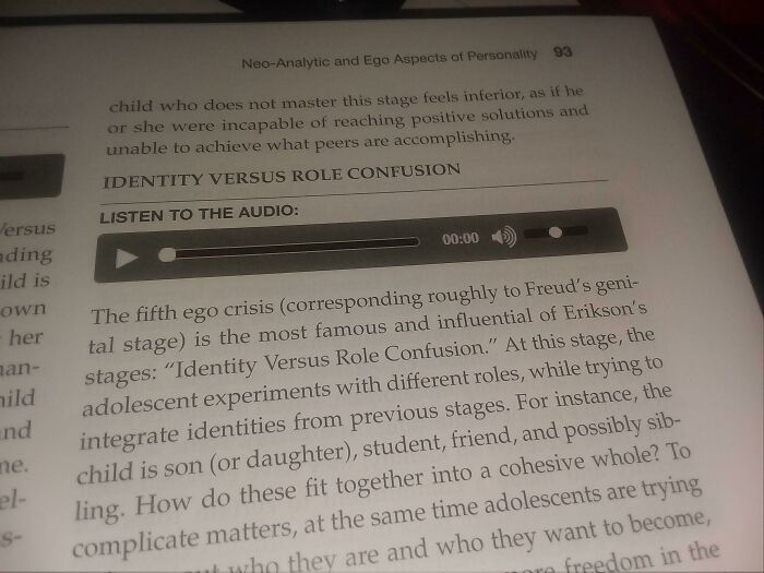
Image credits: reddit.com
Finally, the product should be honest with its consumers, meaning that a person shouldn’t feel disappointed when an item doesn’t work as well as they hoped. So the design should be as innovative, powerful, or valuable as it claims to be. According to Rams, products should be reliable, durable and allow people to use them as they were intended to be used.
#22 Love Handles
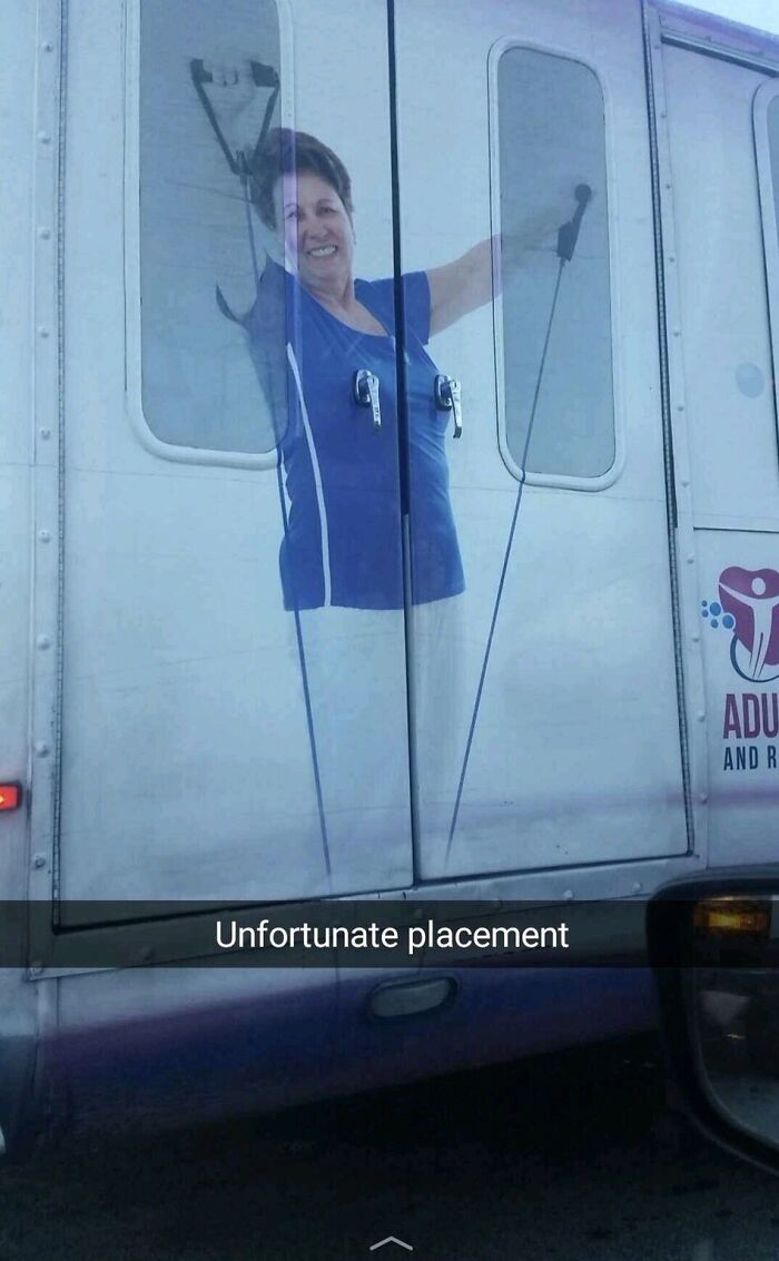
Image credits: reddit.com
#23 Noted
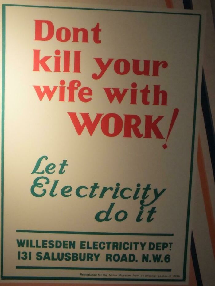
Image credits: jhoang0730
#24 My Company Wanted To Make Our Fountain Pink For Breast Cancer Awareness. Didn't.... Quite Get It Right
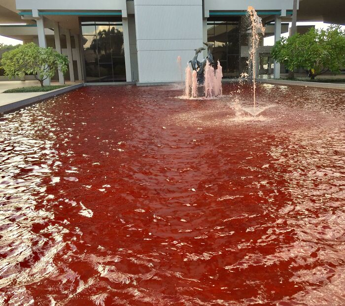
Image credits: BoeJenjamin
In a nutshell, the best design won’t require extra explaining to its users, who will very much appreciate how simple yet thoughtful creations understand the people they are designed for. Jared Spool, the American writer, researcher, and usability expert, put it best, “Good design, when it’s done well, becomes invisible. It’s only when it’s done poorly that we notice it.”
#25 This Ad Placement

Image credits: MyNameGifOreilly
#26 We All Party Down Here
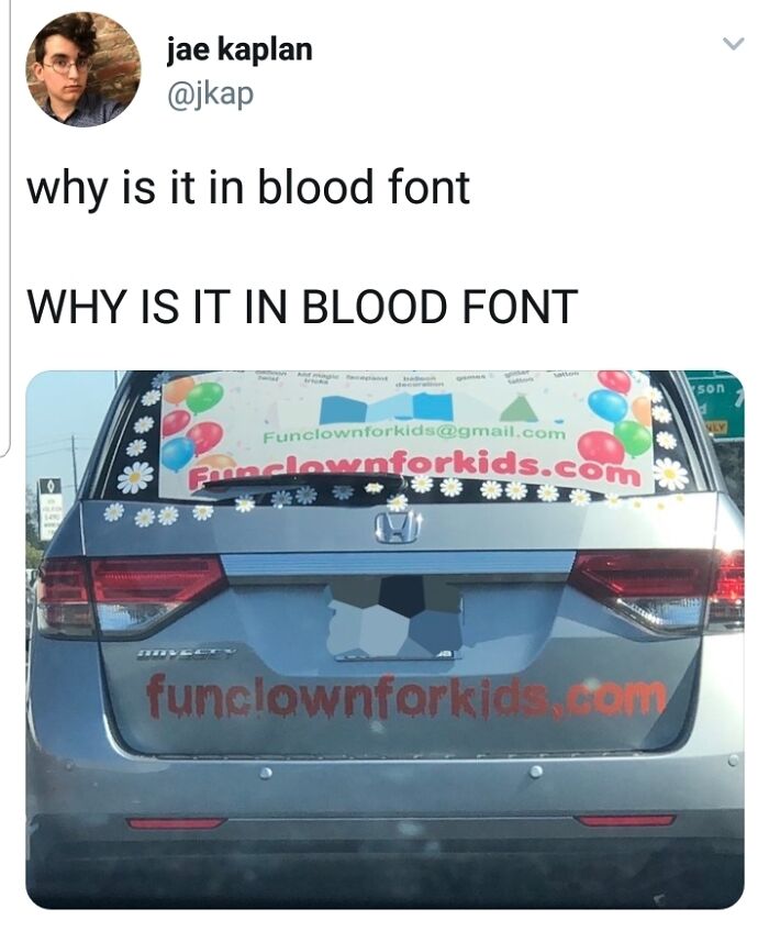
Image credits: Tucko29
#27 It's A Trap!
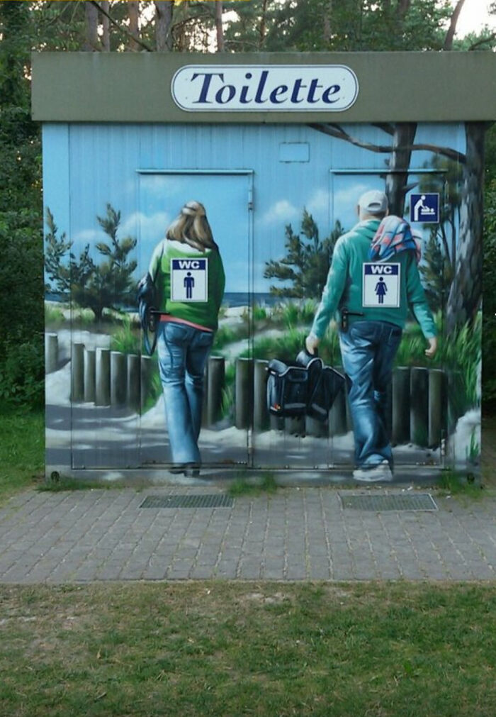
Image credits: RiffRaff161
#28 We Are The Borg. Resistance Is Futile

Image credits: Oceanus5000
#29 So, It's Fine Then?

Image credits: juanjoli
#30 This Kid Mannequin
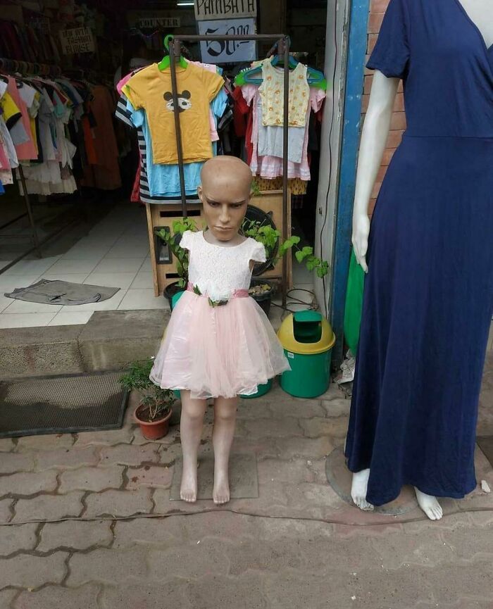
Image credits: Cnmbnmya
#31 My Four-Legged Duck
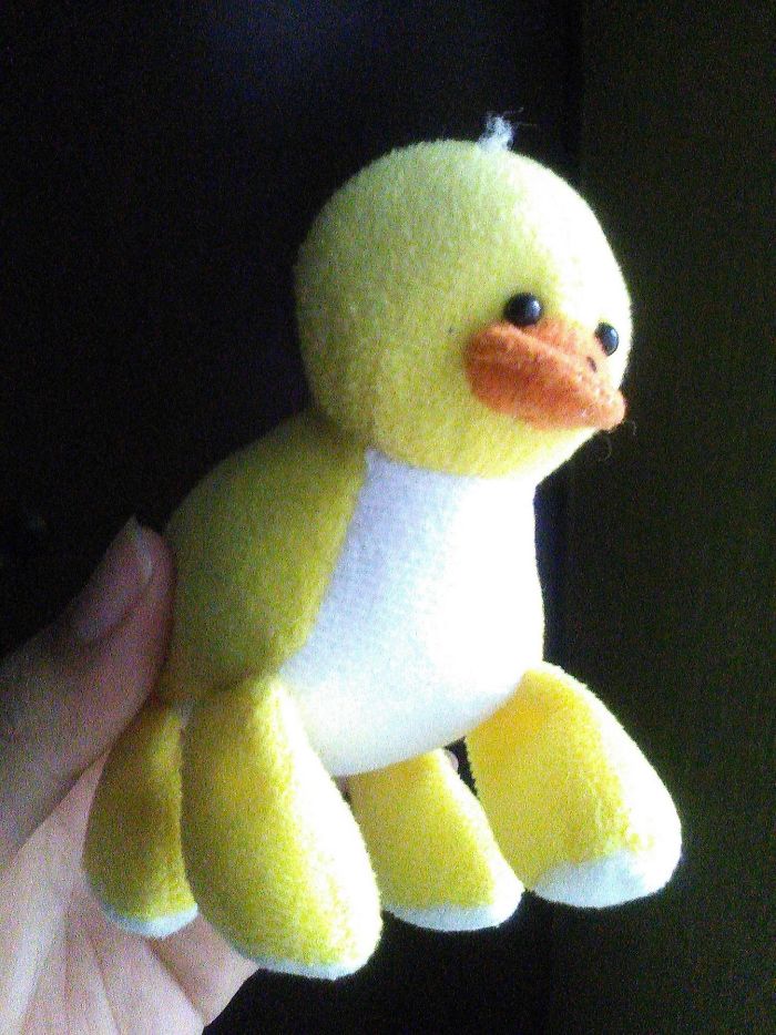
Image credits: imgur
#32 Commas People

Image credits: TardyFriend3
#33 Rose Uh ?
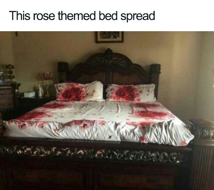
Image credits: Fauconwill
#34 To Motivate

Image credits: The_King_In_TheNorth
#35 A Nail Or A Screw
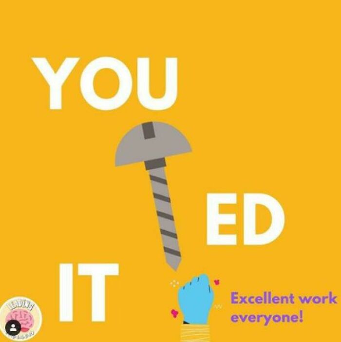
Image credits: irrelevantthroww
#36 Idk I'm European

Image credits: reddit.com
#37 Nothing Like The Smell Of Coffee And A Good Eye-Stab In The Morning
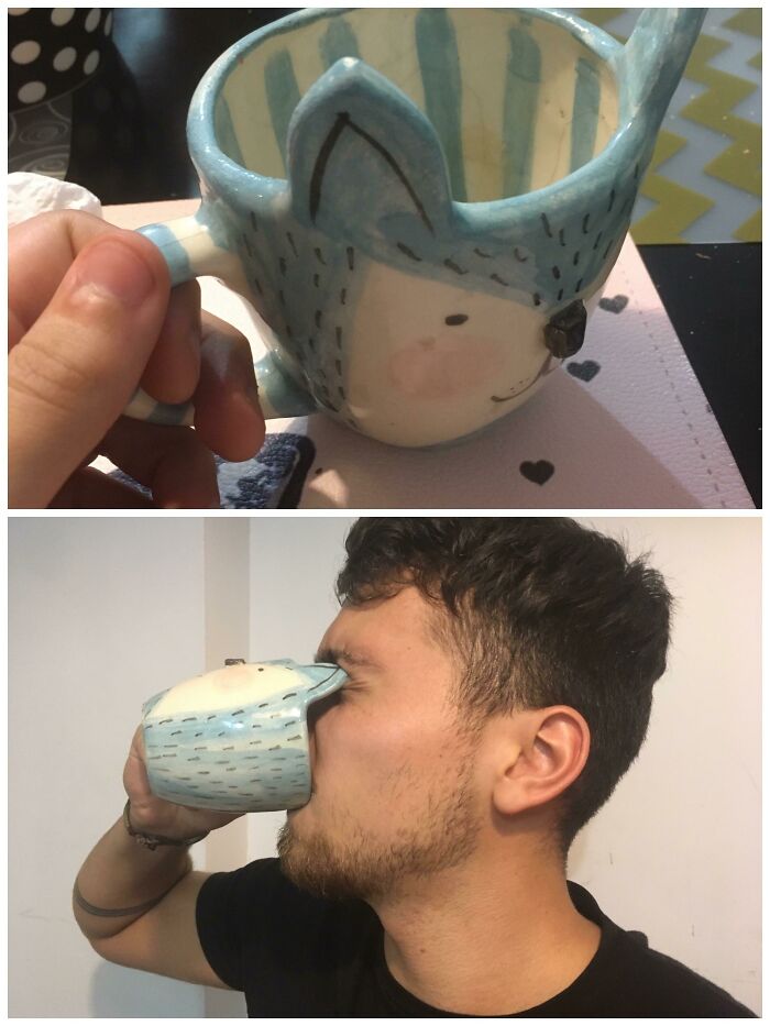
Image credits: CosmeBuzzanito
#38 This Bus

Image credits: reddit.com
#39 Ho Ho-No

Image credits: reddit.com
#40 I Bought A Billboard To Promote My Business And They Screwed Up The Formatting

Image credits: bencahn
#41 Toilets And Mirror Ceiling
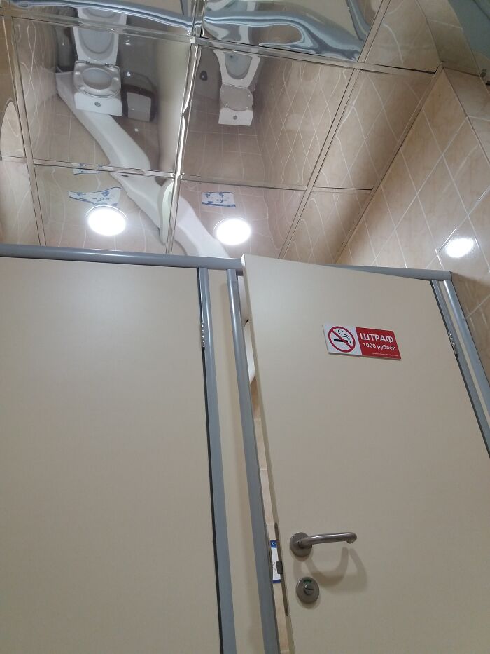
Image credits: zorton213
#42 This Ad For Graduation Photography

Image credits: box_cardinal_peanut
#43 When Life Gives You Lemons
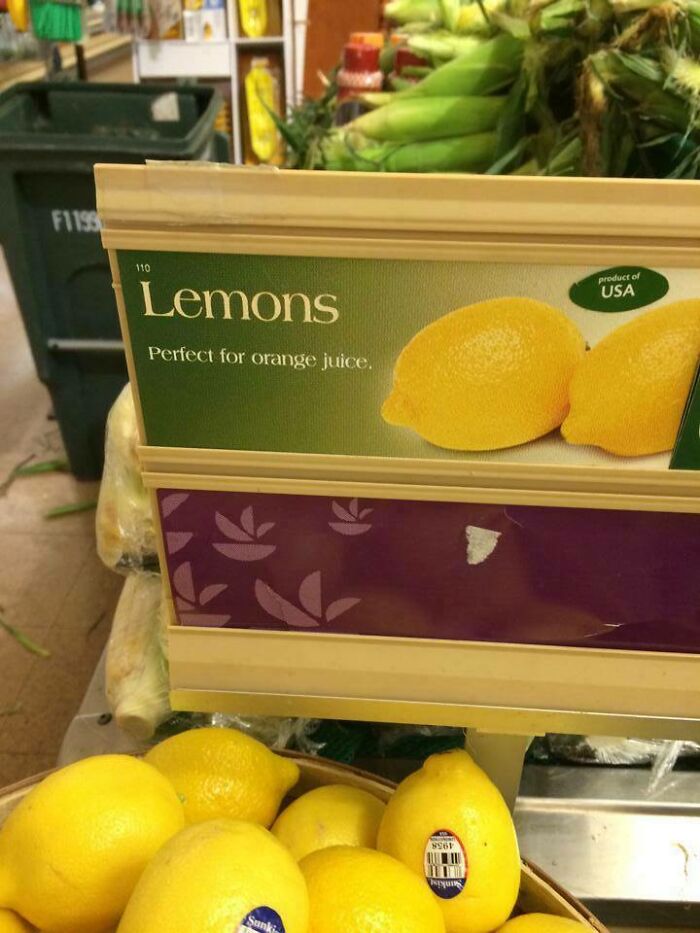
Image credits: mbz321
#44 Step 4: Just Go Sit In Some Other Chair
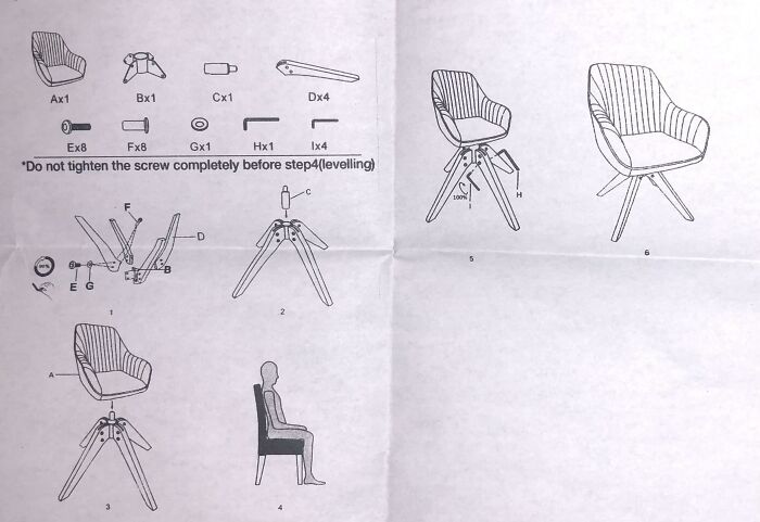
Image credits: wvWvvvWvw
#45 Our Municiplaity Made Bike Lanes For Us Finally!

Image credits: sarsina
#46 The Clock Hands Don’t Glow
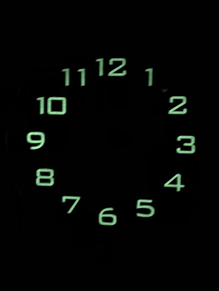
Image credits: Bl0rgasmorg
#47 Proofreading This Book Couldn't Have Been That Hard
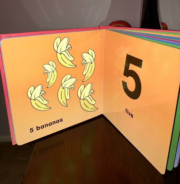
Image credits: UltraLaser23
#48 Crystal Furniture Set That Looks Like Raw Meat
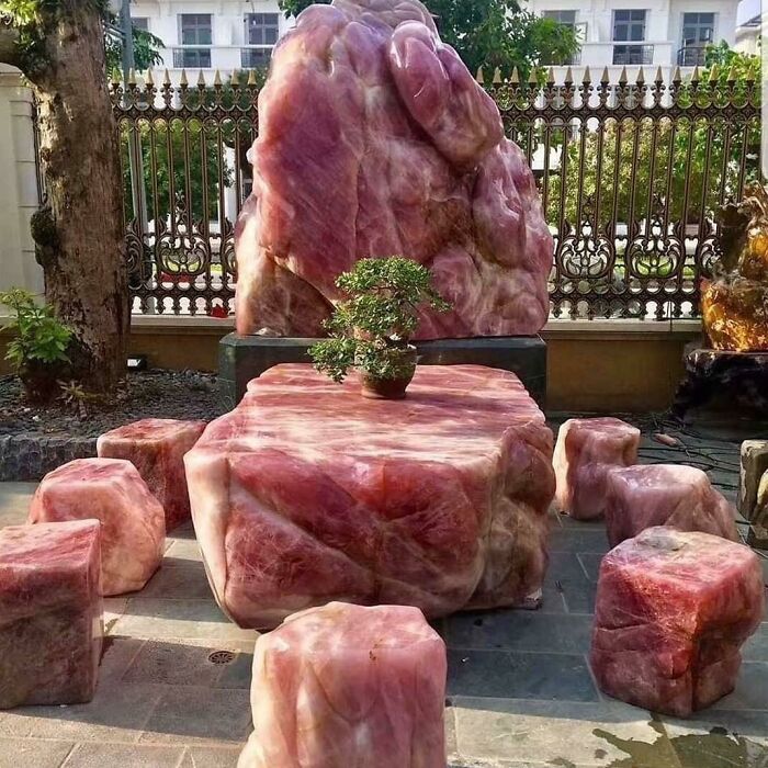
Image credits: GautamXo
#49 Diapers For Mutant Baby
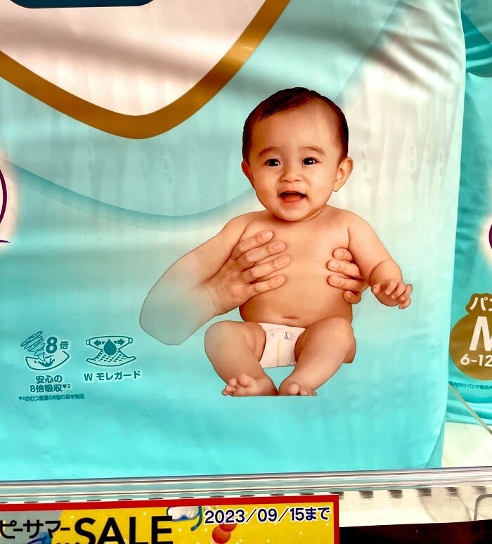
Image credits: XinXaiXoku
#50 This Unfortunately Designed Kid's Balloon
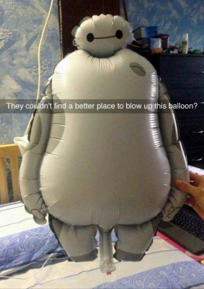
Image credits: ViolentThespian

