While we all strive for a home that looks luxe, creating one can be a costly business. Yes, you could hunt out designer dupes that look like real thing, or track down amazing deals on pricey furniture. But if there's one surefire – and let's face it, cheaper and easier – way to ensure a sophisticated scheme, it's choosing colour combinations that will make any room look expensive.
Paint colour combinations are well-known as one of the most affordable ways to add wow factor. And there are plenty of techniques to try, from colour blocking and drenching to more subtle techniques, but it's all too easy to get it wrong.
So we've reached out to interior design and paint experts to find our which colours will look luxurious side by side – versus those that can cheapen a room. We'll also explore the right paint finishes that will elevate your finish (spoiler alert: white gloss isn't on the list) and colours that look rich in general.
10 colour combinations that will make any room look expensive
Before we launch into our favourite luxe combinations, this insight from Ann Marie Cousins, owner of AMC Design gives a sense of how and why they work – and why knowing how to use the colour wheel will come in handy.
'The best way to create a luxe, expensive look is to choose colours which are complementary to one another (opposite each other on the colour wheel), adjacent to each other on the colour wheel, or on the same paint company colour card,' she says. 'To treat a room like an interior designer, you therefore have to ensure that colours have a relationship with one another.'
'Generally, if a space doesn’t quite work or feel comfortable and luxurious, it’s because the colours used don’t have any relationship with each other, so the room as a whole feels very jarring.'
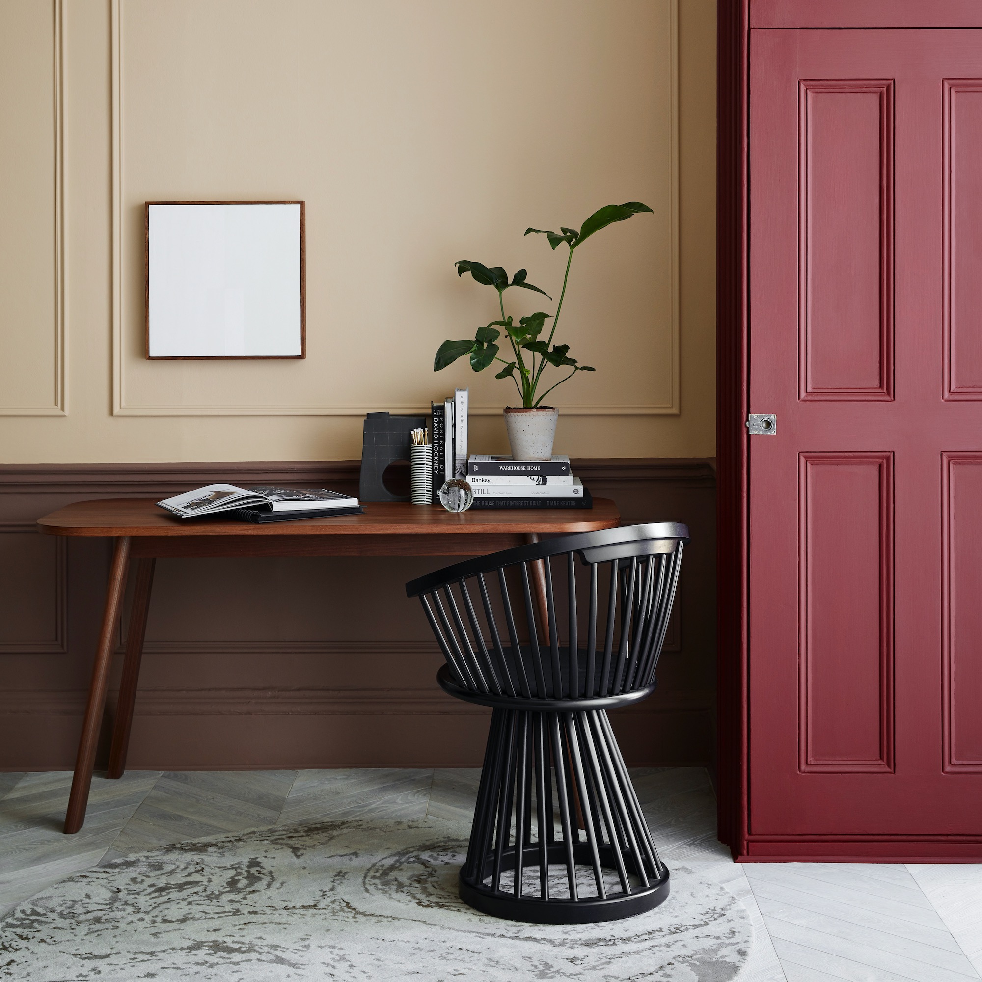
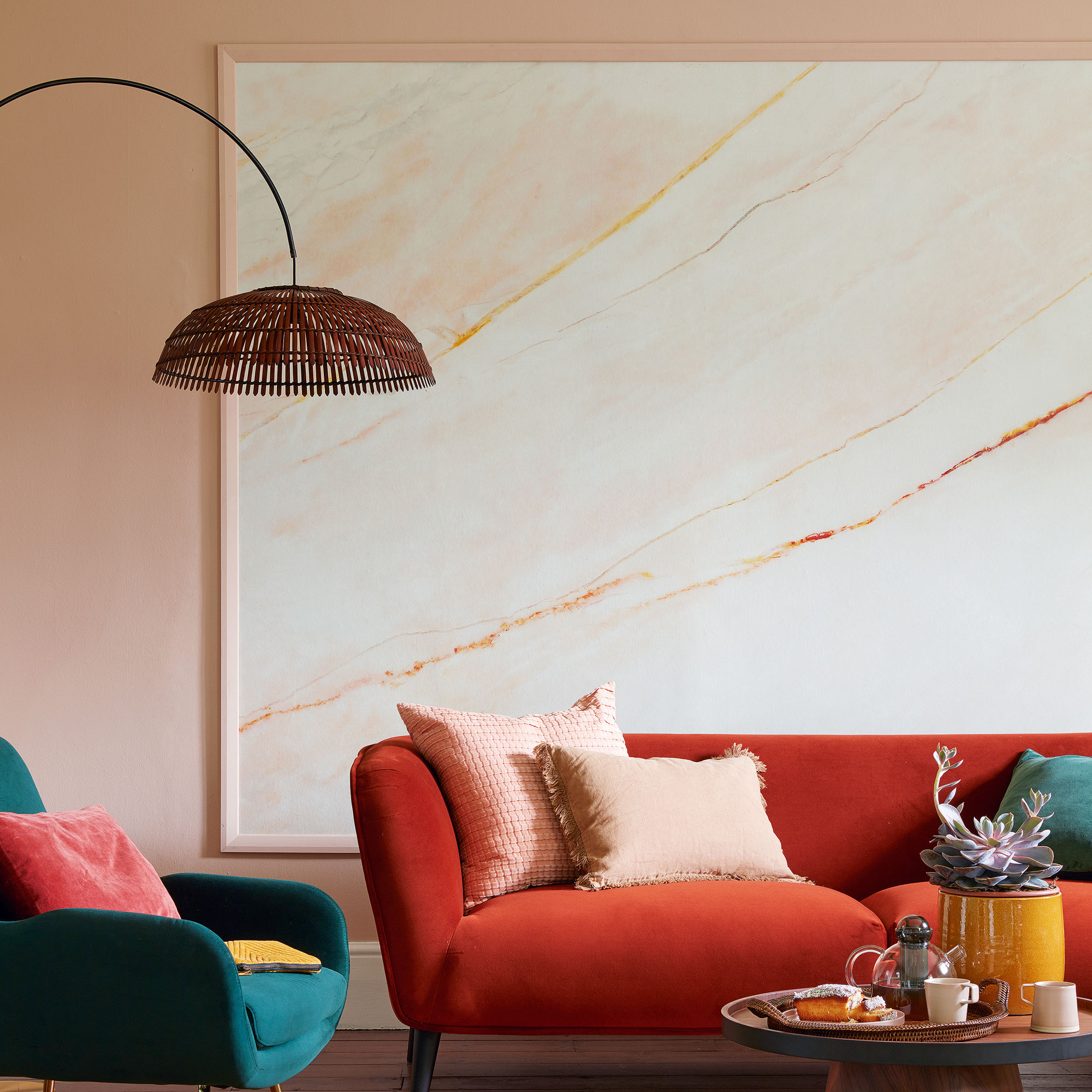
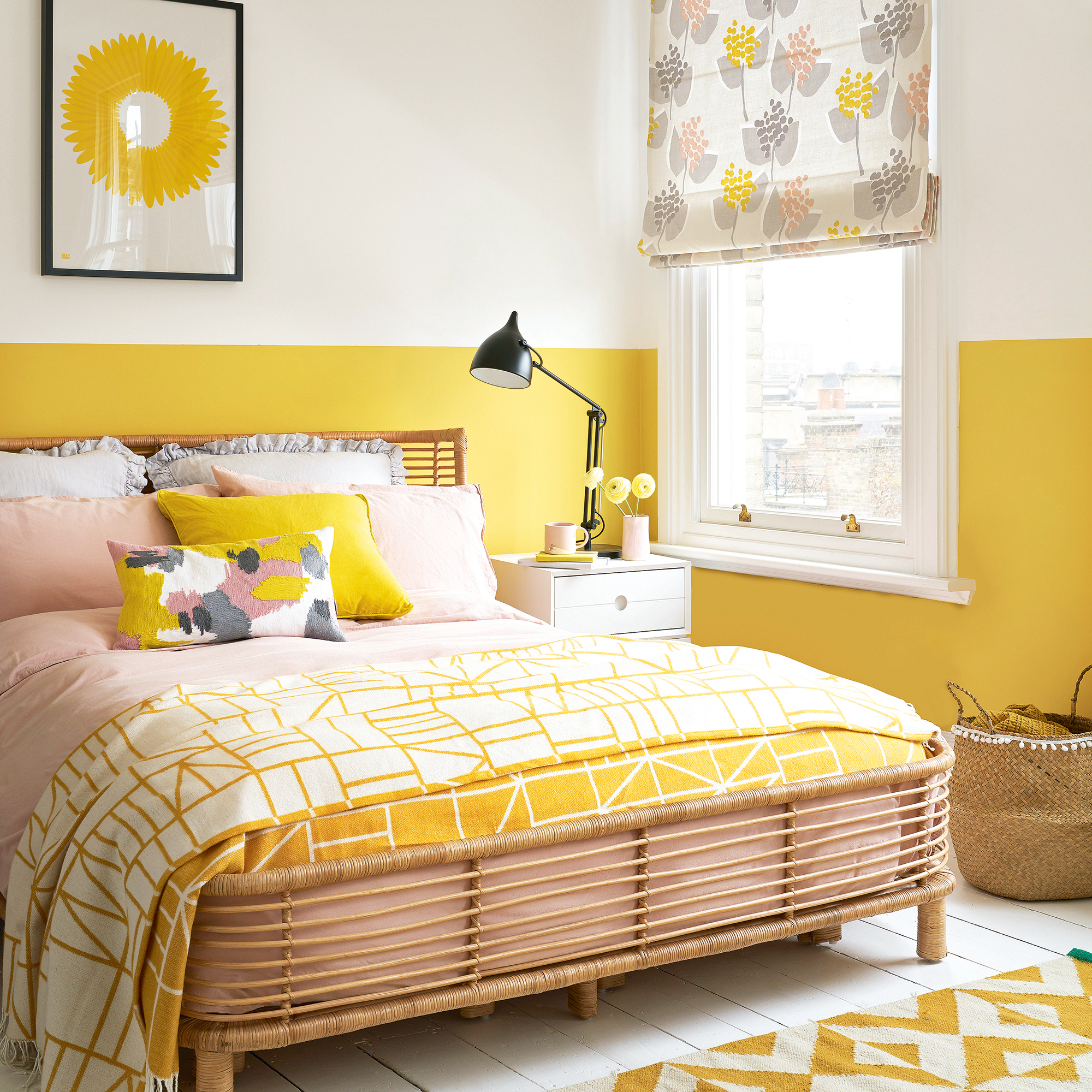
1. Navy and burnt orange
In this space, Ann Marie Cousins has used two colours on opposite sides of the colour wheel to create a very glamorous look. 'Here the rich colour of the Dulux Heritage Oxford Blue walls is complemented by the pale grey carpet and the oak floor. The burnt orange sofa is opposite to navy in the colour wheel and so works in harmony, creating a stunning contrast that really elevates the space.'
'Navy has long been in favour, and we love to use it in our projects,' she adds. 'It is a soft gentle colour to live with, and easier to incorporate into an interior than rich greys or even inky blacks, but we also love to encourage the use of bottle green or aubergine in this way, tethering the lighter shades in any room.'
Ann Marie has also used a colour synonymous with luxury – gold – but in moderation. 'Gold will always symbolise opulence but when the rest of the room is balanced it only needs a gentle touch to make a room look expensive so don’t go overboard,' she says.
2. Red and warm neutrals
In this neutral colour scheme by Little Greene, Arras cabinetry has been paired with upper walls in a soft plaster-like Castell Pink, taken from a reading of sculptural stonework at Penrhyn Castle in North Wales. The area below the skirting has been covered with a Nether Red, for a warm, comforting feel.
'Luxurious red has a history of opulence and can be used to create design schemes with real impact,' says Ruth Mottershead, Creative Director at Little Greene. 'From our soft, muted Tuscan Red to the sumptuous Baked Cherry, this versatile colour can be used in both classic and contemporary interiors. Consider pairing warm Elizabethan red Arras with the softer Rolling Fog or Castell Pink for a sophisticated and inviting scheme.'
3. Plum and taupe
'I have enjoyed working with deep plum tones on both kitchen cabinets and bespoke cabinetry,' says Rachel Usher, director and founder of the Rachel Usher Interior Design Studio, which created this living space. 'I selected Paint and Paper Library's Plum Brandy for our Oakley Street Project,' she explains. 'The rich earthy tones exude a sense of both plum and chocolate, which allowed this vibrant home to have a contemporary focal point against the backdrop of traditional period features.'
'Using a rich paint colour requires a layering of tones of similar depths of intensity, ensuring that one tone doesn’t overly saturate a scheme and helps to keep the palette balanced,' she explains. This is why it's so wise to pair it with taupe and chocolate, which will do exactly that.
4. Red and peach
If you'd rather stick to just two shades, try this red and peach combo, courtesy of Ca' Pietra. 'Umber red wall panelling (try our Asher’s Cranberry paint for something similar) mixed in with the almost peachy backdrop of the floral wallpaper gives rise to a space that feels comforting and nurturing,' says marketing director Grazziella Wilson.
'It’s yet another case of a small space being able to more than handle a combination of colour, texture and pattern – it’s positively thriving because of it.'
5. Mushroom and black
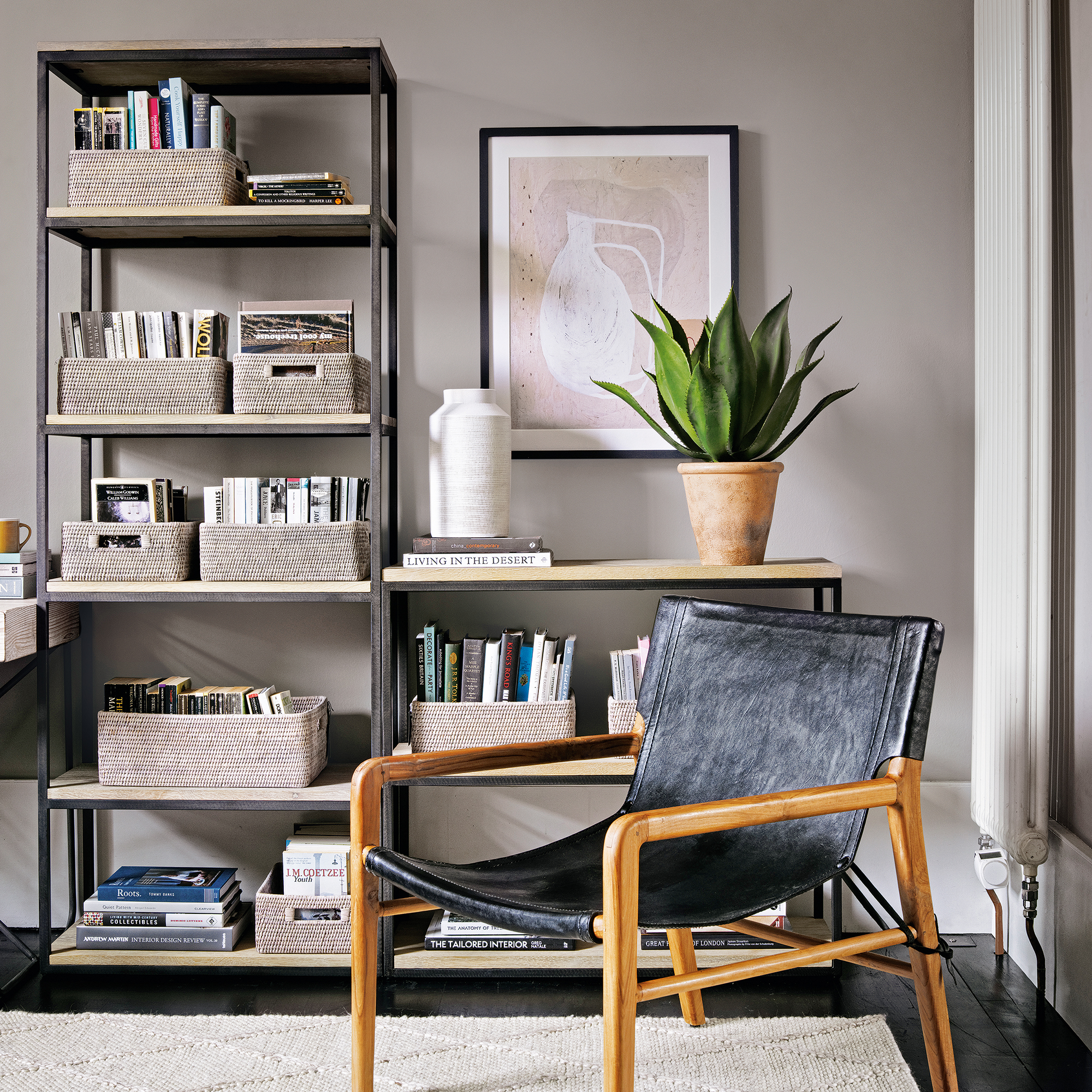
While jewel colours can feel luxurious, it's also worth looking to the less 'showy' side of the colour spectrum for a sophisticated look. 'Warm neutrals such as taupe, beige, and mushroom, paired with lots of texture can make a room feel instantly more expensive,' says Sophie Clemson, interior designer at The Living House. 'A tonal neutral colour combination will create a luxe feel, especially when paired with black finishes. Highlights in brass can also elevate the look,' she adds.
International interior designer to the stars Kelly Hoppen is famously also a big fan of this look. 'Colour of walls are key and for me – I always use light and neutral colours for every wall,' she says. 'The exception being the back wall behind your headboard in a bedroom. As an accent wall this can be exciting and add depth to the room - it could be paint or wallpaper, or could be a very dark panelled wood.'
To add interest to the walls, Kelly likes to use black and white photos – Ideally in black frames. 'For me, black and white photos are wonderful when you choose a subject or artist you love,' she says.
6. Olive and pale green
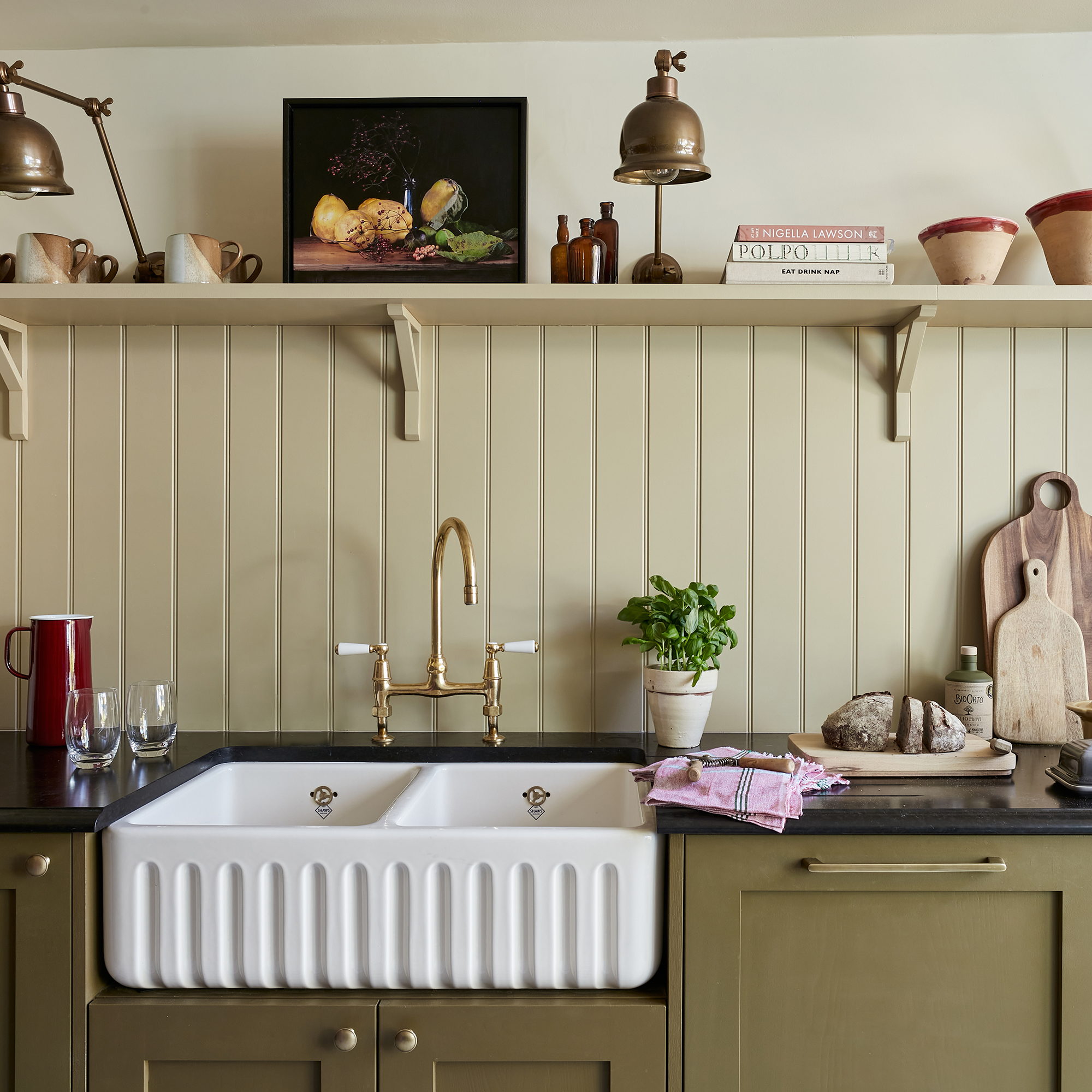
Given that so many colours go with green, it's no surprise that a few green combinations make our list. But our first is exclusively verdant. 'Using the same colour but in different tones – for instance, dark greens, leafy greens, and olive greens – make for fantastic colour combinations,' says Sophie Clemson, interior designer at The Living House. 'This can be similar to colour drenching, which can make your room look expensive and have an impact.'
For example, in this stunning kitchen project by interior designer Laura Stephens, a rich olive has been used on the cabinetry and a paler sage on the tongue-and-groove splashback.
Sophie is a big fan of olive tones and has two go-to shades. 'Olive Fruit by Morris & Co. is a beautiful, rich olive green that I’m looking to use in my own home for my north-facing home office,' she explains. 'It has yellow undertones, which would be perfect for a north-facing room where you want to create depth and a rich look.'
'Olive Colour 72 by Little Greene is another beautiful rich paint colour that would be perfect to colour drench a room,' she says. 'You could also pair this green with blues, pinks and neutrals.
Patrick O'Donnell, brand ambassador at Farrow & Ball agrees with this approach. 'One way to help elevate a room from the mundane to something more glamorous is the judicious use of the right colour,' he says. 'Try moving from a neutral to a deeper, even dark shade for magical transformation. Think our deeply nuanced Green Smoke for a living room.'
'You can even consider painting in a finish with a higher sheen,' he adds. 'Our Full Gloss finish, if applied correctly, can create an incredible faux lacquer effect... but be warned, you do need the smoothest substrate for best results.'
7. Green and mulberry
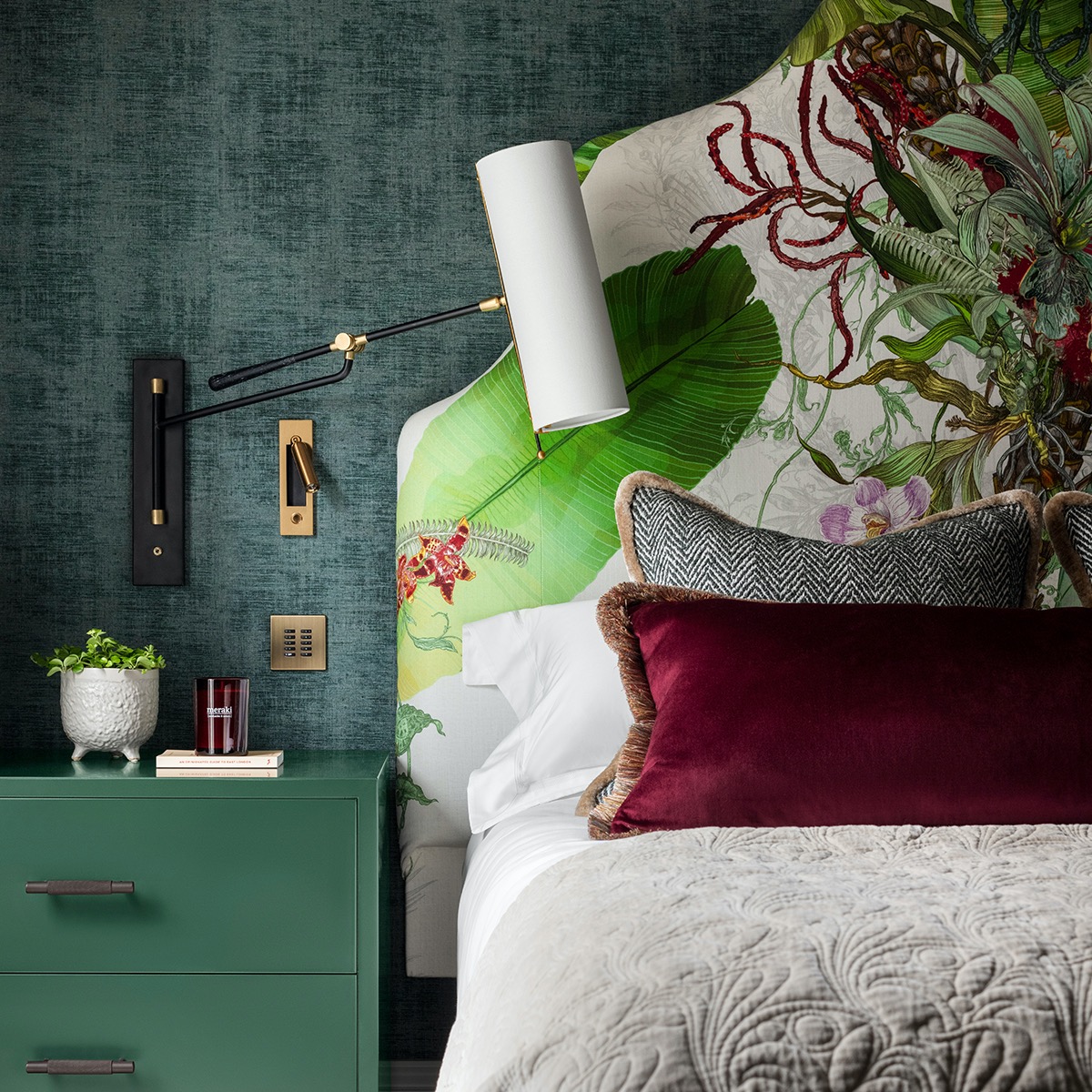
'To curate a colour palette that epitomises understated luxury I would recommend choosing warm neutrals contrasted with soothing earthy tones – for example, rich moody greens and with accents of mulberry,' says Rachel Usher, director and founder of the Rachel Usher Interior Design Studio, which created this stunning green bedroom idea.
'Colours which are found in the natural environment provide the most enduring appeal, offering a timelessness that epitomises elegance and quiet luxury,' she explains.
Rachel also has some advice when it comes to choosing accents for this colour combo. 'Contrasting hints of metalwork in bronze will ensure that the scheme avoids the "trends" of either chrome or brass, which can often be either distinctly in or out of fashion,' she advises.
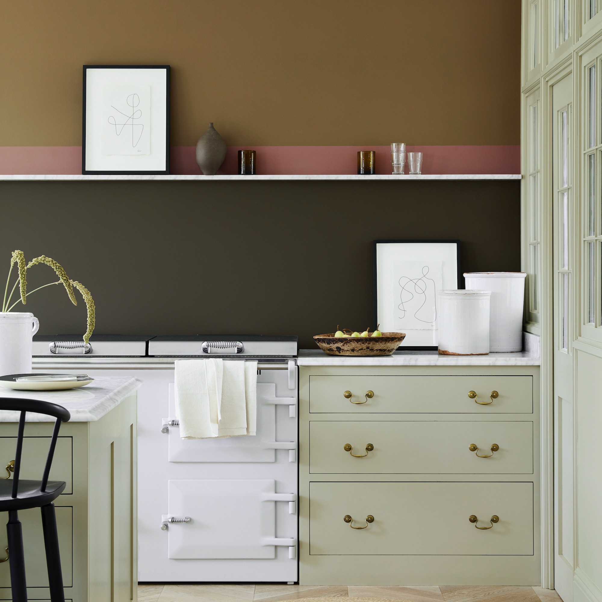
8. Aubergine and deep green
'To me, luxury is synonymous with rich, sumptuous colours – ones that you could imagine in a silk or velvet outfit for a special occasion or wrapping yourself up in before you go to sleep,' says Marianne Shillingford, creative director at Dulux. 'For this reason, I often look to dark smokey hues for heightening the "luxe" feel of a space. Wild Blackberry, Mallard Green and Dark Aubergine – each quietly eye-catching and punchy yet uber sophisticated. The right finish of paint always helps to add a tactile element of luxury, too.'
'We recently worked with Sara Cox to makeover her living room into a cosy book nook. The main colour we used on the walls was Dulux Heritage Wild Blackberry, and this is a perfect example of a gorgeous, rich shade. It’s a bold tone, but also a soothing one, and coating each wall in it envelops you in calm as soon as you walk in.'
9. Blue and green
Contrary to the common adage 'blue and green should never be seen', plenty of interior designers love to use the two together for a luxe look.
Sophie Clemson loves the dark and moody look created with the 'colour combination of moody blues and rich deep greens'. 'These colours will add drama and luxe to your room, so are perfect if you want to make your space feel expensive,' she says.
'Don’t forget the ceiling the same colour as your walls to complete the look,' she adds. 'And make sure in any luxe space you pay attention to the lighting too – varied levels of light are essential, especially if you're going for a dark and saturated look.'
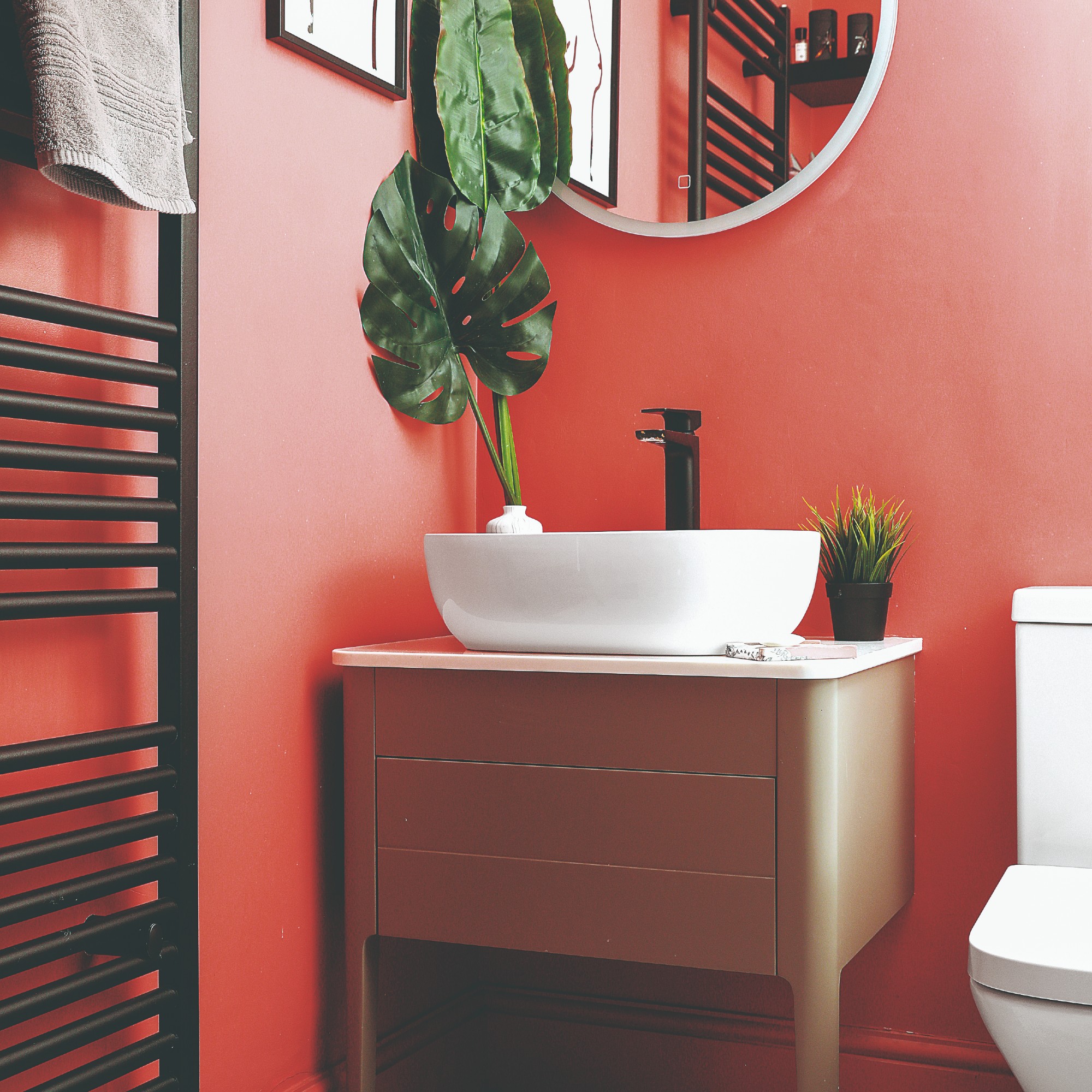
10. Pink and red
'Colour combinations that make a room look more luxurious and expensive are those which have a relationship with the colours we find in nature, and which are used confidently with reference to the room itself and the uses to which it will be put,' says Ann Marie Cousins. 'Referring to the colours found in nature gives us huge scope – everything from the pale pink of the inside of a shell, to the vibrant rust of copper, and everything in between.'
When using pink with red, it's advisable to pick a 'neutral' pink such as a blush. Your deeper red can then be employed as an accent, in line with the 60-30-10 rule to colour combinations. Athina Bluff, founder of interior design studio Topology Interiors, adds: 'Think about which shades complement each other rather than clash. For example, an earthy, muted pink pairs well with a deep red like maroon or burgundy.'
'Finally, think about your accessories,' says Ann Marie. 'Add warm metals (brass, gold, copper) when you want to add drama and warmth or use cooler metals (silver, chrome, nickel) when you want a restrained and soothing scheme.'
11. Yellow and white
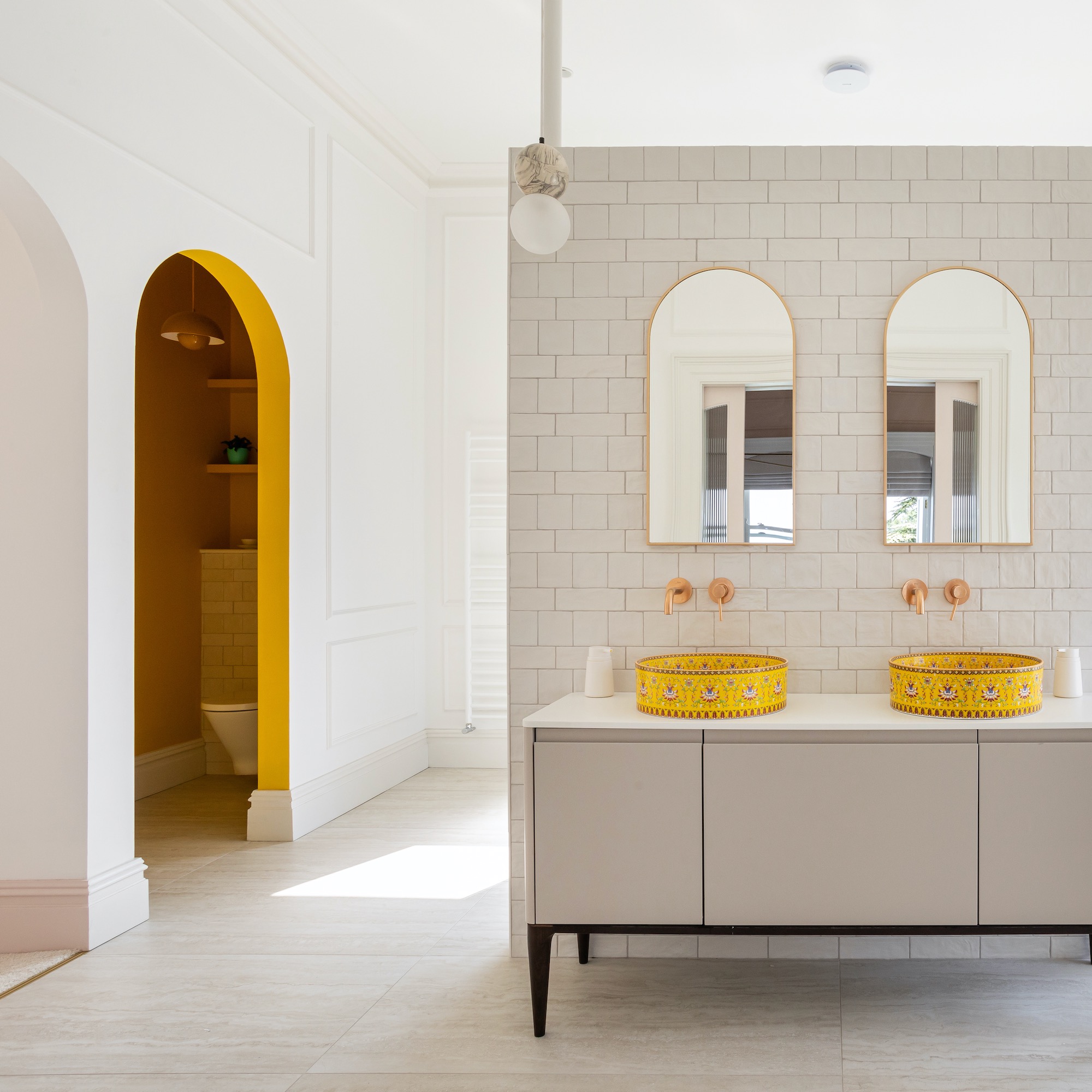
If you thought yellow was a colour used exclusively for kids rooms, prepare to be a pleasantly surprised. Yellow – in a spectrum of shades – is increasingly being used to elevate white room schemes.
In this bathroom, the brief for Donna Collins, interior designer at Dot Projects, was to create a beautiful and calming space with a chic Parisian twist. 'The Marnie basins were a must-have from the beginning,' she says. 'The client had absolutely fallen in love with them, so we designed the whole space around them.'
The result is a bathroom that perfectly emulates a chic and serene Parisian look with a playful edge. 'We were able to combine the best of both worlds - the charm of a period property with the sophistication of Parisian style,” she says. 'The basins from London Basin Company encapsulated a lot of what we wanted to create here and throughout the whole house – high quality, beautifully detailed and a lot of fun!’
Kitchen colour schemes, too, are getting the yellow-and-white treatment. 'Yellow and orange hues are set to dominate the colour trends for Autumn/Winter 2024 and beyond,' says Sinead Trainor, kitchen category manager at LochAnna Kitchens, which designed this cabinetry from the Rowan collection.
'These vibrant shades infuse a kitchen with warmth and energy, transforming it into an inviting and cheerful space that brightens even the darkest days. Embracing yellow in your kitchen design is a bold and stylish choice that brings a touch of joy and the optimism of summer into your kitchen year-round.'
12. Butter yellow and pink
But you don't have to pair yellow with stark white to be chic – there are plenty more colours that go with yellow.
Another key yellow for 2024 and beyond is butter yellow, which looks stunning with pink. 'One of my favourite things about this shade is its versatility,' says Michael Rolland, paint expert and Managing Director at The Paint Shed. 'No matter which room you use it in, the warm yellow creates a calming environment. This is one of the reasons it is so popular within living spaces and kitchens as it creates a soothing feeling of warmth which can help to create a relaxed atmosphere.'
'The adaptability of the butter yellow shade allows for it to be paired with many other colours, including earthy neutrals for a balanced feel, and even bold shades such as navy blue to create a contrast in the space,' he adds. 'But I particularly love it as a companion to a crisp white, to add a touch of the modern and contemporary.'
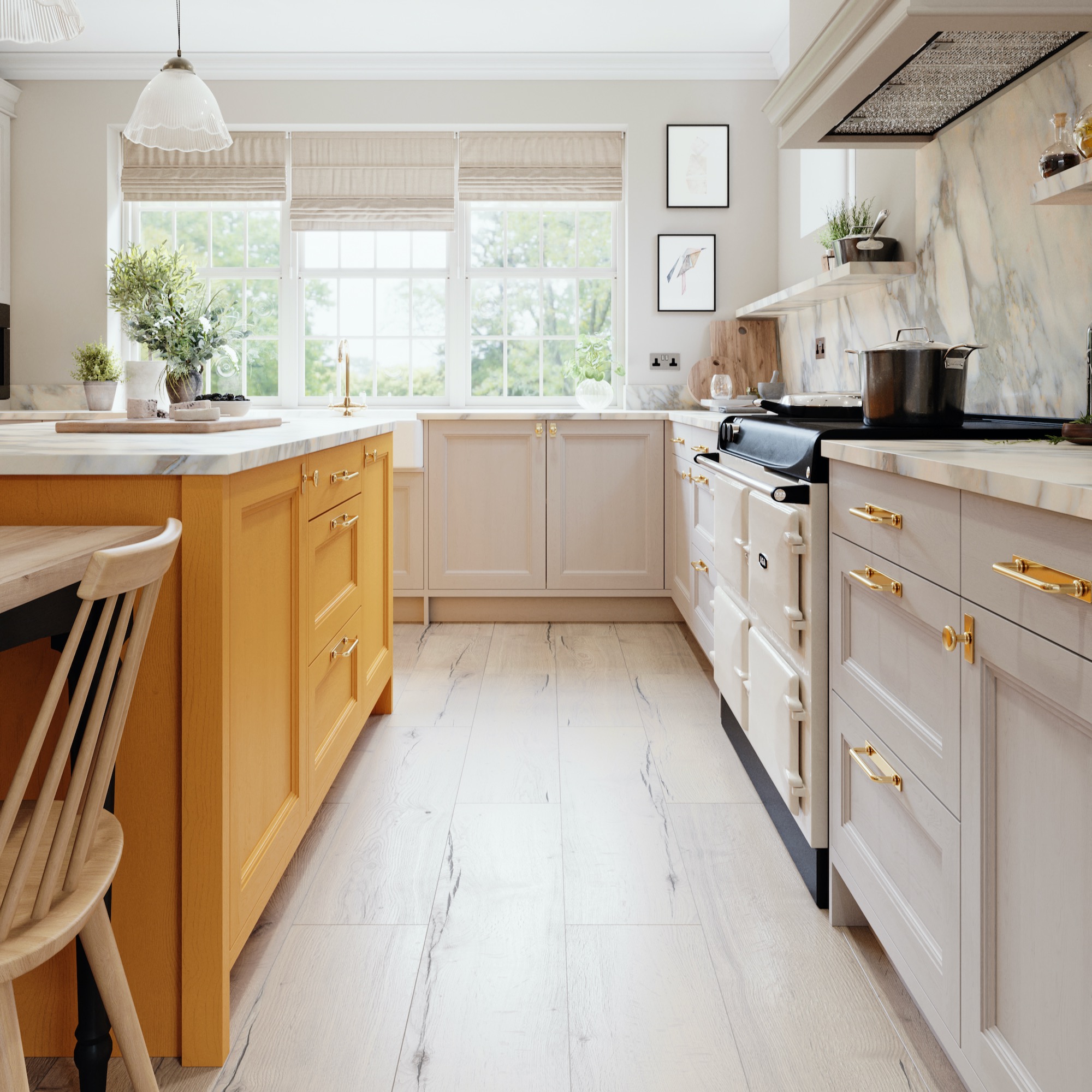
13. Terracotta, limestone and pale wood
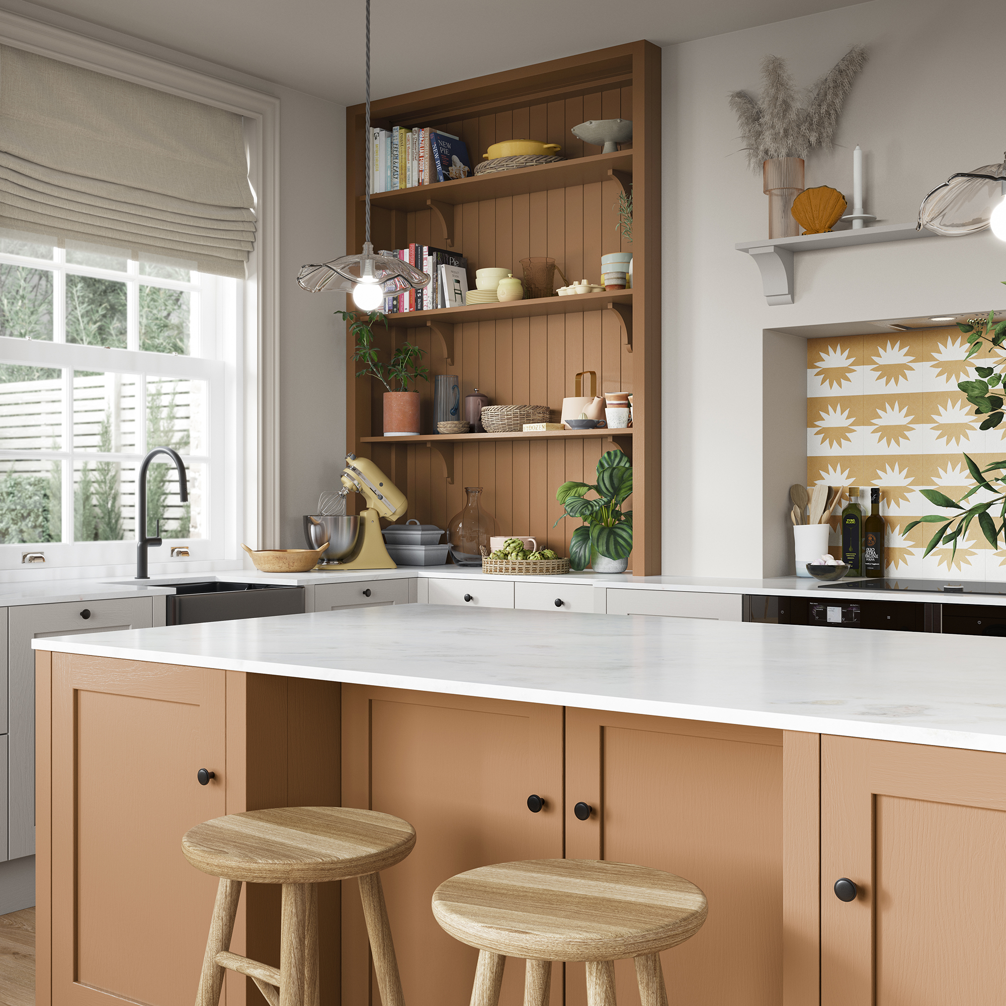
Last but not least, we have the go-to colour for interior designers in 2024 – terracotta. Used as in tile for flooring for hundreds of years, it has a timeless and comforting quality that's also extremely sophisticated. It works particularly well with wooden mid-century modern furniture, so if you're looking to upgrade your retro backdrop from the blue and saffron combos that are starting to fall from favour (see below), it's perfect.
We love terracotta for kitchen furniture – both Magnet (see above) and Husk have introduced it to their ranges for 2024. Magnet's option incorporates limestone cabinets and pale wood flooring and stools in a simple yet classy style.
'Bold colour choices like terracotta matched with contrasting worktops have instant impact – they look directional and help to give a kitchen that expensive showroom wow factor,' says Dave Young, founder of Husk. 'In an open plan space choosing a strong vibrant colour will also physically anchor the kitchen in the space, giving it a strong identity that conveys confident high-end design.'
FAQs
What colour combinations can 'cheapen' a room?
'Cheapening a room has never been easier than picking a blue and yellow combo on a backdrop of grey,' says Cathy Dean, Founder and CEO of Studio Dean. 'It looks so dated now – 2012 is calling! Those brights clashing against each other and the cool grey backdrop have been seen 10,000 times over and have become commonplace.'
'When a room looks cheap, it is because a colour is too synthetic looking or two citrusy looking,' says Ann Marie Cousins. 'Fluorescent and citrus colours absolutely have their place, but need to be used mindfully, because they're quite hard to live with and are not soothing on the eye.'
However, not everyone has a colour palette they steer away from. 'I’m a firm believer in the fact that you can make any colour combination work in the right doses,' says Marianne Shillingford. 'Trends like maximalism and cluttercore have shown us that it's exciting and fun to mix and match our colour combinations and obtain a chic look from doing so. The trick is to commit and go all in if you are going to go bold – oh yes, and think about the lighting. Bad lighting can make even the most gorgeous colours look cheap.'
What paint finish makes a room look expensive?
'A matt emulsion on walls gives a luxurious velvety look, but you must bear in mind how you'll use the room,' says Ann Marie Cousins. 'Not all paint is not created equal, so you should always think about what you're asking of it. Different matt emulsions are more scrubbable than others, so in a high-traffic room like a boot room, check the spec of your paint.
'If you really want to add a sense of luxe to a small room, such as a WC or boot room, think about going for a high-sheen paint,' advises Ann Marie. 'You could even ramp this up all the way and go for a gloss finish, particularly in a WC. However, it's a case of doing this confidently – there's no point in choosing white gloss. Instead, try a deep blue or aubergine, or any rich colour that you love.'
'We always recommend a matt finish when it comes to paint,' agrees Sophie at The Living House. 'It's modern and has a gorgeous chalky finish. Brands we particularly like are Morris & Co, Farrow and Ball, Little Greene, and Paint and Paper Library. All three of these brands have a beautiful selection of colours and finishes. Something we always suggest is to go for a scrubbable and wipeable finish to ensure it is long-lasting, especially in busy family homes.
'Example of finishes for each brand we’ve suggested are Morris & Co's Chalky Matt, Farrow and Ball Modern Emulsion, Little Greene's Intelligent Matt Emulsion and Paint and Paper Library's Architects' Matt.'
'The elusive flat matt look is universally classy, and a chalky finish can really elevate a space,' agrees Coat Paints' founder and CEO Rob Abrahams. 'There’s a theory that high-gloss paints add a touch of glamour and drama to a room as they almost ‘sparkle’ to catch the eye. Whilst this can work when the surfaces are absolutely perfect, be careful in most places with imperfections.'
'Using a high-gloss finish on a rough wall, or damaged skirting, can have the opposite effect by drawing attention to damages and ruining your expensive feel,' he explains.
What paint colours look rich?
'We have a shade called Gumption (below), which is a deep brown that needs some real confidence to try!' says Coat Paints' Rob Abrahams. 'It’s incredibly indulgent with purple undertones, which is a colour historically associated with royalty and luxury. Obviously, our paint is much more accessible than all that, so drenching a room in something like Gumption is a shortcut to a really dramatic space.'
'Wine Dark by Farrow and Ball is a lovely rich blue paint colour but it also has a soft appearance,' says Sophie at The Living House. 'And Paint and Paper Library's Scarlet ‘n’ Rust is nailing the colour red, which is very on trend for 2024. It has a gorgeous richness that you can tone down with plaster pinks and neutrals if you prefer a more gentle look.'
While all these colour combos will help to elevate your home and make it look more expensive, make sure you stay true to your personal taste. A home filled with colours you love will always look better than one that simply looks expensive.