The secret of a great public space lies in its design. For people to visit and make use of these places many times over, they have to be functional, accessible, easy to use, match the needs of the community, and evolve with it as it changes. After all, most things are created to be utilized, not just to be seen.
However, not all designs can check these boxes. “What happens when they fail to do so?” you may ask. Well, they are shared online for netizens to judge. The team at Bored Panda has collected some of the worst cases in the list below. We hope that these photos serve as a public service announcement that we deserve better!
We also reached out to urban planners Taiwo Agbaje and Samuel Austin, who kindly agreed to share some tips on how to create a successful public space.
#1 This Pattern On The Hospital's Floor
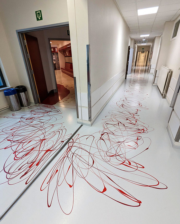
Image credits: Cartapouille
#2 The Students In My Course Complained About Not Having Enough Privacy, And University Decided To Install Glass Doors To Solve The Issue
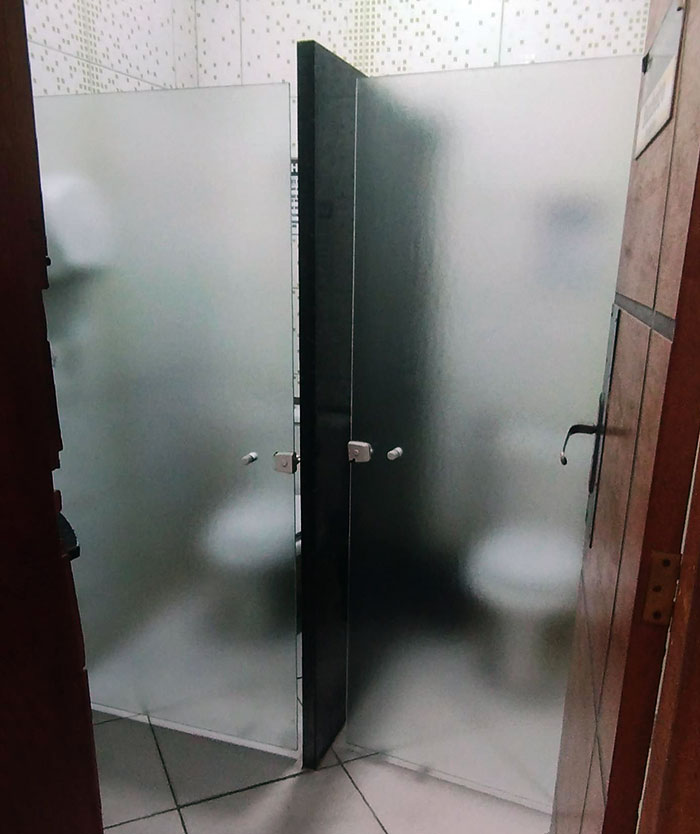
Image credits: Ysisbr
#3 My Classroom Has These Floor Outlets. It's Basically The Toe Stubber 5000
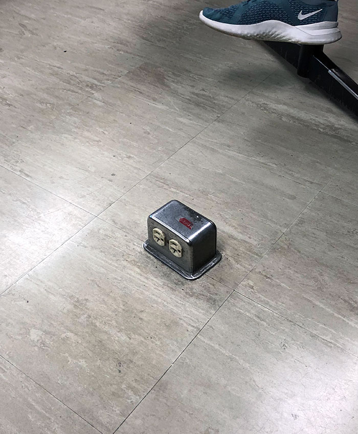
Image credits: Dillon-Croco
Urban planner and GIS analyst Taiwo Agbaje tells Bored Panda that one aspect that makes a public space successful is its accessibility. “A remarkable public space is undeniably easy to access and navigate, visible from a distance, and seamlessly connected to its surroundings.”
Other features that it has to include are engaging activities. “Successful public spaces are unequivocal hubs of vibrant activity, offering diverse opportunities for people to engage and participate in various activities,” says Agbaje.
#4 Public Restroom Stalls With... Viewing Windows? Why?

Image credits: TheOneTheUno
#5 They Put Circus Mirrors In My Local Gym
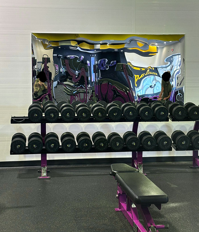
Image credits: Guwoq
#6 There Are Three Steps Down At The Entrance To This Lobby
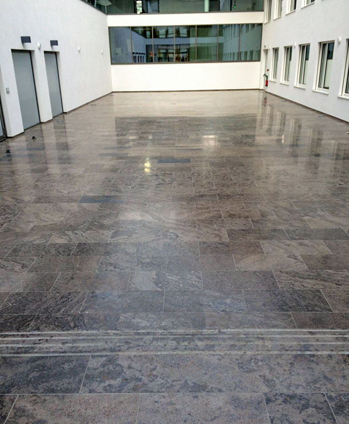
Image credits: HothHanSolo
He also adds that such places should be comfortable, pleasing to the eye, and serve as a fostering environment for social interactions. “A comfortable environment is undeniably crucial, where seating, shade, cleanliness, and pleasant aesthetics significantly contribute to a positive experience. The space's image must radiate safety, inviting warmth, and impeccable maintenance.
Outstanding public spaces definitively foster social interactions, serving as unequivocal meeting points that genuinely enhance the sense of community, enabling connections among friends, family, and strangers."
#7 Leg Space In A Cricket Stadium
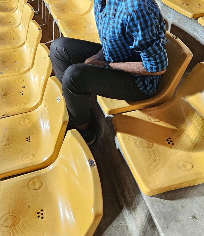
Image credits: stuckintrraffic
#8 The Fitting Room Door At The Thrift Store
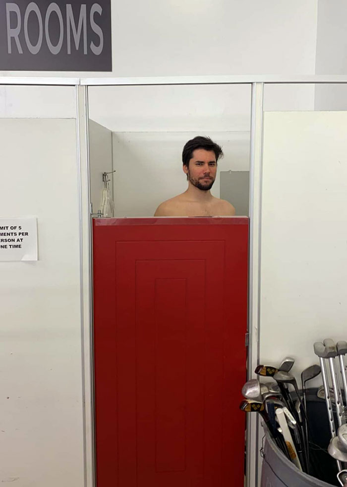
Image credits: SeventhMind7
#9 My School Installed A New Beamer. I Nominate Them For "The Best Engineering 2017"
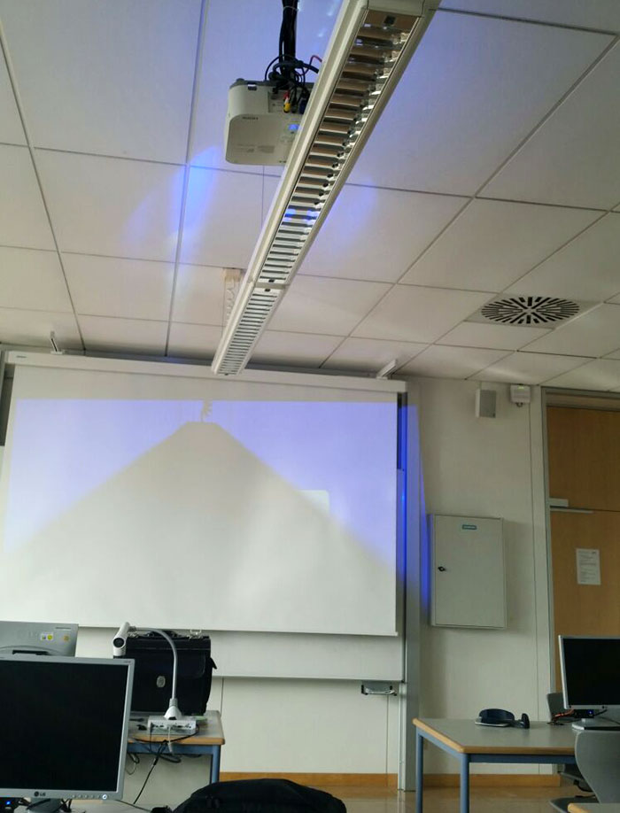
Image credits: Triomat
Urban planner Sam Austin, who advocates building liveable cities for youth, summarized these principles by saying, “Public spaces should make people 'stick' and linger for longer, encouraging people to stay and spend time in. Whether that's having informal seating spaces along a pedestrian street or interactive public art - it should provide multiple opportunities to enjoy the space.”
#10 The Wall Art In This Bathroom Is... Suboptimal
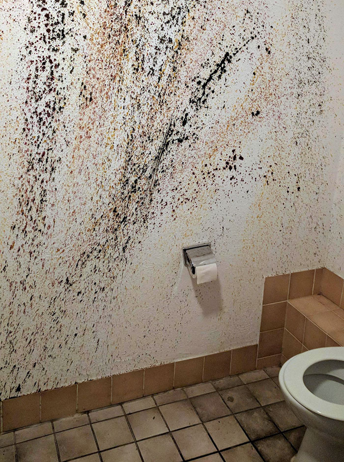
Image credits: DaBittna
#11 These Stairs
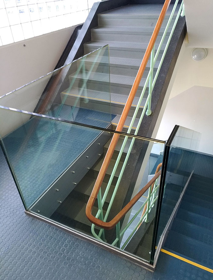
Image credits: adynako
#12 This Is The View Of The Stage At The Concert I'm At
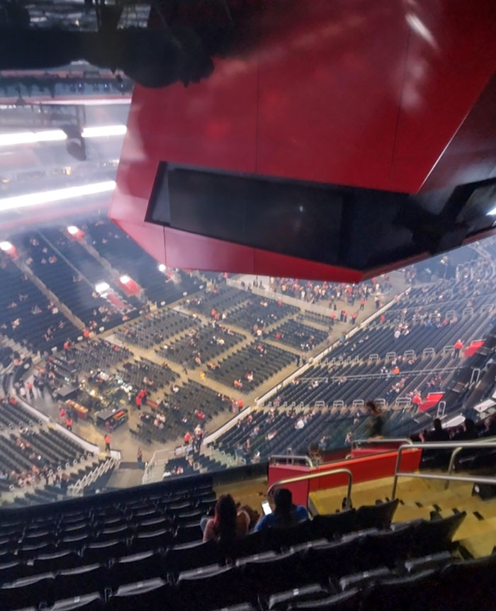
Image credits: thatcancerfurry
Now that we have discussed what makes a public space successful, let’s see what the most common mistakes designers make when creating them.
Austin believes that going too over the top can often ruin the experience of these places. “Some of the most successful public spaces are those that are simple, welcoming and encourage you to stay. While flashy designs and expensive materials look nice, they often create spaces that feel like you don't belong or a sterile, unnatural feeling.”
#13 Lets Hope There Won't Be Fire
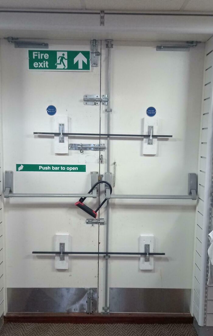
Image credits: robric1985
#14 The Lights In This Hallway
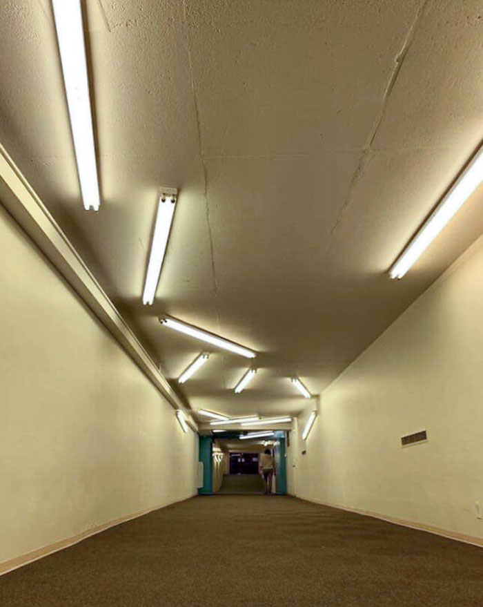
Image credits: ntheg111
#15 This Was The "Sink" In A Restaurant
Nope, this isn’t a minimalist, avant-garde design. The water just spills off the edges onto the floor, which is why the mop is right there. There isn’t even a drain pipe below this counter.
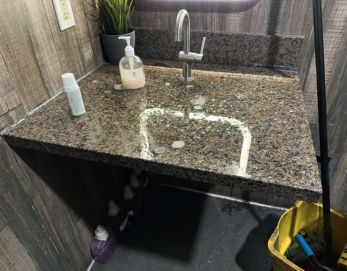
Image credits: CoolBDPhenom03
Meanwhile, Agbaje often notices inadequate seating and lighting in poorly designed public spaces, “Insufficient seating or uncomfortable benches may dissuade individuals from utilizing the space. Adequate seating is paramount for relaxation and facilitating social interaction. While “insufficient or harsh lighting can engender a sense of insecurity within a public space, particularly during evening hours or at night. Well-conceived lighting augments visibility and fosters a welcoming environment.”
#16 This Aquatic-Themed Hospital Couch Weirdly Has An Underwater Giraffe On It
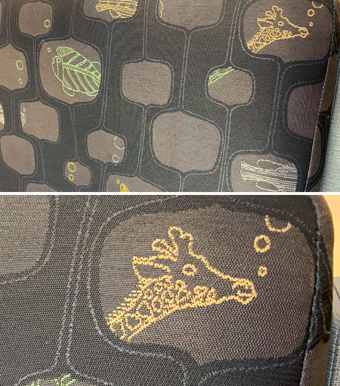
Image credits: CoopDaWoop
#17 Perfectly Thought Classroom
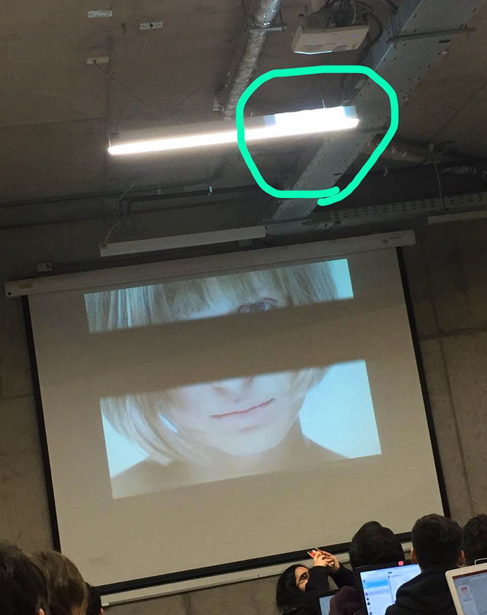
Image credits: Brunorto
#18 My School's Locker Can't Even Fit My Backpack Because Of Those Shelves
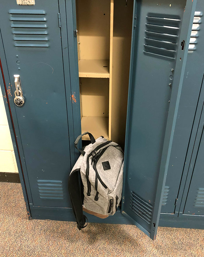
Image credits: zucclivan
Additional issues he mentions are a disregard for maintenance and monotony. No one wishes to be in an environment that is repetitive, unstimulating, and marred by litter, graffiti, or malfunctioning amenities. Neglecting context is a big one too, as “designing without regard for the surrounding environment or the prerequisites of the community can precipitate disconnected or incongruous spaces,” explains Agbaje.
#19 They Replaced Half The Mirrors In My Local Shopping Mall's Bathroom With Advertising Boards
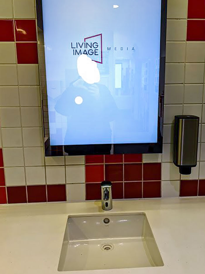
Image credits: BradleyZ17
#20 At Least It's Padded
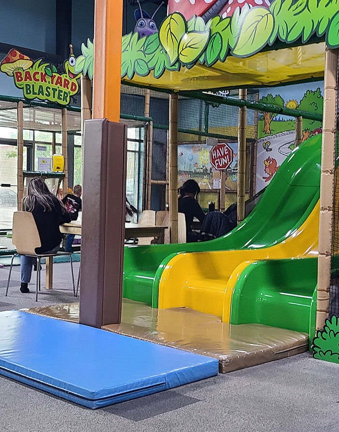
Image credits: cheekymrs
#21 Who Wouldn’t Want A Ceiling That Looks Like It’s Covered With Hair?
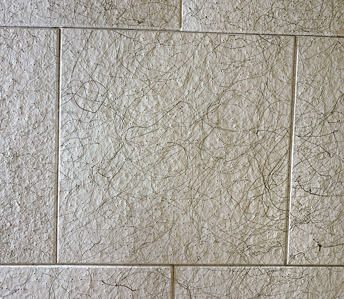
Image credits: im-jared-im-19
One piece of advice that Austin has for designers who aspire to create successful public spaces is to get tactical and then get permanent. “Trial pop-up street furniture, or temporary programming within a space. Physically test what will work best through trial and error before you start pouring concrete and making permanent decisions.”
Agbaje recommends starting by engaging with the local community and considering their needs, activities, and utilization. “Community involvement fosters a sense of ownership and pride in the space,” he says.
#22 Steps That Are Too Long For One Step, But Too Short For Two
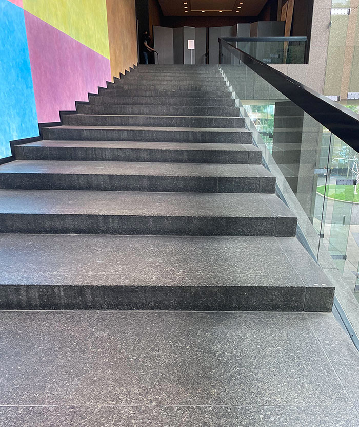
Image credits: enzodr
#23 Cyber-Greco-Roman Architecture
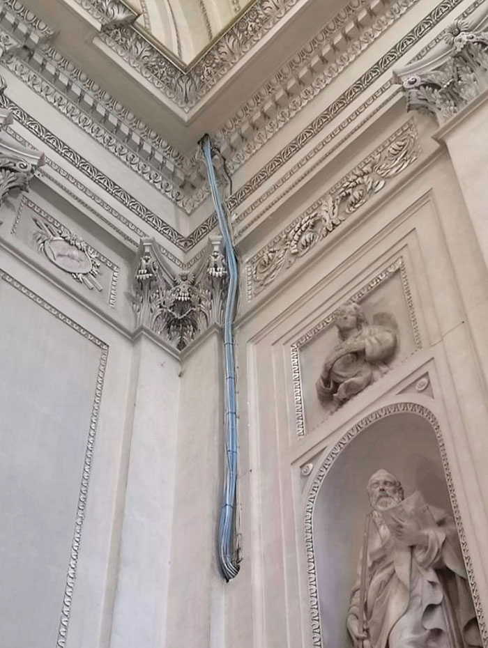
Image credits: Bmchris44
#24 Placing The Emergency Door Button Next To The Children's Play Area
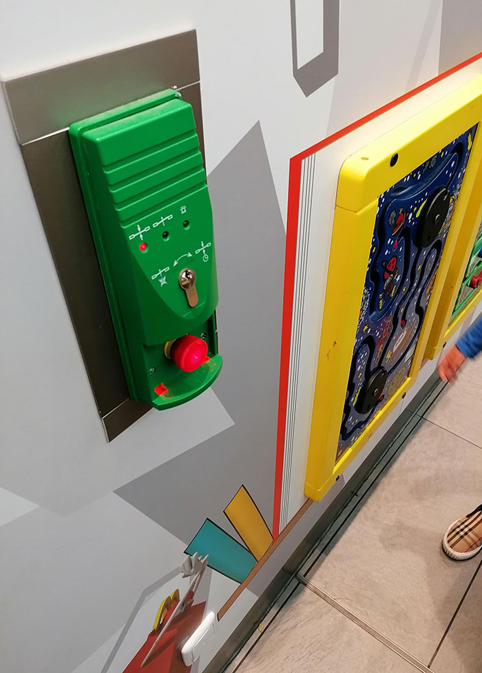
Image credits: CRIMSONSNOW2019
Additionally, it’s important to prioritize users and their accessibility. “Ensure universal access to the space by designing pathways, seating, and amenities with inclusivity in mind. Pedestrian-friendly settings cultivate community interaction. Consider sensory experiences, encompassing visual appeal, sounds, and scents," shares Agbaje.
#25 My View At A Movie Theater Last Night
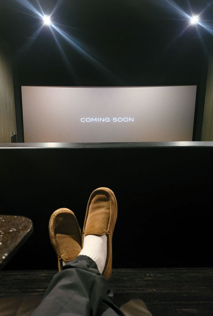
Image credits: NeighborhoodLow8413
#26 World's Most Practical Design
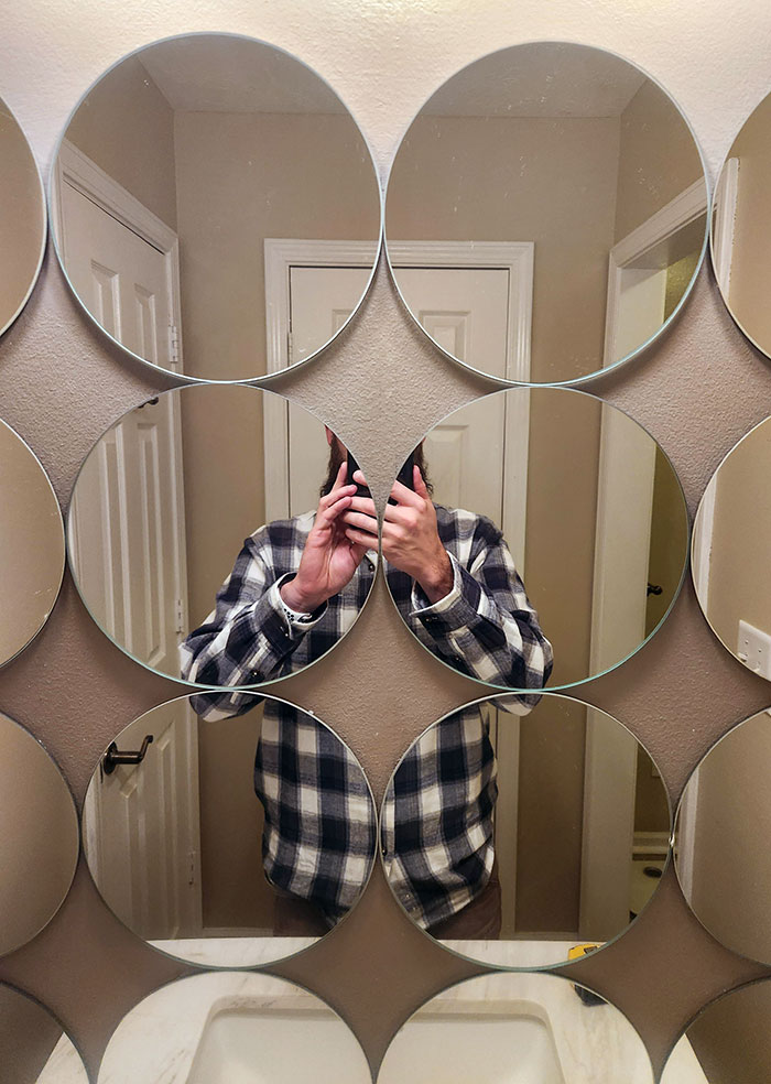
Image credits: IndyNightSky
#27 My Sister And I Went To Use The Bathroom At My Other Sister's Softball Game And We Saw This
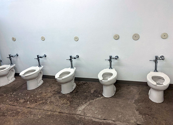
Image credits: BreeMore
He further advises embracing the unique identity of the local culture and embracing greenery, which provides relaxation and improves the well-being of the community. Lastly, he reminds designers not to overlook the materials they use in the space. “Opt for durable, sustainable materials capable of withstanding wear and tear. The use of premium materials notably augments the overall experience and endurance of the space.”
#28 This Escalator Requires That You Still Use The Stairs
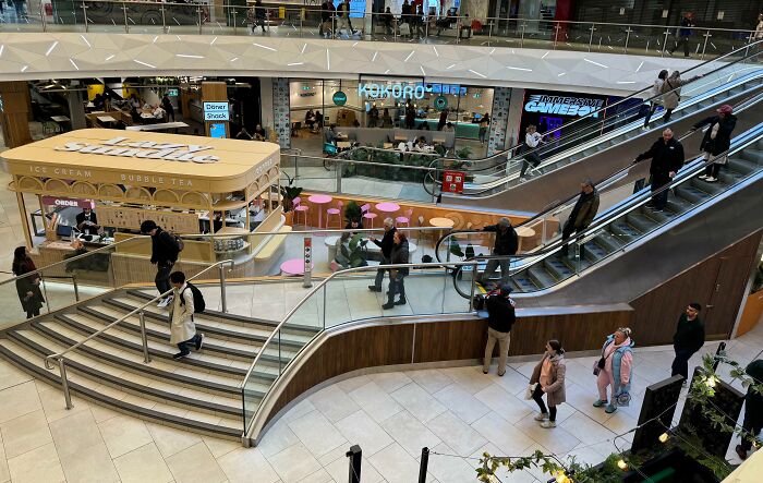
Image credits: Justhereforbiz
#29 Kids' Area In A Hospital's Lobby. N Is For... Nugget?
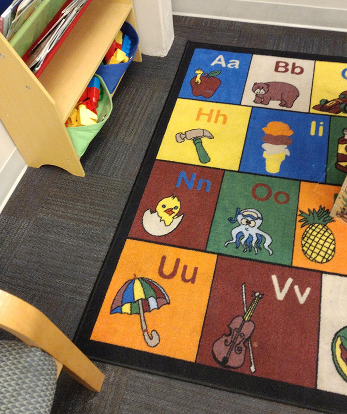
Image credits: SleezeDemon
#30 This Door
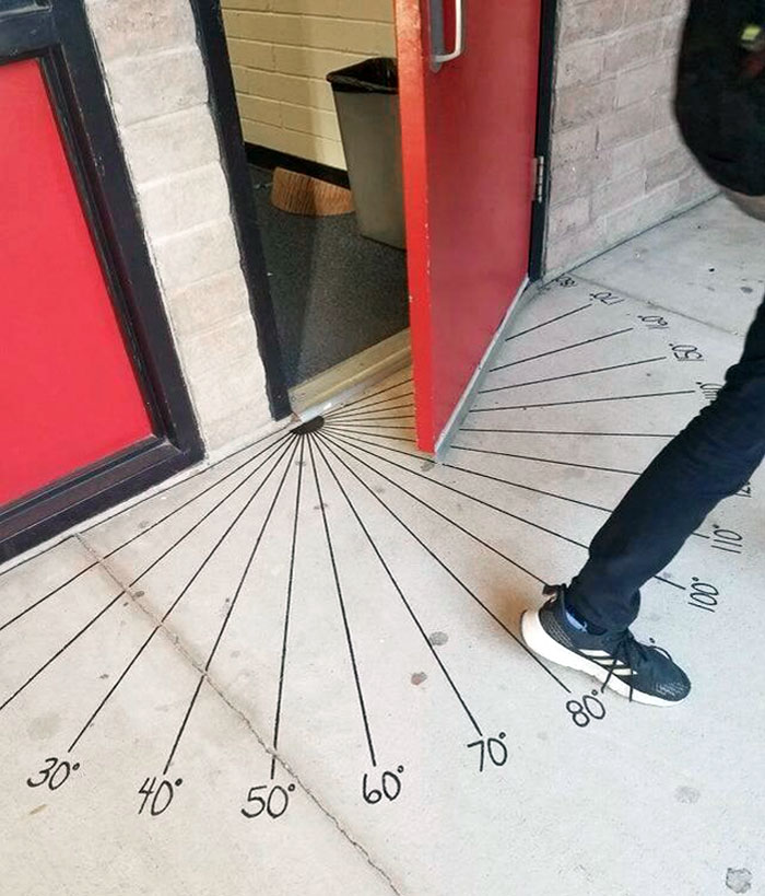
Image credits: ZeroDamnChill
#31 "Mind The Step"

Image credits: tyw7
#32 This Weird Door At The Top Of The Stairs In A Hotel
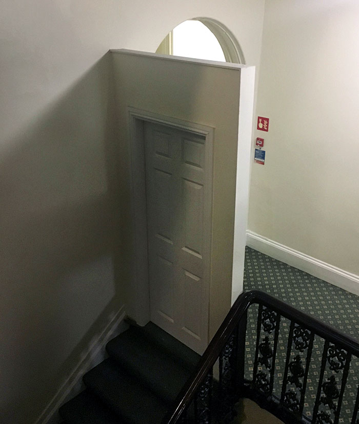
Image credits: AlephMartian
#33 My School Added A New Vending Machine To The Science Building’s Lobby. Better For Them To Eat Junk Food Than Have Free Water
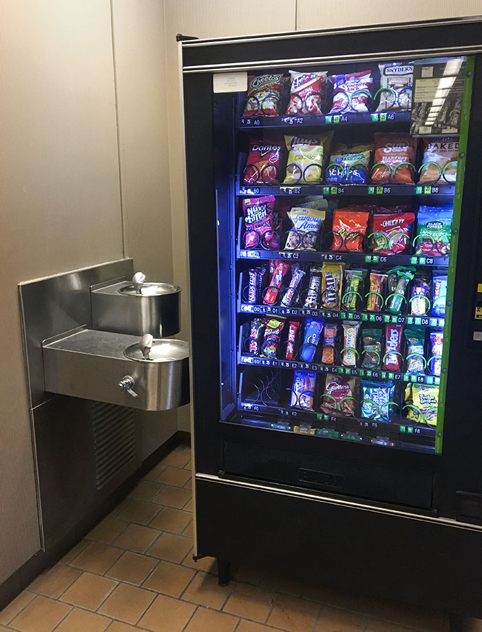
Image credits: Bean_Boozled
#34 Oddly Placed Phone In A Waiting Room
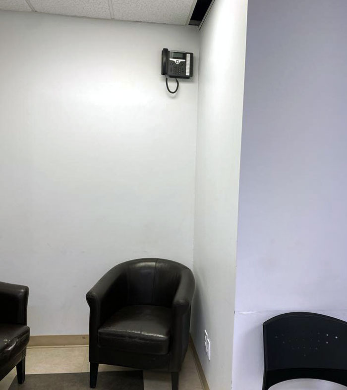
Image credits: Noemo19
#35 Installed Those Elevator Buttons, Boss
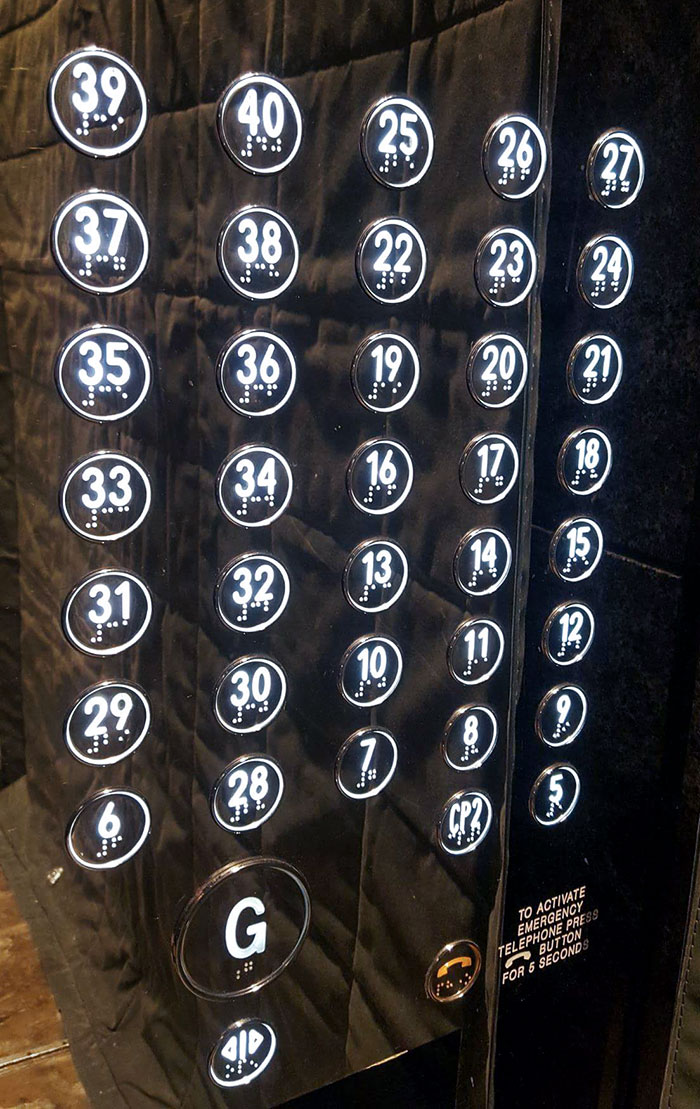
Image credits: compuryan
#36 The Only Unlocked Bathroom At My School
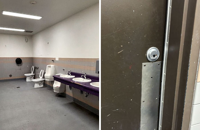
Image credits: SuccessfulNarwhal576
#37 My Friend Saw This At The Cinema
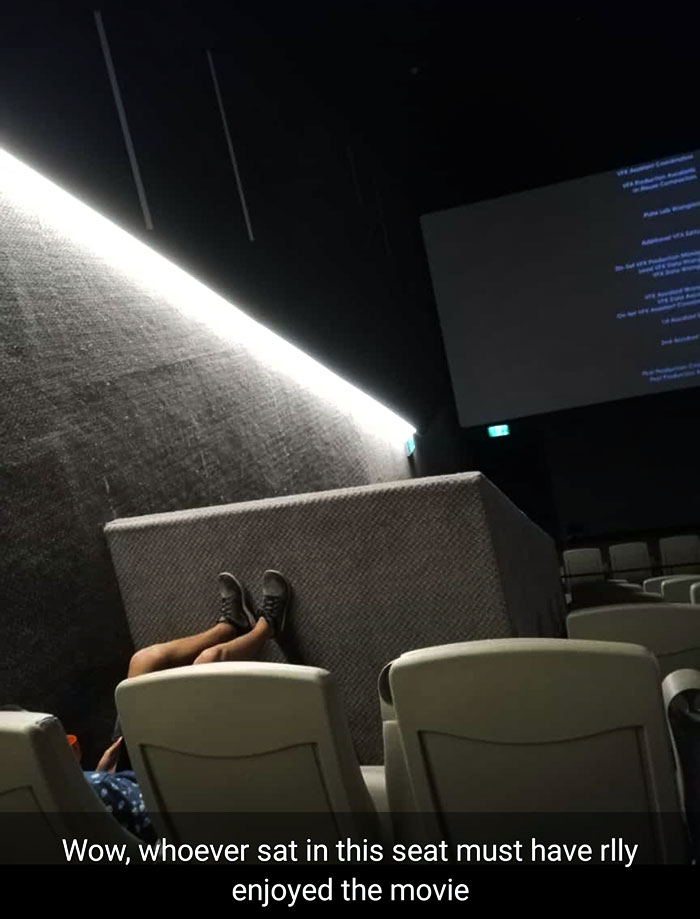
Image credits: carrotlovernomnomnom
#38 The Staircase At My Hotel Room Just Drops Off

Image credits: Opposite_Strategy_43
#39 Wheelchair Accessible Washrooms Are Located On The Second Floor. Just A Quick Trip Up The Escalator

Image credits: _timewasted
#40 Shoutout To This Bar In Rural Alberta, Where The Women's Bathroom Is Right Beside The Piano Stage, No Door. If You Go To The Toilet, Everyone In The Bar Is Going To Hear It
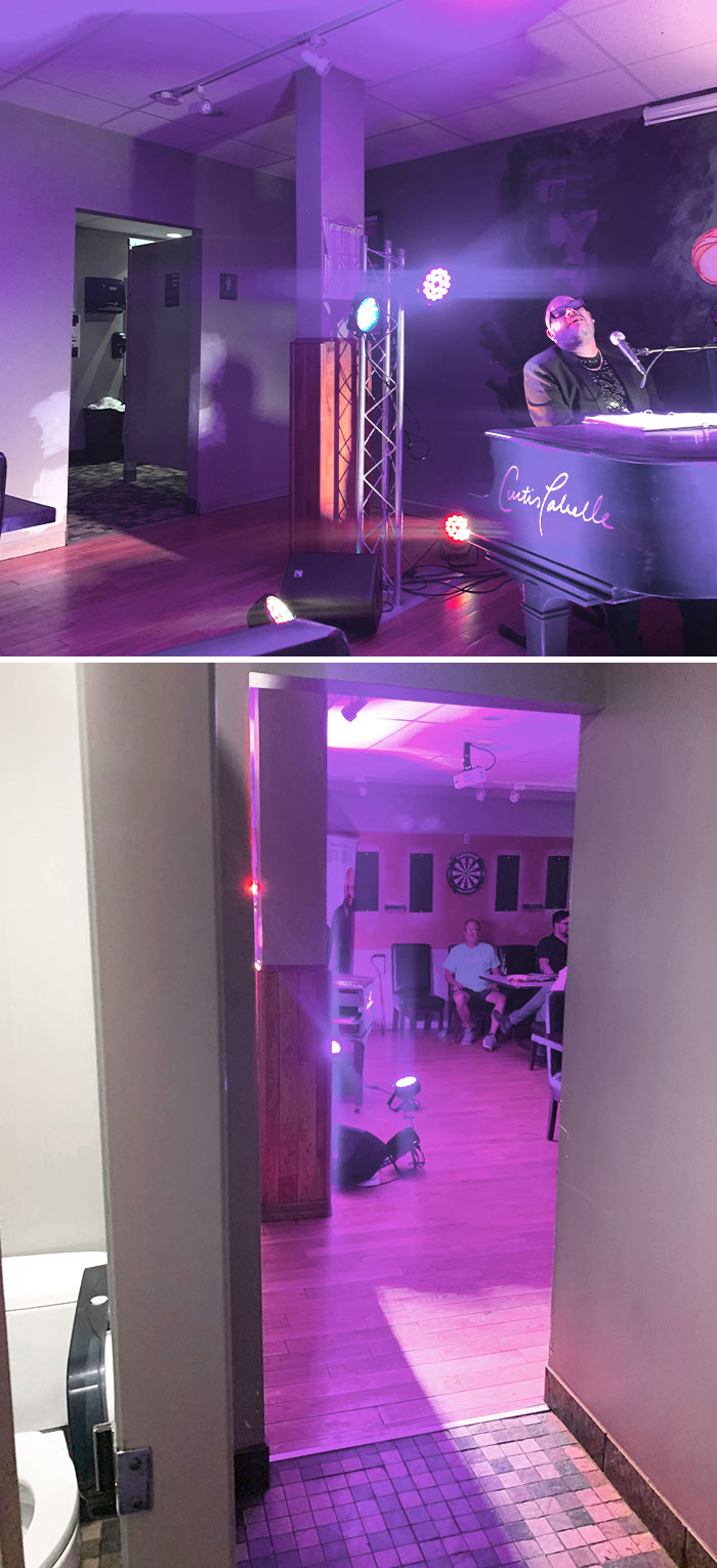
Image credits: eggnog_alcoholic
#41 Meanwhile In Supermarket
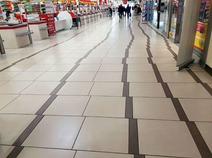
Image credits: iGniSsak
#42 How Close This Toilet Is To The Stall Door. Had A Good Laugh At How My Feet Poke Out Underneath
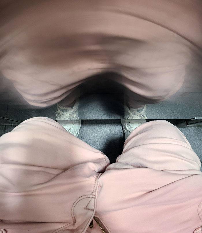
Image credits: CanadasNeighbor
#43 I Found This Gem At A Hotel In Wisconsin
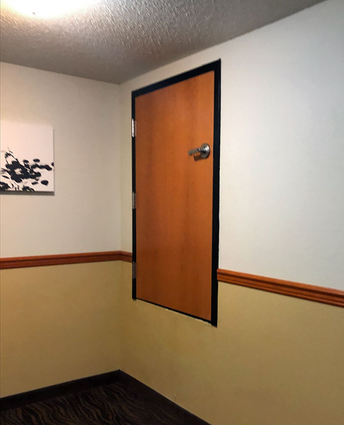
Image credits: drkstrracingjr
#44 The Way These Canvases Were Hung Up In The Bathroom Of My Local Sushi Restaurant
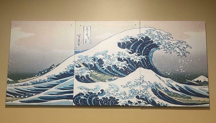
Image credits: stephanonymous
#45 My View At The Kings Theater, Portsmouth, UK
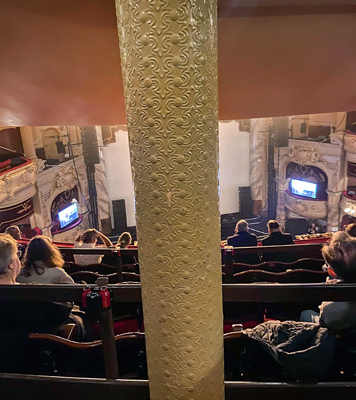
Image credits: Crankyjak98
#46 This Pull Door At Panda Express
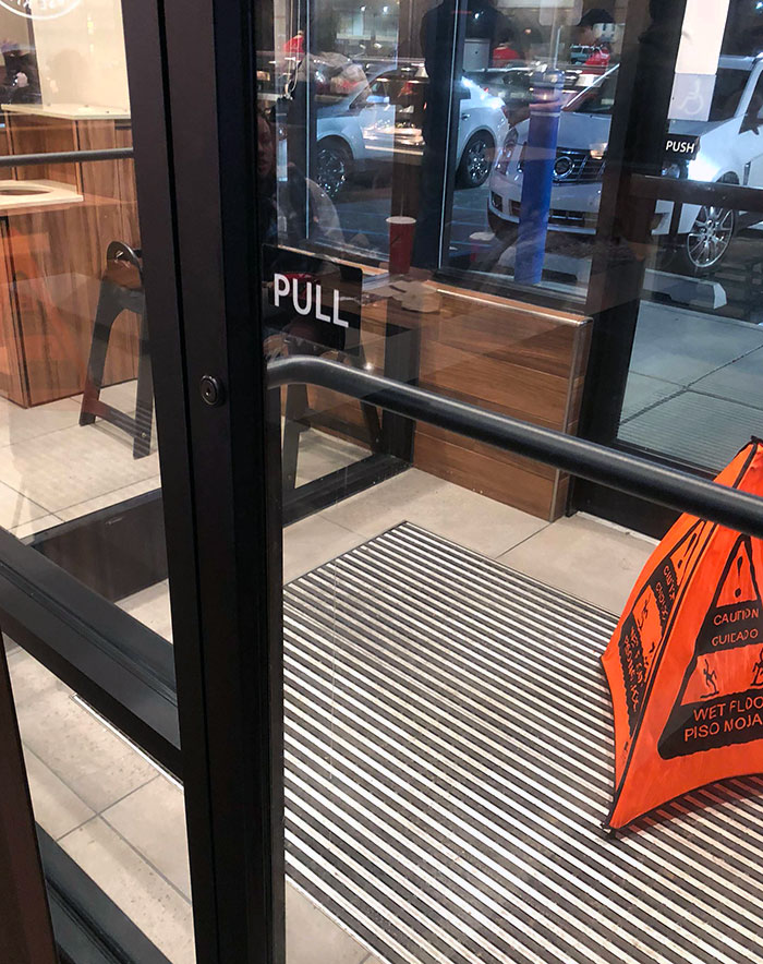
Image credits: inquisitivewinston
#47 This Hallway Is Lined With 12 Framed Copies Of The Same Picture
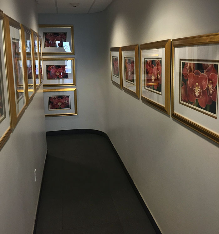
Image credits: itsSlon
#48 These Cinema Cup Holders Have No Bottoms, So They Only Fit Super-Large Drink Cups

Image credits: Shakes-Fear
#49 Which Floor Am I On?
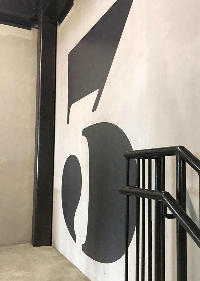
Image credits: SherbetIndividual128
#50 Nice Idea Badly Executed
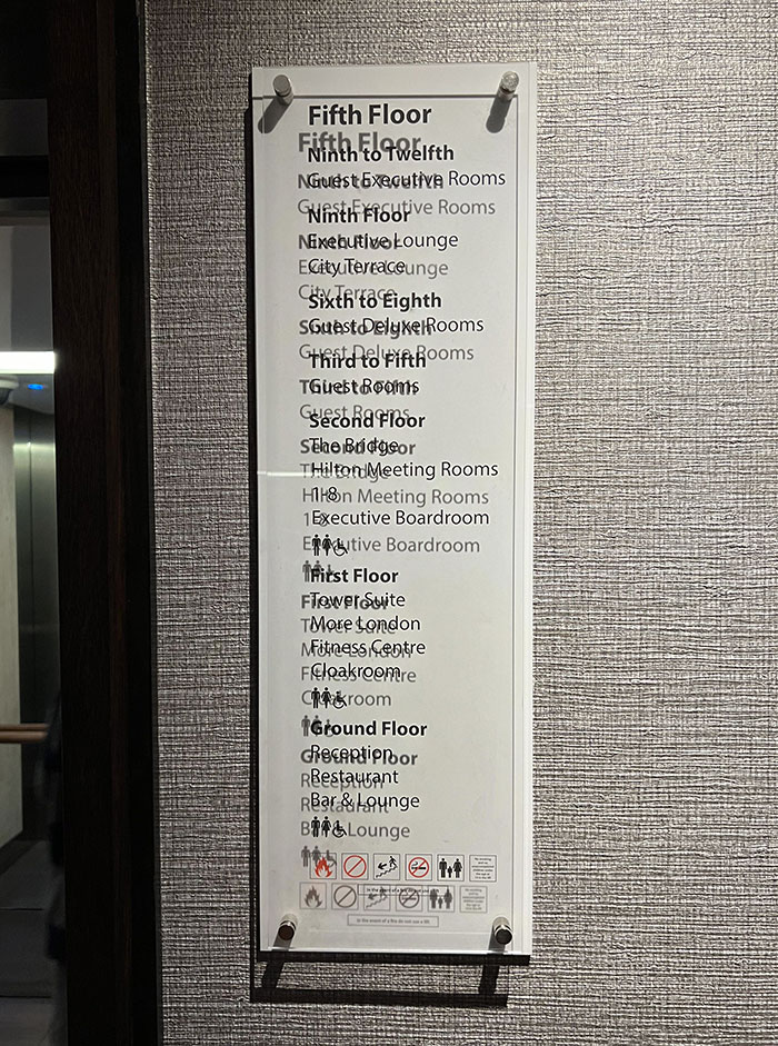
Image credits: judd_in_the_barn


