Millennial pink is one of the interior buzzwords of the last decade. The soft pink shade soared in popularity in the mid-2010s, infiltrating everything from interiors to fashion and technology. Rewind to 2016, and Rose Quartz was Pantone’s Color of the Year, the Rose Gold iPhone was the most coveted gadget, and flamingo motifs were everywhere. The photogenic color caused a frenzy on social media, becoming the go-to shade for Instagram makeovers from bedrooms to kitchens.
The question is, was it another fleeting trend, or is Millennial pink making a comeback in 2026? That also begs the question: Did it ever fall out of fashion? With the current yearning for nostalgia, has the desire to #bringback2016 inspired us to rekindle our connection with the color? To settle this design debate, we consulted the experts to get their insights on the latest pink color trends for 2026.
Is Millennial Pink Making a Comeback?
Put simply, yes, but it never really went away. Interestingly, when we consulted the experts, the thought was unanimous; Millennial pink has remained perennially popular since it boomed in 2016, and, rather than fall out of fashion, the color has simply evolved. ‘Millennial pink has evolved from a generational phenomenon into a prominent player in today’s interior color palette,’ says Hannah Yeo, senior manager, color marketing at Benjamin Moore. ‘Its warmth and versatility make it easy to incorporate into everyday space.’
While the more sugary pinks once ruled supreme, when decorating a pink room today, we’re leaning into earthier and more delicate tones. ‘While its most saturated moment passed, today’s interpretations are more nuanced and refined, leaning toward blush, coral, and pinky-neutral tones that feel timeless rather than trend-driven,’ explains Emily Kantz, color marketing manager at Sherwin-Williams.
So, how do designers make these coveted pink tones work for today's schemes? If you're looking to embrace pink room ideas, read on to discover their top tips and go-to shades for 2026.
1. Go for Pink-Toned Neutrals
The general shift towards more warm, earthy paint tones in recent years – in part due to our yearning for spaces that promote comfort and wellbeing – has had an impact on the shades of pink designers are choosing.
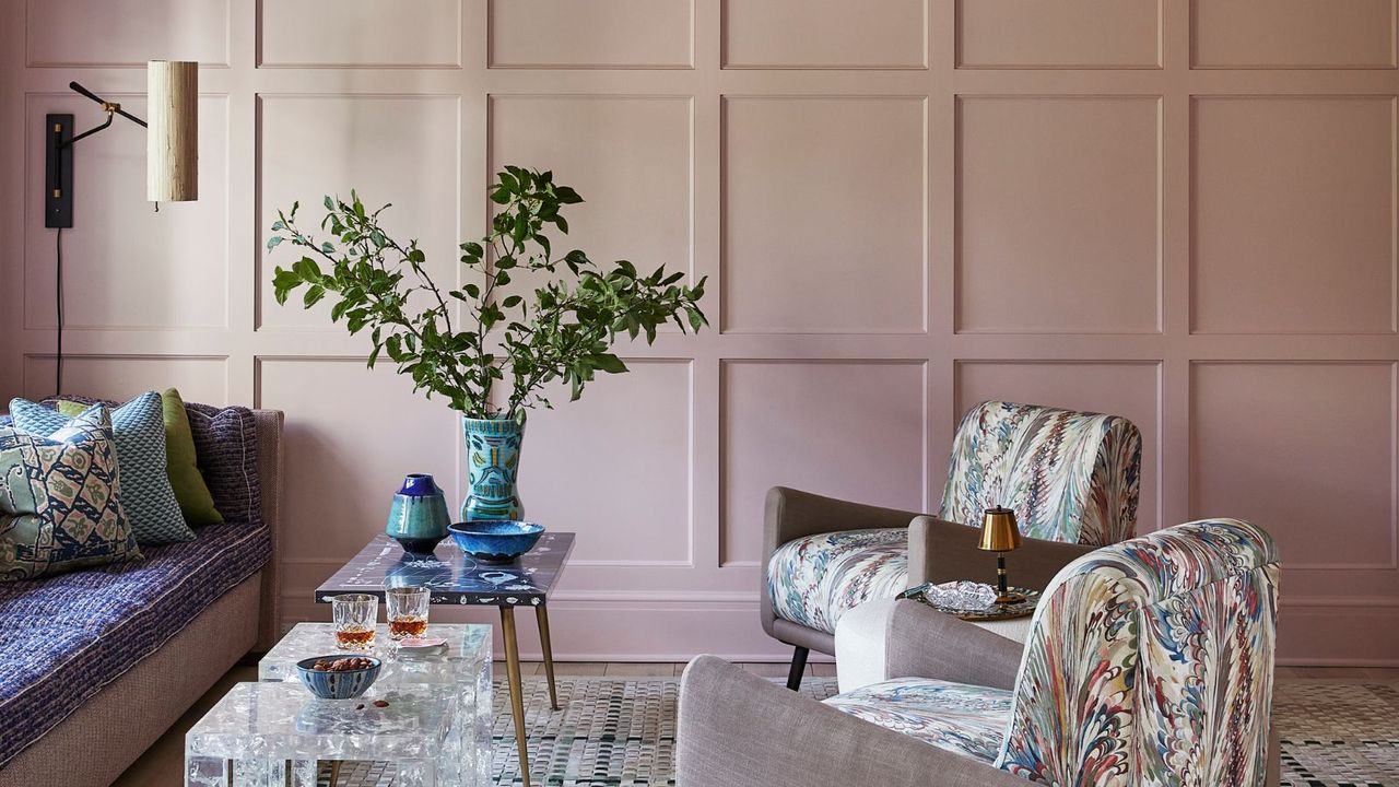
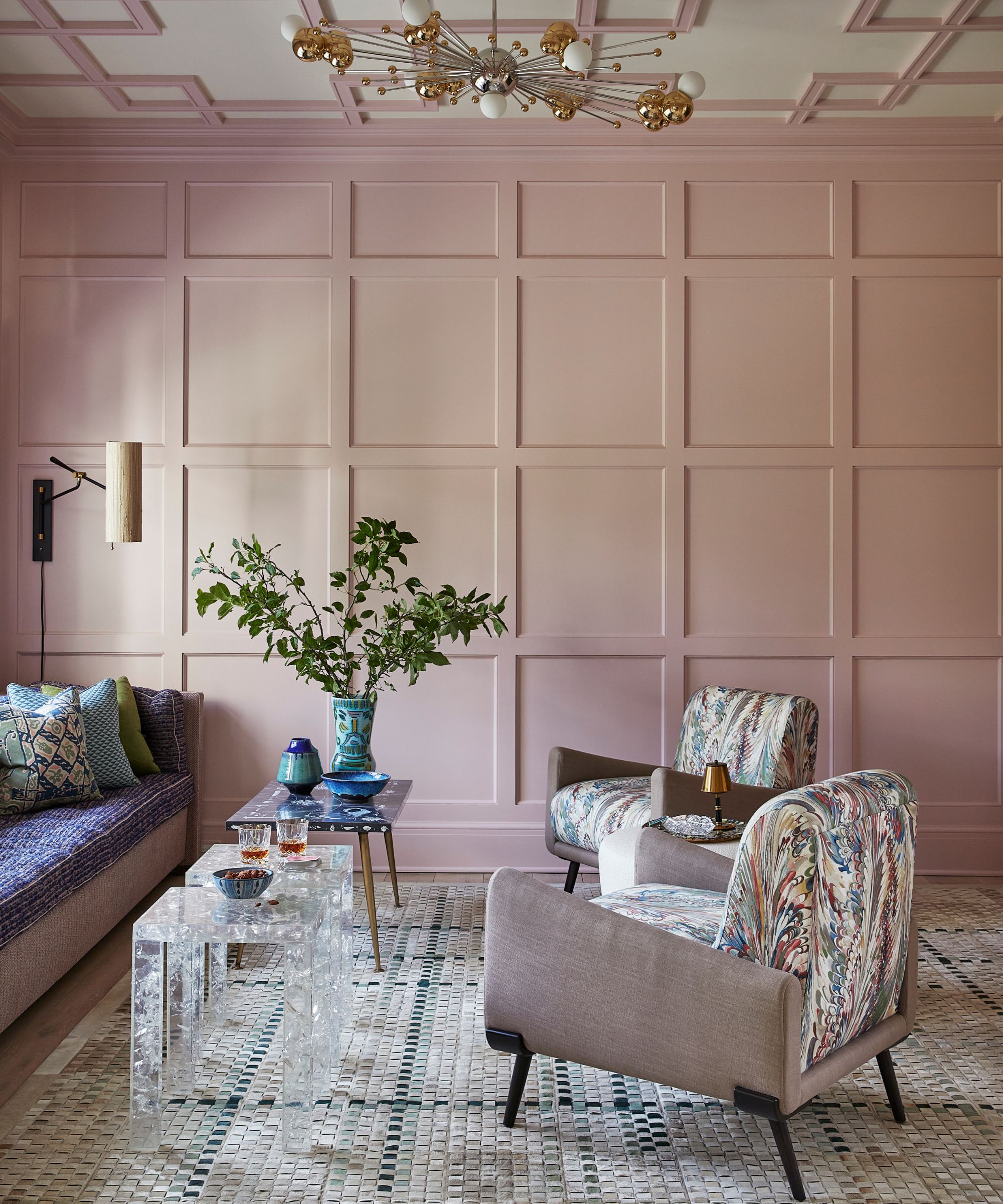
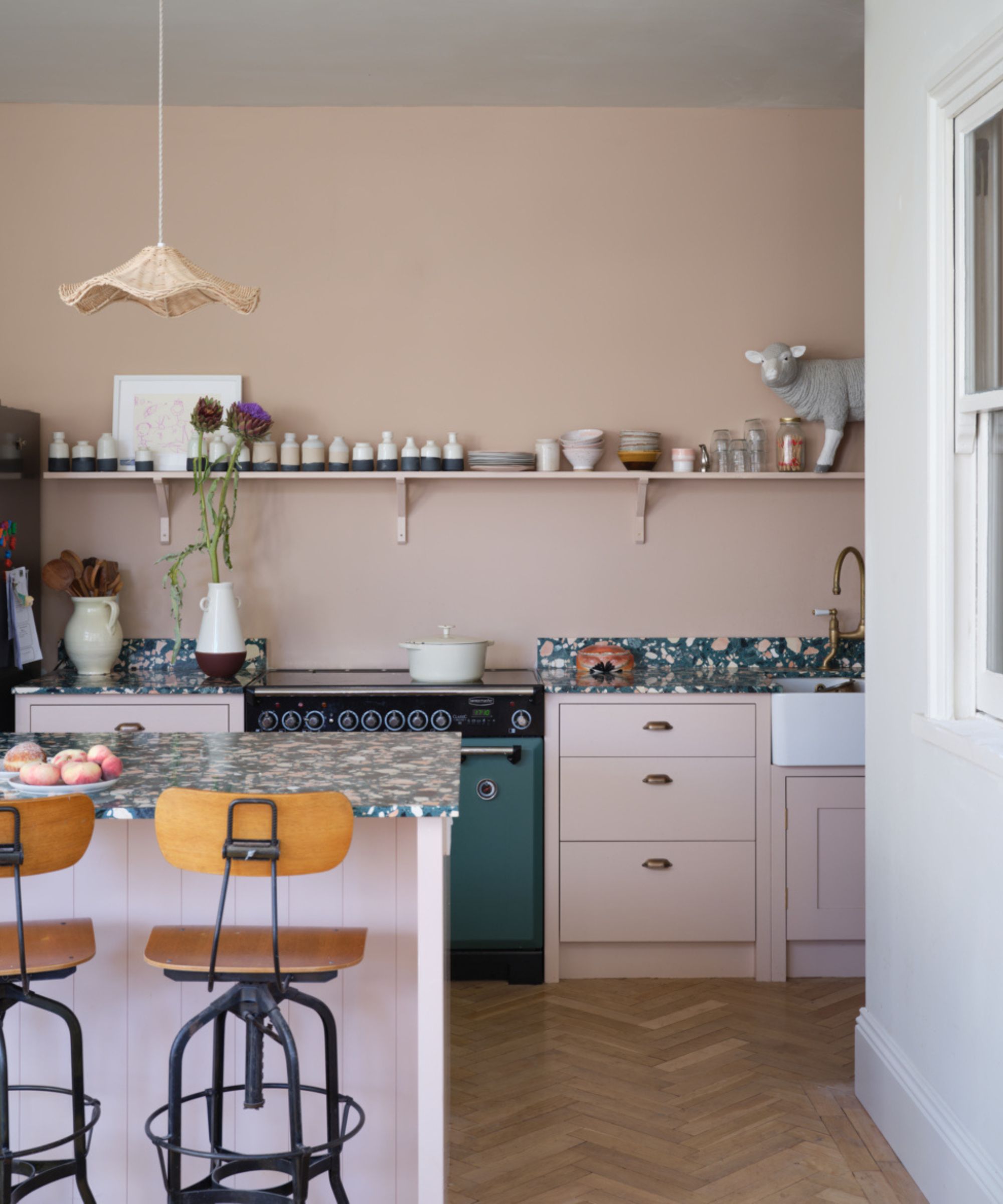
Today, interior designers are moving away from the rosy and more sugary tone of millennial pink and are instead leaning into more subtle, earthy tones. Often termed the 'new neutrals', these delicate pink tones make warm, versatile backdrops to sophisticated, timeless schemes.
'Millennial pink functioned as a "non-neutral” neutral, offering softness and versatility across a wide range of spaces. It also happens to be universally flattering – everyone looks good in a pink room,' explains interior designer, Hattie Sparks. ‘For 2026, favorites include Pink Ground and Setting Plaster by Farrow & Ball, as well as Shell Pink and Tissue Pink by Benjamin Moore. These shades are more muted, with subtle gray and brown undertones that give them depth and longevity.’
Ruth Mottershead at Little Greene has also witnessed the shift towards more pink-toned neutrals. 'It has never been more important to create areas that support restoration and wellbeing in our homes,' says Little Greene's creative director. 'Soft, earthy neutrals that contain subtle pink undertones can play a vital role in shaping these restful environments.'
2. Layer Soft Blush Pinks With Warm, Earthy Tones
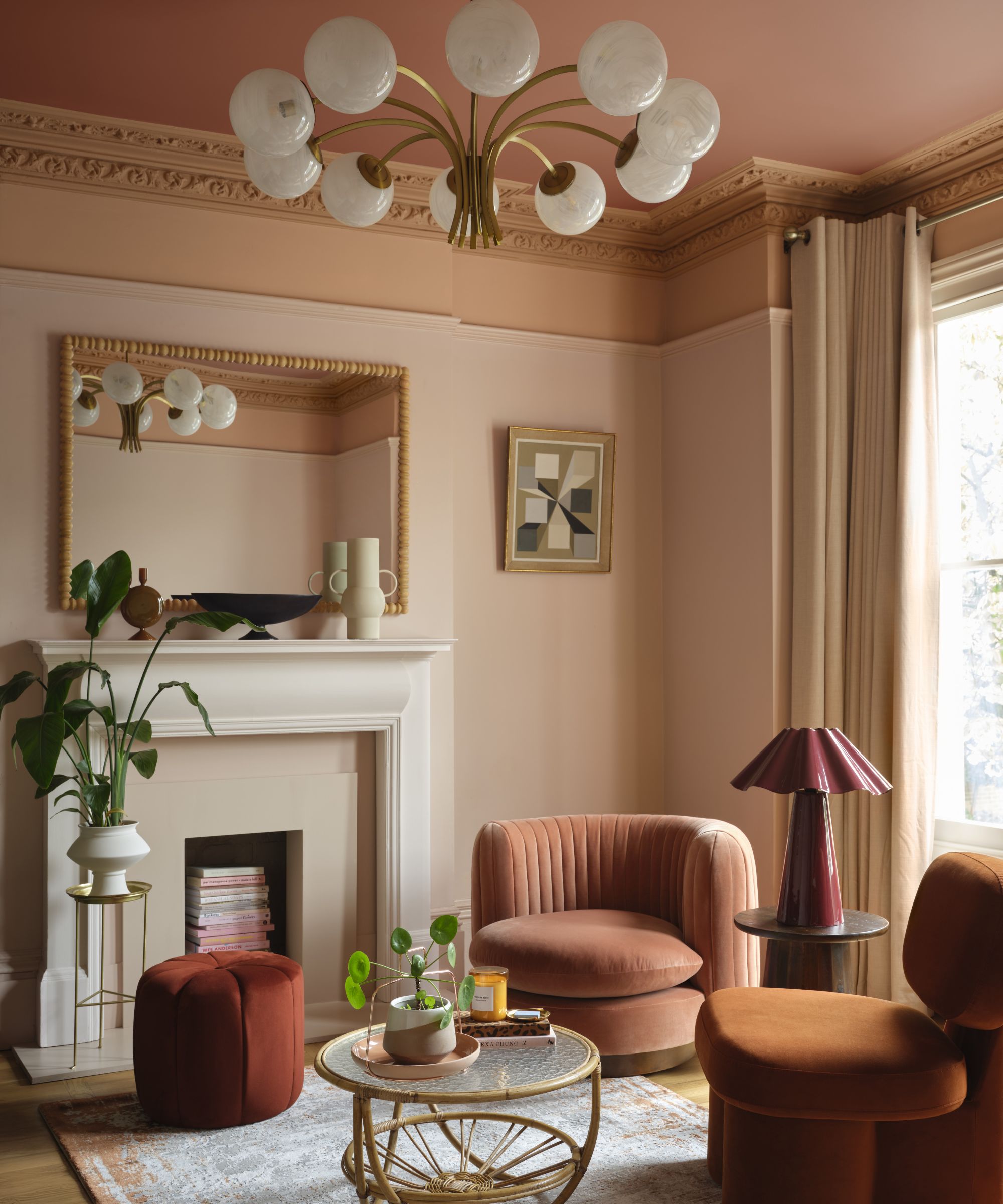
While in 2016 cooler grays and charcoal were popular pairings for Millennial pink, fueled by a desire for comforting schemes, designers are now combining soft pinks with more earthy tones, from beige to terracotta and olive green. As a result, warmer pinks are becoming the more natural choice.
‘Millennial pink pairs well with warm neutrals and grounding tones that balance its softness. Shades like Realist Beige SW 6078 provide an easy, elevated backdrop, while soft whites, earthy browns, and deep greens help create a layered, mature look that feels modern and livable,' explains Emily Kantz, color Marketing Manager at Sherwin-Williams.
Hattie Sparks agrees, adding that, ‘Millennial pink pairs beautifully with earthy tones like terracotta, chocolate brown, and burnt yellow, as well as warm whites that keep the palette grounded.'
3. Use Soft Pinks for Serene Bedrooms and Dressing Rooms
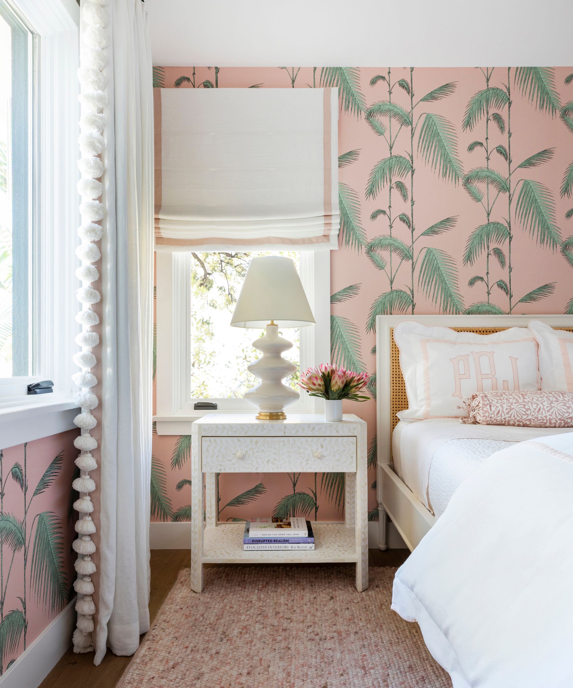
Since its peak in the mid 2010s, Millennial pink has remained a staple choice for bedrooms, bathrooms, and dressing rooms schemes, loved for its soothing and feminine qualities. When we asked the designers where they like to decorate with soft pink tones, it was these rooms that were mentioned again and again.
‘This shade is frequently in more feminine spaces such as bathrooms, dressing rooms, and bedrooms. When used on the walls, pink creates a soft glow that casts the most flattering light,’ explains Aileen Warren, co-founder of Jackson Warren Interiors.
It's also a go-to for Emily Kantz. ‘My favourite room to use a shade like this one is a powder room or guest bedroom. It’s often used to refresh traditional pieces or give softness to a harsher environment, making it ideal for homes that blend old and new design elements.'
4. Pair Pink With Metallics for Glamorous Entertaining Spaces
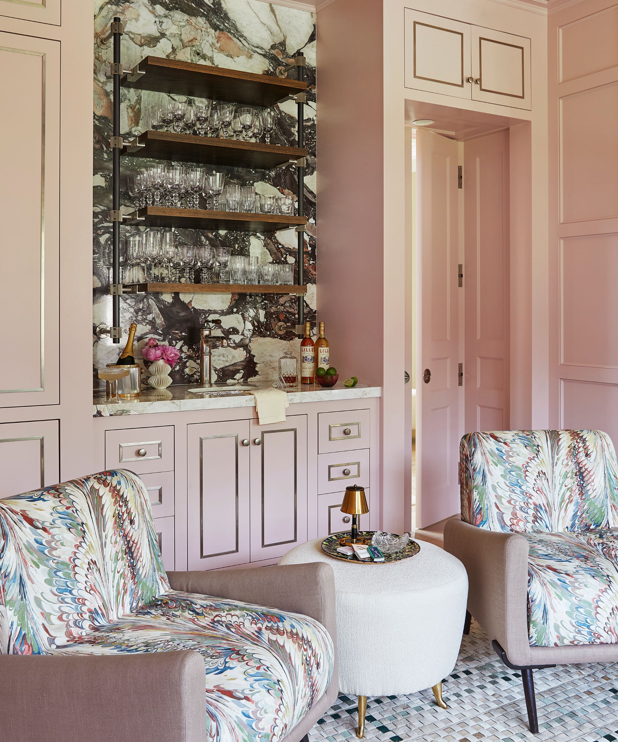
While Millennial pink firmly established itself as a go-to bedroom color, over the years soft pinks have become increasingly popular in living and social spaces. Today, designers are also championing it as a great backdrop for entertaining spaces, especially when paired with metallic touches.
‘Here I wanted to create a space that evoked that glamour both day and night. I chose Benjamin Moore’s Rose Lace 1254 shade because, really, everyone feels gorgeous in a pink space. The warm tones reflect light beautifully and flatter all,’ explains the New York-based designer Phillip Thomas.
‘To me, pink has become a new neutral. I can't get enough of it. When light is reflected off a pink surface, it casts the most beautiful warmth and is completely flattering to any complexion. Metallics like gold and brass are beautiful with pink.'
5. Pair Soft Pinks With Contrasting Accent Colors
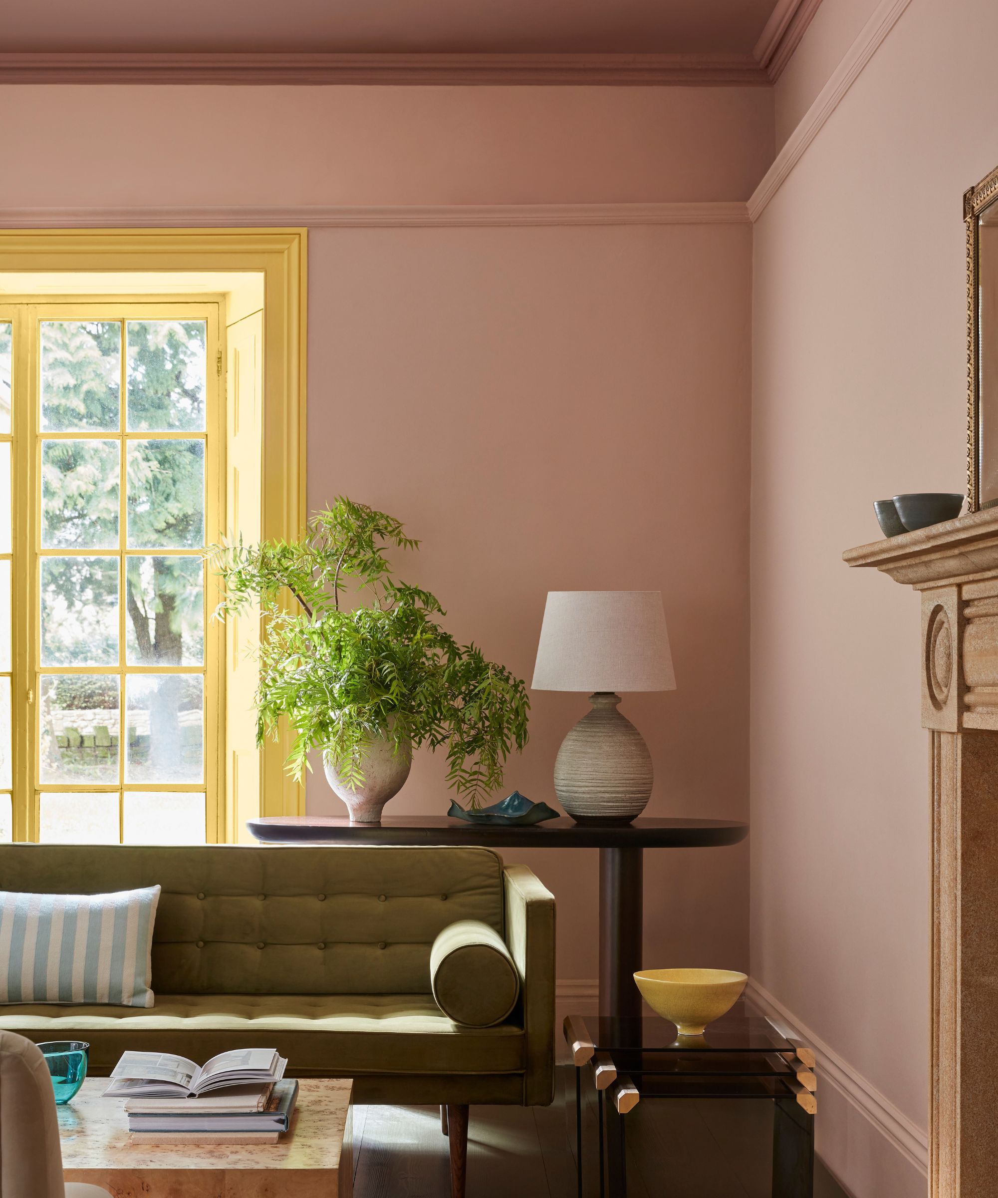
As we are collectively becoming more confident with color, we’re increasingly seeing pink being used in exciting ways. With recent design trends like the unexpected red theory, homeowners have been encouraged to throw caution to the wind and get playful with contrasting color combinations and bold accent colors.
'For a refined and creative scheme, consider combining your chosen pink with a pop of contrasting color in yellow or green. It will provide a beautiful highlight on a window frame or door to bring a surprising design detail to a pink-hued space,' suggests Ruth Mottershead.
Zesty oranges, lemon yellows, and lime shades are all unexpected tones we've seen cropping up alongside pink, together with the more classic terracotta and brown tones. ‘We especially love pairing pink with unexpected shades like chartreuse or rich chocolate brown for contrast and depth,’ adds Aileen Warren, co-founder of Jackson Warren Interiors.
6. Use Blush Pink in Small Spaces
According to designers, blush pink lends itself beautifully to smaller spaces, particularly bathrooms, injecting warmth and color without dominating.
'Millennial pink continues to be a popular choice for home interiors, most notably in bedrooms, living areas, and powder rooms, where warmer blush tones bring softness and approachability to the space,' says Kayla Kratz, director of color and design strategy at Behr. 'It’s particularly effective in smaller spaces, such as the interior of a bookshelf or a small powder room, where dusty pinks can deliver impact without overwhelming the floor plan. Behr offers several shades of pink, including warmer blushes like Noble Blush, muted rose-beiges such as Prairie Rose, and dusty pinks like Beloved Pink.'
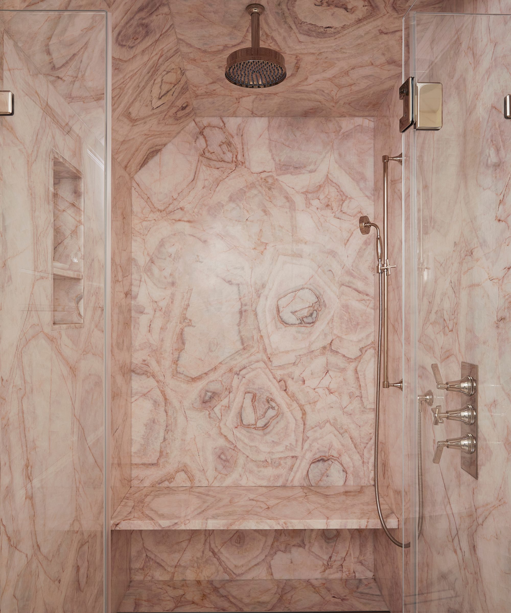
It looks fabulous used as a color drench, creating cocooning warmth, as demonstrated in this beautiful shower room by Phillip Thomas. For best results, go for a textural finish, such as these marble tiles, to bring extra warmth and interest.
The Millennial Pink edit
Whether you're looking for stylish statement upholstery or quick interior update, these hand-picked soft pink pieces are perfect for adding a gentle pop of color.
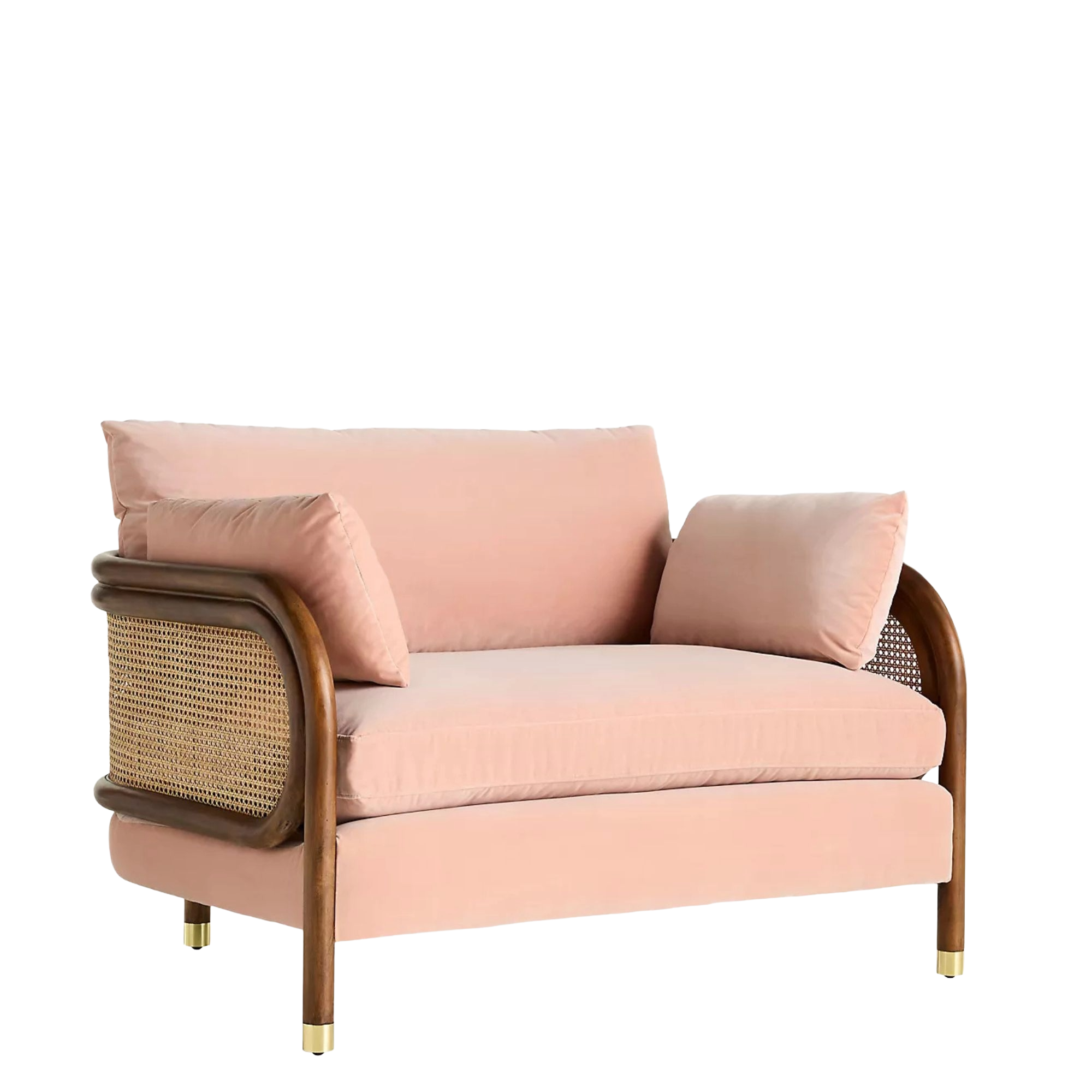
Combining sophisticated blush velvet with a retro caned frame, this snuggler seat would look stunning in a living room or sun room. Deep seat and loose, down-filled cushions bring ultimate comfort while brass detail adds a sophisticated touch.
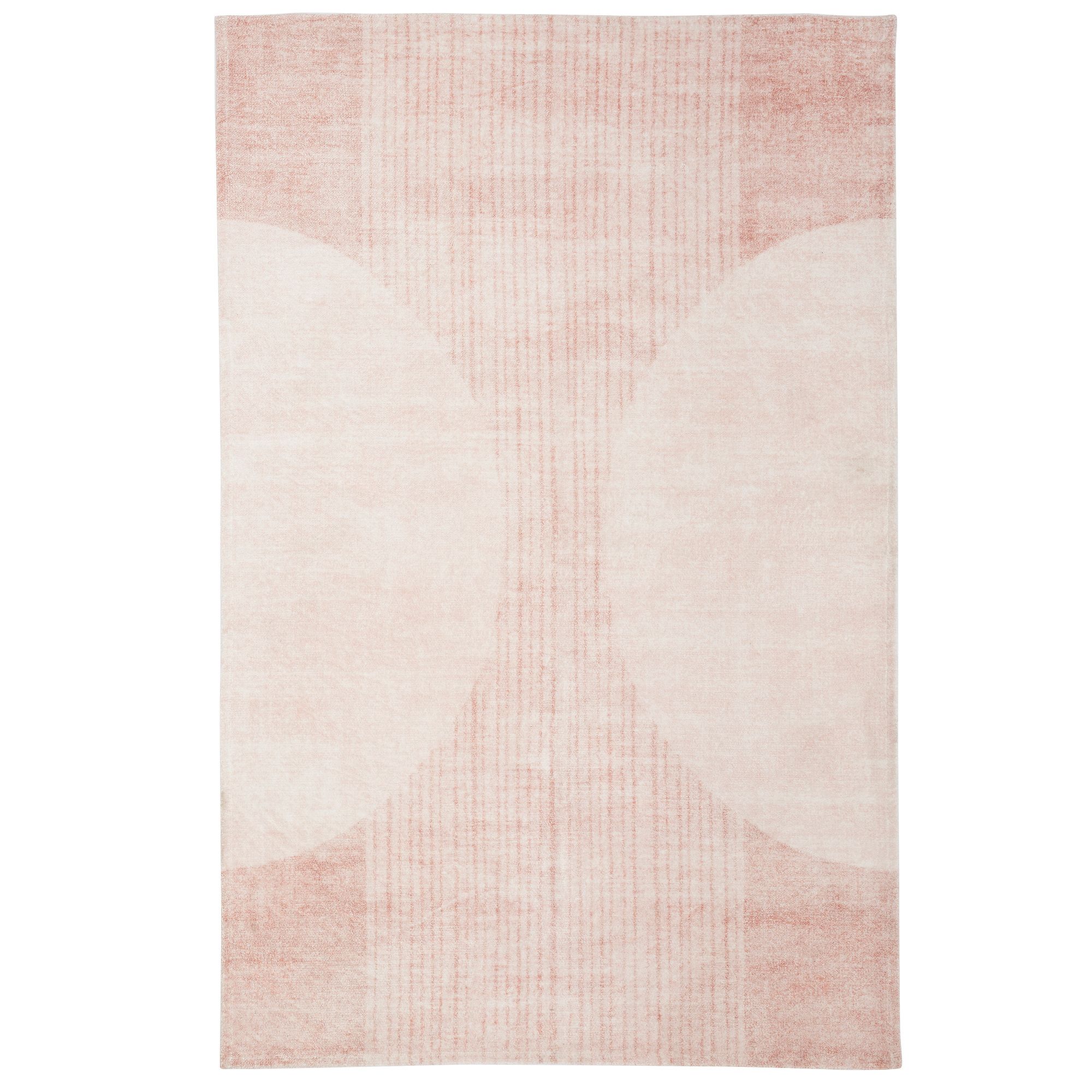
Simple yet sophisticated this Boho rug makes a versatile base for layering statement furniture and accessories, providing a touch of color without overwhelming a space. Vacuum-friendly and machine washable, it's a practical choice for any space.
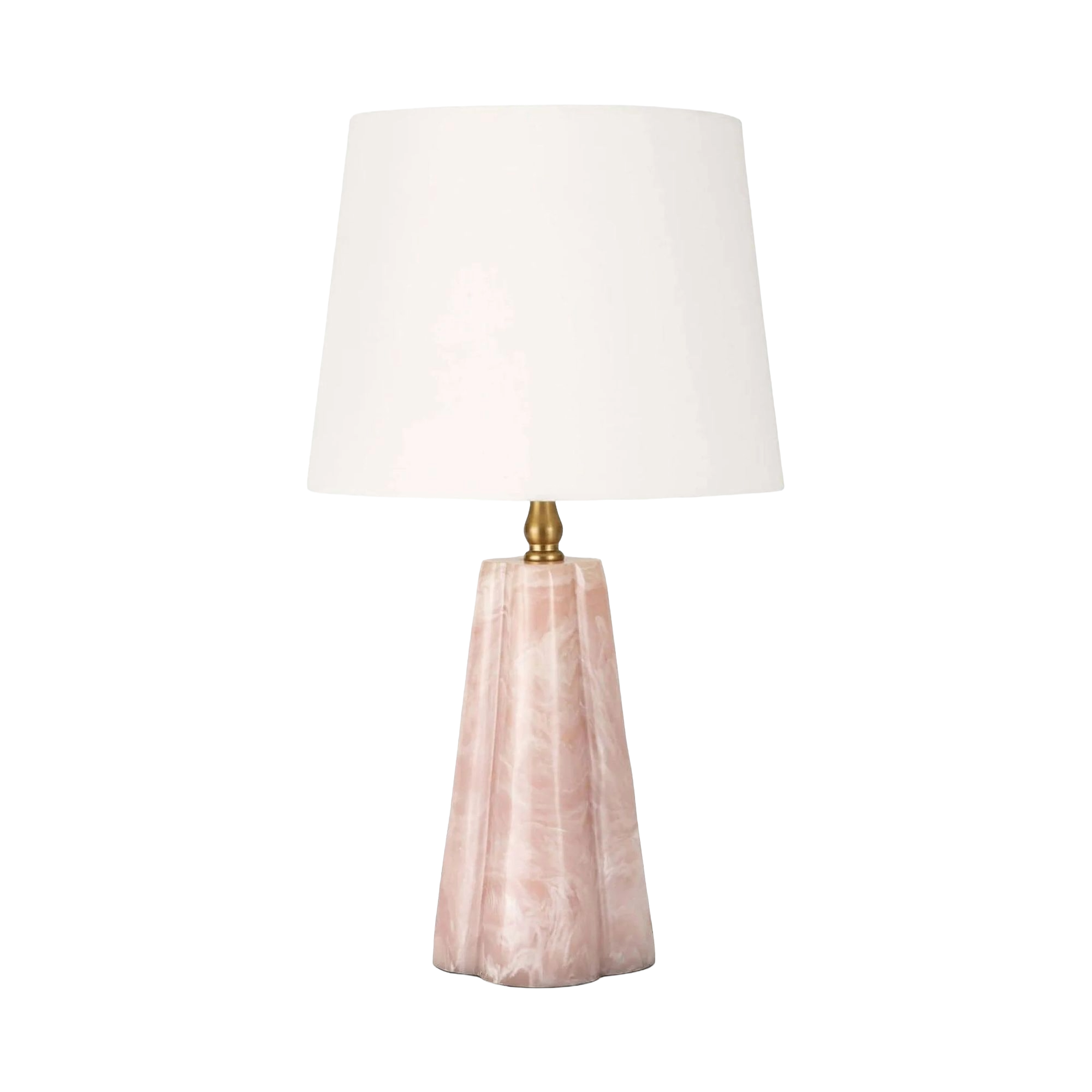
Add a pretty yet practical finishing touch to a bedroom or living room – or even a kitchen with this stylish quartz-look table lamp. With it's stylish shape and beautiful texture it's guaranteed to transform any corner.
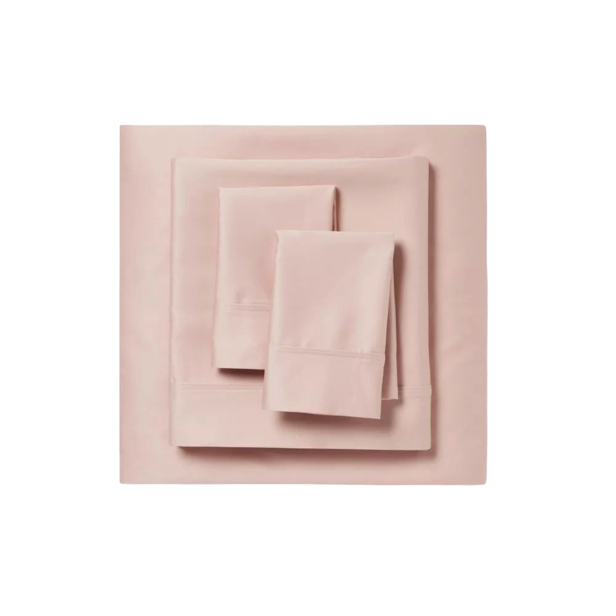
Inject a touch of comforting color into a bedroom with these beautiful blush linens. With a 400 thread count they're ideal for a luxury scheme.
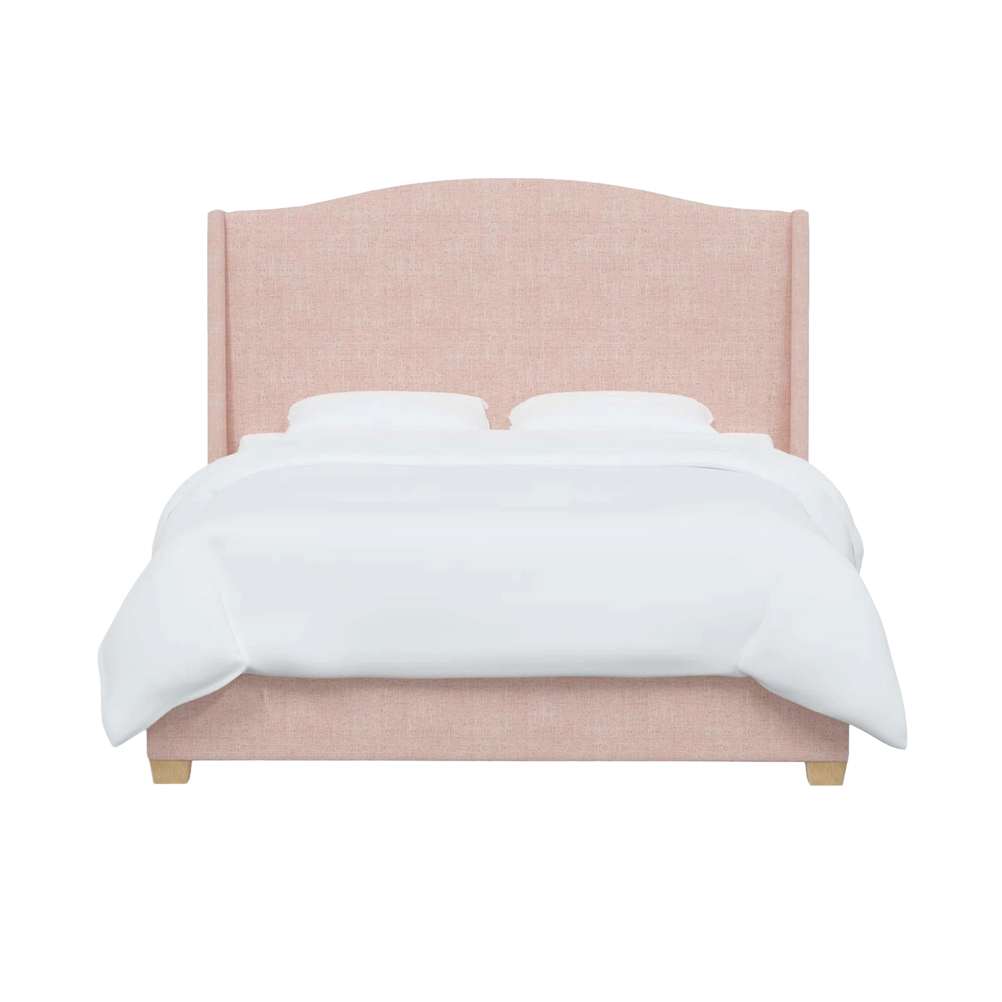
Nothing sets the tone for a luxurious sleepspace than a large upholstered bed with a statement headboard. Upholstered in soft blush pink this Allis design makes a versatile and timeless piece.
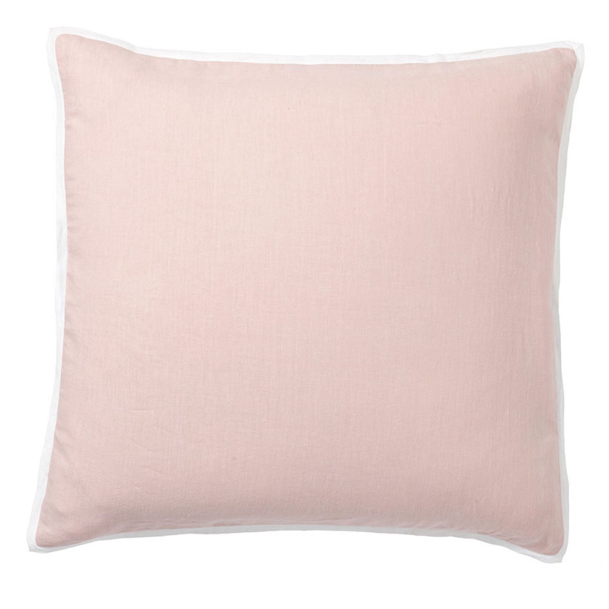
Soft pink pillows are always a great investment as they pair effortlessly with a huge host of shades from white to olive green. This design features a smart white trim for a fresh, tailored feel.
While Millennial pink may have started as an online trend, designers quickly fell in love with its versatility and warmth, and it has remained popular ever since, although the tones designers are using have evolved over the years.
Though the saturated sugary Millennial pink tones haven't endured, the more subtle and sophisticated dusky pink, blush, and warm plaster shades continue to captivate designers. These shades are often termed the ‘new neutrals’ and are used in place of traditional beige, taupe and cream tones to provide rooms with a touch of gentle color in a time where we long for nostalgia and comfort.
'Millennial Pink resonated because it offered a softer, more expressive alternative to the neutrals and greys that dominated interiors and fashion in the mid 2010s. It aligned with a broader cultural shift toward personal expression and comfort-driven design, which helped the color feel accessible and widely adaptable across home, fashion, and lifestyle categories,' explains Kayla Kratz.
'Today, it’s being used in more nuanced, sophisticated iterations – warmer blushes, muted rose-beiges, and dusty pinks. This shift highlights its longevity as a livable color that adapts to changing design preferences rather than disappearing altogether.'