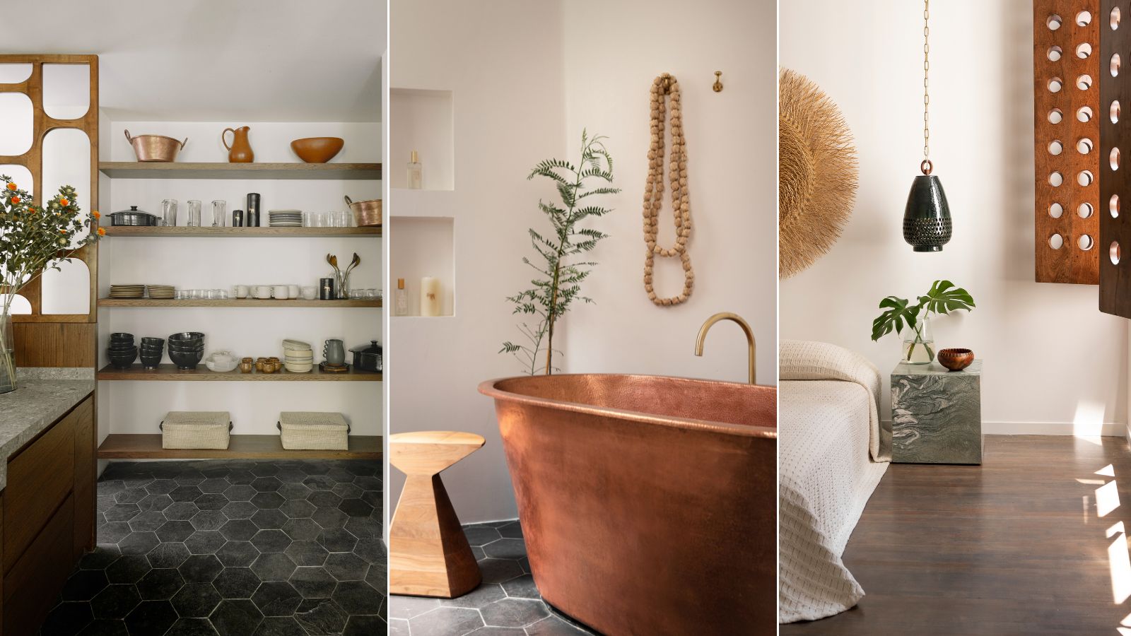
In the artistic La Condesa district of Mexico City is a small apartment that made a big impression on us.
From the outside, the house design is classic Modernist, typical of the era for this block built between 1954-1957. Inside, however, the interior design ideas are fresh, inspiring, and much more up-to-date. That's only to be expected, since this apartment belongs to Laura Aviva of L'Aviva Home.
The founder of the stylish artisanal homeware brand uses the space to showcase some of the company's latest collections and also to celebrate Mexico's rich traditions of artisan pieces for the home. And it's these local materials and talents that truly bring the space to life and give it a strong national identity.
Take the tour, as Laura Aviva explains the thinking behind the key interior takeaways from this special space.
1. Use traditional pieces to add personality to a hallway
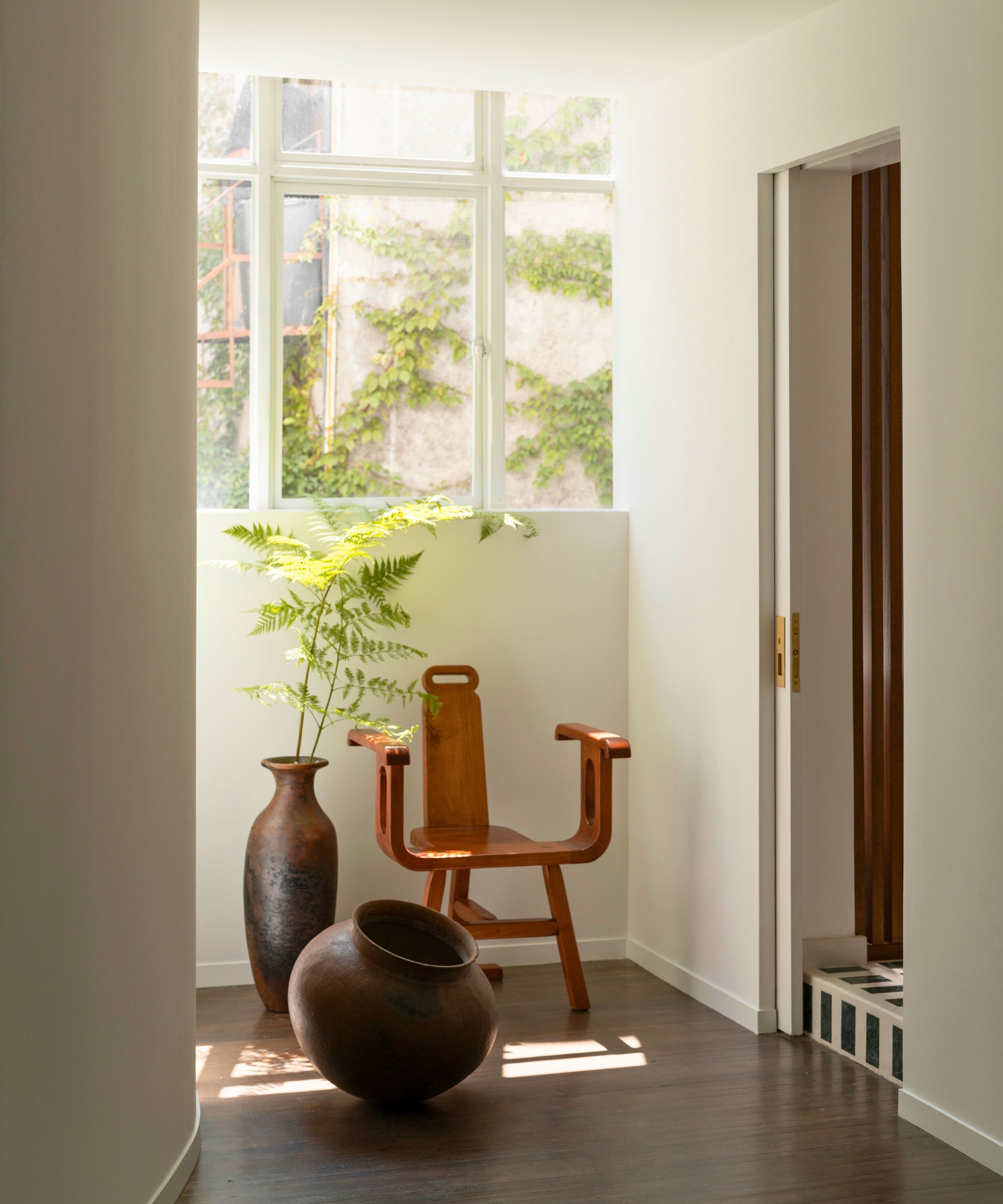
Right from the entryway, it's clear that this apartment is going to feature the beautifully crafted work of local artisans and the strong shapes of the chair and two vases set the tone in the otherwise clean-lined space.
'With a focus on tactile materials and custom elements tailored to the setting, our goal was to create an interior that reflects a reverence for the building’s heritage and local craftmanship, providing an ideal backdrop for showcasing our collections,' says Laura.
'As you enter, you are greeted by this little vignette of cherished pieces: a play on a traditional partera (birthing) chair designed by our friend Raul Cabra, and made by Isaac Castañada, who did a series of custom pieces – all from Mesquite – for the space.' Vintage pottery from Puebla and Michoácan makes a strong statement alongside the chair.
2. Borrow color and shapes from the view to bring the outside in
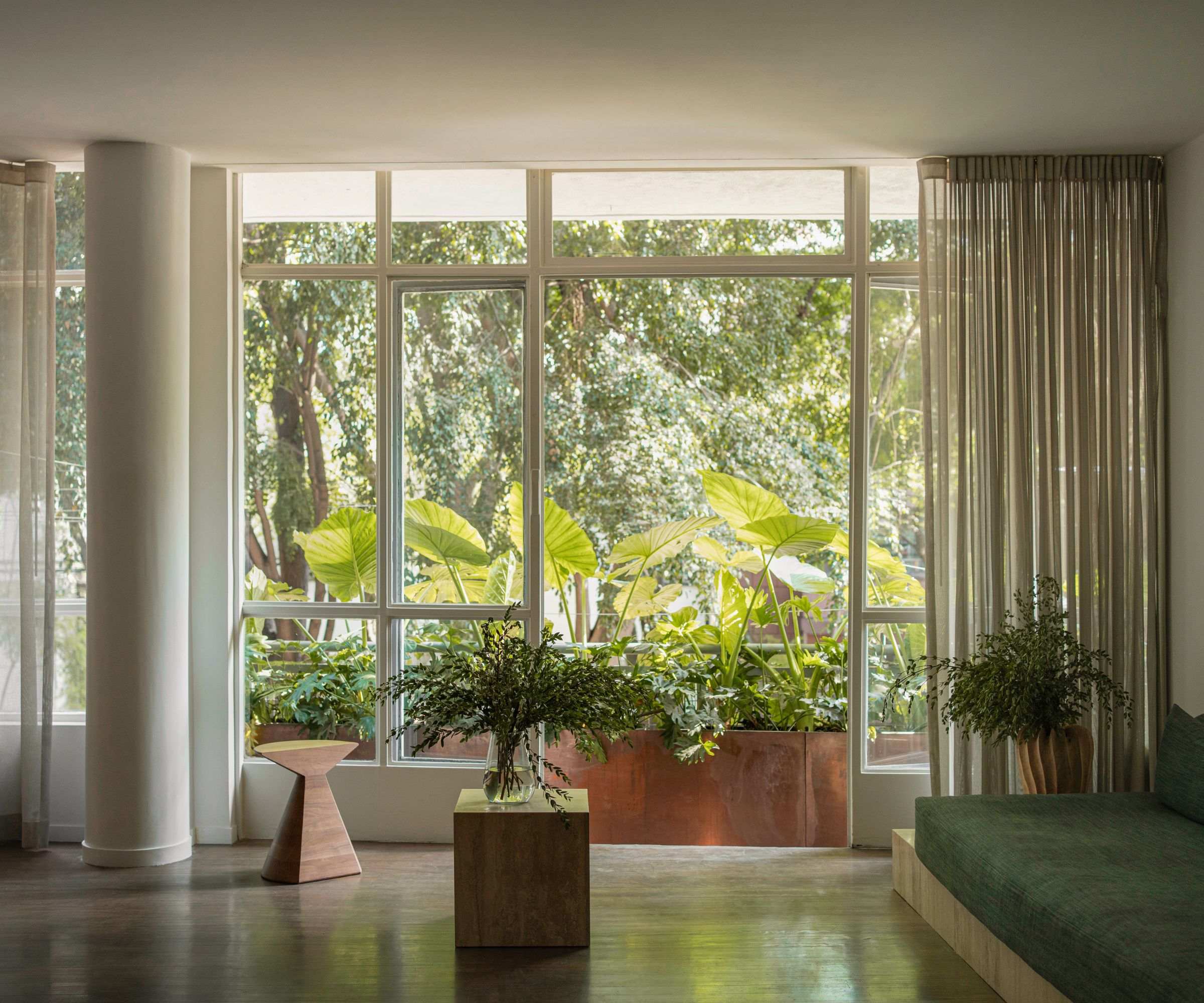
In the apartment's main living space, a long wall of windows directly overlooks the capital's Avenida Ámsterdam, a lush tree-lined street and one of the most coveted in the city. Laura's living room ideas use the landscape to introduce natural greenery, and to cool the space which needs little other embellishment than its leafy view.
'We complemented the view with a custom copper planter on our terrace, filled with plants mirroring those found on Ámsterdam,' adds Laura. 'Together, these elements blend indoor and outdoor environments, creating a sense of bringing the outside in.'
3. Group natural pieces together to create a subtly layered scheme
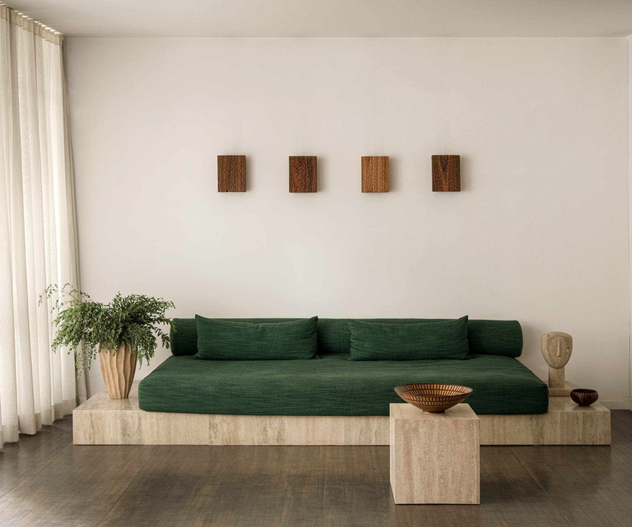
Even in a modernist, pared back space like this one, it's possible to create a big impression and include a layered look in your living room. The key here is to stick to natural, organic materials that all complement one another. So the couch is on a stone base, with matching coffee table, with lighting and drapes all contributing to the picture.
The custom couch and cube table have a travertine clad steel-framed base. The green fabric is from Zak + Fox.
'Above the couch, a row of Martillado Collection sconces made from chiseled salvaged tropical hardwood from Bolivia, play the dual role of wall art and functional lighting,' says Laura, 'and cast a range of beautiful shadows throughout the course of the day.'
4. Use locally sourced materials to ground the room in its setting
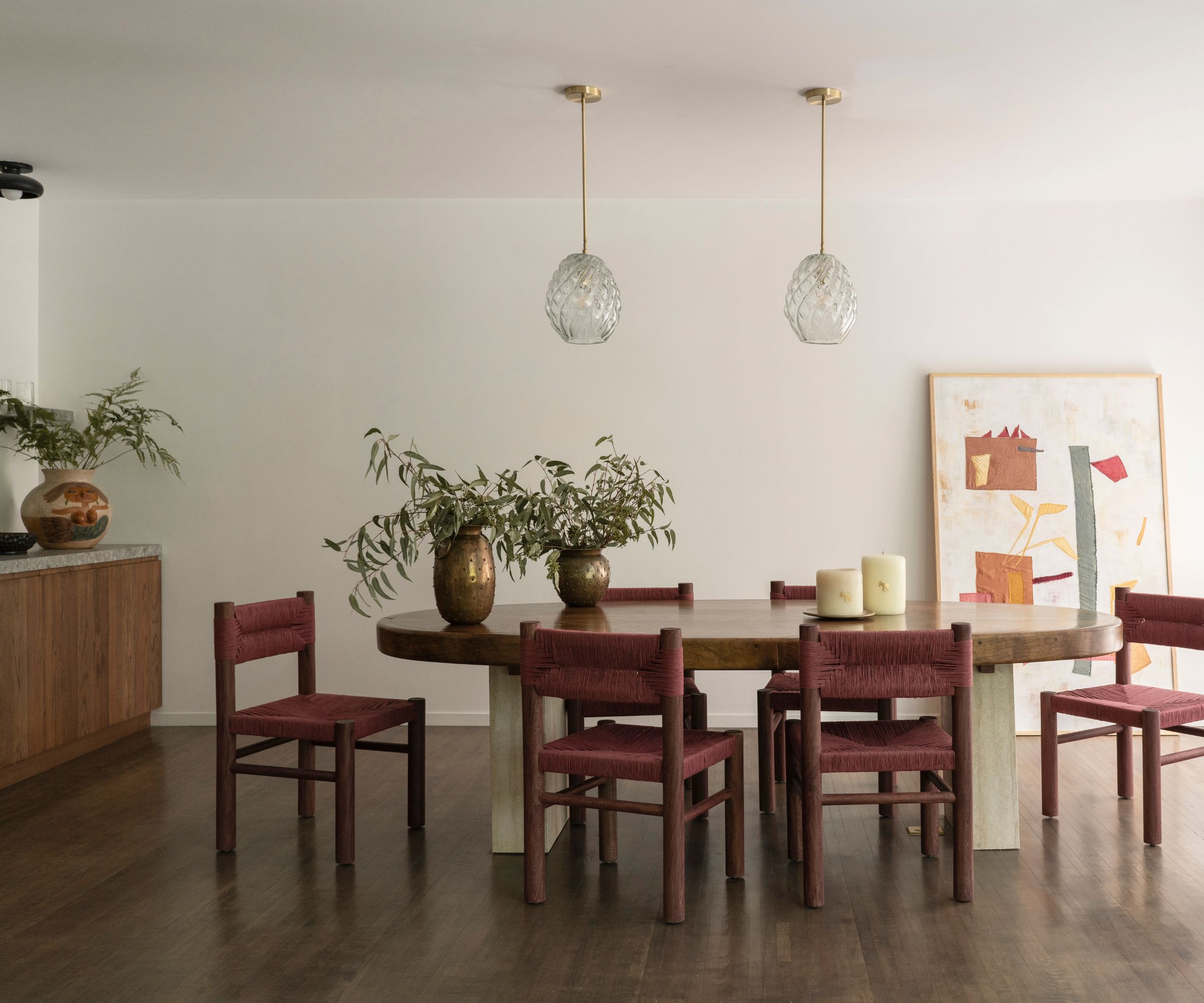
The dining area is open plan to the living room, so dining room ideas have to balance both spaces with style. Since this home is about celebrating local materials and craftsmanship, the table was custom made with a top made from mesquite by Isaac Castañada with travertine clad bases for the legs, to reflect the sofa base opposite.
Other regionally-sourced pieces that add to the room's local color include the canvas commissioned for the space by Oaxacan textile artist Maddalena Forcela and the vintage 1970s brass vases from Santa Clara de Cobre, from Chic by Accident. The Lava chairs by Habitación 116, were bought from Unno Gallery, which showcases the work of young Latin American designers.
L'Aviva Home's Agave Collection blown glass lamps add the finishing touch.
5. Add in quirky accessories to surprise and catch the eye
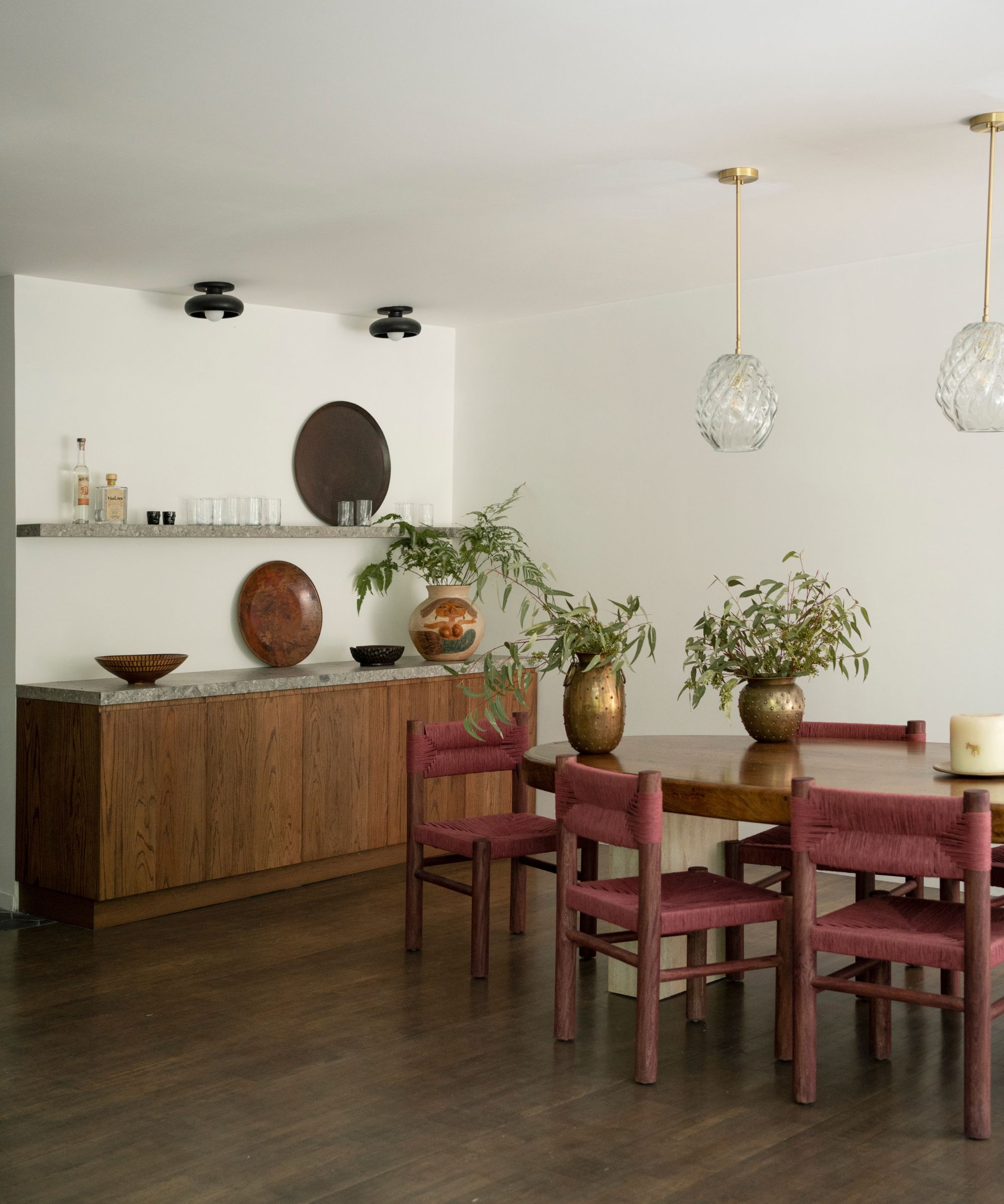
At the back of the dining area is a home bar, designed to look like a freestanding midcentury-style credenza. The cabinetry was all custom and made by Anastacio Ramirez, a local carpenter and his team, while above the bar hang a pair of L'Aviva Home's Piedra Collection semi flush mount lights in black marble.
So far, so classic but here's the fun element, on the far side of the bar, guaranteed to raise a smile. 'The mermaid vessel is perhaps my favorite possession of all time,' says Laura. 'It's a vintage piece by Dolores Poras and her daughter from Santa Maria Atzompa, Oaxaca.' It serves as a colorful reminder to anyone putting together a room scheme not to take it all too seriously, and to always try to include a few moments of light relief.
6. Apply traditional techniques in fresh new ways
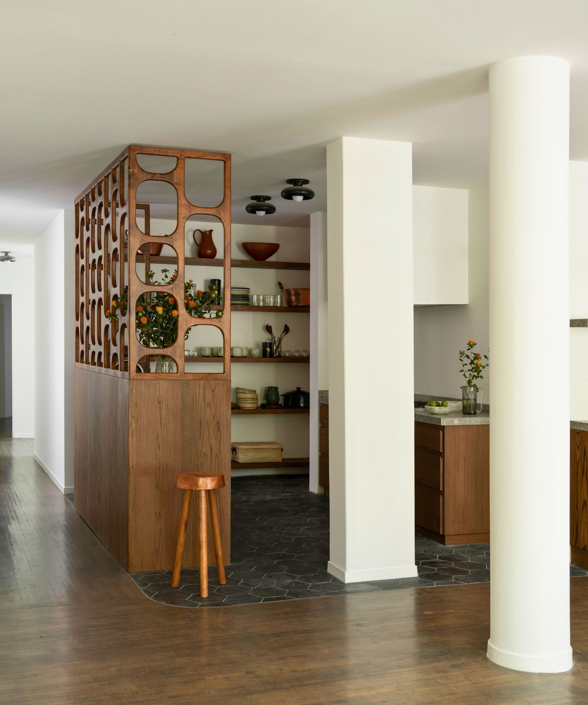
The kitchen is semi-open-plan to the living and dining space. As such, it's a challenging corner to tackle. There were already two structural pillars dividing it from the rest of the room but Laura's creative kitchen ideas take it a stage further with a custom mesquite celosía (wooden latticework) screen, which was custom made for the space and is one of the designer's favorite elements of the whole apartment.
'The celosía sits at its middle, and serves as its heart,' says Laura. 'It was one of the very first elements we designed for the space. Celosías have played a recurring role in Mexican history (from the country’s deep relationship with religion to its Modernist architecture). The wood partitions shield against the intense Mexican sun while allowing gentle, filtered light to shine through. We took this concept and played on it, with very careful attention paid to the shadows – from both natural and artificial light – that it would cast, and how they would change as light moves through the space during the course of the day.'
Custom cut slate hexagonal tile flooring further differentiates the kitchen from the adjacent living and dining spaces.
7. Turn open shelves into a display space for beautiful and useful objects
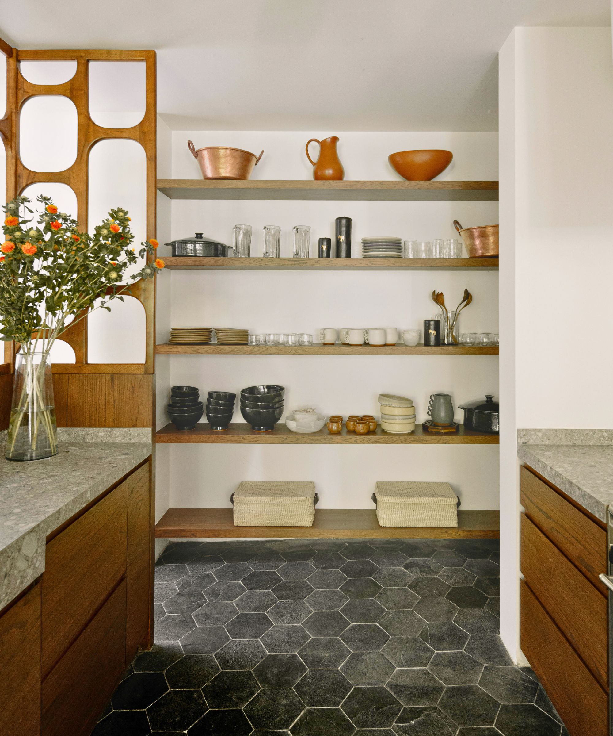
Open shelves are a good option for small kitchens, since they'll take up less floor space than cupboards. If you're a newbie to the concept, check out our guide to organizing open shelving in a kitchen and note that here, combined with neat custom cabinetry, they serve a decorative purpose as well as functional, and are used to display beautiful pots and vessels. 'The pottery, glassware, stoneware (and copper vessels) on the shelving are all made by artisans we work with here within Mexico on our lighting collections,' says Laura.
8. Discover how texture can bring warmth to a minimalist bedroom
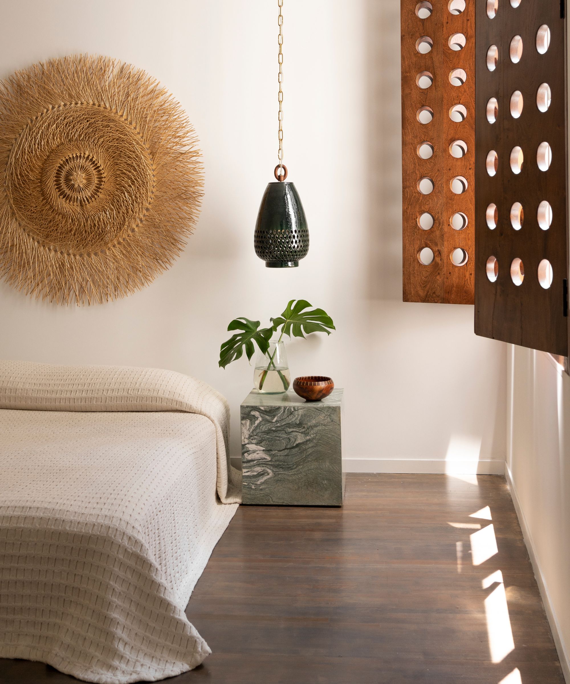
The bedroom ideas here are simple and clean-lined with white walls and minimal furniture. The scheme is softened and warmed with interesting use of textures, most notably the custom mesquite shutters made by Isaac Castañeda, which will play with the light and shade throughout the day.
'The straw piece over the bed is fashioned from popotillo (wheat straw) and made in Patzcuaro, and designed by Oaxifornia,' says Laura. This adds more texture, along with the waffle-style bedcover (from L'Aviva Home's Michoácan collection) and the lamps from the brand's Atzompa Collection.
9. Invest in a luxury bathtub
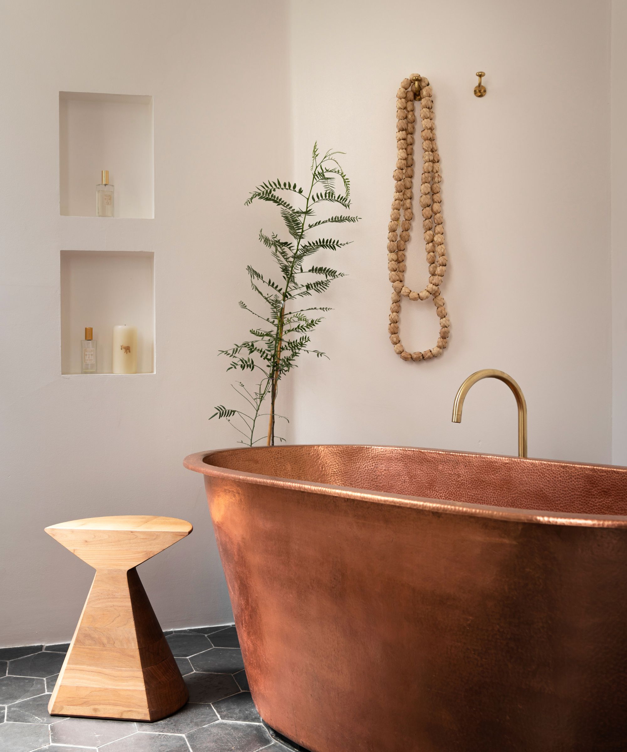
There are times when it really does pay to invest in beautifully crafted statement pieces for the home, and the copper tub in Laura's bathroom is a particularly meaningful – and beautiful – addition to her bathroom ideas.
'Sergio Valasquez, a master artisan in Santa Clara de Cobre, worked with us to fabricate this hammered copper bathtub that we designed,' says Laura. 'It's my biggest luxury!'
Santa Clara de Cobre is the Mexican city famed for traditional copper working and so not only does the bath have the beauty of the metal's natural patina, it's also another instance of showcasing and using the region's heritage crafts.
The sculptural wooden Ban stool is by Héctor Esrawe.
10. Get creative with custom flooring
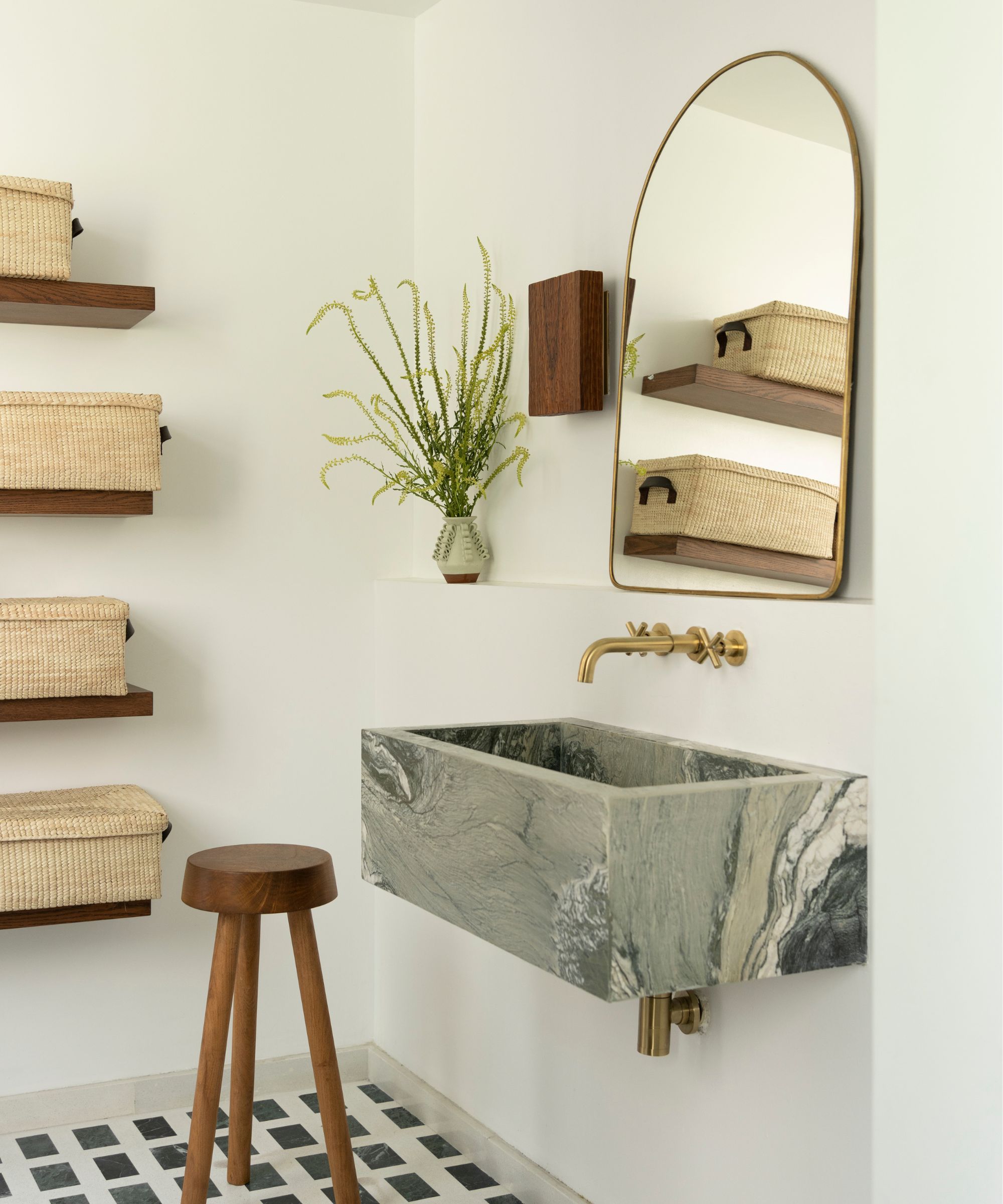
Black and white may be a popular choice for bathroom flooring, but the bespoke floor in the main bathroom has one-off appeal and a historical back story, as Laura explains: 'The floors were custom designed by us and installed with a mix of terrazzo ‘studded’ with rectangular cuts of Verdi Alpi stone, which was used extensively in Mexico, especially at the turn of the 19th/20th century.'
The sink was also custom made, in Verde Luana stone. The wall sconce is from L’Aviva Home's Martillado Collection, and made from chiseled, salvaged offcuts of hardwood from the company's workshop in Bolivia.
The stunning interiors of Laura Aviva's Mexico home owe a lot to local traditions and crafts. These elements ground the apartment in its location, giving it the essence of its setting.
You don't have to be in Mexico to create a similar sense of tradition and place, however. By applying the general principles to your home, wherever in the world it is, and choosing your own favorite local finds, you'll arrive at more meaningful and storied interiors and offer a warm welcome to all who visit.


