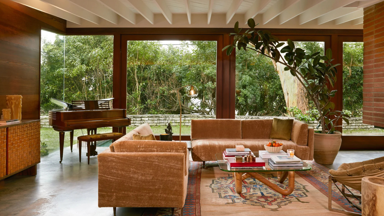
What do open floor plans, geometric shapes, mixed materials, and warm, earthy color palettes have in common? They're all mid-century modern ideas, of course. As a style that emerged after World War II, mid-century modern design responded to the desire for simplicity and function within the home.
Contrary to preceding styles that prioritized grandeur like art deco or Victorian style, mid-century modern design was (and still is) easy and uncomplicated. 'Mid-Century modern is one of those styles that gets straight to the point – clean lines, strong forms, honest materials, and a real feeling of home,' interior designer and mid-century modern expert Amelia Hesketh explains. 'It’s functional, unfussy, and well-proportioned, with just enough design to make a space feel considered without being overthought.'
The mid-century modern design style takes into account lots of features – aside from just aesthetics. 'Unlike many older houses, mid-century modern homes are designed around the shape of the land, the direction of the sun, and the needs of the family,' Amelia explains. 'Their layouts embrace the environment and the lifestyle, rather than forcing a rigid urban design where the house simply faces the street.'
As for their interiors, mid-century modern homes are filled with details made to stand the test of time. From wood paneling and low-slung furniture to organic forms and an emphasis on nature, mid-century modern ideas are a prevalent interior design style, even almost 80 years later.
1. Think statement but simple
Mid-century modern style might sway towards quirky in some of its shapes and designs, but it's never fussy. The lines are usually always clean and simple. As Anthony Barzilay Freund, Editorial Director, 1stDibs describes the style, 'Mid-century modern style could best be characterized by having clean lines realized in natural materials. Emerging after the end of WWII, it embraced the promise of a brighter future and the ways in which the Machine Age could fuel a new design aesthetic and greater production and distribution of these pieces. Mid-century design rejected the fussiness of the 19th century and saw these lighter, cleaner pieces as the backdrop to a happier, better life for all.'
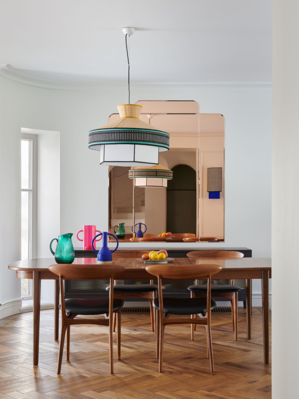
However, that's not to say mid-century modern isn't a statement, it most definitely is. It's just about finding that balance between sleek and sophisticated and statement. This mid-century modern dining room, designed by Colombe gets it spot on.
'This dining room was built in the 1950s, and the design brief was a warm, colorful space for two parents with four children. The owners really like warm, cozy, and unpretentious interiors, and I associate the midcentury modern style with them,' explains the founder of the studio, Marta Chrapka. 'A wooden table (usually teak or walnut dominates in this period) has been set with chairs finished with black leather – also a common material for the era and decorated with strong color accents such as a geometric lamp, rose mirror, or colored glass.'
2. Use materials that reflect the style
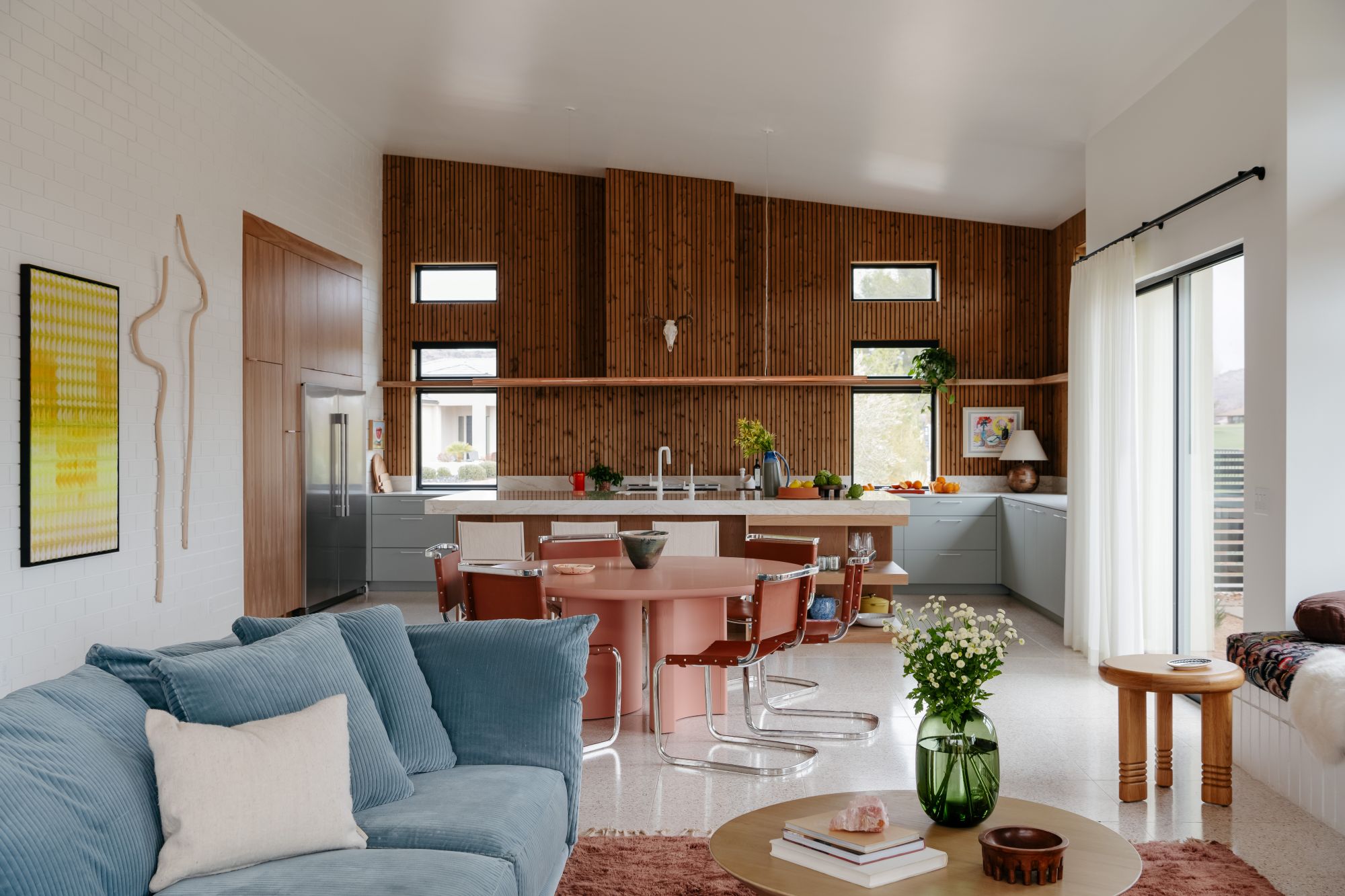
Mid-century modern style can be most easily identified by certain materials – that is, wood, brick, and stone. Often, mid-century modern homes will use these materials in abundance because of their natural appeal, durability, and authenticity. Alone, wood, brick, or stone details can reflect the aesthetic, but together, they work wonders in making a space truly feel like a mid-century modern interior.
This space, designed by Maggie Glendenning of Maggie + Co Studio, features all three. White-painted brick walls set the scene with a simple backdrop, while a classic wood-paneled wall accentuates the kitchen. Terrazzo stone floors add flecks of color to match the furniture and other decorations in this open-plan room.
'The base for designing this home was really a classic mid-century palette: terrazzo, brick, and wood – then layered with all kinds of color and texture to make it feel fresh and lived-in,' Maggie tells me. 'The wood in the kitchen warms up the whole space and brings in that timeless mid-century vibe, especially against the cool terrazzo floors and painted brick.'
3. Blend rigidity with softness
Because of the prioritization of functionality, emphasis on clean lines, and use of practical materials, mid-century modern interiors can sometimes fall into the habit of feeling rigid. For some, this rigidity is what draws them into the design style, but for others, it feels too stiff. That's why it can help to blend the rigidity with softness to make the most of mid-century modern interiors.
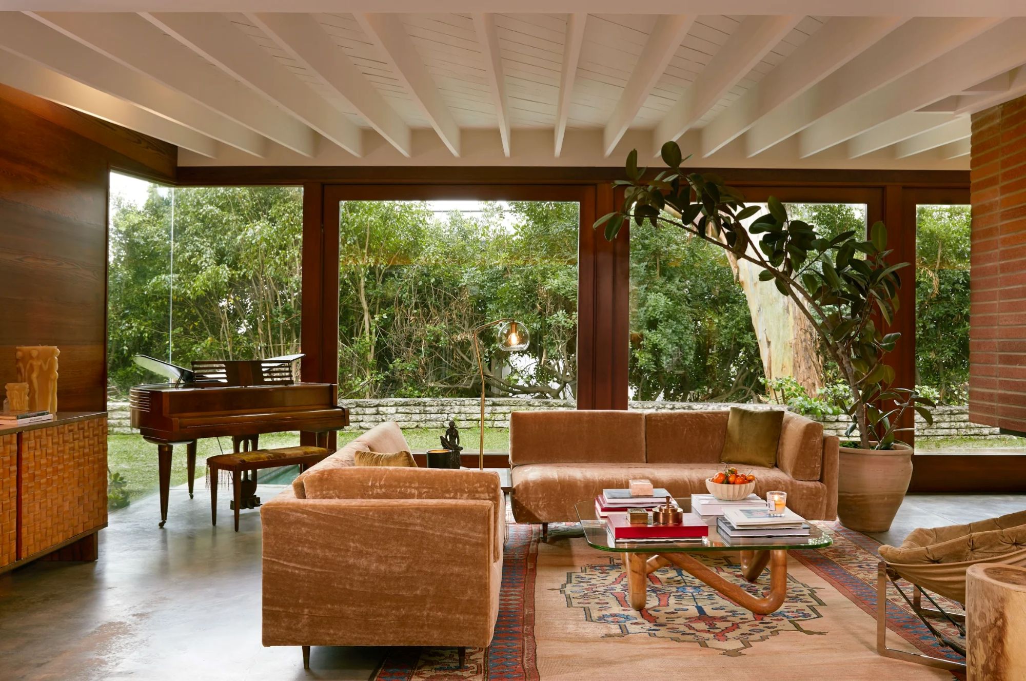
That's what Pierce & Ward accomplished in the living room shown above. 'Mid-century homes tend to automatically feel masculine, so [when designing] we wanted to balance the space with some feminine tones while keeping mid-century lines,' they explain.
'In this room, we restored the original red wood walls and repainted the ceiling to give it a fresh feel. And that couch came with the house, but we had it reupholstered with mohair fabric specially done by an artist we work with,' they explain. The clean lines on the walls and ceiling elegantly contrast with the softness of the mohair couch, creating a visually appealing and inviting mid-century modern space.
4. Incorporate classic mid-century furnishings and decor
While mid-century modern ideas can seem broad, there are specific things that can help you achieve the aesthetic in your home as well. For instance, certain furnishings, decorations, or ready-made design elements can help you lean into the mid-century modern aesthetic without undergoing a total renovation.
Classic pieces of furniture like the Eames Lounge Chair, the Saarinen Tulip Table, or the Arco Floor Lamp by FLOS are quintessential mid-century modern furnishings that are well-known, well-loved, and have become highly coveted by mid-century lovers.
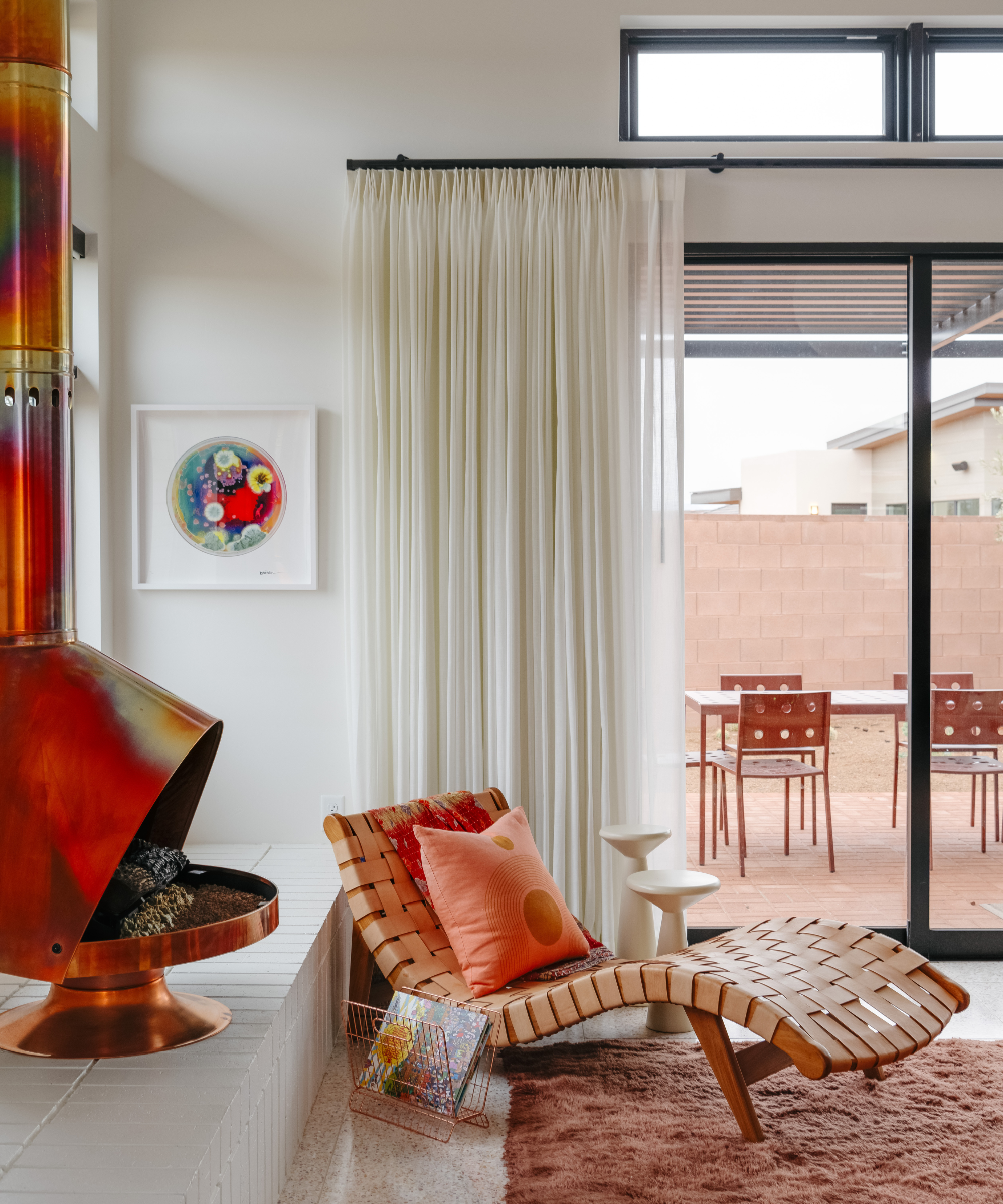
In this living room by Maggie Glendenning, an organically shaped lounge chair leans into the mid-century modern aesthetic. As does the hang-down fireplace, which, according to Maggie, 'totally steals the show.'
'The second I turned it on, it developed a patina with these crazy beautiful holographic colors. It really grounds the space and brings in such a cool metallic vibe,' Maggie says. And because of its sleek design and retro appeal, a fireplace just like this one is an element that can make your living room feel more mid-century in its design.
5. Mix other styles with mid-century modern
Mid-century modern design is highly adaptable, and that's one of the reasons why it's stood the test of time and remained so popular. Not only that, but because of its emphasis on simple, clean lines and purity through design, the core principles of mid-century modern interiors can pair well with lots of other styles.
Amelia Hesketh recognizes this, and uses the most basic mid-century principles of designing around the needs of the family, playing with color and texture, connecting with nature, and respecting the architecture to blend the mid-century style with other design styles.
'I often work with clients who love the look but live in traditional or contemporary homes, so I layer in mid-century modern elements – and it still works,' she tells me. 'Vintage pieces can sit comfortably next to newer ones, it's just about striking the right balance. The heart of mid-century modern is not about trends – it’s about living well.'
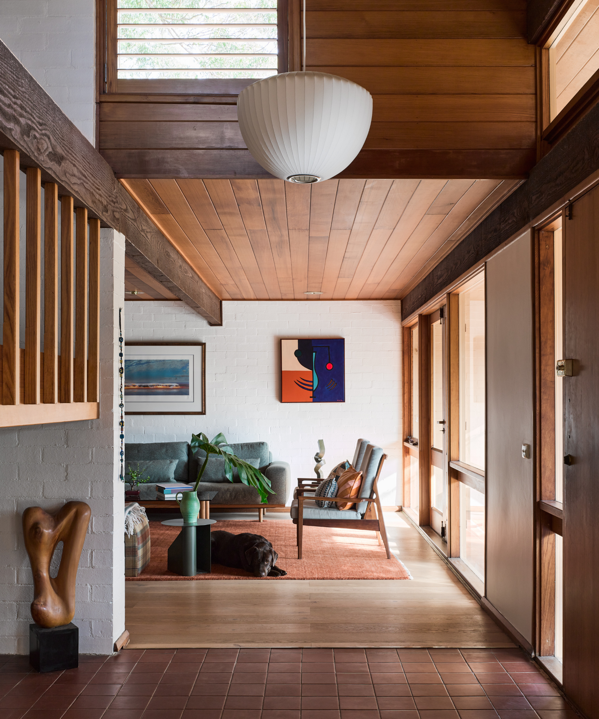
While some of the art and accent details in the room above designed by Amelia might lean contemporary or organic modern in style, the mid-century modern aesthetic has a way of uniting everything to feel inherently connected and meant to be.
6. Try a warm color palette that's classic of mid-century style
One of the things that people love most about mid-century modern design is its color palette. With the prominence of shades of brown, orange, and yellow, as well as the opportunity for pops of colors, and a mid-century modern color scheme feels inherently inviting, warm, and in a way, timeless.
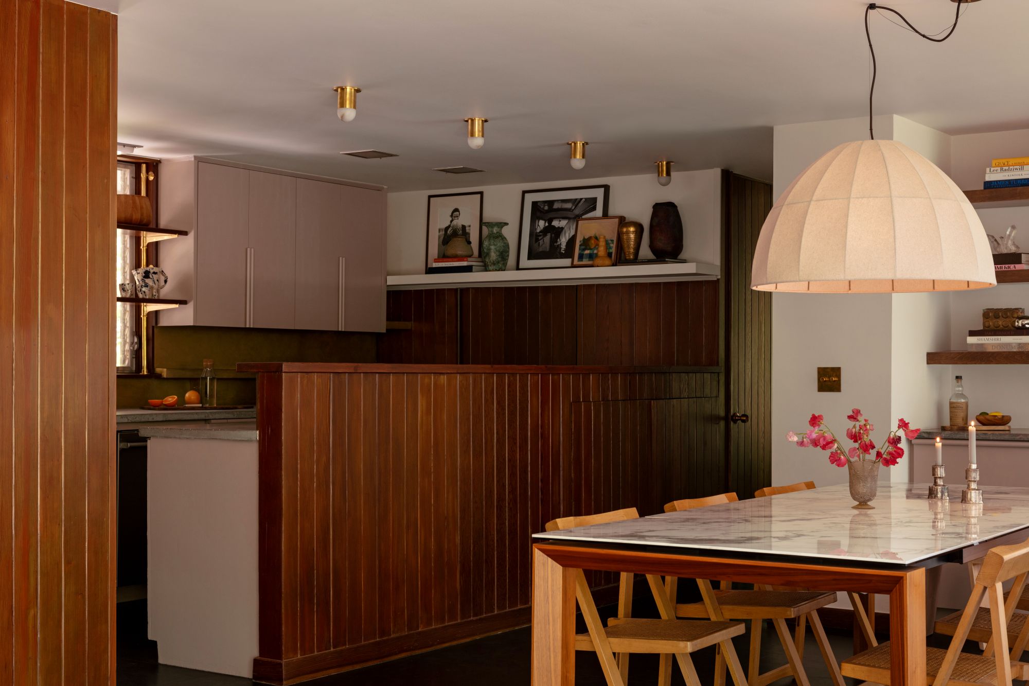
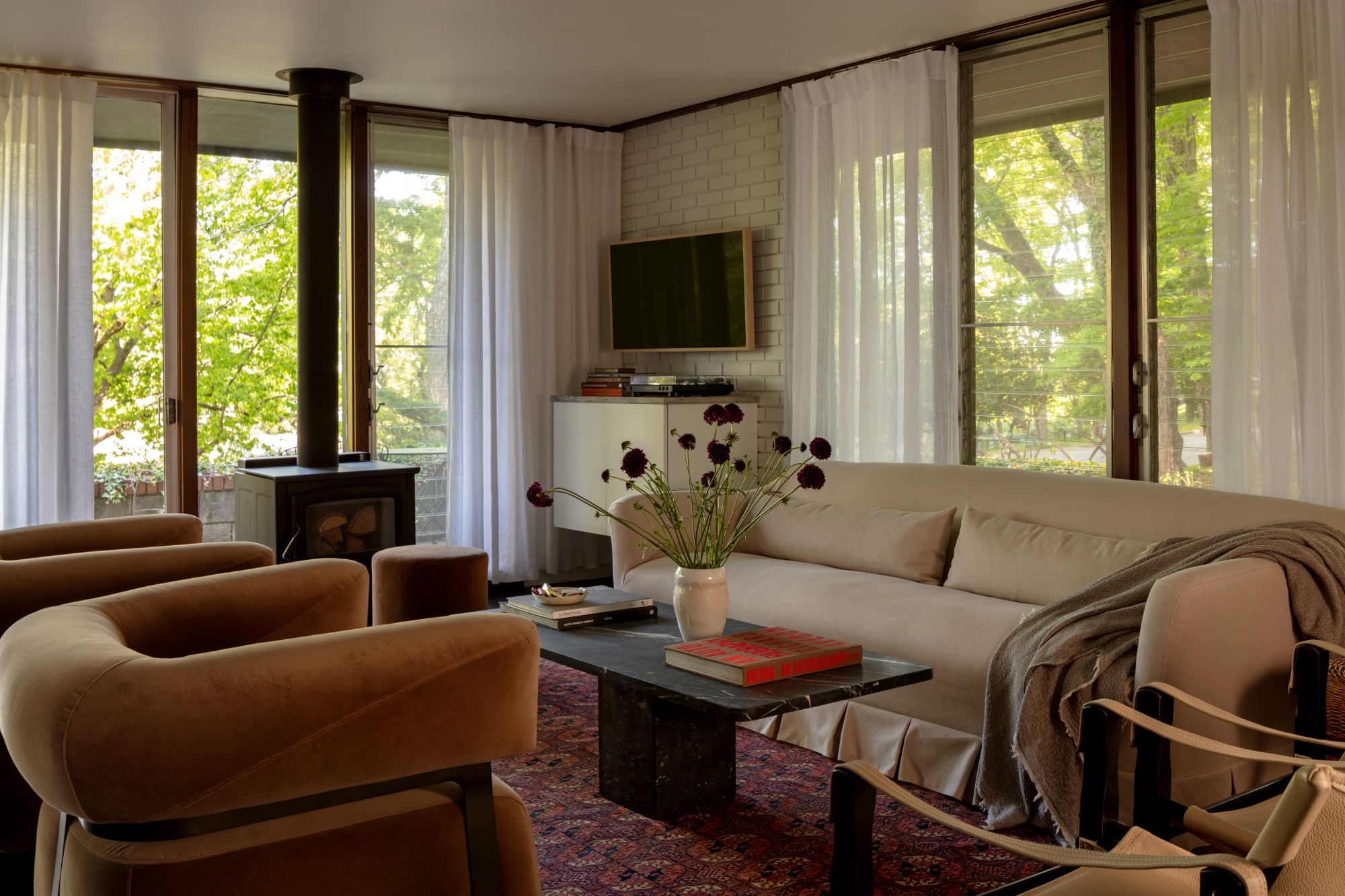
This kitchen, dining room, and living room designed by Whitney Romanoff of Meet West Studio, displays the warmth of the mid-century color palette perfectly. 'We used a more feminine material and color palette to balance out the masculine lines of the home's mid-century bones,' Whitney explains. 'A warm nude tone on the cabinetry complements the original redwood paneling and rosy quartzite, alabaster spotlights, an unlacquered brass backsplash, and oxblood tile add a romantic, cinematic quality in the kitchen and open living space.'
Not to mention, the floor-to-ceiling windows in the living room further benefit the mid-century color palette by allowing the natural surroundings to become a part of the space.
7. Let the mid-century bones stand out
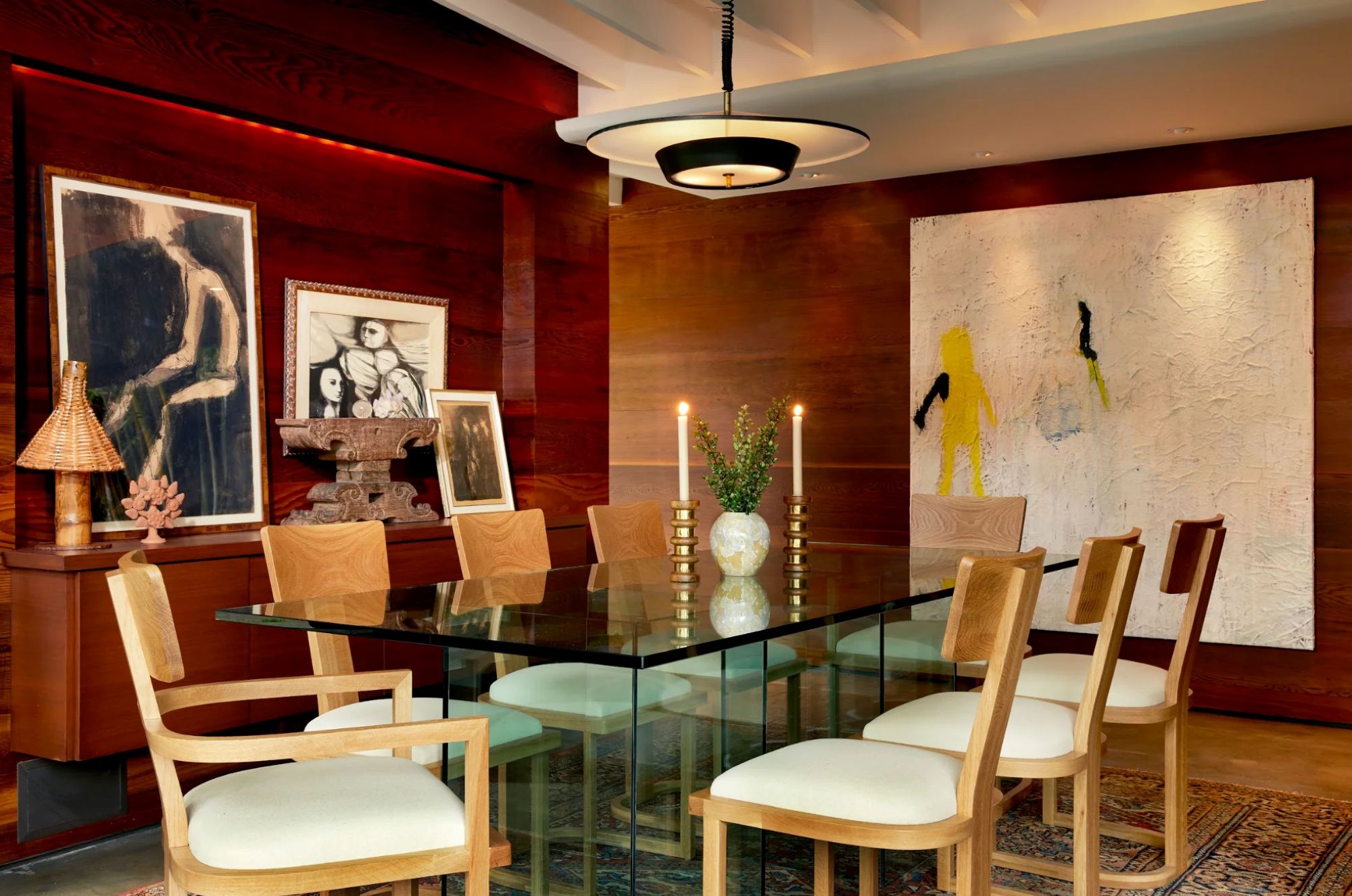
Mid-century modern design is revered for its stunning architecture. And sometimes, the best mid-century modern idea can be as simple as letting those architectural details shine.
That's what design duo Louisa Pierce and Emily Ward of Pierce & Ward did in this dining room. 'We added the floating credenza because we didn't want too much furniture blocking the elements of the home. We made it out of the same material the walls were made of, so it was functional but didn’t disrupt the flow of the room,' they explain. 'That’s also why we made the choice of a glass table, to highlight the beautiful nature of the home.'
Opting for furnishings that don't detract from the pre-established architectural elements of the space enhances the mid-century bones, and makes that the main feature of the room.
8. Add a mid-century flourish with the lighting
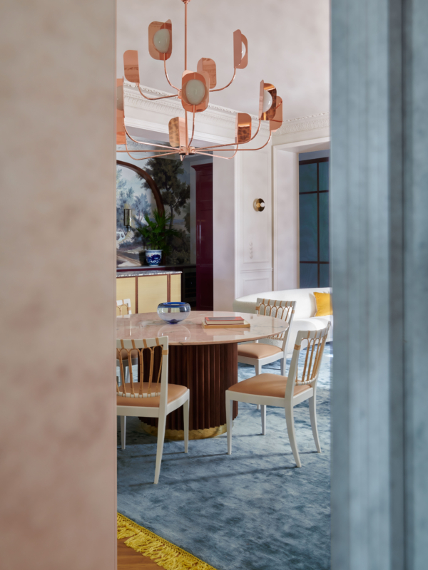
Unique lighting was where fuss and flourishes are allowed in mid-century modern style. You'll notice even in the most simple, stripped-back mid-century modern spaces, the lighting will give something special. And lighting is a great way to bring in a touch of the mid-century into other styles too. This dining room is a smorgasbord of styles, blending traditional with contemporary and mid-century modern.
'This space is the interior of a tenement house from the late 19th century, and its original features are very decorative,' explains Marta. 'Lots of stucco, polished brass and copper, and rich stones were juxtaposed with simpler furniture. The brief was an elegant interior, not necessarily functional, because it is occasionally used by a couple without children. The serious classicist style was broken with colors, wooden accents, and contemporary geometric patterns.'
9. Accessorize with caution
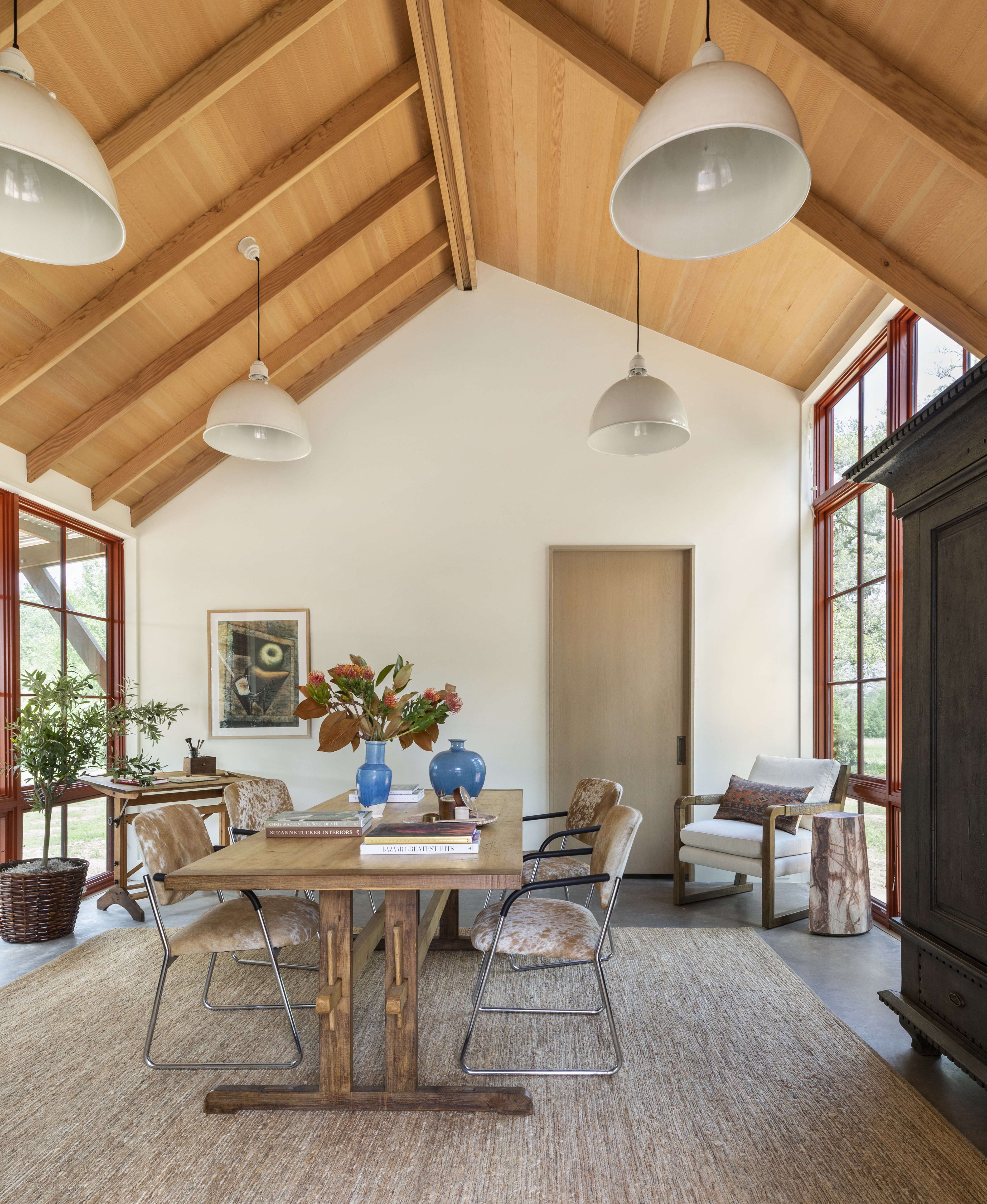
No matter what vein of mid-century modern you are going with, curated and considered is always a must. These spaces are fuss and frill-free, and all decor feels purposeful. The furniture is the focus, and the decor is very much in second. Any decorative pieces you do bring in ensure they have a home, like on shelving or a mantel, and look for organic, curved shapes – handblown glass pieces and quirky ceramics are perfect for injecting a retro vibe.
'Mid-century style is most noticeable by the clean, simple lines typically found throughout the design of furniture, lights, and case pieces. Mid-century style is also often void of decorative accents and embellishments. And I always appreciate the simplicity of mid-century pieces and love to incorporate them in design,' explains designer Marie Flanigan. 'I always appreciate when a room feels collected over time, so I approach these pieces as an accent piece as opposed to a room full of this style.'
10. Keep the backdrop simple and let the furniture be the focus
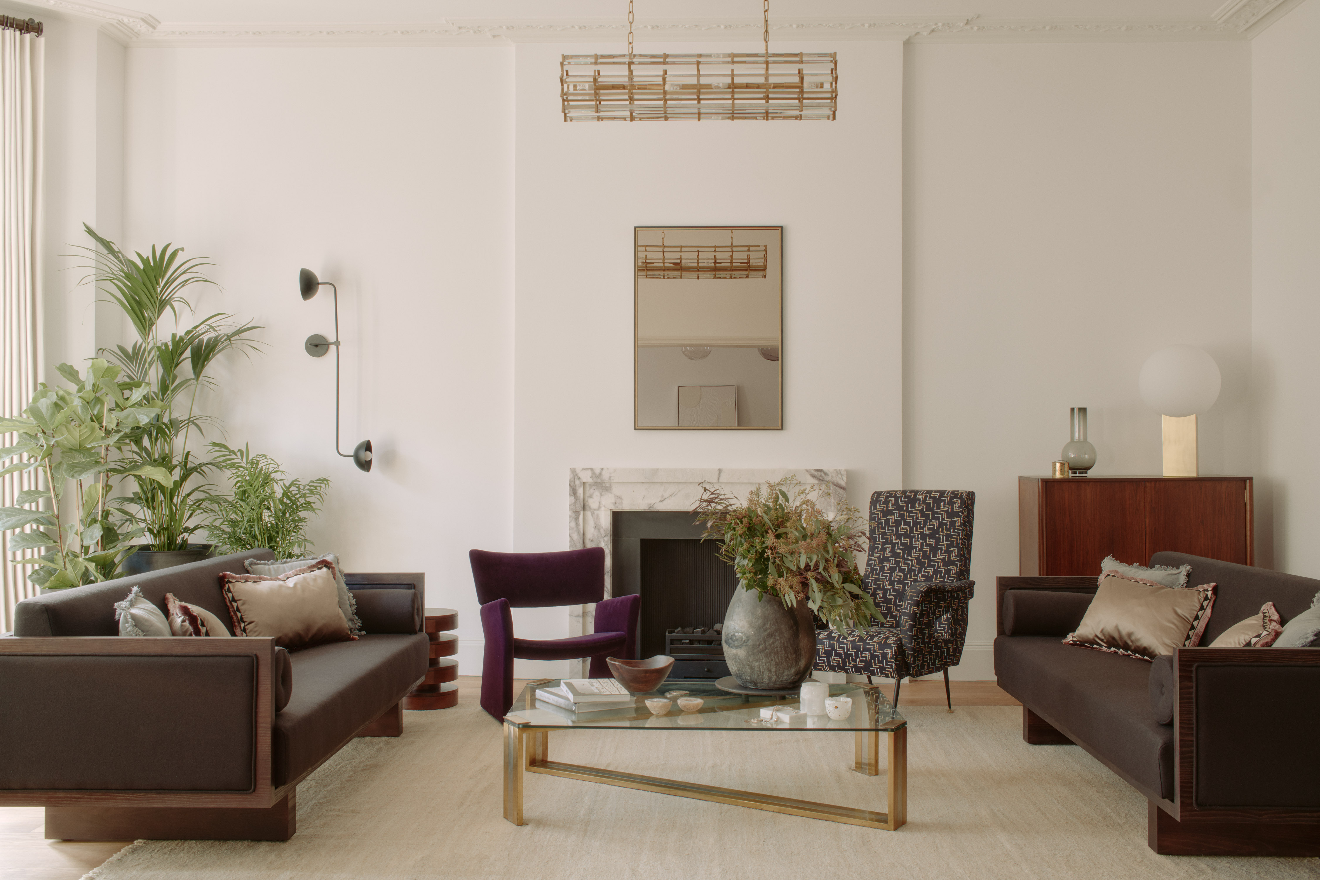
We've talked a lot about how mid-century interiors are all about form and shapes and unusual materials. This can make for very unique pieces that can at first appear tricky to style if you want to really embrace this aesthetic but still keep your space liveable. But this living room designed by Tala Fustok gets the balance spot on.
The room is clearly very inspired by the mid-century look and all the pieces have that fabulously retro feel, and yet the room doesn't look overwhelmed by the furnishings. The simplistic warm white backdrop, and the fact that all the pieces sit low to the ground, giving you plenty of negative space above gives the furniture room to be the focus but also keeps the space looking fresh and contemporary.
'This project is a monochromatic retreat again reflecting our client's personality which we honor in all our work,' explains Tala. 'To create an energetic boost, we played confidently with bold statements to build a backdrop for artwork, vintage furniture, and simple furnishings to enhance the calming powers of this soothing sanctuary.'
11. Play with a stronger color palette
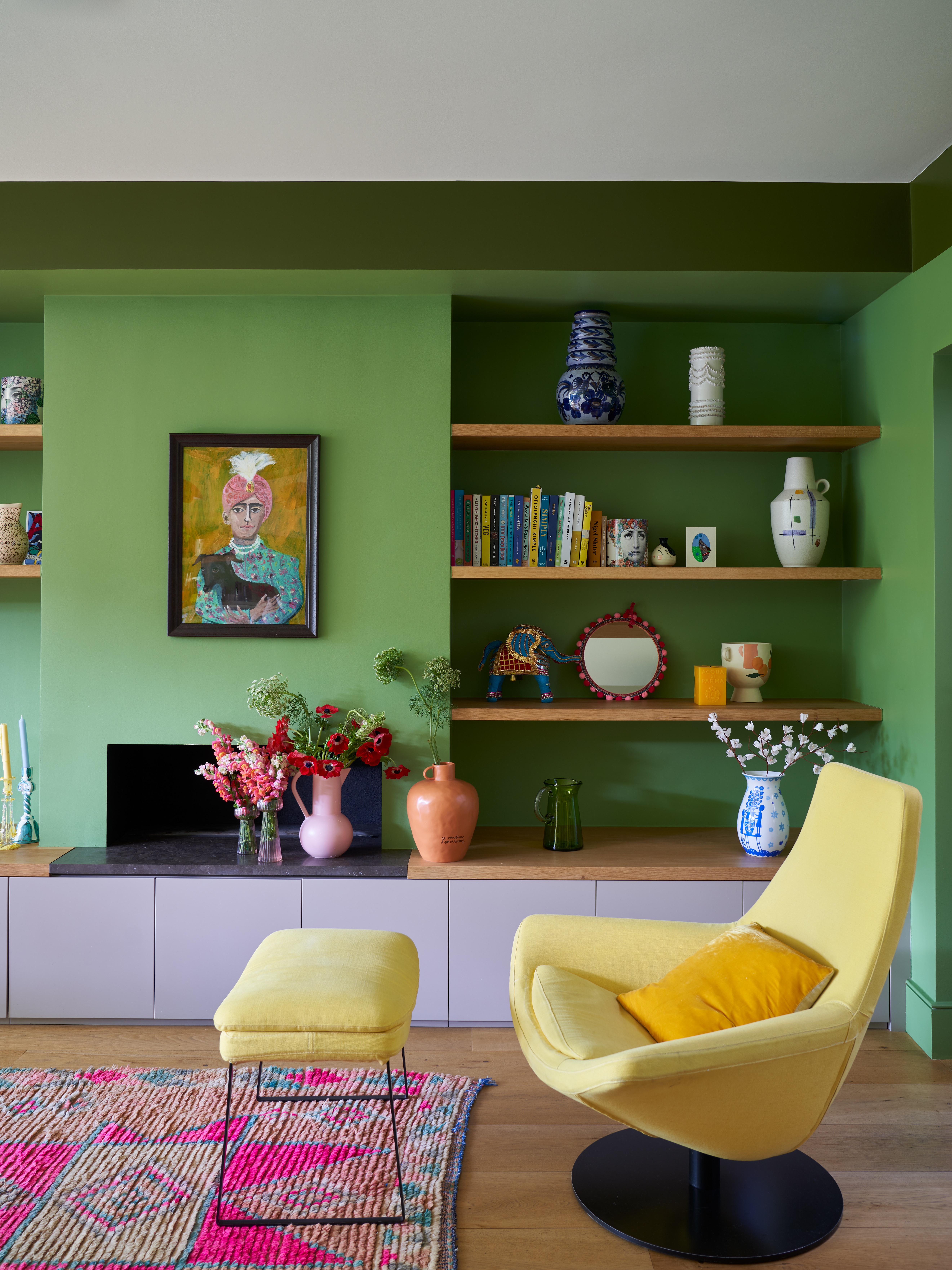
It wasn't all about the shapes, there was a big dose of color in mid-century modern interiors. The 21st take on trend has in some cases toned down this bold color scheme as the style got closer and closer to that of a minimalist, Scandi aesthetic that's so often all about the neutrals. But vivid primary colors are at the heart of the original mid-century modern look.
'Think of some of those great Californian interiors, lots of wood and warmth but with dashes of color added through but never there to overwhelm the space,' says Patrick O'Donnell of Farrow & Ball. ' Think olive greens l or for something more Scandinavian in vibe add a splash of gunmetal blue. Bring stronger colors like chromium yellow or azure blue into the mix in ceramic lamps or appropriately chosen art.'
This green living room is bold sure, but there's also something so serene about it. The clashing colors don't seem to clash at all in this space, they feel soft and inviting. The wooden accents are key to this – if you do want to experiment with this bolder scheme, as Patrick says, look to all those 1970s Cali-cool spaces, and you will notice all of them include plenty of warm wood.
12. Embrace mid-century style but use color and pattern to keep it unique
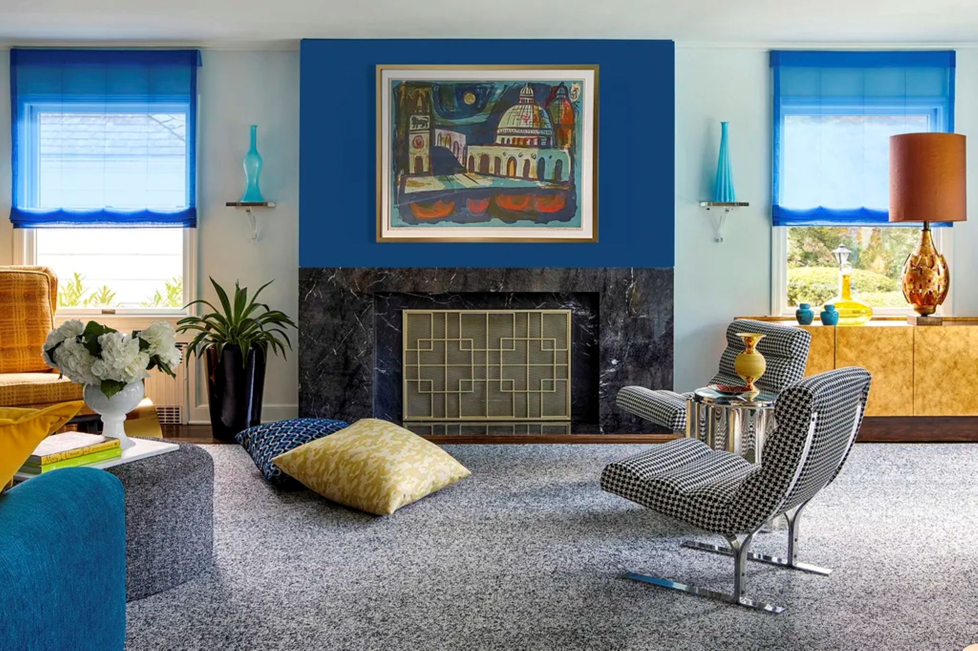
While many mid-century modern interiors feature rich and warm color schemes, they can certainly benefit from bright pops of color. That's what designer Andrew Suvalsky did in his mid-century modern living room. Bright blue and vibrant amber enhance the mid-century modern furniture and layout.
'I did not want to create a time-capsule of the 1950s,' Andrew says, 'but rather to infuse my modern take on various elements from the 1950s to the 1970s.' For Andrew, that meant adding layers of various patterns, materials, and finishes to tell a new narrative.
'The mission was to blend the clean lines of a 1950s California style-home with a rich and dense decor but to also play with – even upend – preconceived notions of what a mid-century ought to be,' he notes.
'I incorporated patterns, colors and objects that tell a story and are meaningful to myself and my husband so that our home would be a seamless reflection of our lives. I wanted our house to be a unique emanation of our personalities, highlighting our love for music, art, travel and hosting.'
13. Combine unexpected materials
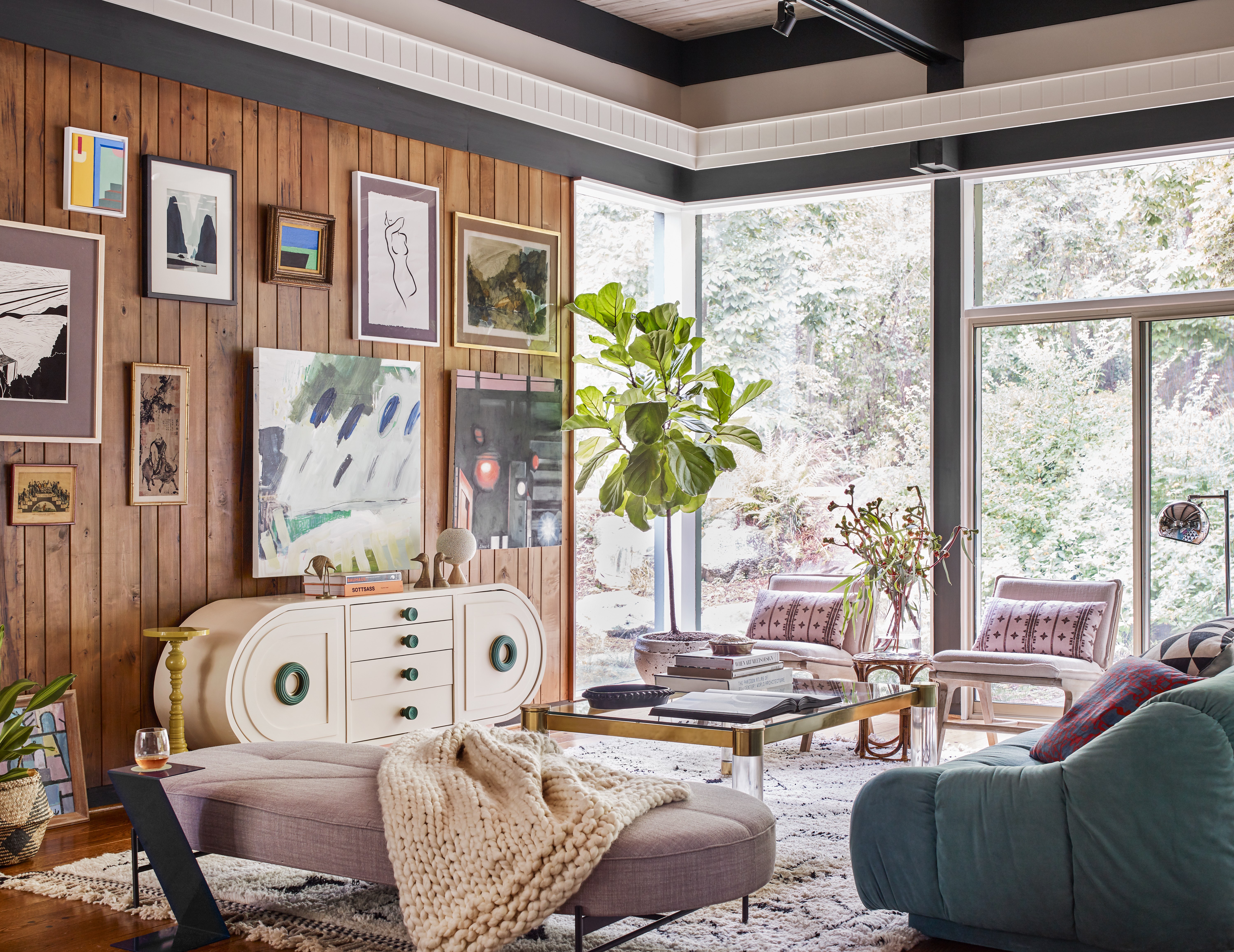
This was a big part of the mid-century modern style. After World War Two, materials were gradually starting to become plentiful once more, and new technologies meant more man-made materials, so rather than furniture just being made of wood, synthetic materials started to come into play too. Fiberglass, vinyl, and metals all started to be used alongside natural materials.
So consider this when recreating Mid-century modern in your own home – mix in different textures and materials and finishes. See how in this living room design by Atelier Davis, warm wood mixes with plastic finishes, glasses, and metallics to create a room full of texture and interest. And that mix of shapes too, curves and clean lines come together – again very of the era.
'The space has mid-century bones layered with a mix of textures, materials, and art,' explains the studio's founder Jessica Davis. 'Mid-century style tends to be clean-lined but leans into warm woods and stones. Usually, the lines tend to be more horizontal and sometimes have a bit of a space-age quality to them. I'd always recommend mixing in other pieces on top that aren't overly mid-century. You want it to feel layered and not thematic.'
14. Go abstract with shapes and patterns
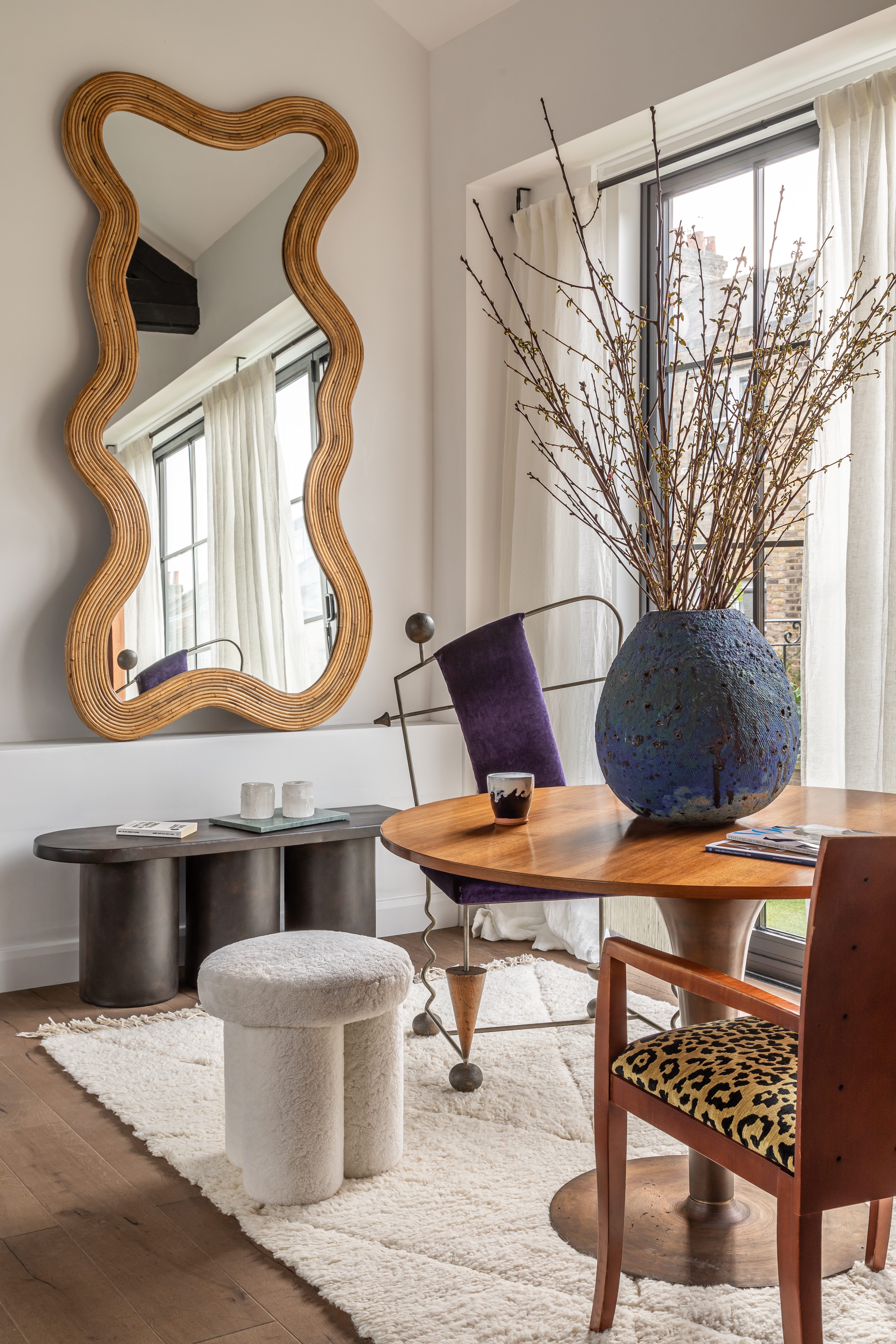
Not every line in a mid-century style space needs to be straight and horizontal. You do want to keep some of those simple lines in there, but bring in curves and sculptural shapes too to soften the look and prevent a room from looking too stark. Freeform furniture and biomorphic shapes were big towards the end of the mid-century era (think the Noguchi glass coffee table).
The same goes for patterns. Pattern was a big part of mid-century style, flamboyant, geometric, and abstract prints in particular. You can find some fabulous wallpapers if you want the pattern to be a real feature or just inject a hint of pattern with soft furnishings like the hint of leopard print used in this space.
'We wanted to cohesively bring an abundance of color and texture to showcase a home now bursting with life,' explains Tala Fustok. 'Bold leopard print and reclaimed oak flooring offer a juxtaposed pop of fun and calm. This loft apartment has a clean modern aesthetic; however, the elaborate mix of carefully curated objects and vintage furniture creates layers of depth and curiosity. Enviable pieces from a rare Pierre Paulin Chair to a Petra coffee table from Toad Gallery are all elements that contribute to a recipe centered around flow and creativity.'
15. Bring back terrazzo
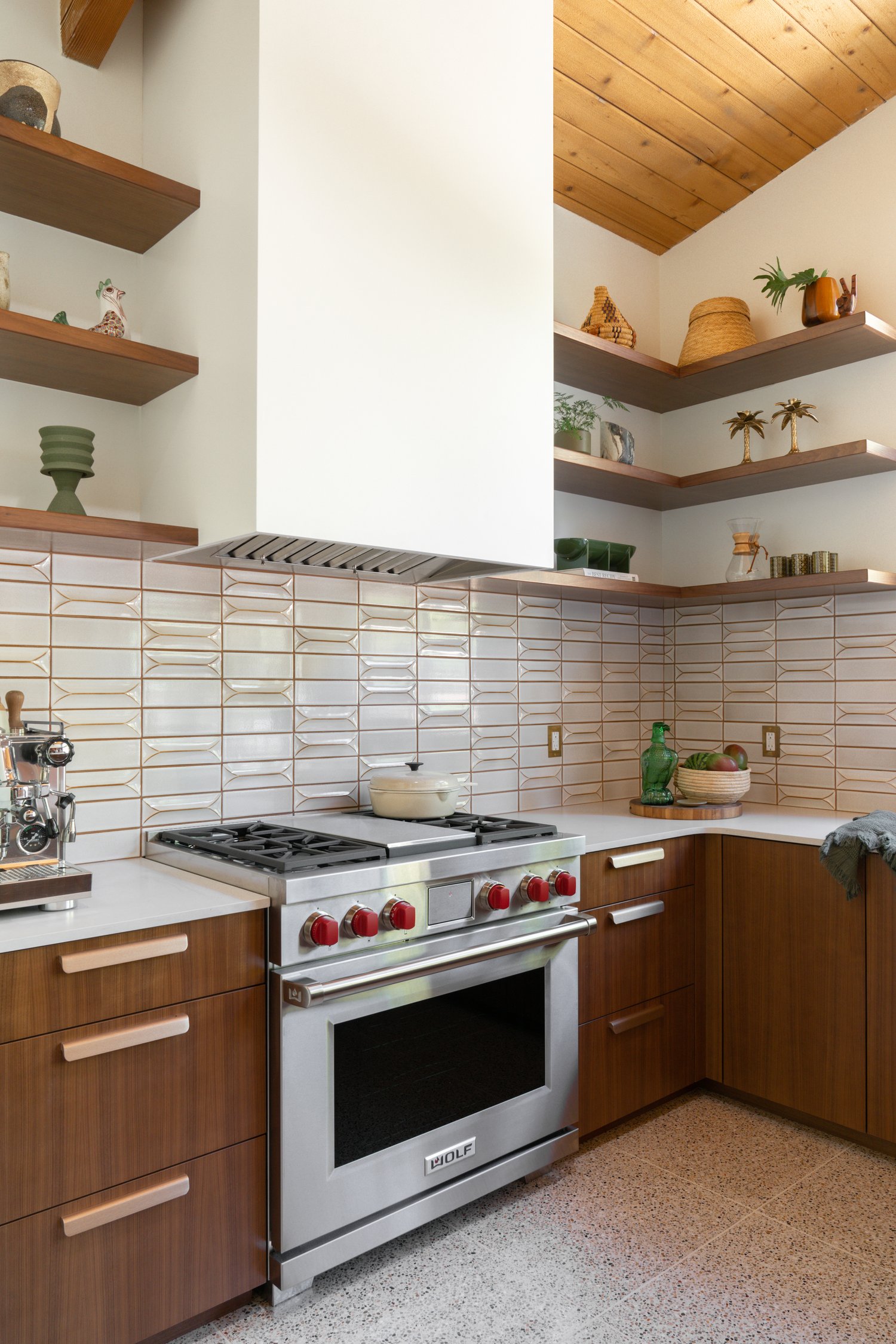
Not so long ago, terrazzo was banished, only to be used to grace the floors of public spaces. But terrazzo has been making a slow comeback in the world of interior design trends and seeping back into our homes. Terrazzo has technically been around for many centuries, but it made a comeback in the form we know it towards the end of the mid-century modern era.
'This renovation was completed in 2021 and updated an original William Krisel Mid-Century Modern home in San Diego. In keeping with the vein of the mid-century style, we updated the kitchen with dimensional tile, terrazzo flooring, and walnut cabinetry, all three of which are quintessential styles of mid-century modern design,' explains designer Abbie Naber.
16. Decorate with a retro wallpaper
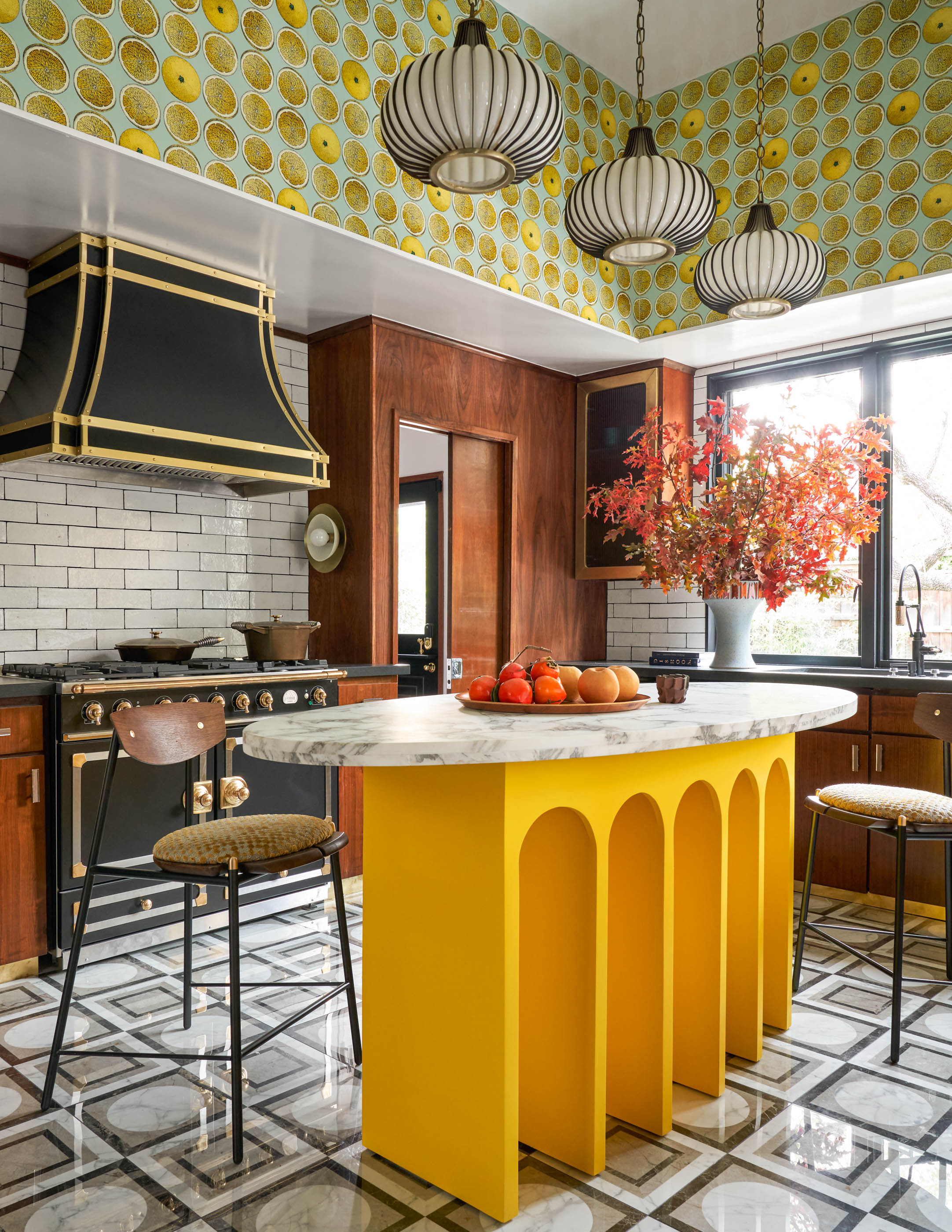
Loving the bold, playful colors going on in this vintage kitchen. And the wallpaper adds the perfect pop of retro pattern. 'I had saved and loved this wallpaper for a long time, but never had a spot for it,' says Eddie Maestri, principal architect and creative director of Maestri Studio. 'I wanted the space to feel like a true 1970s kitchen, so I opted for a lot of pattern on pattern and bold color. I went through retro kitchen books to get inspiration and see what would’ve been done in the ‘70s, and then put a modern twist on it.'
'Much of mid-century modern design is composed of clean lines and simplicity. Furniture is often low to the floor on sleek legs with a strong disposition for wood elements. Spaces designed in this style often have a pop of color, utilizing varying tones of primary colors,' he adds.
Why is mid-century modern style having a resurgence?
Even though the mid-century modern interior design style is almost a hundred years old, it remains a highly appreciated style, and has gained significant popularity over the last decade.
But, why now? According to Amelia Hesketh, 'people are tired of throwaway furniture and trend-chasing. There’s a real craving for calm, grounded spaces that actually feel like home,' she says. And every element of mid-century modern interiors can satisfy that craving.
'Mid-century modern furniture, and the style overall, has a real warmth about it – whether it's in the tone of the wood or the character of the design; it has a timeless appeal. Architecturally, people are drawn to the way [mid-century modern] houses bring the outside in and create a natural relationship with the landscape,' she explains.
It's a design style that's as inviting as it is captivating. Mid-century modern ideas can help you create a space that truly feels like home.
Shop the look
Want to get the mid-century modern look for your home? Incorporate some classic mid-century modern furniture and decor into your space. Find a few of our favorite pieces below.
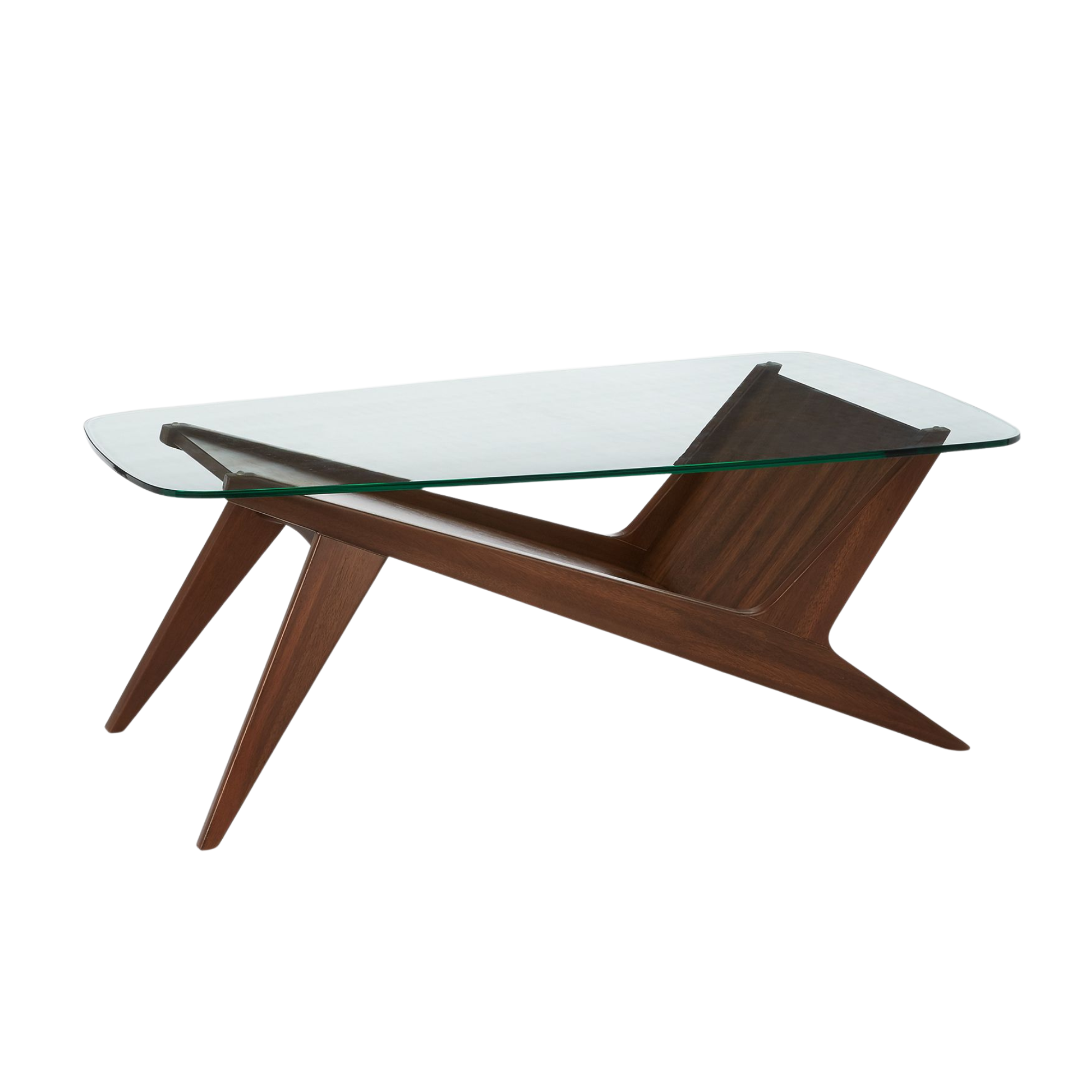
The angular legs of this coffee table add to its mid-century appeal, as does its sleek glass surface. Place this coffee table in your living room to invite some mid-century modern style into the space.
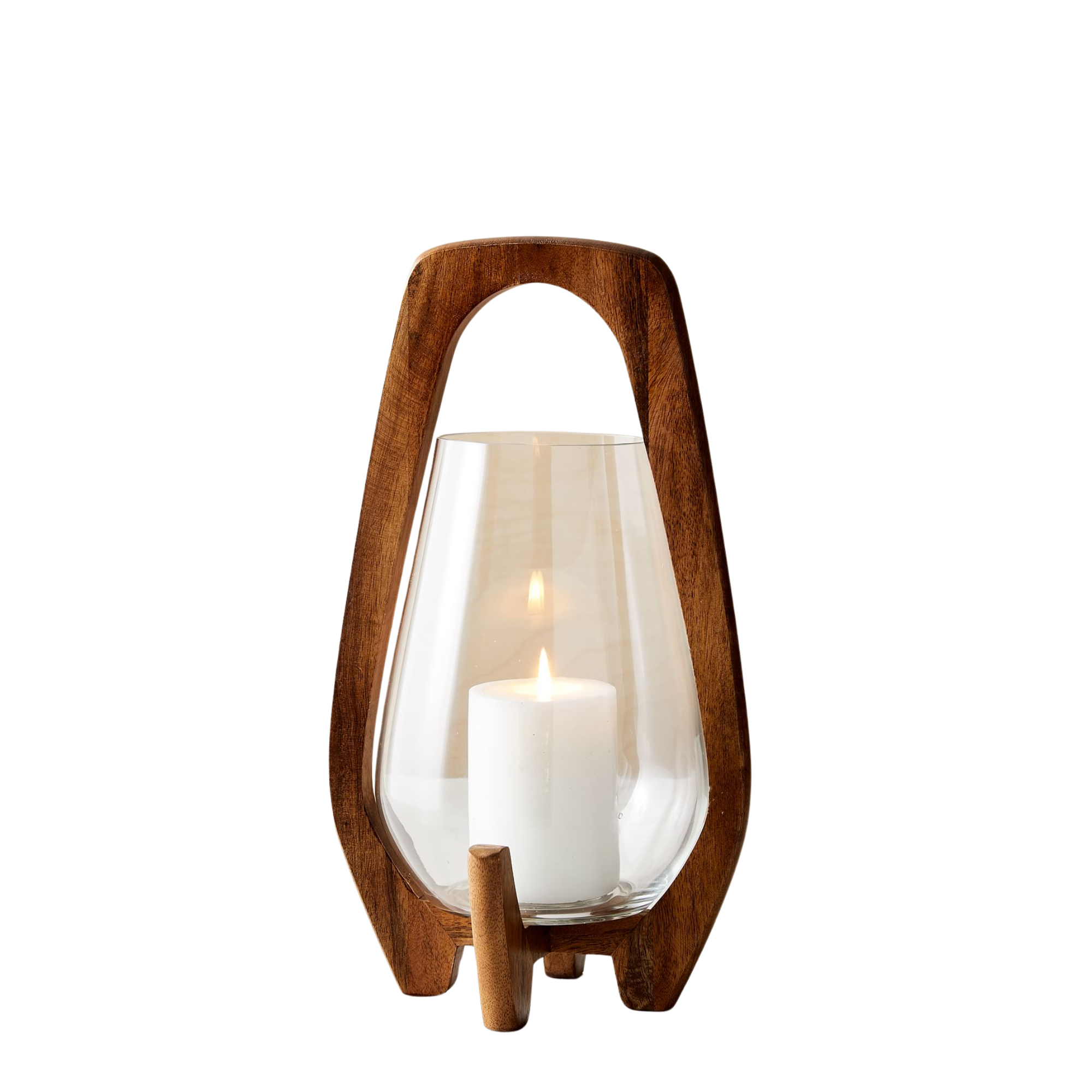
This lantern reflects the mid-century modern style both in its material and sleek silhouette. For a cohesive look, opt for two of these lanterns in varying sizes and style them next to each other on the floor.
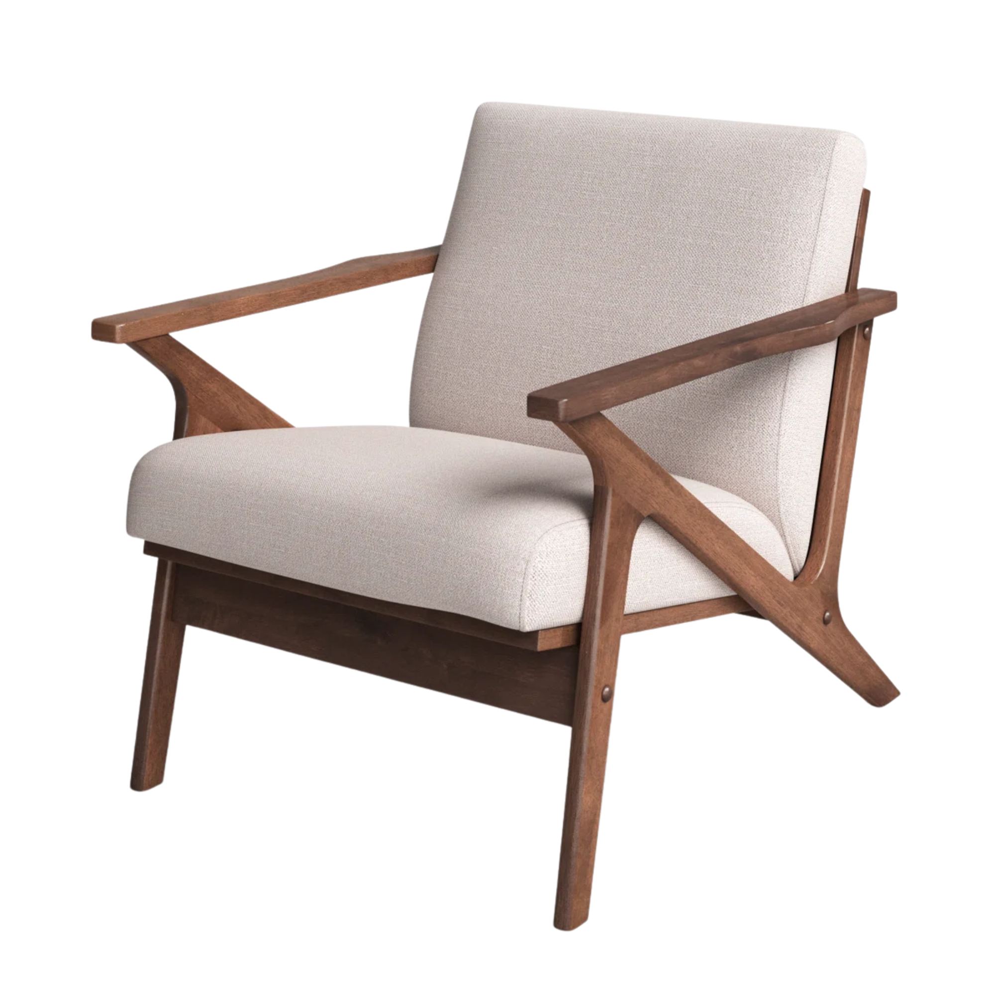
Mid-century modern furniture is known to be low slung and angular in design. This accent chair is the perfect example. Place it in the corner of your bedroom and let its mid-century flair enhance the look of the space.
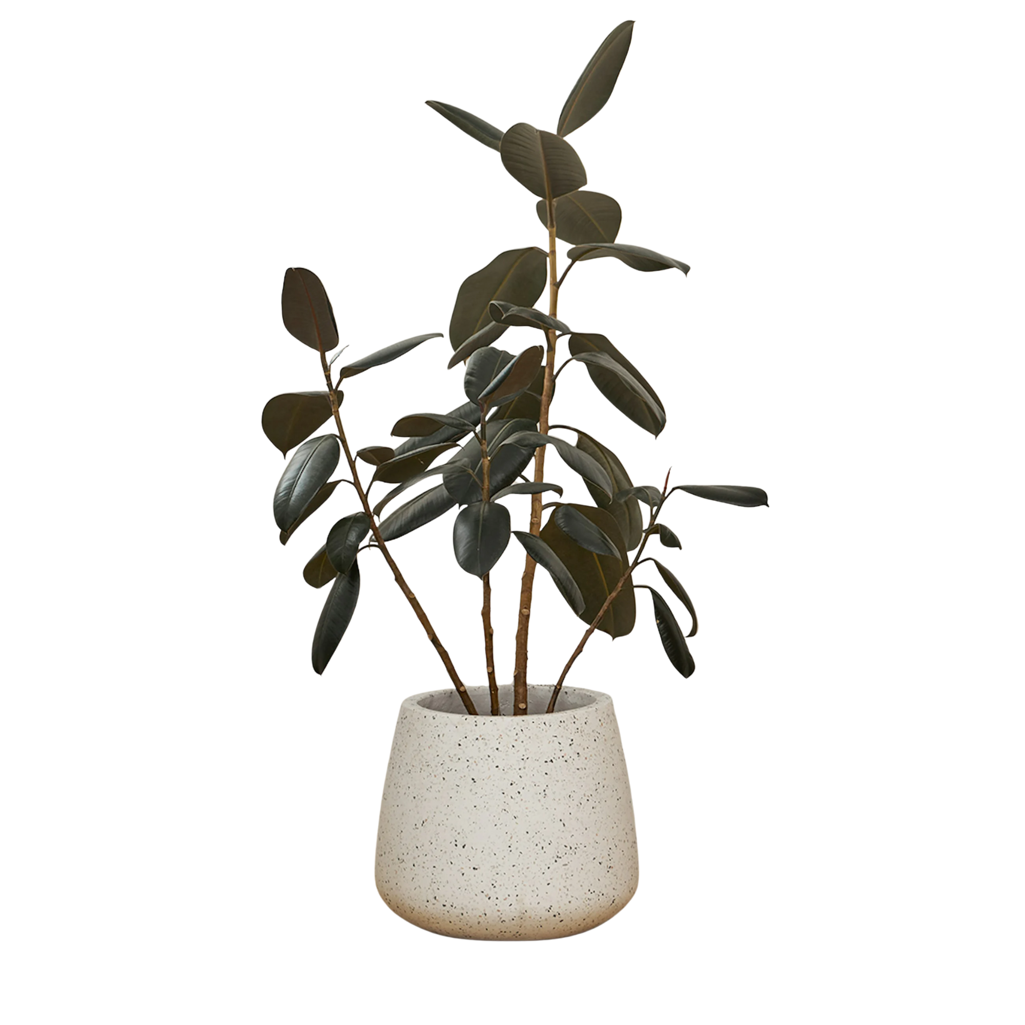
Terrazzo is a key material in mid-century modern design. If you want to bring the material into your home, but you're not sure how – start small. This terrazzo planter can introduce the material in a subtle way, and also provide a space for plant life in your home.
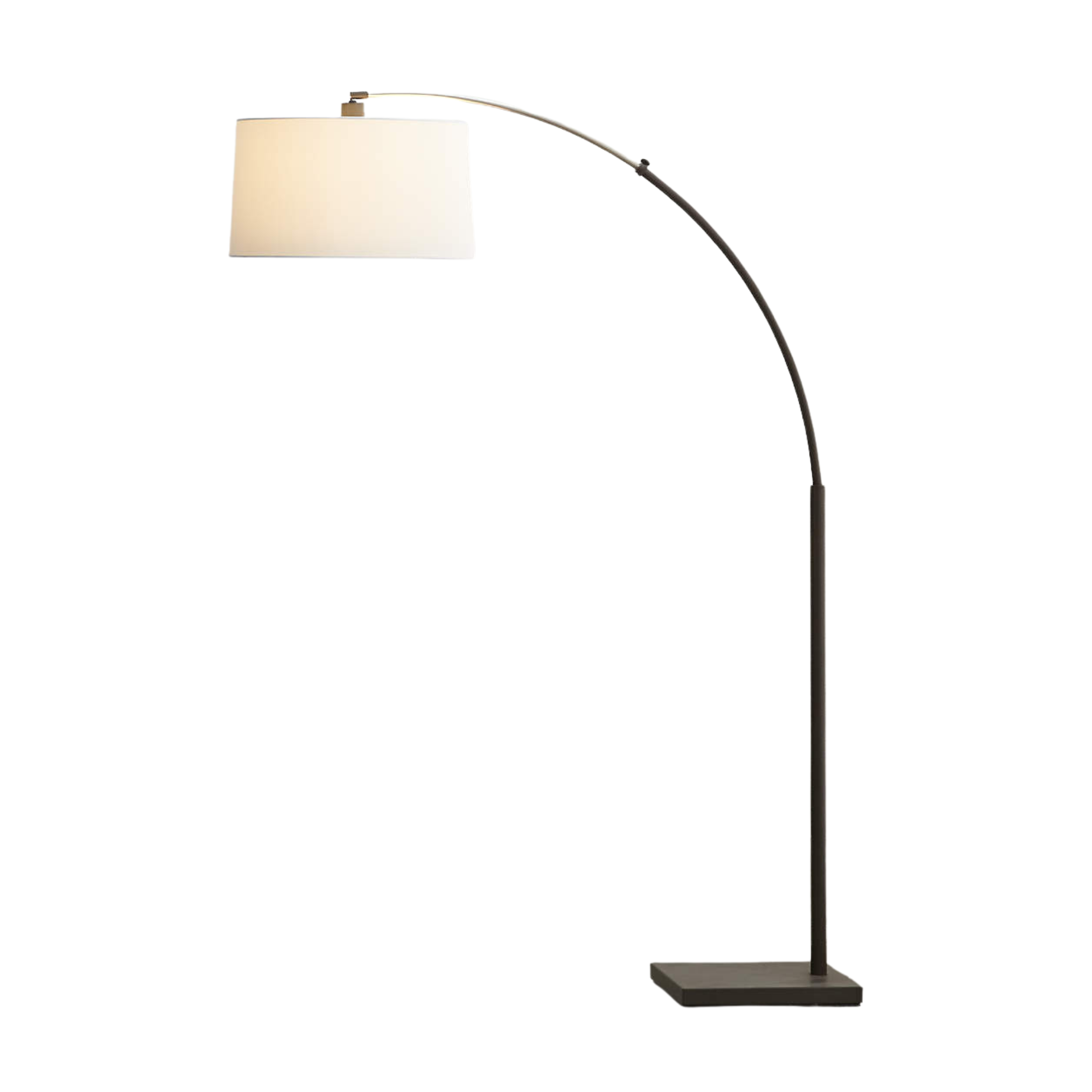
Arched floor lamps are a common feature in mid-century design because of their sleek and angular shape. Made with a black base and complete with a white shade, this model could add some sophisticated style to your living room set up.
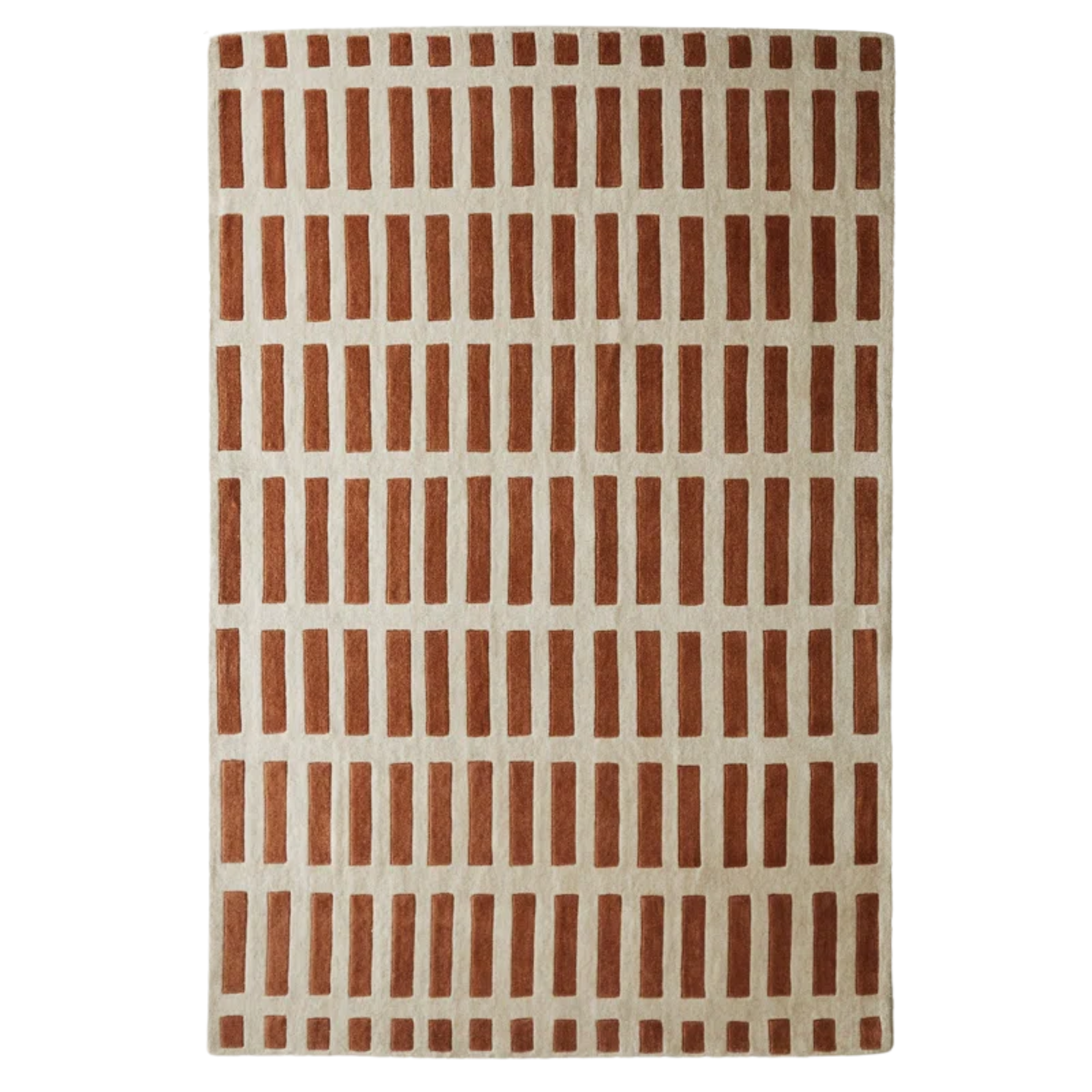
Size: 5' x 7.6" (more sizes available)
Burnt orange is a prominent shade in the mid-century modern color family. Bring it into your space in the form of a rug. With its repetitive geometric design, this rug could provide a bit of excitement to a room without overpowering the space.


